Power BI Challenge 15 - Formula 1 Analysis

Challenge 15!!

Hello All, I trust you are well.

An awesome milestone with this challenge as we reach the 15th iteration. It’s been an incredible past few months and the work produced in the challenges has just been spectacular, innovative and in some cases incredible.

We started the challenge to help provide an opportunity to get hands on and implement the skills that you are learning.

We truly believe that the challenge is an excellent opportunity for all our members and non-members to get involved and enhance their Power BI capabilities. We already have a number of excellent prizes and categories available, but we’ve got some seriously cool stuff lined up and its coming soon so watch this space!

I know I keep banging on about it, but we really want more of you to get involved in this and were definitely trying to listen and ensure that the challenge is accessible to all.

As always if you have any suggestions or comments, we are always happy to listen. Please feel free to reach out to myself or the Enterprise DNA team.

Check out the post below to learn about the challenge.

Prizes and Swag

We have some excellent prizes on offer across a number of categories open to both members and non-members so an excellent opportunity to learn but also bag yourself some freebies.

Enterprise DNA member winner - will receive a complimentary membership to the platform that they can share with anyone and the opportunity for your work to be showcased across our channels.

First time participant winner - open to all Enterprise DNA members. All you must do is let us know it’s your first challenge. Full details of the prizes on offer for this category can be found below.

The prizes on offer are as follows.

  1. A copy of the Definitive Guide to DAX, 2nd Edition (the indispensable "bible"of DAX) or your choice of any other book from the eDNA Forum Recommended List ; or
  2. A copy of SnagIt 2020 , a do-it-all screen capture and graphics tool used by the members of the expert team for screen grabs, annotation, gif and video generation, photo editing, etc. @nick_m got me hooked on this, and it has a million and one uses for Power BI report development; or
  3. A four-month subscription to FlatIcon.com - this is an online service with millions of downloadable and editable icons that you can use to really polish your Power BI reports.

Really simple, its open to everyone and anyone no matter what your background or experience, however you must be a member of Enterprise DNA an intern or part of the scholarship programme.

All you must do is let us know it’s your first challenge.

Non-member winner - Open to everyone and anyone the top 3 non-member entries will receive a complimentary 1 year membership to the Enterprise DNA platform!

The Brief

So while some of the past challenges have focused on specific domain or industry knowledge, we thought it’s the perfect time to introduce something a little different.
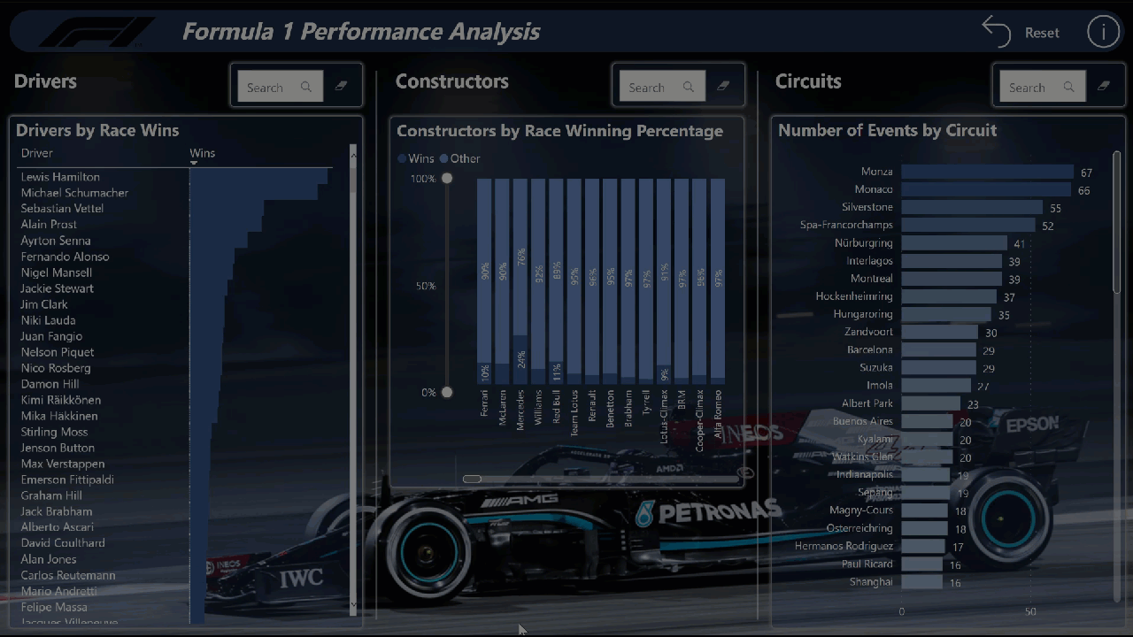
Formula 1 dataset!

For any formula 1 fans out there they would have seen that things are hotting up nicely in the run in for the championship. Last weeks race was full of talking points and some controversy at the end (rules are rules)!

So challenge 15 is all about taking a deep dive into the world of F1.

Kaggle have an excellent dataset available and recently Sam did an excellent session on modelling best practices using this dataset.

So an excellent opportunity for you to follow along and see how to develop a really good data model in power bi.

Building a data model for many is the trickiest aspect of power bi development however as many can attest its also one of the most important aspects and a good data model can make everything else easier.

So a great opportunity to take a dataset that most of us have never seen or used before and create a comprehensive data model followed by some reporting.

The task isn’t prescriptive, and we really want to see what you make of this dataset and the variety of insights you can pull.

There is a single requirement that it must be a ONE page report!

The rest is up to you!

You decide what to present and how!

The direct link to the dataset on Kaggle can be found here;

I have also extracted the files and attached them as a zip folder.

I am also including @sam.mckay original PBIX for your reference and as a starter for some participants who may be more focussed on visualisations or DAX.

F1 Dashboard Demo.pbix (5.4 MB)

The link to the webinar where Sam created this model is below.

An excellent place to start for anyone not sure how to get started.

I have also extracted the data files to a zip folder here:
F1 Kaggle Export.zip (5.4 MB)

So everyone please take your places on the grid!

SUBMISSION RULES

Best of luck!

Any issues or questions please reach out.

Haroon

Enterprise DNA

9 Likes

Nice one, this is going to be great!

5 Likes

Well… on it already - let’s see how fast these cars really go :smiley:

F Pastor

5 Likes

Hello Everyone!

A gentle reminder on the updated mechanics on joining the Power BI Challenge.

:red_circle: :red_circle: How do I submit my entry: :red_circle: :red_circle:

  • Download the data set from the forum .
  • Post the screenshot of your report and explanation in LinkedIn along with the name of the challenge (e.g. Power BI Challenge 15 – Formula 1 Analytics)
  • Include this in your post: I accepted the #EnterpriseDNAPowerBIChallenge and hyperlink the challenge post from the Forum.
  • Submit your PBIX files to powerbichallenge@enterprisedna.co

:warning: Do not forget to post your entry in LinkedIn along with the appropriate format for the caption :wink:

You can also check out the About the Power BI Challenges category for more information.

Hello Haroon:

There’s a one page limit on the Challenge 15 Report. Are Selected Visuals permitting users to toggle between visuals, permitted?

Regards,

John Giles

1 Like

Hi John,

Sure the use of toggle and tooltips is acceptable.

Thanks
H

1 Like

Here’s a question regarding the “grid”.

Does it represent the driver’s position at the start of the race?

If so, what does the number represent?

1 = leftmost in the first row?
3 = rightmost (outside) in the first row?
5 = center in the second row?
9 = rightmost in the third row?

3 machines per row?

Thanks.

John Giles

@JohnG ,

Every time @haroonali1000 sets a one-page limit on submissions:

image

  • Brian
3 Likes

Hi @JohnG. I can’t say for this dataset for sure (@haroonali1000 can comment), but for a normal F1 race there are 2 cars per row on the grid, and the left/right position is set depending on the circuit, so differs from race-to-race. Not what you wanted to hear, I’m sure, but it is what it is.
Greg

Thanks, Greg.

I had hoped to see if there was a correlation between Grid Position and finish position.

However, given that the drivers are only two wide, right and left hand turns, and the length of the race, it’s not an angle worth pursuing, unless I have additional insights.

Regards,

John Giles

1 Like

@JohnG
I like the way you are thinking !

1 Like

All,

If you’re on the fence about whether to participate in the Data Challenges or not, I would urge you to watch today’s YouTube video, where I had a great conversation with Challenge newcomers @DavieJoe and @FPastor. David and Federico spend some time walking through each of their entries, and then we talk about their experience of participating as a first-time entrant.

Really fun discussion, and thanks to both for taking the time to discuss their experience.

– Brian

2 Likes

15 minutes of fame….well……22 really :joy:

1 Like

Hi all. Here’s my submission for Data Challenge 15, Formula 1 Analysis.

eDNA Challenge 15 - Formula 1 - Greg Philps

https://app.powerbi.com/view?r=eyJrIjoiMTZiZjE3YTItYTcwNS00MWQ0LWEwODEtOTUxY2YxNzkxZDJlIiwidCI6IjBjM2ZiODk1LTllZjYtNDkzNy1hYjdkLTZmMjNlYWUxOGY3OSJ9

Here are the notes I kept during development:

Goals
  • to strictly adhere to the one-page criteria for this challenge and not use any sort of navigation at all; the visuals on the main page are thus very simple and are intended to server as windows into the tooltips
  • to attempt to put all useful information for each data subset into tooltips
  • to gain experience using the small multiples display options for line charts and bar charts
  • to gain experience displaying data-driven images in visuals
What I liked
  • I’m happy with the results of using small multiples and plan to incorporate them more frequently, when report space allows
  • I’m really a fan of using variable transparency
  • I’m set in my ways now with using the [General] section of the [Format] pane to set the X/Y/Width/Height to multiples of 10 pixels; makes alignment, spacing so much easier
  • I’m set in my ways now to use PowerPoint to add a “mask” to background images to dull the colours
What I didn't like/needs more work
  • I’m not happy with how simple the visuals are on the main page; having images be simply a means to get to a tooltip, while it served my learning purposes for this challenge, is not a good solution and could be vastly improved, I’m sure
  • I’m not happy with the brightness of the background image and thus how it impacts the overlaid visuals (with transparency), but I like the image so much I wanted to try to keep it and was loathe to cover it up; not a good solution, but I ran out of the time I allotted myself for this challenge before I could come up with a better solution
Custom Visuals
  • used free “Text Filter” by Microsoft to enable searching in text columns
  • used free “Simple Image” by Vincent Faight to enable the display of an image from a URL
Data Loading and Transformations
  • ensured options for “Import relationships from data sources on first load” and “Auto-detect new relationships after data is loaded” were unchecked (disabled)
    • (from File \ Options and settings \ Options \ Current File\ Data Load \ Relationships)
  • ensured option for “Change default visual interaction from cross highlighting to cross filtering” was checked (enabled)
    • (from File \ Options and settings \ Options \ Current File\ Report Settings \ Visual Options)
  • loaded all source CSV files as “RAW …” files to [Staging Queries] query group and disabled load
  • added query parameter for “parameterSourceFolder” and adjusted all staging queries to use the source folder parameter, including check for ending ""
    • *** NOTE: while setup with a local folder only, the use of parameters for source path and file would allow the use of online files (OneDrive for Business) and, if the dataset is deployed to DEV, TEST, and PROD workspaces, the dataset in each workspace could be easily configured in the Power BI Service to use the appropriate folder and file ***
  • [RAW constructor_standings]: changed data type for [positionText] column from decimal to text
  • [RAW pit_stops]: change data type for [duration] column from decimal to text
  • [RAW results]: replaced errors in [number] column with NULL
  • added the Enterprise DNA Extended Dates Table; marked as a date table
  • referenced “RAW …” staging queries as necessary for tables for the [Data Model] query group
  • adjusted column naming for all " …id" columns in data model tables to use “… Key” for linking columns

[Results]:

  • changed data type of [Position] column to whole number
  • replaced errors with NULL

[RAW Drivers]:

  • edited [forname] and [surname] columns to replace accented characters in driver names (a bigger job than I thought, so only partially complete)

[Nationality]:

[Drivers]:

  • merged with [Nationality] supporting query to get [Country] and [Country Code] columns

[Constructors]:

  • merged with [Nationality] supporting query to get [Country] and [Country Code] columns

[Circuits]:

  • I wanted to augment the available data on circuits, to make additional information like track length, race length (laps), lap records, etc. available, and did some quick research and found some circuit info at https://f1.fandom.com/wiki/Circuits and https://f1.fandom.com/wiki/lap_record;
  • additional data for select circuits for laps and track length sourced from the Wikipedia links provided in the Kaggle dataset and entered manually
  • I created a custom circuit Excel file to hold the new circuit data and manually added the same “circuitId” as the Kaggle export circuits.csv file to enable a proper merge; edited the dataset and replaced accented characters in the circuit names
  • I wanted to add circuit maps as well, and downloaded a small number (about 15) images from the wikipedia URLs provided in the Kaggle dataset, then uploaded these 15 images to imgbb.com to generate URLs, then updated my custom circuit CSV file with the URLs
Data Modelling
  • used standard waterfall layout with lookup table on top, multiple fact tables in middle (i.e., [Races], [Qualifying], [Results]), multiple measure tables in a column at the top-right, and multiple supporting tables in a row at the bottom-left
  • used 2 additional modelling pages, 1 each for [Drivers] and [Constructors] to more easily view the relationships for that data subset
DAX Calculations
  • used [Key Measures] group for general simple measures (e.g., [Total Races], [Total Wins], [Total Qualifyings], etc.)
  • used [Driver Measures] group for driver-specific measures (e.g., [Poles], [Podiums], [DNFs], etc.)
  • used [Constructor Measures] group for constructor-specific measures (e.g., [Constructors’ Championships], [Rank], etc.)
  • used [Circuit Measures] group for circuit-specific measures (e.g., [Events], [Turns], [Lap Record], etc.)

[Drivers]:


Q3 Appearances = 

CALCULATE( [Total Qualifyings],

    FILTER( Qualifying,

        NOT ISBLANK( Qualifying[Q3] ) )

) + 0

Circuits:

  • reproduced many values from the [Circuits] table as measures to ease/facilitate use in text boxes and cards, including

Lap Record Time = 
VAR _milliseconds = MAX( Circuits[Lap Record Milliseconds] ) 
VAR _minutes = INT( DIVIDE( _milliseconds, 60000, 0 ) ) 
VAR _seconds = INT( DIVIDE( _milliseconds - ( _minutes * 60000 ), 1000, 0 ) ) 
VAR _ms = _milliseconds - ( _minutes * 60000 ) - ( _seconds * 1000 ) 
VAR _Result = IF(
    ISBLANK( _milliseconds ), "n/a", 
    _minutes & ":" & FORMAT( _seconds, "00" ) & "." & FORMAT( _ms, "000" )
) 

RETURN
_Result

Ran out of time to properly develop a solution for calculating drivers’ and constructors’ points, points rank, championships, and championships rank so chose a quick-and-dirty solution consisting of 4 calculated tables.

Visualizations

Theme:

  • browsed internet searching for dark F1 car images; chose a night image of Lewis Hamilton’s black 2021 Mercedes
  • used PowerPoint to place a mask (rectangle) with gradient fill (dark top, transparent bottom) over the image to dull the intensity of bright spots on the top of the image

General:

  • used 50 px high rectangles for title backgrounds with 25 px radius borders to create appearance of fully rounded left-and-right edges
  • used 5 px radius borders on visuals to create appearance of rounded corners
  • used 2 px 0-degree custom shadows on visuals
  • used multiples of 10 px for sizing for X/Y/Width/Height for all visuals
  • used 10 px around and 10 px spacings between all visuals

Header:

  • browsed internet for a black, transparent Formula 1 logo and displayed at left of title bar
  • used standard text box for title text
  • used “Reset” button to activate “Reset Filters” bookmark
  • used the visual tooltip on an “Information” button to display report info (e.g., description, author, date, report ID, version, custom visuals, etc.)

Drivers:

  • used standard table visual to display drivers and race wins (with data bars); most of the specific driver data will be showcased in the custom tooltip
  • used “Text Filter” custom visual to allow for easy searching for a specific driver

[Driver Tooltip]:

  • used textbox with measures only to display driver name and country
  • used line chart with small multiples to show finishing position and starting position for the drivers’ last 4 career years
  • used donut chart to show wins, 2nd places, 3rd places, other point finishes (i.e., places 4-10), and non-point finishes (i.e., places 11+)
  • used multi-row card to show measures for drivers’ statistics (e.g., wins, rank, drivers championships, rank, etc.)

Constructors:

  • used 100% stacked column chart to display constructor wins and non-wins; most of the specific constructor data will be showcased in the custom tooltip
  • used “Text Filter” custom visual to allow for easy searching for a specific constructor

[Constructor Tooltip]:

  • used textbox with measures only to display constructor name and country
  • used bar chart with small multiples to show wins and non-wins (other) for 2014-2021
  • used multi-row card to show measures for constructors’ statistics (e.g., wins, rank, constructors championships, rank, etc.)

Circuits:

  • used a simple bar chart with gradient coloring to show circuits by number of events held; most of the specific circuit data will be showcased in the custom tooltip
  • used “Text Filter” custom visual to allow for easy searching for a specific circuit

[Circuit Tooltip]:

  • used textbox with measures only to display circuit name and location
  • used “Simple Image” custom visual to display maps for select circuits; for un-selected circuits, showed a “not available” image
  • used multi-row card to show measures for circuit statistics (e.g., turns, lap length, lap record, etc.)
17 Likes

Hello Haroon:

I have a question regarding the Status ID’s.

There is a distinct status for drivers who “finish” the race, Status = “1”.

There many other statuses that indicate “+1 Lap”, “+2 Laps”, and so on. Do these statuses indicate that the driver didn’t finish the race? Or that the driver finished the race, but was however many laps behind the winner?

Regards,

John Giles

1 Like

Hi John. The latter: the race is over when the winner crosses the finish line, and those that have been lapped once “+1”, those that have been lapped twice “+2”, etc.
Greg

1 Like

Thanks, Greg.

Just to confirm, for statistical purposes, those who have been “lapped” are considered to have finished the race?

1 Like

Yes … finished, but lapped.
Greg

1 Like

Thanks, again, Greg.

1 Like

Hi Greg

Excellent submission yet again!

I was going through your report and found that the Driver Championships (titles) numbers for Alain Prost and Ayrton Senna are not correct. Maybe you have used the points column in the ‘Results’ table which has not been corrected for different rules that existed for some years like points collected over best of 6 races to determine the title winner. I would suggest to use the points column in the ‘Driver Standings’ table instead which caters for these changes.

Great report overall.

Alvi

1 Like