browsed internet searching for dark F1 car images; chose a night image of Lewis Hamilton’s black 2021 Mercedes
used PowerPoint to place a mask (rectangle) with gradient fill (dark top, transparent bottom) over the image to dull the intensity of bright spots on the top of the image
General:
used 50 px high rectangles for title backgrounds with 25 px radius borders to create appearance of fully rounded left-and-right edges
used 5 px radius borders on visuals to create appearance of rounded corners
used 2 px 0-degree custom shadows on visuals
used multiples of 10 px for sizing for X/Y/Width/Height for all visuals
used 10 px around and 10 px spacings between all visuals
Header:
browsed internet for a black, transparent Formula 1 logo and displayed at left of title bar
used standard text box for title text
used “Reset” button to activate “Reset Filters” bookmark
used the visual tooltip on an “Information” button to display report info (e.g., description, author, date, report ID, version, custom visuals, etc.)
Drivers:
used standard table visual to display drivers and race wins (with data bars); most of the specific driver data will be showcased in the custom tooltip
used “Text Filter” custom visual to allow for easy searching for a specific driver
[Driver Tooltip]:
used textbox with measures only to display driver name and country
used line chart with small multiples to show finishing position and starting position for the drivers’ last 4 career years
used donut chart to show wins, 2nd places, 3rd places, other point finishes (i.e., places 4-10), and non-point finishes (i.e., places 11+)
used multi-row card to show measures for drivers’ statistics (e.g., wins, rank, drivers championships, rank, etc.)
Constructors:
used 100% stacked column chart to display constructor wins and non-wins; most of the specific constructor data will be showcased in the custom tooltip
used “Text Filter” custom visual to allow for easy searching for a specific constructor
[Constructor Tooltip]:
used textbox with measures only to display constructor name and country
used bar chart with small multiples to show wins and non-wins (other) for 2014-2021
used multi-row card to show measures for constructors’ statistics (e.g., wins, rank, constructors championships, rank, etc.)
Circuits:
used a simple bar chart with gradient coloring to show circuits by number of events held; most of the specific circuit data will be showcased in the custom tooltip
used “Text Filter” custom visual to allow for easy searching for a specific circuit
[Circuit Tooltip]:
used textbox with measures only to display circuit name and location
used “Simple Image” custom visual to display maps for select circuits; for un-selected circuits, showed a “not available” image
used multi-row card to show measures for circuit statistics (e.g., turns, lap length, lap record, etc.)
To learn about the real-life scenario presented for the challenge, be sure to click on the image below.
I recently moderated an informal discussion among Enterprise DNA Experts centered around the question “how do you develop your entries for the Enterprise DNA Power BI Challenge?” The diversity of strategies was really interesting, and there were a lot of practical tips provided for those who participate in these challenges - many of which can also be applied to your real-world report development.
Thanks to all the experts who participated. We had a lot of fun doing this, and I think that comes through in the video. Hope you find it useful in developing your own entries.
This post is part of the Enterprise DNA platform improvements. Through these posts, members and non-members can showcase the resources and inspirations on how they come up with their challenge submissions. We hope all members can utilize it efficiently.
Here’s the full notes I kept during the development of my entry:
Goals
to strictly adhere to the one-page criteria for this challenge and not use any sort of navigation at all; the visuals on the main page are thus very simple and are intended to server as windows into the tooltips
to attempt to put all useful information for each data subset into tooltips
to gain experience using the small multiples display options for line charts and bar charts
to gain experience displaying data-driven images in visuals
What I liked
I’m happy with the results of using small multiples and plan to incorporate them more frequently, when report space allows
I’m really a fan of using variable transparency
I’m set in my ways now with using the [General] section of the [Format] pane to set the X/Y/Width/Height to multiples of 10 pixels; makes alignment, spacing so much easier
I’m set in my ways now to use PowerPoint to add a “mask” to background images to dull the colours
What I didn't like/needs more work
I’m not happy with how simple the visuals are on the main page; having images be simply a means to get to a tooltip, while it served my learning purposes for this challenge, is not a good solution and could be vastly improved, I’m sure
I’m not happy with the brightness of the background image and thus how it impacts the overlaid visuals (with transparency), but I like the image so much I wanted to try to keep it and was loathe to cover it up; not a good solution, but I ran out of the time I allotted myself for this challenge before I could come up with a better solution
Custom Visuals
used free “Text Filter” by Microsoft to enable searching in text columns
used free “Simple Image” by Vincent Faight to enable the display of an image from a URL
Data Loading and Transformations
ensured options for “Import relationships from data sources on first load” and “Auto-detect new relationships after data is loaded” were unchecked (disabled)
(from File \ Options and settings \ Options \ Current File\ Data Load \ Relationships)
ensured option for “Change default visual interaction from cross highlighting to cross filtering” was checked (enabled)
(from File \ Options and settings \ Options \ Current File\ Report Settings \ Visual Options)
loaded all source CSV files as “RAW …” files to [Staging Queries] query group and disabled load
added query parameter for “parameterSourceFolder” and adjusted all staging queries to use the source folder parameter, including check for ending ""
*** NOTE: while setup with a local folder only, the use of parameters for source path and file would allow the use of online files (OneDrive for Business) and, if the dataset is deployed to DEV, TEST, and PROD workspaces, the dataset in each workspace could be easily configured in the Power BI Service to use the appropriate folder and file ***
[RAW constructor_standings]: changed data type for [positionText] column from decimal to text
[RAW pit_stops]: change data type for [duration] column from decimal to text
[RAW results]: replaced errors in [number] column with NULL
added the Enterprise DNA Extended Dates Table; marked as a date table
merged with [Nationality] supporting query to get [Country] and [Country Code] columns
[Constructors]:
merged with [Nationality] supporting query to get [Country] and [Country Code] columns
[Circuits]:
I wanted to augment the available data on circuits, to make additional information like track length, race length (laps), lap records, etc. available, and did some quick research and found some circuit info at https://f1.fandom.com/wiki/Circuits and https://f1.fandom.com/wiki/lap_record;
additional data for select circuits for laps and track length sourced from the Wikipedia links provided in the Kaggle dataset and entered manually
I created a custom circuit Excel file to hold the new circuit data and manually added the same “circuitId” as the Kaggle export circuits.csv file to enable a proper merge; edited the dataset and replaced accented characters in the circuit names
I wanted to add circuit maps as well, and downloaded a small number (about 15) images from the wikipedia URLs provided in the Kaggle dataset, then uploaded these 15 images to imgbb.com to generate URLs, then updated my custom circuit CSV file with the URLs
Data Modelling
used standard waterfall layout with lookup table on top, multiple fact tables in middle (i.e., [Races], [Qualifying], [Results]), multiple measure tables in a column at the top-right, and multiple supporting tables in a row at the bottom-left
used 2 additional modelling pages, 1 each for [Drivers] and [Constructors] to more easily view the relationships for that data subset
DAX Calculations
used [Key Measures] group for general simple measures (e.g., [Total Races], [Total Wins], [Total Qualifyings], etc.)
used [Driver Measures] group for driver-specific measures (e.g., [Poles], [Podiums], [DNFs], etc.)
used [Constructor Measures] group for constructor-specific measures (e.g., [Constructors’ Championships], [Rank], etc.)
used [Circuit Measures] group for circuit-specific measures (e.g., [Events], [Turns], [Lap Record], etc.)
reproduced many values from the [Circuits] table as measures to ease/facilitate use in text boxes and cards, including
Lap Record Time =
VAR _milliseconds = MAX( Circuits[Lap Record Milliseconds] )
VAR _minutes = INT( DIVIDE( _milliseconds, 60000, 0 ) )
VAR _seconds = INT( DIVIDE( _milliseconds - ( _minutes * 60000 ), 1000, 0 ) )
VAR _ms = _milliseconds - ( _minutes * 60000 ) - ( _seconds * 1000 )
VAR _Result = IF(
    ISBLANK( _milliseconds ), "n/a",
    _minutes & ":" & FORMAT( _seconds, "00" ) & "." & FORMAT( _ms, "000" )
)

RETURN
_Result
Ran out of time to properly develop a solution for calculating drivers’ and constructors’ points, points rank, championships, and championships rank so chose a quick-and-dirty solution consisting of 4 calculated tables.
Visualizations
Theme:
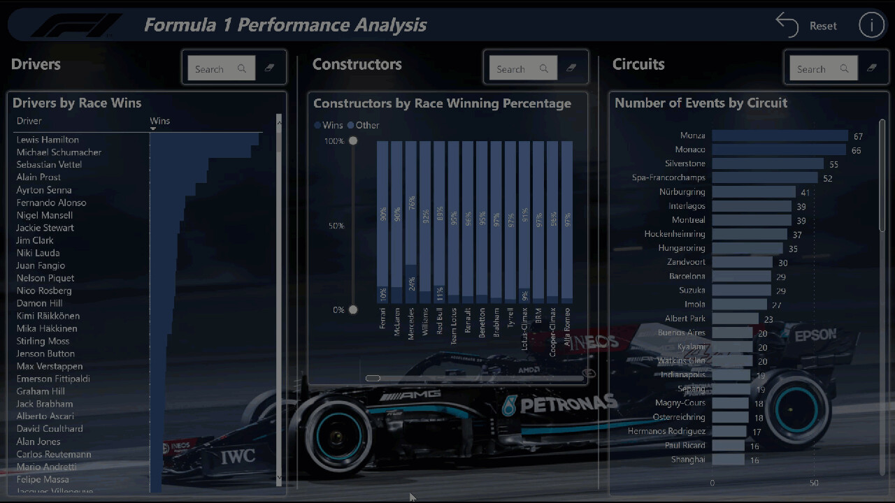
browsed internet searching for dark F1 car images; chose a night image of Lewis Hamilton’s black 2021 Mercedes
used PowerPoint to place a mask (rectangle) with gradient fill (dark top, transparent bottom) over the image to dull the intensity of bright spots on the top of the image
General:
used 50 px high rectangles for title backgrounds with 25 px radius borders to create appearance of fully rounded left-and-right edges
used 5 px radius borders on visuals to create appearance of rounded corners
used 2 px 0-degree custom shadows on visuals
used multiples of 10 px for sizing for X/Y/Width/Height for all visuals
used 10 px around and 10 px spacings between all visuals
Header:
browsed internet for a black, transparent Formula 1 logo and displayed at left of title bar
used standard text box for title text
used “Reset” button to activate “Reset Filters” bookmark
used the visual tooltip on an “Information” button to display report info (e.g., description, author, date, report ID, version, custom visuals, etc.)
Drivers:
used standard table visual to display drivers and race wins (with data bars); most of the specific driver data will be showcased in the custom tooltip
used “Text Filter” custom visual to allow for easy searching for a specific driver
[Driver Tooltip]:
used textbox with measures only to display driver name and country
used line chart with small multiples to show finishing position and starting position for the drivers’ last 4 career years
used donut chart to show wins, 2nd places, 3rd places, other point finishes (i.e., places 4-10), and non-point finishes (i.e., places 11+)
used multi-row card to show measures for drivers’ statistics (e.g., wins, rank, drivers championships, rank, etc.)
Constructors:
used 100% stacked column chart to display constructor wins and non-wins; most of the specific constructor data will be showcased in the custom tooltip
used “Text Filter” custom visual to allow for easy searching for a specific constructor
[Constructor Tooltip]:
used textbox with measures only to display constructor name and country
used bar chart with small multiples to show wins and non-wins (other) for 2014-2021
used multi-row card to show measures for constructors’ statistics (e.g., wins, rank, constructors championships, rank, etc.)
Circuits:
used a simple bar chart with gradient coloring to show circuits by number of events held; most of the specific circuit data will be showcased in the custom tooltip
used “Text Filter” custom visual to allow for easy searching for a specific circuit
[Circuit Tooltip]:
used textbox with measures only to display circuit name and location
used “Simple Image” custom visual to display maps for select circuits; for un-selected circuits, showed a “not available” image
used multi-row card to show measures for circuit statistics (e.g., turns, lap length, lap record, etc.)
Love this one Greg, as always. Another really solid report that gives the user everything that they need.
In terms of understanding the data and enabling the user to navigate down to the insight that they want I feel like there’s no one better than yourself. Maybe there’s a few others who work more on the visualization side but none are as solid and thorough for the user than some of the techniques that you use in your own reports.
Love how you’ve used tooltips to again add more color to certain pieces of information. Also the way that users can filter easily using the search bar is another smart addition to this particular report.
Appreciate the write up as well very comprehensive as always. So much that our community can learn from this so hopefully they are recognizing your amazing efforts as well.