I missed out on Challenges 13 and 14 but this one is very close to my heart as I have been following F1 very closely for the last 30 years!
I am a super fan of Michael Schumacher and the Italian Scuderia Ferrari Team, as the theme of my report suggests. I have tried to capture important metrics at a macro level while spending time to correctly calculate all the key measures from the relevant columns in the dataset. I will cover the details in my write up.
Here are some of the screen grabs from the report. I thoroughly enjoyed working on this one and feel great to be back working on EDNA challenges!
To learn about the real-life scenario presented for the challenge, be sure to click on the image below.
Formula 1 is the ‘Hollywood of Sport’ because on screen there are 20 or so actors (drivers) doing their act for 90 minutes or so, but behind the scenes it is a complete industry bringing together the best of technology, innovation, skills and entertainment. I have been an avid Formula 1 fan and follower for the last 30 years, so to work on the Formula 1 dataset was something that was close to the heart and something I had a fairly good understanding in terms of the history and rules of the business.
I will try to cover my write-up as per the 4 pillars of PBI development that we advocate at EDNA.
Loading and Transforming data
The dataset from Kaggle had 13 files in total but with a lot of incomplete information for years before 1996 on lap times for each driver during qualifying and race day. Although I ended up using this data for data modeling and built DAX measures too, but never used any of this as the focus of my analysis was to cover metrics that encompass the entire history of F1.
‘Driver standings’ and ‘Constructor standings’ tables were important as the correct results for title wins come from these tables, instead of the ‘Results’ table because F1 rules have changed over time and simple accumulation of the ‘Points’ can lead to incorrect results. Both these tables were grouped / aggregated to show total points accumulated at the end of each season (taking care of F1 rules for different eras, post race disqualifications etc.).
To convert ‘nationalities to respective countries’, I used the embedded tables from the following website (with a few minor changes)
I also wanted to include the flags of each country for my analysis and the .GIF URLs were obtained from the fol. link
Also, the data on constructors is appended with Engine manufacturers for teams like McLaren, Lotus and a few others. This impacts the calculations for some important metrics like Titles won and Most race wins etc. This information was decoupled so most statistics match the commonly available stats available on Wikipedia for users not familiar with F1.
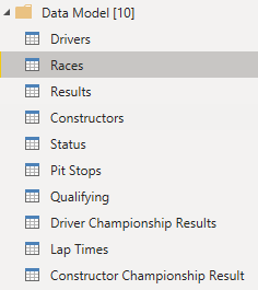
I ended up with the fol. 10 x tables in my data model and the rest were used to reference queries.
I could have dropped ‘Lap Times’, ‘pit stops’ and ‘Qualifying’ tables also, but got to know about the lack of completeness for years before 1996 at a very later stage and decided to keep these as part of the data model.
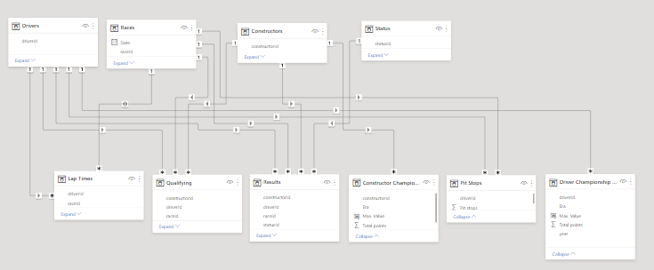
Data Modeling
The data modeling aspect was simple and had already been covered by @sam.mckay in his detailed Video. Here is the snapshot of the data model
DAX measures and Analysis
With the fact and dimension tables joined together correctly, the DAX measures were not that complex, except for some minor considerations like not counting 2021 towards the total count of championships and counting constructors only once for calculating participation in races.
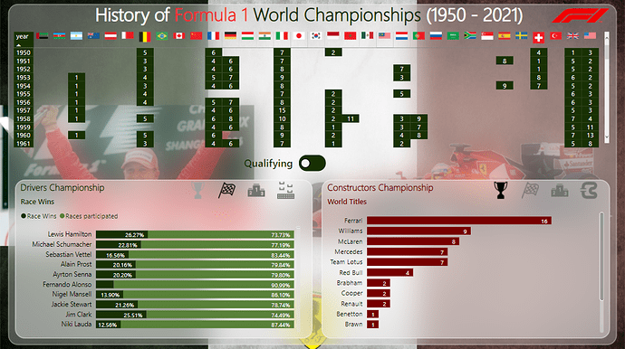
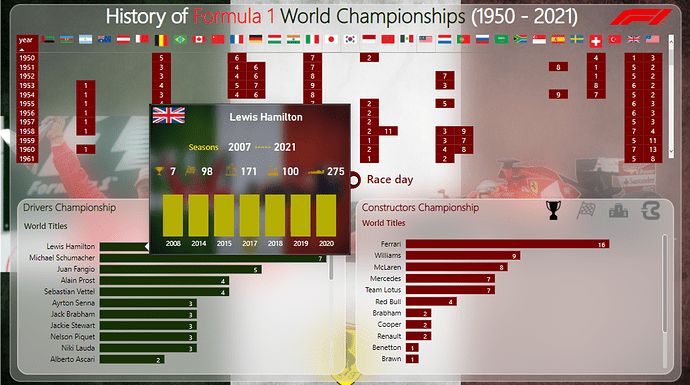
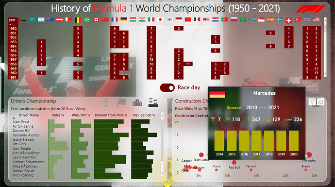
For the analysis and to put it on a single report page (minus the tooltips), my story was very simple. I focused on giving a macro-level snapshot of the history of F1 and how it has evolved from just 7 races over 2 continents in 1950 to a mega globe trotting carnival of 20+ races in 2021. Also, the goal was to capture and compare the performances of leading Drivers and Constructors across the entire history and showcase the following key metrics for both Drivers and Constructors
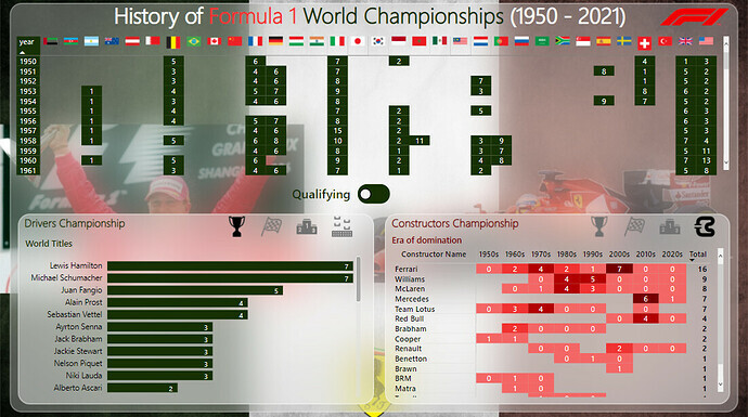
Most Titles
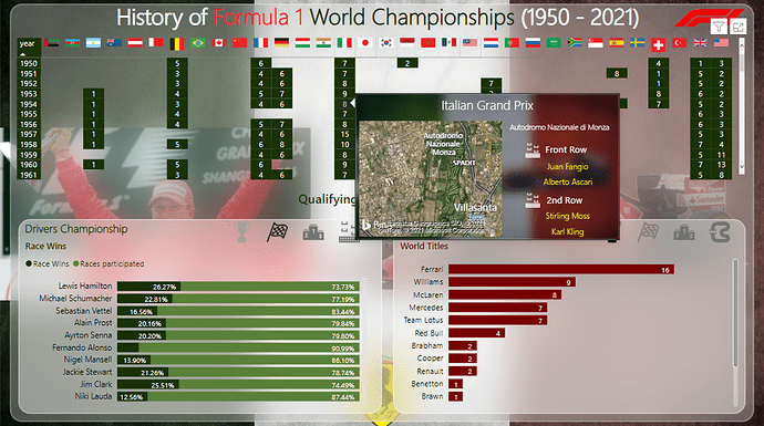
Most race wins
Most podium finishes
Most pole positions
Race participation
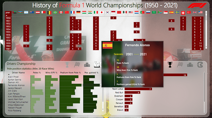
It was also important to compute some results in terms of percentages and rankings for a fair comparison to highlight aspects like performance during qualifying vs performance on race day, position movements (through overtaking, driving skills, pit stop timing and strategy) during the race and how drivers compare across these metrics. I have tried to capture most of these points, if not all.
Visualization
As a big fan of Michael Schumacher and the Italian team Scuderia Ferrari, the report had to showcase this aspect. So I used a picture of the Italian flag, an image of Ferrari from one of the races, logo of Scuderia Ferrari and a picture of Schumacher standing on podium from one of the races. I tried using glass morphism effect to segregate the canvas into 3 parts.
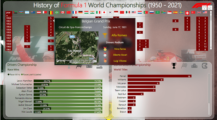
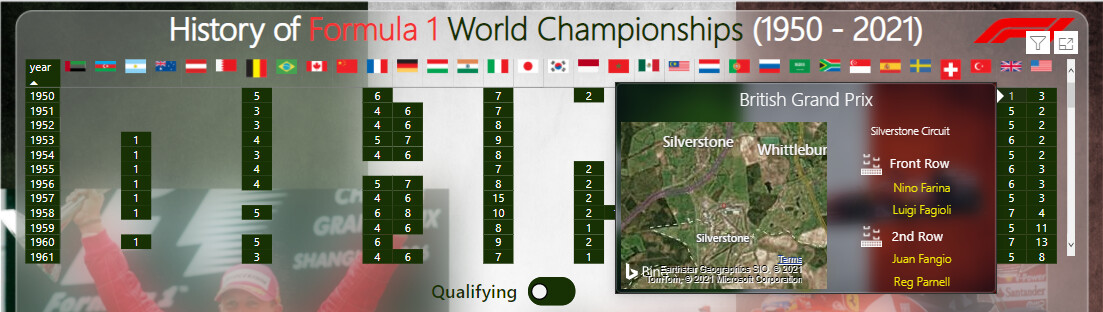
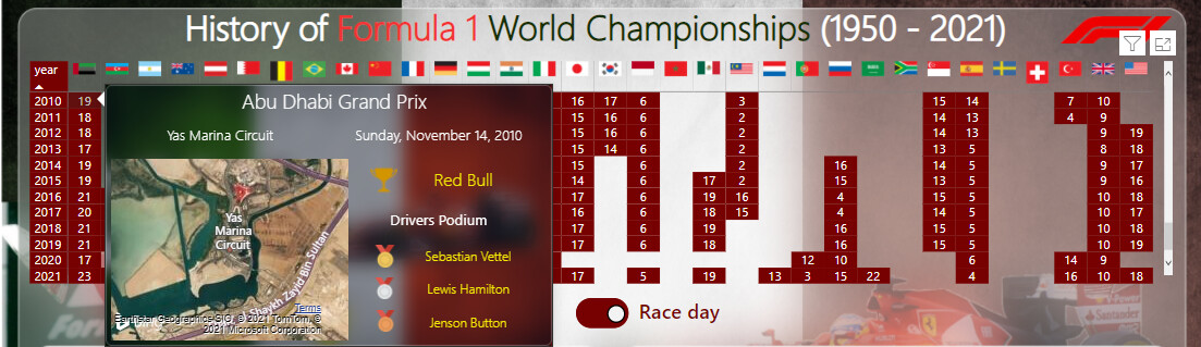
The upper half shows a matrix visual of the history of F1 races for all grand prix locations and in which sequence the races happened. The user can toggle between the qualifying and race day views and see the important information in the respective tooltips. I could have increased the area of the tooltip to capture more information but decided to just stick with the ‘super important’ information only so the user is not overwhelmed with loads of data. The toggle button was developed using the Power BI native button and not through an imported visual. This has been covered by Reid Havens in one of his videos
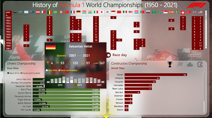
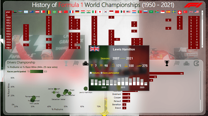
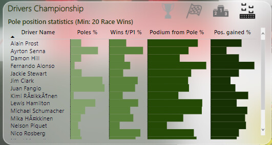
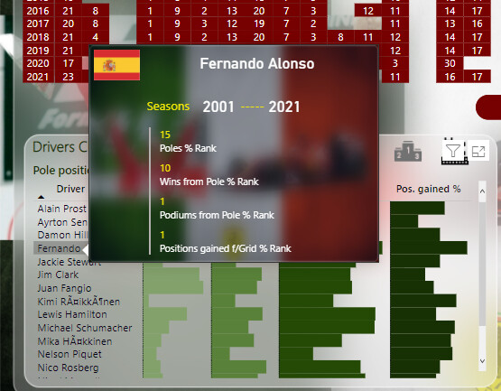
The lower left portion of the canvas was reserved for showcasing visuals on the various performance metrics related to driver performance using the standard PBI visuals. Bookmarks and icons were used to toggle between the various views. A tooltip was customized for each of the visuals where the user can check the micro level details for each driver. I have tried to reduce the dimensions in each visual by focusing on only the drivers who have certain number of min. race wins so the comparison is more realistic. The visual that I would like to highlight is the ‘Pole position statistic’ visual as it captures some less known metrics like number of wins from pole position, number of wins not from pole positions, number of podiums from pole and the number of races where finish position was better than the grid position. These measures give some insight about the driver skill, the consistency of the constructor across qualifying and race performance and is the driver just good enough because of having a fast car. The tooltip ranks drivers based on these metrics.
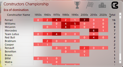
Similarly, the lower right portion of the canvas covers the statistics for the constructors where the visual I would like to highlight is the ‘era of dominance’ for constructors. While Ferrari has been ever present in F1 since constructor championships began in 1958 but the last decade and a half has been dominated by Mercedes and Red Bull.
Conclusion
This was a great challenge overall and I have seen some incredible entries. On a personal level, I participated after missing out on Challenges 13 and 14 for work related reasons and tried to experiment with a few new things like glass morphism and toggle buttons. I plan to explore the charticulator visuals next and would hopefully try and incorporate those in the upcoming challenges.
Thanks to @haroonali1000 for another brilliant challenge and a big shout out for all the participants. Please share your feedback and comments for future improvements.
Fabulous writeup – thanks for taking the time to walk through your exceptional entry in such detail. Provides lots for everyone to learn from. One question – what program did you use to generate the glass morphisim effect? I haven’t seen that used before in the challenges, but I think it gave your entry a very distinct look and an additional sense of polish.
I used Adobe XD to build the glass morphism effect but it can be done in Power point as well. Not very difficult, infact, I found some very handy basic tutorials to get this done on YouTube here and here
Nice one Alvi. Fabulous write up. I really like what you’ve done here with all of the functionality that you’ve brought into this one page.
I will say, love the flags at the top which not many others actually incorporated but I think you did it really successfully here.
Also the way of used tooltips throughout across various different visualizations is a fantastic way to incorporate more details and information into your reports. Also the icons have used within those bottom visualizations was also really smart. A really solid way to enable the user to click through many different insights so really well done on adding this functionality.
Overall a really fabulous report. Appreciate your involvement and love to see that you’re challenging yourself to use a lot of the features available to you with power BI