Here’s John’s entry for Power BI Challenge 15. @JohnG, feel free to add other details of your work.
Here’s the link to the report:
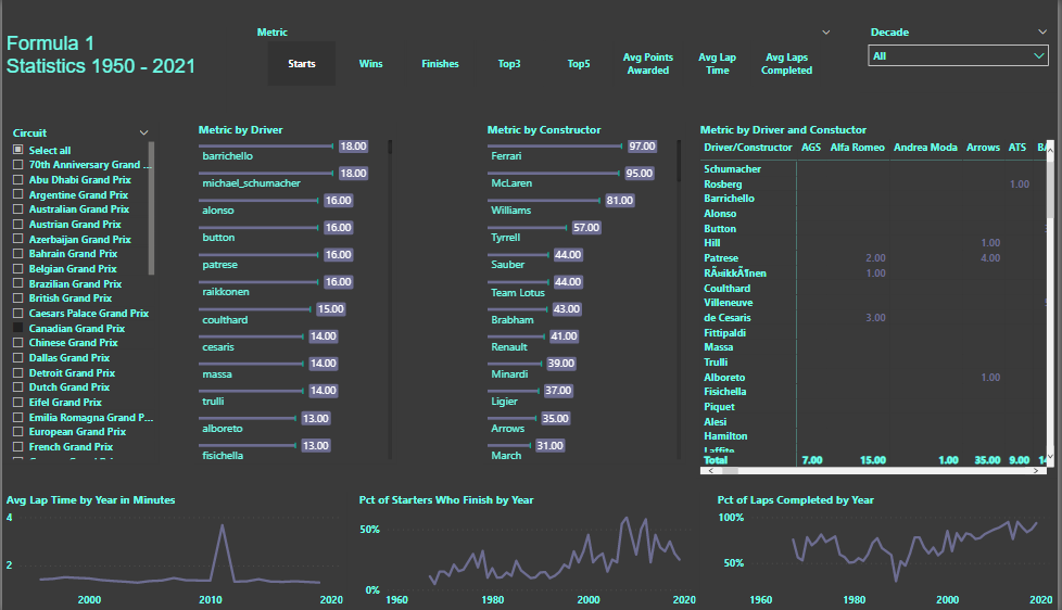
And here’s how John described it:
All:
Here is my submission for Challenge 15.
There’s very little to be proud of here.
- I used a different color theme, which is a vast improvement over that which I used for Challenge 14.
- I used a custom bar chart for two of the visuals. I saw custom Line Charts and Matrices, but they didn’t align with what I was trying to accomplish.
Background - I know very little about Formula 1. However, I am a thoroughbred racing enthusiast. I thought I could apply my knowledge to the Challenge.
I wanted to answer the basic questions: who won?, how fast were they?, who finished close to the winner?
Once again, I used a Multi Threaded Visual to provide that information. I thought that data related to Driver, Constructor combinations would be useful, hence, the Matrix.
It seemed obvious that the results should be filtered by Race Circuit.
While I know very little about F1, my guess was that it has evolved over the years, so I grouped Races by decades to identify trends. Also, since F1 has covered 70+ years, I thought using decades would limit the selections in the Slicer.
All of this was easy.
My main goal was to provide “Results Charts” and “Past Performance Charts” (thoroughbred terminology), for Drivers, Constructors and Circuits. I wanted to create Tooltips that would provide a Result Chart for each year/circuit, and “PP’s” for Drivers and Constructors. The key problem was in creating the “running line”; that is, the running position of each driver/constructor 1/4 into the race, halfway and three quarters into the race. To create a running line, I needed to link the Results and Lap Times tables. I struggled mightily. It was very disappointing that I couldn’t to it. I’m eager to see how others dealt with this matter.
To learn about the real-life scenario presented for the challenge, be sure to click on the image below.
