Here’s Jan’s entry for Power BI Challenge 15. @deltaselect, feel free to add other details of your work.
Here’s the link to the report:
And here’s how Jan described it:
Hallo everyone,
Please receive hereby my workout of the Power BI Challenge 15 Formula 1 Analysis.
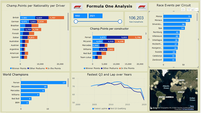
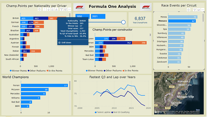
This one page analysis report focuses on times and results from the start in 1950 till 2021 of the Formula 1. World Champion Points are normalized for the point-score nowadays.Workout:
Data Model
- The data model follows the waterfall principle with Lookup table (marked including “LT”) and fact tables. During the development of this report several fact-tables appear not to be needed (Driver Standings, Laptimes, Constructor Standings, Pit Stops and Constructor Results), and therefore left out of the model, simplifying the data-model and reducing the data-load significantly.
- (The data appears 99% true…, Nico Rosberg is not Finnish, Ayrton Senna was more then two times World Champion . )
.Data Enrichment
The data has been enriched to make the chosen report possible and/or easier to read.
- DriverLT : two calculated columns (Driver and Nationality) has been added with a category “Other”, to limit the listing of those dimensions
- Qualifying : qualifying times has be reformatted from text to seconds in Power Editor, whereby “/N” are replaced by 3.599,999 seconds, so Fastest qualifying is made possible by the MIN formula, Average qualifying is made possible by Average, and filtering out this extreme number.
- Results: Fastest Lap and Fastest lapspeed columns reformatted to numbers (seconds) likewise at Qualifying.
In order to normalize previous years Champion Points with the values of today (like 10 points for a win in the past is currently 25 points, a “KeyRevisedPoints” column is added, calculated from columns “positionOrder” x 100 plus “points” (for example Position 1 and points 10 gives a key of 110)- RevisedPointsLT new lookup table which translates WorldChampion Points to values which are used nowadays (e.g. 1990 10 points for a win is normalized to 25)
Only the normalised World Champion Points are used in the one page report- SummWorldChamp : a calculated table, summarizing the Results table, is added, to calculate the quantity of F1 Championships per driver and per constructor
Most columns which are not needed, are removed in PE, to further reduce data-load.
.Measures
- Three measure groups are set up; Circuits, Drivers and Toolkit with straight forward Dax-formulas used, like Average (av Q3), Max (speed), Min (fastest lap, Q), Countrows (q Winners), Rank(Driver) and Sum(ChampPoints)
- A few comparison measures are set up, like % Win from Pole, % improve from startgrid and Average progress from grid to final position.
- Due to the data model the upmost of the measures for drivers can also be used for constructors (drivers add up into constructors)
.Report
- The report exist of charts, a slicer, a total champion points card, an image of F1 and a map.
- Be aware that all ChampPoints are normalized to points as given nowadays.
- “ChampPoints per nationality per driver” and “World Champions” have two levels (drilldown/up), resp. per Nationality and driver and Constructor and driver.
- Tooltip is heavily used, fed with measures, showed when moving over the data in the graphs.
- Most of the graphs interact strongly with each other (Edit Interactions settings)
- It is nice to see the circuits itself in the map, when selecting one circuit from “Race Events per Circuit”
.The Challenge of 15 Formula 1 Analysis
- First a big THANK YOU to Haroon and the EDNA group to provide this Challenge about Formula One data
- The biggest challenge was to determine what to present from the data, what is the story line ?
- I have heavily used “Toolkit” in this report, which works great to provide additional data. Possible using a filter which changes the majority of the page information might be a better alternative.
- Really amazing other submissions are published, very interesting to see the visual concepts used.
To learn about the real-life scenario presented for the challenge, be sure to click on the image below.
