I will also provide much more detailed description of the process as soon as it’s possible (with covering such topics as general context, visual techniques, measures and other fun functionalities).
For now, I honestly say that I have any knowledge related with formula 1 and following report was just made by intuition, along with some basic number veryfication using available sources (like e.g. formula1.com). If there is any topic that I’ve covered in the report, but it should be presented or measured basing on a different specliastic sport foundations, I’will be glad for any feedback in that matter.
According to the basic challenge requirements, I’d like to say that the whole report is physically just a one page with bunch of bookmarks techniques, object groupings, additional ppt backgrounds, tooltips etc.
There was a few fun challenges along the way, such as text/symbol coding (mostly related with names of drivers, names of circuits and others). There is also a bit challenging to identyfi +200 records (depending on a given data base) that automaticaly converted some decimal numbers into dates, that led to inadequate measures.
Below I would list some niuances related with functionalities and UI.
Every page provides access to footers (hyperlinks and also bookmark that allows to come back to start page.
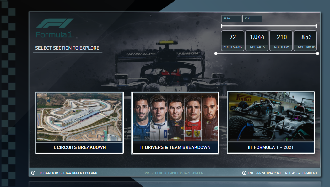
Every “subpage” base on the same date context, except the last analysis, which filters all data only to 2021 year and then erease that filter as soon as You come back to “menu” page
Beside of using one main ppt background there are additional 3-4 background that are added as an objcets (pictures) to visualy diversify different sections.
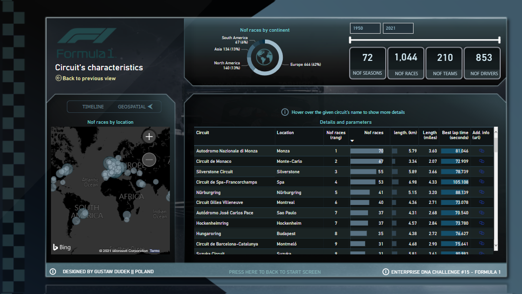
Page: Circuits: Each position in “circuit table” have additional tooltip with details.
Page: Circuits: Upper donut chart is supposed to filter geographical data and make it much more readable. I intentionally used such type of map, as it has not provide excesive amount of additional labels while zooming.
Page: Circuits: there is additional switch between “timeline” charts and map. Timeline chart helps me to undestand how many races has been executed per year (with some visible trends) and it identifies gaps between given years. Another chart shows how best lap times has been changed through the years.
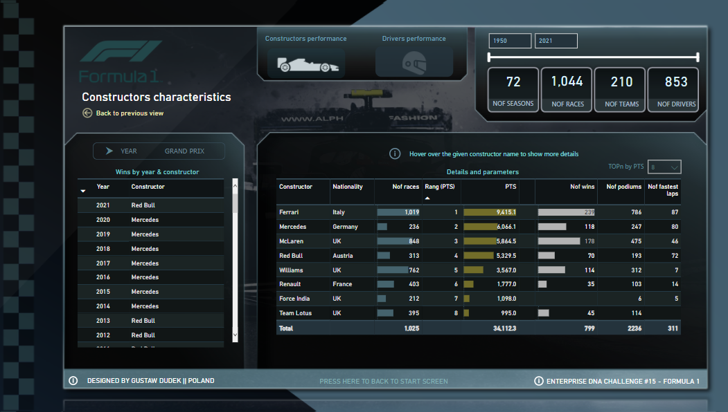
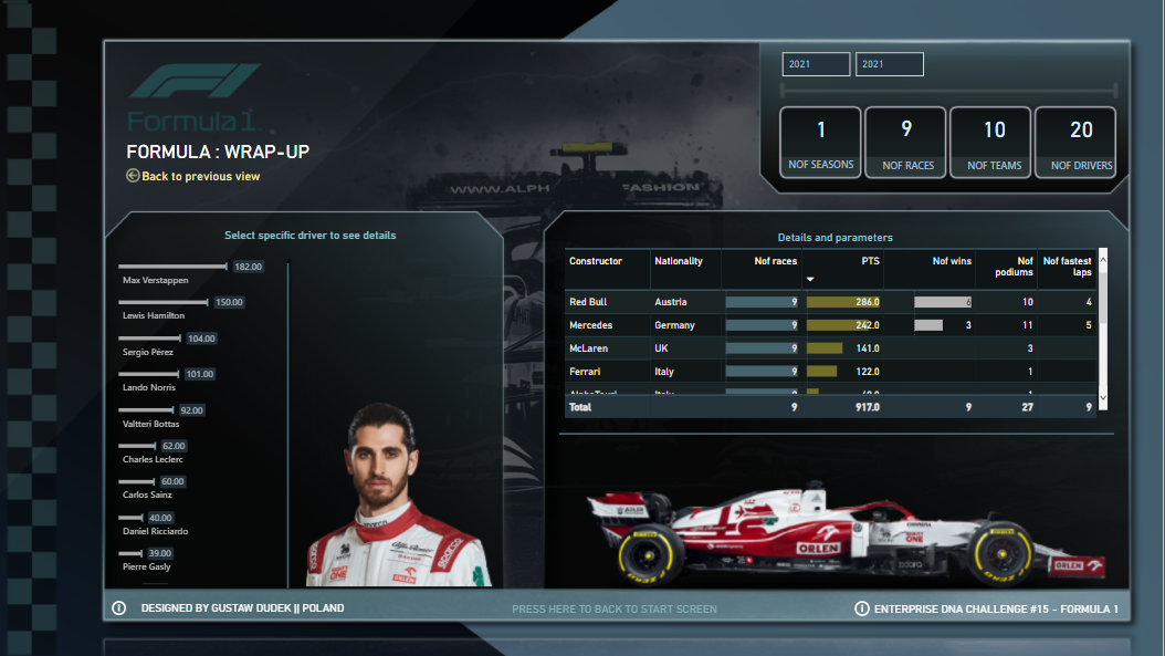
Page: Constructors/drivers: there is visual switch between constructor analysis (which is defaualt) and driver’s analysis. Additionaly You can analyse 1st places by either year or GP.
Page: Constructors/drivers: table provides broader context by hoovering tooltips (it shows positions - ranks by year along with some trends in general number of points/wins/podiums per year)
Page: Constructors/drivers: There is “TOPn” slicer, that allows to filter either constructors or drivers by the highest number of pts gained. It’s just more like a feature, that helps to reduce size of table and shows just a couple of rows.
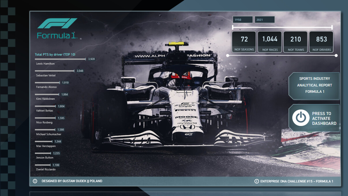
Formula 2021 - it’s just wraps some metrics associated with 2021 GP, with some additional graphics (that F1 cars just look great…).
Hope You’ll enjoy it.
To learn about the real-life scenario presented for the challenge, be sure to click on the image below.
This post is part of the Enterprise DNA platform improvements. Through these posts, members and non-members can showcase the resources and inspirations on how they come up with their challenge submissions. We hope all members can utilize it efficiently.
I just want to commend you on one of the best Power BI reports I think I’ve ever seen. Everything is just perfect in this report. From the visuals, to the design, to the navigation, and then most importantly to the insights that the consumer can review.
You’ve got an incredible talent here that we just have to utilize more within the enterprise DNA community!
I think we already have to automatically move you up to expert status. Your talent deserves it straight out.
I just think everything is spectacular here, I love how a user can click through to different aspects of the data and then they get taken through to almost a new screen of an application where you’ve used really compelling visualizations that aren’t too complicated but just tell the user exactly what they need to know.
Just how you have integrated some of the icons and color schemes within your report is absolutely amazing.
We really need you to create videos and content around how you created this. Anyone in their world using power be I would really benefit an enormous amount by seeing some of your craft.
Congrats again and I look forward to showcasing this particular report over and over.
Hi @sam.mckay !
I can’t even express in words how honored I feel by taking such a meaningful feedback directly from You.
I really appreciate the time you take to check and analyze my submission and I’m glad you like it.
It’s also incredible moment to become an “expert” member on Enterprise DNA platform and obviously I really appreciate that choice as well.
I believe it would be awesome if larger audience may find some benefits or at least and inspiration in their own work by seeing or analyzing our challenge entries (including F1 of course). I could’t agree more with your statement, that it’s more like a collective thing and therefore the more we know and share to other people, the better we become in our own craft reversely.
@Gustaw Amazing layout & amazing theme coupled with great analysis. All the elements are perfectly shaped & placed in the report. The report is packed with so much detail but still not cluttered with visuals & objects.
Great to have you in EDNA forum and really looking forward to such fabulous reports in future.
@Gustaw, your report is amazing! You have an unique style and signature in design!
The incredible design is backed up with great insight. I love how the story is developed, the navigation and experience you propose in your report.
It really gives the emotion of a F1 race. Really a flowless report!
Congratulations on your expert nomination!
@alexbadiu Thank you for your feedback! It’s an honour to get that from a EDNA legend
To be honest, your F1 report and one from @JBocher was so genius (especially from the visual standpoint) that it actually pushed me in terms of design a little bit further, than I used to, so thanks a lot for such inspiration and motivation.
Also, I sincerely thank you for congratulation on recent nomination. I’m very gratefull for that and I believe it makes a door open both in terms of personal development, but foremost, for some cool future initatives and projects made by entire EDNA team!