Welcome to Excel Workout #25!
Difficulty Level:
![]()
This week’s challenge is designed to test your knowledge on WATERFALL Chart.
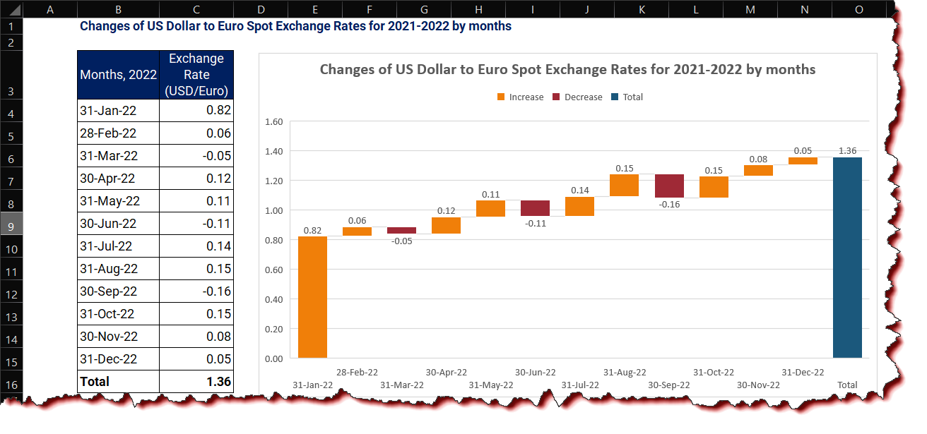
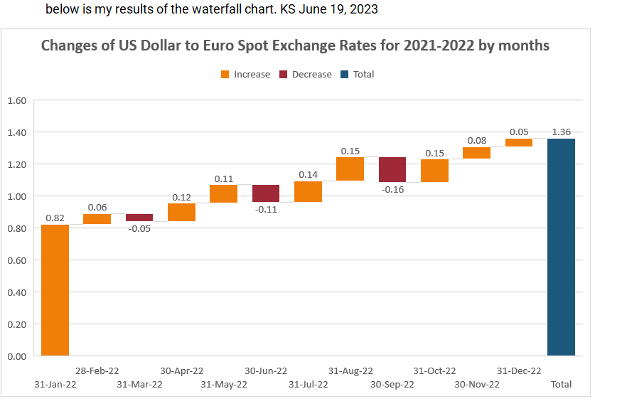
WATERFALL Chart
A waterfall chart in Excel is a visual representation of data that illustrates how an initial value is influenced by various positive and negative factors. It shows the cumulative effect of these factors, allowing for a clear understanding of the overall changes in the data. In Excel, a waterfall chart is typically created using a combination of bar and line graphs, with the bars representing the positive and negative values and the lines indicating the cumulative totals. This type of chart is commonly used in financial analysis to visualize the impact of different factors on a starting value.
Task
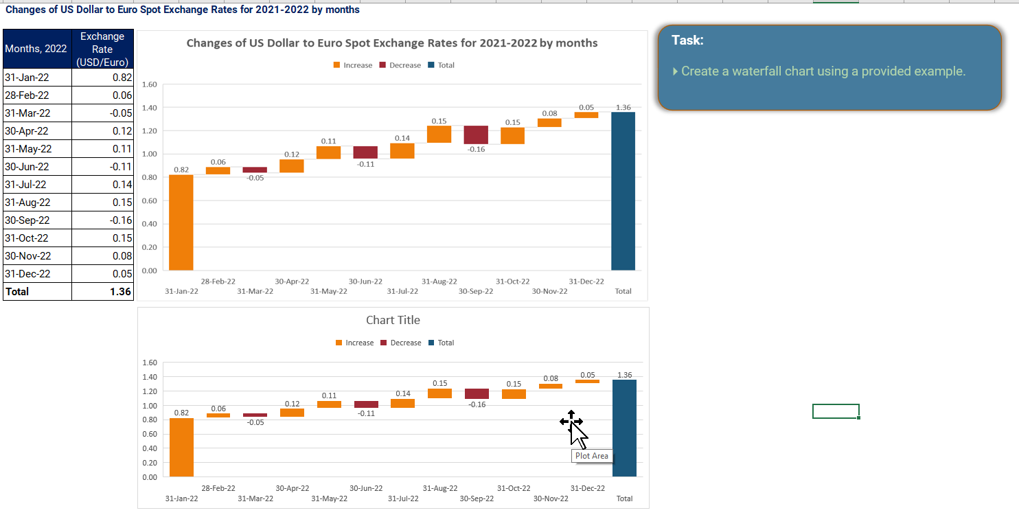
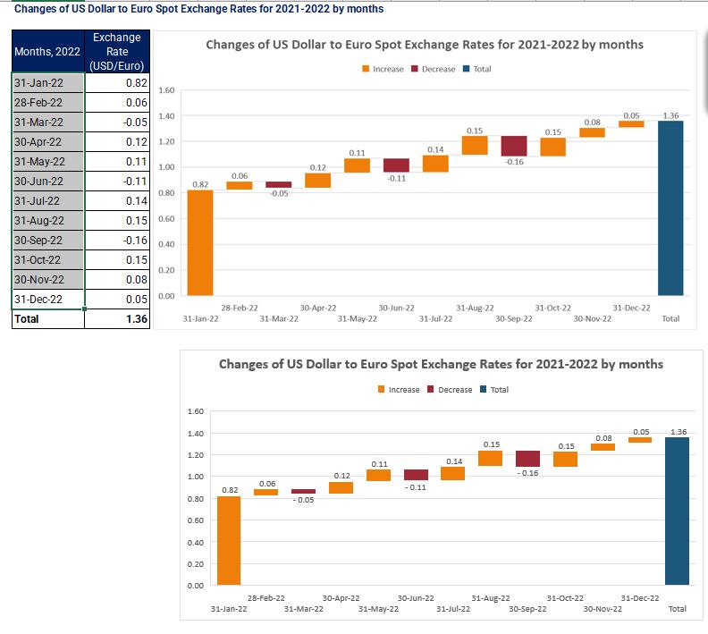
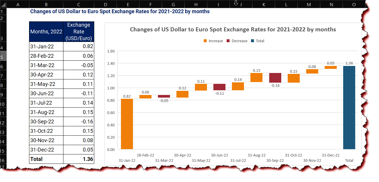
- Create a waterfall chart using a provided example.
Submission
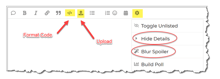
Reply to this post with your formula code and solution file. Please be sure to blur or hide your formula code.
Period
This workout will be released on Monday June 19, 2023 , and the author’s solution will be posted on Monday June 26, 2023 .
Challenge 25.xlsx (8.4 MB)
Good luck,
Ilgar Zarbaliyev