Hi everyone,
This was the second time I participated in the challenges and I really loved doing it.
I think it’s a great way to practice what you’ve learned, experiment or just take a chance to focus on a certain aspect of report development to get a better understanding and/or expand your skills in that area.
If you want to read my submission as well, you can find that here.
Every report begins with getting the data, so first up: Data prep
This is a proof of concept model with static data but you don’t put in all the work just to repeat it all once you get the green light so I made some preparations to ensure a smooth transition.
-
FileLocation parameter, I now points to an excel file but could just as easily be another data source.
-
Today returns August 3rd but is prepared to output the LocalDateTime value
-
fxCalendar is the extended date table function you can find in the Enterprise DNA, M showcase Category
-
Opticaldta is the Raw data supplied for this proof of concept scenario
-
LBound and UBound parameters are used to flag measurements
I split the raw data into 3 tables:
- Clients
- Opticians
- Appointments
There were some Client attributes which appeared to be immutable while others were not, based on that property I placed them in either the Client (Dim) or Appointments (Fact) query.
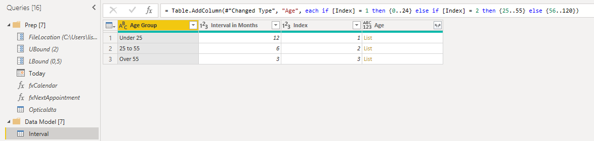
Added an Interval table, to calculate due dates in power query.
Added a Period table, the base code you can find in the Enterprise DNA, M showcase Category. For this report I updated the time frame bins to better suit this scenario.
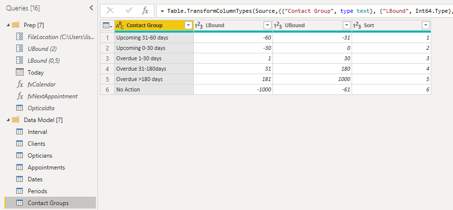
Also added a Contact Group table, which is key for envisioned “Client Action Centre”.
The requirement to dynamically calculate age is done in the Client query. Also added Age Group, Last-, Next- and Suggested new appointment dates and Days overdue.
Like I mentioned in my submission, I had created a recursive function to calculate a Next appointment date after “Today” but decided not to use it…
alexbadiu mentioned in his submission that he wanted to create more than one future appointment, if you are interested in that as well please see this post. Appointment date generating PQ function from the Last Appointment date until the End of Next Year based on Age and Interval.
.
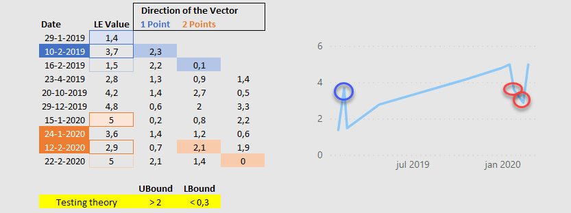
For the Appointments table I created a nested function that adds a number of columns to generate the components needed for the direction of vector flags , this uses the LBound and UBound parameters.
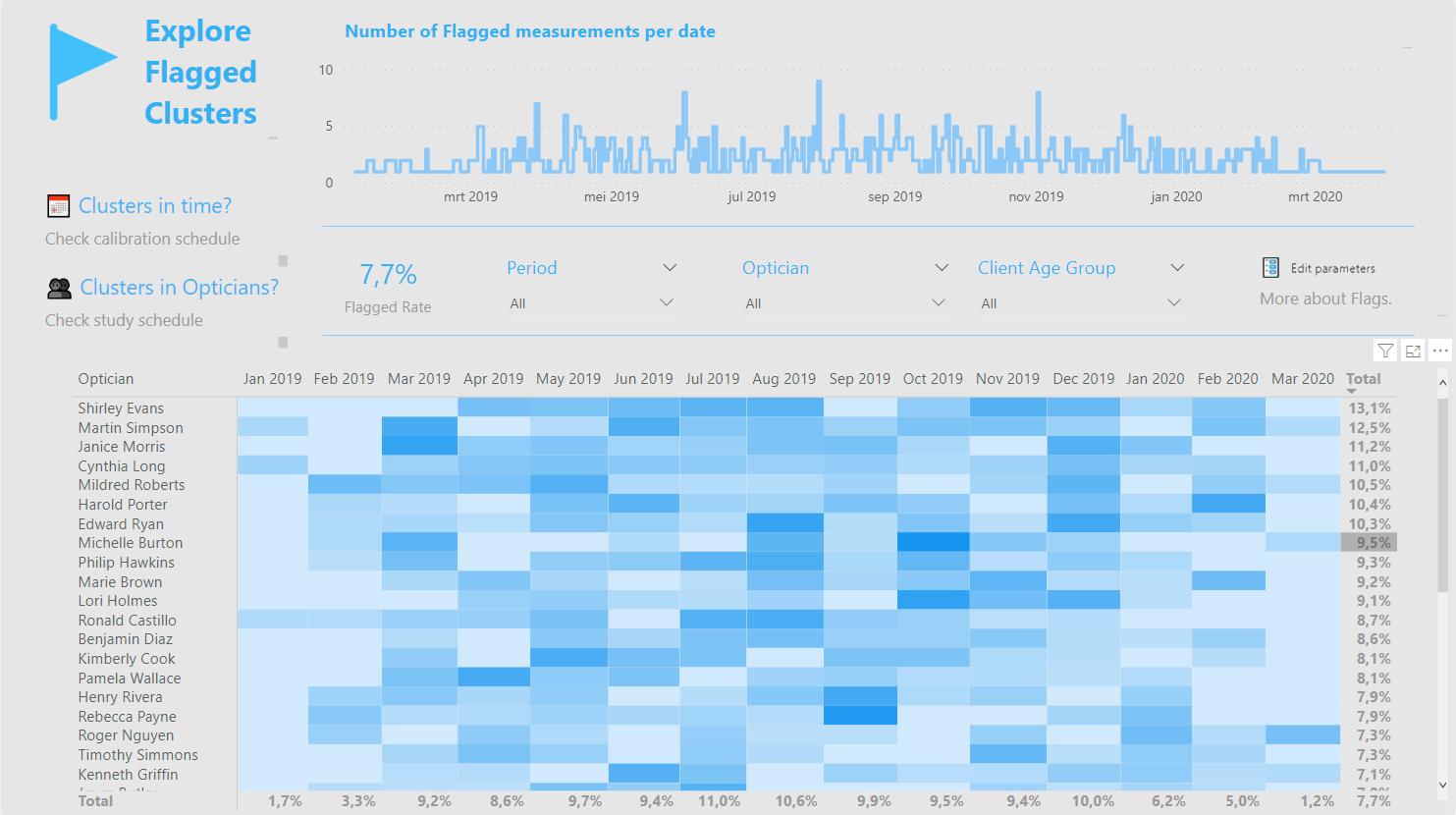
I really wanted to flag suspect measurements somehow and decided that the only possibility was to check the direction of the vector, identifying V shapes. With a maximum of 10 data points I only created a 1 and 2 point vector but you can extend this further if that is required.
To calculate the direction of a 1 point vector you need at least 3 data points (marked in blue).
- Calculate the absolute difference between the previous and current point (1,4 – 3,7 = 2,3)
- Calculate the absolute difference between the previous and next point (1,4 – 1,5 = 0,1 )
- Testing the theory. The direction of previous and current point exceed the UBound threshold while the direction of the previous and next point is within the LBound threshold.
Translation. The first and second data point are not aligned while the first and third data point are.
To calculate the direction of a 2 point vector you need at least 4 data points (marked in orange).
- Calculate the absolute difference between the 2nd previous and current point (5 – 2,9 = 2,1)
- Calculate the absolute difference between the 2nd previous and next point (5 – 5 = 0 )
- Testing the theory. The direction of 2nd previous and current point exceed the UBound threshold while the direction of the 2nd previous and next point is within the LBound threshold.
Translation. The 7th and 9th data point are not aligned while the 7th and 10th data point are.
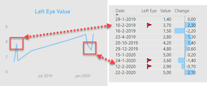
This is by no means an exact science. The best you can hope for is identifying clusters either in time or by optician, so I used a heatmap to visualize that.
.
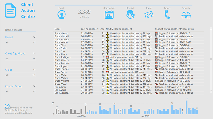
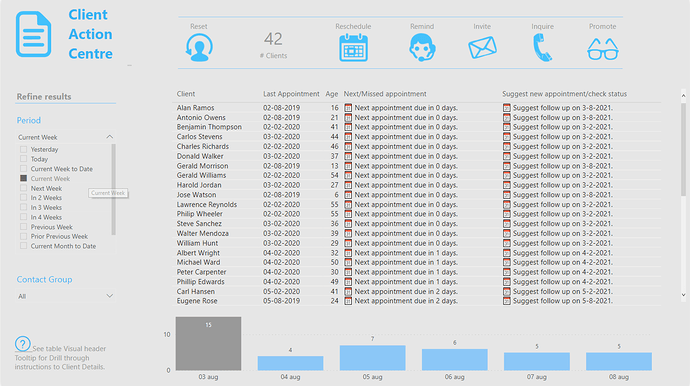
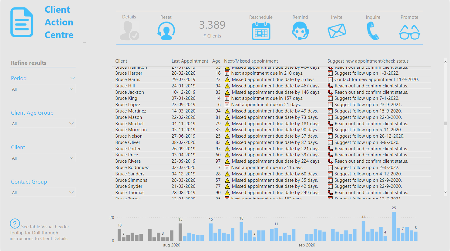
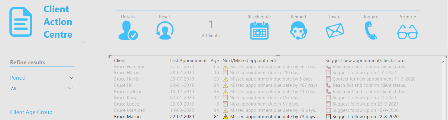
Finally report lay-out and colour scheme. Really wanted to create a ‘one stop’ Client Action Centre that would allow the user quick and easy insight by just pressing a button. Due to the unfamiliarity of the audience all buttons on top override filters from the slicers on the left hand side, that is by design.
Ensuring that when they zoom into a subset of customers (contact groups) they will always get the same results, allowing them to get things done quickly.
Reschedule : Shows all customers 1-30 days overdue, it also suggests a new appointment date.
Remind : Shows upcoming appointment due dates in the next 0-30 days. Customers can actively be contacted to make an appearance. Based on their age it also suggests a date for a follow up appointment after that.
Invite : Shows upcoming appointment due dates in the next 31-60 days. Letters can be send to inform customers to expect a phone call to schedule an appointment.
Inquire : Shows all customers 31-180 days overdue, it also suggests reaching out for new appointment or to check client status if they missed a due date twice in a row.
Promote : Shows all customers >180 days overdue, you might still want to include them in marketing but no longer actively pursuit them…
At the moment the logic for these actions is arbitrary of course but can easily be updated to suit Penny’s actual wishes so she can then share this with the customer contact team.
.
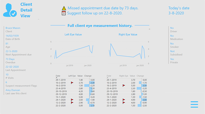
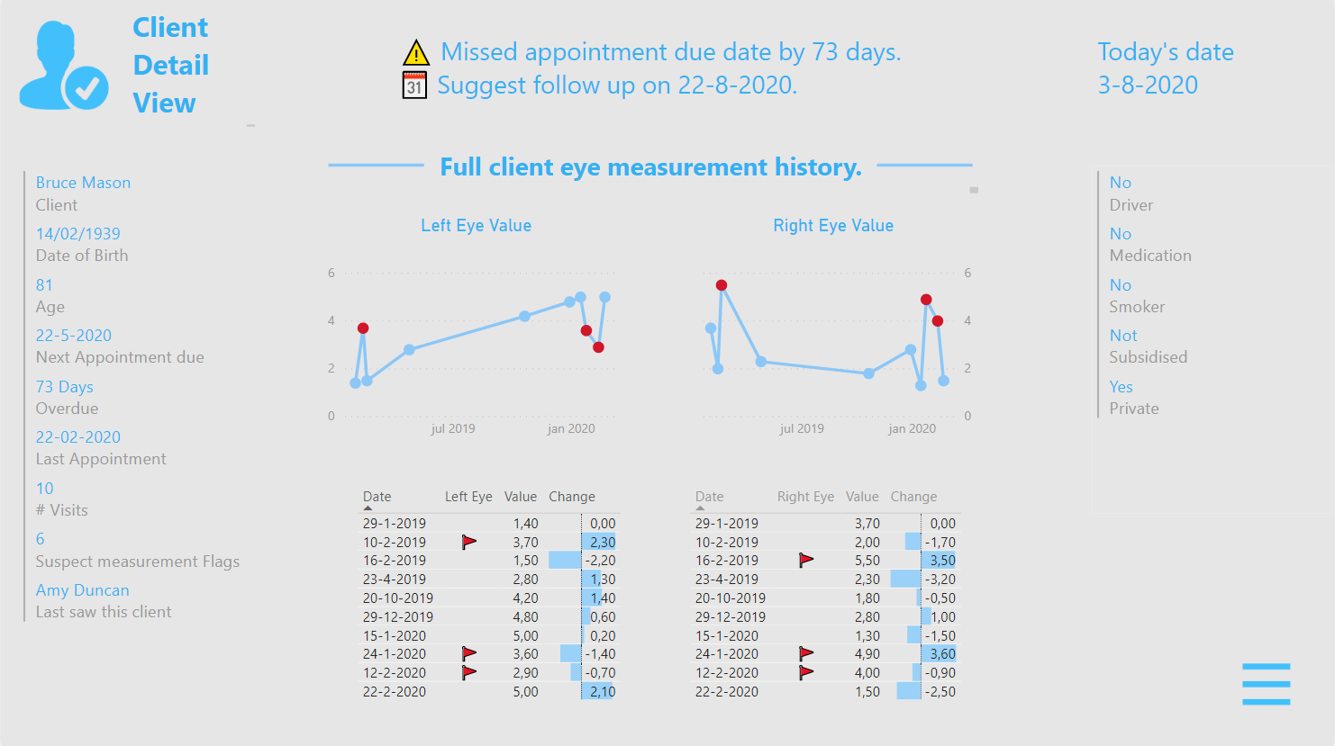
The “ Client Detail ” page is an information hub for the Optician, only accessible via drill through from the “Client Action Centre” page as noted in the bottom left corner of the screen. How that works is visually explained by hovering over the Table (?) tooltip via a GIF image in the background of the tooltip page.
Improvement. I’ve seen others use a conditional drill through button on the page (only enabled when a single Client is selected) in this challenge. Think that would be a real improvement to the current functionality, so I’ll keep that in mind. 
Again I limited amount of colours, all visuals are standard and a line here and there is used to create segments on the page.
Have fun exploring the PBIX. eDNA - Challenge 5 - Optical Data, Melissa.pbix (1.4 MB)
All the best.