Power BI Challenge 5 - Optical Data from Hideo

Here’s Hideo’s entry for Power BI Challenge 5. @Hideo, would you like to share how you built this dashboard and what your inspiration is in building it?

image

image

image

image

Here is the link:

To learn about the real-life scenario presented for the challenge, be sure to click on the image below.

power-bi-chal-1

2 Likes

Congratulations on your efforts here. I can see that you’ve really tried to challenge yourself in many ways here.

I like how you have incorporated plenty of visualisation and navigation techniques into all the pages you’ve developed for the submission.

There is also a lot of information that you provided so it’s really detailed and covers every aspect of the brief.

Couple of things to have a think about for next time;

Try to pick a consistent colour palette. I feel that in some of the middle pages you really detract from the valuable insights you have generated in your analysis by having a random set of colours in some of the visuals. Check out some of the previous winners of challenges to see how colours have been used effectively. One of the main things to take away from past winners is actually the simplicity in colours used.

Make sure to use the colour theme generator and also just to have a think about the concept of less is more. Sometimes just using 2 to 3 colours can be so compelling in a report. So just have a play around with this idea.

Also another thing is maybe try next time to be more condensed in your displaying of the analysis you’ve created. I think that you can easily show all of the insights required for this challenge within two pages if you just get more creative around how you bring things together.

Even though I say that you’ve really thought hard about what insights you wanted to show here, and I can see that. So I really commend you on bringing many insights together to cover what the stakeholders required in the project brief.

Last recommendation for you is to maybe try to get more consistency around your titles and labelling across your report pages. Every different page here looks like it has a different size of the logo and also different positioning of the title. I think as a consumer you want to see consistency here so that you can very easily understand where you are at in a report and within 10 seconds know what you’re looking at.

Just some really small things here that I think you could tidy up really quickly and easily and it’s going to improve your engagement from consumers considerably.

Let us know how you went about creating your submission and also your thought process around all aspects of the development…

Sam

1 Like

Thank you so much for giving me the opportunity to join this challenge-5.
Here is how I imaged to build up the report.

(Inspiration)
I was trying to image if I was in Penny’s position, what would I expect myself to streamline the current process.
What I read from the Penny’s instruction and also what I would like to manage are

  1. Patients schedule
  2. Patients details
  3. Possible sales promotion

Patients schedule and details can be managed by using the historical data supplied.
I also thought by categorising due days reasonably they can use that data for their sales promotion by emailing, calling or posting etc.
Out of 3,389 patients, I wouldn’t want to focus on the patients whose due is yet to come.
That’s why I have created 6 groups by due days.( also I tried not to create too many)
First category “Yet to Due” is 24% so we could successfully reduce the number we would like to focus on.
Next category “Due 30days” is only 181 patients so maybe Penny wants to look into this group first.
image

(Findings)
I also want to show Penny what it can be achievable by PBI.
Interestingly some patients were having two tests on the same day with having different results.
This could be test quality assurance issue so Penny should know about.

(Something found useful on this report)
In the report, I have used dynamic colour measure and found this worked well on this report.
The measure used is as below.

ColourForOverDueGroupM =
SWITCH(TRUE(),
[Due DaysM]<0,"#3172f5",
[Due DaysM]<=30,"#3172f5",
[Due DaysM]<=90,"#eef531",
[Due DaysM]<=180,"#f7bd3e",
[Due DaysM]<=360,"#fc03ca",
#fc0303
)

and then go to the conditional formatting, chose “front color” this time
image

chose “Colour measure” I created
image

Good side of this dynamic colour measure is we can use it repeatedly with different chart and different page.
(Sadly I found negative side too… If there is no option of conditional formatting or f(x) , I still had to change colour manually… PBI does not smile 100% always)

Thank you so much all the members.

As one of the participants, it isn’t easy for me to participate in the challenge because of the pressure I feel but definitely this is incredible experience with connected members & experts closer than before.

Also I appreciate a lot EDNA experts who created this environment and working very hard behind the scene.
Congrats all the participants all reports looks beautiful and nice.

With all my respects to all the EDNA members.

Regards,

Hideo

PBIX file attached.
challenge5 (Hideo).pbix (3.9 MB)

2 Likes

Hi @Hideo,

Think you did an amazing job! I was wondering how did you get those red dots in the line chart for left- and right eye values. Didn’t see a conditional format option or did I overlook that??

Thanks!

1 Like

Hi @Melissa,

Thank you for your warm word.
Also thank you for looking at the report.
Really nice question and it is not your overlook.
There are no conditional format option in line chart so we need to create “Column chart” first with conditional formatting and then change it to line chart so finally we’ll get dots in line chart.
(Image as below)

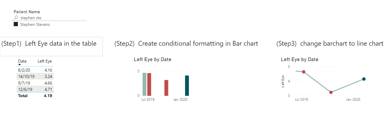
I thought I would mention in my wrap up but didn’t as it was getting long. Really appreciate for your question. This small dots have really nice impact.

Regards,

Hideo

P.S.
I like your videos (congratulation x millions) and cool solutions in the forum.
Also Congratulation for winning in challenge 5.
My logic in Challenge 5 here.
Open excel → Noticed lots of ELT→ winner must be Melissa
I was not wrong. I feel lucky to be connected with you today. Thank you so much.

3 Likes

Hi @Hideo,

Thank you for sharing this!
It’s amazing how much knowledge we posses in our community. And I love those little tips and tricks being shared. I learn so much from them - love it.

Thanks for your kind words, that means a lot and I really appreciate it.

2 Likes

Dear @sam.mckay,

Thank you so much for looking at the report.
The comment you mentioned is really precious for me to improve my skills to the next step.
To be honest what you have pointed are all my weak parts ( I did not focus on before) and it is really nice to know from the professional point of view.

(Viewed Point)

  • Pick up consistent colour pallet and choose colour carefully without being too many
  • Page condense – Less could be better sometimes
  • “Size and Location” for “Logo and title” consistency

I agree that these things will pile up and make a big difference for the consumer.
I will keep those points in my mind for the next challenge.

This is a fantastic review. Thank you so much again.

Regards,

Hideo

1 Like