Power BI Builds 5 - Optical Data

@Mohammed_ali,

Thanks! For the appointment density calendar, I used a custom visual called BeyondSoft Calendar. I thought about doing this by hand in DAX. Overall, it’s very similar in implementation to the custom heat map I created in Challenge #1. The challenging part would be the repositioning/reformatting of the matrix blocks that would need to be recalculated each month. At that point, I’d already put in enough time on this entry that it was beginning to feel like an unwelcome houseguest, so I went with the simpler custom visual approach. :upside_down_face:

I hope that’s helpful.

  • Brian

image

3 Likes

@MudassirAli and @Neba ,

Thanks very much for your feedback – greatly appreciated.

I totally agree with your assessment here. I used a very simple data model, and wrote very little DAX for this report (mostly simple SELECTEDVALUE harvesting measures and some IF and SWITCH statements for graphics/icon handling, since I did the heavy lifting on the appointment processing in Power Query). Big departure from the last challenge, which was extremely analysis-intensive.

I like the way @haroonali1000 is mixing these up - never know what to expect from one challenge to the next.

  • Brian
2 Likes

Hi @bafuzie,

Nice clear report!

Daniel

2 Likes

Hi @sacrow,

That’s a really fresh looking report with the colouring and spacing. I also like the optician selector.

Daniel

2 Likes

Hi @Neba,

Great report. I like the lay-out with the all the sections. The lay-out and the colours that you use both are really easy on the eyes.

Hi @Brian,

Very visually appealing report! I would like to learn to import images also.
It’s interesting to read that you choose to do the heavy lifting in Power Query. I consider you as a DAX Jedi so it could be so easy to go for the DAX again and again. What I can learn from this is that DAX is just a force among many forces. :smiley:

Daniel

4 Likes

Hi everyone,

Here’s my submission for Challenge 5 - Optical Data
:tada:

Thought I would take the scenic route and include a Menu page, although this can be omitted.

It leaves the user with two routes into the actual report.

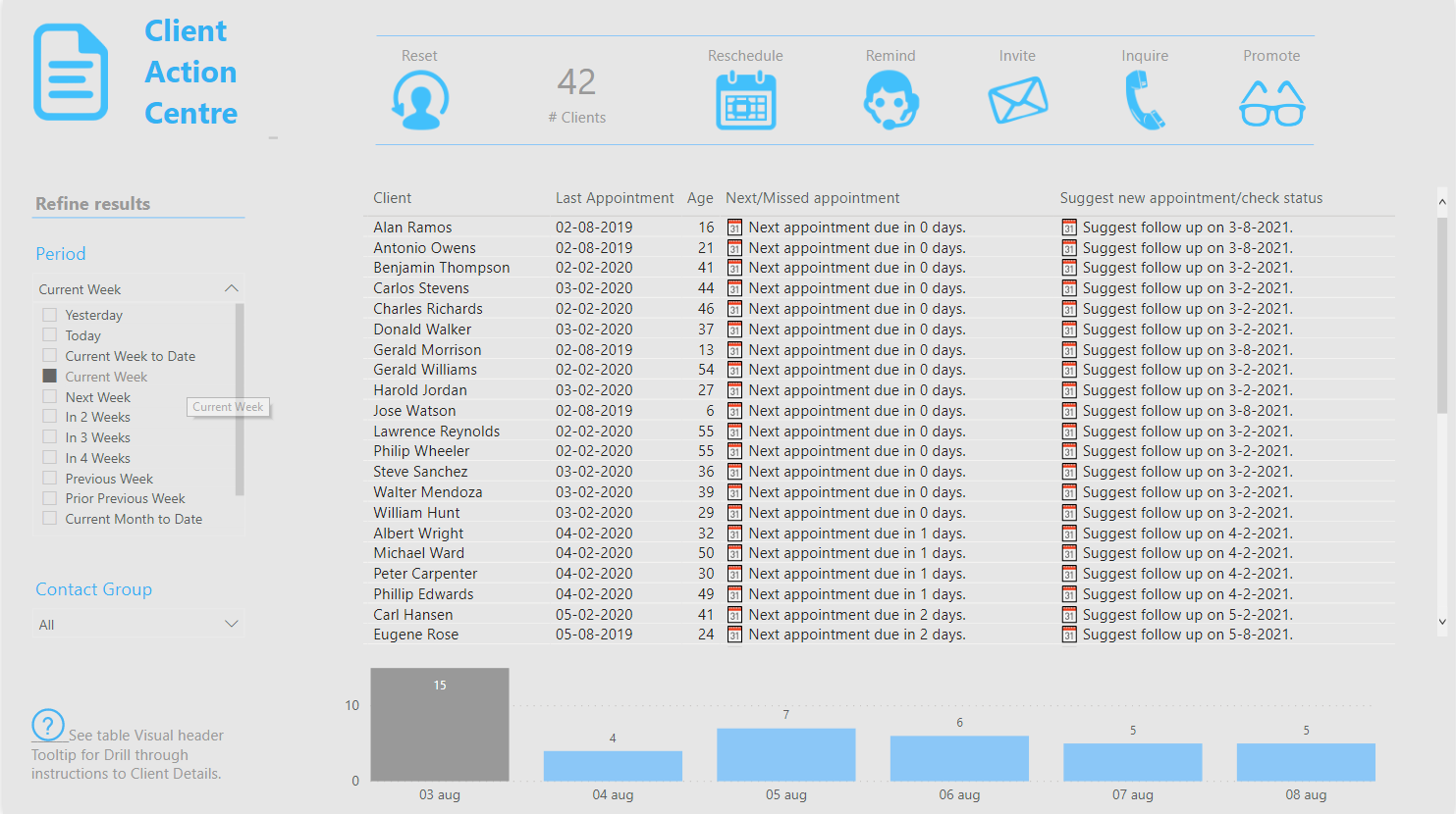
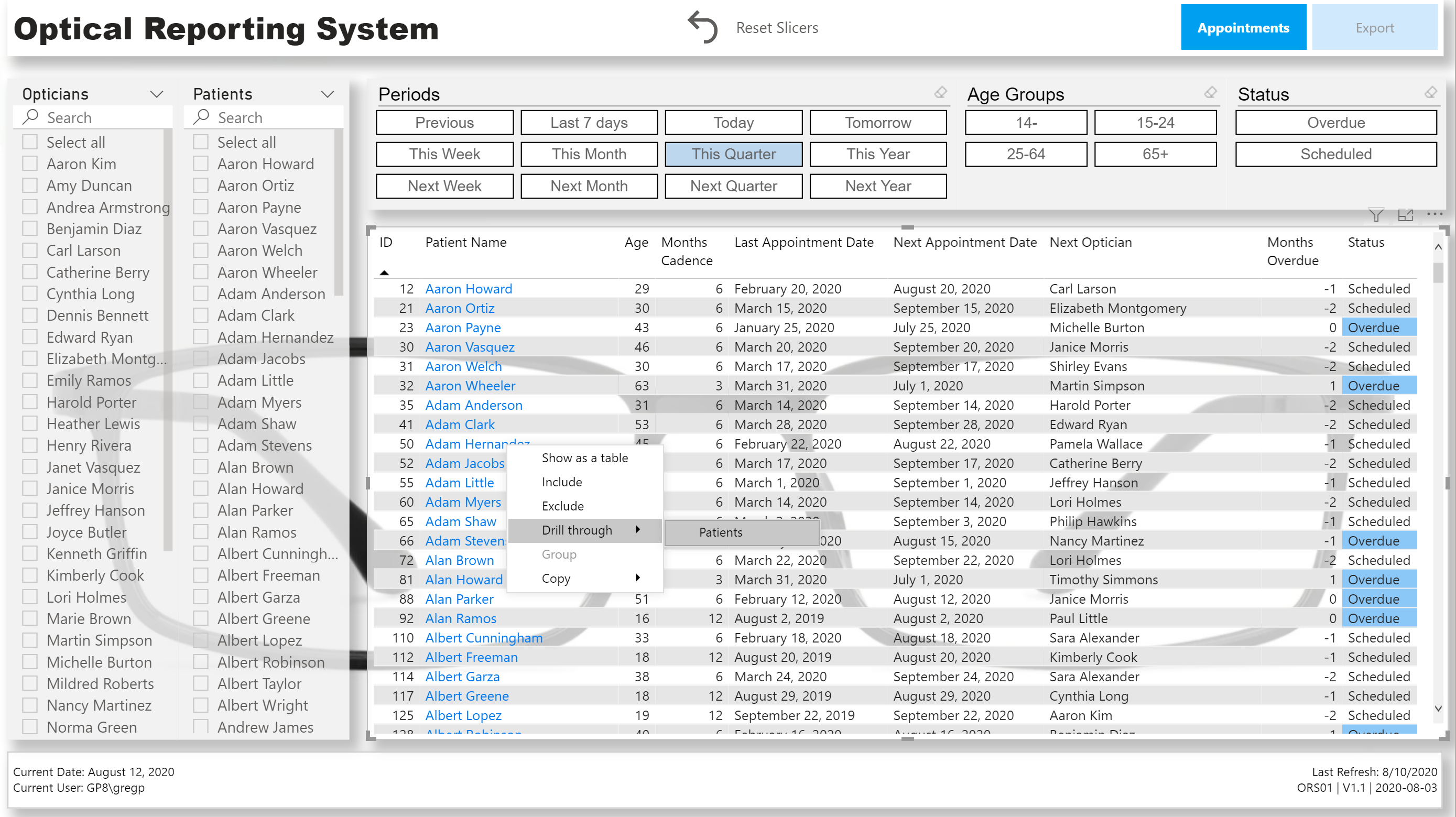
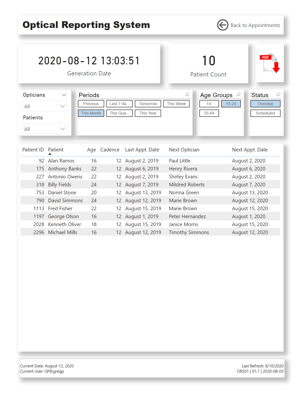
The main one being the “ Client Action Centre ” when you click on it (or right-click in Desktop) a page navigation action will take the user to that report page.

In the top of the screen there are buttons (based on bookmark actions) to zoom into a subset of customers (contact groups) to get things done quickly, additional filters can be set with the slicers on the left hand side.

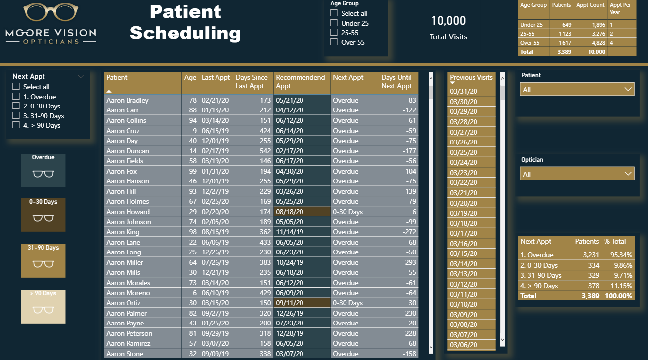
Reschedule : Shows all customers 1-30 days overdue, it also suggests a new appointment date.
Remind : Shows upcoming appointment due dates in the next 0-30 days. Customers can actively be contacted to make an appearance :wink:. Based on their age it also suggests a date for a follow up appointment after that.
Invite : Shows upcoming appointment due dates in the next 31-60 days. Letters can be send to inform customers to expect a phone call to schedule an appointment.
Inquire : Shows all customers 31-180 days overdue, it also suggests reaching out for new appointment or to check client status if they missed a due date twice in a row.
Promote : Shows all customers >180 days overdue, you might still want to include them in marketing but no longer actively pursuit them…

At the moment the logic for these actions is arbitrary of course but can easily be updated to suit Penny’s actual wishes so she can then share this with the customer contact team.

The column chart at the bottom of the screen show’s the number of Appointment due dates within a 10 week window, all blue bars are future dates. This interacts with the Period slicer so to get quick insight in expected traffic based on Appointment due dates.

I’ve used the Dynamic Date Range Slicer M code you can find in the M code Showcase category on the forum and updated the time-frame bins better suiting this scenario.

Based on the client’s age at that point in time I calculated a Next Appointment- and Suggested New Appointment due date in Power Query. First time I ever created a recursive function in M so to calculate the next appointment due date for a date after today called: fxNextAppointment , that was fun!
In the end I decided to handle missed due dates differently so didn’t use it but for those of you who are interested, here’s the M code:

(myDate as date, dateDOB as date) as date => 
  let
    BufferedInterval = Table.Buffer(Interval),
    curDate = Date.AddMonths(
        myDate, 
        Table.SelectRows(
            BufferedInterval, 
            (BT) => 
              BT[Age] = Number.RoundDown(Duration.TotalDays(Date.From(myDate) - dateDOB) / 365)
          ){0}[Interval in Months]
      ),
    Result = if Date.DayOfWeek(curDate) = 6 then Date.AddDays(curDate, 1) else curDate
  in
    if Result >= Today 
    then Result 
    else @fxNextAppointment(Result, dateDOB)  

How does this fxNextAppointment function work?

  • The function requires two parameters of type date.
  • Loads a query called Interval into memory, this contains age ranges and interval in month values.
  • Adds the number of months to the initial myDate parameter based on the age at that point in time and storing it in a variable called curDate.
  • Checks if the curDate returns a Sunday if it does, it adds a day so it returns a Monday instead, storing it in a variable called Result.
  • Next checks if the Result is equal to or after Today’s date
  • If it is it returns the Result else the query calls itself and passes the Result to the myDate parameter to start the cycle all over again…

.

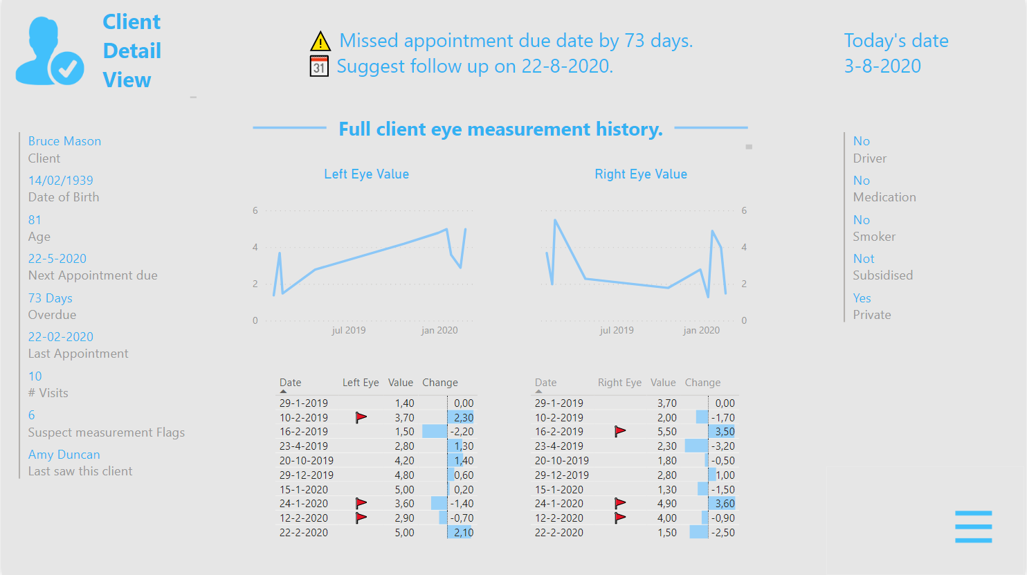
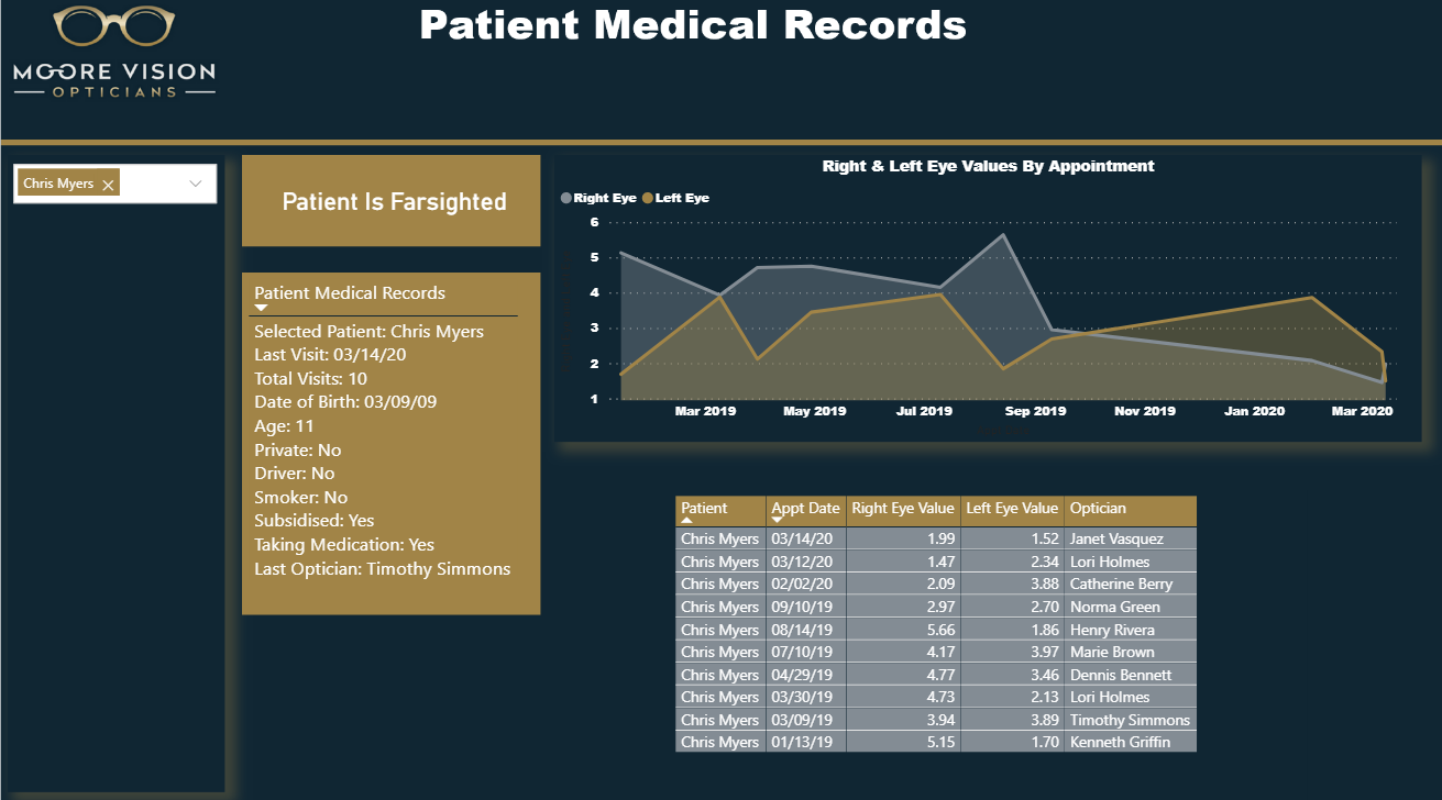
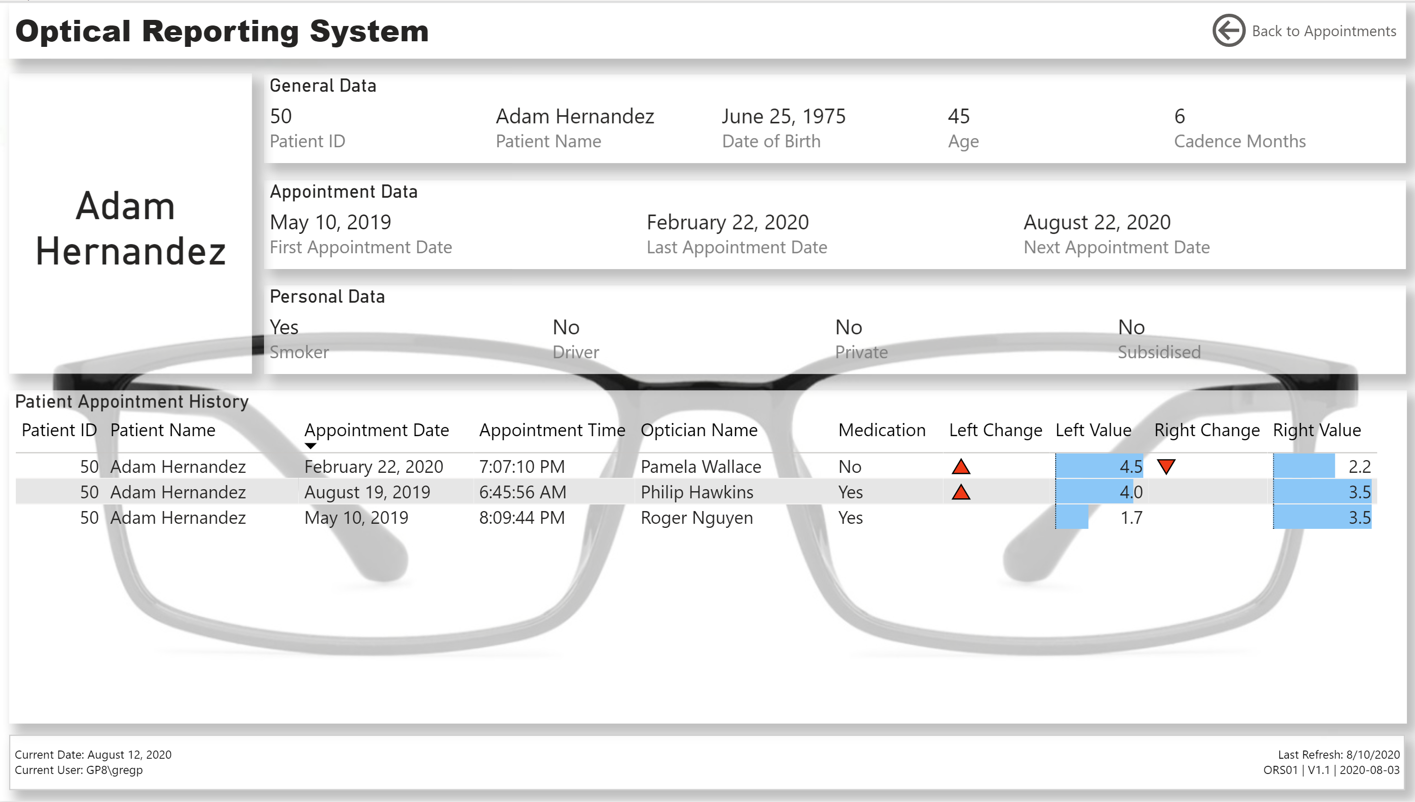
The “ Client Detail ” page is only accessible via drill through from the “Client Action Centre” page as noted in the bottom left corner of the screen. How that works is visually explained by hovering over the Table (?) tooltip via a GIF image in the background of the tooltip page.

Clicking on the Image/Title in the left upper corner will bring the user back to the “Client Action Centre” page and the hamburger menu in the bottom right corner to the “Menu” page.

On top it shows the Action messages for the selected Client and the current date (which isn’t up to date in our static POC sample data set). In multi-line cards on the left and right it shows all requested client details and also how many times this client visited, who saw the client last and how many flagged measurements have been recorded, so they can be examined more closely.

.

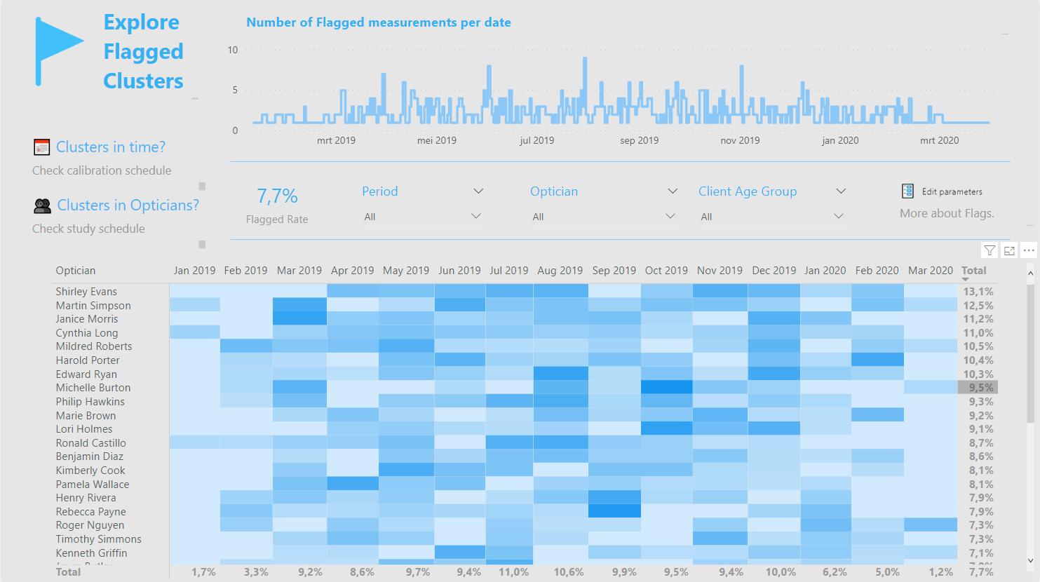
Since I attempted to incorporate visual ques for datapoint review, I also included an “Explore Flagged Clusters” page.

In certain circumstances rapid change in eye sight can be considered “normal”, that makes this part really tricky therefore I decided to base these flags on the direction of a vector, hoping to identify V shapes for example because that could be suspect…

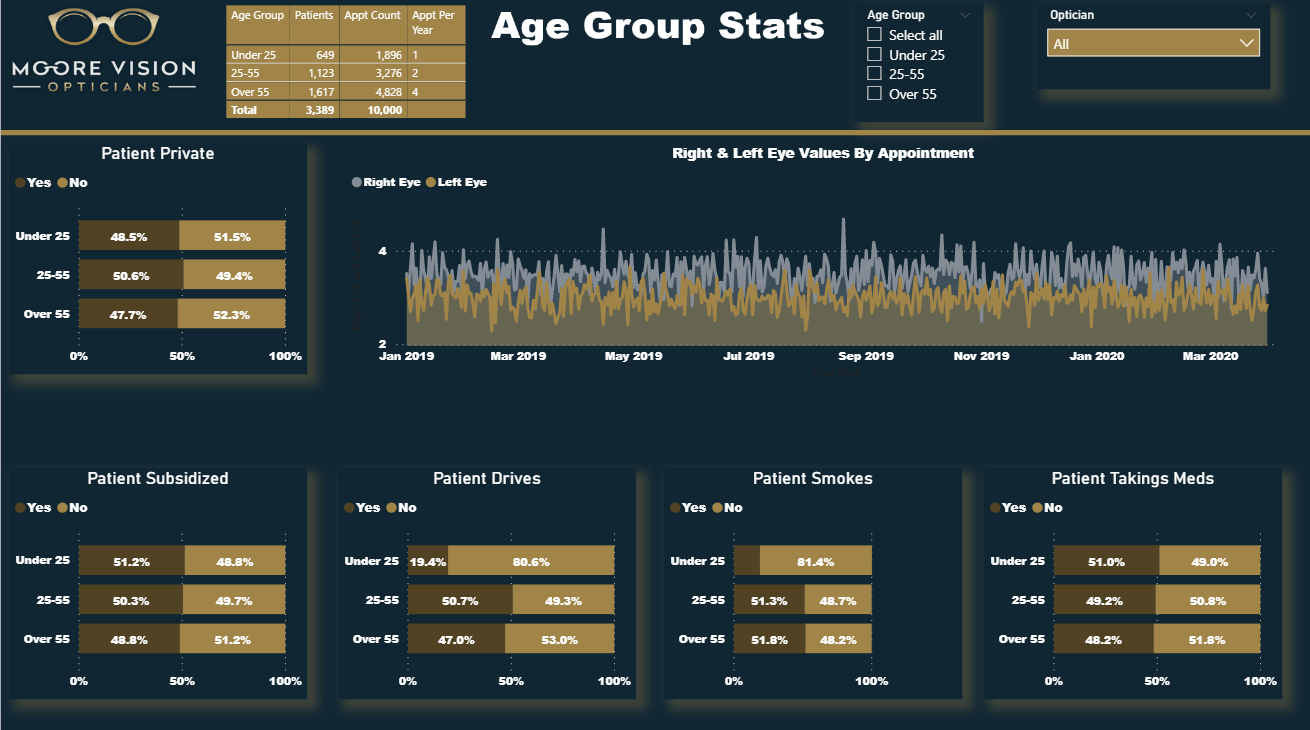
The logic for the 1- and 2 point check is all done in Power Query because there’s a maximum of 10 data points I didn’t extend this further but we can add more levels if that is deemed necessary. Also wanted to give the user the ability to fine-tune threshold values so to optimize the results - that’s done via parameters. An explanatory page can be viewed by clicking on the “More about Flags” button.

This is by no means an exact science of course, think the best you can hope for is identifying clusters either in time or by optician and in that case maintenance/calibration of equipment or training is advised for example. In my view a heat map is the best way to visualize that.

.

All in all the DAX measures are pretty basic except for a segmentation pattern and even though I kept it simple I think you can get a lot of quick insights from this report.

Enjoyed working on this one and look forward to seeing all your entries…

.

UPDATE
@BrianJ was so kind to publish the report for me so here is the web link for all explorers among you.

19 Likes

@BrianJ

Thank you very much. Great entry from yourself! design is brilliant! Keen to see your write up on the web scrape images too. I had that initial thought for my profile page, but when I saw there were 3000+ patients, I immediately wrote off the idea without looking into it further. Replaced it with an image from flaticon instead

Thanks,

Sam

1 Like

All,

Here is my submission for Challenge 5. I will provide a full write up after all the entries have been posted. My objective in this challenge was to provide screens that provided the following info:

  1. Scheduling Info
  2. Medical Records
  3. Age Group Stats

Did a bit more DAX than usual with this one, but was able to get this one done very quickly. Looking forward to seeing all of the other entries!

Here is the link:

Thanks
Jarrett

11 Likes

@Melissa This is just wow!
Looks like the report covered everything from A to Z.
Excellent submission !

1 Like

@Melissa,

WOW! WOW! WOW!

I’ve been wondering when you were going to roll out the heavy artillery in one of these challenges, and I guess now I have that answer. This is beyond brilliant, with better functionality then many full-blown commercial scheduling apps I’ve used. And it looks terrific.

I can’t wait to start digging into how you did some of this. It looks like we’re holding off posting the PBIX files until the challenge closes, but can you please post a publish to web link so that we can play with the full functionality of this report?

Absolutely amazing. :clap: :clap: :clap:

  • Brian
3 Likes

Hi uriah1977 ,
Thank you for you for your great feedback. Even though you created an impressive report before I even try to think about creating a report.

2 Likes

Hi @MudassirAli and @BrianJ,

Thank you both so much for your kind words, really appreciate it!
I’m sorry to say I can’t publish to web within my tenant but will definitely share the PBIX file in the final write up after the closing date. :+1:

What I love most about seeing all submissions - is that although we all start with the same dataset - everyone finds a different way to get amazing insights from it and create appealing reports.

2 Likes

Hi All:

Here is my submission for eDNA challenge #5, Optical Data.


I tried to make this “report” look more like an app, so I made minimal use of analytical visuals, instead concentrating on the main “Appointments” page; the secondary “Patients” page was to be accessed as a drill-through target of the “Appointments” page only, and the “Export” page was added to allow not only allow easy export of the patients needing appointments, but one that would “sync” with the main “Appointments” page.

NOTES:

Data:

  • made assumption that the optician that did the patient’s last appointment would do the next appointment

Data Model:

  • imported [Optical Data Set.xlsx] as a staging query, and created references in new [Data Model] group for [Patients], [Opticians], [Appointments]

  • [Patients] table:

  • [Opticians] table

    • merged first and last name columns; duplicated column; split columns to re-create first name and last name
  • added [Dates] table using eDNA Extended Date Table M Code;

    • marked as Date table
    • used parameter to get and set start date to Jan 1 of first appointment year
    • used parameter to get and set end date to Dec 31 of the year after this year
  • added [Periods] table using eDNA Period Table M Code (Dynamic Date Range Slicer- Query M); adjusted for “this” and “next” periods (week, month, quarter, year)

Measures:

Visuals:

  • General:

    • added pages for [Appointments], [Patients], [Export]
    • hid all pages except for [Export] page for so PDF export (in either Power BI Desktop or Power BI Service) will output only the [Export] page
    • added buttons for page navigation to header (font bold white for current, font regular grey for options)
    • added card for [Session Admin] to footer to display last refresh, report ID, report version, report version date (these in card title and whitespace character in card field well)
    • added card for [Report Admin] to footer to display current date, current user (these in card title and whitespace character in card field well)
    • made extensive use of the [General] section in the Visualizations pane to confirm and adjust the values X/Y/Width/Height as necessary
    • used object layering (selection pane grouping) to make the user experience more “app-like” (https://www.youtube.com/watch?v=PKIcjGz_Swg)
    • calculated whether user was accessing report in Power BI Desktop or the Power BI Service and used this info to present tooltips relevant to the user’s environment
      • (used difference between NOW() and UTCNOW() to see if user was on Desktop or Service; I know this is a hack, and doesn’t work if the time in your time zone is the same as UTC, and I would have preferred to use USERNAME() and USERPRINCIPLENAME(), but against my understanding, for whatever reason [perhaps my free PBI license type?], these both gave me the same value irrespective of environment) (*** I’m not happy with this method, I’m still looking for a better way, and would be interested in anyone’s experiences/thoughts/comments ***)
  • [Appointments] page:

    • used standard list slicers complete with “Search” for (Next) Opticians and Patients
    • used “Chiclet Slicer” custom visual for Periods, Age Groups, and Next Appointment Status
    • used “Reset Slicers” button complete with bookmark to allow user to easily return to the original state
    • changed font colour of [Patient Name] column to blue to indicated that you can do something (in this case drill-through to [Patients] page for the selected patient)
  • [Patients] page:

    • used 3 multi-row cards to display General, Appointment, and Personal information for the selected patient
    • set “Patient Name” as drill-through target
    • presented the patient’s appointment history in a table, complete with data bars and up and down triangle icons as necessary to denote a changed right-eye or left-eye value from the previous appointment
  • [Export] page:

    • changed page size to “Letter” and increased spacing from edges in case PDF export was printed
    • used “Chiclet Slicer” custom visual for Periods, Age Groups, and Next Appointment Status
    • sync’d slicers to [Appointments] page to allow export of the patients/appointments that had been selected (via slicers) on the [Appointments] page
    • added PDF Download icon to permit use of the current environment (Desktop, Service) to display the tooltip relevant to the user’s environment
8 Likes

@Greg Good report and great explanation of what you have done in the report. I like the PDF export concept in the report too. I was wondering how you did you calculate the Next Optician for a particular patient.
Are next optician was selected randomly or you used/assumed a particular concept behind this?

Thanks.

1 Like

I just made an assumption.

1 Like

Wow

Some incredible submissions so far.

Looking forward to getting into my development today.

1 Like

Below is my submission as Newcomer.

The main goal is to track patient’s appointments.

  1. Did Age Category in Power Query itself
  2. Break down into 2 dimensions(Patients, Opticians) and Fact table(Appts)
  3. Main challenge is to come up with Next Appointment date based on the age, Frequency and the last appointment date
  4. Few measures to get the counts
  5. Conditional formatting to get the flag based on the appointment status

Vision Appointment Tracker

5 Likes

Wow this is good

3 Likes

WOW! WOW! WOW! WOW! WOW! WOW!

We are seriously lifting the bar some amazing entries and techniques on display.

Great to see you guys have given me the easy task of having to pick a winner from this lot :worried:

No but seriously some amazing entries and great to see some new faces joining in.

I’m looking forward to reviewing your submissions and sharing some feedback with you.

Any one sat on the fence, there is still time to join in so get involved you wont regret it.

P.S Some great prizes on offer for the new entrants category be sure to check out the post below.

Thanks All
Haroon

@sunip,

I like the way you structured your report, and showed all of the data that was required. One area I would suggest to improve on is the color theme. This is one thing, even if you are a newbie to Power BI , can help take you to the next level! First of all, I will proclaim that I’m color blind, and without the help of additional tools my report color schemes would be awful. You have a great image in the top left corner of the report. Use this to your advantage, and create your color scheme off this. Here are step by step instructions to help create this.

  1. Go to https://analysthub.enterprisedna.co/colour-theme-generator
  2. Select Image to Colours
  3. Upload your image
    Here is what it came up with:

I also use this website as well to compare:

** All you do is upload your image, and here is what it came back with**

** If you want to take these colors a step farther and create your own JSON theme, go to this site and enter all of the HEX codes: https://themes.powerbi.tips/

Selecting a color scheme is very first thing I do when I’m creating reports. Nothing beats a great first impression!

Cheers!
Jarrett

4 Likes