All,
Introduction
For a while, we’ve been planning to do a joint entry to explore the dynamics of collaborative Power BI development, in order to provide the Enterprise DNA community with a set of practical, tested recommended practices. Our ultimate plan is to use Analyst Hub as the primary mechanism to facilitate this collaboration, but the first time through we thought we would focus on the broader elements of learning to work together as a team, since each of us has only ever been the sole developer on either our real life reports or our Data Challenge entries.
Collaborative Effort
One of the goals of our approach to this challenge was to try to mimic what might be a not-uncommon situation many people may find themselves in when developing a Power BI report, namely that there are many people involved. That, and the inherent logistical difficulties brought about by the fact that only one person can work on a Power BI file at a time, led us to establish a common location for collaboration, in this case we used a OneDrive master folder. We created a shell collaboration Word document and PowerPoint presentation that we used to toss around ideas, then began with the data loading and transformation. (You can find more details about the specifics of the data prep below.)
One team member did most of the data loading and data prep work, then posted their solution to the OneDrive site with a version number (to allow for easy identification of the latest version) and their initials (to prevent other users from accidentally overwriting their contributions). Once the initial data prep and modelling was drafted, each team member took a copy and we each created possible visualizations, which we then iterated together until a path forward with consensus appeared. We then more specialized into the particular strengths of each team member, and from here on always worked on the common file, and one-at-a-time added our enhancements and suggested changes.
This iteration was both time consuming and communication-intensive, and clearly exposed one of the current main difficulties in Power BI development at this time: namely that changes from different authors can’t be merged.
So, in the end, we “ate” the difficulty and iterated and communicated extensively, ending-up with a Power BI candidate report with many pages, most of which were hidden and not included in the final submission (or were interim “work” pages).
Choice of Data Story
Story-telling is essential in dashboards as it helps to engage the users and communicate the requirements easily without having to put so much effort into digging out the essential points. Therefore, we came up with a story “How have countries dealt with COVID-19?” and based our workings in communicating the story with different visuals, narratives, regression models, dynamic report level tool-tips, navigations, maps and so on.
Data Prep and Data Modeling
When we first looked at the data for this challenge, it seemed fairly simple and that the data modeling step would go quickly. However as we began to dig into the data in detail, we realized that JHU had made at least three highly questionable choices in their management of this data that increased the need for aggressive data cleaning:
1) Use of Country Name, Rather Than ISO Code to Uniquely Identify Each Country – there is no recognized standard for country names, however ISO codes (both the three and two character versions) are a recognized international standard. The absence of ISO codes severely limits the ability to add additional important information to your country dimension table. Fortunately, we found someone on GitHub who had already gone to the trouble of matching the JHU country names to the three character ISO codes, saving a ton of time and allowing us to create through a simple merge a “universal adapter” field that allowed easy buildout of the country dimension table, detailed further below. From the three character ISO code, we added the two character ISO code now making it possible to incorporate almost any other country level data source into this analysis.
2) Reporting of Daily Cumulative Rather Than Marginal Totals - We’ve never seen data reported in this way before at the raw data level, and with good reason – it makes it very difficult to work with as many on the forum indicated in their first dig into this data. To correct that, we employed the “Feldmann Shift” (named for Imke Feldmann of the BIccountant blog, who was the first person we ever saw employ this technique), explained in this thread. The resulting marginal daily data allowed us to use all the standard measures and techniques to which we are accustomed, as well as some more advanced statistical modeling discussed later.
3) Use of Zeros Rather Than Blanks to Indicate Missing Data – this is a convictable crime against the laws of data management. Once the data was normalized to daily values, it became apparent that in a number of instances the data was coded with zeros to indicate missing values rather than blanks – which led to the presence of some enormous outliers. Once we recognized what had been done we treated the zeros as missing values and filtered them from the dataset.
4) Reporting of Data at the Province/State Level – Unlike the other three above, there is nothing inherently wrong with doing this, but it just makes adding additional country level data to the dimension table difficult. Thus we used the Power Query grouping functions to roll the data up to the country level only to make it easier to merge with country level demographic, geographic, economic and social data critical to our analysis.
Once the data were cleaned, we configured them into a standard star schema model, with a snowflake off the Dates table to allow slicing by period. The odd wrinkle in our data model is the presence of the three additional sub fact tables, referenced from the main fact table and built specifically for the R multiple regression analysis discussed below.
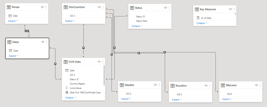
Building out the Countries Dimension Table
The work that Brian did recently on the “Where in the World Is Enterprise DNA?” mapping effort was incredibly timely for this challenge, since we were able to reuse almost all of the country level dimension table fields he developed for that report for this one. In addition, we added the following data used for our regression analysis:
Population = Population data by country, 2019 (source: World Population Review)
Income = Adjusted net national income per capita, 2018 (source: World Bank)
NumNeighbors = Number of countries with a shared physical border to the selected country.
+1 added to value for each country to prevent log(0) undefined error for island countries.
Democracy = Democracy Index value, 2019 (source: The Economist Intelligence Unit)
Corruption = Corruption Perception Index value, 2019 (source: Transparency International)
Design Strategy and Elements
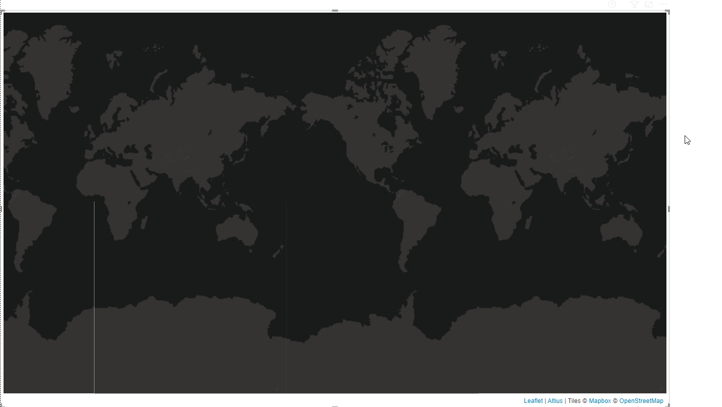
It’s not always easy to choose a design especially if you plan on including Maps in Power BI reports. The first biggest challenge was to integrate it well with the background so it looks visually good and the second one is to leave enough space for other visuals/analysis in the report. For this, we took a screenshot of the Map and used it as a background and used the same dark color theme as was in the Map.
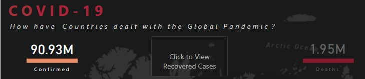
After this, the Maps blended well with the report but what about other visuals? The first visuals that can be seen are the card visuals at the top that show the number of cases by different status. To keep the report as clean as possible, these cards are also used as navigation to filter the report by different status. The different colors are used for Confirmed, Recovered & Death cases for better visibility in the report. We also added the stacked Bar Chart with different color for each status to invite the users to click on it but when they do, they will see the navigation option created with a blank button. To get this effect, we inserted a blank button on top of the card visuals, used the background option in format pane and under hover, added the same background as we used for the report. Then used the Button Text option, selected hover from drop down and inserted the text “Click to see the Confirmed/Recovered/Death Cases”.
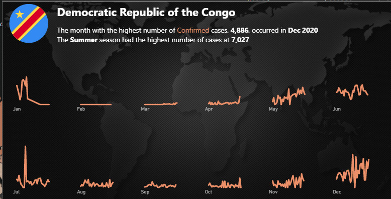
The main part of the reports are the tooltips that are packed with information and trends.The first static tool-tip is added to map as a starting point for the user to see the outliers. After seeing these outliers the users can filter the data to see different types of information and trends. This tooltip shows the Top 10 cumulative cases by country after reaching the first 1000 cases. Why the first 1000 cases? The reason is many countries started acting after the cases reached a particular number. Moreover, the tool-tip also shows which season had the highest number of cases as it was necessary given the cases are analyzed by the top officials by seasons. There were talks of a second wave already in the fall so we thought it would be a good idea to show some different insights.

Another tool tip in the map is the dynamic tooltip that shows the trend of the cases in different months by country. The best option we found was to use the small multiple feature in line chart to show the trend.
We presented the country flag and name, as well as a dynamic textbox (smart narrative using static text and dynamic measures) to describe the country’s particulars.
Main Map
Like many other entrants in this challenge, we started our mapping effort using a circle map based on latitude and longitude. While this is a great approach if you have very detailed, city level data we felt that it did not depict country level data as well as the choropleth map (a filled shape map).
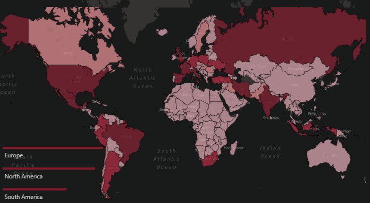
To implement the choropleth map, we used the 1.9 beta version of the custom mapping visual Icon Map. The default shape map in Power BI is very limited in its configuration options, and Map Box while it looks great does not support report page tooltips – a must have for our analysis. Thus, we relied on Icon Map at the recommendation of EDNA GIS guru @Paul. This worked great, using the Well-Known Text (WKT) option to define country boundaries. More detail about this approach can be found in Brian’s writeup of the “Where in the World Is Enterprise DNA?” Mapping effort.
1000 Case Tooltip (see screenshot above)
The best part about this tooltip is that it contains a gradient line chart designed in Charticulator. It shows the color getting darker as the number of cases increases over time. Moreover, at the end of the line, it contains the name of the country instead of showing it with Legend. We added a calculated column to get the number of days by country when the case was first reached to 1000 and used that as a starting point on the X-axis. With some sophisticated DAX, a measure can be created instead of a calculated column but went ahead with the calculated column due to time constraints.
Seasonal Tooltip (see screenshot above)
This tooltip was designed to keep in mind the seasonality of the cases therefore chose the months on x-axis so the users can see the trends by both months and seasons. Season names aren’t mentioned explicitly as it’s obvious which season is in which months. Moreover, the smart narrative visual also shows which Month and Season has the highest number of cases.
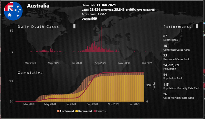
Detailed Trend and Ranking Tooltip (Scatter Chart)
In this tooltip we presented again the country flag and name, along with select statistics (confirmed cases, recovered cases, % recovered, active cases, deaths). We presented both daily and cumulative data in column charts, with a 2nd Y-axis on the cumulative chart as the deaths count is at a much different scale from the confirmed and recovered counts. Finally, we included a performance section at the right listing the country’s global rank for deaths, confirmed, and recovered cases, then again presented the rankings normalized by the country’s population.
Multiple Regression Analysis and Residual Plots
At the heart of our data story question “How Have Countries Dealt with the Global Pandemic?” is the need to be able to meaningfully compare the performance of countries against each other or against a common standard. Toward this end we constructed a multiple regression model that attempted to explain the variance in global deaths, confirmed and recovered. With more time we could’ve done additional research and specification testing to improve the model, but what we came up with seemed pretty good for the amount of time available. Here’s the model specification and key results for deaths, though confirmed and recovered follow nearly identical patterns:

Here are the major takeaways from these results:
- the model accounts for 60%+ of the variance in global deaths due to the virus. This is actually substantially higher than we expected given the limited time available for research, model creation and specification testing – a process that in many cases can take weeks or months to do thoroughly. There is evidence from the resulting statistics of at least one key variable missing from the specification, which given the complexity of the dynamics related to virus spread and deaths is not surprising
- all the estimated model coefficients are significant at any threshold p level chosen, and are of the expected sign
- other than the aforementioned missing variable issue, the diagnostic plots do not show any other obvious modeling flaws
Once we constructed the model and estimated it, we plotted the results separately for deaths, confirmed and recovered, using predicted values for each country on the x-axis versus residual values (actual minus predicted) on the y-axis. This allowed us to see, controlling for all the variables in the model, which countries performed better than expected and which performed worse. In most scenarios, where you are modeling a positive outcome, being above the zero line (i.e., actual exceeding predicted) is considered a “good” outcome and below the line is considered a “bad” outcome. However since we are modeling negative outcomes, the interpretation is reversed and being below the line is considered “good” (note that recovered is still treated in the modeling as a negative outcome since it is so highly collinear with Confirmed)
Mechanically, we estimated the model using a magical feature of Power BI referred to as the “Dataset” call, which allows you to invoke R code in the middle of a query and then continue postprocessing the results in Power Query within that same original query. This has two tremendously beneficial outcomes: 1) it gives you access to 12,000 custom R packages designed for every type of advanced analysis imaginable; and 2) it allows you to skip learning 95% of the R data processing routine and lets you leverage your knowledge in Power Query instead. Brian is obsessed with this technique, and will be doing a separate post at length explaining it in detail for those interested
The bottom line of all this is that this section of the report allows the user to interactively explore which countries exceeded their predicted values and which fell short leading to some interesting and unexpected results and allowing for the meaningful comparisons between countries that we were originally seeking.
Conclusions/Thoughts on Collaborative Development
We all agreed that despite the challenges and limitations inherent in using Power BI for collaborative report development, that working closely together, seeing each other’s processes up close on a daily and hourly basis, leveraging the diverse expertise that each of us brought, experiencing the teamwork and camaraderie of accomplishing something difficult under intense time pressure, was a fantastic experience for each of us, and that the final product produced was better than anything any of us could have done individually. We hope you think so too.
Here are some of our specific observations and recommendations regarding the collaborative development process:
-
Most of us have a set, well-established process that we use for our own Power BI development. Be willing to let go of your normal process in order to maximize learning from the processes and perspectives of others.
-
Assess the strengths of each team member, and collectively choose clearly defined roles based on those strengths at the start of the project. This will help avoid getting in each other’s way.
-
Establish and all agree to follow a well-defined process for check-in/ check-out of the PBIX file. Work backward from the due date/time to determine who should have the master file when and for how long.
-
Tabular Editor is your friend. Once the data prep/data model are complete, it will allow multiple people to work on DAX measures while the file is checked out, and then easily transfer those measures back into the master file.
-
At an appropriate point, agree to the data story you collectively want to tell. A sizable team likely will have far too many interesting ideas to fit all of them into a manageable report. Use the story to guide which analyses are key and which analyses are tangential. Be willing to let go of the tangential ones, even if they are interesting.
-
Be aware that its likely collaborative development effort will take more time than an individual one (when you are the one fulfilling all roles, there’s no iteration required when communicating, for one)
As always, thanks to @haroonali1000 for leading a fantastic challenge and to Enterprise DNA for building and supporting the incredible community around these initiatives.
We look forward to a second iteration of this collaborative process in the future, using Analyst Hub as the primary planning and collaboration tool.
Thanks for reading, and congratulations if you survived all the way to the end of this writeup.
The JMAP Team (Julius, Moore, Ali, Philps)