Hi All. Here is my submission for eDNA challenge #10.
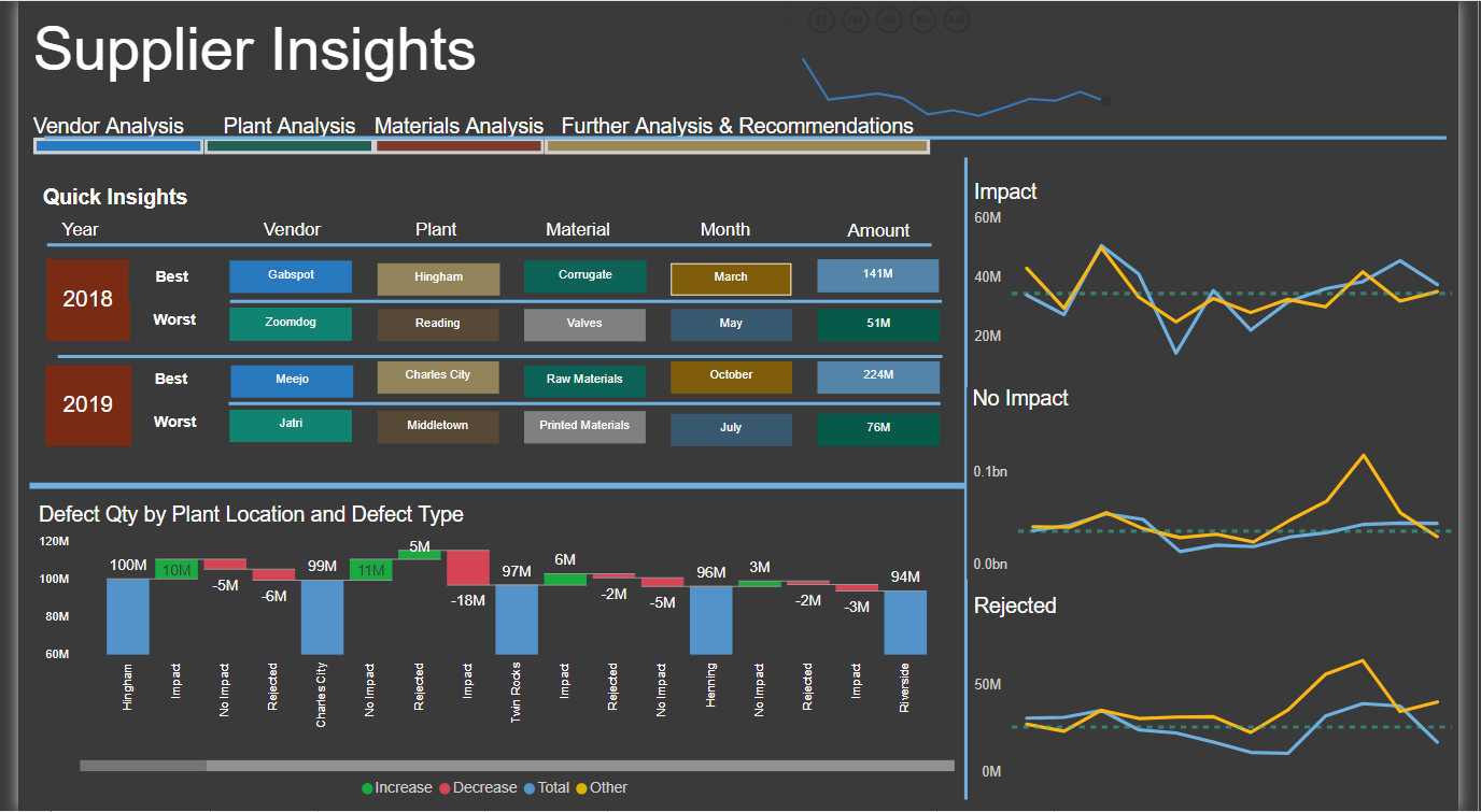
Summary:
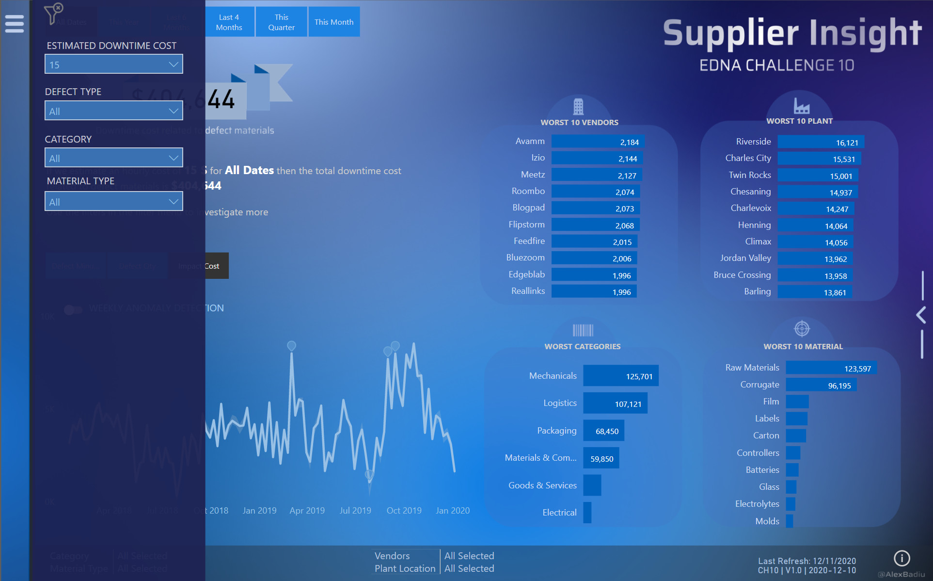
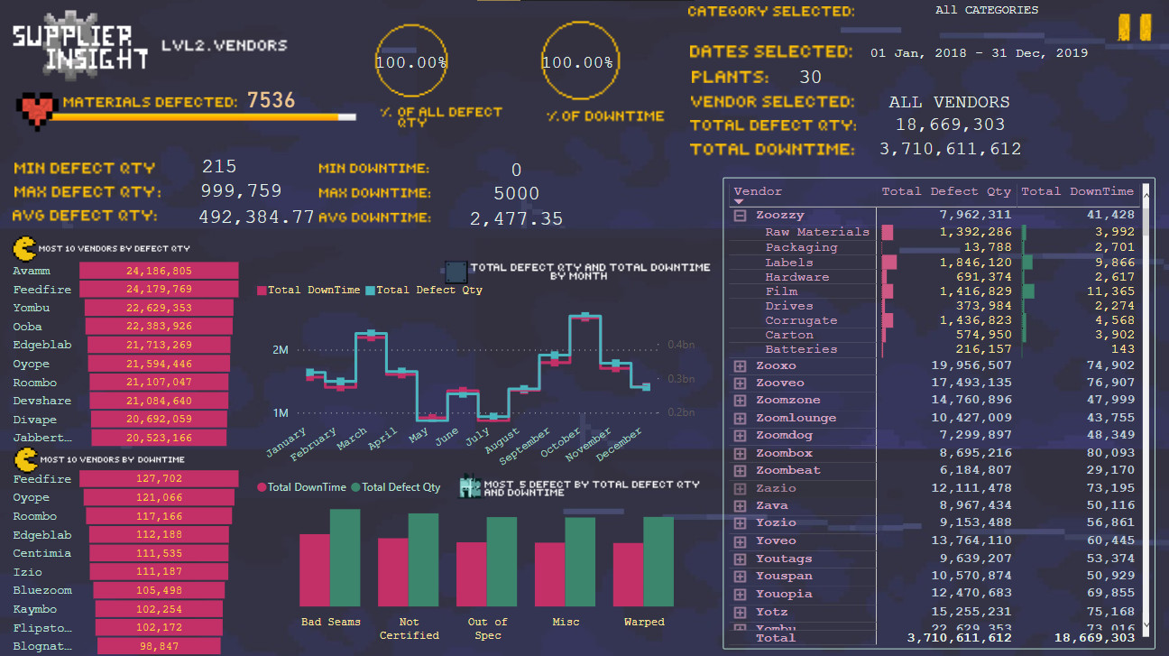
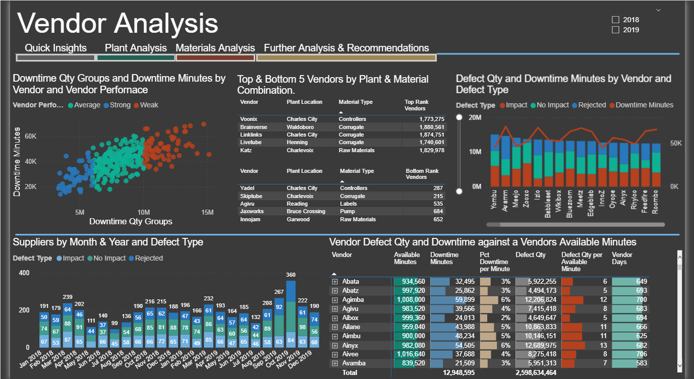
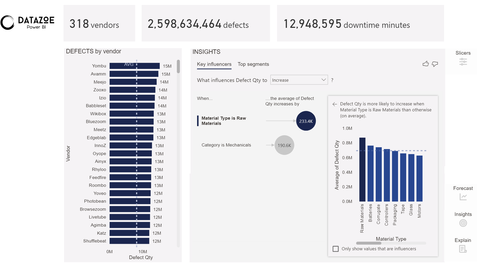
Vendors:
Defects:
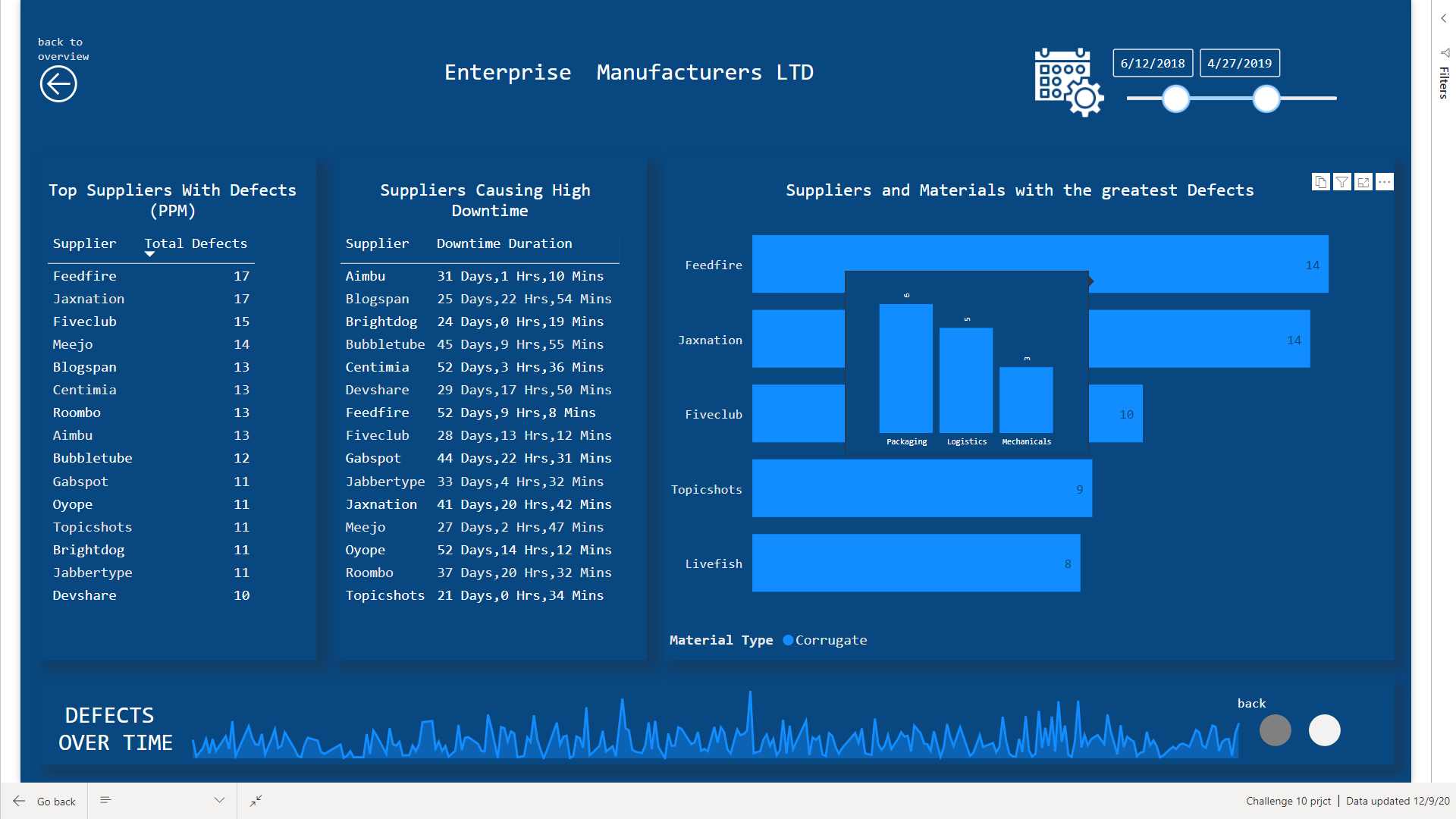
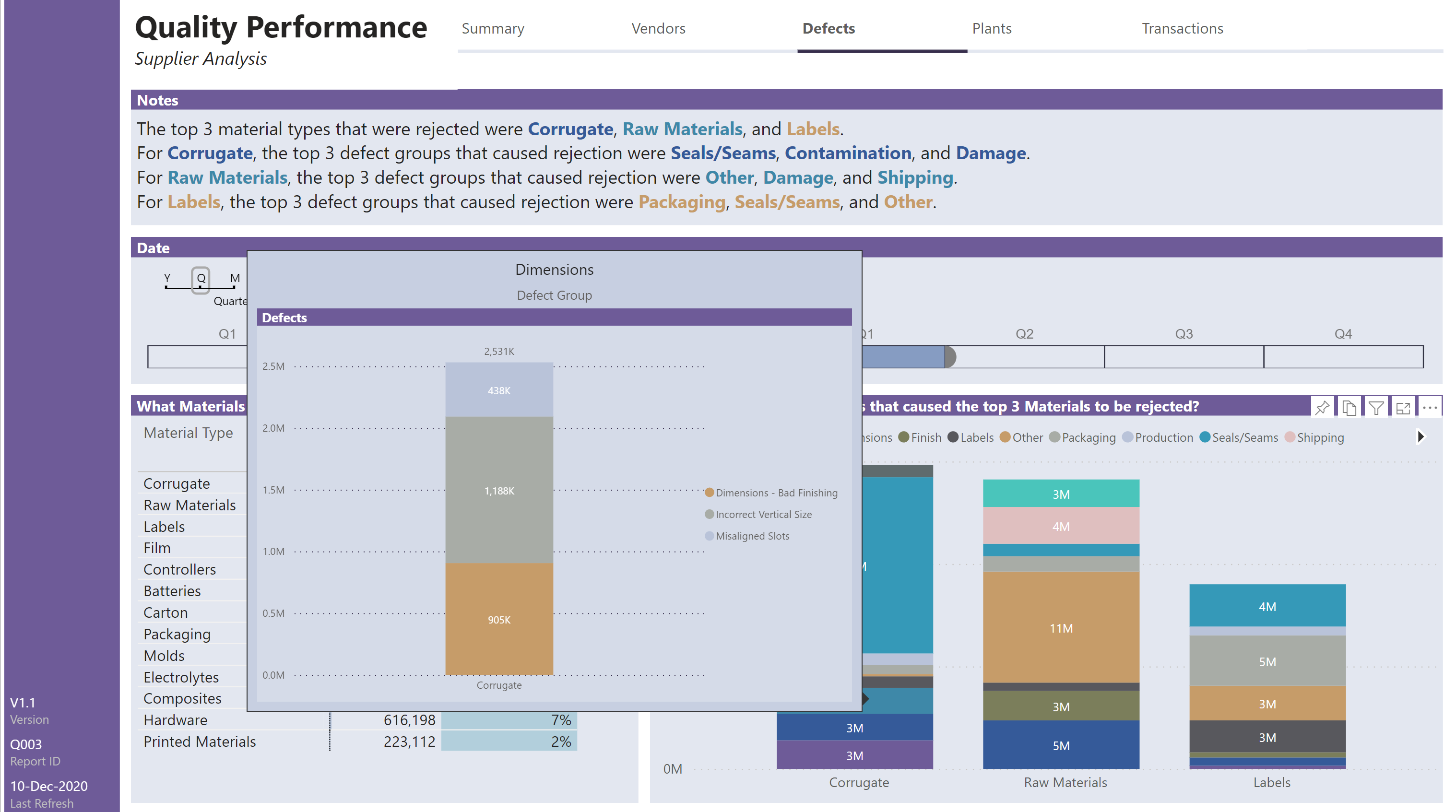
Defects (Tooltip):
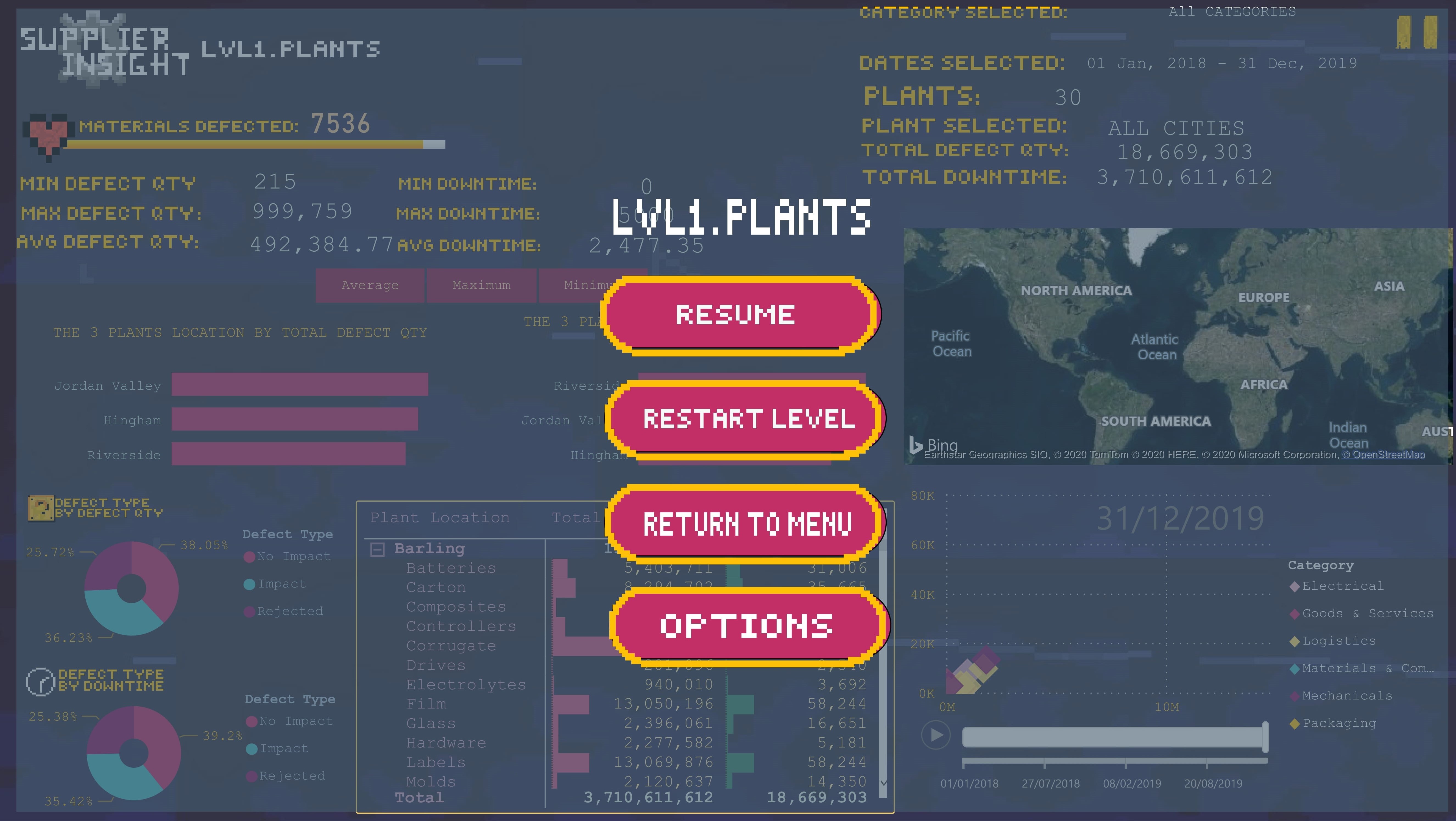
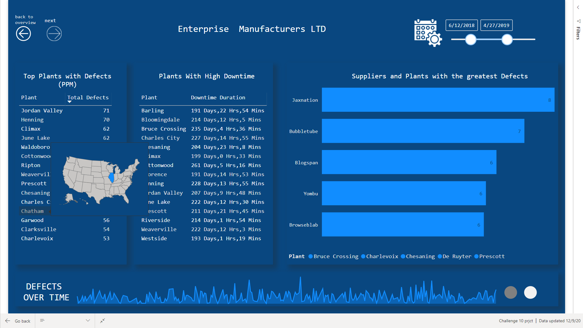
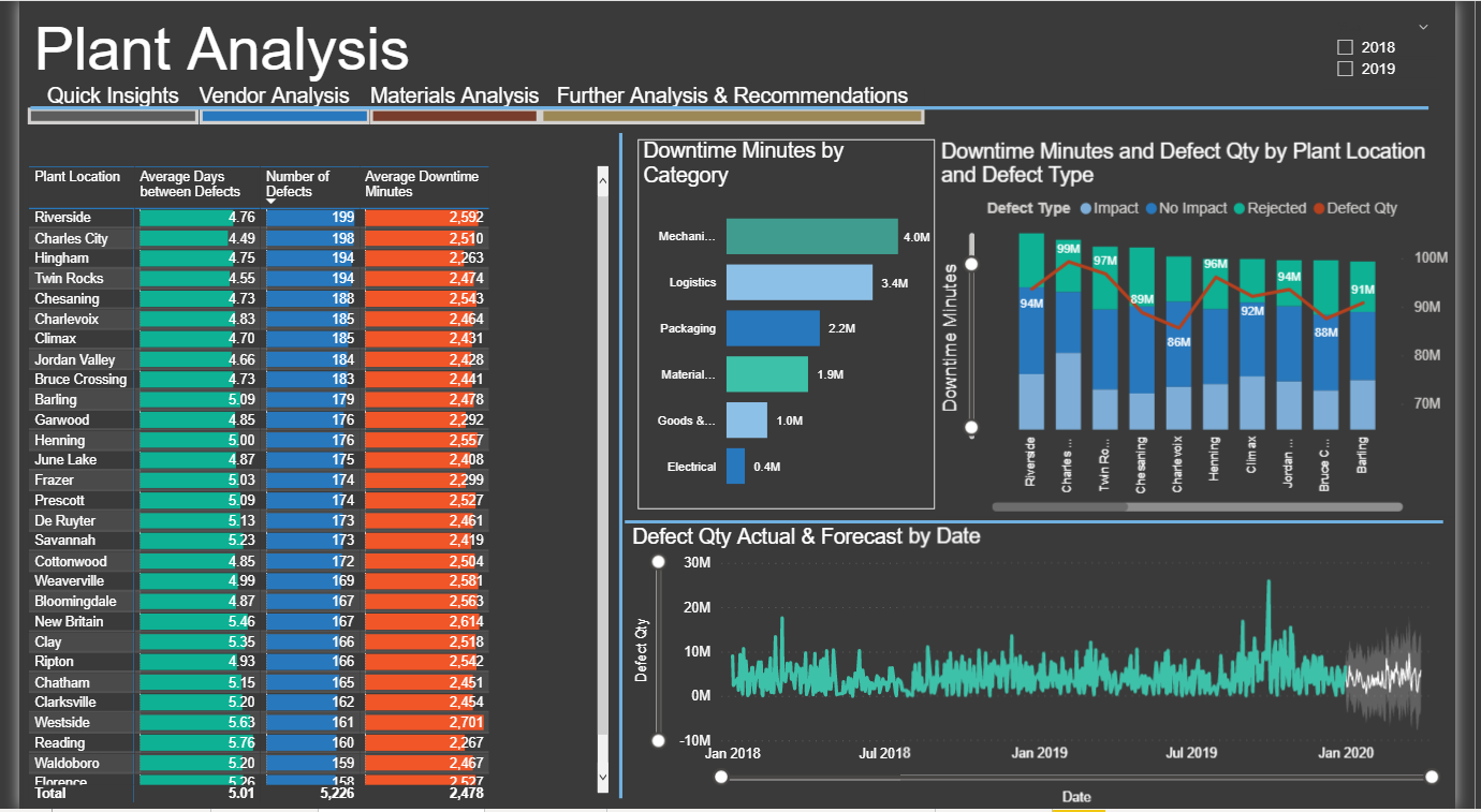
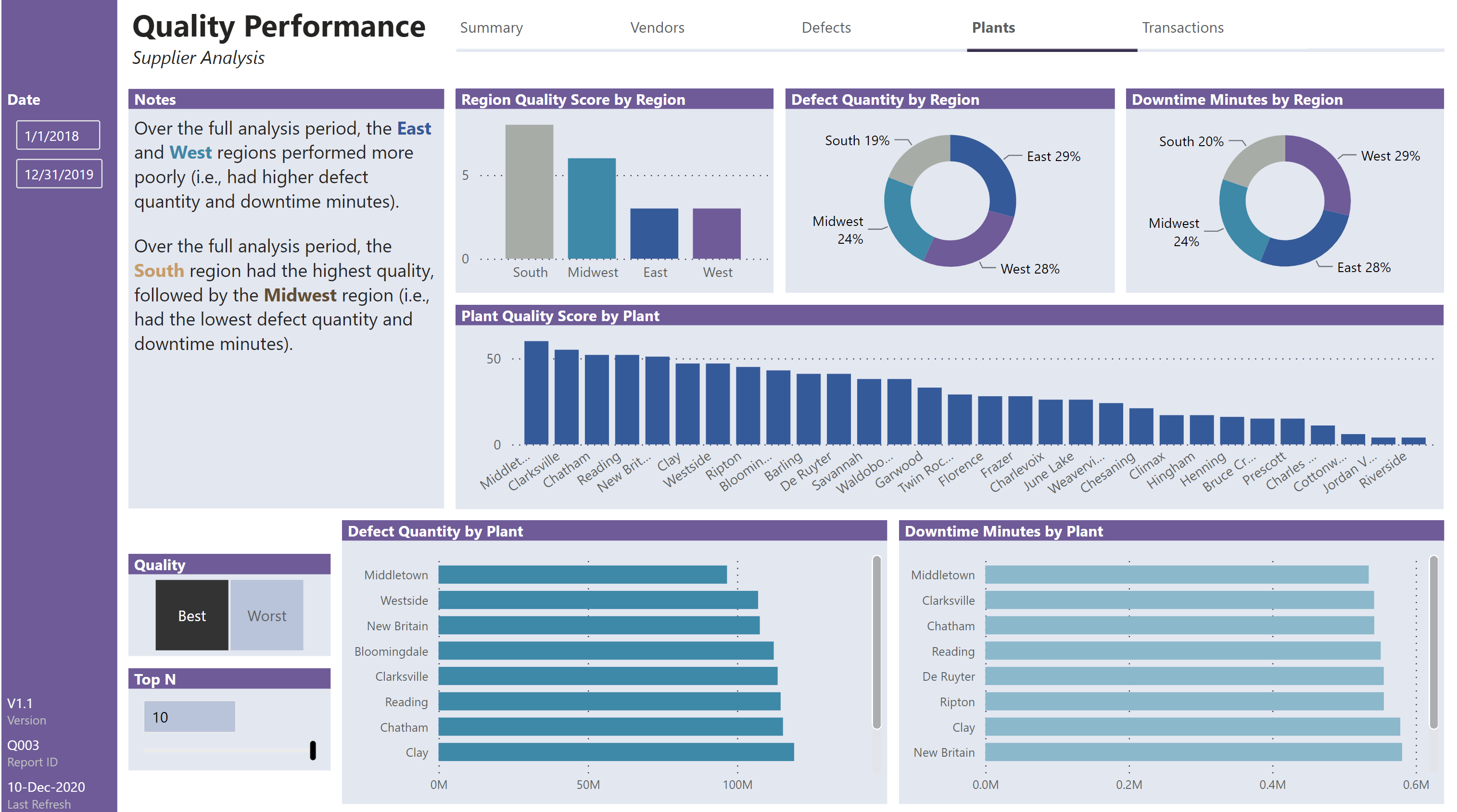
Plants:
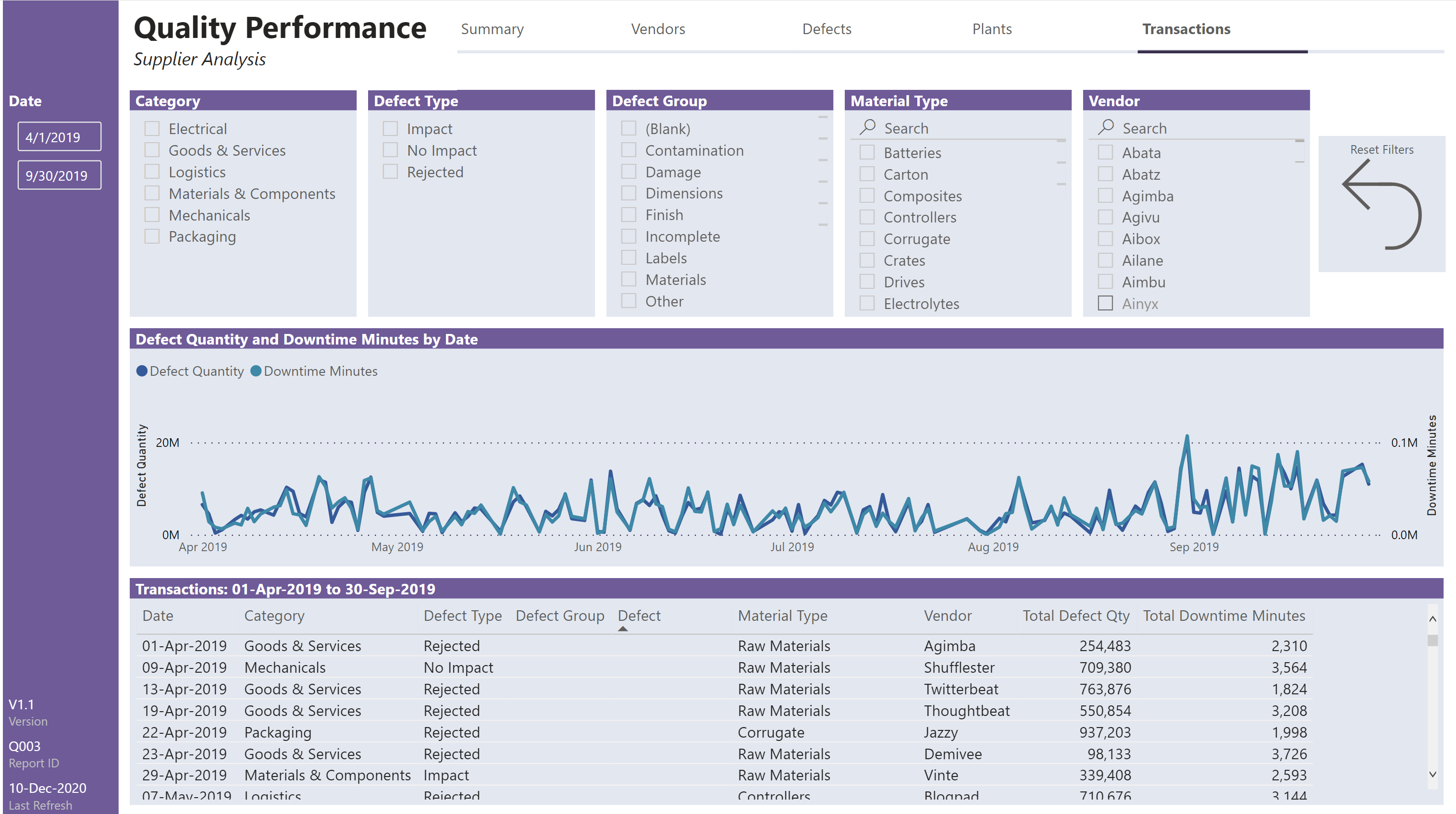
Transactions:
Here are the notes I kept during development:
My takeaways:
- I tried to innovate a new layout, but was not too happy with the outcome; I feel that the “happy place” that I came to with my challenge 8 submission was my place of comfort, and I’ve been uncomfortable in not making those same design and layout choices
- I really like the use of simple shadows around visuals to “form” the grid layout and to make the use of a single (white) colour base easy; I tried with this submission to use a white background with the lightest theme colour as the background for the visuals, and while it works well, I prefer the simple shadows and all-white design
What I didn't like/needs more work:
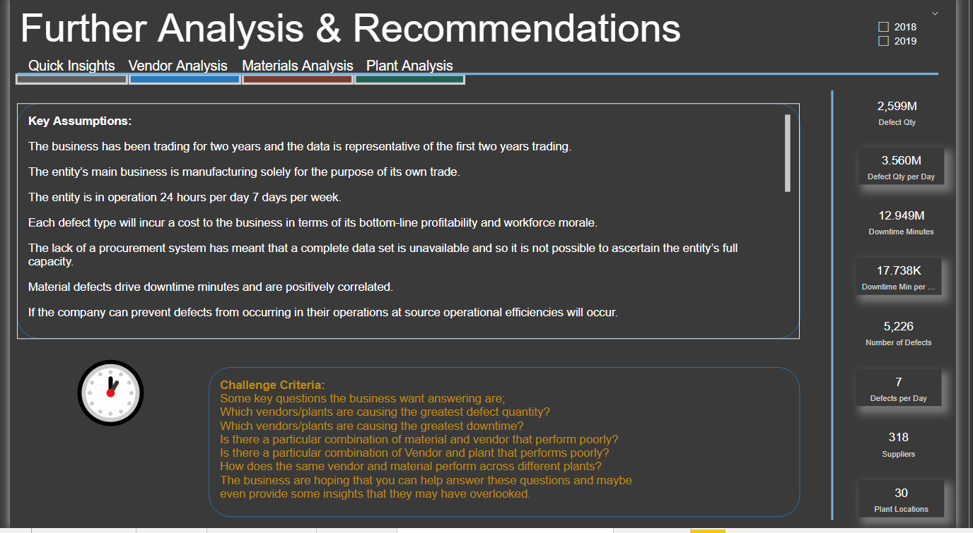
- the display of the top N plants best/worst by quality (both defect quantity and downtime minutes) don’t respond to the selection of a region (e.g., in the donut charts above them); I’m sure its just a small thing (ALLSELECTED vs. ALL?) but clarity was not achieved in the time I allotted myself for this challenge
- I had hoped to be able to assign defects to only a small number of defect groups, but ended-up with 14 groups, which cannot be shown clearly in the stacked column chart on the [Defects] page; this is data limited at this time, but in a real business scenario, I would pursue getting the number of different defects down from over 300 to a more reasonable, much smaller number and have business analysts properly assign defects to defect groups
- I had hoped to limit the time and effort involved in developing measures for the calculation and display of dynamic values in the various smart narrative textboxes, but ended-up spending significant time in the development of those measures, and, given the restriction of the time I had allocated for this challenge, I was not able to conduct a proper full testing effort; although the dynamic measure look good in the smart narratives, I remain unconvinced they display properly for the various slicer selection combinations
- I put in effort to source the latitude and longitude for plant cities anticipating a mapping effort, but a map visual didn’t end up making the cut, so the effort was in vain
Inspiration:
- being an independent consultant, I need to prepare my business transactions for my accountant annually; the time required for this annual effort cut drastically into the time I could spend on my C9 submission (hence the incomplete), but it did offer me the “opportunity” for prolonged exposure to the QuickBooks application. I decided to see if I could use some of their UI features in Power BI
- a similar navigation concept was employed by @sam.mckay in his C6 submission (which I really liked), so I know its not exactly new, but its new to me, so …
General:
I developed in a non-standard order:
- I actually started with the colour theme and navigation pattern before the challenge was even released (my file system folder was entitled “Challenge 10 UNKNOWN”)
the selection and implementation of the colour theme only took about 20 minutes fro start of search until full implementation; I feel this is a very good use of my skills, as I had spent a not-insignificant percentage of my time on previous challenges on selecting, implementing, and tweaking colours
- The navigation pattern was based on what I thought might be a four-page report, and was developed with measures for page names so changes would be easy when the time came; it turns out that I have five pages, and the extra page slipped easily into the navigation theme
- Once the challenge was released, I did all of the data loading and transformation of the base data from the supplied dataset
- I then opened two sessions of Tabular Editor, one on my new C10 file and one on my previous C9 PBIX file, then copied and pasted all admin and key measures from my C9 file to my C10 file (yes there were lots of errors, but I didn’t need to re-create the names or folders, so a real time saver
- With my C9 and C10 files both opened to the Power Query editor, I copied the [Dates] table, [Last Refresh] table, and data parameters from my C9 model to my C10 file
- Augmented [Plants] table with state, region, country, latitude, and longitude to prepare in case mapping was to be used
- Normally I would do the bulk of my DAX measures next, but this time I decided to only develop what was needed by my visualizations, so I roughed-out what visuals I would like where on each page using hidden “Work” pages, and then developed the DAX measures required
- Plants: I developed the [Quality] lookup table and slicer, [TopN] what-if parameter and slicer, plant and region defect and downtime measures, and plant and region quality score measures
- Vendors: I copied the [Quality] and [TopN] slicers from the [Plants] page, as well as the [Defect Quality], [Downtime Minutes], and [Quality Score] visuals from the [Plants] page and adjusted to suit, developing [Vendor] measures where needed
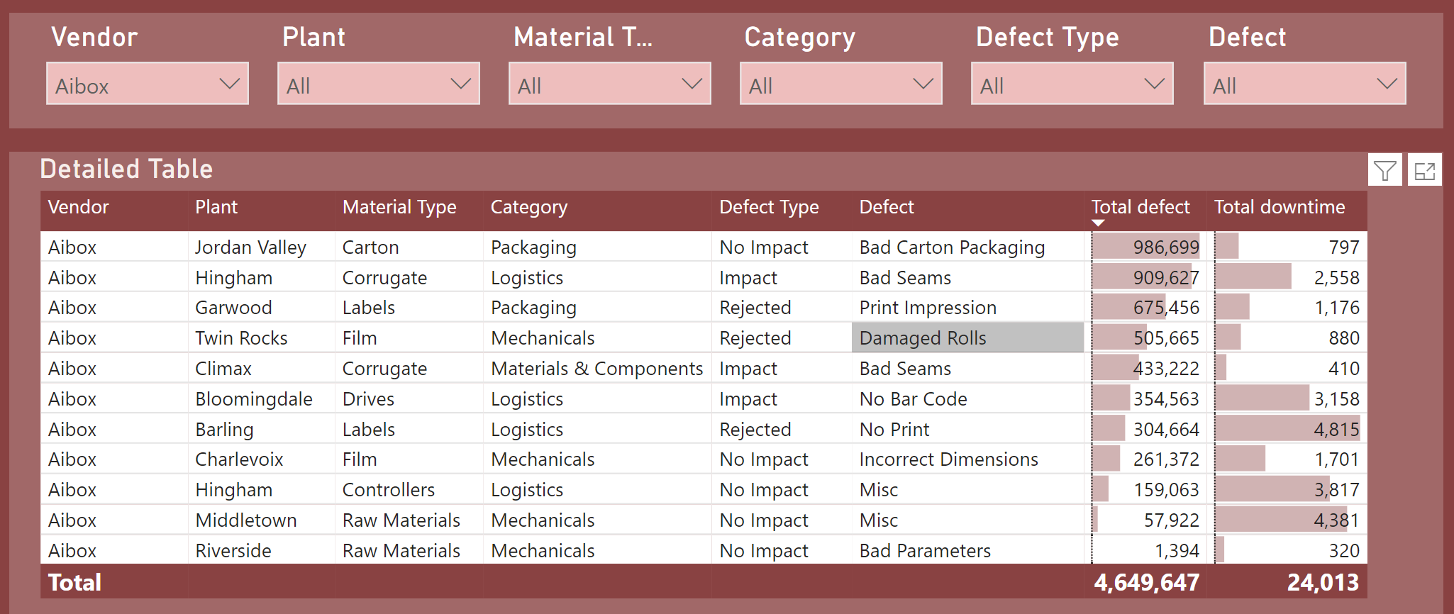
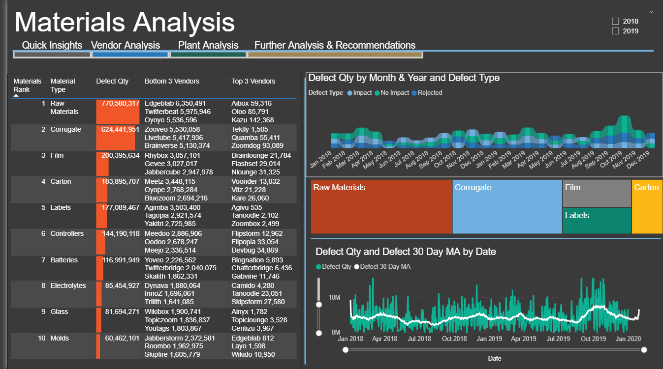
- Defects: I decided to concentrate only on rejections, and included a table of material types along with their associated defect quantities and downtime minutes; I also used a stacked bar chart to show the top 3 rejected materials, the defect groups that corresponded to these material types, and a custom tooltip stacked bar chart to drill-through to the component defects for each defect group. The goal here ws to not to develop too many measures, but it didn’t work-out at all, as I ended-up developing 28 measures to calculate and display to “top 3” values
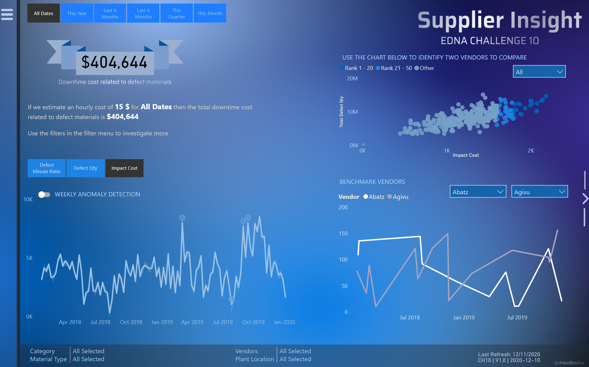
- Transactions: decided to permit more detailed analysis through the selection of many slicers, along with a 2-line line chart to showcase the relationship (or not) of defect quantity to downtime minutes for a particular combination of slicer selections
- Summary: I developed the category and material type defect and downtime measures, and plant, vendor, category, and material type best and worst quality narrative measures
Setup:
Custom Visuals:
- Timeline Slicer 2.1.1.0 from Microsoft
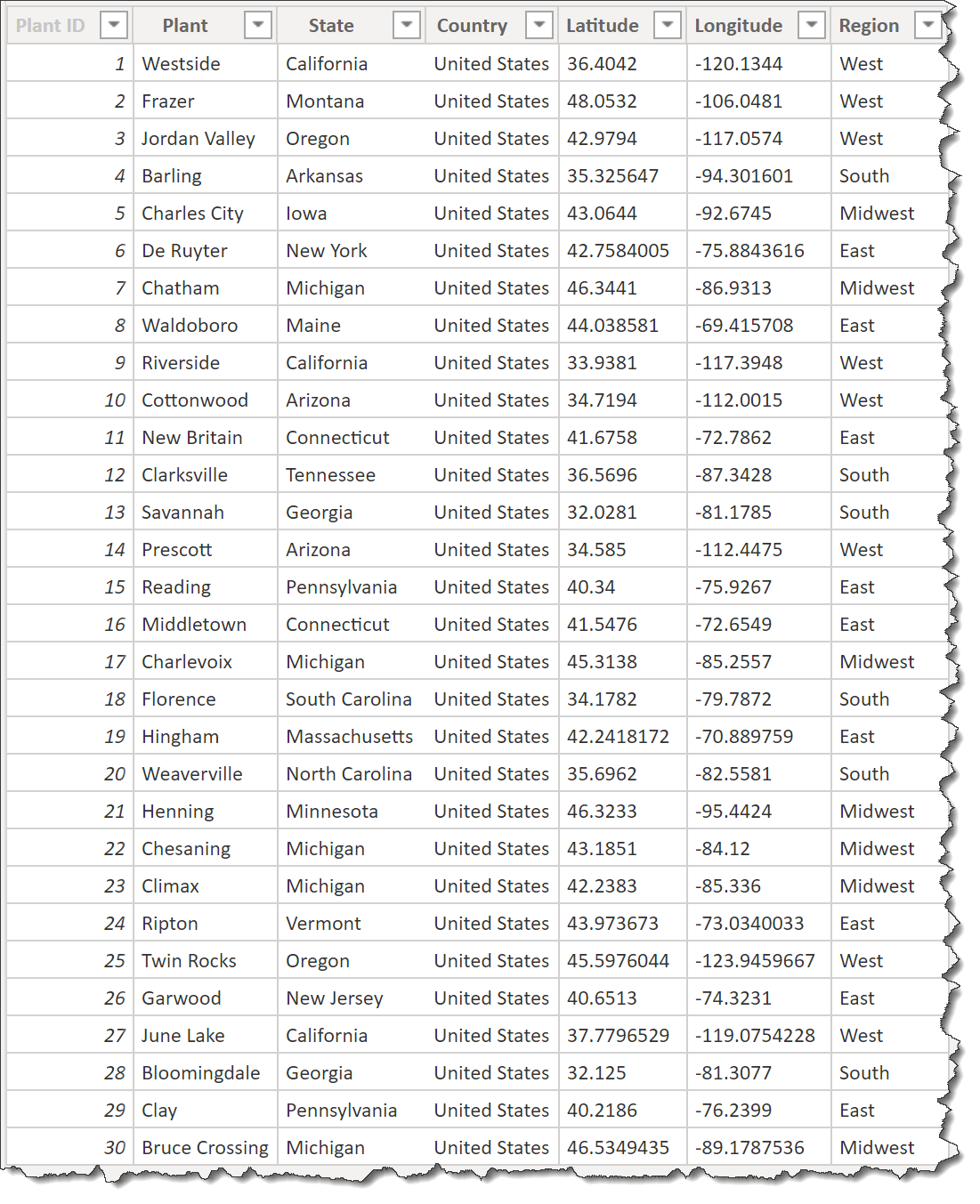
Plants:
- augmented [Plants] dataset with states (used internet search to find state names for plant cities), regions, and country = “United States”
- augmented [Plants] dataset with latitude and longitude sourced from same source used for eDNA C4 Delivery App Review (https://simplemaps.com/data/us-cities)
- was able to get latitude and longitude for 22/30, and searched the internet (https://www.travelmath.com/) to obtain the latitude and longitude for the remaining 8/30
- ([Plants] table now looks like this:
Defects:
- augmented [Defects] dataset with “Defect Group”; edited Excel file directly to assign 308 defects to 14 defect groups (I would have preferred to use DAX in a calculated column like previous challenge entries, but there were too many defects)
Data Loading/Data Transformations:
- imported tables from Excel data source
- renamed [Supplier Quality] table to [Transactions] (I prefer single-word table names where possible; easier to read DAX)
- added eDNA Extended Date Table as [fxDatesQuery]
- used the [fxDatesQuery] function to create [Dates] table; marked as date table
- changed all date formats in [Dates] table to dd-mmm-yyyy [by typing “dd-mmm-yyyy” into “Format” box directly]
- moved [fxDatesQuery] function into a [Parameters and Functions] group
- moved all source data tables and [Dates] table into a [Data Model] group
- added empty tables for [Key Measures], [Admin Measures], [Narrative Measures]
- moved [Key Measures], [Admin Measures], [Narrative Measures] to [Measure Groups] group
- opened 2 sessions of Tabular Editor and copied all measures from C8 PBIX to C10 PBIX (this file) for [Narrative Measures]
- opened 2 sessions of Tabular Editor and copied all measures from C9 PBIX to C10 PBIX (this file) for [Key Measures], [Admin Measures]
- opened C9 PBIX and C10 PBIX (this file) both to Power Query, then copied [fxNow, fxToday, fxStartDate, fxEndDate, fxFirstDataDate, fxLastDataDate]
- moved [[fxNow, fxToday, fxStartDate, fxEndDate, fxFirstDataDate, fxLastDataDate] to [Parameters and Functions] group
- adjusted [fxFirstDataDate] and [fxLastDataDate] measures as required, then updated [Dates] query to use [fxStartDate] and [fxEndDate] parameters
- opened C9 PBIX and C10 PBIX (this file) both to Power Query, then copied [Last Refresh] table
- moved [Last Refresh] to [Supporting Tables] group
[Transactions] table:
-
merged [Transactions] table with [Categories] table, keeping only [Category ID] column and removing [Category] column
-
merged [Transactions] table with [Defects] table, keeping only [Defect ID] column and removing [Defect] column
-
merged [Transactions] table with [Defect Types] table, keeping only [Defect Type ID] column and removing [Defect Type] column
-
merged [Transactions] table with [Material Types] table, keeping only [Material Type ID] column and removing [Material Type] column
-
merged [Transactions] table with [Plants] table, keeping only [Plant ID] column and removing [Plant Location] column
-
used “Properties” pane in Model view to hide all ID fields
-
organized all [Admin Measures] into subfolders using Model view as displayed in @JarrettM’s video https://www.youtube.com/watch?v=J_qZ_S-ghoc
-
developed a custom “Quality Score” combining rankings based on defect quantity and downtime minutes: highest quality = lowest ranking
-
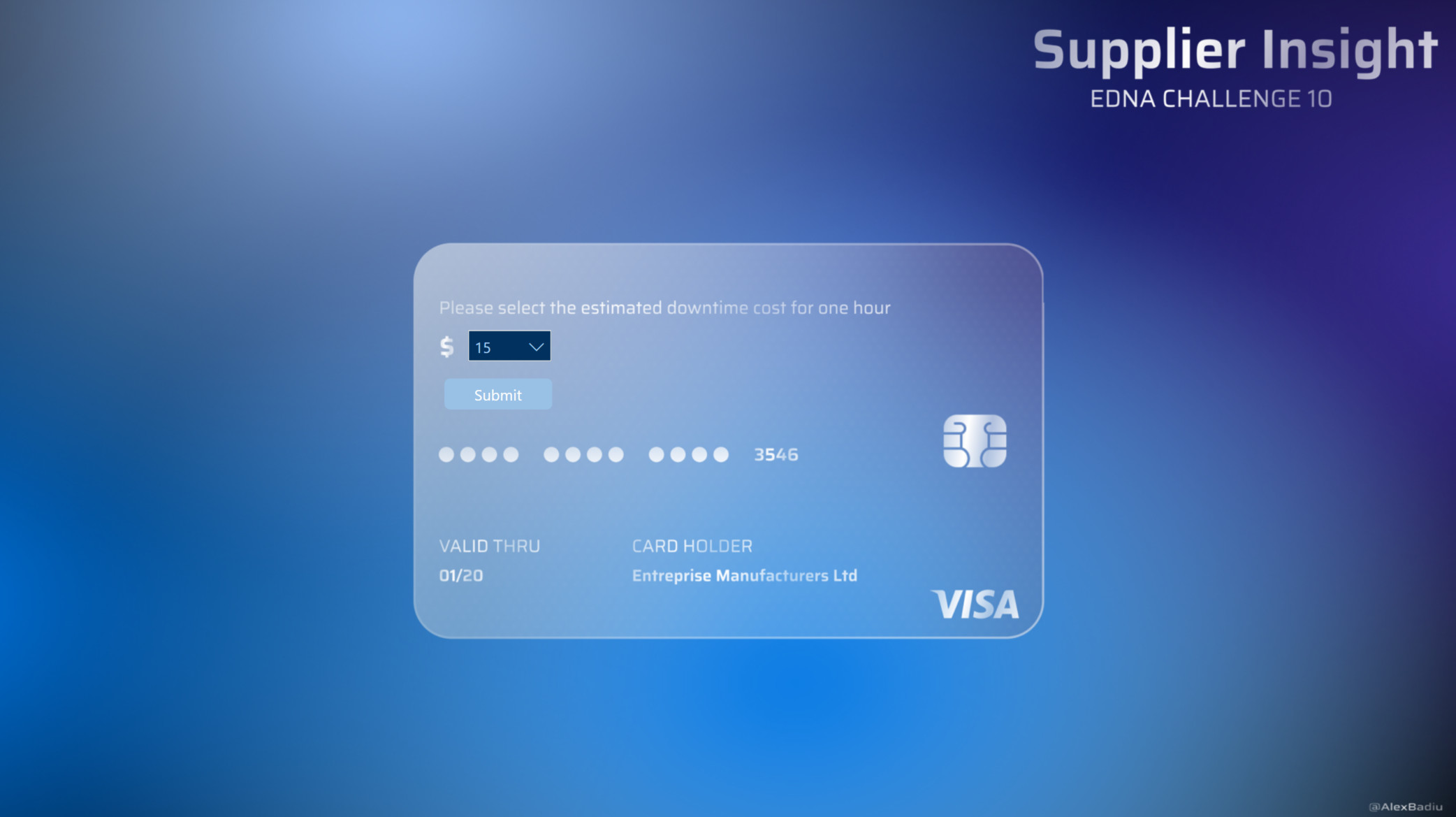
added “top N” what-if parameter (whole number, 1-10, increment 1, default 5, add slicer to [Plants] page
-
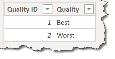
added supporting table for “Quality”
Data Model:
- deleted all relationships auto-generated by Power BI
- arranged tables into “waterfall” layout, with lookup tables at top, fact table at bottom, measure tables at top-right, and supporting tables at bottom-left
- created 1-to-many relationships:
- Categories[Category ID] → Transactions[Category ID]
- Defect Types[Defect Type ID] → Transactions[Defect Type ID]
- Defects[Defect ID] → Transactions[Defect ID]
- Material Types[Material Type ID] → Transactions[Material Type ID]
- Plants[Plant ID] → Transactions[Plant ID]
DAX Calculations:
- added “Admin” measures for:
- [Is Desktop] using difference between NOW() and UTCNOW() to determine user interface
- [Is Service] using difference between USERNAME() and USERPRINCIPALNAME() to determine user interface
- [… Tooltip] measures to use [Is Desktop] and [Is Service] to display the appropriate tooltip regardless of interface
- used eDNA DAX Clean Up tool to format all DAX measures and calculated columns https://analysthub.enterprisedna.co/apps/dax
- added “Defect” measures using measure branching:
Defect Quantity =
SUM( Transactions[Total Defect Qty] )

Plant Defect Quantity Rank ASC =
RANKX( ALL( Plants ), [Defect Quantity],, ASC )

Plant Defect Quantity Rank DESC =
RANKX( ALL( Plants ), [Defect Quantity],, DESC )

Plant Defect Quantity Rank =
VAR _Quality = SELECTEDVALUE( Quality[Quality] )
VAR _TopN = [TopN Parameter Value]
VAR _Rank = IF( _quality = "Best", [Plant Defect Quantity Rank ASC], [Plant Defect Quantity Rank DESC] )
VAR _Result = IF( _Rank <= _TopN, _Rank, BLANK() )
RETURN
_Result
- added “Plant Downtime Minutes” measures similar to the above
- added “Vendor Defect Quantity” measures similar to the above
- added “Vendor Downtime Minutes” measures similar to the above
- added “Category Defect Quantity” measures similar to the above
- added “Category Downtime Minutes” measures similar to the above
- added “Material Type Defect Quantity” measures similar to the above
- added “Material Type Downtime Minutes” measures similar to the above
- added Narrative Measures including 8 measures for Page 1 (Summary), one each for the best and worst quality performance for plant, vendor, category, and material type; e.g.,
P1 V1a (Plant Best Quality) =
VAR _vTablePlants = ADDCOLUMNS(
    SUMMARIZE( Plants, Plants[Plant] ),
    "@PlantBestQualityRank", [Plant Defect Quantity Rank DESC] + [Plant Downtime Minutes Rank DESC],
    "@PlantWorstQualityRank", [Plant Defect Quantity Rank ASC] + [Plant Downtime Minutes Rank ASC]
)
VAR _Result = CALCULATE(
    MIN( Plants[Plant] ),
    TOPN( 1, _vTablePlants, [@PlantBestQualityRank] )
)
RETURN
_Result
- included 12 measures for Page 3 (Defects), one for each of the top 3 rejected material types, and 3 for each of the top 3 defect groups that were associated with the 3 material types; e.g.,
Rejected Material 1 =
VAR _vTable = ADDCOLUMNS(
    SUMMARIZE( 'Material Types', 'Material Types'[Material Type] ),
    "@DefectQuantity", [Defect Quantity],
    "@DefectQuantityRank", RANKX( 'Material Types', [Defect Quantity],, DESC )
    )
VAR _First = CALCULATE( MAX( 'Material Types'[Material Type] ), FILTER( _vTable, [@DefectQuantityRank] = 1 ) )
VAR _Second = CALCULATE( MAX( 'Material Types'[Material Type] ), FILTER( _vTable, [@DefectQuantityRank] = 2 ) )
VAR _Third = CALCULATE( MAX( 'Material Types'[Material Type] ), FILTER( _vTable, [@DefectQuantityRank] = 3 ) )
VAR _Result = _First
RETURN
_Result

Rejected Material 1 Defect Group 1 =
VAR _Material = [Rejected Material 1]
VAR _vTable = SUMMARIZECOLUMNS(
  'Material Types'[Material Type],
    Defects[Defect Group],
    "@DefectQuantity", [Defect Quantity],
    "@DefectGroupDefectQuantityRankDESC", [Defect Group Defect Quantity Rank DESC]
)
VAR _Result = CALCULATE(
    MAX( Defects[Defect Group] ),
    FILTER(
        _vTable,
      'Material Types'[Material Type] = _Material &&
       [@DefectGroupDefectQuantityRankDESC] = 1
    )
)
RETURN
_Result
Visualizations:
- used Segoe (Bold) 10 pt for all titles, font colour = white, background colour = theme 1
- used Segoe UI for all labels
- made extensive use of the “Visualizations \ Format \ General” section to adjust the X/Y/W/H of every visual to be multiples of 10 so size and alignment of visuals was consistent within a page and across pages (e.g., navigator button underlines, etc.)
- hid all pages except for [Summary] so the inherent page navigation sidebar would not be displayed when viewing the report in the Power BI Service
- created numerous hidden “Work” pages to aid in the development effort and help identify the visuals/DAX calculations that would be most beneficial
General:
- set “General \ Maintain layer order” to “On” for all visuals
- made extensive use of the Selection pane to rename all visuals, set the correct order, and group where appropriate (i.e., sidebar, header)
Sidebar:
- used 100-pixel wide rectangle for left sidebar on all pages in main theme colour (HEX #6E5B98) (I used this as well in my C8 submission, but I really like it and think this is likely to become a fixture of my reports from now on)
- used multi-row card at page bottom to show admin info measures (Version, Report ID, Last Refresh)
- adjusted to minimum dimensions (X/Y/W/H 0/607/80/113) to locate in bottom-left corner
- used date range slicer with “responsive” set to “On”, then reduced width to fit into sidebar; disabled slider
Header:
- used admin measures to set the page titles, then in each navigation button used button text formatted by field value to reference the appropriate page title measure
- used 4 buttons for navigation complete with interactivity or “bounce” (default: Segoe UI 10 pt; on hover: Segoe Bold 10 pt; on press: Segoe Bold 10 pt, fill theme colour 8, 60% lighter (#E3E7F0), 50% transparency)
- used line for header underline in theme colour 8, 60% lighter (#E3E7F0)
- used line for underline of currently selected button in main theme colour (#6E5B98); made line 20 pixels wider than navigation buttons (so 170 px) and adjusted X coordinate to be 10 pixels left of the button to counteract the 10-pixel gap inherent at the start and end of a line shape in Power BI
- adjusted Y coordinate of underlines to be 9 pixels higher than perfect alignment with buttons so buttons would perfectly overlap blank space above underlines
- used tooltip measures in concert with the Is Desktop / In Service admin measures to show only the correct tooltip for the environment
Page 1 Title = "Summary"

Tooltip Page 1 =
VAR _TooltipSuffix = COMBINEVALUES(" ", "to go to the", [Page 1 Title], "page...")
RETURN
    SWITCH (
        TRUE (),
        [Is Desktop] = TRUE (), COMBINEVALUES ( " ", "CRTL+click", _TooltipSuffix ),
        -tooltip for Power BI Desktop
        [Is Service] = TRUE (), COMBINEVALUES ( " ", "Click", _TooltipSuffix ),
        -tooltip for Power BI Service
        BLANK ()
    )
- got all navigation buttons fully working and set actions and tooltips on the single [Summary] page before duplicating the page 3 times for Suppliers, Defects, and Plants
- removed actions and tooltips from the “active” button on each page to disable interactivity
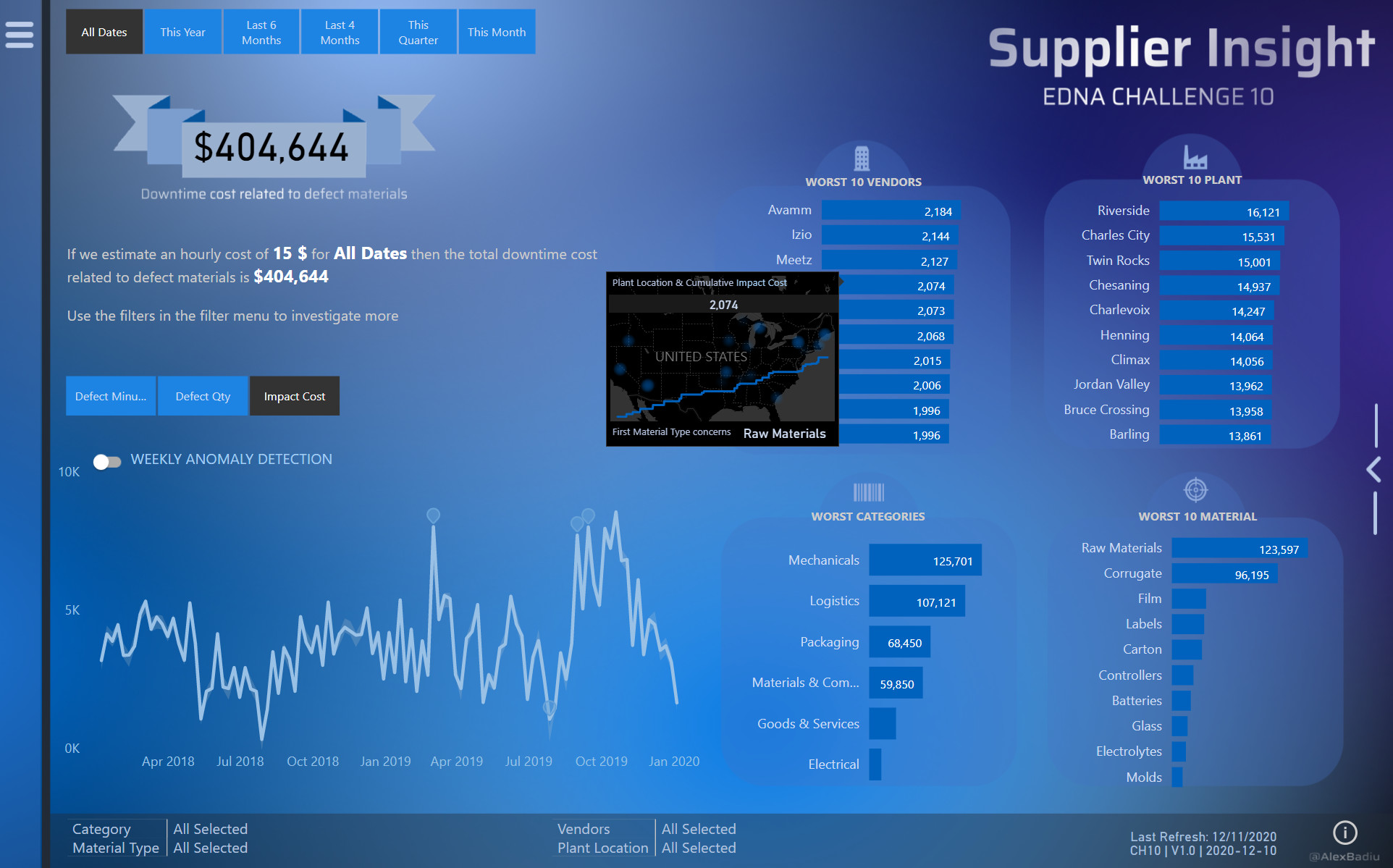
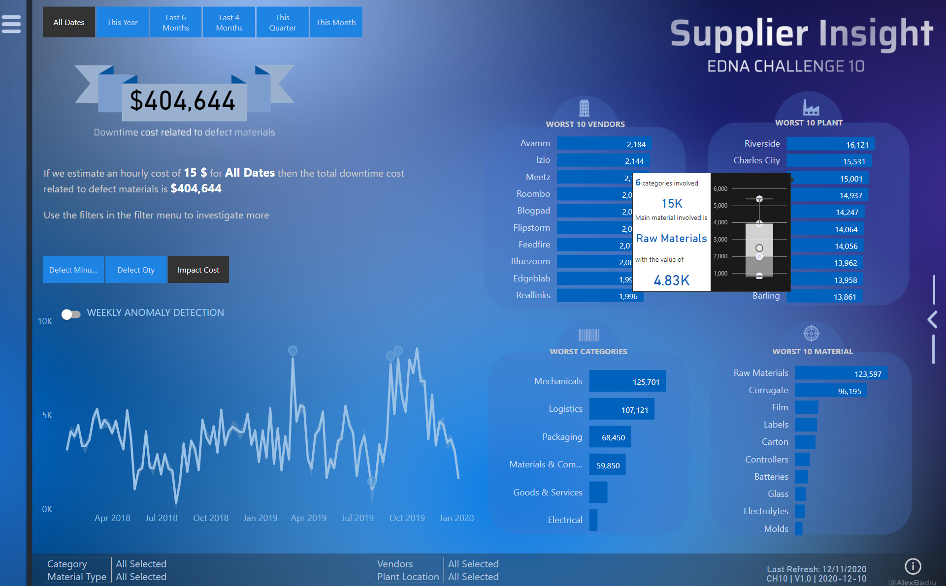
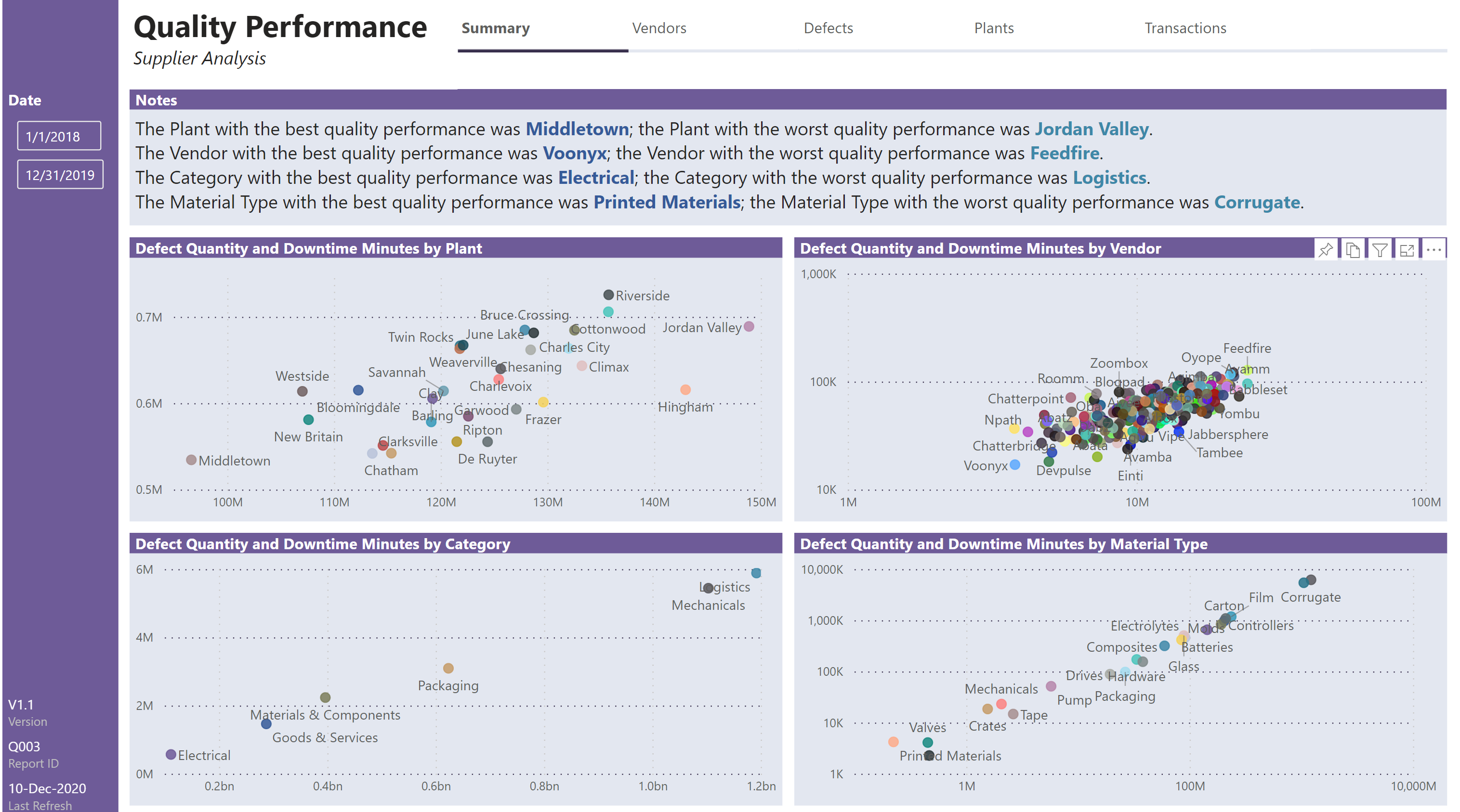
Summary:
- used smart narrative textbox to show static notes and dynamic measures, namely those for the best and worst quality performance for plant, vendor, category, and material type.
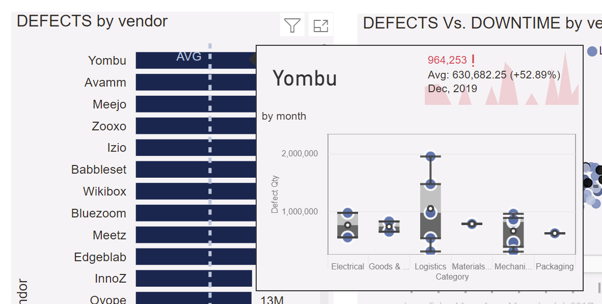
- used standard scatter chart to show defect quantity and downtime minutes by Plant (linear x-axis and y-axis)
- used standard scatter chart to show defect quantity and downtime minutes by Vendor (log x-axis and y-axis)
- used standard scatter chart to show defect quantity and downtime minutes by Category (linear x-axis and y-axis)
- used standard scatter chart to show defect quantity and downtime minutes by Material Type (log x-axis and y-axis)
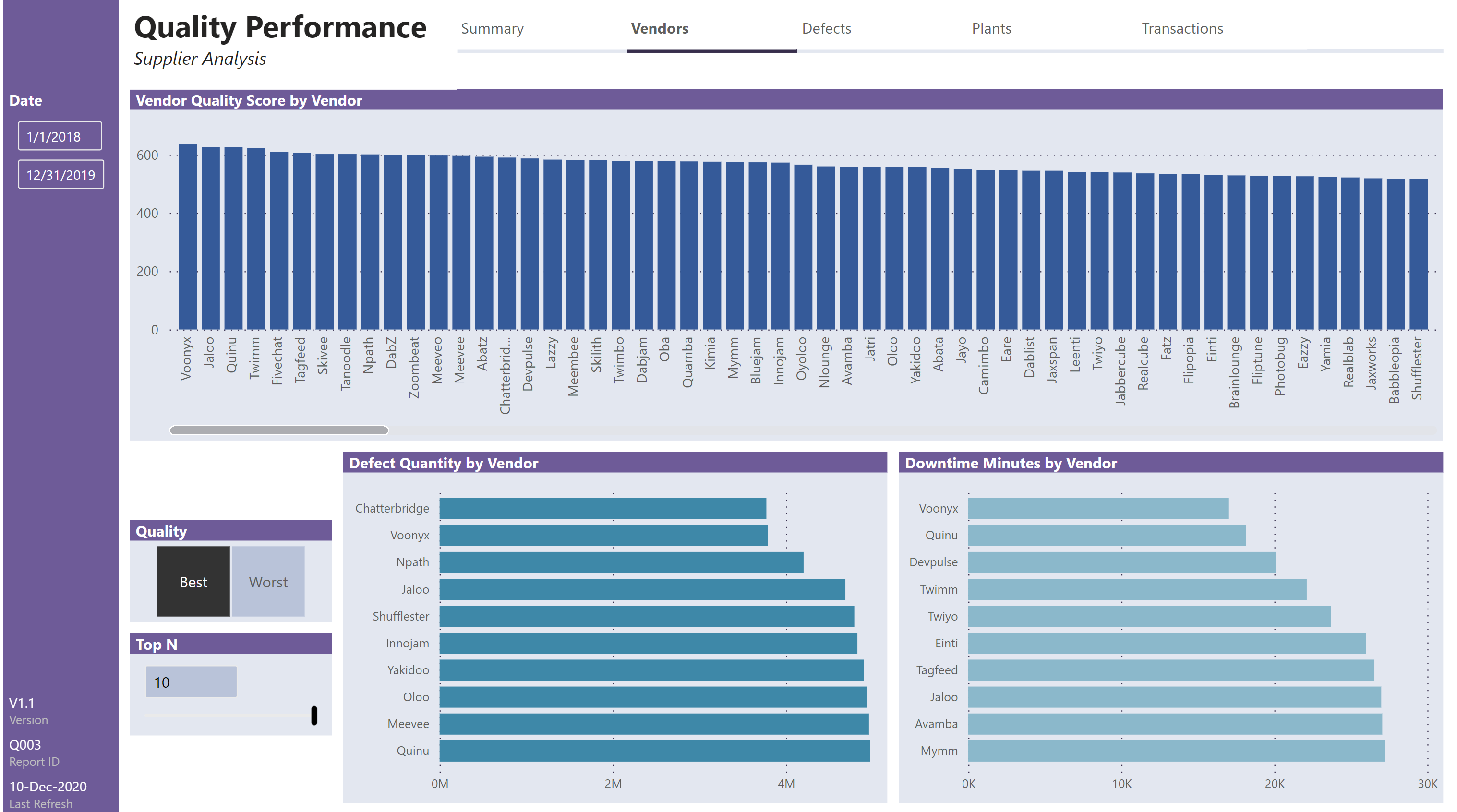
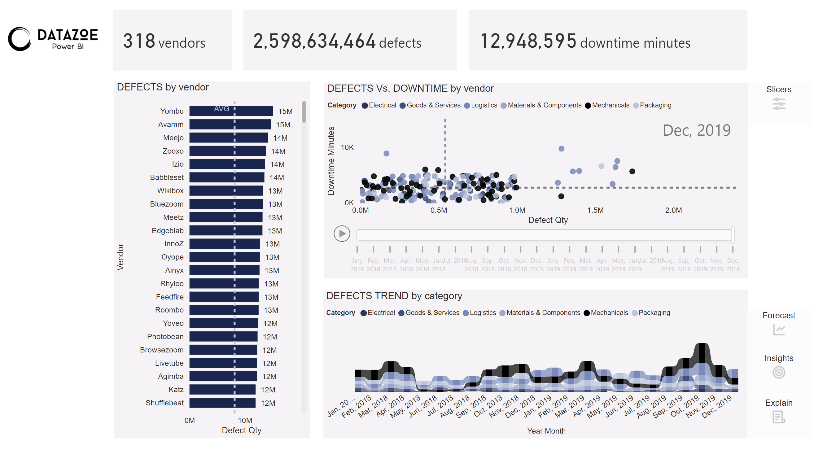
Vendors:
- used column chart to show quality score by vendor (y-axis gridline theme 1 colour 50% darker)
- used bar charts to show defect quantity and downtime minutes by vendor, complete with best/worst toggle and top N what-if parameter
- added slicer for quality (Best/Worst), horizontal, single select, background lightest theme colour, font Segoe UI 10 pt
- used Top N what-if parameter slicer (see notes under [Data Loading/Data Transformations] above), responsive off, numeric input background lightest theme colour, font Segoe UI 10 pt
- used selections of quality slicer and Top N what-if parameter to control the display of the defect quantity bar chart, showing only the vendors with non-blank defect quantity rank (x-axis gridline theme 1 colour 50% darker)
- used selections of quality slicer and Top N what-if parameter to control the display of the downtime minutes bar chart, showing only the vendors with non-blank downtime minutes rank (x-axis gridline theme 1 colour 50% darker)
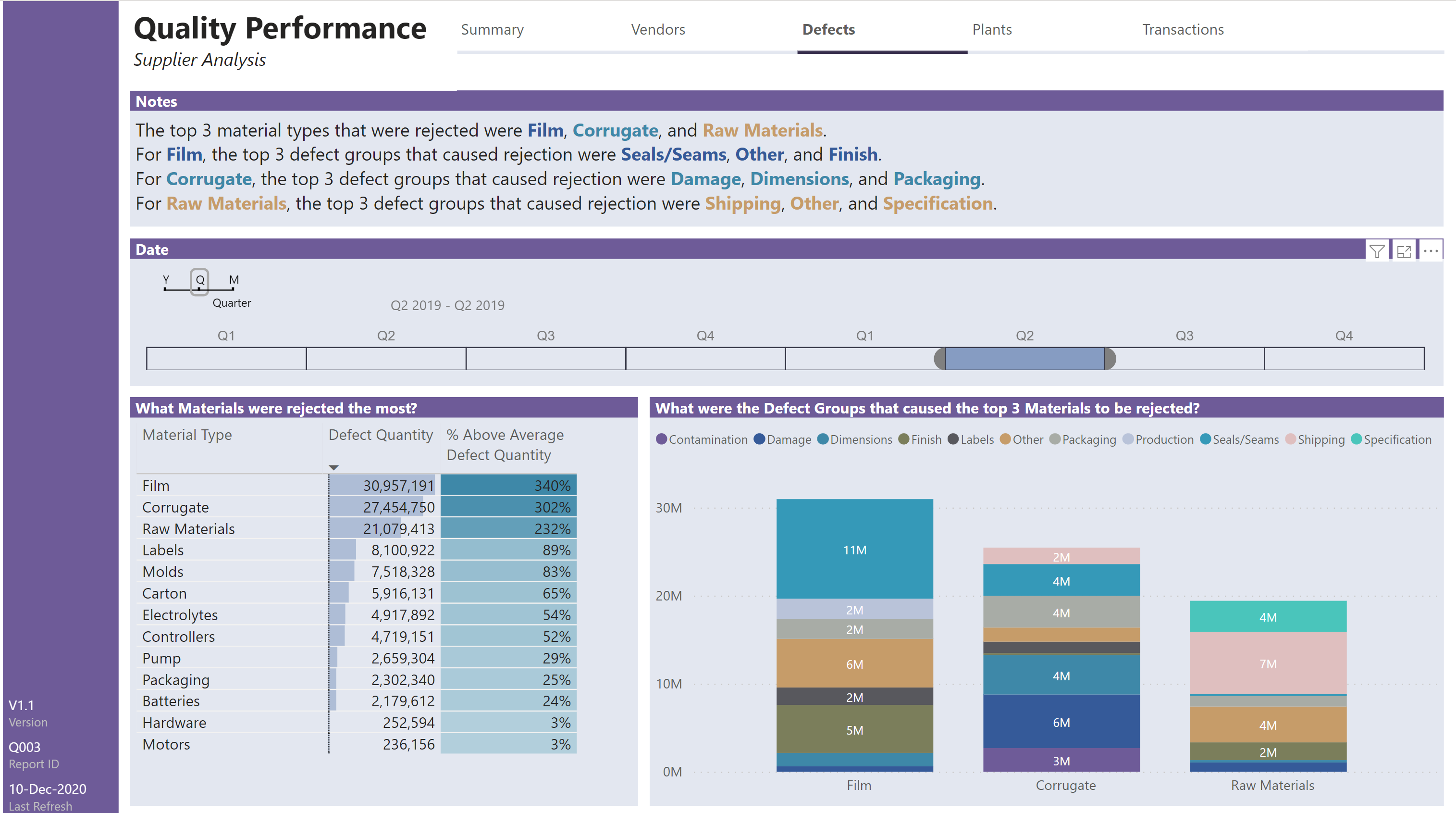
Defects:
- [I chose to dedicate this page to a presentation of defects that caused rejection; I included a hidden Defect Type slicer set to “Rejected”.]
- used smart narrative textbox to display dynamic measures for the top 3 rejected material types, along with the top 3 defect groups for each of the top 3 rejected material types
- used Timeline Slicer custom visual set to show only years, quarters, and months
- used Defect Type slicer (vertical, single select, item background colour theme 8 60% lighter)
- used Quarter & Year slicer (vertical, single select, item background colour theme 8 60% lighter)
- used standard table to display the rejected materials by defect quantity (descending) c/w data bars
- used standard stacked column chart to display the top 3 rejected materials and the defect groups that caused their rejection
- on stacked column chart, set “Visualizations \ Tooltip \ Type” to “Report page” and selected “Page” = “Tooltip Defect Group”
Tooltip Defect Group:
- adjusted page size to custom 640x480 pixels, set “Visualizations \ Format \ Page Information \ Tooltip” to “On”; set background to theme 8 20% lighter
- used standard stacked column chart to display the defects that were inherent in the selected defect group for the selected material
- on stacked column chart set dimensions to X/Y/W/H 10/60/620/410 to set 10 pixel-wide border
Plants:
- used smart narrative textbox to show the regions that had the lowest and highest quality performance; this was not as dynamic as I ran out-of-time in preparing for this challenge (although the data was manually checked for the full period and each quarter, the “dynamic” measures are actually just bolded and coloured static text)
- used donut charts to show quality score, defect quantity, and downtime minutes by region
- used column chart to show quality score by plant (y-axis gridline theme 1 colour 50% darker)
- used bar charts to show defect quantity and downtime minutes by plant, complete with best/worst toggle and top N what-if parameter
- added slicer for quality (Best/Worst), horizontal, single select, background lightest theme colour, font Segoe UI 10 pt
- used Top N what-if parameter slicer (see notes under [Data Loading/Data Transformations] above), responsive off, numeric input background lightest theme colour, font Segoe UI 10 pt
- used selections of quality slicer and Top N what-if parameter to control the display of the defect quantity bar chart, showing only the plants with non-blank defect quantity rank (x-axis gridline theme 1 colour 50% darker)
- used selections of quality slicer and Top N what-if parameter to control the display of the downtime minutes bar chart, showing only the plants with non-blank downtime minutes rank (x-axis gridline theme 1 colour 50% darker)
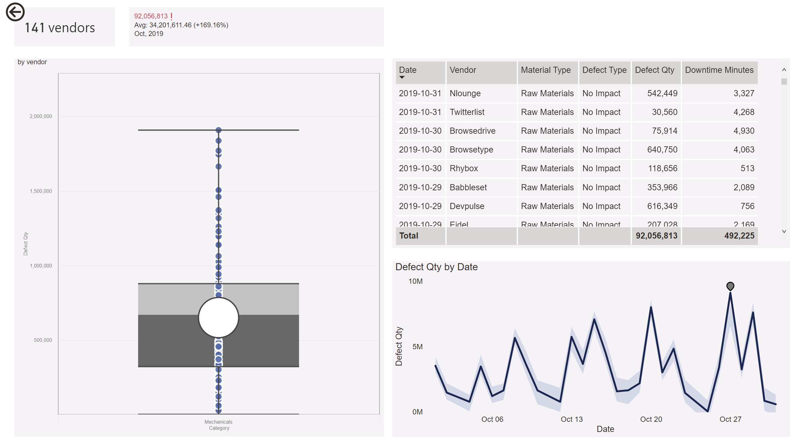
Transactions:
- used 5 slicers for category, defect type, defect group, material type, and vendor, each multi-select and material type and vendor with search fields
- used “reset filters” button and bookmark to easily clear all slicer selections
- used standard line chart with lines for defect quantity (1st y-axis) and downtime minutes (2nd y-axis) to easily show the relationship between defect quantity and downtime minutes for any combination of slicer selections
- used standard table to show date, category, defect type, defect group, defect, vendor, defect quantity, and downtime minutes; included selected date range in table title

 Your report looks awesome! The top navigation is slick, and the side bar with the details at the bottom left are a professional touch too. I like all the scatters! I like it all really ha. Also, what is that date thing you used on the Defects page?