Dear all,
Once again, the EDNA challenge is over. Challenge n10 was special. It reaches the milestone of 30 weeks since the beginning of this initiative. 10 challenges of unique scenarios and solutions from a very dynamic, full of creativity and open community.
For me it is the 8th consecutive challenge and I know that I will come back to the first two challenges one day and finish what I started 
I considered Challenge n10 as being easier than the previous ones, as from the model point of view it was less complicated. But it was far from being easy. In my point of view, the complexity shifted to the analysis and design. We had only 2 metrics to play with: minutes and defect quantity plus several dimensions.
What I found difficult this time was finding the right data story. What to present, in which order, what is the message I want to transmit, what does my analysis bring new to the table.
I also had some ideas which, unfortunately I had to abandon and start over. Building this report was not a smooth path for me as I tried as always to create something new (in terms of design techniques, navigation or analytical techniques).
One of my favorite quotes is : “Shoot for the moon. Even if you miss it, you will land among stars”
So I started with all kinds of crazy ideas. Sometimes they work, sometimes they don’t, sometimes it helps me adapt and find a new solution, and sometimes, it takes time and brings no result. It is time well spent thinking, testing & prototyping.
What I try to do as an exercise is to not limit my imagination. I believe that it is not us who have to adapt to what Power Bi can do, it is the tool that has to obey and do whatever we imagine. Creativity should not have limits.
So, here are the steps I took that brought me to the final result:
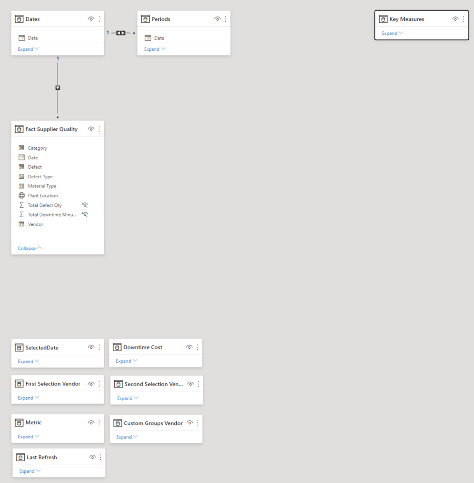
THE DATA MODEL
I started as always by creating the Date Table & mark it as date and add the Key measure table.
I connected all the Dimension tables with the fact table: “Fact Supplier Quality” using the following keys:
“Category” for Dim Category Table
“Material Type” for Dim Materials Table
“Defect Type” for Dim Defect Type Table
“Defect” for "Dim Defect Table
“Plant” for "Dim Plant Table
Then I thought… what does it bring? Why should I create all this dimension tables if there is no additional information? There is no performance justification, the relationships are string so the ID s are not really useful. Maybe it is better to have them because in the future we will have more data… I had a more radical approach. I deleted all these dimension tables. I am curious to see what the other participants did, and understand why. For me the approach was simple: I don t need it, I don t keep it.
Here is a print screen of my final model.
From the transformation point of view, for the main fact table I used an OuterJoin with dates. I did this because I wanted to use forecast in my visualizations. As we do not have Defect Qty every day, I wanted to make sure that a forecast could be displayed.
I added an additional, Period Table & related functions, a custom Groups Vendor for dynamic segmentation, a Metrics table & a last refresh Table
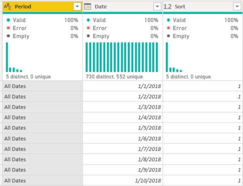
Period Table
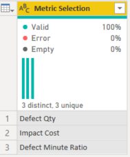
Metric Selection Table
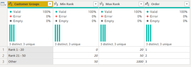
Custom Group Vendor
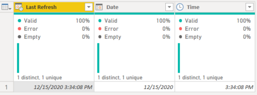
Last refresh Table
DATA STORY and the ANALYTICAL JOURNEY
In order to build my data story, I read several times the requirements.
One of the things I like to do when I create reports is to build a tab where I write the requirements of the challenge. I know that I will come back and read it multiple times. There are always some details that I discover later.
Print screen of my report in the discovery phase
This best practice exercise I impose myself in every challenge helped me in finding the key to the way I developed the report. Let me explain.
It took me about one week to play with the data, try all kinds of visuals, tables, test, find a way to present it. After almost a week I did not yet started to think about backgrounds, navigation, design, user journey, color theme, etc. I started to feel uncomfortable. I did not feel in control of my work. I did not understand where I am going, and I knew that if I do not have the story clear in my head, I will create a report without substance and insight.
So I spent time thinking and reading again and again the requirements. I then started to visualize the problem from the client’s point of view. I resumed the requirements as follows:
“Our company wants to start monitoring the performance & the quality of goods sent to us. We do not have a procurement system in place. We do not have all the data, but we do not want to lose time and we are looking for all insights that might help monitor this activity”
Why? Because defect quality impacts production. So what? It makes us lose time. So what?
Time is money…! Time is money ==> that is the key for my report. This is the direction I took. Thousands of minutes , millions of defect products, do not really give a sense of the story. What makes it a story is to make it clear and impactful. The purpose of the report is to show how much money we lose because of the defect quality, show the evolution, identify the main responsible & products. And after testing, the anonymized data showed me that there is no clear answer. So I wanted to answer these questions in a dynamic manner and leave the user in control. That means interactions, buttons, filters and simplicity.
Starting that point, ideas started to flow, I was in my element.
First idea: use the technique showed by Patrick LeBlanc (Guy in a cube) to highlight periods. My idea was the following. Use conditional formatting to show months with anomalies, and let the user choose with a month filter where he/she wants to focus the attention. That would highlight the month that would activate a drill through button.
Another filter would let the user choose which drill through he/she would like to see.
Basically I wanted to go deeper, try out new techniques, and make an use case that was never explored before…
The problem was that the technique of highlight is actually a Conditional Formatting not a real highlight as I imagined/understood when I saw the video.
With a bit of disappointment, I abandoned the idea and found another that seemed less far fetched. Use calculation groups to choose which metric I want to see and automatically format based on selection. I used this technique before, easy pie I told myself.
I created the calculation groups. Tested it out. Perfect. Then I wanted more. I wanted to create a benchmark between vendors where I use the technique of disconnected tables showed in a recent video of Bi Elite. I built it. Worked fine. I was super happy. I tested it… I was less happy! The calculation groups completely messed up my benchmark technique. And I also wanted to build a dynamic segmentation…
As much as I like Tabular Editor and calculation groups, I had to abandon them and start over. So started everything over again with disconnected tables. Classic!
After my second start over , I considered I have enough elements to start the visualization part.
USER JOURNEY AND DESIGN
I started my design when all the ideas and analysis were very advanced. I had my “Time is Money” report theme.
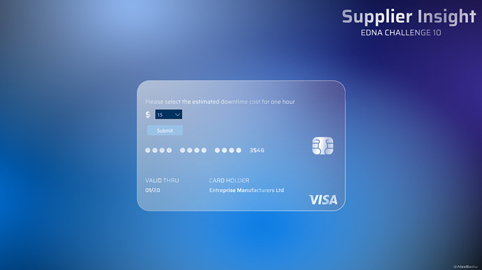
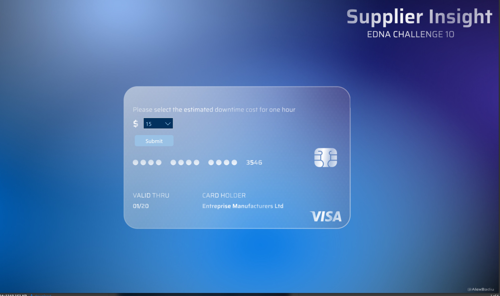
So I started with a teaser: Use a filter under the shape of a credit card before going to the report itself. Like the idea Sam used in one of his last EDNA challenge submissions.
In my mind, it was the perfect way to set the tone of the report and prepare the user to what he/she is about to see. Defect Impact computed in $
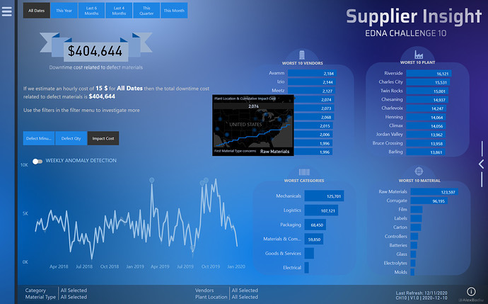
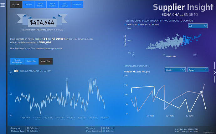
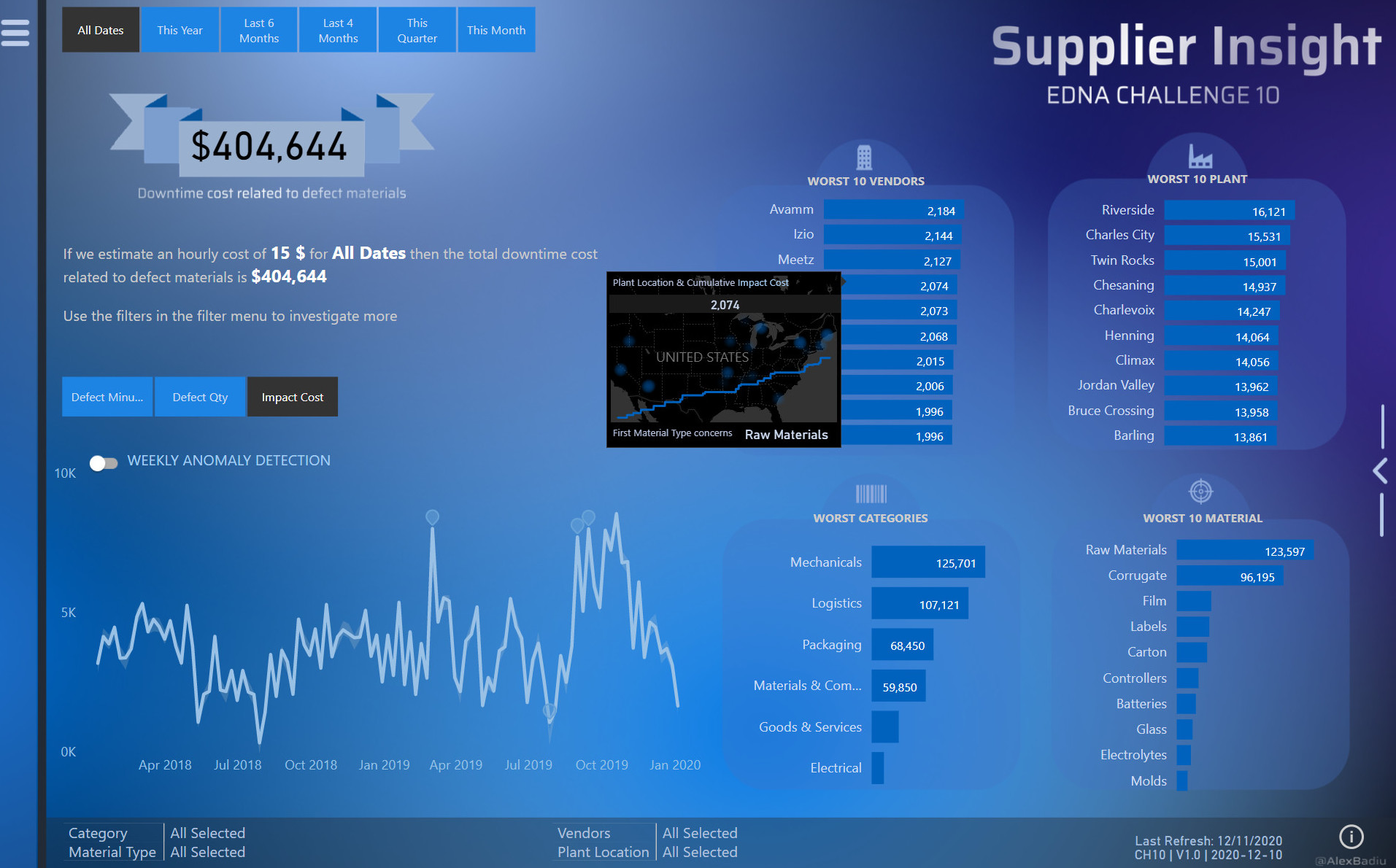
Then we have the Main Page
I used the most precious space on the report page to highlight the main KPI: Downtime cost impact. The user will see the main two filters he/she can play with: The metrics and the Period Table.
I added also 4 bar charts with the main information to slice and dice
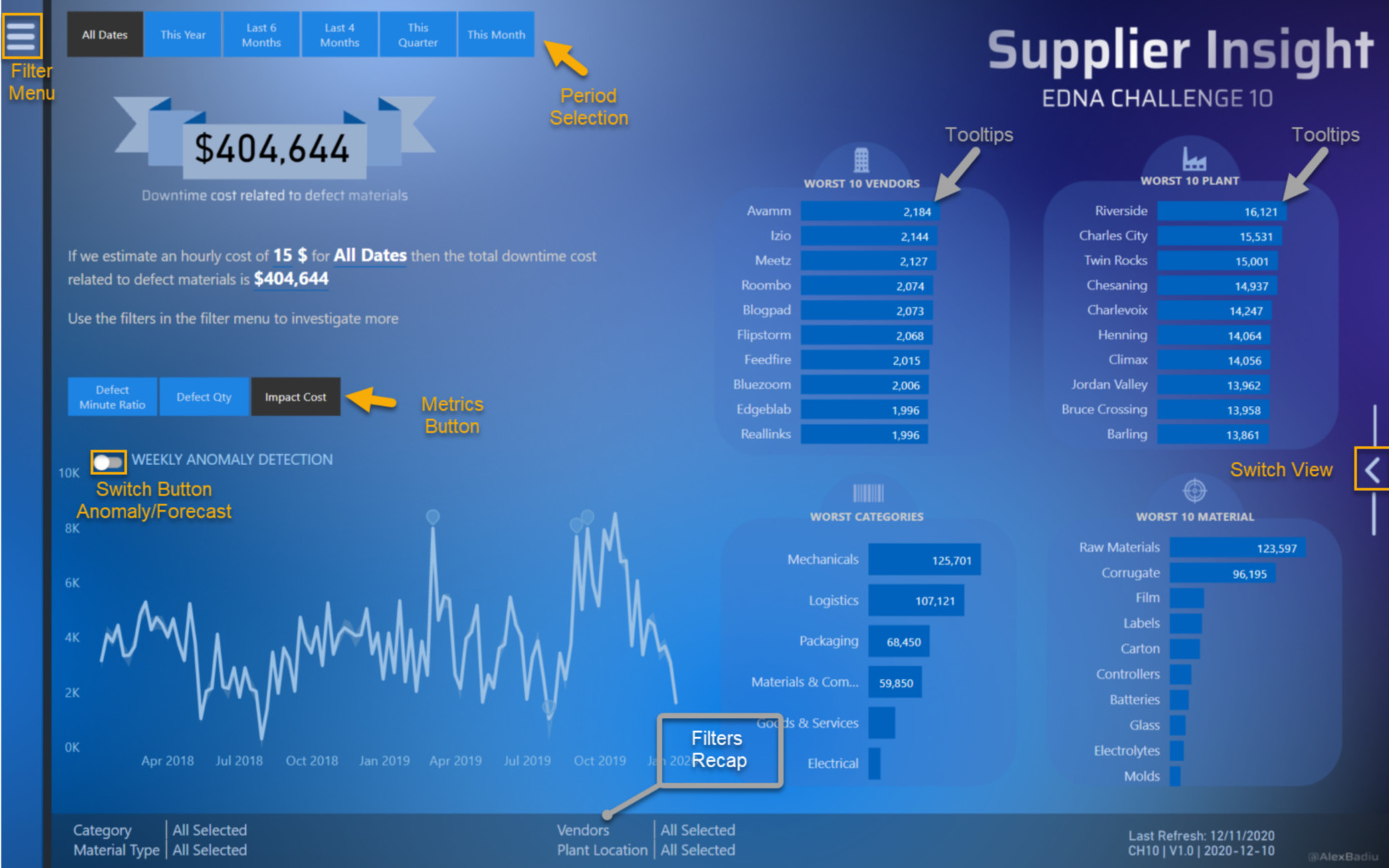
In the top left corner I added a sliding menu. I wanted to give space to breath to the page and keep it simple.
I fell in love with the anomaly detection since I saw it for the first time so I had to use it. I think that the switch anomaly/forecast can work very well. I therefore created a toggle between the two. I found these graphs working very well with the Period Filter & Metric Filter.
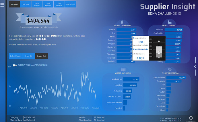
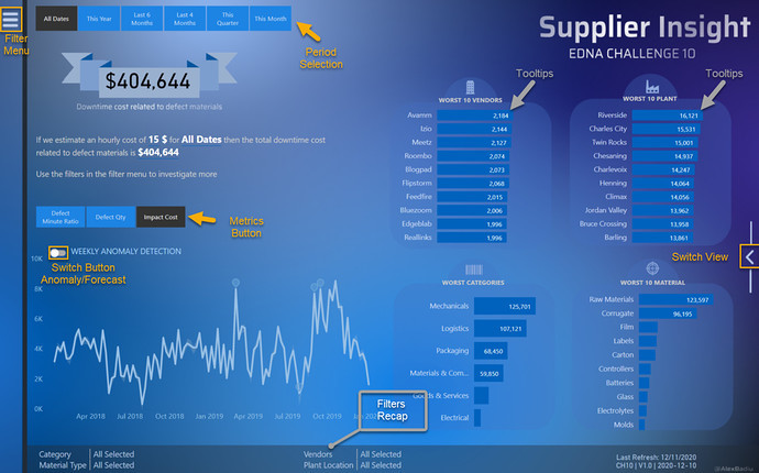
I created two tooltips in this report.
The first one was for WORST 10 VENDORS.
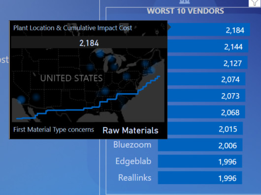
I found it would be interesting to see where are the plants situated for every vendor on the map. I completed the information with a cumulative total of the selected metric. It shows the dynamics in time. It is an additional information, therefore a good uses case for a tooltip.
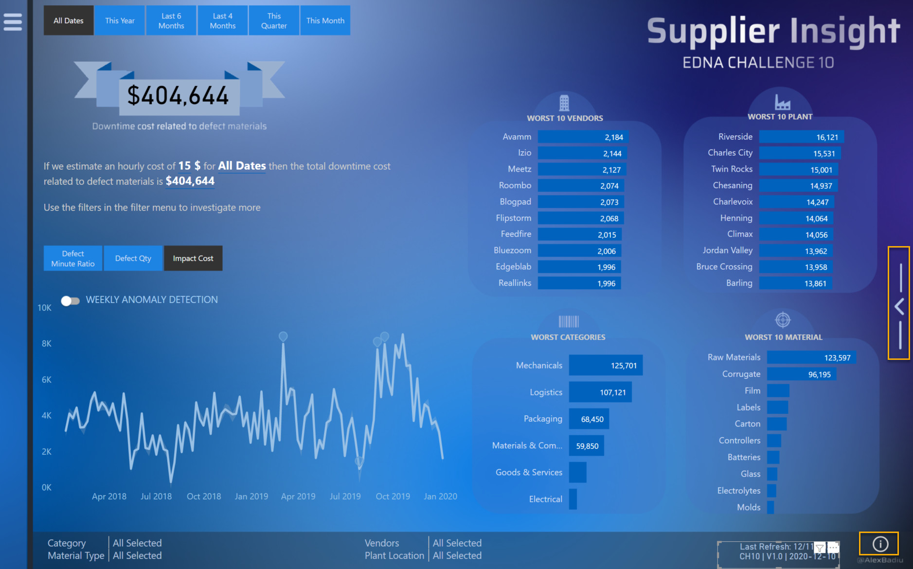
The tooltip for Worst 10 Plants
I was inspired to use this tooltip after seeing it used by @datazoe in the last submissions.
I found the ratio space/information great. It is quite visually appealing also, and works like a charm with narrative text / cards & text.
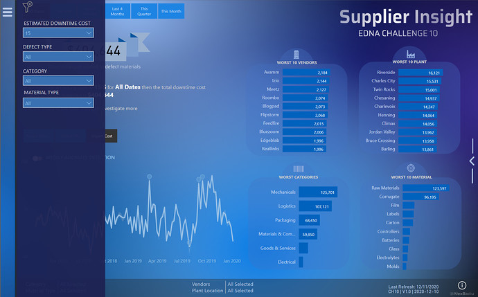
I used another idea from past submissions. I was inspired by @Greg filters summary on page & Last refresh technique using titles in a card. I slightly modified the DAX in order to return a max of 3 selected items. If more then 3 dimensions are selected it retrieves “Multiple Selection”. If nothing is selected then “All selected” is shown
Filters on Page Plant =
VAR AvailableCount = CALCULATE(
    DISTINCTCOUNT( 'Fact Supplier Quality'[Plant Location] ),
    ALL( 'Fact Supplier Quality'[Plant Location] )
)
VAR _MaxNameOnPage = 3
VAR SelectedCount = CALCULATE(
    DISTINCTCOUNT( 'Fact Supplier Quality'[Plant Location] ),
    ALLSELECTED( 'Fact Supplier Quality'[Plant Location] )
)
VAR Result = SWITCH(
    TRUE(),
    SelectedCount = AvailableCount,
    "All Selected", SelectedCount > 3,
    "Multiple Selection", CONCATENATEX(
        VALUES
           ( 'Fact Supplier Quality'[Plant Location] ),
          'Fact Supplier Quality'[Plant Location],
            " , ",'Fact Supplier Quality'[Plant Location],
            ASC
    )
)

RETURN Result
This formula is now shared on the Analyst Hub. You can search it under the name “Filters on page recap”.
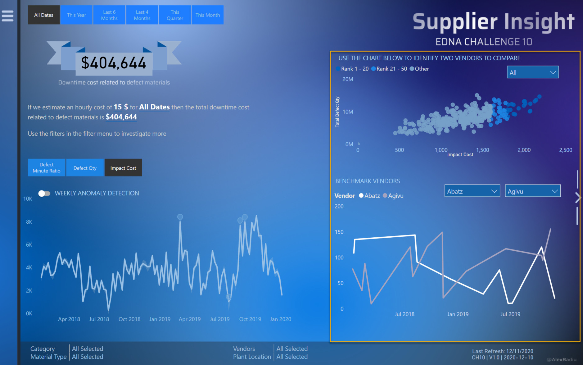
From the navigation point of view I used this time a button in the right of the page that replaces half of the screen. It will show instead a benchmark between 2 vendors.
In order to help the user know which two vendors to select and compare, I created a scatter chart with dynamic segmentation based on dynamic ranking. It will update based on the metric and period chosen.
Last but not least, I created a Info button in the first screen. I created it because I found that my switch screen that takes me to the second page is not visible enough and users might miss it. I therefore created a Helper to solve this issue.
In conclusion, it was quite a bumpy ride for me this challenge. I did not feel comfortable until maybe the last day. I am satisfied of the result. I used many techniques that I did not use before and tried some ideas that are, at least for now, not possible.
This was the story of my Challenge N.10.
Best regards and see you at the next challenge!
Alex Badiu