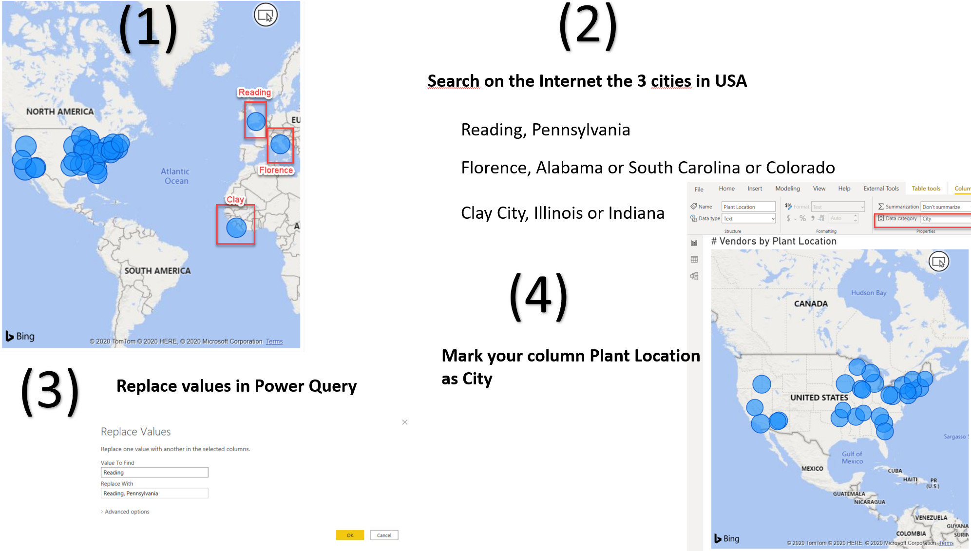
You mean Florence not Venice as Venice doesn’t exist in the dataset.
Yes, sorry my mistake
as suggested I created a hierarchy on the plant location adding Country (all with USA) and State, but still when putting on thr map it does show me values in Italy and England.
any suggestion?
Thanks
Luca
Map:
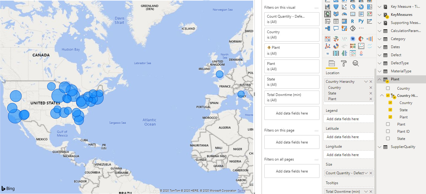
Table Values:

Links:
1 Like
The best option would be to go on google maps and get the Latitude and Longitude for each of the plants ( Based on City & State) if you want it to show up correctly. May be a little extra work, but it will get the results you want.
Thanks
Jarrett
1 Like
Hello guys ! any tips and tricks for the dashboard visuals ?
I’m a little bit lost when it comes to show the metrics, KPIS…
@amira.bedhiafi.pro
The basic rule for KPI is to show the current status, previous status (year , quarter , month or day) and the trend. You can refer to the following video for step by step guide to create a KPI.

However, if you are looking for amazing KPI visual, check the challenge # 9 report by @alexbadiu here
Thanks.
4 Likes
@LucaB72, I do not know if you succeeded to do the changes you wanted. Another way of tacking this problem is simply replacing values for the incorrect plants location in Power Query.
1 Like
Thanks,
I solved using the Longitudine and Latitudine.
I went to google maps and quickly pick them up.
Lesson learned for me that there are different Lat/Lon convention, the Bing map in Power BI work with the Longitudine in negative format.
In this way have an unique identifier and pick the correct city in case of same name for different ones.
Luca
Attached an extract of the table with few of the Lat / Lon : 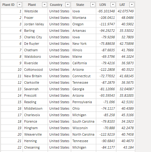
3 Likes
Hi,
I’ve been using Excel all my life. I’ve just got into Power BI about 4 months. I’m having issues with designing the dashboards. It’s not something I’m used to doing. Anyone got any tips on how to make my report look really snazzy?
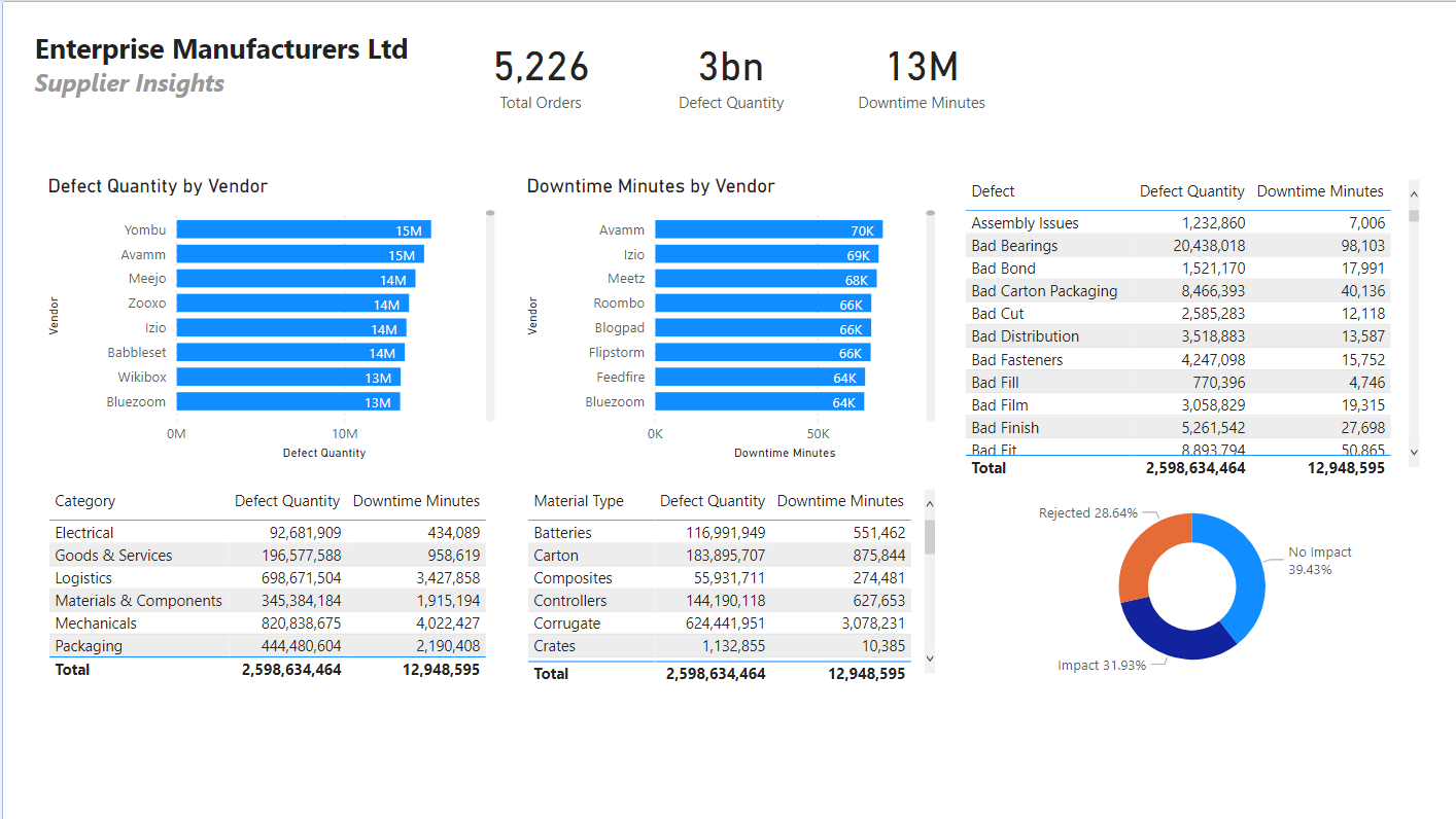
Supplier Insight.pbix (287.0 KB)
4 Likes
It looks like you’re off to a really good start here. You’re clearly addressing the questions in the brief, and you’ve got a nice clear, gridded organization to your report.
In my opinion, the best possible resource for improving your design and visualization skills is the Enterprise DNA Challenge Showcase. This compiles all the previous entries to past challenges in an easy to browse format, so you can quickly identify the ones you like that may have techniques, color schemes, designs, etc. you can adopt in your report to polish the look of it.
Starting at about challenge 3 or 4, the entrants began drafting very detailed writeups explaining how they implemented their reports. These are phenomenal resources for improving your design skills, and you can also download all the PBIX files to dig further into how they did it.
Big kudos to you for jumping into the challenge after just four months of working in Power BI. You’re clearly picking it up quickly, and participating in the challenges is one of the fastest ways to further improve your skills.
I hope this is helpful. Good luck!
- Brian

3 Likes
@YusufGillani Adding to the great advice by @BrianJ, you are way ahead and can probably do more analysis.
Don’t try to put all the analysis in one page. Try to divide the page in 3 or 2 sections and create an analysis per section that should complement other sections. For e.g. you showed the card visuals on top that’s the first section. In the second section, try to focus on the worst performers rather than showing all the vendors, category and material type. The third section might be where you can show the trend of defects or downtime. Keep it simple and make separate pages to tell a different story leading up to the main story.
Try different visuals and ditch the table visual. Choose color patterns, preferable one to three or one with a family of colors. For color inspiration, you can check out the reports in other challenges.
Best of luck for your report!!
3 Likes
Thanks Brian. Much appreciated!
Thanks Mudassir! Thanks for your support.
1 Like
@haroonali1000
No Impact
Impact
Rejected
I’am not quit sure how to understand it.
No impact, but it has value in Total Downtimes Minutes. So therefore it must have an impact.
Rejected. Does it means they have rejected to receive the goods and now they needs goods which isn’t defect.
/Amdi
Hi
my understanding, but I am have no experience in manufacturing, is the follow:
- Rejected : the material has severe defects that could not introduced into the manufacturing process and have to be sent back to the supplier. The lack of material, assuming the manufacturing process work on material arrive just in time, impacted the overall process flow (time to complete the finished product from the raw material) of the downtime quantity;
- Impact : the production line has to stop due to the discovered defect and had a time impact on the overall completion of the manufacturing process (time to have the complete finish material from raw status); and
- No Impact : even if the material was defective and the somewhere in the production line the process was hold of the downtime quantity (in minutes) due to other parallel processes that are driving the final production time, they did not have an impact on the overall completion of the manufacturing process.
I also believe that this raw data may be generated by automatic system and some data flaw may be present
luca
3 Likes
@LucaB72 Spot On 
Hi Luca,
Can you please share, how you added State column, I am new in Power BI, struggling with this.
Kind Regards
Shumaila
Hi
I have done quick and dirty, with excel added the extra field and populated the additional information.
luca
2 Likes
Hi @Amdi,
Luca is spot on with his evaluation please see his reply for any clarifications.
Thanks,
H
1 Like
Thanks Luca
1 Like