My experience is mostly creating dashboards/graphs/pivot tables in excel and providing reports to management on my findings. I was wondering what does everyone use in power bi as per layouts/colour schemes that you like using the most in reporting to management.
I’m new to power bi and like to learn from everyone experiences.
In terms of color themes, I really like the following:
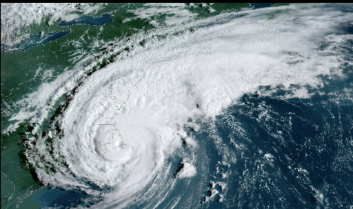
With regard to the color theme generator, you can’t go wrong with the color fan. I’ve also generated some nice schemes using the image to colors. For example, here’s an image I used recently to generate what I thought was a color scheme that worked well:
With regard to layouts, I don’t think you can do better than to look through the entries for the three recent Enterprise DNA Data Challenges. There are some absolutely amazing layouts and color schemes used.
Hi @Keith, a response on this post has been tagged as “Solution”. If you have a follow question or concern related to this topic, please remove the Solution tag first by clicking the three dots beside Reply and then untick the check box. Also, we’ve recently launched the Enterprise DNA Forum User Experience Survey, please feel free to answer it and give your insights on how we can further improve the Support forum. Thanks!