The whole world needs to see what you’ve done here! Very impressive.
4 Likes
@MudassirAli , Wow amazing work. Is it possible to share a link to the report ?
2 Likes
@sam.mckay wow that’s such big compliments from you. I believe hard work pays off. For 1.5 weeks I was just working to design the charts that could embed as much information as possible. At one point I thought that maybe this wasn’t possible but then I started watching how visuals are designed in Tableau and then used that information to design the visuals.
I really do hope that Power Bi will have its own custom easy to use visual designer inside the the desktop service.
4 Likes
@Neba
I don’t have access to publish to web feature and the file size is too big to share .
1 Like
@MudassirAli this is seriously impressive! I really like this one (honestly there was a lot of them I liked too!):
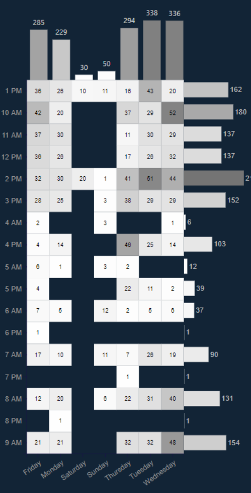
Of course, would be cool to have it order properly on the x/y axis, though I see it is alphabetically on the y axis, I wasn’t sure what was driving the x axis ordering. I really like the way you can get into the summary and details so easily.
4 Likes
@ datazoe
Sorting is the biggest problem in Charticulator but I found the way. I didn’t do it in heat map as I was too tired to design it again 
3 Likes
Hello forum members,
Please let me share my submission.
On this report I have focused on Open ticket expecting that I can see any errors or issues through those tickets.
First screen is only one simple bar chart to make the consumer feel easy to prepare for the next step.We can find already issues from first visual that there are still open tickets sitting that were issued in 2018 which I think is too long if that really is the case.
I have prepared 5 icons in the lower section with explanations.
With these icons consumer can explore more details.
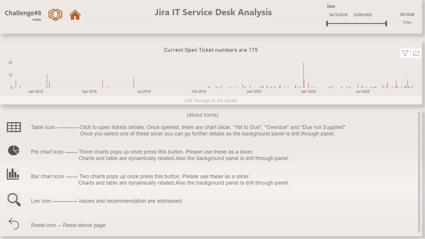
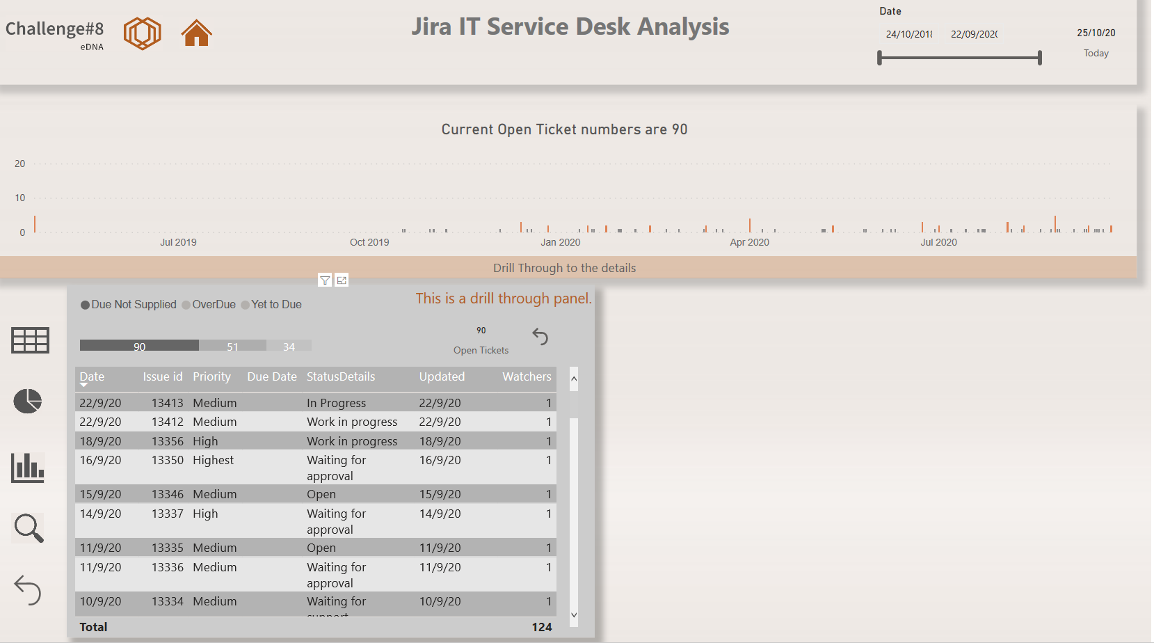
First step is to click table icon. This is a table for all the open tickets.Total open tickets are 175 and consumer can sort by “Due Not Supplied”, “OverDue” and “Yet to Due”. Once one of these are selected, background colour changes and message pops up as “This is a drill through panel” (image as below) so consumer can move to the drill through page by clicking the background panel which is having all the details of the tickets.
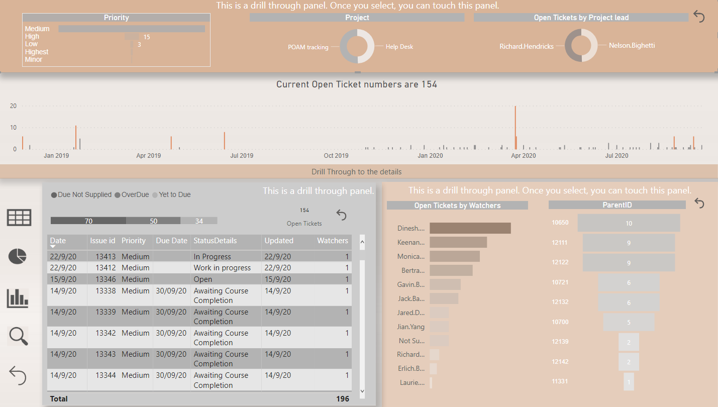
By clicking next pie chart icon and bar chart icon, another rays pop up. Those are slicers.
Consumers are having multiple option whatever they want to dig deeper depends on their convenience.
I made all the back panel as drill through button as well.
4th len icon is for the issues and counterpart solutions.
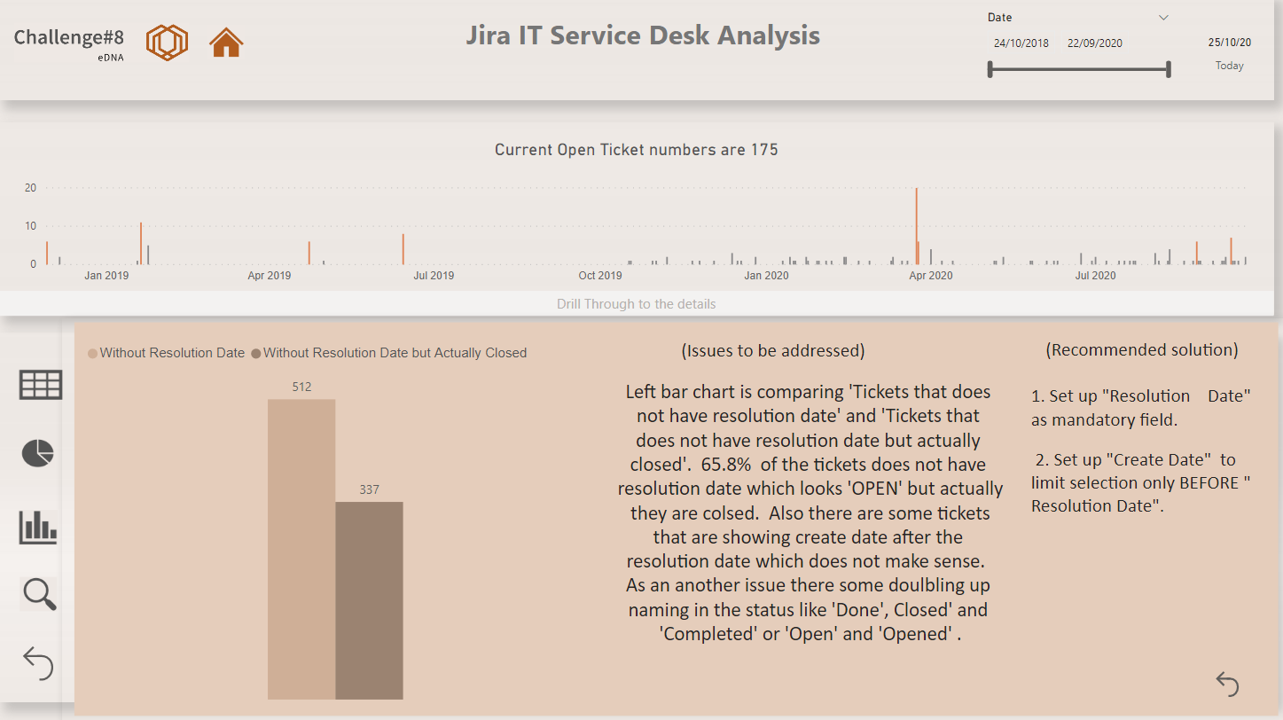
Last icon is to return to the home page.
Wow to the other participants especially with new visual by Python and charticulator. Advanced technology with cool solutions!!!
Thank you for letting me share the report.
All the best to the other participants.
Regards,
Hideo
11 Likes
@MudassirAli that I do understand! I have so many versions of them when I am creating them too. I spent 3 hours straight making little tweaks last night on one. I can tell you put serious effort and the outcome is amazing! Surfaced a lot of great insights!
3 Likes
Whoa! I had the feeling in talking with you over the past couple of weeks that you were cooking up something special in the Charticulator Mad Scientist Lab, but this is beyond anything that I imagined. It’s really like a magic trick – fascinating, and I have absolutely no idea how you did it.
Huge props to you and @datazoe for bringing to our attention what this tool can do. I had kind of written it off initially as a half-baked Microsoft Research effort, ala SandDance, but this report clearly shows that you can use it to extract incredible insight far beyond that which is available in the native visuals.
I can’t even imagine how much time you put in this, so it seems greedy to be anticipating a detailed writeup on top of this, but I’m dying to know how this magic trick works. Incredible job. 
- Brian
P.S. just give a shout if you’d like me to publish this out for you.
3 Likes
@BrianJ
As I said it was the rollercoaster ride, even at office I was working on the custom visuals most of the time 
I will try to explain how I designed it as even one visual will require a lot of writing to do. Arranging the dataset in the right order to be fed to Charticulator, aligning the axis, sorting the axis and then trying to place the text where it doesn’t take a lot of real state are some of the things that should be in mind before diving into creating one. The best thing I like is the ability to switch off the auto alignment of axes.
Thanks for the offer and yes I would like to avail that.
Thanks again 
3 Likes
Totally agree, I would love for Power BI to have custom visualization tool built within desktop like in Tableau. Honestly, trying to recreate tableau visuals in Power BI has resulted in some of my most amazing visuals. Even if I haven’t been able to recreate it exactly, I end up learning some crazy DAX measures that I love!
7 Likes
Wow! This is a fascinating report. The design is beautiful, and I’m totally intrigued by the way in which you structured the navigation, which is incredibly creative and unique. It really draws the user in in a very interactive way and allows them to explore the data and questions most important to them. Terrific use of drill through all throughout the report. I spent a long time playing around with this, just exploring different paths through the data. Outstanding!
- Brian
3 Likes
Thank you so much Brian. When looking at my own other reports, I need some time to understand what I have created by the multiple visuals I created also I am confused myself which one I should look at first.
So it is easier for me if there are some indications to lead myself towards the right directions and I noticed that this way is more comprehensive for me and overall is quicker to understand. Thank you for spending some time with the report.
Throughout the challenge your advice and feedback always helps me for my improvement and motivations.
P.S. “Custom tiebreakers for Rankx” video is fantastic video. Creating your own Rand() by using median value is something beyond I have never ever possibly thought. This is the moment human won against technology, really cool.
I always want to be creative like you are.
Regards,
Hideo
4 Likes
Would you be interesting in creating a course walking through how you did each part of this. Could be like an interview style with me. We can discuss this for the future maybe
5 Likes
@sam.mckay 100% yes. If it wasn’t for Enterprise DNA, I would still be creating dashboards in excel.
This is a big achievement that the efforts are being recognized by the Experts. Meanwhile, I will try to document as much as I can for everybody to learn.
You can let me know when you want to do this.
Thanks for the recognition
7 Likes

5 Likes
Hi everybody,
Thanks again @EnterpriseDNA for hosting this challenge!
Here is my submission for the 8th challenge:
The first Image shows my data model. Since I didn’t have enough time, I decided to keep it simple and just created two distinct Date Table for “Creation Date” & “Resolution Date” columns in the main table. For other categorical columns like “Status”, “Type”, Assignee", etc. also I didn’t create separate lookup tables, and just used their columns in the main table.
If there is any problem with my data model, technically or conceptually, I would appreciate it if you help me to correct it. Any comments would be appreciated.
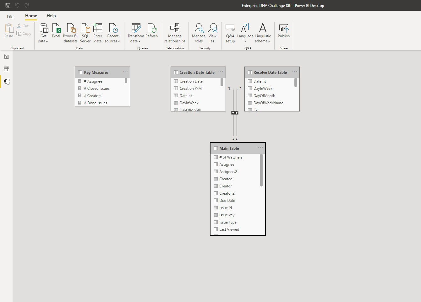
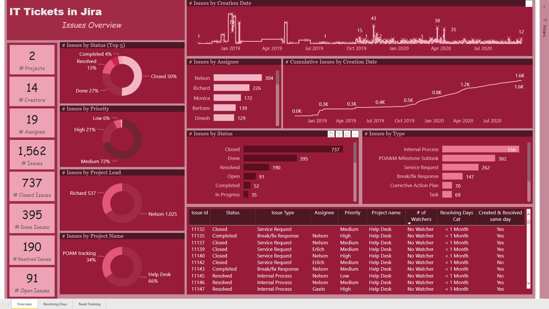
On the first page, “Overview” I just wanted to show some important and basic information about the whole process. Since the amounts of assignee column were emails, I decided to use “Assignee Names” instead of emails using query editor.
Using DAX I created “# of watchers”, “Resolving Days Cat”, and “Created & Resolved same day” measures using measure branching as follows:
# issues created & resolved same day = COUNTROWS(FILTER(‘Main Table’,DATEDIFF(‘Main Table’[Created],‘Main Table’[Resolved],DAY)=0))
Created & Resolved same day = IF( [# issues created & resolved same day]=1, “Yes”,“No”)
Resolving Days Cat =
IF ( [Resolving Days] <= 30, “< 1 Month”,
IF ( [Resolving Days] > 30 && [Resolving Days] <= 60, “1-2 Months”,
IF ( [Resolving Days] > 60 && [Resolving Days] <= 90, “2-3 Months”,
“> 3 Months” )))
# of Watchers =
IF ( ‘Main Table’[Watchers] = BLANK (), “No Watcher”,
IF ( ‘Main Table’[Watchers] <> BLANK () && ‘Main Table’[Watchers_4] = BLANK (), “1 Watcher”,
IF ( ‘Main Table’[Watchers_4] <> BLANK () && ‘Main Table’[Watchers_5] = BLANK (), “2 Watchers”,
IF ( ‘Main Table’[Watchers_5] <> BLANK () && ‘Main Table’[Watchers_6] = BLANK (), “3 Watchers”,
IF ( ‘Main Table’[Watchers_6] <> BLANK () && ‘Main Table’[Watchers_7] = BLANK (), “4 Watchers”,
IF ( ‘Main Table’[Watchers_7] <> BLANK (), “5 Watchers”, BLANK () ))))))
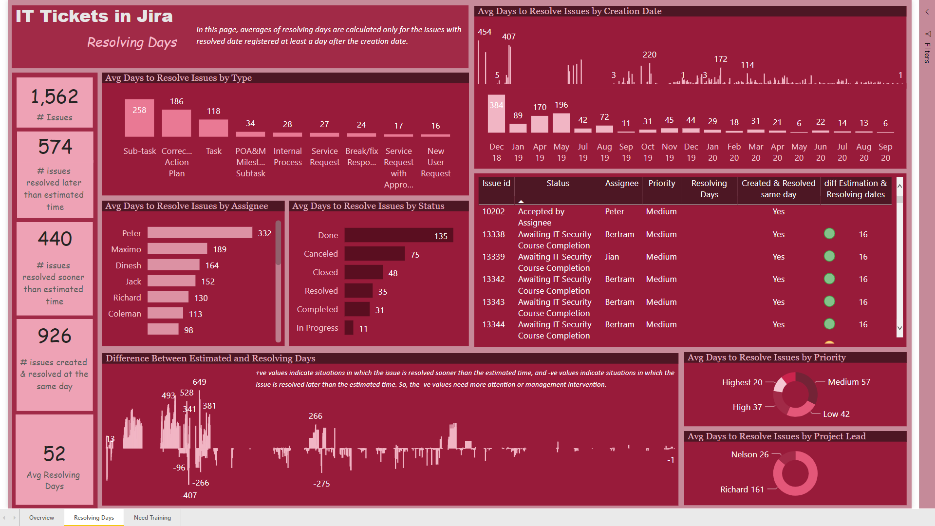
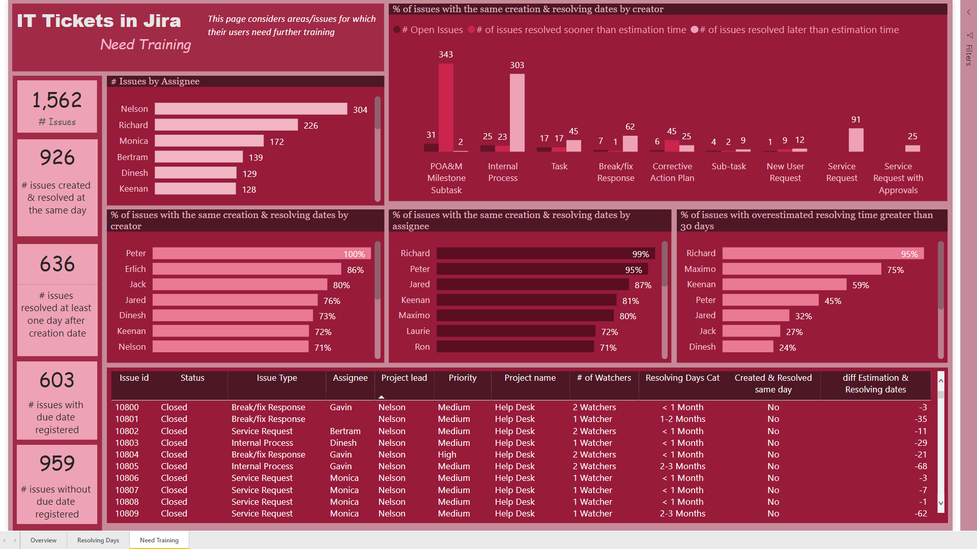
On this page, the graph showing the “Difference between Estimated and Resolution Dates” was so important to me, because I thought that maybe it can help the managers to find the problems with estimating the time an issue needed. I also used color circles in the table to categorize this measure into 3 different categories. If the estimated time was between (-30, +30), the color would be green, if it was greater than 30, the color would be yellow, and if it was less than -30, the color would be red.
Any feedback would be appreciated.
Best wishes
Hossein
Enterprise DNA Challenge 8th.pbix (288.4 KB)
9 Likes
Amazing report @MudassirAli ! And I am not talking only about the visuals/ colours/ navigation! The analytical side is impressive as well! Great job! Now I’m starting to be interested about using custom visuals/Charticulator as well 
4 Likes
@Hideo, I am a real fan of your reports ! Your reports are unique and I am starting to see your signature in this unique navigation you build. Very creative and intelligent. And it helps indicate the order of the steps an end user should follow.
Great for storytelling with data!
2 Likes
@datazoe, the design of this report is impressive! Especially the Slicer Panel, it is very inspirational! The navigation is fluide and intuitive, the visuals are so well integrated! The attention to details is also impressive! Discovering the data through your report was a pure pleasure! Great job !
3 Likes