Thank you for your warm feedback. It took some time for me to understand this Jira IT data set as they are not consistent. I recalled myself your Challenge7 analysis “Refocus on the essential” trying not to lose the destination I should reach. It is important for me what and how the constant high performer like you are feeling to build excellent report consistently. Nice to hear from you who I believe has the most talent of creativity and diligence.
@Gifted I like the way you categorized by situation, project name and duration. This immediately highlights which project has the highest issues and take longer days to be resolved. One thing I would advise is to make the slicer as dropdown and use that space to include one more visualization for your analysis.
@Neba Great Report and nice looking Key Findings Page. I guess White & Blue color really stands out. I have seen some videos about Calculation Groups in Tabular editor but haven’t really dived into that yet and you have made really good use of the editor.
@bradsmith
Wow that’s one way to look at data. Really amazed how you came up with Average Age calculation. However, my only concern is that the report was expected in English Language
@MudassirAli , Thank you for your kind words. This is the first time I used calculation Groups and they are awesome. Especially for Time related calculations using the same measure like Sales LY , LM , LQ etc… .
BTW I was watching some YouTube videos about Charticulators after I saw the discussions about them in the Forum. Interesting stuff.
P.S. I can’t wait for your interview with Sam on your work.
Really, really love the report @datazoe . The EDNA Challenges are really fantastic inspiration. Really love how the Challenges take you through from the basic data all the way through to a final report, the write ups are absolute gold dust. I’ll hopefully set aside some proper time to complete the next challenge.
@alexbadiu
Your reports always have one thing constant and that’s Elegance , combined with great analysis, navigation, interactivity and last but not least the ability to narrow down the scope to focus on the root cause has always been the highlight.
Really good use of the colors in this one and love how you placed the charts inside the circle shape. The one that says HD, actually looks like HD (High Definition)
This one is Special:
For the topic modelling? Oh I just chose English because that’s my native language haha plus, then I could use the same module in Python for the k-means clustering, topic modelling, and anomaly detection.
I hadn’t thought about it before but… I could probably have it detect the language the program is using, return that as the corpus language, and perform the same calculations… but I’d only be confident in being able to validate the findings if the language was either English, French, Italian, Spanish, or Mandarin as those are the only ones I am comfortable speaking and thus building a quality corpus. I have some experience with Russian and Arabic, but not enough to be able to validate my findings or tune the model. If I had a native speaker of whichever language though I could replicate this process for any language. Technically though, the script is using unsupervised learning… so as long as I had a corpus for whichever language then I could do the same for any language…
Sorry, that was just me thinking out loud haha I really like that idea so I was trying to think out how to do it. Essentially I could make it compatible with any language.
@bradsmith LOL Good ONE!
The terms and the types of analysis you have used are new to most of us. We will have to dig in deep to understand what you have done and how you have done. Waiting for your write-up though
Thank you for your feedack @MudassirAli!
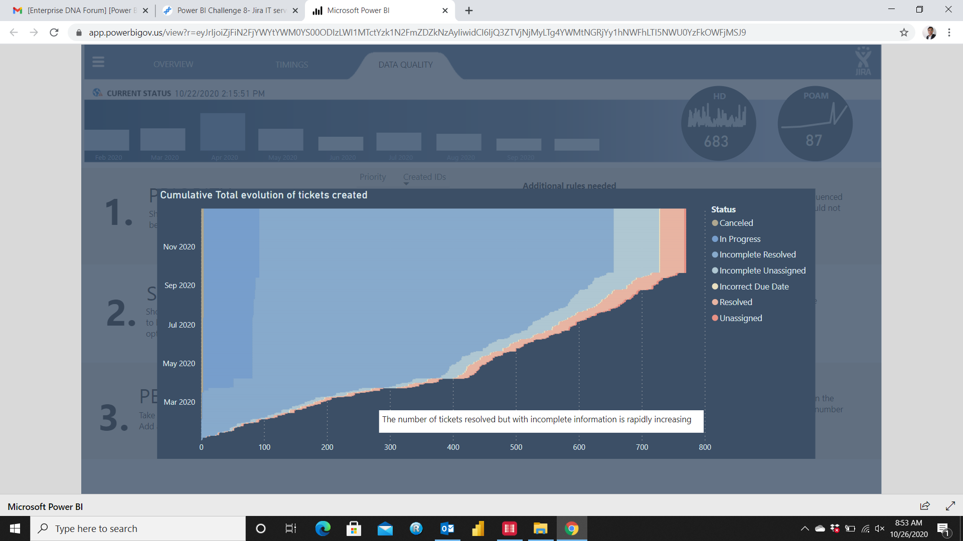
The graph you pointed out is actually a simple stacked bar chart using Cumulative Totals of tickets created and status on legend.
@DavieJoe Thank you! I used numerro.io’s template for this submission, which has really helped me understand the importance of space in a report. And I agree, these challenges are awesome! Looking forward to seeing what you create for the next challenge!
I love this report. Because your designs are always so striking and creative, I think the quality of your analysis sometimes gets overlooked. However, while this design is beautiful as well, I think the user experience and the analysis really shine through here. Much the way that @Hideo’s report really engaged me to dive in and explore the data, yours did the same and the level of thought that went into the user experience in this report is evident. Also, the report does a wonderful job providing recommendations and areas for focus, and ties them together in a really clear way with the results of the analysis.
Really inspiring, and so much to consider and learn from here. Awesome work.
Thank you for your feedback @BrianJ ! The user experience is always a priority for me when I create reports. It takes a lot of energy and thought but I am sure it s worth the investment. The data story and user journey in a report is a challenge to build every single time. I am glad I can participate to EDNA challenges and get to test and push myself to improve.
@Senabiz
Welcome to the amazing EDNA Power BI Community.
If you have time, you can get started with this challenge’s dataset. It will help you a lot for the next one.
@MudassirAli - I agree with the others - a fantastic report. The page showing the performance comparison among the staff was something I was thinking about but really like how you displayed this.
 .
.