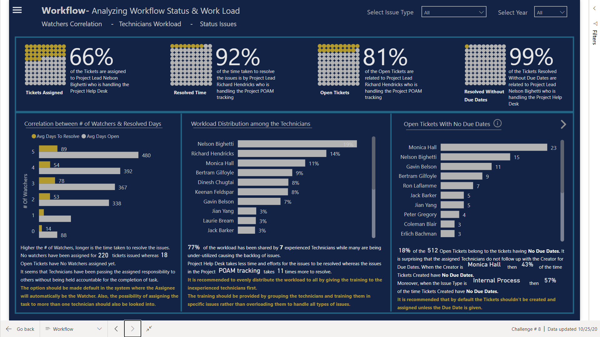
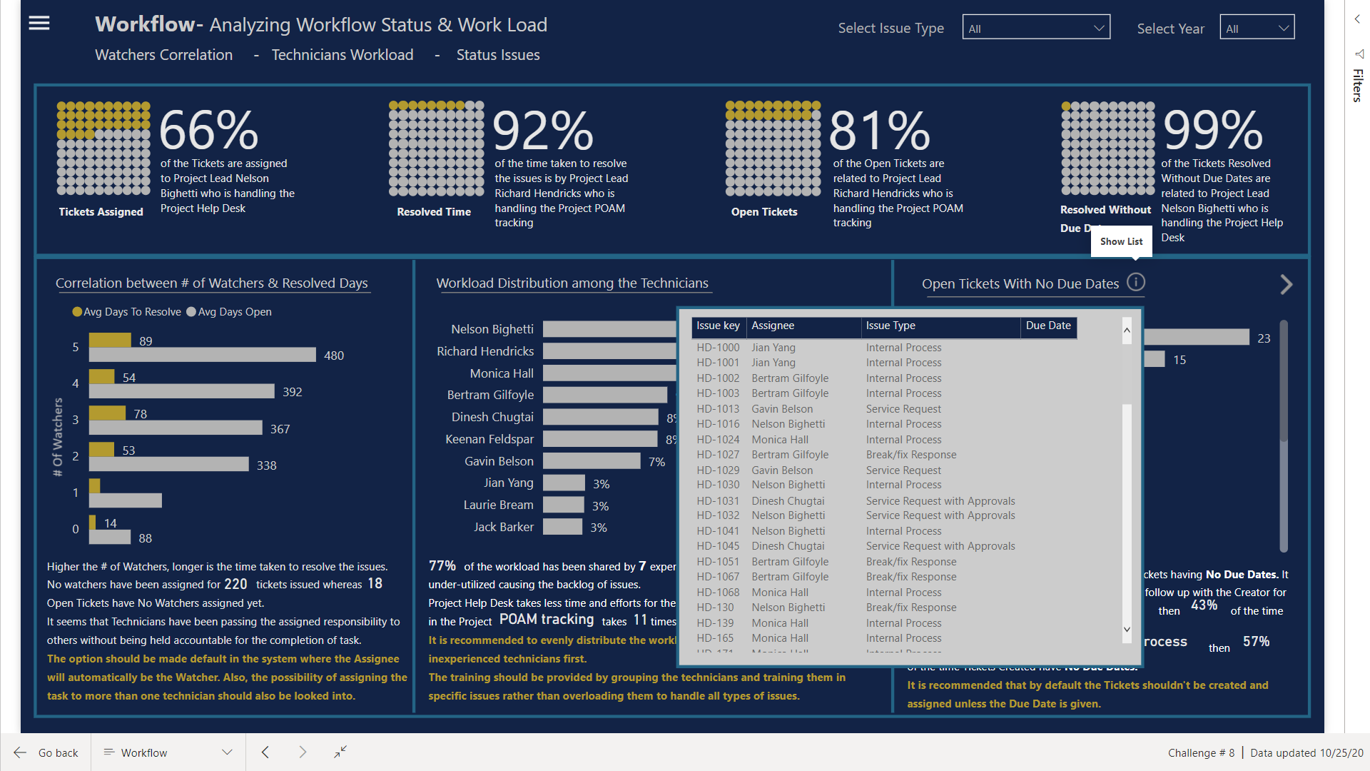
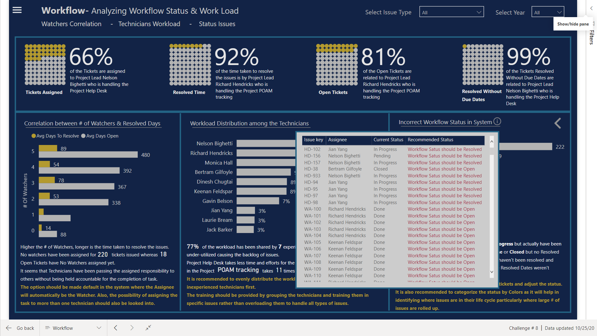
@alexbadiu such a cool design, love the tabs and the gradient bar with the circle kpis, the toggles, so many cool features!
I actually was surprise I was able to get that to work haha I could have done it with one measure, but I ended up using two: Time to Close (seconds) and Average Age (DD HH:MM:SS). That way I could use the Time to Close measure in other measures.
Time to Close (seconds) =
// Calculates the difference in seconds between opening and closing.
CALCULATE(
AVERAGEX(JIRA, DATEDIFF([Created], [Resolved], SECOND)),
FILTER(JIRA, [Resolved] > [Created])
)
Average Age (DD:HH:MM:SS) =
// Transforms time in seconds into DD HH:MM:SS format.
// Formats time in seconds into days
FORMAT(
ROUNDDOWN(
CALCULATE(
AVERAGEX(JIRA, [Time to Close (seconds)]) / 86400
),
0
),
“d”
) & " day(s) " &
// Formats time in seconds into hours, minutes, and seconds
FORMAT(
CALCULATE(
AVERAGEX(JIRA, [Time to Close (seconds)]) / 86400
),
“hh:mm:ss”
)
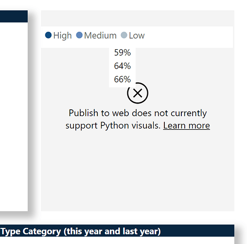
@Greg this is a machine I just reset a couple days ago so I don’t have python installed yet, so here is what I see:
I installed Anaconda and then took another look, and still see the same. So then I clicked the link on it, which went to https://docs.microsoft.com/en-us/power-bi/create-reports/desktop-r-visuals
So I installed R ![]() And it still doesn’t work for me.
And it still doesn’t work for me.
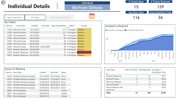
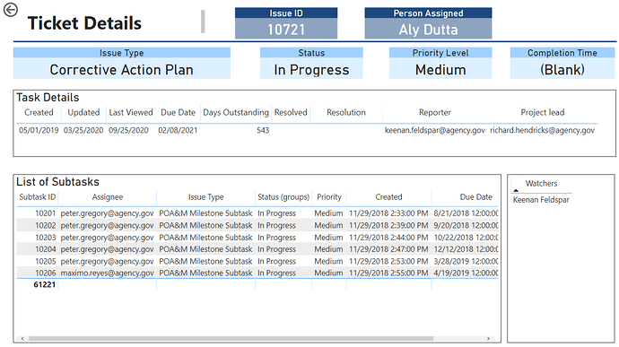
Hi Everyone - attached is my submission for the challenge.
(Unfortunately I have a work account so am unable to publish this to web. If there is way to publish this, I would love to as it’s impossible to see the buttons in action)
Features I tried this time:
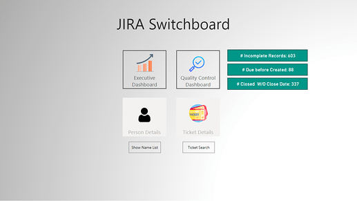
- Used a Switchboard to allow the user to select among the four areas:
-
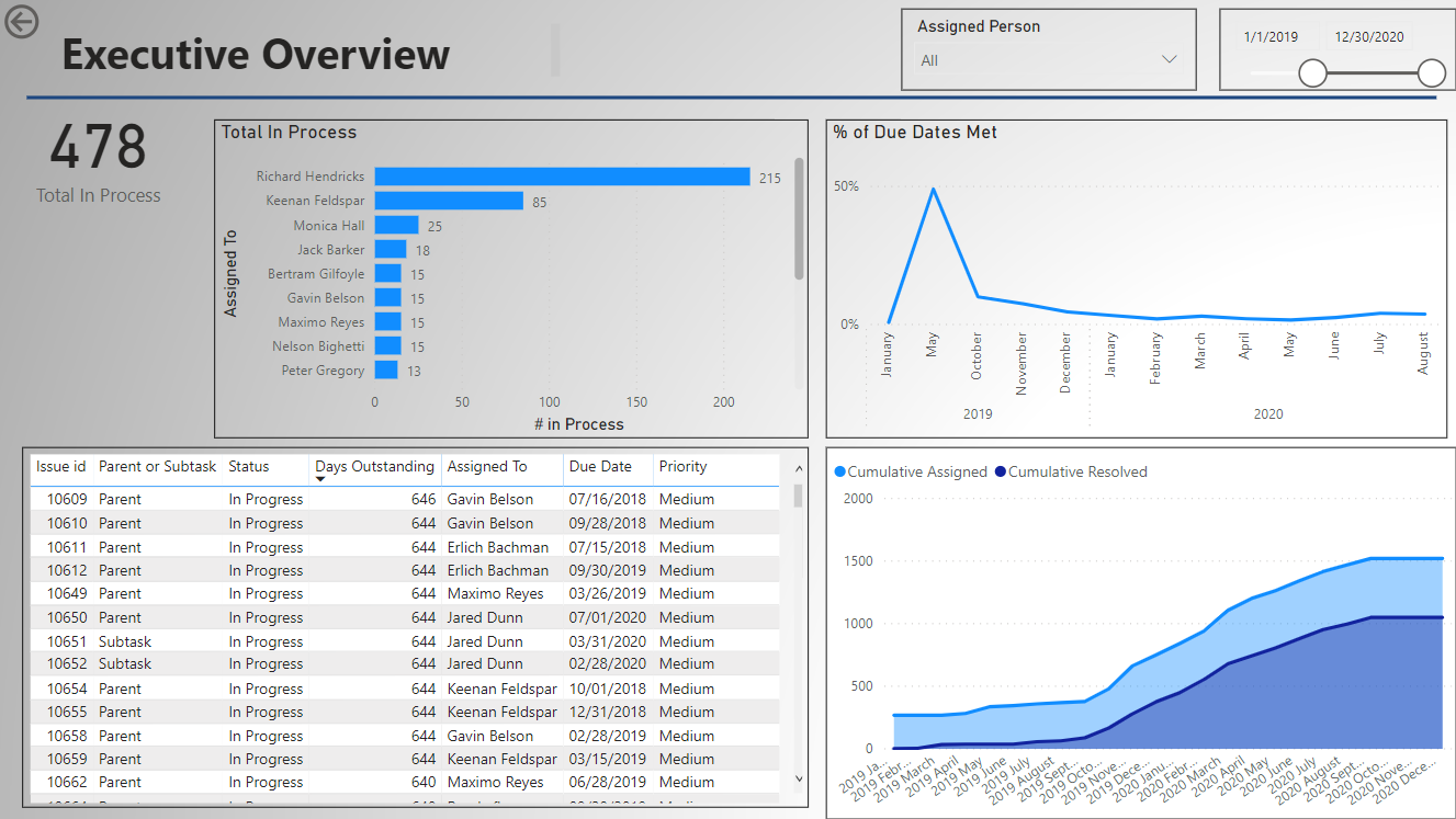
Executive Dashboard – a quick overview
-
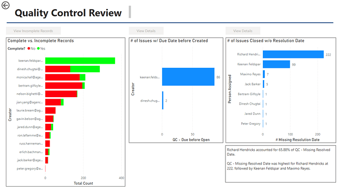
Quality Control Dashboard – to provide quick information on three key areas
1.Incomplete records (no due date)
2.Tickets with a due date before a creation date
3.Tickets closed without a close date
(The green text boxes indicate the # of records in this area and will update if an individual user is selected) -
Page for Person Specific Details. (For this – I have a button to show the list of names to select from. Selecting a name will then active the button to view the details.)
-
Page for Ticket Details (Similar to the person, there is an option to search for a ticket and then see the specific details)
- Using R script in the Power Query to get a separate table of “Watchers”. To do this, I used a copy of the “Tickets” dataset, removed all columns with the exception of the “Issue ID” and all “Watchers” column. Then – I used a simple R Script to convert the table into “key-value” pairs. The output is a separate row for each unique Issue ID and Watcher. I then cleaned this up by splitting the columns to remove the email address and convert the end result to just the person’s name.
@bradsmith - your use of Python and R was great and something I want to get more into.
Things I wish I would have done (and plan to approach for the next one):
-
Spend more time upfront studying the dataset rather than just jumping in and playing around with visuals;
-
Related to above more time planning out the layouts on paper/whiteboard and the overall strategy. While I did whiteboard ideas - I have the bad habit of jumping into the solution instead of spending more time on the overall design.
-
Improving on the overall color schemes and design, etc. Seeing all these submissions really provides excellent ideas.
Icons on the switchboard made by Freepik from www.flaticon.com</a>
All,
I am absolutely blown away by the quality and creativity of every one of entries submitted (there also seems to be an emerging consensus that blue-and-white designs just look good…)
Given that all the interactive features being used “show” better in the service, I’d like to offer to anyone that if you don’t have publish to web capabilities but want your entry published, just let me know in this thread and I will direct message you to arrange to get your PBIX file published to web and send you the link.
- Brian
@BrianJ - I am definitely interested in this. Thanks!
-Tim W.
@BrianJ
You can charge for this service and can get rich real soon 
I’d be interested in doing this as well!
Sigh … apparently both R and Python visuals aren’t supported by PTW… who know?
@Greg That is fantastic information to know, even if it’s disappointing that I couldn’t get to see your charts in action.
Thanks @BrianJ for helping publish this report so everyone can see my report in action. I included the link in my original post.
Hi All,
Please find my submission for challenge number 8. Here is the link
Following is brief writeup for the submission
• Data loading and transformation
- Excel loaded into Power BI
- Used Enterprise DNA extended date table M code as [Dates] Extended Date Table (Power Query M function)
• Data modelling
- Created following dimensions
a. Issue Type
b. Project
c. Priority
d. Project Type
e. Resolution
f. Creator
g. Issue Status
h. Reporter - Fact Table
a. Jira
Created many to one relationship between Facts and dimensions

-
DAX calculations
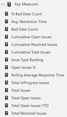
Created following DAX calculations
-
Reports and visualizations
- Created a background image based on EDNA Visualization course
- Developed color template using color generator (coolers) and imported the theme
- Downloaded icons from flaticon
- Created Summary Report
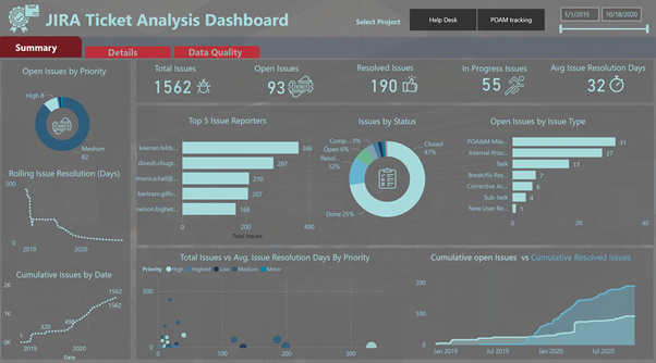
- Created Details Report
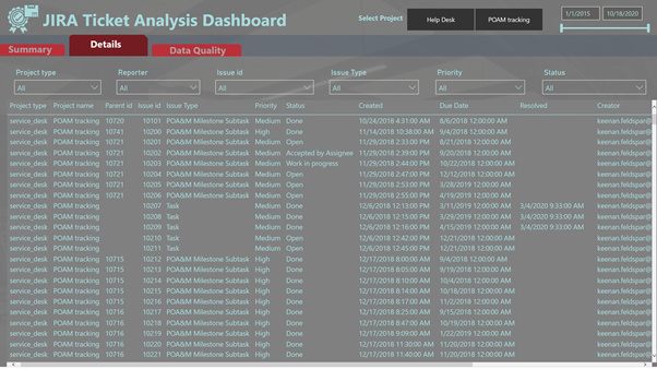
- Created Data Quality
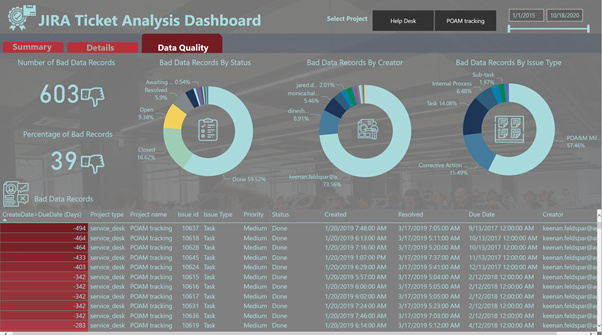
Inspiration:
- Navigation was inspired by @DianaB entry in Challenge 3 HR Data Insights
- Most of the Visualization were inspired from EDNA Courses
Thanks,
Kiran Kumar
@tweinzapfel , Thank you very much for your positive feedback. I enjoyed working on this report.
All,
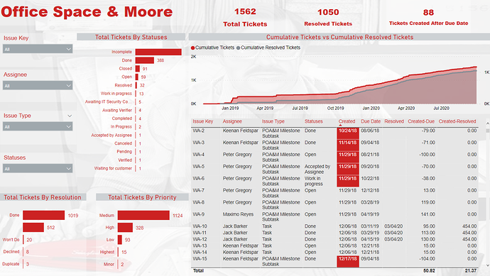
Here is my submission for this challenge. Had a fun time creating this one. Those of you who have watched the movie Office Space, will get a kick out this! Full writeup to follow in the next couple of days.
Here is the weblink:
Thanks
Jarrett
Welcome to the World Of Charticulators
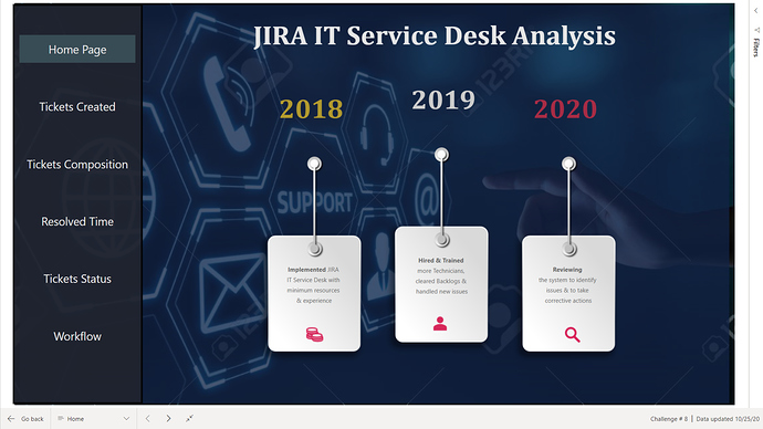
Here is my submission for Challenge # 8
Finally managed to complete the report. Some visuals took days to complete and it was really a Rollercoaster ride.
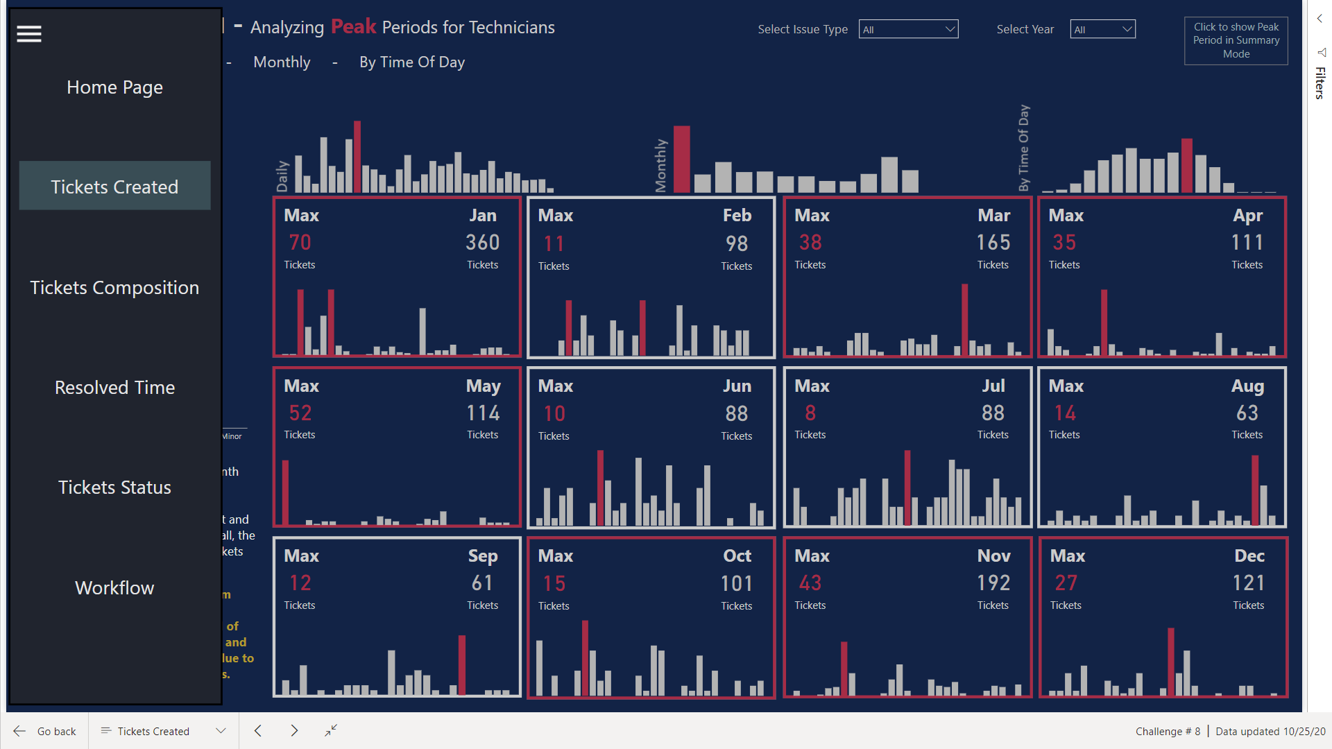
Using The Report
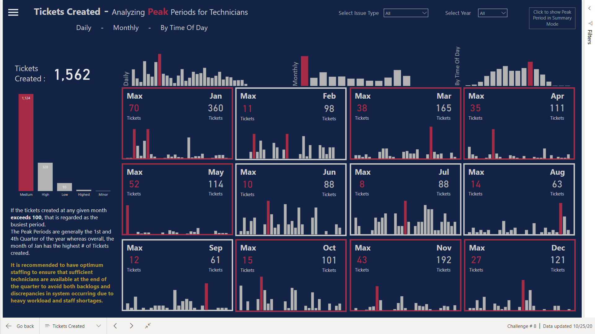
Tickets Created
I tried to build the flow of the chart by first analyzing what Peak Periods are. I tried to show the Peak Periods by Time of Day also so management has the idea as to what time of the day are the busiest for Technicians. You can see that Borders of the Calendar looking visual are Red for some but Grey for others. I made an assumption that the # of issues more than 100 in a month will be considered as a busy period. Therefore, the Borders will turn Red Dynamically whenever the # of issues are more.
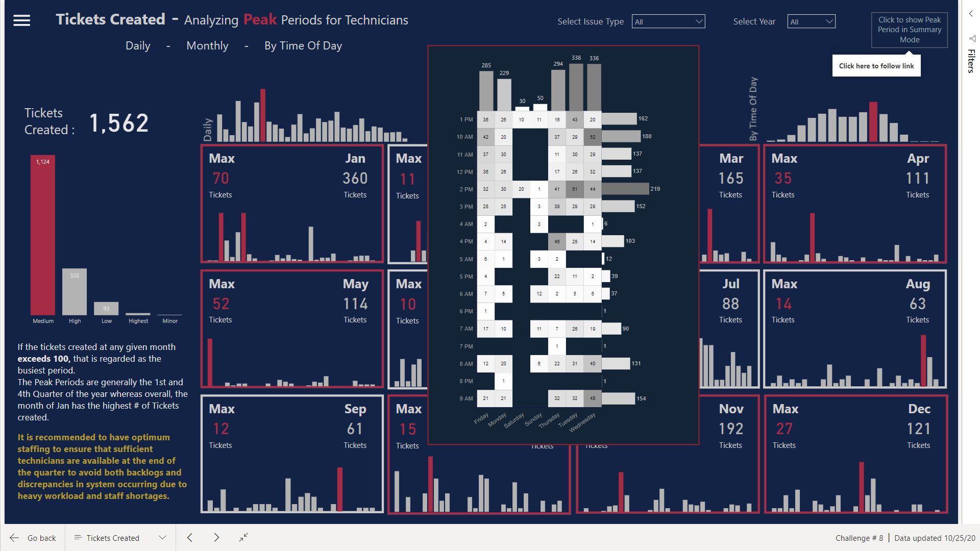
Moreover, If you click on the top right corner, heatmap looking table will pop up giving the summary of Peak Times & Days.
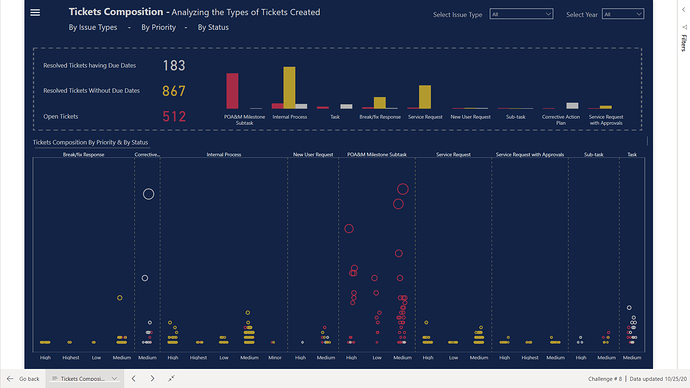
Tickets Composition
Here I have used the Dot Plot Visual to show the # of Tickets Created, segregated by Priority and highlighted by the Status of the Tickets.
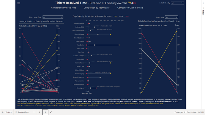
Tickets Resolved Time
The # of days taken to resolve the issues are highlighted here divided into years. The visual itself conveys a lot of information but I have also marked some items for management to analyze.
There were some items whose Created Dates were higher than Due Dates so here I assumed that Created Date column was valid as we already are facing issues with recording of Due Dates in the system
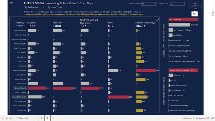
Tickets Status
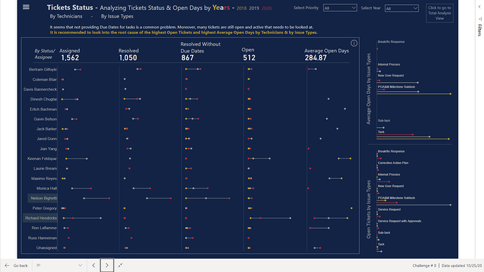
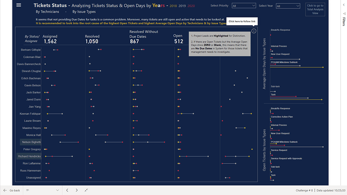
Here I have converted the table into Bar Chart looking Table that can easily highlight the issues. I have used OPEN DAYS ** term that actually means Active Tickets & Active Tickets Days.
If you click on the top right side, analyzing the Status Trend over the Years will be much more easier with the use of Dumbbell & Lollipop Charts
Workflow
At the end the system issues and allocation of resources are highlighted.
Here I have used Waffle Charts instead of Card visual as Waffle charts are perfect for comparison between 2 categories.
Visuals Used
Native Bar Charts
Native Column Charts
Dot Plot by MAQ Software
Enlighten Waffle Chart by MAQ Software
Dumbbell Charts designed in Charticulator
Bar Charts designed in Charticulator
Lollipop Charts designed in Charticulator
HeatMap designed in Charticulator
Slope Charts designed in Charticulator
I know I haven’t explained much as I am exhausted and have to get prepared for the grinding starting tomorrow. I haven’t worked so hard before in completing the project but now I feel satisfied as we can have Tableau looking visuals in Power Bi too ![]()
This past 2 weeks have been a great learning experience, diving into R scripts, Statistics and Charticulators.
Thanks @BrianJ & @AntrikshSharma for your help along the way.
Thanks @haroonali1000 for coming up with the right dataset at the right time ![]()
P.S. Charticulator is not easy when you are trying to design visuals and to make it work with the report design but custom visuals communicate way too much information than native PBI visuals.
With the help of @BrianJ, here is the link to the report
Superb design. Love it. Very inspirational!
Wonderful design here as well. So smooth and easy on the eye
Once again amazingly creative! Love the web based app look and feel
Wow! This is so incredibly good it’s crazy. 5 stars
Me too. So amazed at how creative our community is. So inspiring.
#bestPowerBIcommunitybyfar
Well done to everyone.
To see the improvement from everyone, challenge to challenge is so inspiring.
I haven’t been able to put anything together yet due to being consumed with the Analyst Hub development and release.
Might try in the coming days…
