Here’s Greg’s entry for Power BI Challenge 8. @Greg, feel free to add other details of your work.
Here is the link to the report:
Here’s how Greg described it:
Here are the notes I kept during development:
NOTES:
What I liked:
- I’ve been gravitating towards simplicity for the last few challenges (even while producing complex but visually compelling reports), and feel that I’ve found my “happy place” in this challenge submission, with its standard white background and simple, small, and familiar navigation
- Rather than choosing a colour palette myself (I’m an engineer by training, so by no means would I impose my graphical sense on others), I went to the colour experts and used a palette they had chosen; I really like the results and it certainly freed-up time for me
- I’m happy with the categorization of priority, status, and type into 3 groups each, and feel that the simple column charts on the summary page of the report effectively show trends without becoming overwhelmed by detail
- I’m happy to have implemented at least a partially-successful Ring Chart in Python; I can see great opportunities for future Python visual development as my Python and statistical knowledge both increase
- I’m pleased with the results of avoiding blanks in numerical measures by appending a “+ 0” onto the end of each; I can see this becoming a standard practice with me
- I’m pleased with finding a method of easily working with custom smart narratives (write text first with placeholders for the measures, write the measures, replace the placeholders with the measures [which are now the “values”] [and name the variables to match the measures], save the values, then last of all format the values)
What I didn’t like/what needs more work:
- I was not able to figure out (in the time I allowed myself for this challenge) how to add the data labels for the percentages themselves into the Python Ring Chart, and so resorted to a “hack” by adding 3 standard Power BI Card visuals, 1 with each of the 3 percentages; a full implementation in Python would have been preferred
- I did figure out how to implement a 2-item dataset (category, value) sample into a Python Ridge Plot, but was unable able to figure out (again, in the time I allowed myself for this challenge) how to properly extend the sample into a Python Ridge Plot with a 3-item dataset (project, date, issue count)
- I’m discouraged I didn’t get the opportunity to explore the “watchers” further (in the time I’d allotted myself for this challenge); I figured out the data model well, but didn’t have time to analyze it properly (or actually at all)
- I’m discouraged I didn’t get the opportunity to explore the parent-child hierarchies further (sigh, again, at the risk of repeating myself, in the time I allotted myself for this challenge); again, I figured out the data model but ran out of time before I could explore this in visualizations
Inspiration:
- I was inspired by the simplicity of @sam.mckay’s eDNA Challenge #6 submission, with its solid-colour sidebar and white body, and wanted to challenge myself to take this as far as I could and try to minimize the “chrome” as much as possible
Power BI Challenge 6 - Insurance Complaints- Ever since I saw the use of multiple overlapping donut charts in @Walter’s eDNA Challenge #2 submission, I’ve been on the lookout for an easy way to re-create this.
Power BI Challenge 2 - Customer Insight- With my son taking an Introduction to Python programming course in university this year, I seized the opportunity the explore Python visuals inside Power BI and am pleased with the results. The method of “attaching” Power BI datasets and measures to a Power BI Python visual is the same as for other visuals (i.e., drag-and-drop). Once the data is available within the Python visual, however, the complexity begins and a thorough knowledge of the use of Python mathematical packages is in order; I’ve just scratched the surface and would need to make a concerted effort to improve my statistical chops before attempting to use this visual in a production report.
Setup:
- used Power BI Desktop October 2020 release (Build 2.86.727.0, date published 10/19/2020)
Goals:
- challenge myself to try and minimize the Chrome as much as possible, using simple sidebars created in PowerPoint and familiar navigation (same as iPhone/iPad and Microsoft Teams, for example)
- to allocate a much higher percentage of my challenge preparation time to data preparation and analysis rather than to visualization niceties/themeing (in sharp contrast to my previous challenge entries)
- to gain more experience with the Smart Narratives visual
- to gain more experience on how to use Python visuals within Power BI
- to gain experience handling Parent-Child hierarchies in Power BI
Assumptions / Characterizations:
- this was my first time working with a JIRA dataset, so researched standard workflows and statuses to assign the available statuses to one of the three what seemed to me) standard status categories: To Do, In Progress, and Done. The assignments used in this analysis were:
- To Do:
- Accepted by Assignee, Awaiting IT Security Course Completion, Open, Opened, Pending, Waiting for approval
- In Progress:
- Awaiting Verifier, In Progress, Verified, Waiting for customer, Waiting for support, Work in progress
- Done:
- Canceled, Closed, Completed, Done, Resolved
Here’s the code for the calculated column:
Status Category =
VAR _DoneList = { “Canceled”, “Closed”, “Completed”, “Done”, “Resolved” }
VAR _InProgressList = { “Awaiting Verifier”, “In Progress”, “Verified”, “Waiting for customer”, “Waiting for support”, “Work in progress” }
VAR _ToDoList = { “Accepted by Assignee”, “Awaiting IT Security Course Completion”, “Open”, “Opened”, “Pending”, “Waiting for approval” }RETURN
SWITCH( TRUE(),
‘Status’[Status] IN _ToDoList, “To Do”,
‘Status’[Status] IN _InProgressList, “In Progress”,
‘Status’[Status] IN _DoneList, “Done”,
BLANK()
)
- I renamed [Priority] to [Description], then assigned a shortened [Priority]
Here’s the code:
Priority =
SWITCH( TRUE(),
    Priorities[Description] = "Highest", "P1",
    Priorities[Description] = "High", "P2",
    Priorities[Description] = "Medium", "P3",
    Priorities[Description] = "Low", "P4",
    Priorities[Description] = "Minor", "P5",
    BLANK()
)
- I assigned the 5 priority levels into 3 priority categories as follows:
- High: Highest, High
- Medium: Medium
- Low: Low, Minor
Here’s the code for the calculated column:
Priority Category =
VAR _HighList = { "Highest", "High" }
VAR _MediumList = { "Medium" }
VAR _LowList = { "Low", "Minor" }

RETURN
SWITCH( TRUE(),
    Priorities[Description] IN _HighList, "High",
    Priorities[Description] IN _MediumList, "Medium",
    Priorities[Description] IN _LowList, "Low",
    BLANK()
)
– I assigned the types into 3 type categories as and used a calculated column to implement this as follows:
Here’s the code:
Type Category =
VAR _BugList = { "Break/fix Response", "Corrective Action Plan" }
VAR _TrainingList = { "Internal Process", "New User Request" }
VAR _GeneralList = { "POA&M Milestone Subtask",  "Service Request", "Service Request with Approvals", "Sub-task", "Task" }

RETURN
SWITCH( TRUE(),
    Types[Type] IN _BugList, "Bug",
    Types[Type] IN _TrainingList, "Training",
    Types[Type] IN _GeneralList, "General",
    BLANK()
)
Python Notes:
- as noted above, a thorough knowledge of the use of Python mathematical packages is required to effectively use the Python visual within Power BI
- for the Ring Chart, the pandas, matplotlib, and numpy package libraries were used to explore modifications to and extensions of a standard one-level donut chart as a 3-level ring chart
- (didn’t get a satisfactory implementation, so left the Ridge Plot out of the report, but am including my notes anyway for posterity) for the Ridge Plot (or Joy Plot or Overlapping Area Chart), the pandas, matplotlib, numpy, and scipy package libraries were used to explore the modifications to a standard area chart
- the Python visual is interactive and respects filters and slicer selections from other Power BI visuals, but my understanding is that each time the Python visual has to be redrawn (i.e., after a dataset change), the underlying data is written to disk as a CSV file and is then “pulled” back into the Python visual as a static screenshot. As such, tooltips are not available.
- I am a verbose coder, and a Python neophyte, so I don’t pretend that my coding is representative at all, but for the Ring Chart only required 32 lines of code were required (after comments and whitespace were removed)
- although legends are available in the handful of Python charts and plots I sampled, they are quite different in layout than those in standard Power BI visuals, and standalone standard Power BI visuals should probably be used to generate legends consistent with the other visuals in the report
General:
Setup:
- sourced blue-based colour theme from https://www.pantone.com/color-intelligence/color-of-the-year/color-of-the-year-2020-palette-exploration
- used [Just Color Picker] to grab HEX codes
- used Power BI Tips Theme Generator https://themes.powerbi.tips/ with these copied HEX codes to generate JSON theme file
- used PowerPoint to generate sidebar images with theme colours and set page backgrounds with them
Data Loading/Data Transformations:
- used eDNA extended date table M code as [Dates] Extended Date Table (Power Query M function)
- marked [Dates] table as a date table
- changed all date formats in [Dates] table to dd-mmm-yyyy [by typing “dd-mmm-yyyy” into “Format” box directly]
- used eDNA DAX Clean Up tool to format all DAX measures and calculated columns https://analysthub.enterprisedna.co/dax-clean-up
- created empty tables for [Key Measures], [Admin Measures], and [Narrative Measures]; opened 2 sessions of Tabular Editor (1 each on my Challenge #7 [C7] PBIX and this file) and copied measures
- created empty tables for [Ring Chart Measures] and [Ridge Plot Measures]
- added [Last Refresh] table (used Power Query in both C7 PBIX and this file to copy-and-paste)
- added [fxNow, fxToday, fxStartDate, fxEndDate, fxFirstComplaint, fxLastComplaint] parameters (used Power Query in both C6 PBIX and this file to copy-and-paste)
- renamed [fxFirstComplaint] to [fxFirstDataDate]; renamed [fxLastComplaint] to [fxLastDataDate]
- changed [fxFirstDataDate] to use earliest [Created] date; changed [fxLastDataDate] to use latest [Due Date]
- modified [Dates] query to use now-available [fxStartDate] and [fxEndDate] parameters
- used “Properties” pane in “Model” view to hide all ID fields
- imported [jira cleaned.xlsx] as staging query [RAW Jira Tickets]; disabled load; moved into new group [Staging Queries]
- created reference of [RAW Jira Tickets] as [Assignees], chose only [Assignee] column, removed duplicates, removed empty, sorted alphabetically, added index column (from 1)
- renamed [Index] to [Assignee ID]
- added [Name] column using “Column From Examples”; duplicated column, then used “Split Column\By Delimiter” (space) to add First Name] and [Last Name]
- created reference of [RAW Jira Tickets] as [Creators], chose only [Creator] column, removed duplicates, sorted alphabetically, added index column (from 1)
- renamed [Index] to [Creator ID]
- added [Name] column using “Column From Examples”; duplicated column, then used “Split Column\By Delimiter” (space) to add First Name] and [Last Name]
- created reference of [RAW Jira Tickets] as [Priorities], chose only [Priority] column, removed duplicates, sorted alphabetically, added index column (from 1)
- renamed [Index] to [Priority ID]
- created reference of [RAW Jira Tickets] as [Projects], chose only [Project key], [Project name], [Project type], and [Project lead] columns, removed duplicates, sorted alphabetically, added index column (from 1)
- renamed [Project key] to [Project Key], [Project name] to [Project Name], [Project type] to [Project Type], [Project lead] to [Project Lead], [Index] to [Project ID]
- created reference of [RAW Jira Tickets] as [Reporters], chose only [Reporter] column, removed duplicates, removed empty, sorted alphabetically, added index column (from 1)
- renamed [Index] to [Reporter ID]
- added [Name] column using “Column From Examples”; duplicated column, then used “Split Column\By Delimiter” (space) to add First Name] and [Last Name]
- created reference of [RAW Jira Tickets] as [Resolutions], chose only [Resolution] column, removed duplicates, removed blanks, sorted alphabetically, added index column (from 1)
- renamed [Index] to [Resolution ID]
- created reference of [RAW Jira Tickets] as [Status], chose only [Status] column, removed duplicates, sorted alphabetically, added index column (from 1)
- renamed [Index] to [Status ID]
- created reference of [RAW Jira Tickets] as [Types], chose only [Issue Type] column, removed duplicates, sorted alphabetically, added index column (from 1)
- renamed [Issue Type] to [Type] and [Index] to [Type ID]
- created reference of [RAW Jira Tickets] as [Issues]
- renamed [Issue key] to [Issue Key], [Issue id] to [Issue ID], [Parent id] to [Parent Issue ID]
- [Due Date] column was text, so renamed to [Due Date (text)], then split column on [space] into [Date], and [Time]; deleted [Time]; split [Date] on [hyphen] into [Year], [Month], [Day]; merged [Year], [Month], [Day] into [Due Date]; replaced “–” with blank; changed column type to “Date”
- merged [Issues] table with [Assignees] table, keeping only [Assignee ID] column and removing [Assignee] column
- merged [Issues] table with [Reporters] table, keeping only [Reporter ID] column and removing [Reporter] column
- merged [Issues] table with [Creators] table, keeping only [Creator ID] column and removing [Creator] column
- merged [Issues] table with [Priorities] table, keeping only [Priority ID] column and removing [Priority] column
- merged [Issues] table with [Resolutions] table, keeping only [Resolution ID] column and removing [Resolution] column
- merged [Issues] table with [Status] table, keeping only [Status ID] column and removing [Status] column
- merged [Issues] table with [Types] table, keeping only [Type ID] and removing [Issue Type] column
- merged [Issues] table with [Projects] table, keeping only [Project ID] and removing [Project key], [Project name], [Project type], and [Project lead] columns
- changed datatype of all date columns in [Issues] table from “Date/Time” to “Date”
- changed date format of all date columns in [Issues] table to “dd-mmm-yyyy” [by typing “dd-mmm-yyyy” into “Format” box directly]
- Issues:
- changed [Parent Issue ID] data type to “Whole Number” so could combine with existing “Whole Number” [Issue ID] in next step
- used Parent-Child DAX pattern (https://www.daxpatterns.com/parent-child-hierarchies/#) to combine [Issue ID] and [Parent Issue ID] into new [IssuePath] column
- used Parent-Child DAX pattern (https://www.daxpatterns.com/parent-child-hierarchies/#) (again) to split [IssuePath] column into separate [Level1] and [Level2] columns
- created DAX table for [Watchers]
- extracted all values for [Issue ID] and [Watchers], [Watchers], [Watchers_4], [Watchers_5], [Watchers_6], [Watchers_7]
- added calculated columns for [Name] without domain; set to proper case; added calculated columns for [First Name] and [Last Name]
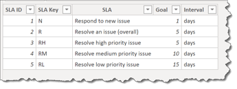
- added supporting table for SLA (service level agreements), and made-up data for overall and priority-specific SLA’s
- added supporting table for Python Ring Chart ring colours and data labels
- added supporting table for Python Ridge Plot area chart colours and data labels
Data Model:
- deleted all relationships auto-generated by Power BI
- arranged tables into “waterfall” layout, with lookup tables at top, fact table at bottom, measure tables at top-right, and supporting tables at bottom-left
- created 1-to-many relationships:
- Assignees[Assignee ID] → Issues[Assignee ID]
- Reporters[Reporter ID] → Issues[Reporter ID]
- Creators[Creator ID] → Issues[Creator ID]
- Priorities[Priority ID] → Issues[Priority ID]
- Resolutions[Resolution ID] → Issues[Resolution ID]
- Status[Status ID] → Issues[Status ID]
- Types[Type ID] → Issues[Type ID]
- Projects[Project ID] → Issues[Project ID]
- organized all [Admin Measures] into subfolders using Model view as displayed in @JarrettM’s video https://www.youtube.com/watch?v=J_qZ_S-ghoc
DAX Calculations:
- added “Admin” measures for:
- [Is Desktop] using difference between NOW() and UTCNOW() to determine user interface
- [Is Service] using difference between USERNAME() and USERPRINCIPALNAME() to determine user interface
- [… Tooltip] measures to use [Is Desktop] and [Is Service] to display the appropriate tooltip regardless of interface
Visualizations:
General:
- used same-size, different colour sidebar on all pages
- generated sidebars using theme colours [25% darker for sidebar colours (#0B3961, #48658D, #818E96)] and static text in PowerPoint, and exported slides as PNGs, then used as page backgrounds
- used buttons with less-than and greater-than signs (button text font=DIN, size=30 pt, padding=0) as back and forward chevrons at top-left of sidebar for navigation
- used changing colours to improve “bounce” (from grey default to white-on hover), similar to Microsoft Teams
- used multi-row card for Version and Report ID in bottom-left corner
- used smart narrative textbox in bottom-right corner for last refresh date (static text and dynamic measure for last refresh date)
- made text as small as possible and set style to italics
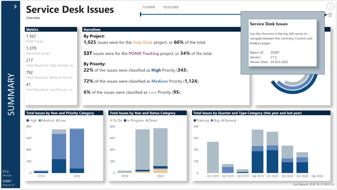
- used button with “Information” icon in top-right corner to allow the Info Tooltip to be displayed (when mouse is hovered over icon, then question mark icon appears below, which in turn when hovered-over display “Info Tooltip” page
- used changing line colours and line weights to improve “bounce” (from light grey default to darker grey on hover)
Info Tooltip:
- in Visualizations pane, Format section, set “Page Size” to [Tooltip]
- in Visualizations pane, Format section, set “Page Information \ Tooltip” to [On]
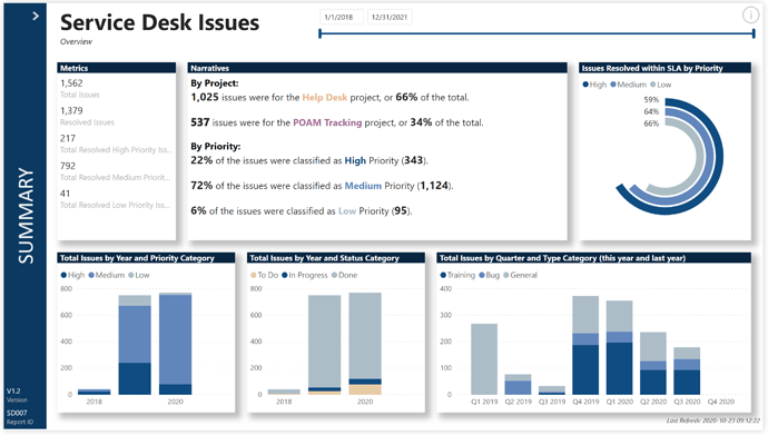
Summary:
- used standard multi-row card to show metrics
- used smart narratives textbox to display custom static text and dynamic measures; created a [Narrative Measures] measure group to hold the measures I wanted to include so I could both find them easily and set their formatting how I wanted without impacting the main report
- added standard Python visual and configured as a Ring Chart displaying high, medium, and low priority issue resolution vs. SLA performance
- adjusted transparencies (did you know you can use “#FF000000” as a colour in Power BI to “colour” something transparent?)
- the legends available in the handful of Python charts and plots I sampled are quite different in layout than those in standard Power BI visuals, so a standard Power BI donut chart was created and used with same measures and colours as the Python Ring Chart, and the title was removed and the height was reduced until only the legend was visible, then this visual was overlaid on the Python Ring Chart to create a consistent legend; further, the ring chart and the standalone legend were grouped in the Selection Pane so their visibility z-order would stay the same and they would be moved as a set
- couldn’t figure out how to add the percentages themselves into the Python Ring Chart, so created 3 standard Power BI Card visuals, set 1 each to each of the 3 percentages, and overlaid them on the Ring Chart
- used standard column chart to show issues by year and priority category
- used standard column chart to show issues by year and status category
- used standard column chart to show issues by quarter and type category for this year and last year (used filter pane to add visual filter for [YearOffset] of -1 or 0)
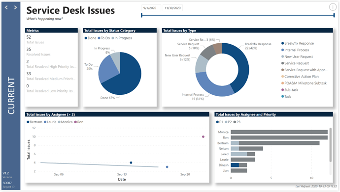
Current:
- used a standard date slicer
- used page filter for “Month Offset” between -1 and 1 to show a three-month period centred on this month
- used a standard pie chart to present issues by status category to determine the relative size of the current backlog vs. the current work-in-progress
- used a standard doughnut chart to present issue type, checking for the relative volume of bugs/fixes and internal process vs. other types of issues
- used a standard line chart to display the number of issues for each “assignee” during the current period; filtered the chart to display only those “assignees” who were assigned more than 2 issues
- used a standard bar chart to display the number and priority of issues assigned to each “assignee” in the current period
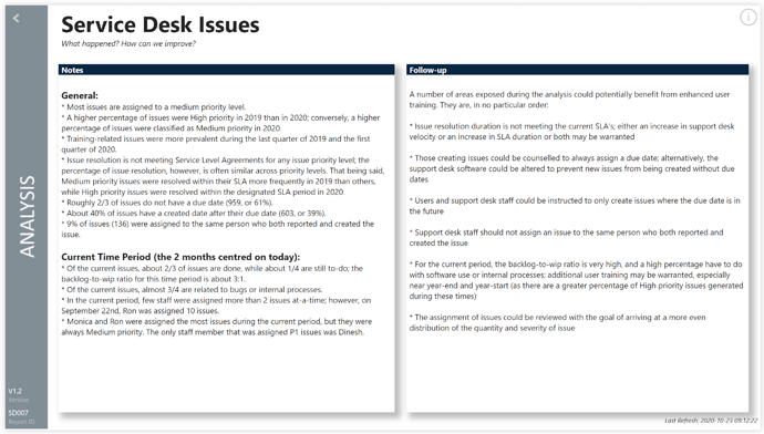
Analysis:
- used a smart narratives textbox for “Notes”
- used a smart narratives textbox for “Follow-up”
To learn about the real-life scenario presented for the challenge, be sure to click on the image below.
