Totally agree with @MudassirAli in that I think the bright red theme looks awesome, but wish you’d committed to it fully. As always, so many detailed touches to love in this report (I’m 100% stealing that Chevron page navigation construct). One thing I absolutely cannot figure out is how you got the publish to web to default to full-screen with no other on-screen navigation except that which is native to the report itself?
I am in awe of all the wonderful reports in this challenge, I look forward to learning about all your reports. I almost do not do it. It took me more time than I expected. My report is simple I tried to do more complex but with my current knowledge will take longer.
Thanks @MudassirAli. I’m looking forward as well to extending the use of the “TopN and Others” technique. I couldn’t agree more on the theme … I did it all in red at first, but then found it difficult to differentiate, so tried to find (and failed epically) to find nice complementary colours … oh well … perhaps next time. Greg
Thanks @BrianJ. It was my first try with PTW, so not sure … it just happened. The only thing I can guess is that I hid all pages except for the first page; perhaps if PTW only “sees” one visible page? Greg
Loved working through this, I’ve gone all out with my design too really how far you can take Power BI and your UI.
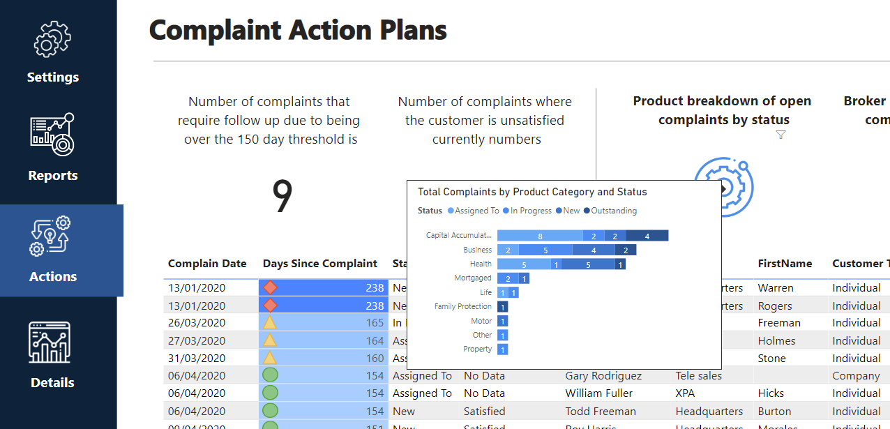
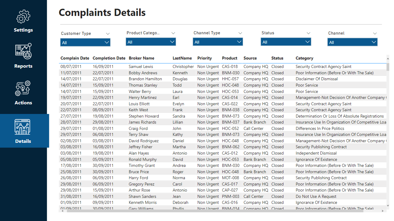
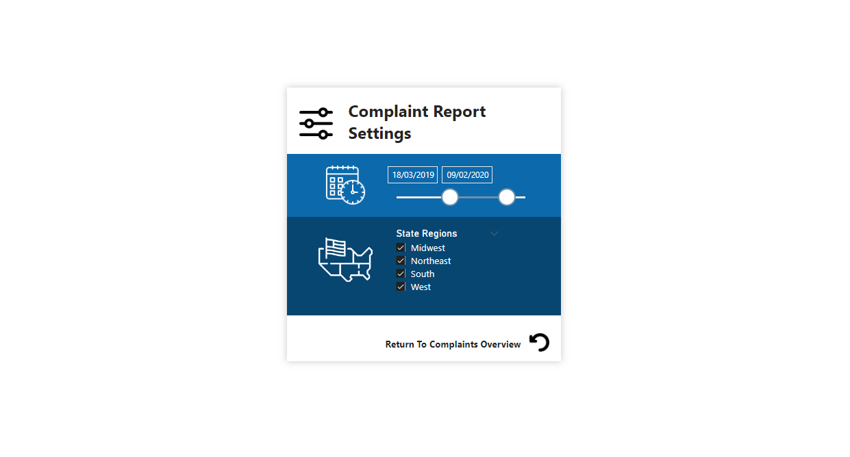
I really wanted to build a full on application this time round. These type of reporting applications are where you can showcased immense value in what you are doing. No other tool compares to the feature set of Power BI in enabling this.
More details to follow how I did a few features here
@sam.mckay this is the first time I have seen you using so many techniques in a report. I loved the way you broken down individuals and business complaints analysis in two different tables.
The way you analyzed status change using different colors and icons is also very cool.
I have created two parameters for status changes and completion days so the auditors can find which complaint ID files they need to look into.
After filtering those, result details are shown on the table.
Red flag pops up in visual tool tip if days to complete (average 13 days) or number of status changes (average 3 times) are over the average.
Just wondering how amazing all the other participants reports are. They are so beautiful.
Wow wow wow. Everyone well done, an amazing standard of work. Its going to be a tough one to judge!
Please can you all ensure that your pbix files have submitted and any participants wanting to be considered for the newcomer challenge please let us know.
@MudassirAli thank you and I totally agree, it’s really cool to see so many different (and high quality) reports on the same data. Especially data you already understand.
The chart I used on the Trends is the combo line/stacked column chart. It gave the look I want but the tooltips would not cooperate with me at all!
My fav part about this was playing with the calculation groups to be able to use a chiclet to flip the date table to be joined to complaint date or completion date. And then also using a bookmark/button to move between date/month.
@BrianJ This is super interesting, I am always struggling with getting that AI visual to work honestly! I am not sure why Daniel Harris is chosen though. From what I can see he’s doing ok – 5 complaints and the the only one with an outcome is positive, the rest are N/A. I am wondering what I am missing?