Thanks @MehdiH The Bowtie visual was something I stumbled across, worked quite well but it has some limitations.
Challenge 14.pbix (880.4 KB)
Challenge 14 Data.xlsx (603.7 KB)
Hi, here’s my submission for Challenge 14.
I accepted the #EnterpriseDNAPowerBIChallenge14.
From
Wan Teck (Newbie)
5 Likes
Hello everyone,
Here is my entry for Challenge 14
The main purpose of this report was to keep it as simple as possible, from the perspective of an executive that must take a decision fast and is not quite interested of seeing a bunch of information on the same page.
So I created a Start Page where is possible to choose one of the categories (Patient | Ambulance | Hospitals and Employee)
Each page has what I believe are the main KPI. (Needless to say that there are endless possibilities but those numbers were my choice😊 )
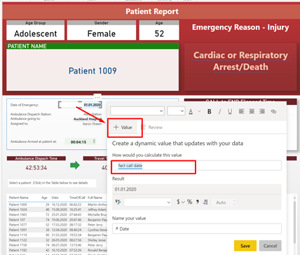
For Patients and Employees Analysis I created a Drill through to a landing Report page where the “Manager” can see more information about the Patient, Ambulance Performance, Protocol name and Duration of the task from call to end.
In the Patient/Employee Report Page I used a great feature available in Power BI, the “Value” when using the text. I love it!
The Report can of course be printed or saved as pdf.
Also, for making it easier for the “manager”, I created some custom tooltips
Well, this is my first entry and clearly a lot to learn. However, I am PROUD to be a member of EDNA.
Cheers
Sorin
7 Likes
All,
While it’s always great to see the Challenge regulars back for another round, I am especially thrilled to see the large number of first time entrants and non-member submissions.
This was not a simple dataset, nor an easy challenge but the quality and creativity of the submissions across-the-board is absolutely outstanding.
Kudos to everyone who submitted an entry! 
- Brian
3 Likes
Great model/
1 Like
Thanks Steven!
Hi everybody,
Congratulations to everyone for creating such great reports.
well done eDNA community
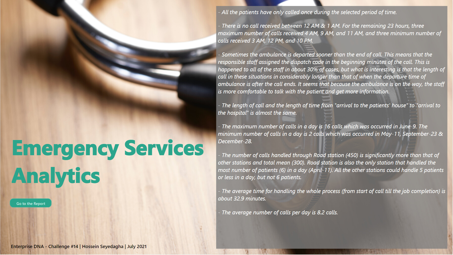
And I am sorry that I miss the deadline, but I had busy weeks, and I just could finish up my report.
Here is my submission for this challenge.
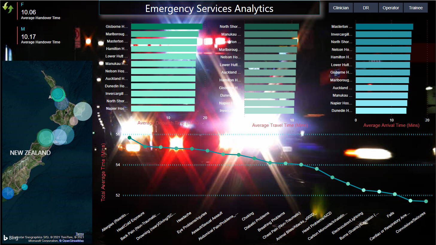
This page is going to give the reader a brief overview of all aspects of the report:
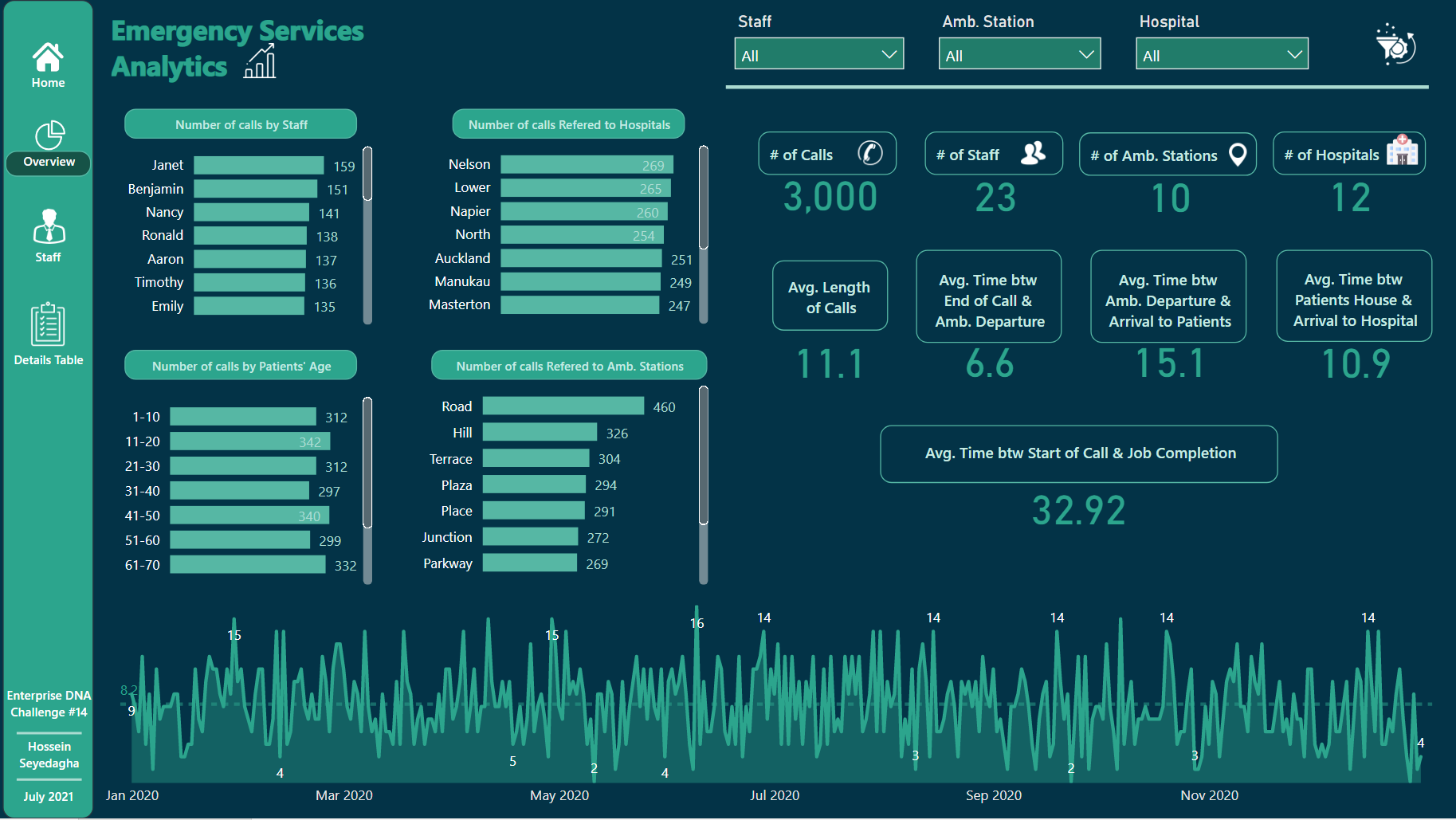
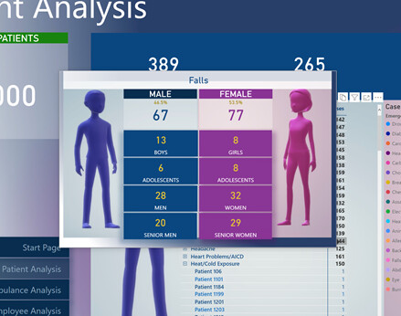
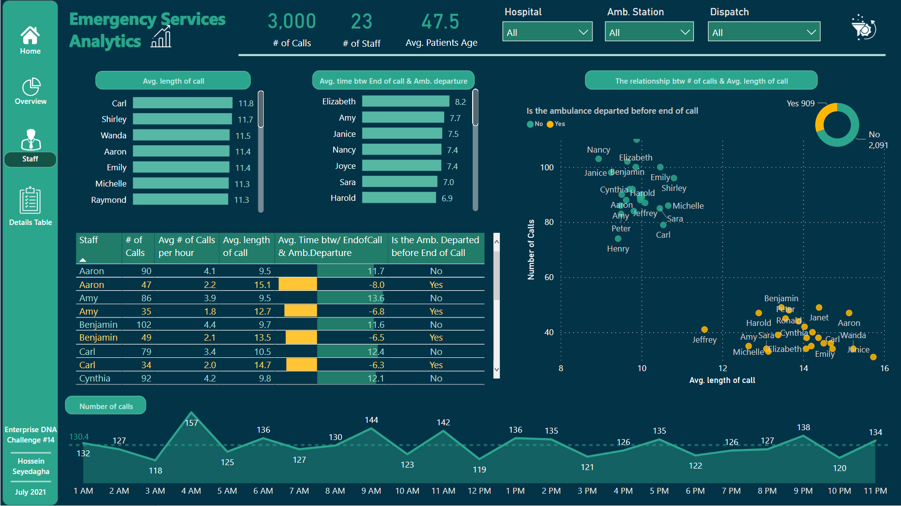
This page tells more details about the staff and how they candled calls:
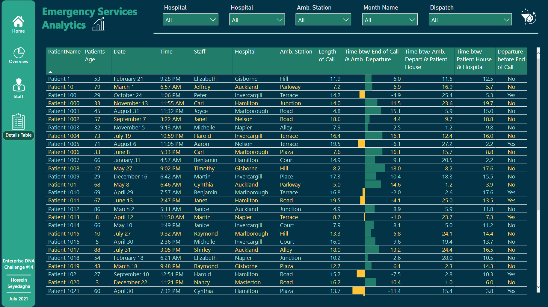
This page is planed to give detailed information about patients using the drill-through option.
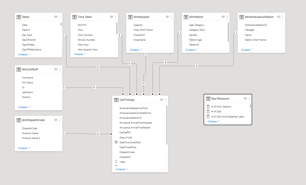
And finally, here is the data model:
This is also the Power BI file:
eDNA Challenge #14.pbix (4.7 MB)
I will add the description as soon as I can,
Any feedback is appreciated,
Regards
Hossein
10 Likes
Very good data governance, well done!
3 Likes
I like this submission very much, especially since it’s your first.
- The colors are pleasant and complementary.
- I’m impressed by the use of several types of visuals on the same page, especially the Heat Maps.
- I like the Performance vs. Target donut charts.
- In general, each page is well-organized and neat.
John Giles
6 Likes
Thank you very much John for your kind words.
It has taken me some time to gather the bravery to participate in an EDNA Challenge, I felt way out of the level needed.
So your words and how this report has been welcome by other members is quite inspiring.
F Pastor
3 Likes
You’re welcome, Federico.
Your bravery was well-rewarded.
John Giles
1 Like
I’ll try to not get all slobbery here, but it won’t be easy. This is fantastic. You earned your vacation.
There’s so much to be impressed by, but I’m really wowed by the analytical breakdown of the key components of the emergency services delivery process.
Also;
- Home Page Background
- Analytical Insights and Structure - Call Volume, Time Analysis, Patient Analysis
- Filter Panel
- Tooltip on the Ambulance Station vs. Hospital Matrix
- Patient Timeline
There’s so much to aspire to here where ‘aspire to’ implies deconstruct and lift.
Regards,
John Giles
2 Likes
@FPastor ,
I totally understand that hesitancy, but would just like to use your example to encourage everyone, regardless of your Power BI experience and skill level to participate in these Challenges. The Enterprise DNA forum community is one of the most supportive and encouraging I’ve ever encountered, and even if you are a beginner and submit a very basic report I guarantee it will be warmly received, you will enjoy the community experience of participating in these Challenges, and you will learn a ton and rapidly improve with every submission.
I have sponsored the “newcomer prize” for first time entrants for the past year expressely to encourage new folks to jump in and join the EDNA Data Challenges, since I believe they are the single best way to improve your Power BI skills that exists anywhere.
Remember that we all started as beginners, and that if you go back to the early submissions of our Challenge superstars like @MudassirAli and @alexbadiu , you will see a major evolution from those entries to the reports they are producing now. Personally, there’s nothing I enjoy more in these Challenges than watching the progress and growth of entrants over time.
Finally, if you are still hesitant to jump in and participate in the Challenges, consider participating in the Power BI Accelerator series, which is focused on expert-led skills development exercises that will give you a great foundation for participation in the Challenges. Week 2 is ongoing now, and you don’t have to have done Week 1 to participate.
OK, stepping down off my soapbox… ![]()
- Brian
5 Likes
Thanks Brian,
F Pastor
2 Likes
Hello Alex;
So much data presented in such a concise fashion.
A couple of questions;
- What is a ‘switch’ measure; I tried to investigate on my own, but can’t find an answer.
- I know very little about emergency services. But the Benchmark page, you offer metric for Hospitals. For some of the metrics, avg trip to patient, avg time to depart, for example, does the Hospital have a bearing upon the metric and performance/- this is a question mark, really.
Regards,
John Giles
1 Like
Hello JPS
I like your use of the two hour segments to examine performance data.
Also, the chart to compare time versus protocol is very interesting.
Regards,
John Giles
2 Likes
Hello Jarrett;
[I don’t have use of my SHIFT key, so my grammar may be awkward, as in no parentheses]
-
How do you rate your Charticlator exerience
-
How long did it take to add the Charticulator visuals. I like the data cards with the line charts.
Regards,
John Giles
1 Like
Hello @JohnG!
Thank you for your feedback and questions.
The switch measure is a technique I used in my report that consists on creating a table in the model that is afterwards related to Dax measures (main kpis) through a “switch measure”. This allows the user to select the KPIs they are interested to follow. The user is more engaged as the report becomes more dynamic and in the same time I am sure the user does not see to much information at once. (Avoid info overload).
In which concerns the second point, I am glad you asked this question. I am by no means experienced in hospital/ emergency service dashboards so I do not have any idea if my decision was good or not. But I will tell you my thought process. At first glance “avg trip to patient” and “avg time to depart” are not related to the performance of the hospital. I was decided not to show these metrics. Than I thought that maybe the performance of the emergency service act should not be siloed. I also thought of the purpose of the reports in general. In my opinion, a report should not only provide insights but also help ask new questions. Maybe the key to the performance overall in this use case is the process… or maybe not. Data is too anonymised to be certain. There you go. I hope it answers your questions 
3 Likes
Hello DeltaSelect;
-
I liked the stacked column chart on the first page. I wish I’d thought of it. It’s good information to present as part of KPI’s, one man’s opinion.
-
Credit to you for taking a swing at the anomaly analysis, especially the user selected threshhold.
-
One suggestion - On the Anomaly Analysis page, provide users with the ability to select a date to automatically view the anomalies that you display on the Detail Analysis page.
Regards,
John Giles
1 Like
Hello Alex;
I like your answer to my second question, regarding the Hospital Benchmark; especially the ‘data siloing’ and ‘asking new questions’ remarks.
Essentially, the analytical question I wrestled with during the challenge was that of responsibility. Does the Dispatcher bear responsibility for performance once the ambulance has departed, can the hospital be responsible for delays prior to arrival at the hospital. Perhaps, they do; again what I know about the delivery of emergency services would echo in a thimble.
I was looking for a means to tie the entire provess together, but failed.
From what I’ve seen so far ‘tweinzapfel’ comes closest to this goal.
Hoping you enjoyed Bastille Day.
Regards,
John Giles
2 Likes