Hello all !
Happy to participate to the first challenge organized by Entreprise DNA in 2021!
It was yet another great challenge! @haroonali1000 is really a master mind in choosing the right topics that will challenge us in a new way every single time!
COVID data using open data source is not that easy to prepare. And if you decide to enrich the data with other open data source it becomes even more complex.
And the requirement was to build a one pager out of it ! That was hardcore!
Covid Data is not like any other data. It needs context, it needs explanation, it needs to answer a specific needs, it needs a story! The report is about something that still has a huge impact on our lives and our jobs. It cannot be taken lightly.
I must confess, I might have spent more time on this report then the average in my past challenges.
After quite some time spent playing & experimenting with the data, the main idea of the report I wanted to build was the following:
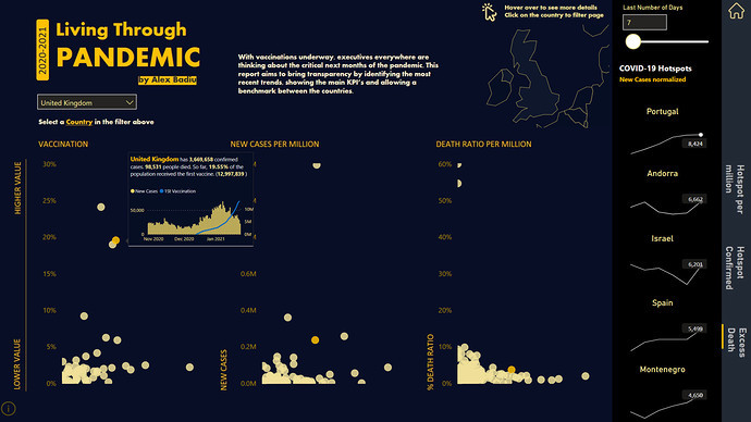
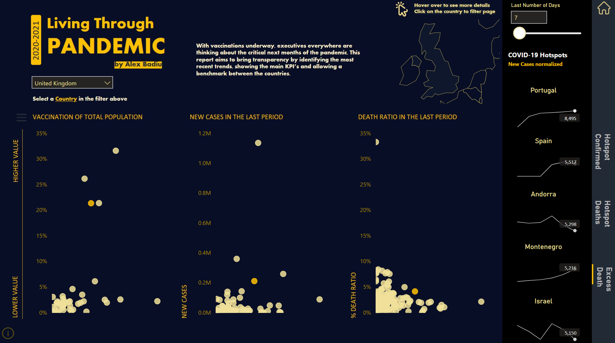
Create a report that will allow the user to benchmark the COVID situation of a chosen country against all other countries. I also wanted the user to easily identify which countries have an alarming increase in the evolution of cases compared to the other ones.
I wanted to show this because I observed that countries that have a strong increase in the number of cases will most probably close their borders, schools, non essential activities and impose movement restrictions to the population. So, if your company is active on that specific market, the business will be impacted.
Secondly, the virus rarely stays within borders, so impact on the number of cases for neighbor countries is to be expected.
From this main idea, I started to think about the user journey and the user experience. I wanted to create a report that, even though it has one page, it still offers an experience. In order to create this experience, I did not want to show all the data and information at once. I wanted the user to explore, to be in control, to find information by interacting with the report and by connecting the dots himself. I used a similar technique that is used by the book writers, which is to engage early on the user’s curiosity.
So, how did I build the data story into this report?
I decided to use scatter charts and using conditional formatting to highlight specific countries. I never used scatter charts and highlight in this way before. I never saw it in any other Power Bi report either. What pushed me to think about it was a past experience I had while participating to previous EDNA challenges.
I even wrote in one of my previous write ups that when I build reports, I sometimes find myself blocked. I have some ideas, I test them, but at the end, the result is not as expected. I therefore need to adapt, abandon the idea and move forward even though I invested an important amount of time.
What I did not say is that even though you spend time and effort to experiment new ideas that do not work in that specific moment, that does not mean it will not work in the future if they are used in a slightly different way.
An old idea that did not worked then, come back to me and gave me confidence it will work this time.
And it did! The highlighted scatter charts based on user selection are the backbone of my report.
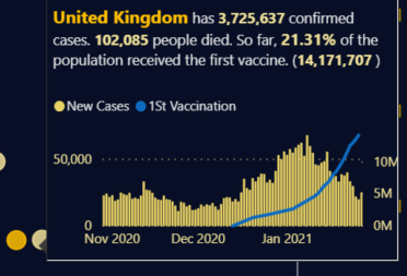
I built 3 scatter charts: one that shows on Y axis the latest vaccination % for the first vaccine. I thought that it can be interesting to show this information as the datasource is very recent it was not yet used in older COVID reports. I also wanted to give a more positive note to the report. The end is near, for the virus I mean! Seeing how the vaccination evolves from one day to another is for me the the most important information I want the end user to see from the beginning.
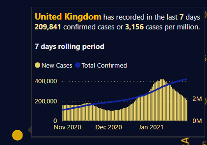
The second scatter chart shows the data of new confirmed cases. And what I thought it would even be better was to show this information based on the last X number of days decided by the end user.
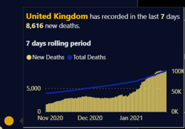
The third scatter chart shows the death ratio for the last selected period
All the scatter charts are completed with additional information with the use of tooltips.
In order to be consistent in the use of colors, I use the same Orange color in the title, selected country in the name of the filter, highlighted scatter chart round point and the name of the country inside the tooltip
Ex: Tooltip Vaccinated
Tooltip New cases in period
Tooltip Death Ratio
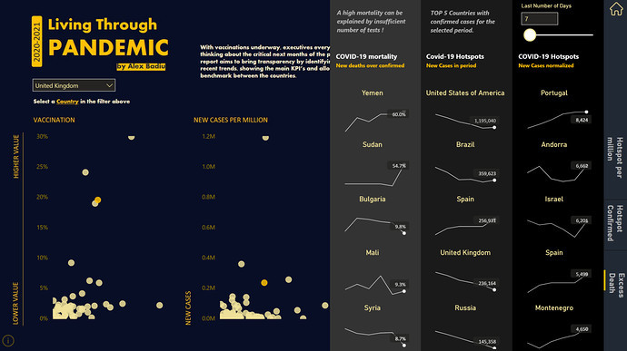
These scatter charts answer half of my main idea. I also wanted to easily identify which countries have an alarming increase in the evolution of cases compared to the other ones.
So I developed this:
In order to keep the harmony of the report I used again 3 types of metrics
First group is showing the top 5 countries + trend in the last week for COVID 19 hotspots compared to their population in the selected period
Second group is showing the top 5 countries + trend in the last week for COVID 19 total number of confirmed cases in the selected period
Third group is showing the top 5 countries + trend in the last week for the mortality %.
As I observed some very high % (the mortality should be lower then 10%) I felt the need to alert the viewer that the high percentages of mortality can be explained by the fact that the data is falsed by the insufficient number of tests in that specific country
To make the trend lines more appealing I wanted to see only the latest value label. I did not want to over clutter my page with to much data. The exercise of building all these trendlines and countries was long and pretty complex. (I invested the time to do it because I really felt it brings something extra to my report)
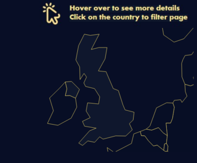
I also added a very discrete map. It was added for a specific use. I thought that if users will choose countries like New Zealand where there are not so many cases, the highlight will not work as the values are always close to 0. My idea was to let the user interact with this map in order to filter down the numbers and see the situation in any country.
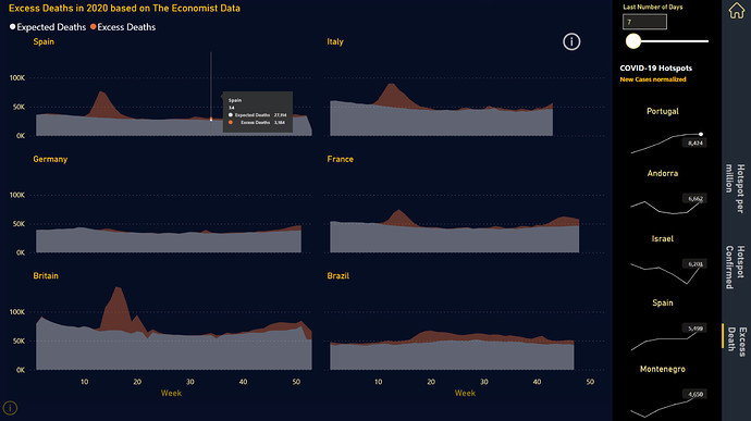
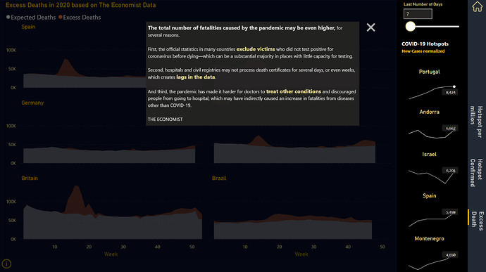
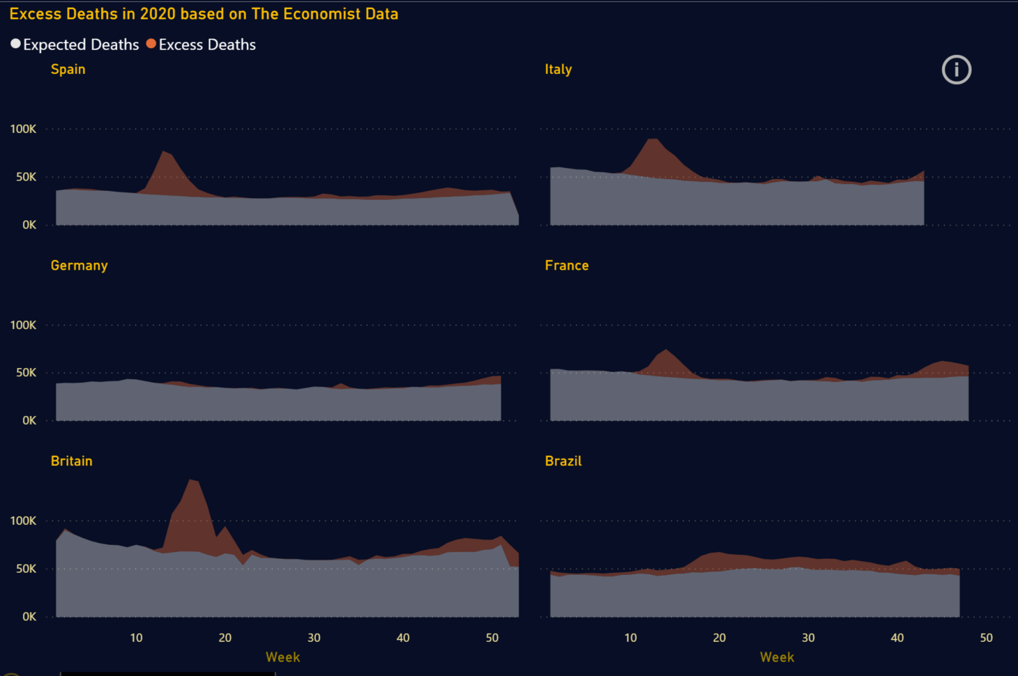
Last but not least I created an analysis I saw last year in the Economist:
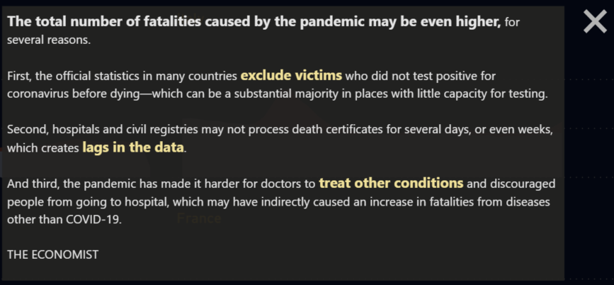
I thought is is useful to give extra information and to send to the audience the message that the numbers they see do not say the entire story of COVID.
At this point I considered my report as being finished. I started to check the numbers, compare, who knows, better test then be sorry later. I almost made a a huge mistake
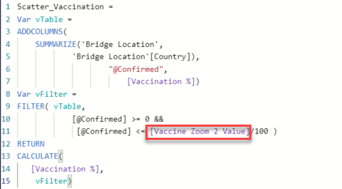
The data in the dataset is cumulative… I kept it like this in PQ. In order to compute the number of cases I always referred to the highest data in the dataset. That was a mistake if you kept the locations of countries like United Kingdom or France. You do not want the highest number, but the sum of values at the latest date that has values.
A simple change in the DAX resolved this issue
Total Confirmed =
    CALCULATE(
       LASTNONBLANKVALUE('Date'[Date], SUM('Covid19 Fact'[Cases])), 'Covid19 Fact'[Type]="Confirmed")
My advice is to always check the numbers!
After I published my report and sent it to eDNA I thought it might be a good idea to share the report also inside my company. It spread like wildfire!! Now I have more users interested in learning Power Bi, more users sharing and happy to give their feedback.
I received a very constructive feedback. My manager wanted to see also the report so I was sharing my screen with him. He was working on a small screen (his laptop).
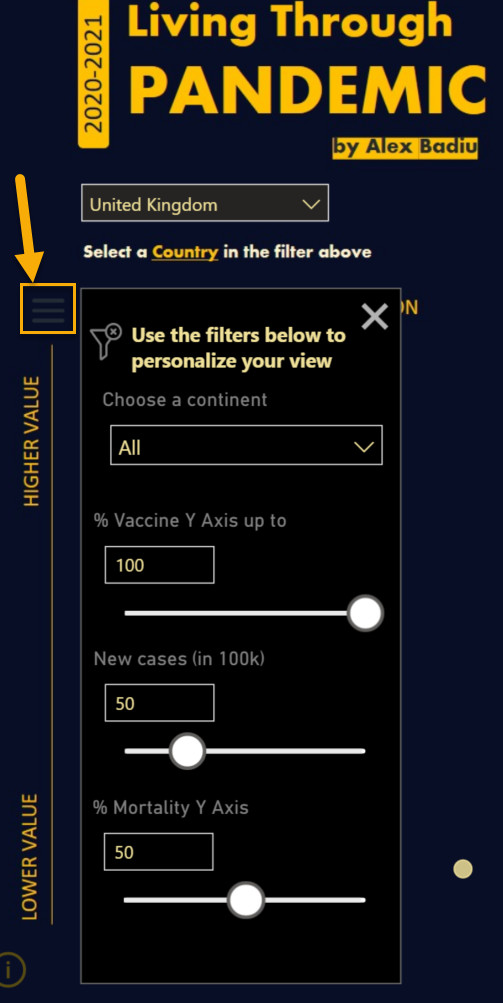
He asked me to choose a country which was not quite an outlier. He had difficulties in identifying the highlight. I explained him that he can filter down using the map but he had another idea.
He asked me why did I not create a way to control the Y axis of the scatter charts. He also said it would be nice to benchmark countries based on the continent.
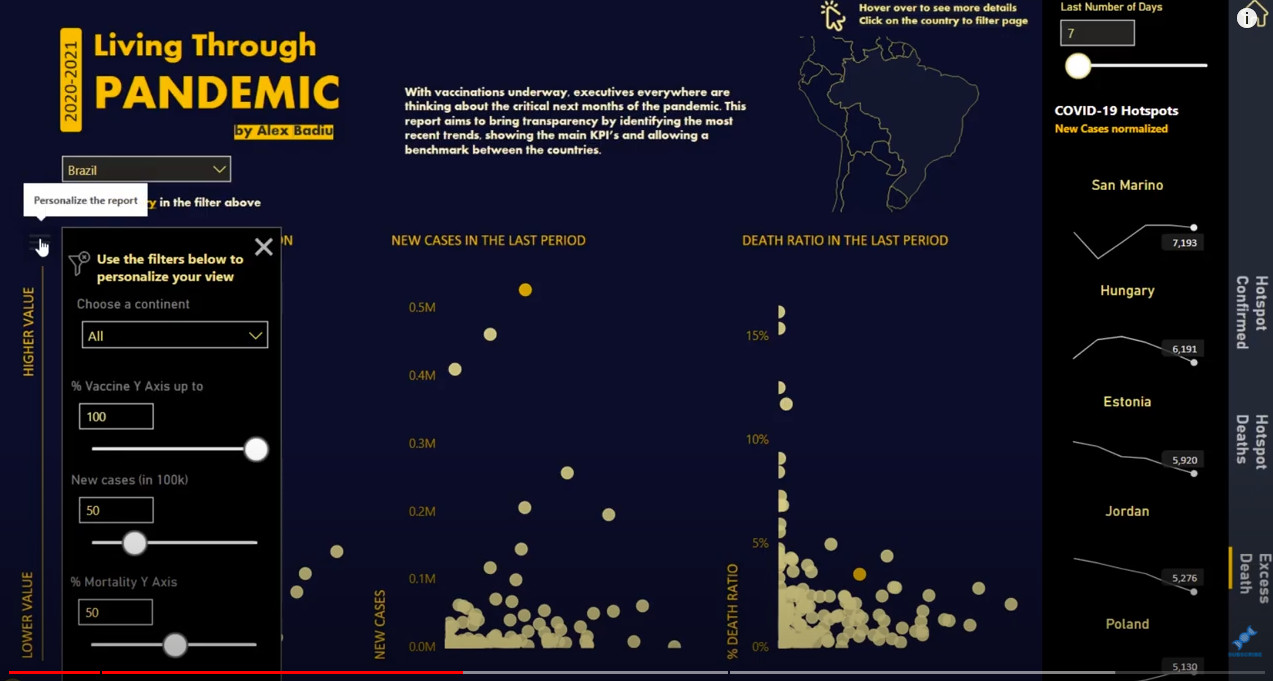
I thought he was right… so I went back to my report and developed this:
I added a dynamic menu that offers the possibility for the end user to personalize the Y axis of the scatter charts and/or focus on a specific continent. More power to the user to benchmark but in the same time I improved the overall visibility.
I am happy with the result. I think it works well and gives even more power to the user. I made a burger menu that is not that visible at first glance, but visible once the user zooms into the details of the scatter chart!
This was the story of how I built the report for Challenge n11 !
Thank you!
See you at the next Challenge!
Best regards,
Alex Badiu


 . Secondly, I didn’t know that there was a dynamic menu and at the first glance I thought it could have been better if the points in Scatter Charts were more visible. In your write-up I saw it exists and I am literally impressed by the beauty, analysis, navigation & completeness of the report.
 as always!