This is my first submission. I learnt a lot of things by participating this challenge. Thanks for EDNA for hosting this challenge.
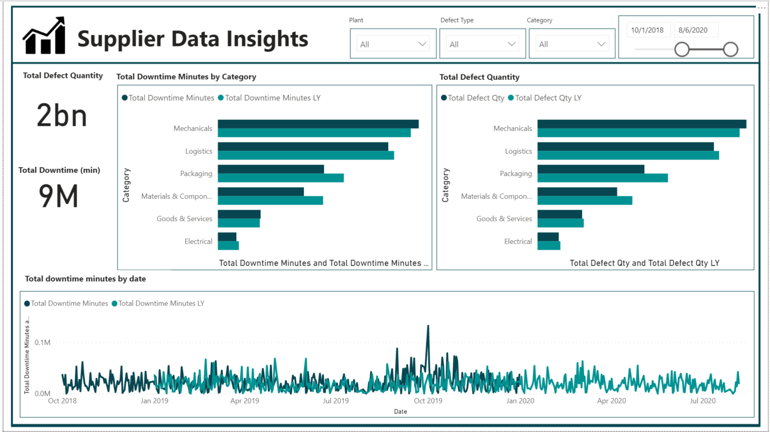
I used 1 report for showing most important metrics.
This is my first submission. I learnt a lot of things by participating this challenge. Thanks for EDNA for hosting this challenge.
I used 1 report for showing most important metrics.
I am new to Enterprise DNA and new to Power BI. There are some fantastic submissions that have taught me more about the potential of Power BI as a biz intelligence tool and give me some great ideas about different charts and how to effectively present data.
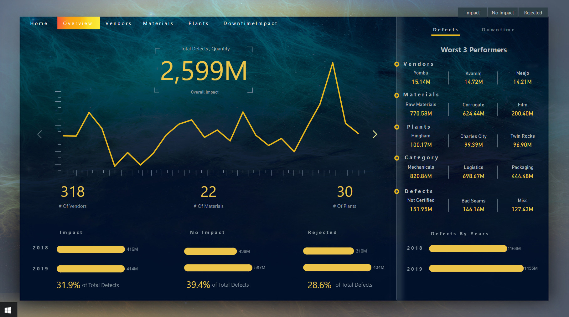
If appropriate, I would offer the following as a topic of discussion: How do we determine if something is the best or worst item in a category? In other words, if we have two suppliers and one has 15 million total defects and another has 8 million, is the second supplier better than the first? Or do I need to add context and convert it to a comparable measure? In my experience, “Total” figures are only relevant if everything else is equal. Not properly adjust totals to “per…” measures usually leads to incorrect business decisions.
So if a dashboard is using a ‘Total Defects’ or ‘Total Downtime’, is that the best indicator of which vendor or plant is the best/worst?
20th Dec 2020 will be my one year anniversary of learning PowerBI.
Here is my submission for this challenge 10.
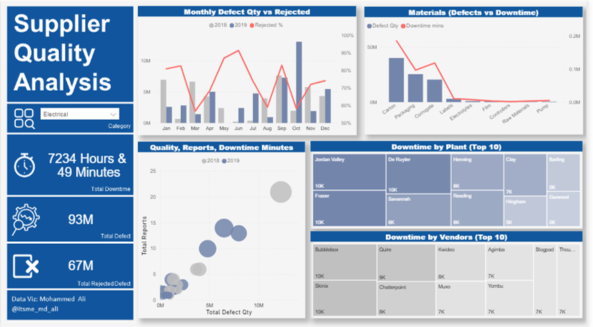
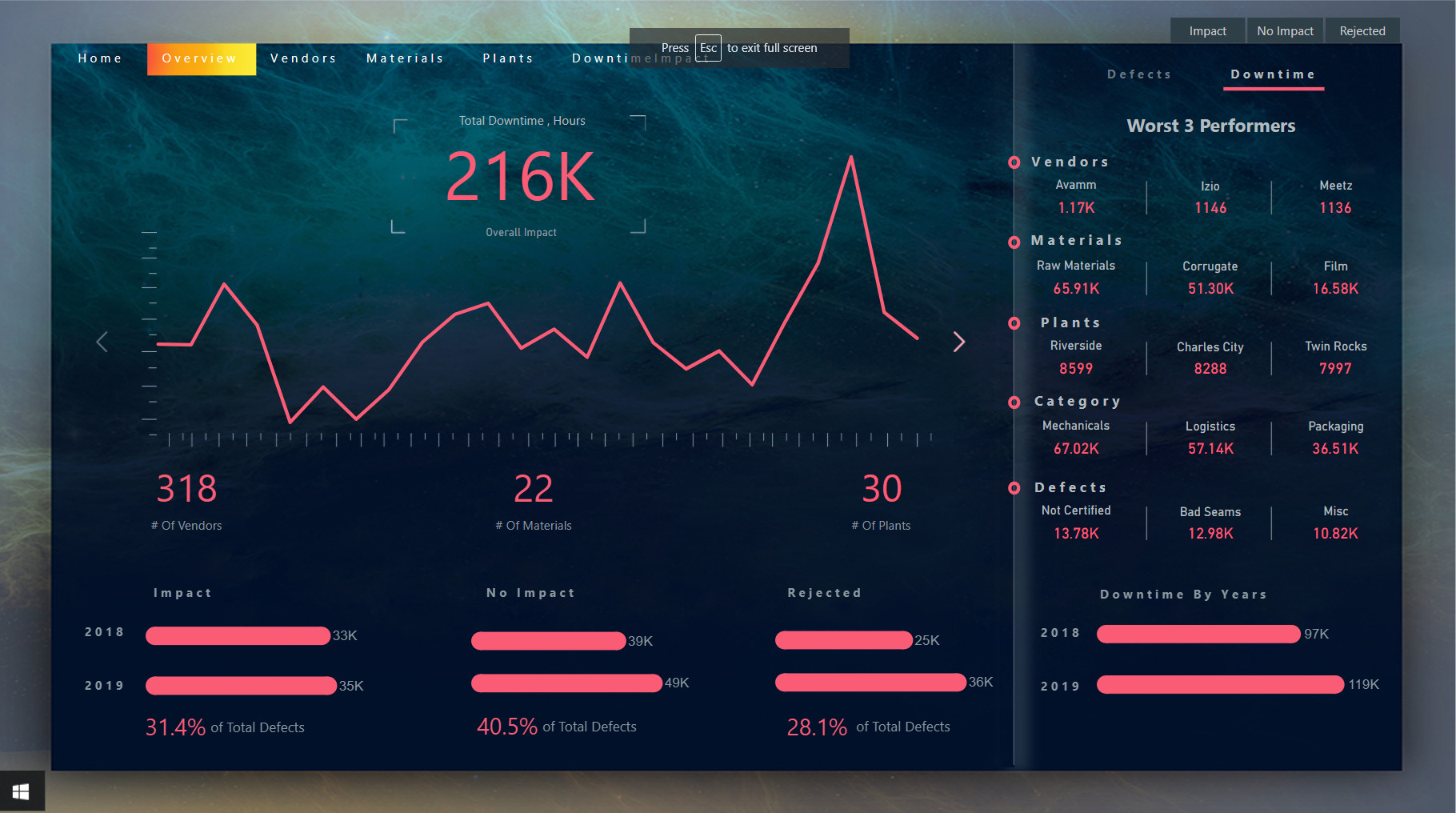
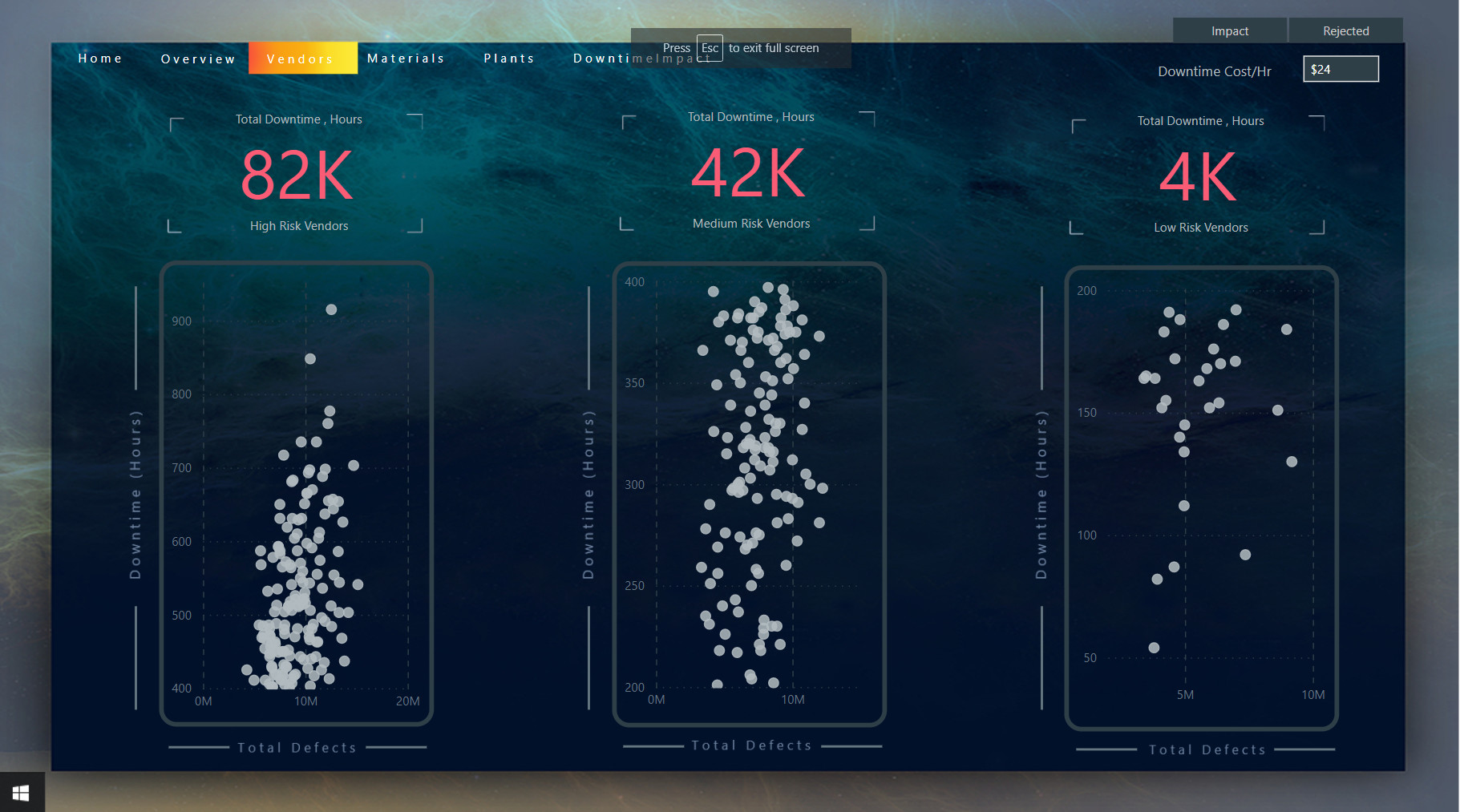
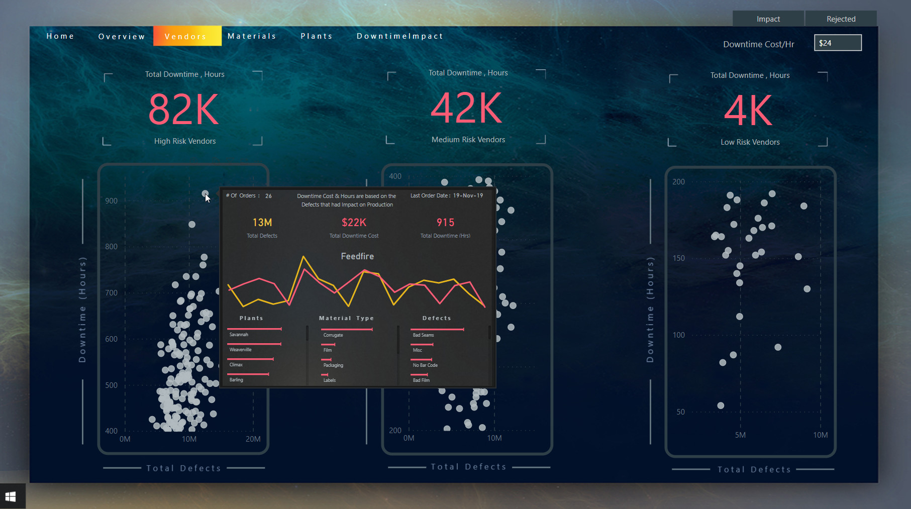
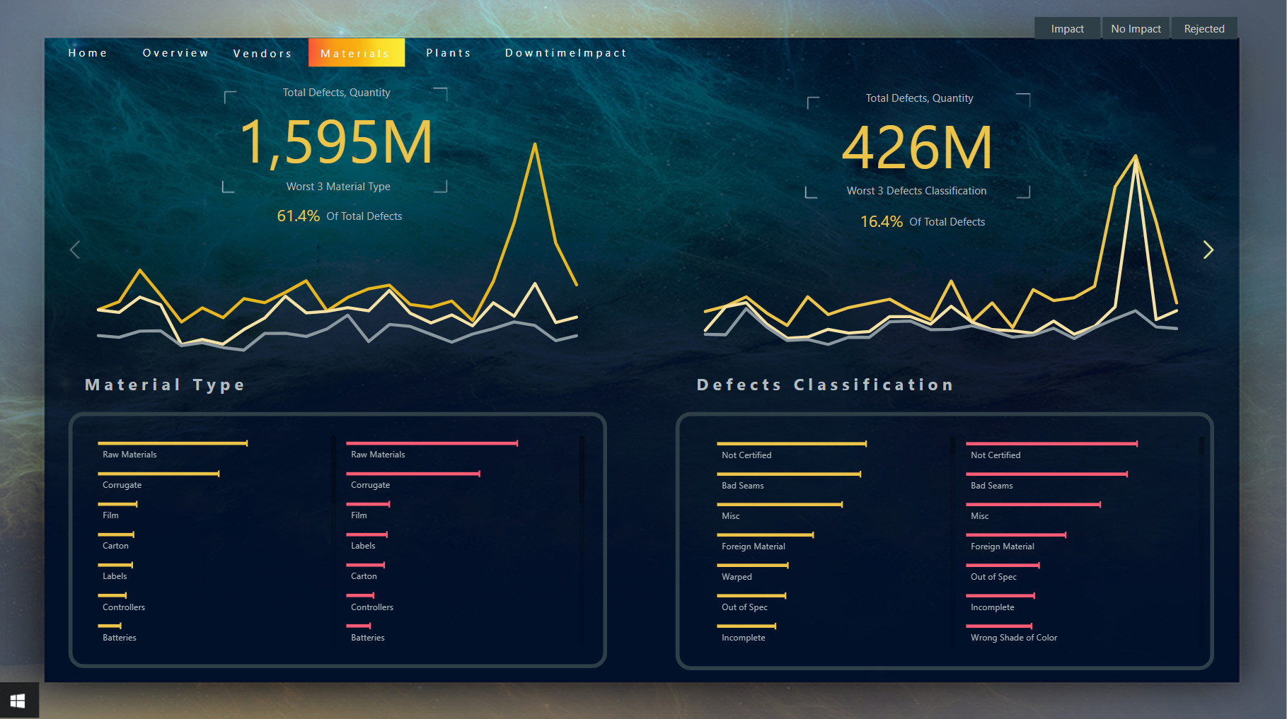
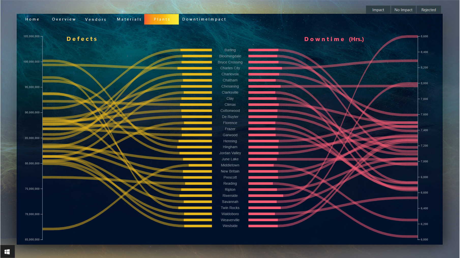
I have considered two key metrics for this challenge: total defects and the total downtime that these defects caused. With that, I have created Treemaps to understand who are the worst vendors (top 10), with respect to downtime and identify which plants do a better job finding and rejecting defects, to minimize downtime (top 10). Any feedback and suggestions are most welcome.
As always, so many excellent submissions to learn.
That’s incredible. You just took Power BI reporting to a another level. I didn’t even think this was possible.
I liked your design. It’s very clean and easy to understand. Sometimes I feel like less is more.
Yusuf.
This time I combined Adobe Photoshop, Power Point, Custom Visuals & Charticulator Visuals. Oh wait, yes Native Visuals too ![]() Thanks to my brother who helped me in some design aspects of the report.
Thanks to my brother who helped me in some design aspects of the report.
I found this one very challenging not because of the complexity of the analysis but how to present the required analysis. So here is my submission for Challenge # 10.
@marieke Good work in this challenge. The color theme looks pretty cool and the navigation in the report is a breeze. I feel the colors in the Bar charts are somewhat overwhelming so you can try to reduce the number of colors in a visual. Overall a good report with good analysis. 
@Greg The design of the report is somewhat similar to your previous challenge and I like the Navigation at top that looks pretty cool. You have become a master of using smart narrative visual and I still use Card Visuals with Text Boxes  . The level of detail is great in the report and the explanation is awesome as usual. Thanks for participating in the challenge again
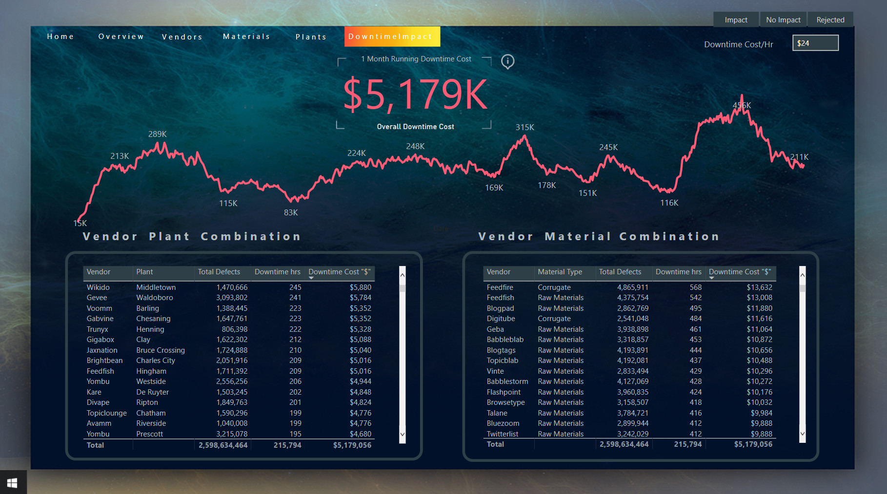
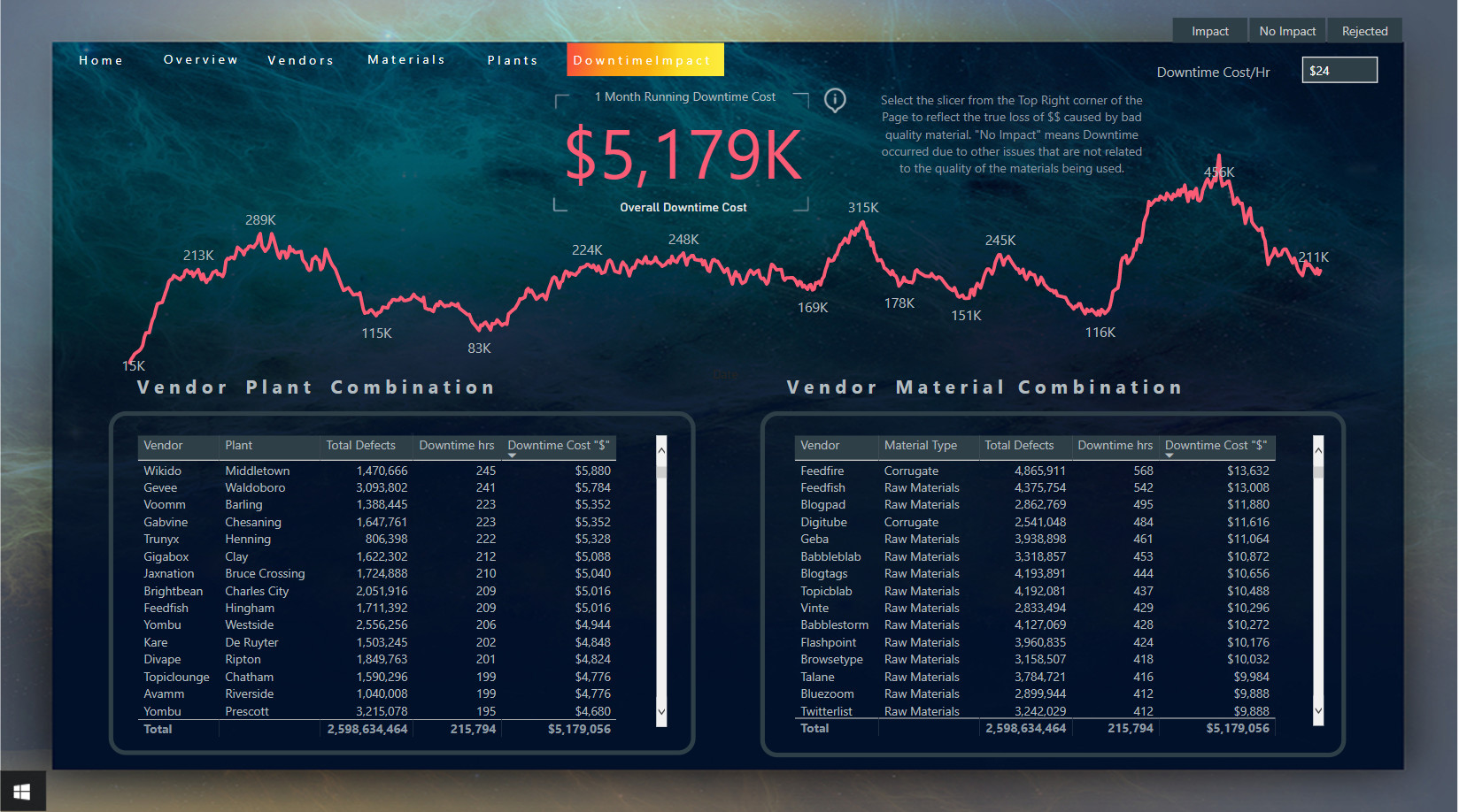
@MudassirAli Wow! Your report is so very cool! It looks amazing, and all the analysis is amazing. I really like the cost per downtime hour especially.
Mind blowing report @MudassirAli! Wow! Design pushed to the level of art! Well done! 
Everything is possible with Power BI, there are a lot of amazing reports in this challenge, every report is different from one to another, everyone has their own style and their unique ideas to present their solutions and that is the beauty of this challenges.
looking forward to see your amazing report for the next challenge.
Thanks @YusufGillani for your lovely feedbacks !!!
Yup … I’m falling into a “style” hole (that’s a good thing for production reports, I think … not so much for challenge entries …)
Hello All
Please find attached my submission;
This is about my 5months into PowerBI and I can only say I am here to learn.
Looking at the other submissions, I know I have a lot of ground to cover and looking forward to learning more.
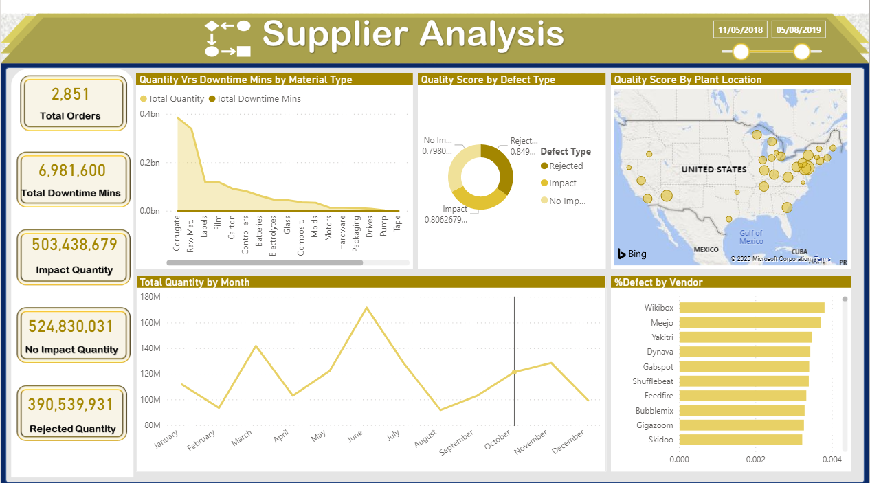
Any comments on this will be greatly appreciatedSupplierAnalysis.pbix (580.8 KB)
@Rachwen_Mesbehi This is just extreme creativity. It’s probably not so difficult to get the theme you selected but very difficult to match the visuals with the theme of the report which you did magnificently well. Which Text format did you use? Is it native in PBI or you imported the texts after designing in Power Point?
The only thing I feel there are many visuals clustered in a page that makes it somewhat difficult to focus and to get the flow of the story. Maybe the difficulty level is set as Veteran?
I’m stuck for superlatives, your report is stunning!
Beautiful report!!! Great Visualization
Thanks @MudassirAli for asking this good question, Indeed, I wanted to create an incomplete report (a lot of colors, a lot of disorganized visuals, and also a lot of ugly buttons and shapes) all of this in order to simulate the problems that faced this industry in that period (80’s) when the developers were struggling with a lot issues even after they launched the final product (Bugs , glitch and many other things), but after all this we see that this industry has developed and has had a lot of success, all this begins with a small step, we are still learning and developing our Skills everyday and this is really nice.
About the Text Format, I designed all texts from this website https://www.pixilart.com/
PS: After I saw your amazing entry, I think I’ll add a “Veteran” Button linked to your report .
Thanks
Rachwen
Hi DataZoe,
How did you make that Slicer menu. That’s a really good idea.
Yusuf.
Hi @YusufGillani to make the slicer menu what I did was the following:
That’s how it’s created ![]() Making sure your “Data” is unselected is very important or the slicers will reset when the panel is triggered which defeats the whole purpose.
Making sure your “Data” is unselected is very important or the slicers will reset when the panel is triggered which defeats the whole purpose.
Wow very impressive work