Dear all,
This challenge number 9 was yet another great challenge. I admit being a bit lost at the beginning. First of all, I did not know anything about waste management business model. I never used currency exchange either in my reports. Last but not least, I did not understand very well the data and couldn’t find right away a reliable source for daily exchange rate.
Of course, my first thought was to look into the currency exchange videos on Entreprise DNA then read all the blogs I could find around the subject, then look again other videos available on Youtube.
The usecase was not easy, even a bit intimidating at first. Comparing to previous challenges I had a lot more to prepare and learn before opening my Power Bi Desktop.
But the satisfaction of getting through these kind of challenges is enormous!
Every challenge takes you out of your comfort zone. Every challenge helps you improve, gain confidence and helps you better organize in the future. Practice makes you better! And in these challenges you practice in collaboration with some amazing analysts and designers.
So, back to Challenge number 9
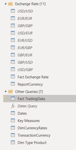
DATA MODEL
First tables I created are the Dates Table/ marked as Date and the Key Measures
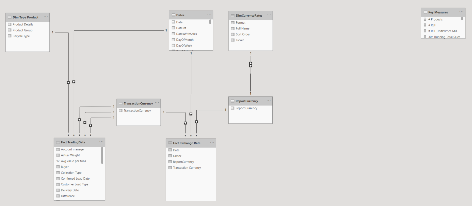
Then I prepared my main table: Fact TradingData
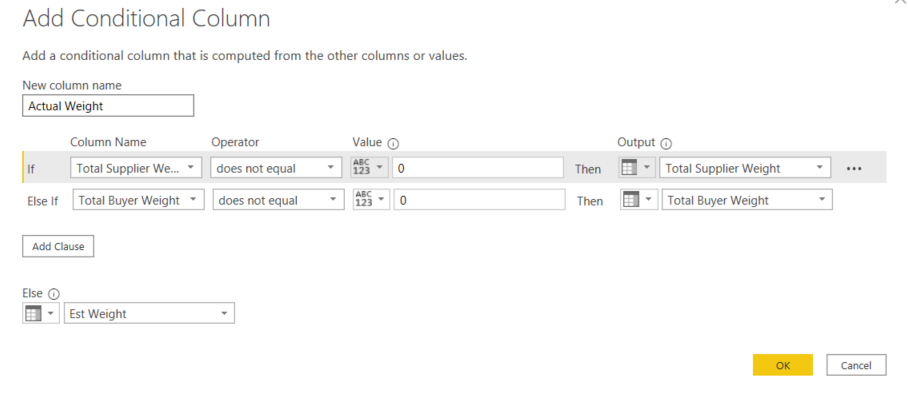
As indicated in the challenge request I created a column Actual Weight that takes into account the value of Total Supplier Weight, if not Total Buyer Weight and if both column values are missing, Est Weight
I also created a column Total Cost Amount and Total Sales Amount
I used the daily Exchange Rates from @kentyler who was kind enough to share with me an excel file he prepared with daily exchange rates. And when I say prepared, I say also cleaned and taking cared of the exchange rates during weekends. Thank you @kentyler for the file you shared with all the community! Personally, it saved me hours to prepare the data!
So I appended all the excel sheets into one single table and had my Fact Exchange Rate table ready.
Report currency table summarizes the currencies used in the report EUR/USD/GBP. It serves as a Bridge table between Fact Exchange Rate and Dim Currency Rates Table (the last contains the format )
Transaction Currency is my second bridge table that has 3 inactive relationships with Fact Trading Data. I use it because I want to connect to: Purchase Currency, Haulage Currency and Sale Currency.
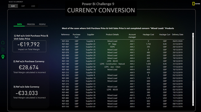
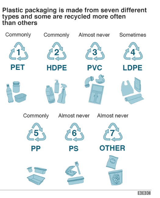
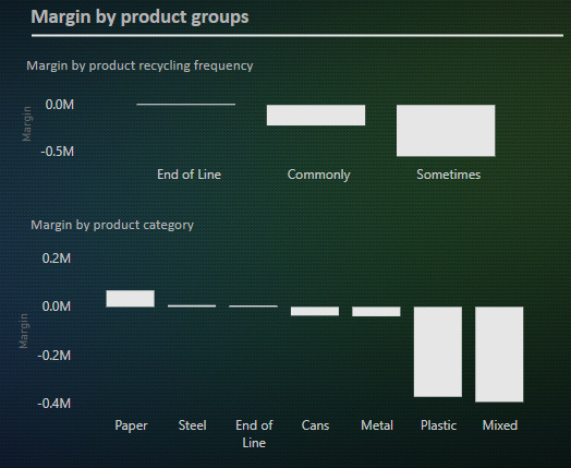
Dim Type Product is a table where I enrich my model with new information. After investigation on waste management, recycling and business model, I grouped my products as in the photo below.
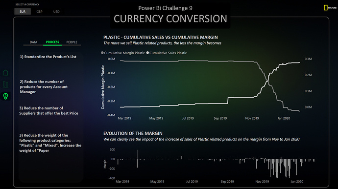
To be honest, I would have never have thought that plastic packaging is made up from seven different types of products. Doing this extra investigation on the data, made me realize that one of the problems is the product names. The list is to big, not standardized. And there is another problem I discovered. Mixed products are actually as bad for the margin as the plastic products…
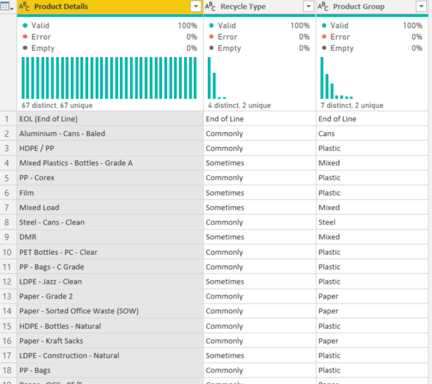
Print screen of the Dim Type Product
DATA ANALYSIS
Before jumping into the dashboarding part, I need to write couple of sentences about Data Analysis.
Generally, before jumping and even thinking about how I will design my report, I jump into the data. I create multiple tabs where I explore, test, turn the data upside down. I have to understand what is going on and the main ideas I want to present.
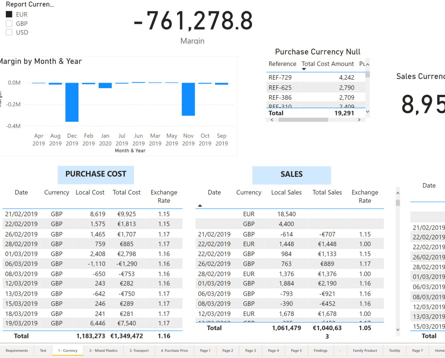
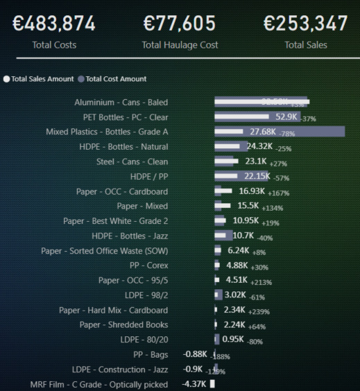
Ex: this is how my report looks like before starting to think about visualization. (tables help validating numbers before using in charts)
DATA VISUALIZATION
At this stage I did my data analysis in multiple tabs and written down the main issues/ subjects I want to address. I start from some ideas and select only the ideas that are the most relevant for the challenge.
Then I start prototyping. Usually I use a piece of paper. I read some time ago a book saying that designers tend to attach to what they create. That means that when you create a first design draft you keep it even though you are not fully satisfied. Even worse, you are in a “fix it” mentality, and you try fixing by adding new visuals, images etc. At the end you have a much more complicated design.
That is why, most often then not, I start my first prototypes on paper. I start simple. Data story and customer journey. What is my message and what is the simplest way to do it?
I start with the main page. I do not draw charts (not yet), I write text. In my main page I want to create an Overview. It is the first thing the users sees, it needs to be clear and simple. For this challenge, I thought that the main thing the user expects to see is the evolution of Margin. I wrote on my Top part of the page “evolution of margin”. In the challenge requirement we had to show the exact currency exchange rate, so I wrote that down (“to be included in the tooltip”).
Then I thought of user’s reaction. Ok, I can see the margin is going down. What is causing it? All the products behave the same? Or are there better products with positive margin?
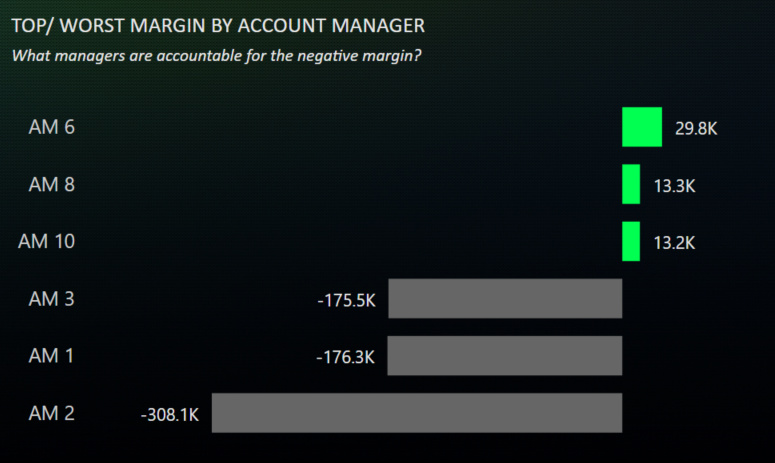
I wrote down on the paper top/worst margin products .
While analyzing my data, I knew the Account Manager is an important information. Maybe the key of the whole report. I knew I had to bring information concerning Account Manager as well. So, I thought of putting TOP/Worst AM
Harmony wise, I knew that my two charts below had to be the same type of visualization. I thought very fast of TOP/Worst 3 using barcharts because they show an interesting story, the main variations. I use them very often at work, most often in tooltips. (Information/Space ratio is really great in my opinion)
OK, now my first page is prototyped. I looked at the page and looked to improve it. I thought of KPIs (we use them so often that it seems natural to see KPIs on the first page). So I wrote KPI on the top right corner. I thought that my report was clear enough for my paper draft.
Will my report have a dark/white background? I felt that I will go with dark for this challenge. I searched on the internet for a background that I will use and Inserted inside a Power Point Page
Choose the color palette: For the color palette I searched high contrast. The highest contrast you can have with black is bright yellow. I started from there. I created a logo that is similar to National Geographic.
I then took the yellow and searched for similar colors.
I thought green is a good idea taking into consideration that the Challenge is about Waste Management. In order to find the right shade of green I made many tests. I tweaked the green until I found the one that stands out the most on my background
I put on my slide the background, the title, the logo. I then imported everything in Power Bi and started creating visuals.
I did some adjustments along the way between Power Bi and PowerPoint in order to have a background that works well with the visualizations.
Navigation was next. Buttons. I wanted the simplest buttons for the report. I thought of the structure of 3 buttons, 3 ideas, 3 exchange rates. I think it works well. Mathematics is working well in design. I do ratios also for spaces, limits, alignment. What is neat is that Power Point has already incorporated a lot of alignment features and helps you do it even without thinking.
The Power Point Background evolved all along the project. I incorporated along the way horizontal directions for the margin/costs/haulage/sales evolution by day, a splash of color to highlight and catch the eye of the reader (pre attentive signal) so that they knows what they are looking.
I used transparency to differentiate the main navigation buttons. When hovering on a new button its contrast kicks in and you know that there is a button. But when the button is not hovered, and the user makes a print screen for ex, he /she knows exactly where they are in the report.
Another think I always do, especially when I use a black background is to SWITCH OFF visual headers. It is a small detail, but for me it is important. (it takes 5 seconds to do it and gives a polish feeling to the report)
Design/Redesign. One thing to know is that in design, nothing is fix. Iteration is key for a good dashboard. In my initial paper prototype, I had a KPI for margin. When I put it in Power Bi, that KPI did not look at its place.
I used another button so that I replace the Evolution of Margin/Costs/Sales/Haulage with this KPI. I thought that it deserves a much more central part in my report. I then spent some time on creating a special KPI.
This decision was costly in time and in design. I knew that the extra button will give me extra work, as I need to create the same bookmarks for Margin/Costs/Haulage/ Design
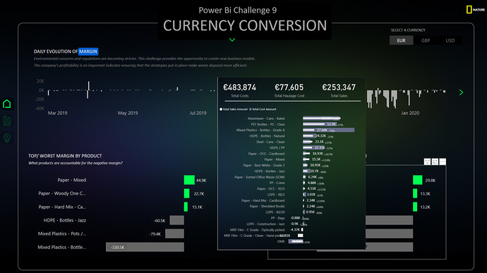
Tooltips. Once my page looked more or less like in the photo above I stopped and summarized from the users perspective what he/she will see, in which order, and what he/she will think.
I already have the evolution, the tooltip on daily exchange rate, the Top/Worst barcharts. I added also titles and subtitles to make it as clear as possible. I checked my interactions so that the user can play around and learn things through interaction as well. But I had 2 more barcharts, so I had more room for information.
I choose to create a tootltip presenting the details by product in terms of sales and cost.
What is nice about tooltips in this case is that the end user can find additional insight.
For ex, when hovering on the account manager that has the lowest margin, the end user will see that he/she is buying/selling an important amount of products. For the account managers with the highest margin is the opposite. They only commercialize a small amount of products. That was the small plus of this tooltip
The same tooltip was created for Products, but this time with details by account manager
TOP/WORST 3 BARCHART - How to do?
The technique to create a top/worst chart is simple.
You need to create two measures
- You need to create a measure that will keep only the top 3 and worst 3 values. This flag measure will then be used as a Filter in the visual
	Top_worst_flag AM Margin =
	VAR topX = RANKX(
	ALLSELECTED( 'Fact TradingData'[Account manager] ),
	[Margin],,
	DESC
	)
	VAR worstX = RANKX(
	ALLSELECTED( 'Fact TradingData'[Account manager] ),
	[Margin],,
	ASC
	)
	RETURN
	IF(
	OR( topX < 4, worstX < 4 ),
	1,
	0
	)
I shared this DAX measure in the Analyst Hub (search Top_worst_flag)
- You need to create a measure or use an existing one to control the color.
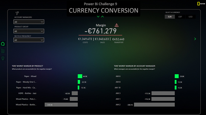
SPECIAL KPI
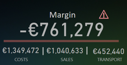
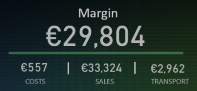
I would like to stop a second and talk about the KPI I created in my submission. I spent quite some time to perfection it and even though it seems simple, in reality it is full of surprises
What do we learn from this KPI?
First of all we have the main information concerning the cost, sales and transport (haulage). Secondly, we see a red line. This red line is calculated in the same time as the value. So performance wise it is better. The number and the line is not card but a button. The technique to build is explained by Havens in the following youtube video: https://youtu.be/5RnqhwF1cds
Then we have a Warning card icon . This warning card icon is dynamic, meaning that it disappears if the margin is positive.
The question you probably ask yourself at this moment is… WHY? Why do you create a dynamic icon to show that the margin is negative, when we have the red line that shows the exact same thing?
Well, the answer is additional information. A card has also the advantage of having a tooltip. That means that when the margin is negative I have the possibility of additional insight.
The main idea of this report in terms of design, but also for all my reports, is the use of the Progressive Disclosure technique.
Progressive Disclosure is an interaction design pattern that sequences information and action across several screens (step by step flow). The purpose is to lower the chances that users will feel overhelmed by what they encounter. By disclosing information progressively, interaction designers reveal only the essential, and help users manage the complexity of feature rich websites or applications.
Design should always be a creative process that is fueled by the data story and the user journey.
Creativity is a muscle, and the best way to gain muscle is to exercise. And guess what? Entreprise DNA is the best gym you can find 
Take care and see you at the next challenge,
Best regards,
Alex


 because your every report has this technique without fail.

