Hi All
Here’s a link to my report.
Power BI Report
Thank you
![]()
Best rgds
Wan Teck
I agree 100% his intro page is just…

Welcome to challenge 19, great entry!!
Can I please have a copy of your Power BI file please.
Does Power BI Elite crypto currency challenge sounds familiar to you?
Thanks
Federico Pastor
Hello @FPastor
Thank you
Following are the 2 files that i worked upon, 1) PBX File, and 2) power point file.
Although I am not particularly aware of the Power BI Elite crypto currency challenge, After creating my analysis, and struggling with design and colour scheme ideas for over 7 days [ and I often find myself struggling with], I looked for some design Inspiration online. and came across a video from BI Elite (https://www.youtube.com/watch?v=l6NspVReKz0&t=223s )
So I tried to recreate the same in my report - As I Found it the best way to represent my analysis
And for Colour Scheme, I picked colours from Your Report, As I thought they were the ones matching with EDNA’s Actual Theme.
Challenge 19.pptx (1021.3 KB)
Challenge19 pbix.pbix (4.7 MB)
Hello everyone,
This is the report development process for EDNA Call Center analysis.
During the process of developing this report, I have attempted to apply the knowledge learned in the Report Development Best Practices course taught by @Greg.
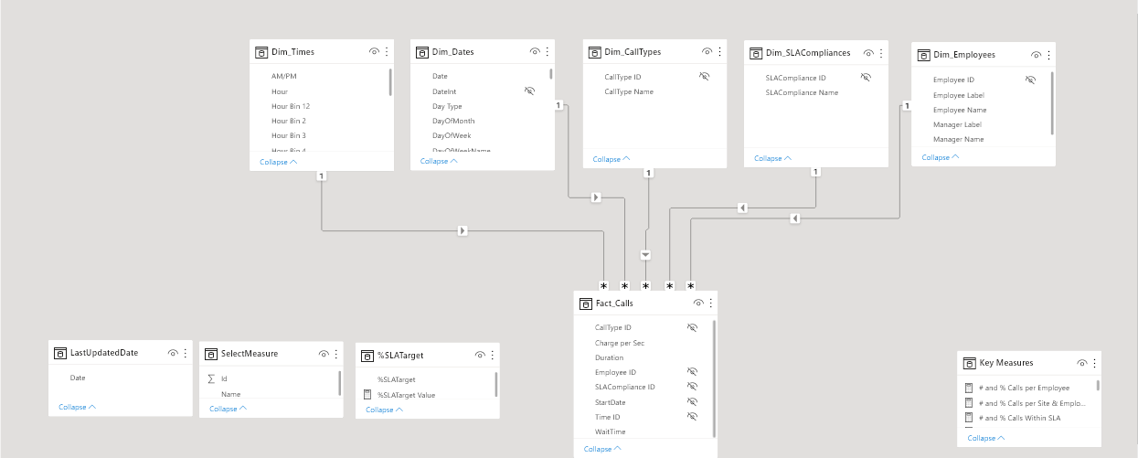
First of all, I have created two pbix files:
DS_CallCenterDataReporting_JAFP.pbix: File that only contains the Report Dataset, that is, the data and the data model.
It is created from a pbit template file containing the settings suggested by @BrianJ in the video (70) The Four Horsemen of the Power BI Apocalypse - YouTube along with the date table created by @Melissa for EDNA.
DB_CallCenterDataReporting_JAFP.pbix: File that connects to the previous Power BI Dataset and contains only the Graphical Interface.
It has been created from the same previous pbit file, eliminating the date table.
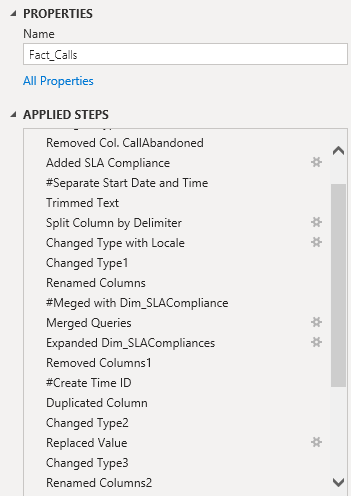
The development process consists of the following steps:
• Organization of consultations in groups.
• Rename the steps followed in the transformation process of each query.
2. Data Modeling
• I have followed the Star Scheme to model the data.
• For its graphical representation I have used the cascade design.
• The modification of the metadata of the columns of the queries, I have done with the external tool Metadata Mechanic Pro belonging to the set of external tools that Greg Deckler has developed for EDNA.
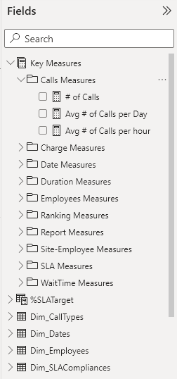
3. Creating DAX Measures
• All measures have been organized in folders within the Key Measures table.
• The Dax code of all the measurements I have formatted using EDNA’s DAX Clean Up.
• To display Duration and Wait Time in hh:mm:ss, I used Chelsie Eiden’s Duration measure developed by Greg Deckler in the external tool Quick Measures Pro.
4. UI design.
For the design of the report I have used the flaticon iconography and the theme has been generated with the EDNA ColourTheme Generator tool.
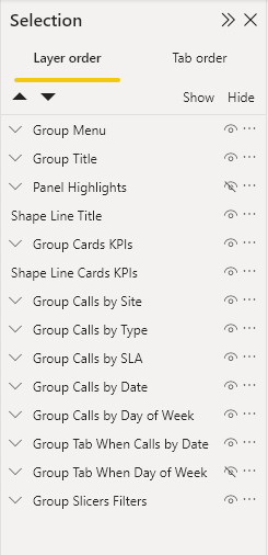
The visual objects are grouped in the Selection Panel.
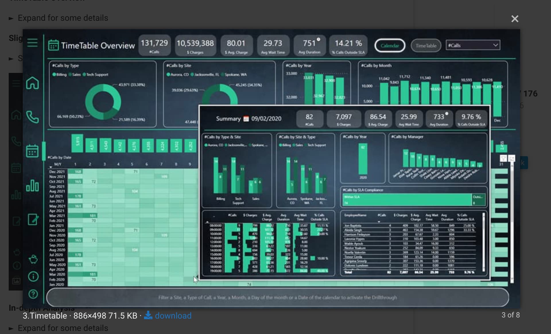
The report consists of the following pages:
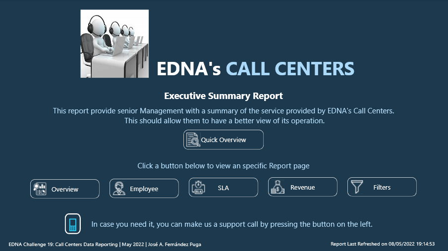
• Home
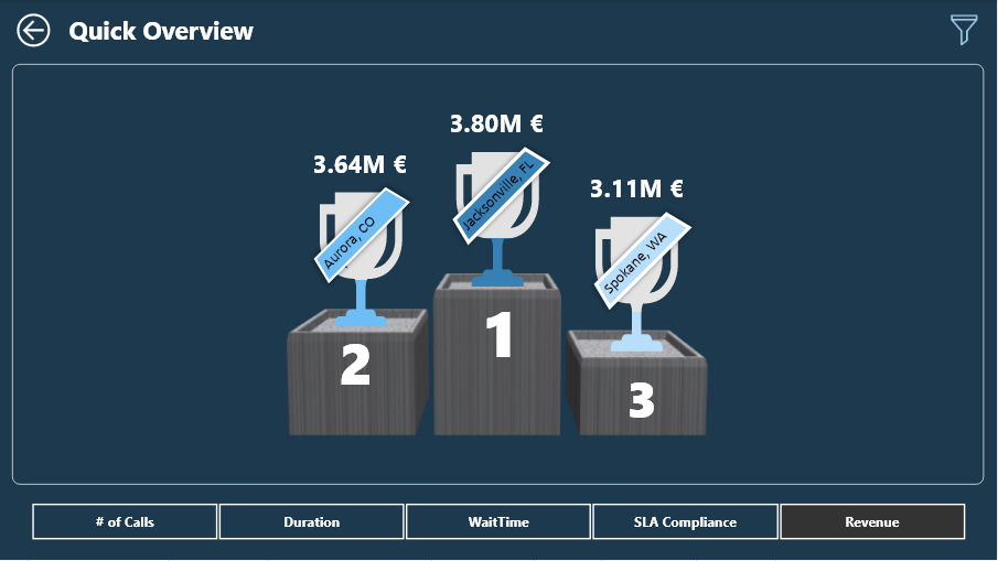
• Quick Overview
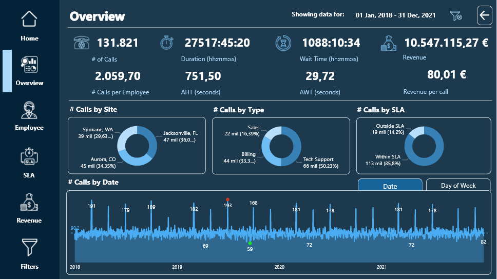
• Overview
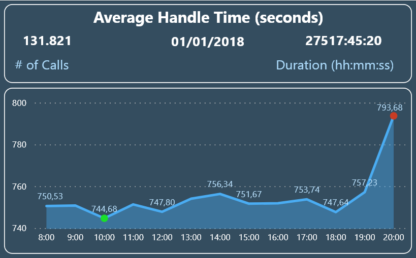
• Tooltip Calls by Date
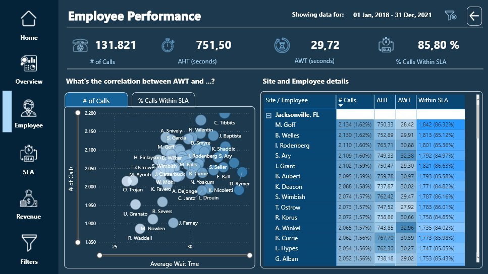
• Employee
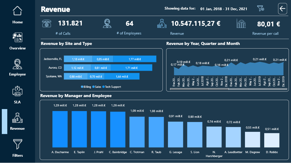
• Revenue
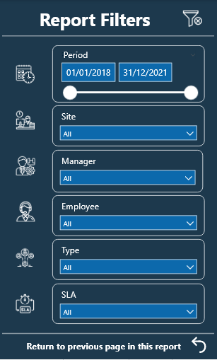
• Filters
I have used Bookmarks to switch tabs within the Overview and Employee pages. Initially I used a Bookmark Navigator but when calling the Bookmark to clear the filters, the Bookmark Navigator did not return to its initial state. @Harsh confirmed it for me on the forum and told me how to do it with individual buttons.
Each of the report pages has a button to clear the filters and another button to the right of it to display highlighted information using the Smart Narrative visual.
The custom visual objects that I have used have been:
HTML Css Viewer from K Team Solutions, with the free 1-month license. With the help of the video (70) How To Ace Your Power BI Challenge 19 - YouTube by Pascal Kiefer, I have added a button on the Hpme page that allows the user of the report to make a phone call to the support center in case need.
PureViz Infographics and the free license that allows the animation of infographic elements only in design mode.
I have created a video so you can see the animation:
Sparkline by OKViz to see the monthly evolution of the SLA by Type of Call.
Here is the link to the report.
Regards
Hi Brian
Where can I send you the report so you can publish it? I sent to this address as well: powerbichallenge@enterprisedna.co
@Ibarron20
Please send to federico.pastor@enterprisedna.co and please copy powerbichallenge@enterprisedna.co
Thanks and Regards,
Federico
@BINavPete If i show you my first ever report, you will throw your computer and will never look back at Power BI.

Honestly speaking, your overall report is great and you have done the justice with the theme and used consistent colors throughout the report. I really love the information and help icons as they show very useful information about the report and how to navigate it. Moreover, drilling manager and agent information separately is very intuitive and doesn’t cause any ambiguity because of the drill icon that pops up when a row is selected on a particular table.
Amazing job on this one and thanks for participating and making this community great!
P.S. I reckon @DavieJoe pulled out after looking at your report 
True story 
Hey @MudassirAli
Thanks for positive feedback. Much appreciated
Reckon @DavieJoe was taking in the sun in the UK and ran out of time to submit.
Pete
Scottish people can only handle 10 minutes of 20 degree heat, I had 30mins. Burnt to a crisp!
Oh no, you don’t. Not this time, my friend. You still have nearly 14 hours before the deadline, so get crackin’. 
Don’t make me send @FPastor to your house…
I will look to complete it but over the next week or so.
Hi everyone!
How’re you doing guys?
Below you can find my idea for EDNA challenge #19.
Here is a link to interactive published-to-web report:
Below I’ll try to highlight a few interesting features, broken down by given report page.
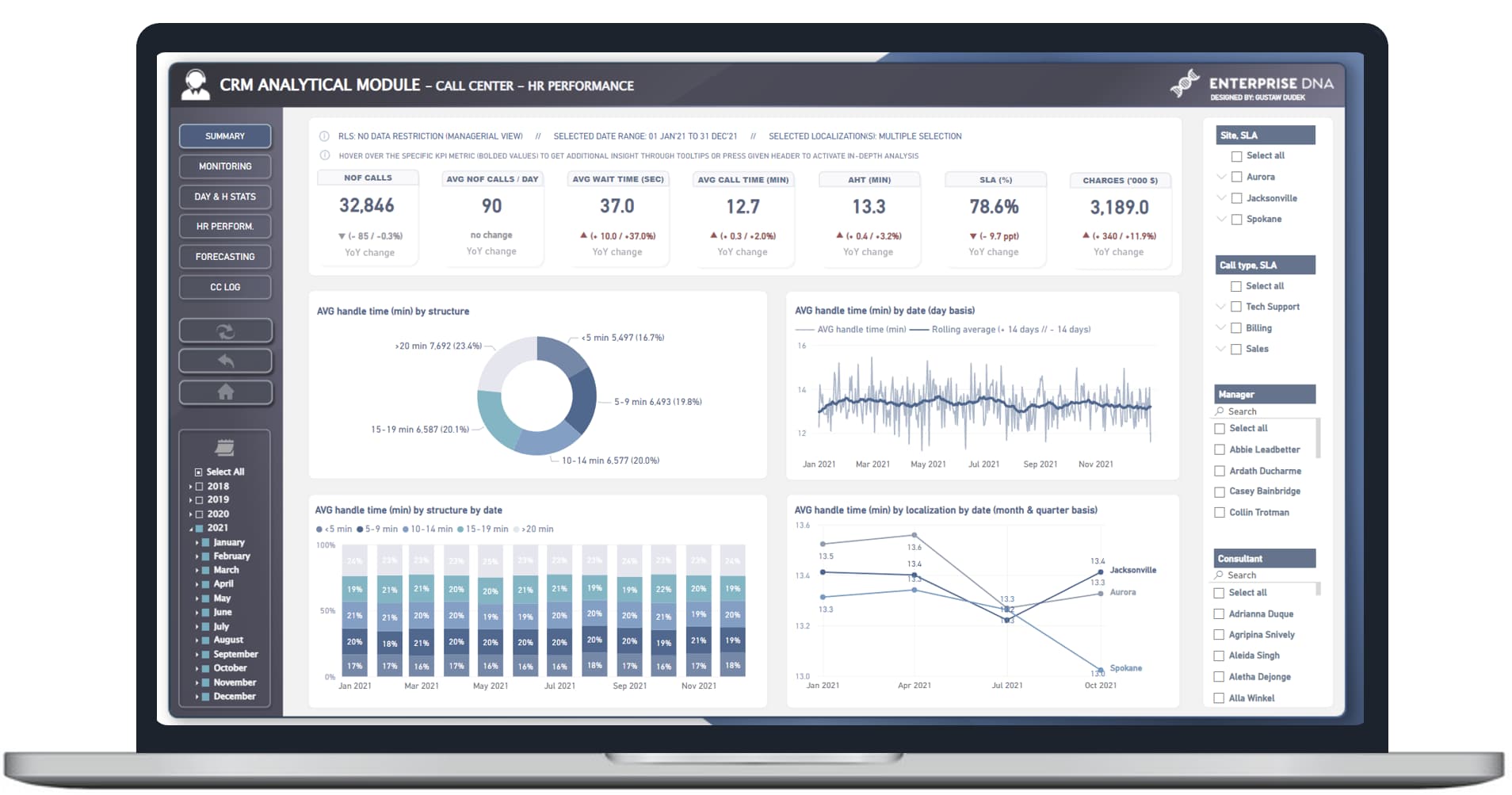
General info:
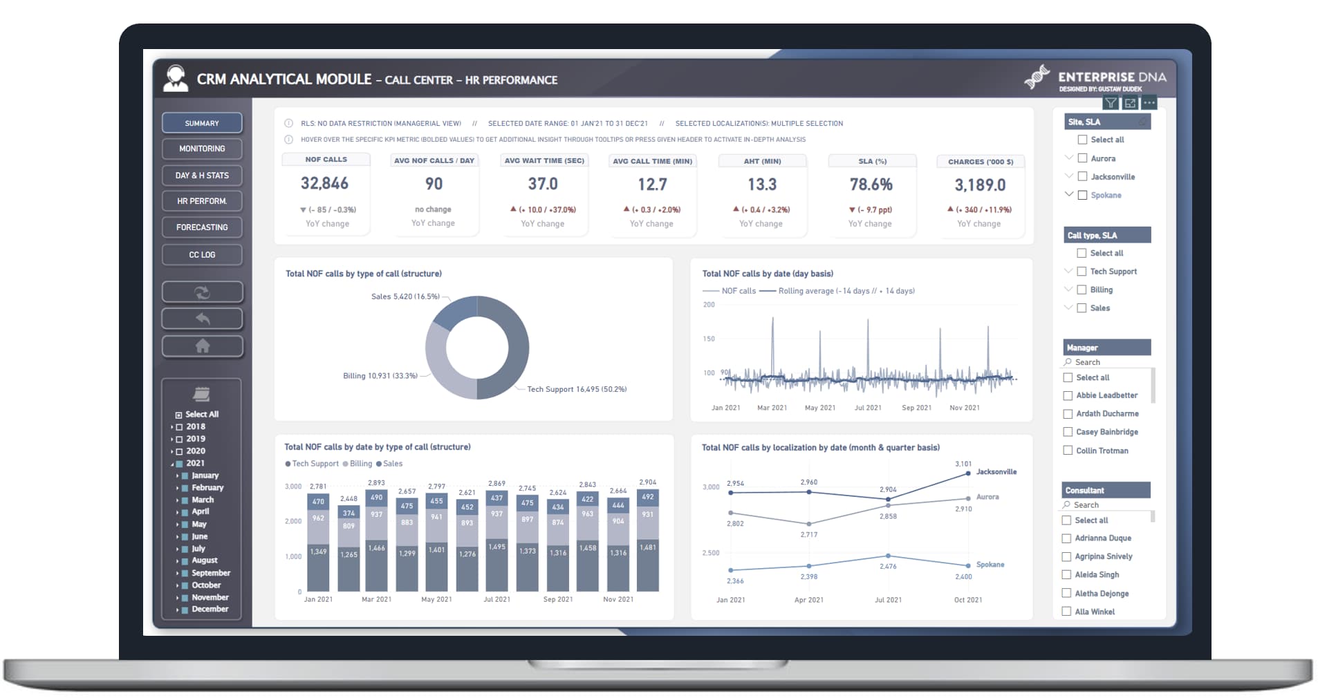
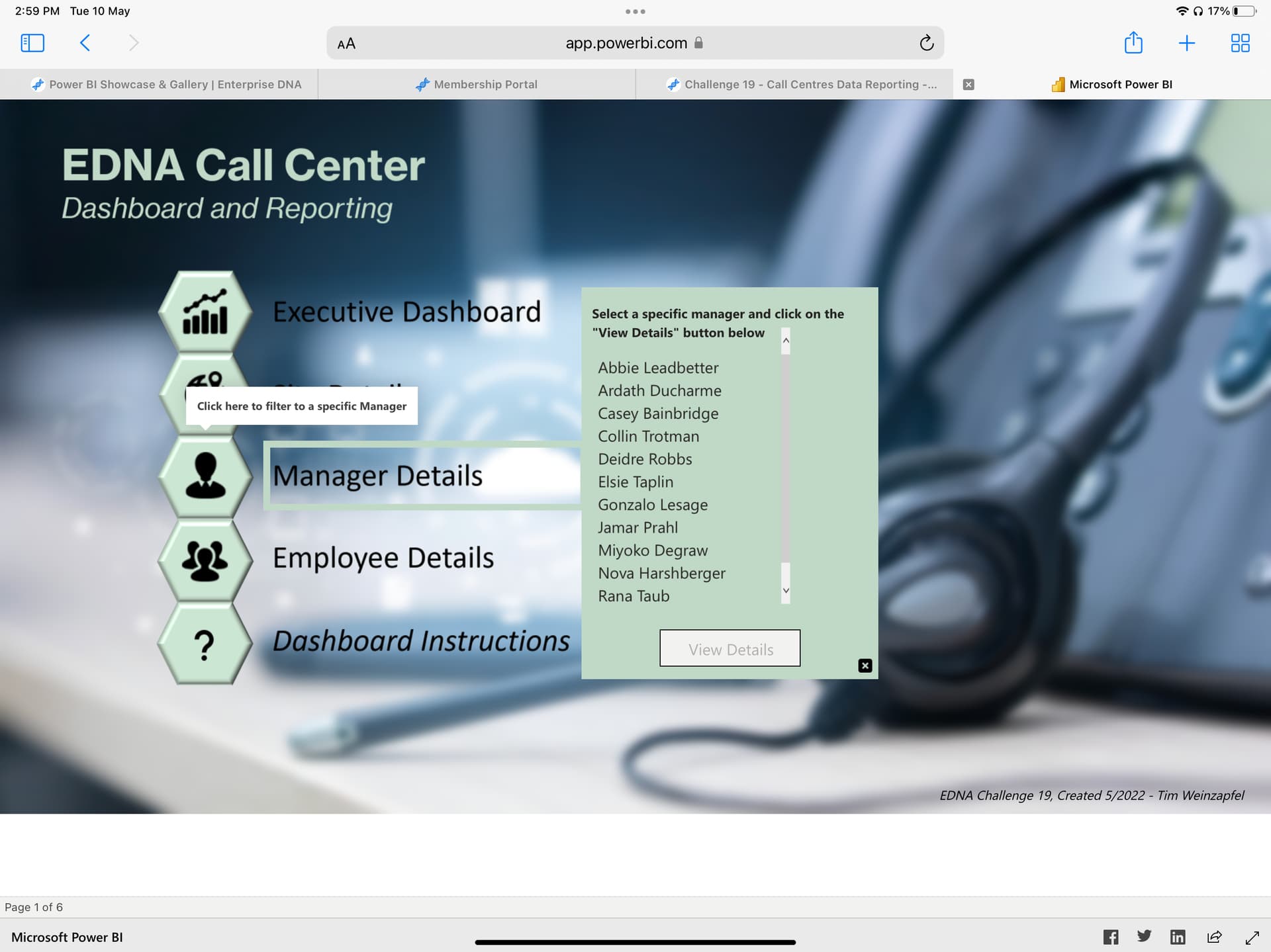
All pages have the similar structure and include:
a) Main nagivation pane (left upper corner: summary, monitoring, HR etc.) - main sections of the report
b) Additional navigation (left pane) - refresh / back / home button
c) Main date filter (left pane)
d) Additional text / info (upper section) - info related e.g. with current selections
e) Supplemental filters (right pane)
f) KPI cards - either with YoY change or not - depending on the report page
g) Main sector / space - analysis / visualizations
h) Each page alows to use drill-through analysis (which navigates to either separate “HR performance analysis” or to “CC log”
i) most of KPI cards has applied tooltips that shows both top / bottom 3 agents by given metrics (they can be activated by hovering cursor on specific KPI card)
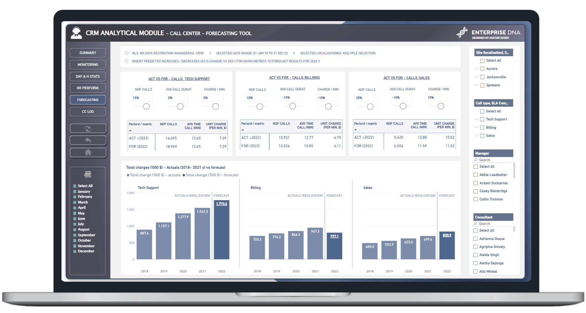
1st page: Summary
Each KPI header is a button, which enables to “drill through” to specific analysis. In other words, summary report page focuses on 7 different metrics and allows to reveal 7 different perspectives.
Each section is created in very similar way to increase report readability.
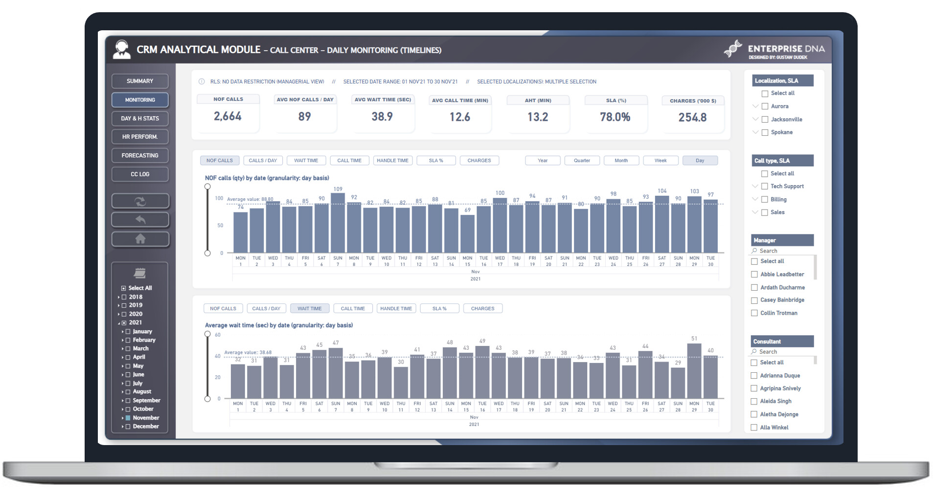
2nd page: Monitoring
Main application of this particular report page is to analyze data in daily granularity. On the other hand however, there is a slicer which enables to dynamically change granularity to week/month/quarter/year basis with maintaining hierarchical structure of x-asis at the same time.
There are also switch buttons to quickly change metrics.
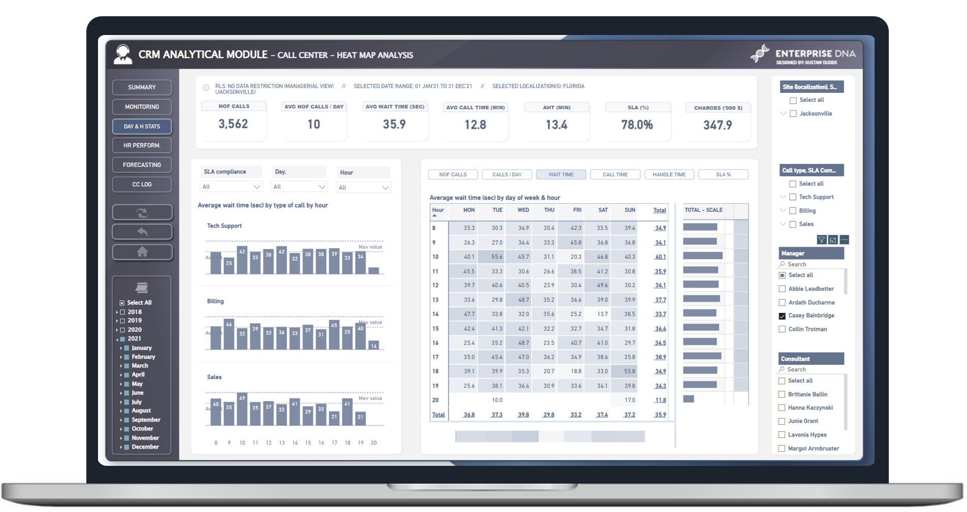
3rd page: Day & H Stats
Main application is to analyze given metrics by hour/day. Heat map is additionaly enhanced with formatted background colour & bars.
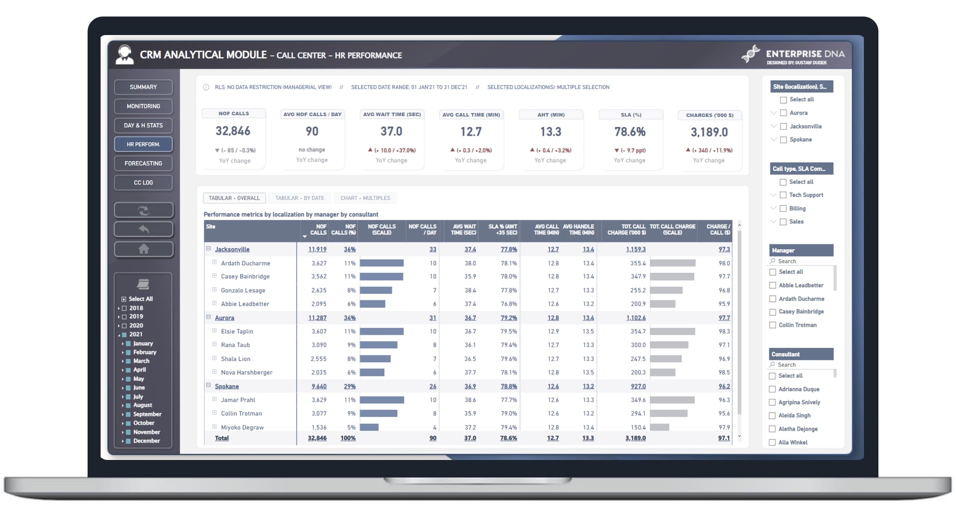
4th page: HR Perform
This page mainly focuses on analyzing given metrics by manager & agent (or employee).
There’re included three different views (tabular overall, tabular with data in monthly perspective, and small multiples)
5th page: Forecasting
This page enables to make a simplistic forecast (of total charges $ in 2022) based upon “what if scenarios” including variability of predicted number of calls / predicted avg. duration of single call and predicted change in charge value per min. All of this is separately “linked” to different type of call, as they might vary due to different specification.
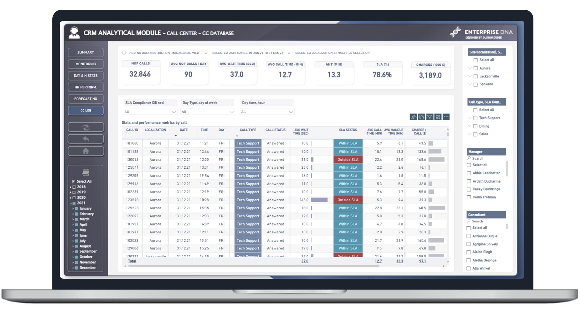
6th page: CC Log
Generally it’s a form od “database” or log, which contains all of individual calls in case of need for analyzing particular records.
I’ll do my best to share more details along the way.
Meanwhile, congrats for all participants. It’s cool to see such great commitment. It’s look like the number of entrants is much more impressive comparing to recent challenges. Keep up your excelent work
All best to everyone!
Here is my entry for the Challenge. I was able to put this together at the last minute. Going to do my upcoming Summit video on this entry.
Thanks
Jarrett
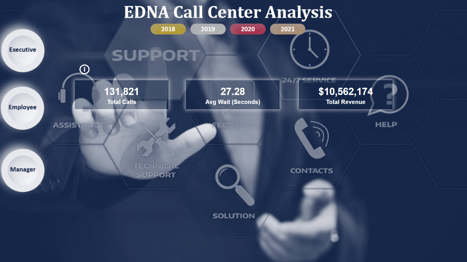
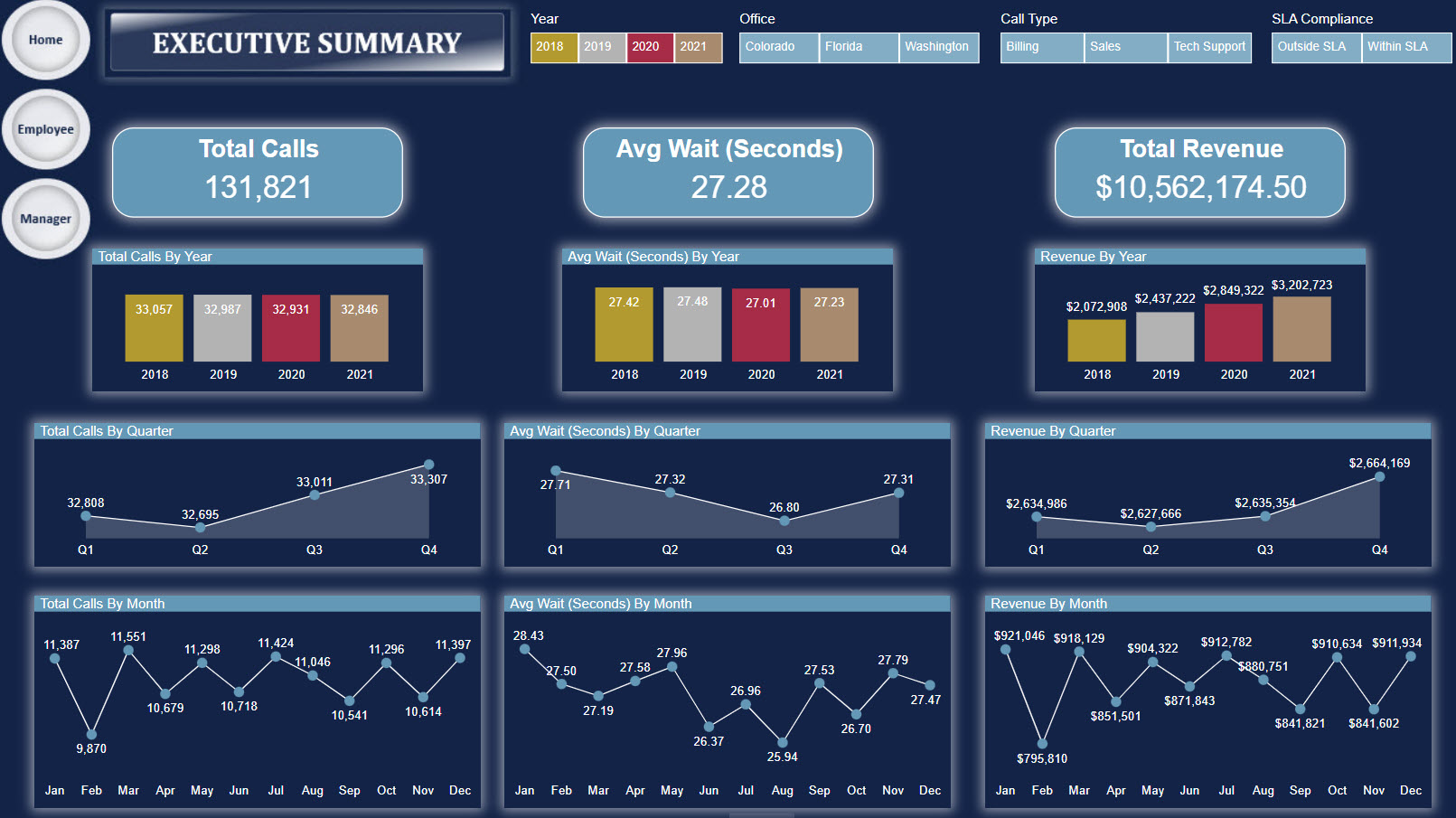
“I accepted the Enterprise DNA challenge.”
First entry in a challenge and it seemed like a real world scenario. Congratulations to EDNA team and our head of challenges @FPastor for putting this one.
Quick notes:
I’ve struggled a lot since I know nothing about this call center stuff. Had to make some research to understand the industry, the KPIs, etc. Ended up putting just some basic metrics. I think it’s good for a start. Didn’t put much effort on the visualization part (hope to get better in the next visualization summit), but used some tools from the Analyst Hub, like the color palette. It speeded up the basic coloring part.
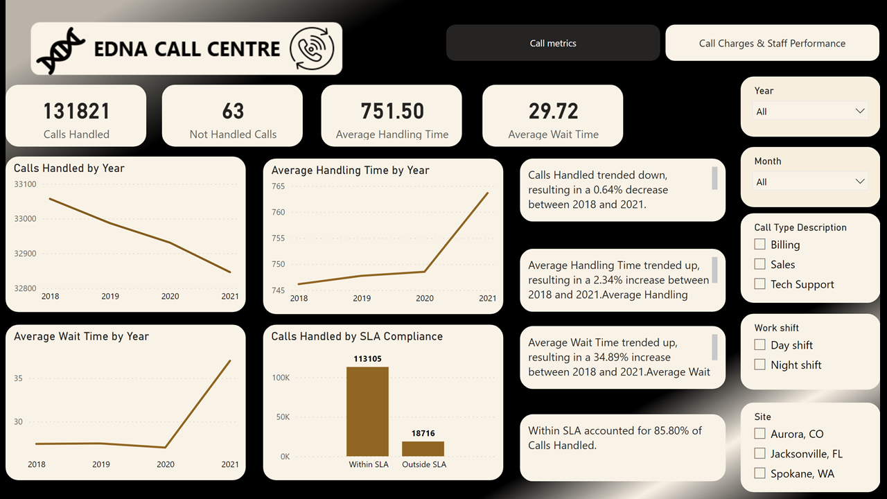
Also didn’t use many DAX, since I’ve concentrated my efforts on transformations in Power Query. The “Day Shift”, “Night Shift” column/filter was created there as an effort to see if there are any relevant differences calling during day (6 a.m to 6 p.m) or night (6 p.m to 6 a.m).
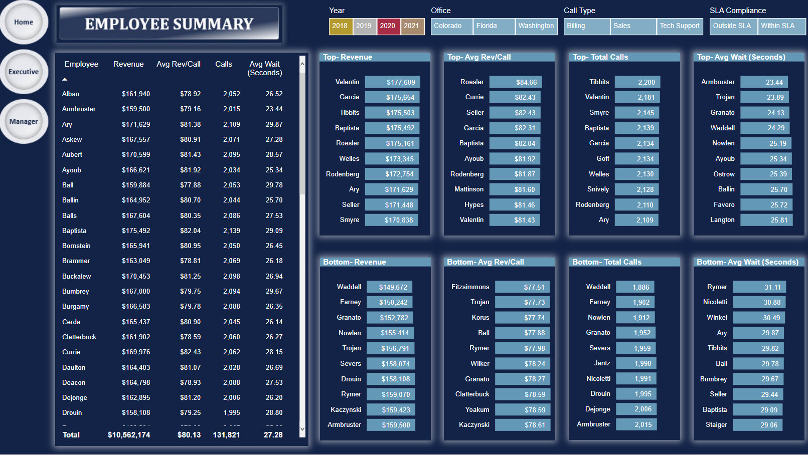
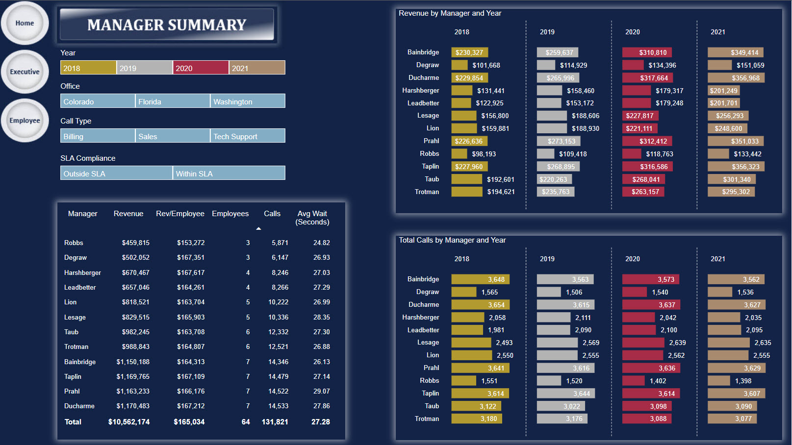
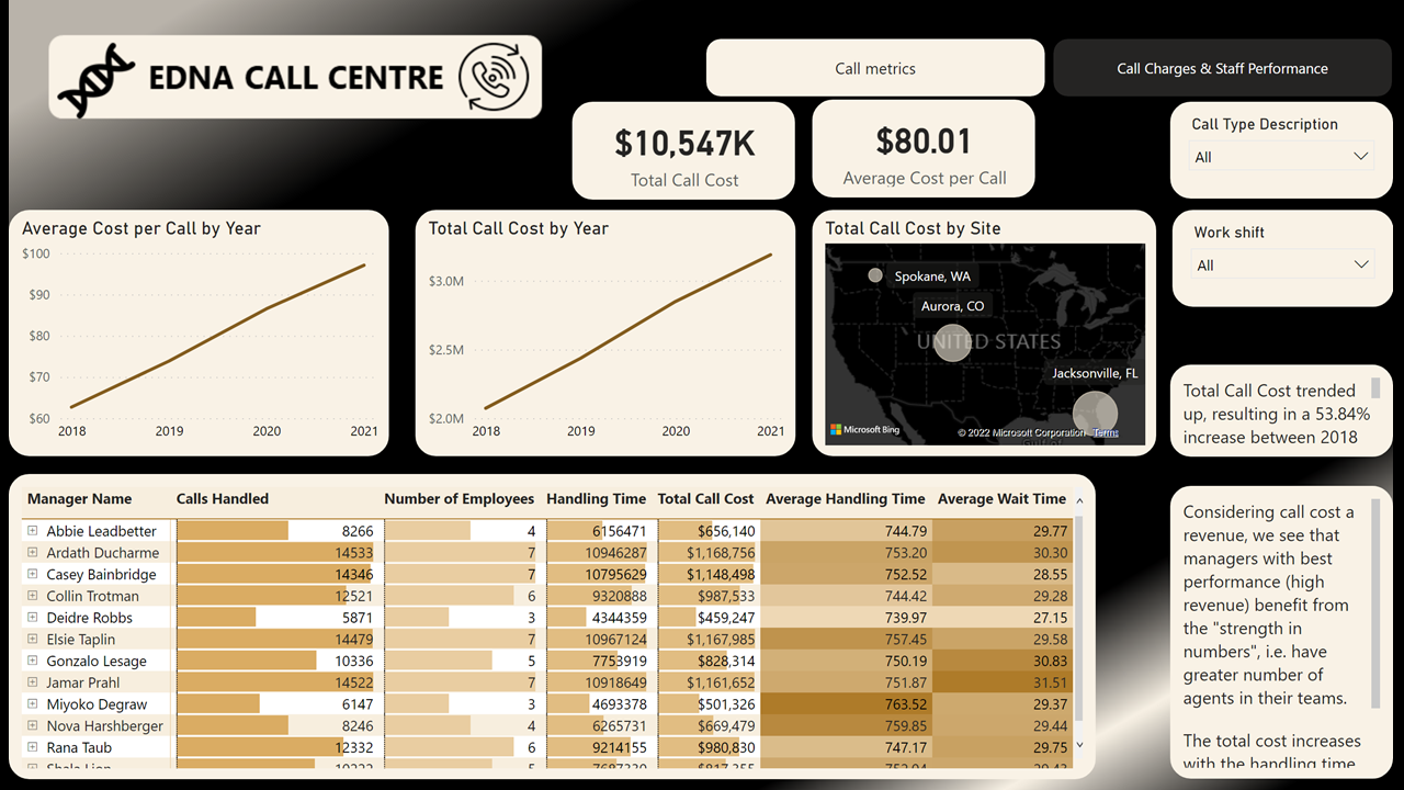
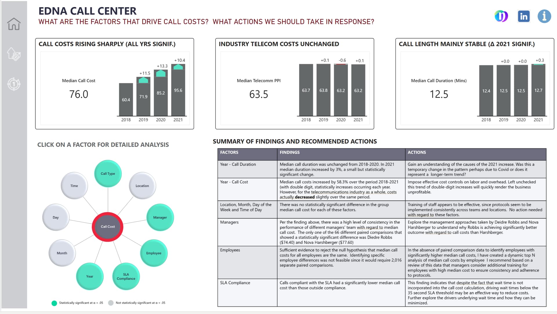
Realized that manager performance is not depending solely on handling time or number of calls handled, but it mostly depending on what I called “strength in numbers”, since the best performing manager are the ones with a larger team. So, I’d advise Mr Mark Phoney, the CEO, if he wants to increase the revenue (considering total call cost as revenue), then more human resources are needed, mainly for Spokane, WA.
Used the map here as a “natural visual filter”, and used smart narrative to get some quick insights.
It was both challenging and fun this one. This time I had enough courage to press the send button and I hope to get better in time.
All the best
link to the report
Incredible report! Well done, looks fantastic
Also really love the idea from Tim’s report that I just want to shout out. Great use of dynamic drill down
Fabulous design as usual Gustaw. Stunning looking report
All,
Attached please find my submission for Daily Challenge #19. I’m not so much submitting this as I am evicting it from my head, where it is been living rent-free for the past month.
What seemed like a simple dataset at first glance turned into one of the most challenging reports I’ve ever done. Part of this was the nature of the data, part was what I set out as my objectives, and part was due to some dumb choices I made (for example the custom radial chart seemed like a good idea until I realized to get it to work across my navigational structure required setting 300 different button states…).
In terms of objectives, I wanted to focus on the following:
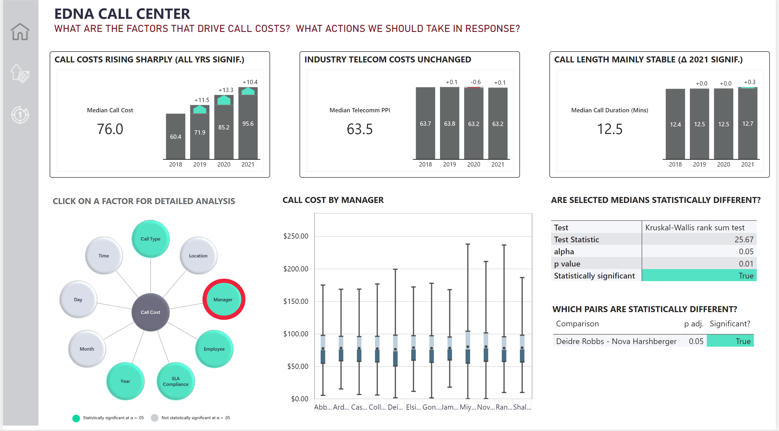
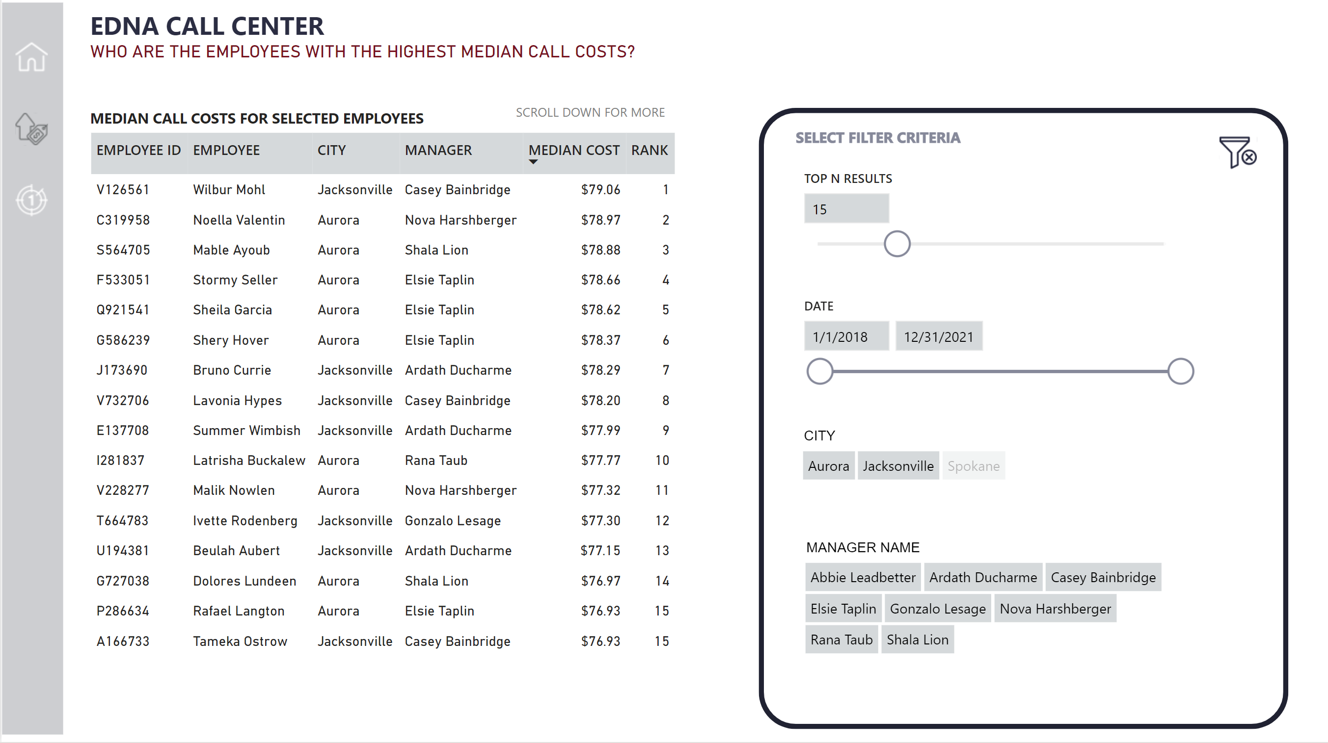
Making the analysis as actionable as possible, centering on specific actions that I thought followed directly from the analysis findings, and including those findings and recommended actions right up front in the report.
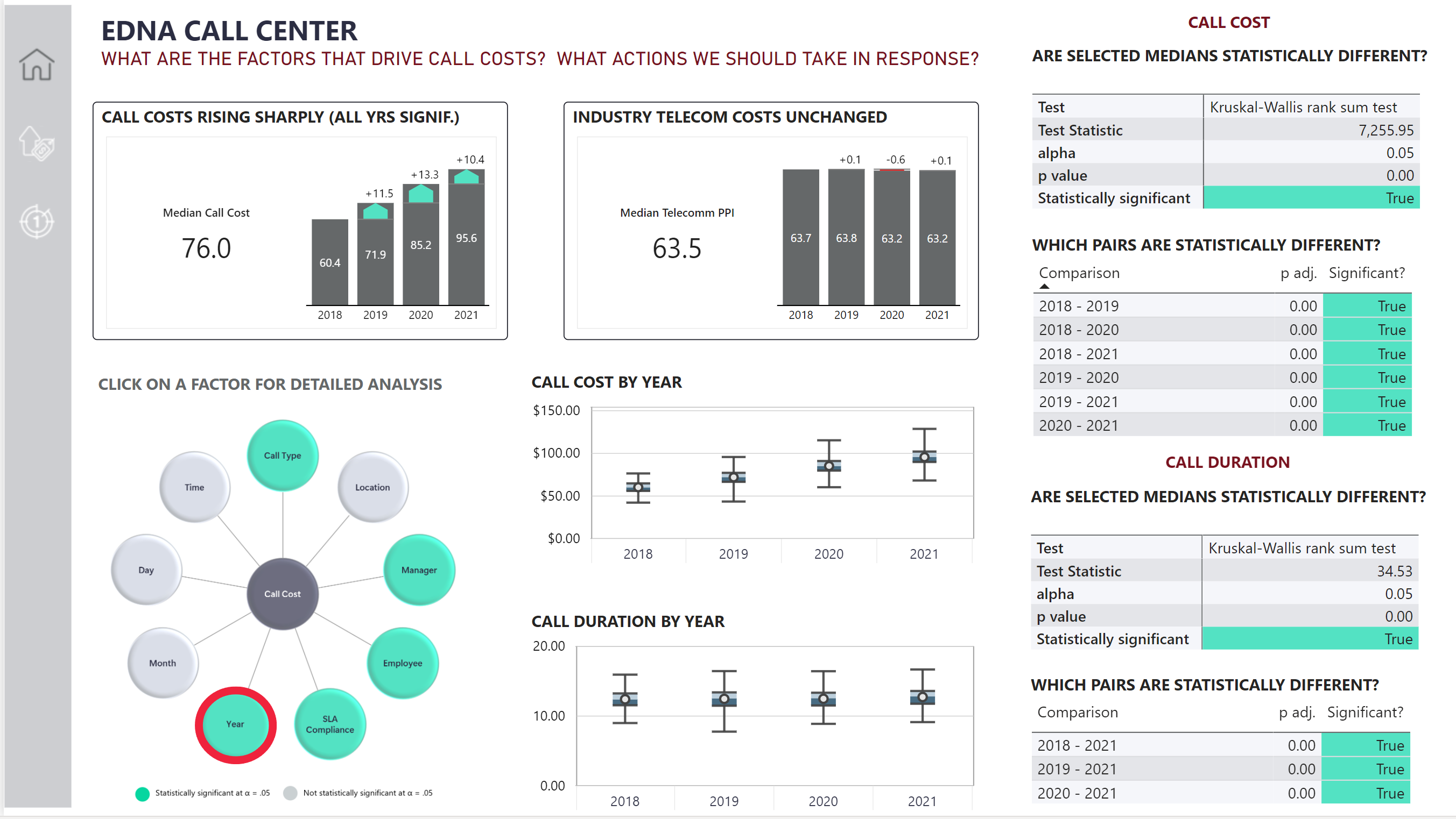
Integrating Power BI and R to perform a full statistical analysis to determine which factors likely did and did not have an impact on cost. Because of my focus on making the recommendations actionable, I thought cost was a logical centerpiece for the report.
Continuing to learn how to use some new tools from our recent technology partners – Zebra BI and Numerro.
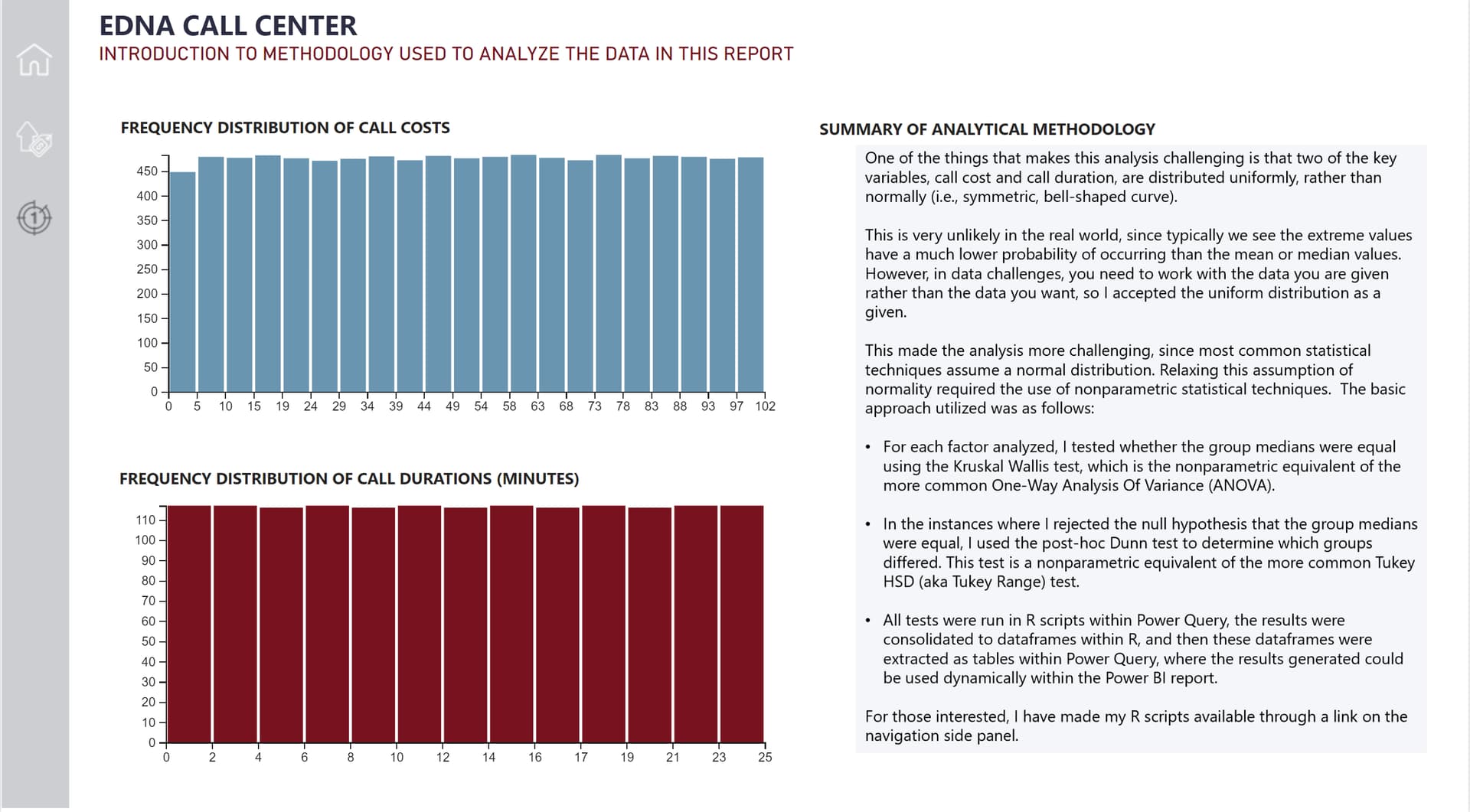
As I explained in my report, one of the things that made this analysis challenging was that the data were not distributed normally, and thus common statistical tests such as t-tests and analysis of variance were not appropriate. Instead I had to rely on nonparametric statistics that relax the assumption of normality. This presented some unique challenges, particularly in terms of extracting the data dynamically from R scripts run within within Power Query to properly structured tables that could be used dynamically in the subsequent analysis.
I will write this all up in a detailed report this week, but wanted to get this submitted (just,) before the deadline.
Really looking forward to more deeply exploring all the submissions posted this week. Thanks to all for participating, and to Federico and his team for running an awesome challenge.