I need to visualize certain metrics on a single chart (either bar chart or line chart) and the y axis needs to switch between numeric and percent based on a selected metric.
Is this possible ? I created a measure called Test and this works in a table but not in a bar chart/line chart.
Test = IF(SELECTEDVALUE(‘Table’[Type])= “Number”, FORMAT(SUM(‘Table’[Value]), “#,0.00”), FORMAT(SUM(‘Table’[Value]), “Percent”))
The thing is it wouldn’t work anymore because you are changing your measure to a TEXT, it is not a number anymore. I would recommend to use a bookmark to switch between visuals.
My apologies, but really there’s no other way round because if we try to write subsidiary or supporting measures the effect will remain the same since these measures will be generated based on the Primary measure. [Measure Branching Technique]
Still it wouldn’t be possible because when you use the "SWITCH( TRUE () )" logic the percentage number will still show it as 0.00 Format on Y-axis instead of 0.00% although you may have 2 different measures.
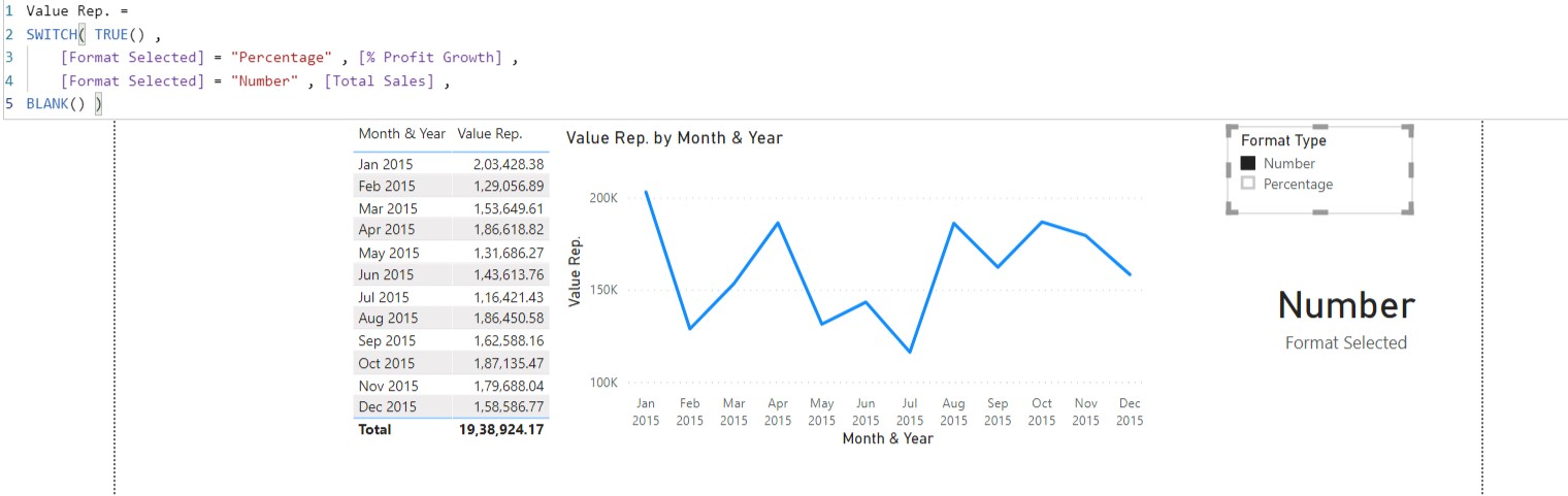
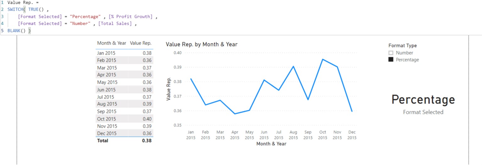
I would like to take an example to explain it to you on the basis of screenshot provided below -
In the given example, I’ve two different measures one is “Total Sales” which is as per the normal "Number" format and the other one is “% Profit Growth” which was also in simple “Number” format but then I converted it to the “Percentage” format using simple “%” option from the “Measure Tools” option under the Menu Bar. So now although it show as % format it will still be be number and not in “Text” format.
Now, when I combine these 2 separate measures under the one roof .i.e. “SWITCH( TRUE() )” logic you will observe that “Total Sales” still retains it’s "Number format but when I select the “Percentage” option in the slicer the “%” format is lost from the “% Profit Growth” measure although I had converted to it.
Conclusion: The 2 different format cannot be incorporated into the charts whether the measure was originally created as per Number format and then changed to other Format or was originally created as per the particular format as is. (In your case, you directly applied the % format using “0.00%”.)
Just to give you heads up this can be done using the coding in Python but in Power BI as of now there’s no option to have this.
I hope you find this useful and helps you in the analysis.
Thank you Harsh for the detailed explanation. Much appreciated.
Will explore the Python option. A last question - will the chart be fully rendered in matplotlib/… or just create a measure using python and consume in PowerBI?