Seeking your advice on some design issues I’m struggling with. I am currently working on a series of complex financial reports, and the user requirements have each report chockablock with slicers - 8 slicers per page, plus two search/filter boxes. I’m trying to make all the slicers readable and attractive, but minimize the amount of real estate they take up to leave sufficient space for the necessary analysis/visuals on each page (note: I don’t want to use a sliding slicer panel, since I think it’s important for the users to always be able to view the current filter context). So, two questions:
do you have a good, compact slicer design that you be willing to share? (screenshot would be fine, PBIX even better). Most of my slicers will be drop-downs and/or hierarchies, but a few are short enough to be lists
the Microsoft search/filter box is pretty bare-bones. I’ve been considering using the OKViz Smart Filter Pro custom visual instead. Have any of you used that in your reports, and if so how’s your experience with it been?
Hi @BrianJ, Just some initial thoughts.
I have used slicer panels before, as well as using the new filter pane.
Also, turning slicers into dropdowns to save on space too.
Can some slicers be merged?, or maybe use the new Hierarchy slicer.
Maybe use some funky bookmarks or drill throughs.
You can change the size of the report page by customising the width and height of the custom page size, so the user can say. scroll further down to view more visuals.
@BrianJ
One thing to keep in mind is that if you are pushing these to the Service, native visualizations offer much better performance. Before the msft slicer was able to handle hierarchies I used the 3rd party version. When opening in the service it took ( and still takes) much longer when compared to the msft one. Might not be an issue with your reports, but something to keep in mind.
(though if I was to use any 3rd party visuals, they would most certainty be from OKViz )
Thanks for the input – definitely good things to consider in the choice as to whether to use it, since I will be pushing all the reports to the Service. They claim that through memory management, filter mode with logical operators and incremental loading that the visual performs well even on large data sets (my data set isn’t huge – about 230,000 records currently and about 150,000 added per FY, but big enough that I’m concerned about performance), but I haven’t tested that yet on the trial version.
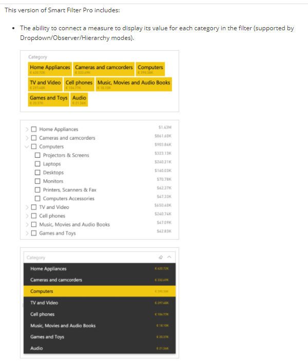
Hi Brian. Using dropdowns for slicers is preferable for space reasons (and performance too), but doesn’t show multiple selections. You can, however, display the selected values in a matrix of measures. Here’s a sample of various slicer selection display methods. Hope this helps. Greg
Thanks for the input – this is fantastic! Slicer array is compact, but highly readable and your use of the matrix to show the full filter context for multiple selections gives me good food for thought.
Really appreciate your effort in putting this together.
Thanks to the contributors of this post. A response on this post has been tagged as “Solution”. If you have a follow question or concern related to this topic, please remove the Solution tag first by clicking the three dots beside Reply and then untick the check box. Thanks!
I’ve been running the trial version of Smart Filter Pro through its paces for a while, and can report back that at least in my view it’s everything they say it is and more.
It’s incredibly fast. Even when filtering on my largest dimension table (over 2,300 records) it responds instantaneously on the autofill and search. They say anything more than 30,000 records will slow it down, so just to see what happened, I filtered directly on my fact table of 230,000 records. It was a shade slower, but barely noticeable.
saves time and space - rather than fiddling around with a whole bunch of different slicers, you can drop multiple fields into the Smart Filter Pro visual and basically create an integrated slicer panel in seconds. You can choose to have these fields filter each other or not.
looks cool and really good UX/UI - it has a great look to it, super configurable and intuitive for the users. One great feature is that with a switch you can turn on a “clear all” slicers option, in addition to the ability to clear any individual slicer separately. This is something I now have to build by hand using buttons and bookmarks.
logical filtering - one function I’ve never seen before is the ability to choose between “AND” and “OR”’ interaction between slicer fields in the visual.
cost - they just changed the licensing model and it got much cheaper. They also have a nonprofit and government discount of 50%. Taking advantage of the latter, I was able to license up to 200 users for under $150 annually. Even at full cost, it’s basically under two bucks per user per year.
I’m totally sold on this, and it will probably become the most used visual in my reports. I’ve attached a PBIX file from OKViz that demos all these features and many more.
@BrianJ,
Was this on the desktop version and/or using the PBI Service. The issues I run into are generally when I (or a user) is using an App in the service.
I found “Text Filter” from Appsource is a great tool for searching. And it is pretty accurate and you can have several of them. Not sure if that is what you were thinking.
I saw the above. Do you know if Microsoft made any progress on Power BI search / filter box since this was posted?
Unlike you, I am looking for something pretty simple, I would like to be able to type some text in a slicer box and have the dropdown list appearing instead of having the dropdownmenu .
 )
) . Definitely report back after you’ve given it a try - eager to hear your review.