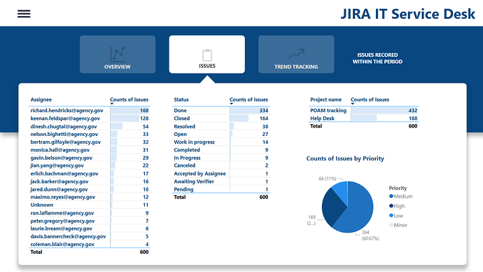
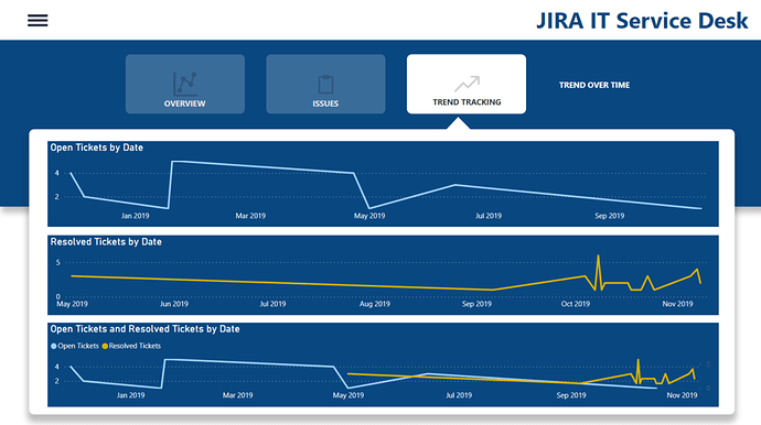
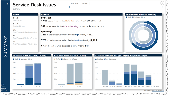
@Greg I also showed someone else afterwards and they now think I’m the DAX master 
You’re too kind … I’m glad it helps.
Greg
A post was merged into an existing topic: Power BI Challenge 8 - Wrap Up!
this is really beautiful. and tempted to ask you for you pbix file lol. this is good.
Hi @bafuzie,
You can find all the entries to the challenges in the portal
Select the challenge you are looking for, in this case: Power BI Challenge 8 - Jira IT Service Desk Analysis
Use the link on top to navigate to the files section where you can download the PBIX from anyone who participated in that specific challenge.
All the best.
@datazoe
The design looks absolutely amazing.
can you share the PBIX file ?
Hi @pradeep1620 ,
Welcome to EDNA community and great to have you here. You can go through different showcases and can also download the pbix files from the following link:
https://info.enterprisedna.co/power-bi-challenge-8-pbix-files/
Thanks.
@pradeep1620 thank you! I haven’t shared the PBIX for that one yet. Was there something specific you were looking for a closer look on in that report?
Very nice and informative !
Hello @Greg
I’ve down loaded your pbix file for challenge 8 to unpick how you created such a beautiful solution. Could you please attached your Python Data.xlsx and SLA Definition.xlsx files? Also, if there are any additional instructions for libraries or anything else to install please let me know? I’m on a machine where I have nothing in addition installed and am quite inexperienced at using 3rd party libraries.
Best regards and thank you in advance,
Michelle
Hi @michellepace. Sure, here you are.
Python Data.xlsx (11.6 KB)
SLA Definitions.xlsx (10.6 KB)
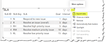
You can also easily create these anytime you wish by making a table and exporting the data.
Exporting data from DAX Studio is even easier.
As for installs, just follow the Python install instructions provided by Microsoft:
[Run Python Scripts in Power BI Desktop - Power BI | Microsoft Docs]
Thanks for the interest.
Greg
Hello All
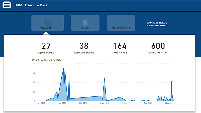
I am taken it upon myself to go back and run through all the challenges that I missed, thus I am submitting the task on challenge 8. I am here to learn and will be happy with any feedbacks.
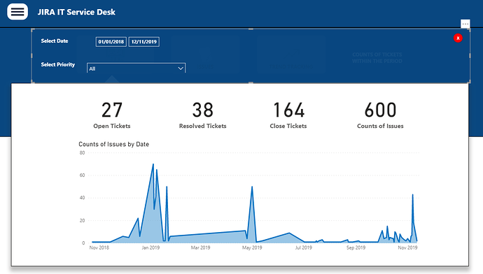
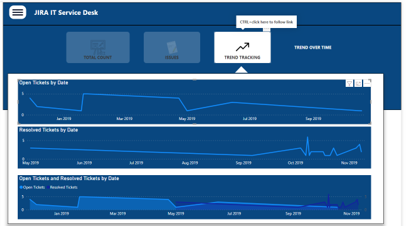
- I have implemented a menu that when its clicked, show up 2 slicers ie date and priority
- There is a red button that when click, hides the menu item
- The report has three pages, (Issues, Tickets & Trends)
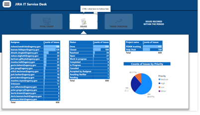
 Jira-Analysis.pbix (355.9 KB)
@Eze I really like how you approached this report! The tooltip feel with the navigation is really cool and works well! At first I was concerned about the contrast but they are buttons and they light up when you hover over them! Really cool! I’m always a fan of the blue reports (and buttons) and the dark and light contrast you have going is really well done.
My feedback to you is with your slicer panel (which is also great) when you set up the bookmarks for it you can have it so it only affects the panel visuals only by changing it to “selected visuals” in the “…” drop down. Making sure you have the panel visuals group selected when you do of course! For your report the way you did it is also just fine as you don’t have slicers outside of the panel though!
Great job and I hope you had fun building it!
Many thanks @datazoe, much appreciated.
the learning journey continues 
Really nice & clean @Eze, nice use of space too, it’s often tempting to cram as much as possible into a page. Your colour theme works really nicely!
Thanks a lot @DavieJoe
Hello @Eve,
I like the simplicity of your report. You are taking a very wise decision to come back and complete the challenges. It is the best way to accelerate your Power Bi learning.
I have some tips that might help you improve the design of your reports.
Alignment.
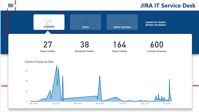
Alignment is very important in design. Make sure that your visual elements have the same size and are well aligned on page.
Shape
In modern reports we see more and more the use of round curves for shapes. If you give a round shape to your buttons, do the same everywhere to keep consistency
Icons
Try to use similar icons. In your report you are using a detailed icon for Total Count, an image for issues and a simple icon for Trend Tracking
I slightly modified your report to showcase the points above:
Jira-Analysis (1).pbix (352.9 KB)
Hello @alexbadiu
I am lost for words, I am very grateful for the feedback and I have taken your inputs on board,
Thank you so much!
Hi All. It was mentioned in one of the eDNA Summit sessions yesterday that it would be interesting to see the Python ring chart replaced with a Deneb ring chart, so I used the Deneb ring chart template I posted a little while ago and came up with this.
I hope this is of interest to others.
Greg
Power BI Challenge 8 - Jira IT Service Desk Analysis | Enterprise DNA
@haroonali1000 if you want to create dashboards based on your Jira you can use https://marketplace.atlassian.com/apps/1221150/power-bi-connector-for-jira?hosting=cloud&tab=overview

