Power BI Challenge 7 - Purchases, Inventory And Sales!

Hi @Ericadyson,

This is as @MudassirAli has said we have only been given an extract of the data.

In any cases if there is not a corresponding PO you should just say that there is ‘No Associated Purchase Order’.

Thanks for your input @MudassirAli.

Regards,
Haroon

2 Likes

Hi @haroonali1000, does this mean until receiving the whole quantity, or until we get the first shipment?

Hi guys,

how do we calculate the time elapsed between purchasing and receiving the goods into our warehouse?

Do not know if anyone else has found this issue or not. For example PO # 6800533 with respect to all items on this PO # the unit cost and Unit price ( per Billing table) all are equal! , I guess the company make profit by doing business in volume :slight_smile: similar to SNL clip ( for every dollar I receive I give you 4 quarters, one asked how then you make profit, the answer “in volume”), unless I missed something …

2 Likes

I use a combination of calculated column in received table : Date Diff=DATEDIFF(MAX(RELATEDTABLE(PURCHASE1),PURCHASE1[PO DATE]),‘RECEIVED’[POSTING DATE],DAY) then use this in the measure as: Diff in date = sum('Received[DATE DIFF]) , for example the result I got for PO # 68000498 item no 61580 is as follow
Order date:01/03/2020
Received Date: 02/05/2020
Diff in date: 33
P.S. all my table relationships are many to many between all fact tables (Purchase, Received, and Billing) hope this help, I am sure there are far better way to do this and more efficient.

1 Like

@hamidmilani,

I assumed “Customer U118” is the owner’s brother-in-law, but I like your explanation better…

  • Brian
1 Like

I think there is no receipt of Material 61580 in PO # 68000498 in Receiving Table. Can you double-check?

you’re correct, no receipt , in my explanation for date diff calculation I meant to say for PO 68000496 item 61580 the result is as shown , guess my fat finger caused some confusion. sorry.

1 Like

Material 61580 in PO # 68000498 i found them in the receipt table…did you clear the filters on the file?

This is my submission for challenge # 7 :

1st Technique:
As it was mentioned in the task to keep it as brief as possible therefore, tried to use a new trick that I never used before called “Embedded Hover Over Tooltip Effect” on a Card & on Headings as shown below:

To see the tooltip hover over the cards or in case of charts, hover over the chart headings.

2nd Technique:
Another technique used called " Chart Annotations" where the events are described via tooltip as follows:

3rd Technique:
This technique is a bookmark (Next Image) to go to different visual for analysis. When hovering over the image it will indicate what’s the next visual is.


When the last visual is reached the image position will change indicating to go back to the first visual.

At the end scatter charts show the average times taken to arrive at the warehouse and to bill the customers characterized by average, fast and slow moving. The management can see and try to take actions for slow moving inventories and for the materials that take longer time than usual to receive in warehouse.

It looks like a very brief report but the amount of measures created in this challenge is a lot.

Next week is also my final Budget presentation therefore, submitting the challenge now.

Hope I managed to tackle the requirements of this challenge.

21 Likes

Hi @michaelsampsonidis,

You can assume the first shipment, however no issues if you have done whole quantity.

Regards,
Haroon

Hello,
how you made your Data Model and relationship between tables ?

I used Lookup value function to retrieve the values from tables. I was short on time so didn’t really dig in to establish bridging tables to connect the tables. For this task, it worked fine though.

Wow very impressive once again. Well done

Just a fabulous and inspiring design.

Sam

1 Like

This is where I’ve got to.

Might put the finishing touches on it in the coming days

Here’s how I’ve constructed the model.

Hopefully this can assist you all in simplifying down the data.

Not too difficult.

I fear the data is a bit incomplete and very random, but don’t let that stop you diving into the challenge, still plenty to test yourself on.

Sam

15 Likes

Challenge Participants,

Below is my submission for Data Challenge #7. Of the seven challenges so far, this one was definitely my favorite. After a subpar performance in Challenge #6, I hit on a great inspiration for this one. My favorite non-Power BI YouTube deep dive is music mashups, where someone takes two (or more) artists with completely contrasting styles and combines them into a single song, that when done right creates something new and cool. So I wanted to try to do that with my entry this time, shouting out many of the great ideas I’ve seen implemented throughout the challenges and mash them up into a one-page report that fully answers the charge from @haroonali1000. So here’s the roster of tips and tricks that I mashed up:

@jarrettm - building color theme from a logo, conditional formatting via DAX SWITCH() returning hex values
Paul Ross - bar chart tooltip
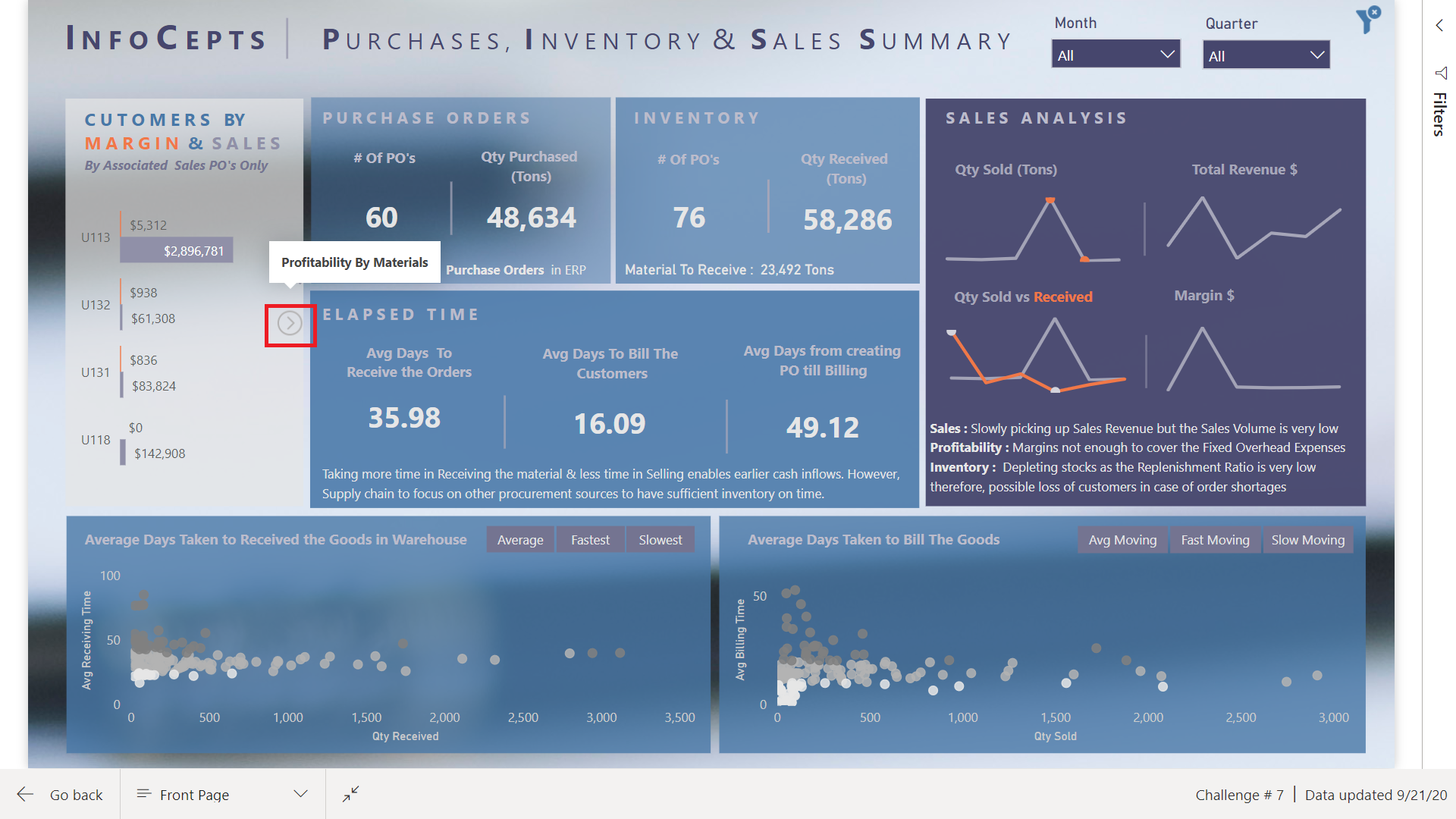
@mudassirali - clickable info pop-ups on visuals, also incorporating parameter entry box into report
@michaelsampsonidis and @alvi - overall look influenced by their visual styles, which I really like
@alexbadiu - placing slicers in header to conserve space
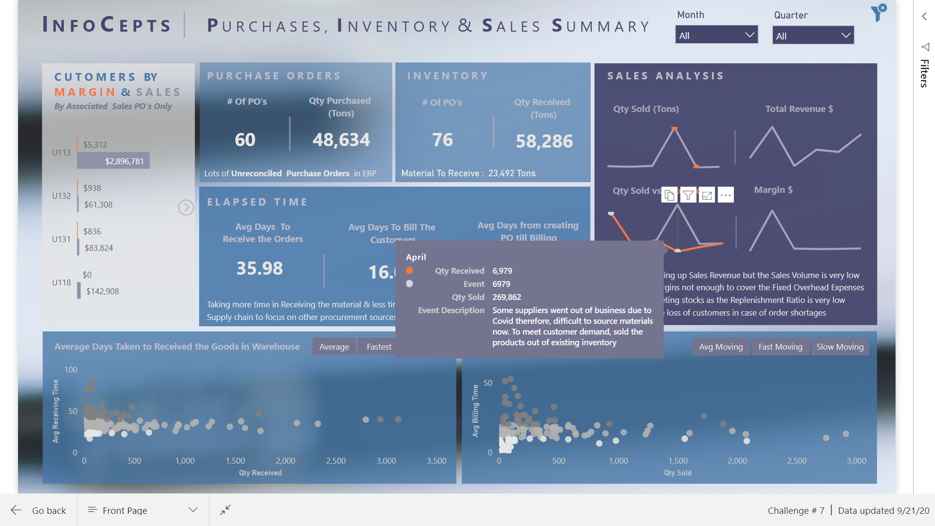
@datazoe - incorporating notes about the data and analysis into the tooltip
@greg - dynamic narrative summary using Envision Data Story (I thought about switching this over to the new Smart Narrative feature, but decided to keep it a straight up shoutout to @greg’s reports that have a craftsman quality to them that I think is awesome)
@sam.mckay - inspiration from the 30 for 30 series on creative use of tooltips (I think I used every type of tooltip available in this report)
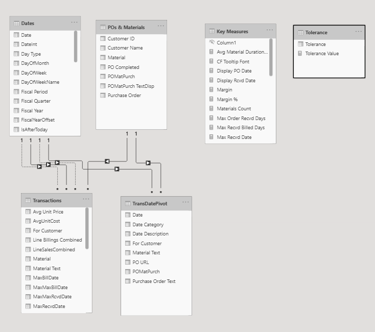
@melissa - the backbone of this report is a powerful data model I built entirely through techniques I learned from Melissa’s incredible forum posts and her Power Query YouTube video series (plus some basic assumptions I made about business practices regarding when a purchase order is considered completed):

This challenge was unique in the sense that prepping the data in Power Query and building a robust data model to support the required analytics was 90% of the battle. Everything went together quite easily after that.

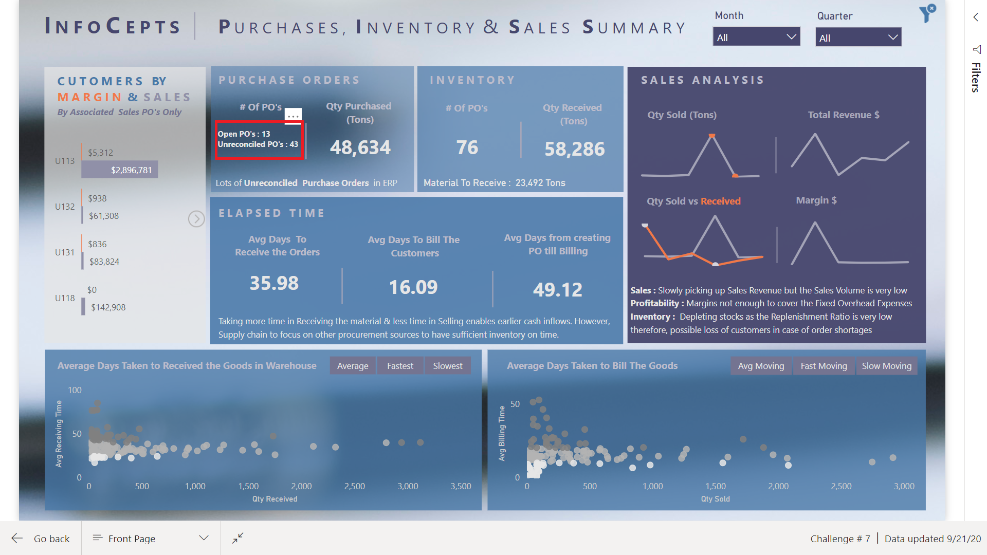
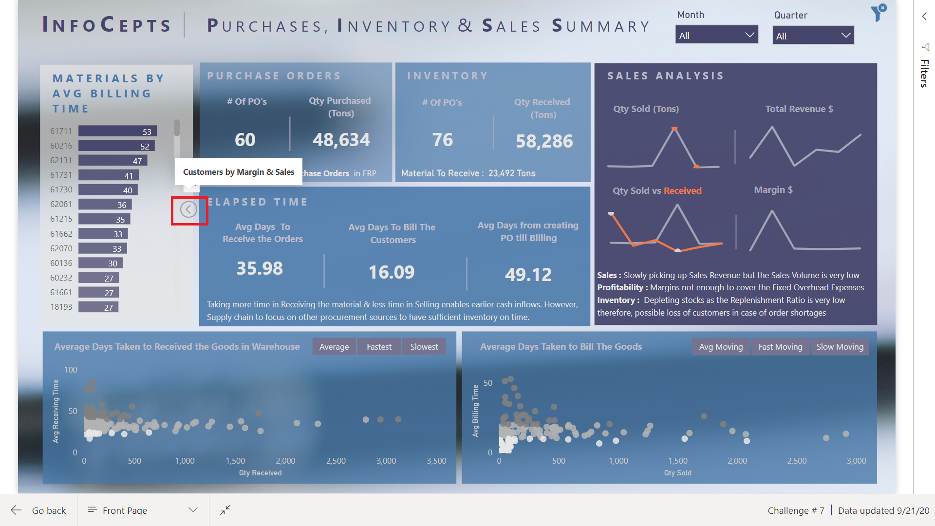
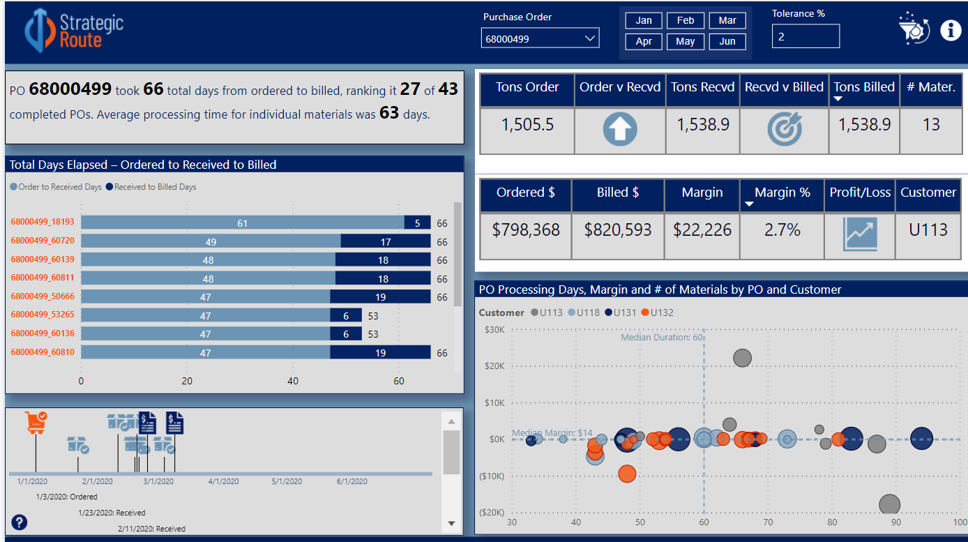
One of the problems I ran into in Challenge #6 was reaching far beyond the scope of the brief. This time I tried to stay tightly within scope. Thus, per the charge, the left side of the report addresses in multiple ways only the elapsed time between ordered and received, and received and billed, while the right side analyzes billings.

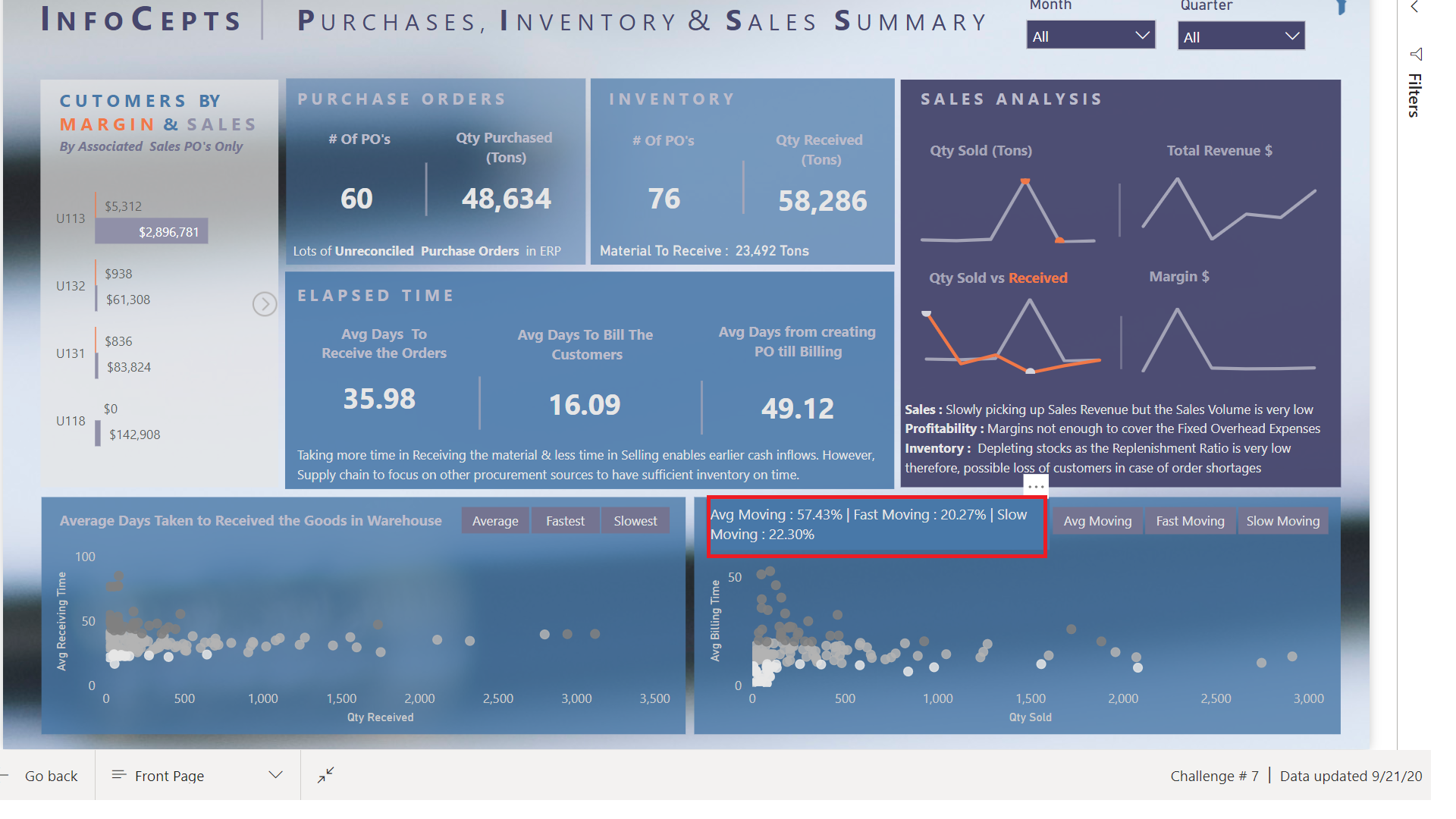
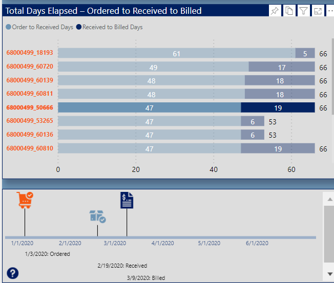
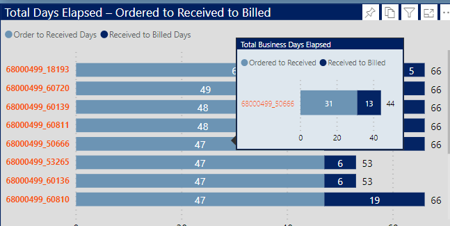
The top narrative is dynamic based on the Purchase Order (PO) slicer, and uses the Envision Data Story custom visual. The second visual is a standard bar chart that uses the new September 2020 feature to show bar totals. I couldn’t decide whether to use total days or business days, so I figured why not both? To show the latter, I added a report tooltip with a single stacked horizontal bar chart, again using the bar total feature.

image

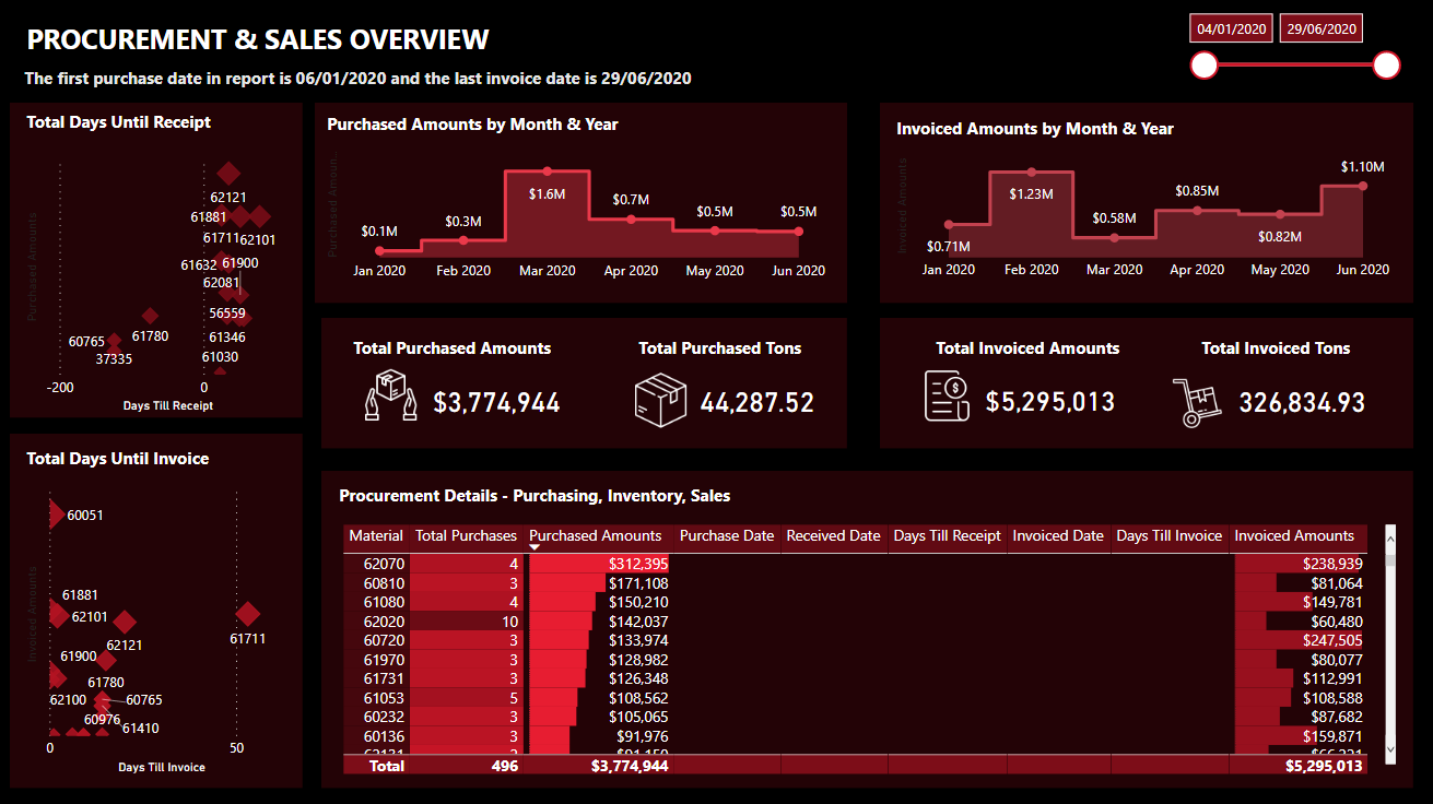
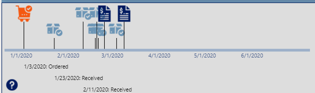
The next visual is my favorite in the report. It’s a really flexible timeline visual called Queryon Timeline. The problem is it is almost completely undocumented – no usable documentation on the company site, no YouTube videos, no postings on the Microsoft Community. Thus, it took me a while to figure out how to make it work, and then I combined it with the custom icon image hosting technique I stumbled onto in my Challenge #5 entry.

This timeline provides a spatial/visual representation of the elapsed times between the ordered date, the received date(s) and the billing date(s).

image

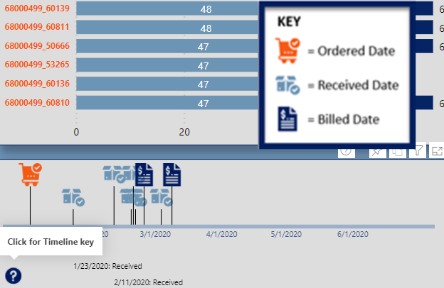
You can filter it down by material using the bar chart above:

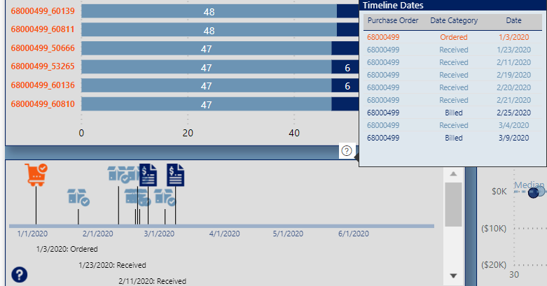
Or go into focus mode to see the entire date history

image

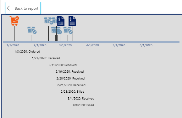
Or click on the visual tooltip header to see a table of the dates conditionally formatted by the icon color

I modified Mudassir’s really innovative clickable “information dot” approach to show a graphic key explaining the icons

image

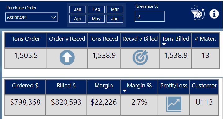
Okay, onto billings. Seeing that for most POs the total ordered quantity, received quantity and billed quantity differed by varying degrees, I created a “Tolerance %” what-if parameter to indicate within that percentage is close enough to call the compared quantities (ordered vs received, received vs billed) equal. If the two quantities are equal within the set tolerance, the icon returns an on target arrow, whereas if the second item is less than the first outside of the tolerance it returns the down arrow, and an up arrow if the reverse outside the tolerance.

Finally, I think the four-quadrant scatterchart provides an enormous amount of information in a single chart: margin, margin %, customer, purchase order, total PO duration and number of materials. This allows us to visualize a number of key elements regarding the billings across a range of dimensions:

  • this is a low-margin business
  • the longest durations tend to be associated with the orders involving a large number of materials
  • customer U113 is associated with both the greatest variability in margin, and also generally long durations
  • no other customers have a discernible pattern with regard to duration, margin or margin %

Thanks to those who made it through this long-winded writeup, to Haroon, Sam and the entire Enterprise DNA Team for a phenomenal challenge, and most of all to my fellow challenge participants – thanks for all you’ve taught me, all I’ve borrowed here from you, and best of luck on your entries. Can’t wait to see them!

– Brian

19 Likes

Wow Brian Seriously awesome work! Love the design and to say its 1 page the level of detail available is amazing.

Love how you have called out the hints and tips you have picked up on this journey. Shows you the incredible talent we have in our community and how we all bring something different to the table.

Thanks for submitting Brian an amazing entry and knowledge share.

Haroon

1 Like

@MudassirAli you seem to be raising the bar every week!!! Awesome submission and creativity love the use of tool tips.

Good luck in your presentation.

Hopefully we can see a write up on how you went about creating this report when you get time :).

Thanks
Haroon

1 Like

Wow, so good.

Hi friends,
This is my report for this challenge, it looks like a simple report but the number of measures created was very important.

I displayed in cards: total sales, profits and costs
avg days taken to receive the orders & avg days taken to bill the orders
Count purchased, received and invoiced orders
and quantity purchased, received and invoiced.

I added a table to detail each order: the Purchase date, First and latest date Received, and the number of days between the order and the last entry.
Also I displayed the First date billed and latest date billed, and the number of days between the first entry at the warehouse and the last invoice date for each order.

To see tooltip for detailed materials by purchase order, hover over the visual tableau

I created 2 scatter charts
the first to show the average days taken to arrive a the Warehouse by PO compared to quantity sold
the second to show the average days taken to bill the customers by PO compared to quantity invoiced

I segmented the “purchase to receive period” into groups of days to display the costs for each period
also for the “receive to bill period”, I divided it into groups to display the sales for each period

12 Likes