Power BI Challenge 15 - Formula 1 Analysis

Amazing submission @Greg :clap: :star_struck:
I like the simple theme, search buttons, and attached images for each circuit.
The page tooltips are also well organized and informative.
The whole package is great.

2 Likes

So beautiful and well-designed submission @JarrettM
The theme, red color, navigation buttons, and the pretty image in the middle of the page are awsome :clap: :+1:

2 Likes

Hey Guys,
Hope you are great and sorry for missing the deadline.
Thanks @haroonali1000 for preparing such a great challenge. I really enjoyed participating. It was so fun and really challenging for me for some reason.

Here is my submission for the “Formula 1 Challenge” :

It was a novel idea to create a one-page report. So, this is the main page with quite a lot of page tooltips :wink: I really wanted to stick to the one-page criteria, so didn’t use any sort of navigation at all.

Since I love scatter plots, I wanted to have at least one scatter chart in the report, so decided to use it for illustrating the relationship between Pitstop Time, Pitstop Rate, and The Number of Wins for each driver that at least have had one win in his races.

I used three simple bar charts for the Number of Races by Race Name, Driver Name, and Constructor Name and put all the related information on the tooltips.

I highly wanted not to split the dataset, or just use one last year’s data. So, I created the area chart showing variations in the number of races for different years, then put all the useful information about the drivers and constructors into the tooltip.

Used Adobe Photoshop to create a blurred background.
And to add some creativity placed slicers at the bottom of the page.

Hope you enjoyed it :blush:

List of Page Tooltips:

  1. Scatter plot tooltip

  2. Year Tooltip

  3. Race Tooltip
    Race Tooltip

  4. Driver Tooltip
    Driver Tooltip

  5. Constructor Tooltip
    Constructor Tooltip

I wish I could use pictures in my report like what @Greg, @JarrettM, @JBocher, @davidcenna and @Alvi did for example for Circuits, Cars, Drivers, or Countries Flags, but unfortunately I didn’t have enough time. I think it’s so cool and advanced. Maybe I could do this for the next challenge.

Any queries and feedbacks would be appreciated.

Regards,
Hossein

17 Likes

Amazingly done and love your additional notes to share your knowledge with us!

2 Likes

@sedhosen ,

When I first looked at this report, I thought “Wow! - It’s a gorgeous design, but Hossein must not have had a lot of time to do detailed analysis given how simple the primary visualizations are”. Then, I realized this is what I call a “mystery box” report (@datazoe is a master of this type of report as well) - incredibly simple on the face of it, but revealing a tremendous amount of detail and analytical depth when you begin to explore it. That’s exactly what you’ve accomplished here through the use of beautifully designed and perfectly implemented tooltips.

I also love the slicer configuration, which I’ve never seen done exactly in that way before. One of the things I struggle with in my own reports is slicers clumsily taking up way too much real estate. The way you have used them here – slim, at the bottom and using very intuitive icons rather than titles, is an approach I intend to “borrow” in my future reports.

As always, amazing work. Thanks so much for being such a stalwart participant in the challenges, and a fantastic contributor to the Enterprise DNA Community. :clap: :clap:

  • Brian
5 Likes

Please find below some comments and notes about the challenge.

What was challenging

  • Building the report on just one page.
  • Building accurate metrics

Report description

  • The report contains 3 main sections (Races, Drivers and Teams)
  • The races section toggle between two views (map and table). The section also contain a slicer (to select a specific year or season) and 3 cards to display the number of rounds, the number of drivers and the number of teams that participated in the selected season. The map visual have a custom tooltip that shows metrics for a specific race.
  • The two others sections contains 6 visuals a slicer (to select the driver or the team), 3 cards to display total of participations, total of wins and total of seasons, a table to display (driver or team) statistics and a clustered columns chart for participation vs races by seasons.

Design, graphics and colors

  • I got the logo and the wallpaper from “WallpaperAccess” (https://wallpaperaccess.com/f1-logo) and the icons from “Noun Project” (https://thenounproject.com/term/f1/)
  • I created a specific “theme” for the report using “Adobe Color” to extract different theme colors from the image used in the backgroud.( https://color.adobe.com/)
  • I used PowerPoint to build the report backgroud and took the inspiration from an eDAN report “Complaints analysis report”. I also build a specific background for the tooltip page.

Data model

  • I imported and kept all the tables provided even if in some of them there was redundant information and even if I did not use each one in calculations.
  • Because the model contains many fact tables, I added 3 Model layouts to view subsets of tables and get a better understanding of the information flow.

Data Enrichment

  • No data enrichment was made

Measures

  • I created 4 sets of measures for Races, Drivers, Teams (constructors) and Fastest lap

Learning outcomes and improvements gained
Learning

  • Using the SELECTCOLUMNS() function to return a subset of data (single column table) to use it as an argument with the IN operator to filter another table

Improvements

  • Implementing a toggle button
  • Using bookmarks
  • Creating a custom tooltip page
  • Understanding of the FILTER() and LOOKUP() functions.
  • Visual titles conditional formatting
  • Using Variables and DAX Studio to debug measure

Things to learn/improve on

  • Build a “Countries table with flags URL” and add it to my toolbag
  • Create measures based on many to many relationship
  • Review and debug broken measures
  • Enhance the report with new measures and a new section for circuits

What I liked form other participants (Things I wanted to do but was not able to or even didn’t thought about)
(This is not an exhaustive list and I did not mention everyone)

Objects Type Participant
First and last participation ( race + year ) Measure Sabine, @KimC,@JBocher
NOF Championship titles Measure Sabine, @KimC, @Alvi,@JBocher
NOF Pole Position Measure Sabine, @KimC, @Alvi, @JBocher
NOF Podiums Measure Sabine, @KimC, @Alvi, @JBocher
Including the flag of the country Measure Sabine, @KimC, @Alvi, @JBocher
Presenting the drivers like a contest D1 vs D2 Page Sabine, @JBocher
Win % (in a season) Measure @KimC
Podium % (in a season) Measure @KimC
Age when the driver won a championship Measure @KimC
Top 10 Drivers World Champion Wins (bar chart) Visual @KimC
Country World Champion Wins (bar chart) Visual @KimC
Last Year Driver Won World championship (QueryOn Timeline custom visual) Visual @KimC
Driver Age when Won World Championship by year (line chart with trend) Visual @KimC
Bar chart of incident in a race Visual Filip
Podium like presentation Visual Filip
% Q3 to Qualifying Measure @deltaselect
% Pole to win Measure @deltaselect
In the points (4th place to last point place) total point - points for 1 to 3rd place) Measure @deltaselect
Best Q3 Qualifying time Measure @deltaselect
Custom Filter pane Visual @JBocher

Everything in @Alvi report.

Any comment is welcome

8 Likes

@BrianJ ,

Thank you for highlighting the report that I presented.

While viewing the post, I noticed that the screenshots I had uploaded were of very poor quality, which is why I just re-uploaded them.

@MehdiH ,

The notes you’re taking on what you like re: the other entries will serve you very well. I do the same thing, and in Data Challenge 7, I intentionally developed my report to be almost entirely a mash-up of techniques I’d highlighted from others in the first six eDNA Challenges. It remains the most popular report I’ve ever done, though it looks charmingly primitive (“retro”) compared to the incredible submissions a mere eight Challenges later.

Hard to imagine what these reports will look like in another eight Challenges…

  • Brian

P.S. To anyone who wonders whether participating in the Challenges will significantly increase your skills, take a look at @alexbadiu 's Challenge #7 report and Challenge #14 and Challenge #15 report. Don’t get me wrong, his #7 report was still excellent, but just look at these two latest…

I think he would be the first to say that a good portion of his improvement was based on learning from others in the Challenges and being pushed by other entrants to continually innovate and advance.

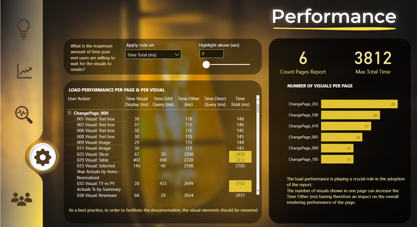
Alex Badiu - Challenge #7

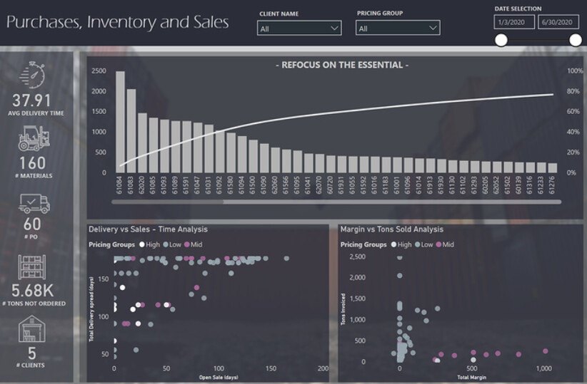
Alex Badiu - Challenge #14

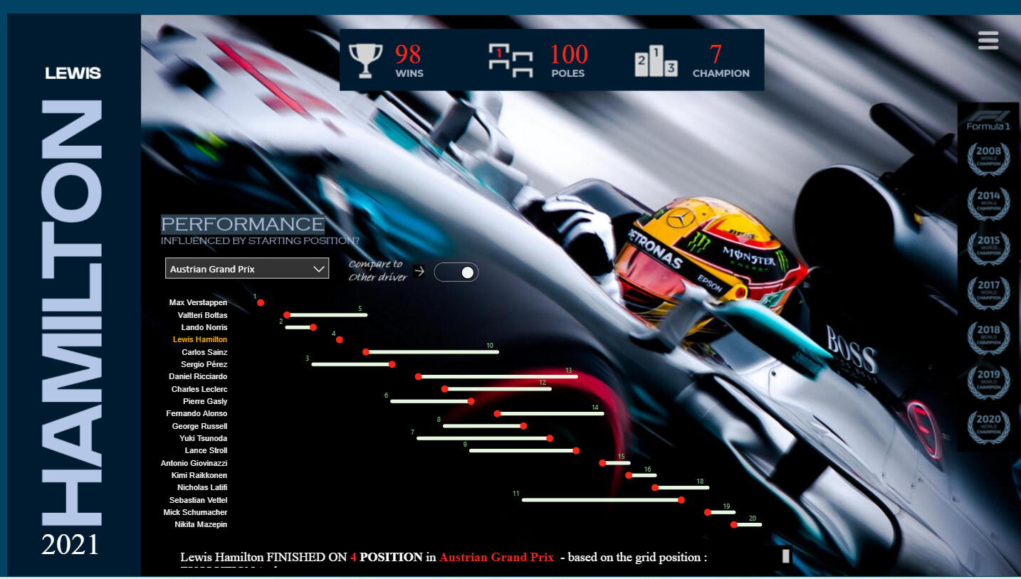
Alex Badiu - Challenge #15

10 Likes

Thank you, Brian!
I confirm that I learn a lot from these challenges. As Brian mentioned in previous posts I also consider these challenges as a mad scientist lab. I get to try all the time new techniques I see or read about, I can try new ux/ui, I learn how to better organize myself and I also learn how to analyze & present the data in a better/ more efficient way. I am consistenly pushed outside my confort zone & I learn a lot from the other entries. There are many talented people in this community, passionate and eager to improve. More than improving and learning new skills, I find in these challenge the encouragement and fuel to the passion we all share, analysis and data visualization. And I remain focused to keep learning.

8 Likes

Fabulous work everyone. Another incredible round of the Challenge!

Feedback coming from me soon…

4 Likes

Hi @sedhosen
I like the look of your report and I want to try some of your ideas, are you ok to please share the pbix file with me ?

Cheers

Hi @Eze
You can download the .pbix files through eDNA portal “Power BI Challenge Showcase”.

Best

2 Likes

Hi @sedhosen

Ok noted and thank you very much

Hi Greg, what an amazing entry. Well done. Will you be posting the PBIX file at all for us to take a deep dive?

Cheers
Antony

Thank you for the kind words @AntonyC. Yes, the PBIX will be posted in the “Power BI Challenge Showcases” eDNA course along with the other challenge submissions. The C15 topic has been posted and the PBIX files will be available shortly.
Greg

2 Likes

Congratulations @Gustaw and @JBocher !

5 Likes

Hi Greg, Amazing submission, I am a beginner in Power BI can you please share the .pbix file of the formula 1 analysis too. It will be a great help to a beginner like me to learn and explore more about Power BI.
Thanks.

1 Like

Hi @MandarAglawe. Thanks for your kind words. For eDNA members, the PBIX file can be downloaded from the Resource Center\Showcase section of the eDNA website.
Greg

1 Like

Still one of the most astonishing reports to showcase datastorytelling in PowerBI where most people can relate to. Congrats!!

1 Like