Power BI Challenge 7 - Purchases, Inventory And Sales!

Hi @michaelsampsonidis,

You can assume the first shipment, however no issues if you have done whole quantity.

Regards,
Haroon

Hello,
how you made your Data Model and relationship between tables ?

I used Lookup value function to retrieve the values from tables. I was short on time so didn’t really dig in to establish bridging tables to connect the tables. For this task, it worked fine though.

Wow very impressive once again. Well done

Just a fabulous and inspiring design.

Sam

1 Like

This is where I’ve got to.

Might put the finishing touches on it in the coming days

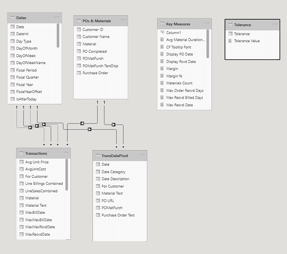
Here’s how I’ve constructed the model.

Hopefully this can assist you all in simplifying down the data.

Not too difficult.

I fear the data is a bit incomplete and very random, but don’t let that stop you diving into the challenge, still plenty to test yourself on.

Sam

15 Likes

Challenge Participants,

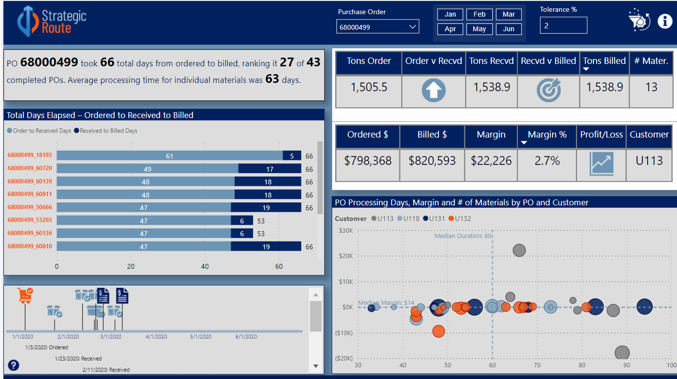
Below is my submission for Data Challenge #7. Of the seven challenges so far, this one was definitely my favorite. After a subpar performance in Challenge #6, I hit on a great inspiration for this one. My favorite non-Power BI YouTube deep dive is music mashups, where someone takes two (or more) artists with completely contrasting styles and combines them into a single song, that when done right creates something new and cool. So I wanted to try to do that with my entry this time, shouting out many of the great ideas I’ve seen implemented throughout the challenges and mash them up into a one-page report that fully answers the charge from @haroonali1000. So here’s the roster of tips and tricks that I mashed up:

@jarrettm - building color theme from a logo, conditional formatting via DAX SWITCH() returning hex values
Paul Ross - bar chart tooltip
@mudassirali - clickable info pop-ups on visuals, also incorporating parameter entry box into report
@michaelsampsonidis and @alvi - overall look influenced by their visual styles, which I really like
@alexbadiu - placing slicers in header to conserve space
@datazoe - incorporating notes about the data and analysis into the tooltip
@greg - dynamic narrative summary using Envision Data Story (I thought about switching this over to the new Smart Narrative feature, but decided to keep it a straight up shoutout to @greg’s reports that have a craftsman quality to them that I think is awesome)
@sam.mckay - inspiration from the 30 for 30 series on creative use of tooltips (I think I used every type of tooltip available in this report)
@melissa - the backbone of this report is a powerful data model I built entirely through techniques I learned from Melissa’s incredible forum posts and her Power Query YouTube video series (plus some basic assumptions I made about business practices regarding when a purchase order is considered completed):

This challenge was unique in the sense that prepping the data in Power Query and building a robust data model to support the required analytics was 90% of the battle. Everything went together quite easily after that.

One of the problems I ran into in Challenge #6 was reaching far beyond the scope of the brief. This time I tried to stay tightly within scope. Thus, per the charge, the left side of the report addresses in multiple ways only the elapsed time between ordered and received, and received and billed, while the right side analyzes billings.

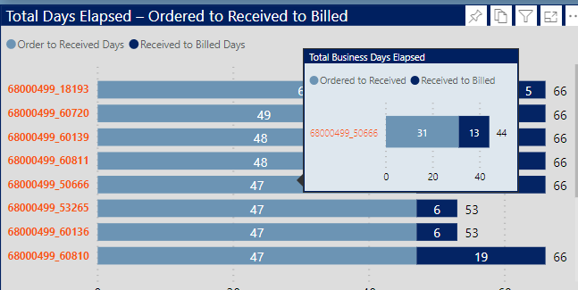
The top narrative is dynamic based on the Purchase Order (PO) slicer, and uses the Envision Data Story custom visual. The second visual is a standard bar chart that uses the new September 2020 feature to show bar totals. I couldn’t decide whether to use total days or business days, so I figured why not both? To show the latter, I added a report tooltip with a single stacked horizontal bar chart, again using the bar total feature.
image

The next visual is my favorite in the report. It’s a really flexible timeline visual called Queryon Timeline. The problem is it is almost completely undocumented – no usable documentation on the company site, no YouTube videos, no postings on the Microsoft Community. Thus, it took me a while to figure out how to make it work, and then I combined it with the custom icon image hosting technique I stumbled onto in my Challenge #5 entry.

This timeline provides a spatial/visual representation of the elapsed times between the ordered date, the received date(s) and the billing date(s).

image

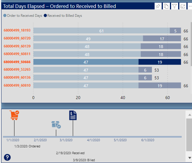
You can filter it down by material using the bar chart above:

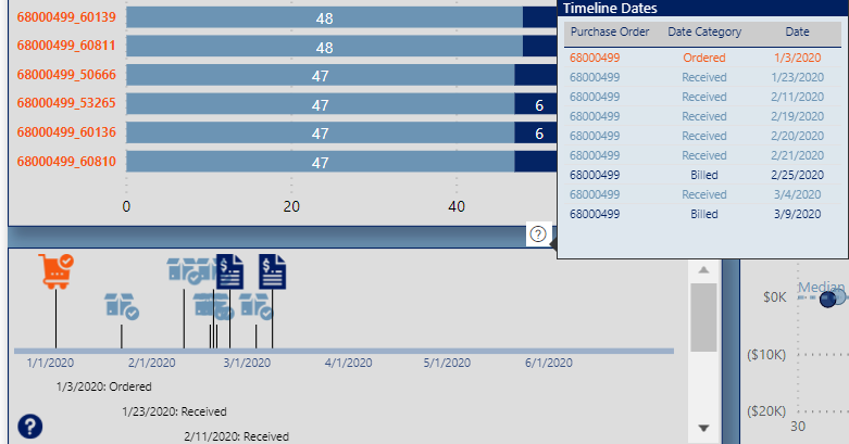
Or go into focus mode to see the entire date history
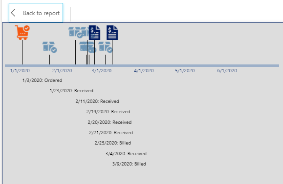
image

Or click on the visual tooltip header to see a table of the dates conditionally formatted by the icon color

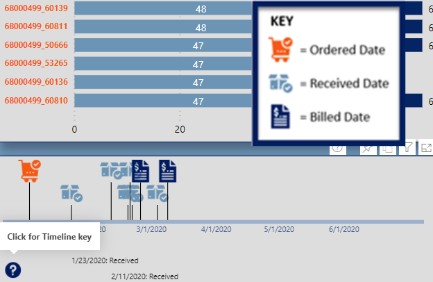
I modified Mudassir’s really innovative clickable “information dot” approach to show a graphic key explaining the icons
image

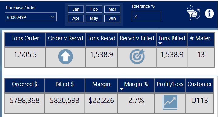
Okay, onto billings. Seeing that for most POs the total ordered quantity, received quantity and billed quantity differed by varying degrees, I created a “Tolerance %” what-if parameter to indicate within that percentage is close enough to call the compared quantities (ordered vs received, received vs billed) equal. If the two quantities are equal within the set tolerance, the icon returns an on target arrow, whereas if the second item is less than the first outside of the tolerance it returns the down arrow, and an up arrow if the reverse outside the tolerance.

Finally, I think the four-quadrant scatterchart provides an enormous amount of information in a single chart: margin, margin %, customer, purchase order, total PO duration and number of materials. This allows us to visualize a number of key elements regarding the billings across a range of dimensions:

  • this is a low-margin business
  • the longest durations tend to be associated with the orders involving a large number of materials
  • customer U113 is associated with both the greatest variability in margin, and also generally long durations
  • no other customers have a discernible pattern with regard to duration, margin or margin %

Thanks to those who made it through this long-winded writeup, to Haroon, Sam and the entire Enterprise DNA Team for a phenomenal challenge, and most of all to my fellow challenge participants – thanks for all you’ve taught me, all I’ve borrowed here from you, and best of luck on your entries. Can’t wait to see them!

– Brian
19 Likes

Wow Brian Seriously awesome work! Love the design and to say its 1 page the level of detail available is amazing.

Love how you have called out the hints and tips you have picked up on this journey. Shows you the incredible talent we have in our community and how we all bring something different to the table.

Thanks for submitting Brian an amazing entry and knowledge share.

Haroon

1 Like

@MudassirAli you seem to be raising the bar every week!!! Awesome submission and creativity love the use of tool tips.

Good luck in your presentation.

Hopefully we can see a write up on how you went about creating this report when you get time :).

Thanks
Haroon

1 Like

Wow, so good.

Hi friends,
This is my report for this challenge, it looks like a simple report but the number of measures created was very important.

I displayed in cards: total sales, profits and costs
avg days taken to receive the orders & avg days taken to bill the orders
Count purchased, received and invoiced orders
and quantity purchased, received and invoiced.

I added a table to detail each order: the Purchase date, First and latest date Received, and the number of days between the order and the last entry.
Also I displayed the First date billed and latest date billed, and the number of days between the first entry at the warehouse and the last invoice date for each order.

To see tooltip for detailed materials by purchase order, hover over the visual tableau

I created 2 scatter charts
the first to show the average days taken to arrive a the Warehouse by PO compared to quantity sold
the second to show the average days taken to bill the customers by PO compared to quantity invoiced

I segmented the “purchase to receive period” into groups of days to display the costs for each period
also for the “receive to bill period”, I divided it into groups to display the sales for each period

12 Likes

@amal.rebai1995 I know I don’t get to vote on any of these but in my humble opinion this is the best one I’ve seen for this challenge.

Very nice work.

Guy

2 Likes

@GuyJohnson wow That’s very nice of you to say so, thank you so much.
it’s a simple report, I would have liked to develop it even more

Thanks @haroonali1000 for the comments. Every time I think that I am out of ideas for the next challenge but come automatically when you take the challenge seriously. These ideas never ever come when designing work-related dashboards because no one is looking at it critically.

As for the detailed write up, it has been done.

1 Like

@BrianJ To be honest, to understand the work you have done and to learn from it, I need some time to actually digest it. You have come up with an excellent way to implement the different techniques shown in the forum in different challenges. The way you mashed the data via power query is really cool and would love to see how you did it. Frankly speaking, I always used power query extensively so wouldn’t have to create complex DAX formulas but now I am doing the other way round to learn DAX more.

Honestly speaking, no one comes close to the way you do the analysis and always bring different perspective to look at. So as far as the analytical aspects are concerned, you could have won every challenge.

However, I would only advise you to be daring with color formats as @alexbadiu and @Greg did in the previous challenge. The current report seems like it has been designed in Power BI but some reports in the previous challenges looked like as if they were designed in high level designing softwares.

Nonetheless, thank you so much for completing the challenges as there are many invaluable things to learn from you every time :+1:

Great Submission I really love the way you categorized Sales by Billing Group & Cash by Receiving Group based on range of days. Incorporating details on the heading section also looks very cool. You could have used the same color theme on the Table Visual as it would have given the nice uniform look.

Very good submission overall!!

@amal.rebai1995,

Terrific entry. I feel like you made really smart choices all around on this one – in terms of color scheme, the choice of visuals, and particularly the choice of measures and metrics to characterize the key questions from the brief. One of the things I felt was challenging in this one was there were so many directions to go analytically, but looking at your report I feel you really captured what would be important to a manager trying to understand the dynamics behind the ordering/receiving/billing process.

As I said to @MudassirAli, I also feel your entry would benefit from people being able to use it hands-on. If you don’t have the ability to publish to web, let me now I’ll be glad to do it for you.

Great work!

– Brian

2 Likes

I just want to put my two cents in … first of all, thanks @MudassirAli for the props … I’m trying to push myself from a design point-of-view with every report (and challenge), and its rewarding to see it’s being noticed. I do, however, want to comment on your note to @BrianJ wishing for more colours: I’m a data guy by training and by experience and more than echo your first thoughts for Brian’s work … I can’t say enough about having good quality, well-analyzed data upon which to make decisions, and, as you said, Brian excels at that. I’m focusing a bit more on the design aspects at the moment, because, as a consultant, I most often work with people who already know their data inside and out, and are sometimes challenged in the way they’ve traditionally presented that data. That being said, I do and always will subscribe to the axiom “you can’t make good decisions from bad data”. So I look on presentation as more of a bonus than the primary goal. That being said (2), I’ve also had clients who’ve said “if your design is off, how can I trust your data?”, so both are important. All of which is to say, it’s like the consultant’s standard answer, “it depends”.

Thanks everyone for their patience in reading this … I actually intended only a short note, but ended-up rambling for a bit. Congratulations to all who have pushed themselves on this and previous challenges. My submission is in its final stages, and I hope to have it completed later today or tomorrow.

Greg

6 Likes

With courtesy of @BrianJ, here is the web link for my report:

The bookmarks aren’t working as the Sep 2020 update messed up the bookmarks. However, the file I submitted to EDNA team has the bookmarks working perfectly.

1 Like

Hi All:

Here’s my submisstion for eDNA Challenge #7. I opted to use many bookmarks to make a single-page report look like a multi-page report. I had a blue-based colour theme initially, but @JarrettM’s timely video this week provided much better results, so thanks. Also, I was a little later completing my submission than I had intended as I anted to spend some time with the new Smart Narratives visual (available since Sep 22).

Here’s the notes I took during development (I hope all are still applicable; I was a bit rushed to get this in, so please bear with me … my editing might be off a bit, but anyway…):

NOTES:

What I liked:

  • the colour theme and transparency of visual backgrounds I used; I think it looks great
  • the “fake” navigation that made this single-page report (with many bookmarks) react like a multi-page report (via the extensive use, flexibility, and power of grouping in the [Selection Pane] to make assigning and updating bookmarks easier)
  • the “bounce” of the button text and images; slightly changed font colour, size, padding, image weight, size, etc. to identify that an action can be performed
  • the new “Smart Narratives” visual available as a preview feature as of the September 2020 release of Power BI Desktop; I’m really looking forward to exploring this further
  • the “Horizontal Bar Chart” custom visual by Microsoft, as a technique to save space when presenting a bar chart by placing the category inside the bar instead of having axis labels
  • the use of the “Top 10 and Average of Others” in said Horizontal Bar Chart; I think this provides a great insight as t let’s you know just how far the top 10 are above the average

What I didn’t like / needs more work:

  • I used the whitespace character to try to hide the tooltip for the “Info” dialog open button and the “Close” button in the “Info” dialog, but they now show a portrait blank white tooltip … a complete absence of tooltip was the goal, but oh well…
  • the scroll bar in the “Horizontal Bar Chart” custom visual used in the Sales bookmark section seems to be automatically set to a dark colour when a dark background is chosen; needed to increase the transparency of all visual backgrounds to 50% (I initially set everything to 25%, as I liked it better, but, again, oh well…)
  • I got a bit lost in the interactions of the bookmarks and visibility of the dialog box, and on closing the dialog box, then display reverts to the [Purchase] bookmark, which was not the intent, so this is a “known issue” with this report
  • the “Departures” table in the [Time] bookmark incorrectly shows all materials, including those that have not “departed”; ran out-of-time that I had allotted myself to pursue further, so this is a “known issue” with this report
  • the visualizations are a bit sparse, but my focus was more on the presentation of the bookmarked data than on a full analysis of the data
  • the fragility of the new Smart Narratives visual; I’m guessing the fault was mine, not the visual’s, but regardless, I was almost done when I decided to clean up a little and reorganized one of the measures used into a new table; this broke the Smart Narratives visual and I couldn’t recover it … I needed to start again from scratch. From now on, I’ll create my text in an outside editor, including placeholders for measures, then replace the placeholders with measures once at the end only; I’m sure this will get better over time and will shortly no longer be an issue
  • only on final polishing did I publish to the Power BI Service for final testing, and with USERPRINCIPLENAME() now being active for the current user, the width of the sidebar is now qite enough; I’ll test the published report sooner in the development cycle from now on, but this remains a “known issue” with this report

Setup:

  • used Power BI Desktop September 2020 release (Build 2.85.681.0, dated 9/22/2020)

Goals:

  • to gain experience using the new Smart Narratives visual (only available as of September 22, 2020)
  • to increase my experience with multiple bookmarks on the same page
  • to increased my experience with “bounce” to give users an extra visual clue that a button can perform an action

Data Model:

  • used eDNA extended date table as [Dates] Extended Date Table (Power Query M function)
  • marked [Dates] table as a date table
  • changed all date formats to dd-mmm-yyyy [by typing “dd-mmm-yyyy” into “Format” box directly]
  • imported Invoices, Purchase, and Receipts as staging tables; disabled load
  • renamed [Material] as [Material ID], so once a duplicate column had been created as [Material], could change type to “Text” and enable “Search” in a slicer
  • deleted all auto-generated relationships
  • arranged table model in a “waterfall” and used “Manage Relationships” dialog to add all relationships (all 1-to-many)
  • created empty tables for [Key Measures] and [Admin Measures]; opened 2 sessions of Tabular Editor (1 each on my Challenge #6 PBIX and this file) and copied measures
  • added [Last Refresh] table
  • hid all ID fields
  • added disconnected supporting table for [Materials plus Others]; accepted default of many-to-many relationship offered by Power BI when linking to [Materials] table
  • imported tables from dataset as staging queries;
    • created references for Purchasing, Receiving, Invoicing
    • created reference (remove other columns, remove duplicates) for Customers
    • created reference (remove other columns, remove duplicates) for Materials; where a value was in more than one table (e.g., Material) created staging level 2 reference from each and appended all results (then removed duplicates) to ensure all values accounted for); duplicated the [Material ID] column to [Material] and changed type to Text so the “Search” option could be used in slicers
    • created reference (remove other columns, remove duplicates) for Purchase Orders from each of Purchasing, Receiving, Invoicing; as some PO numbers were present both on the Inventory and Sales sides, added a custom column and set the [PO Type] to “INV” for PO’s from the Purchasing and Receiving tables, and [PO Type] = “SALES” from the Invoicing table; duplicated the [PO] column to [Purchase Order] and changed type to Text so the “Search” option could be used in slicers; appended all results (then removed duplicates) to ensure all values accounted for)
  • disabled load for all staging tables
  • renamed columns to ensure consistency
  • deleted all auto-generated relationships
  • created relationships:
    • Customers[Customer] → Purchasing[Customer]
    • Materials[Material] → Purchasing[Material]; Materials[Material] → Receiving[Material]; Materials[Material] → Invoicing[Material]; all inactive
    • Purchase Orders[Purchase Order] → Purchasing[Purchase Order]; Purchase Orders[Purchase Order] → Receiving[Purchase Order]; Purchase Orders[Purchase Order] → Invoicing[Purchase Order]; all inactive
    • Dates[Date] → Purchasing[Purchase Date]; Dates[Date] → Receiving[Received Date]; Dates[Date] → Invoicing[Invoice Date]; all inactive

DAX Calculations:

  • added “Admin” measures for:
    • [Is Desktop] using difference between NOW() and UTCNOW() to determine user interface
    • [Is Service] using difference between USERNAME() and USERPRINCIPALNAME() to determine user interface
    • [… Tooltip] measures to use [Is Desktop] and [Is Service] to display the appropriate tooltip regardless of interface

Visualizations:

Custom Visuals:

  • Horizontal Bar Chart (by Microsoft)

General:

  • used filter pane to restrict report to historical dates by using Dates[IsAfterToday] = False
  • used “Work” pages to try out different visuals and identify trends that were interesting and should be included in the main report page
  • formatted measures using eDNA DAX Clean Up tool https://analysthub.enterprisedna.co/dax-clean-up
  • made extensive use of the [General] section in the [Visualizations] pane to ensure consistent sizing of all visual elements and adjusted the X/X/Width/Height as necessary; tried to keep multiples of 10 px and 20 px spacing between visuals
  • made extensive use of the [Selection Pane], naming and ordering all visuals and assigning into groups, which eased the copying of “Work” page “groups” to the single visible page and subsequent assignment to bookmarks
  • used internet search to find blue abstract background image;
  • visual colours: set background colour to darkest theme colour 25% darker #00245A; set background transparency to 25%; set font colour to white for all (items, column headers, axes, data points, etc.)
  • hid all pages in the report except for the single main page (i.e., hid “notes” page and all “work…” pages)
  • added “Info” button in top-right corner to display info dialog and altered button text padding, button font, button colour, and button fill slightly between “default” and “on hover” (as well as icon colour and weight) to give the user a visual indication that an “action” can be performed
  • added “Info” dialog with placeholder sample text

Sidebar:

  • used buttons for false “navigation” (to fake the appearance of a multi-page report even though this is actually a single-page report) by:
    • activating bookmarks to show/hide the desired visuals;
    • altering button text padding, button font, button colour, and button fill slightly between “default” and “on hover” to let the user know an “action” can be performed
    • duplicated navigation buttons and set background to white, font colour to black for “active” navigation choice;
    • used selection pane and bookmarks to show/hide the appropriate “active” and “inactive” navigation buttons
  • added Reset (slicers) button and altered button text padding, button font, button colour, and button fill slightly between “default” and “on hover” (as well as icon colour and weight) to give the user a visual indication that an “action” can be performed
  • used “shadow” and slightly darker background colour to ensure buttons and slicers stand out on navigator
  • added 210 px-wide rectangle background for sidebar and title textbox; grouped both in selection pane with title above background so would always appear in front
  • used 2-column multi-row card at bottom to display report admin and session admin measures

Top:

  • used Smart Narratives visual to display summary text and dynamic measures
  • used line to separate Top portion (unchanging with bookmark) from Bottom portion (changing with bookmarks [“false” navigation])

Bottom - Purchases bookmark:

  • used [Horizontal Bar Chart] custom visual to display top 10 materials and average of others (this visual saved horizontal space by placing the category inside the bar)

Bottom - Inventory bookmark:

  • used pie chart to depict material movements for inflows vs. outflows
  • used pie chart to depict value movements for sunk costs vs. sales
  • used inventory summary table to show detailed quantity, value, and balance amounts
  • used combo chart to show inventory balance quantity vs. inventory balance value

Bottom - Sales bookmark:

  • as the was a large quantity of one material sold compared to all others, decided to break-out the top selling material into it’s own multi-row card, so that the Horizontal Bar Chart custom visual could be useful in presenting the relative quantity sold of the remaining materials
  • used line charts for total sales and total quantity; noted the spike of material quantity sold between the 17th and 24th of April 2020

Bottom - Time bookmark:

  • used table visual to present materials arriving in the warehouse, including their delivery days; used conditional formatting/data bars on delivery days
  • used table visual to present materials departing from the warehouse, including their residence days; used conditional formatting/background on residence days
16 Likes

Hello All,

Please find below my submission for Challenge n7.

I tried to focus on the essential and be clear on the message I wanted to send.
The first decision I made was to concentrate only on the POs and the corresponding Materials that are present in Purchase/Received & Invoiced Table. This is the reason why the numbers might seem a little bit different then in the other entries.

The second (difficult decision) was to decide what are the best visualizations to choose in order to be clear, concise and still provide flexibility to the end user.

My main problem was that in a 1 page report it is more difficult to imagine and create a story. I did not want to create a page of only KPIs and information spread across the page.
As in every report I want my audience to know or do something. I summarized the whole report into one sentence that I put in the middle of the Report:
" Refocus on the essential "

I spent a lot of time trying different approaches to present the data but finally the best combination I found is using the following charts:

The Pareto Chart

I placed the Pareto Chart strategically in the top of the page. It is so central that is difficult not to see it from the start. I ve chosen that place because that is where my story starts.
What are the materials you want to see and analyze? Doing so, I do not put the end user analyze all the data, I encourage them to take a certain path.
And for me, the best path is to start with volume

The GIF below can show the most probably path the end user might take.
Challenge 7

The Scatter Charts

The Scatter charts have many advantages. They are easy to understand, and provide a lot of information if you use it with groupings, good X/Y axis, tooltips and interactions.
Once again, I found the combination of the scatter charts and the Pareto to work very well.

I think I did not do anything too difficult or extraordinary in this challenge, but I spent a lot of time thinking about details and trying all kinds of analysis. In the beginning I wanted to go with cohorts, spent a lot of time on that, and with Brian’s help I succeded to create it… but still I had to let it go.

This challenge for me was about simplicity, about going to the basics, at taking the time to think and present something clear and simple.
In one sentence I summarize my analysis, my recommendantion and the call for action
REFOCUS ON THE ESSENTIAL

Colour Theme

Please find below the theme used for this report. (photo and colours hex)

Best regards,
Alex

13 Likes