Thanks @EnterpriseDNA for hosting this challenge. I did update the link this morning after fixing the Customer functionality/relationships in the data model.
DataZoe Challenge 7 Submission
Overall – the point of the report
The report was to answer three main questions,
- days from Purchase Order to Warehouse,
- days from Warehouse to Invoice, and
- sales analysis.
It also had to be one page only.
Data and Assumptions
The data was challenging for me, because there was a lot of unknown data. Many of the invoiced items had a PO that I didn’t have details on, including cost. I wanted to make sure I was clear on what was being shown and what was missing.
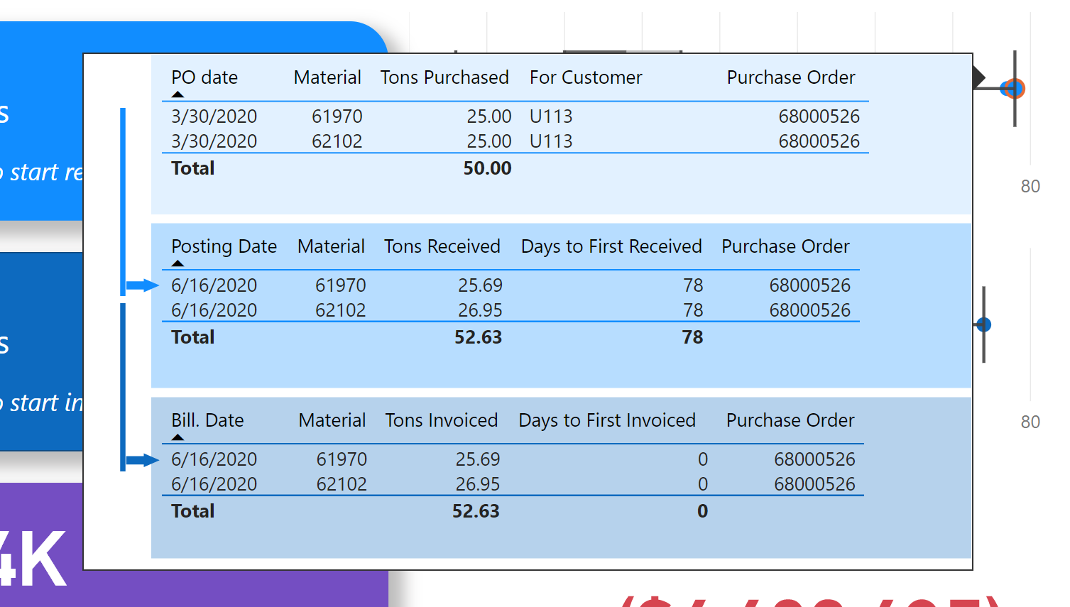
A purchase order can have many materials included, and they can arrive in partial shipments of materials on a purchase order, or just one of the many materials on a purchase order, at the warehouse. I chose to focus on the first receive date for each purchase order.
Similarly, the invoices could only some of the materials and also in partial amounts, so I chose to focus on the first invoiced date for each purchase order.
Late in the process I actually tried to change this to line item specific, instead of purchase order, so the first receive date for purchase order/material combo, and same for invoice date, but it was getting too close to deadline to fully explore it.
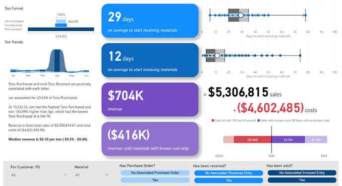
Key Metrics
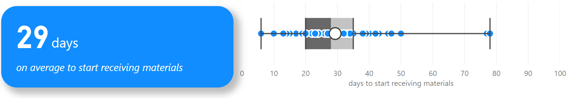
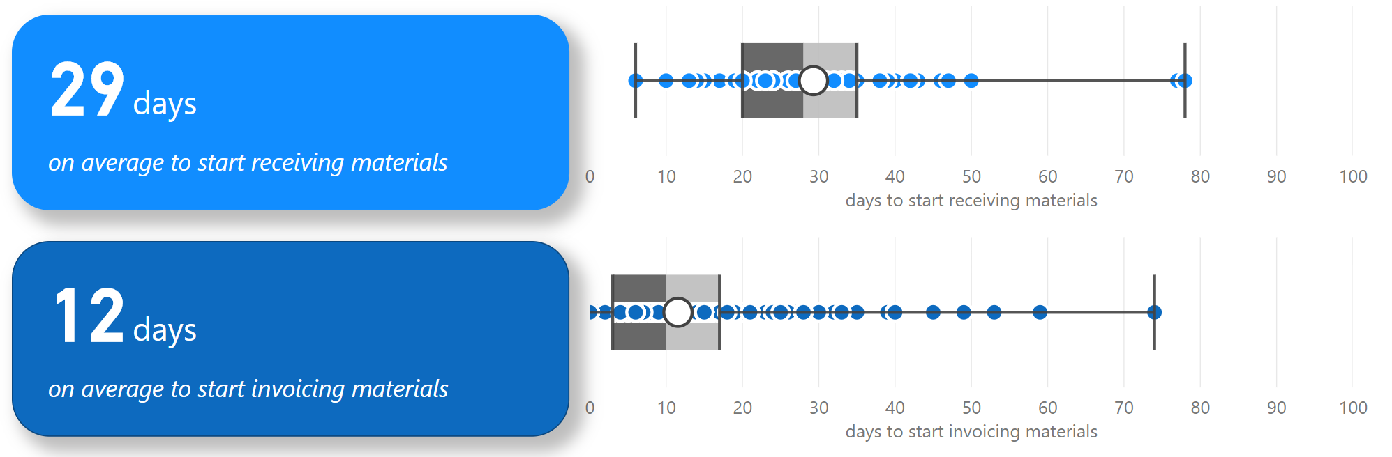
Days to start receiving materials
The DAX
Days to First Received =
AVERAGEX(
  'All Purchase Orders',
    CALCULATE(
        MINX(
          'All',
            DATEDIFF(
                MINX( 'Purchase Order','Purchase Order'[PO date] ),
                MINX( 'Received','Received'[Posting Date] ),
                DAY
            )
        )
    )
)
Here I am taking the first purchase order date by the po/material combo, the line item, and the first received date of the line item. I’m getting the days difference. I then am aggregating that by purchase order as the average of the line item days to receive for that purchase order.
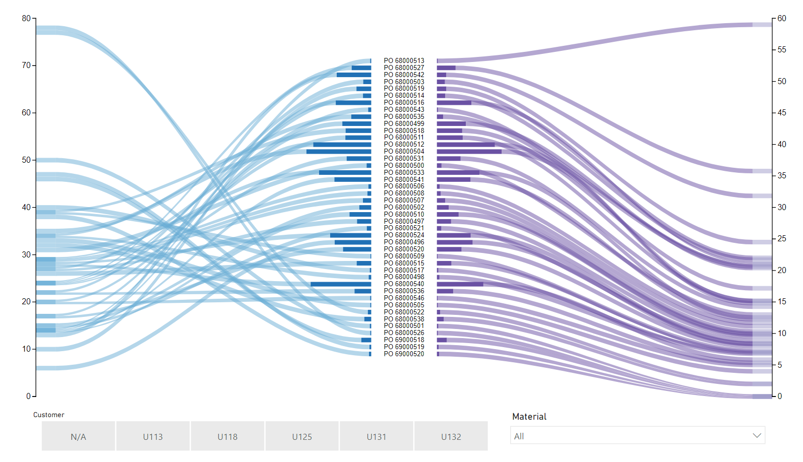
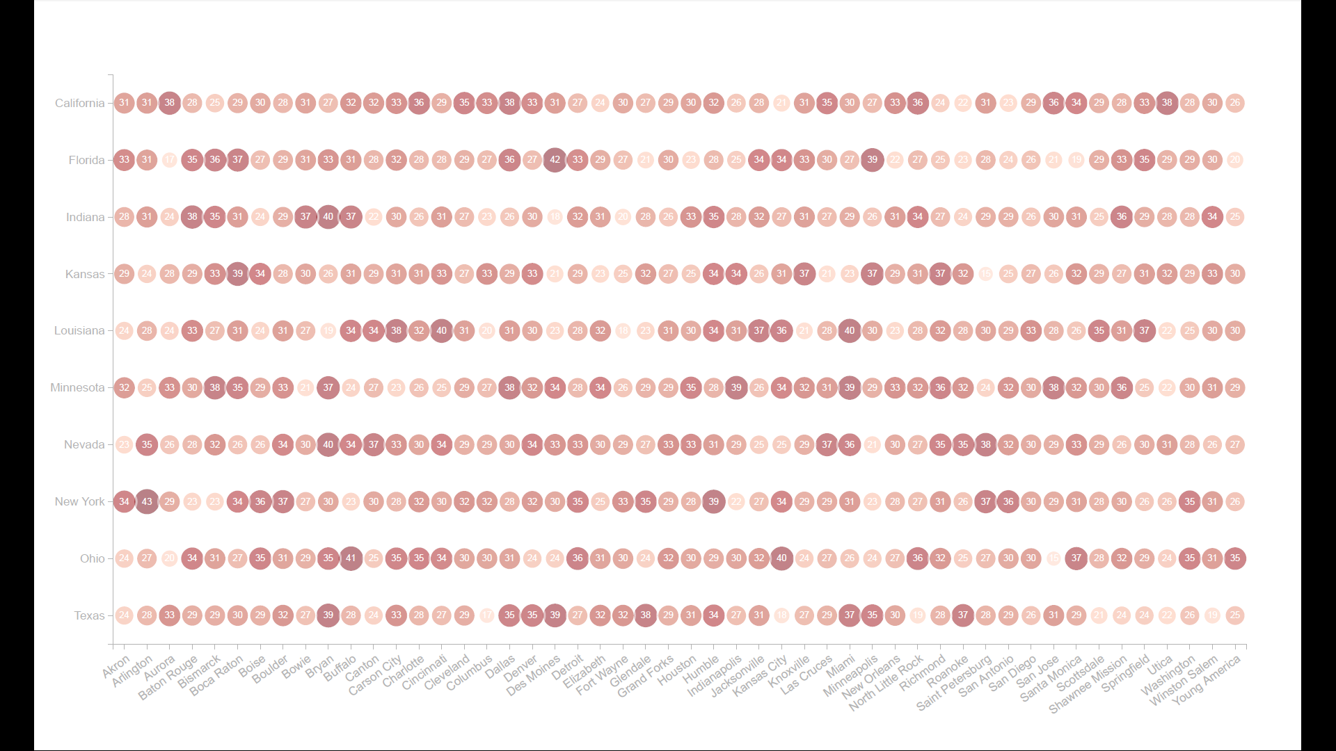
The Visuals
Cards are kind of annoying to me, mostly because they do not left align and there are a lack of formatting options. I used the
Advance Card custom visual, which includes postfix, prefix options (to add the “days” and I could left align and add the more user friendly label.
The other custom visual used in the Box and Whisker by MAQ Software. I’ve used this one before and am always impressed by how it conveys a lot of data in such an effective way.
I also have a tooltip on all those dots, so you can hover and see some more detail. It would be more effective as a drill through, but I was trying to be very good on that one-page requirement. I’d love to change it to the timeline visual that @BrianJ used in his report for it though.
You can also click on any of the dots to see the rest of the page for that PO only.
Days to start invoicing materials
The DAX
Days to First Invoiced =
AVERAGEX(
  'All',
    CALCULATE(
        MINX(
          'All',
            DATEDIFF(
                MINX( 'Received','Received'[Posting Date] ),
                MINX( 'Invoiced', Invoiced[Bill. Date] ),
                DAY
            )
        )
    )
)
Again, this is similar to the days to receive, but I am taking the first receive date and comparing it to the first invoiced date. I actually kept this on at the item level for an average.
The Visuals
The idea would be to keep it comparable to the days to start receiving. They are lined up so you can see at a glance where the time is spent:
Sales analysis
The DAX
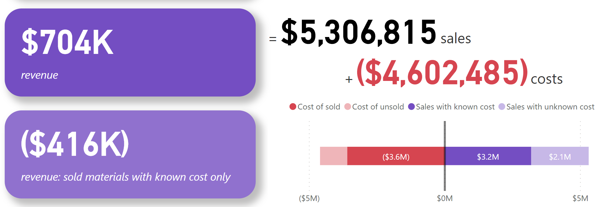
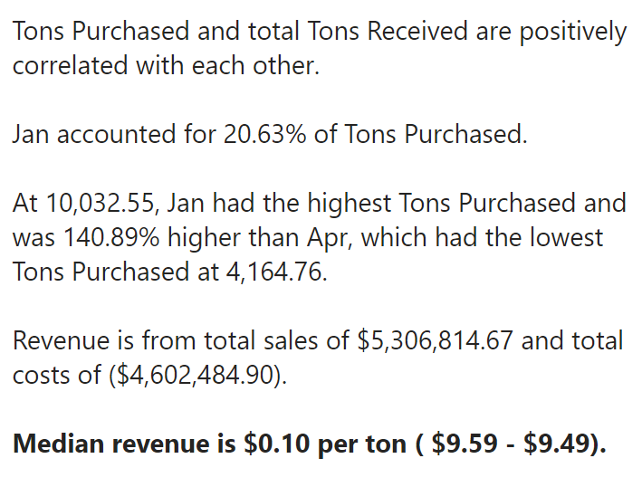
Here is were I wanted to point out what was unknown in a very obvious way. I did this by bucketing the sales and costs into know and unknown.
Sales =
SUMX( Invoiced, Invoiced[ Unit price] * Invoiced[Tons Invoiced] )
Sales w / PO =
CALCULATE( [Sales],'All Purchase Orders'[Has Purchase Order] = "Yes" )
Sales w / o PO =
CALCULATE(
    [Sales],
    FILTER(
      'All Purchase Orders',
      'All Purchase Orders'[Has Purchase Order] = "No Associated Purchase Order"
    )
)
Cost =
SUMX( 'Purchase Order','Purchase Order'[Unit Cost] *'Purchase Order'[Tons] ) * -1
Cost w / invoice =
CALCULATE( [Cost],'All Purchase Orders'[Has Been Invoiced] = "Yes" )
Cost w / o invoice =
CALCULATE(
    [Cost],
  'All Purchase Orders'[Has Been Invoiced] = "No Associated Invoiced Entry"
)
Revenue =
[Sales] + [Cost]
Revenue w / Known Cost =
IF( ISBLANK( [Sales w/ PO] ), BLANK(), [Sales w/ PO] + [Cost w/ invoice] )
The Visuals
The goal was to clearly show the unknown variables with the revenue calculation. Afterwards I thought perhaps a decomposition chart would have worked well too, but I think this is fairly clear.
I also added in the new smart narrative visualization. I kept the default things it provided, and added in the one thing I did add, which was the median revenue per material, broken down to also median price and median cost. It was neat but I found it a little difficult to use in the whole 20 minutes I spent on it. I usually do this type of thing in my reports via tooltips or the Enlighten Data Story custom visual.
Other Visuals
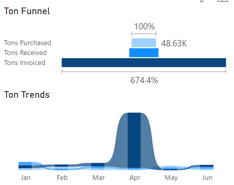
Ton Funnel and Ton Trends
These are to give you an idea of volume and timing.
Slicers
At the bottom in it’s own section I have ways to drill into the data by Customer, PO, Material, and a way to eliminate some of the unknowns in your analysis of the data.
Overall report design
I’ve been looking at different techniques for report/dashboard design and I’m not sure it’s fully sunk in yet, haha! With this report I tried to make the central focus to quickly answer the required questions and that’s the focus of the 4 cards in the middle. I colored them to most and added shadows to make them stand out.
The other visuals are all supporting, so they are close to the primary visual.
I kept my colors consistent as well:
- Light blue: purchase orders
- Blue: Warehouse
- Dark blue: Invoiced
- Purple: Revenue/Sales
- Red: Costs
- Black: Sales
Things I wanted to do but didn’t
- The timeline visual I spoke to above.
- Because I did focus on PO, I started to look at using Charticulator to do this visual, but I didn’t figure it out in time. I wanted to have the purchase orders in the middle, with days to receive on the left and days to invoice on the right axis.
- I wanted to add top 5 material/purchase order/customer.
- I wanted a way to show cumulative tons over time for purchase, receive, invoice too.
Data Model
A.K.A. the fish 
I created a common date table, and then also created a line item table (All) that matched to the purchases, received, and invoiced. To the tail of the fish we have the dimensions for the line items, all the materials, all the purchase orders, and the customers. They are titled “all” because there were purchase orders in invoiced that were not in purchase orders table, for example.
Customer was a late add, and I hid it because I wanted to show a “N/A” bucket instead of “(blank)” in the slicer. So to do that, I used a calculated column in the line item table.
Thanks!
Thanks for making it to the end of the write up, and if you want me to explain anything else, please ask!