I actually used Powerbi.tips version when I watched the video too, but that’s when I realized actual charticulator is the updated one and has many more options. The video was still amazing because it walked me through how to use the options.
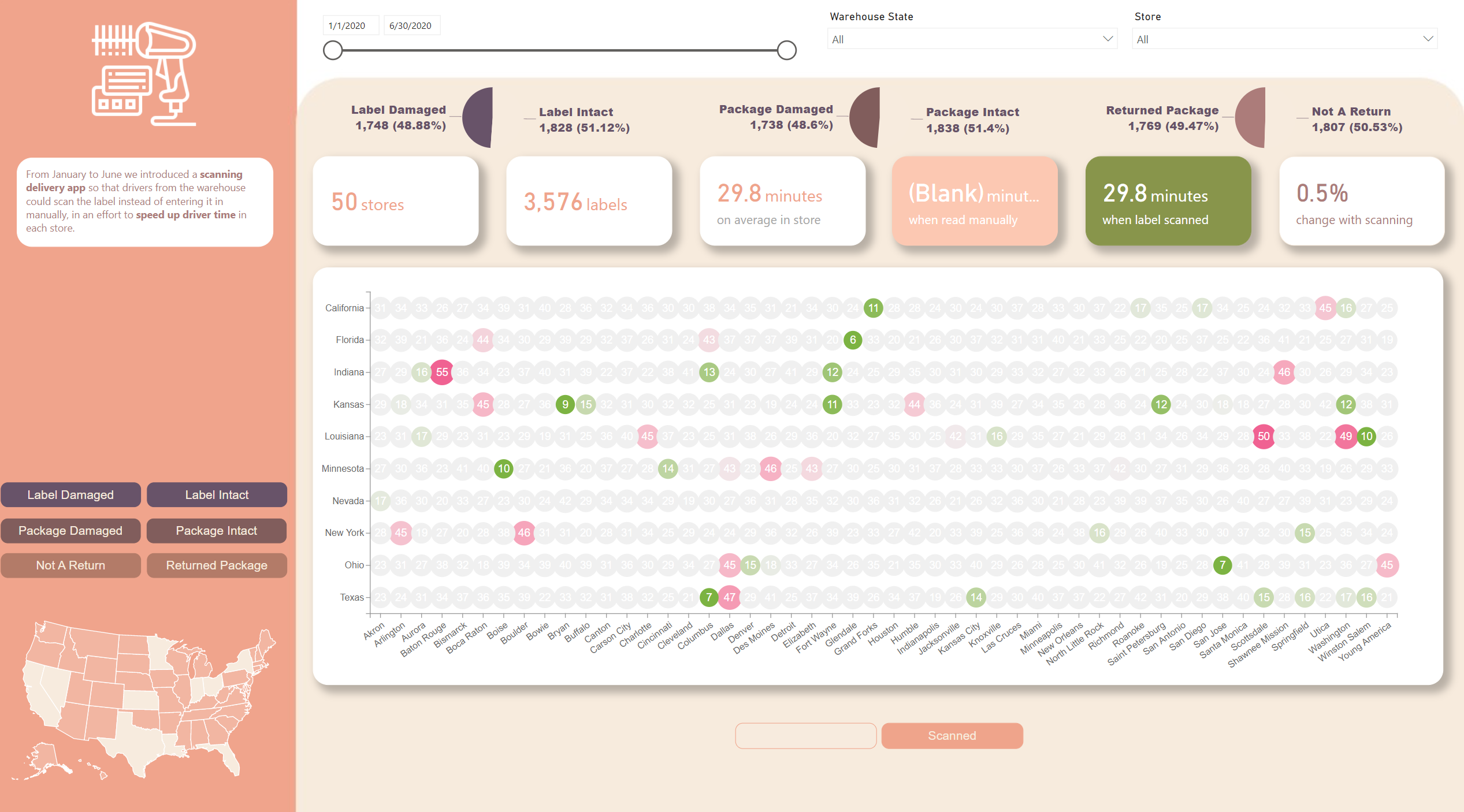
@datazoe wow. This approach is the best in terms of highlighting the best and worst performing areas. For example, I immediately noticed the store in Indiana taking the highest time. I don’t know why but I am beginning to dislike the native visuals in power bi after looking at the ones in tableau whose visuals are very flexible and can even handle multiple axes. On YouTube, there aren’t much videos depicting stunning visuals generated in Power Bi platform unlike Tableau.
I hope Microsoft upgrade the performance and flexibility of the visuals soon.
Amazing job on this visual. It conveys an enormous amount of information in a really attractive, clear way.
If you’re considering adding more videos to your website, a walkthrough of how you put this together would be incredibly instructive.
I was just watching @sam.mckay’s new video on the Analyst Hub capabilities. He talks about using it to share things like DAX and M code, and color themes, but it would also be really cool if we could collectively begin to build shared libraries of custom visuals created in Charticulator, R and Python.
Love what you and @MudassirAli are doing with Charticulator. Thanks to both of you for sharing your creativity and learning with the rest of us.
Thanks @BrianJ. Yes, you are right, we can look into the possibility of creating custom made visuals and can add in the analyst hub library.
I also created another visual in response to a query on the forum.
It’s a simple line chart but annotations like above aren’t easily achievable with native visuals.