Wow. You are trying to go to full application mode which looks terrific. I have done the opposite though, have gone full non-application mode.
5 Likes
I love the clean, streamlined look of this. A great hybrid of your distinct style with some of the excellent design elements of @Melissa’s winning entry from Challenge #5.
- Brian
2 Likes
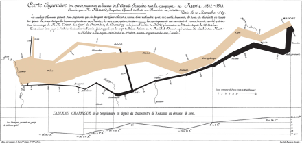
Wow! This is an absolutely incredible piece of data storytelling visualization. Reminds me of Minard’s legendary “Napoleon’s March” visualization:
The way you break down the elements of the upper plot in the visuals below and relate them together vertically and horizontally is wonderful. No need for slicers or other interactive elements - a complete story on one page. ![]()
![]()
- Brian
1 Like
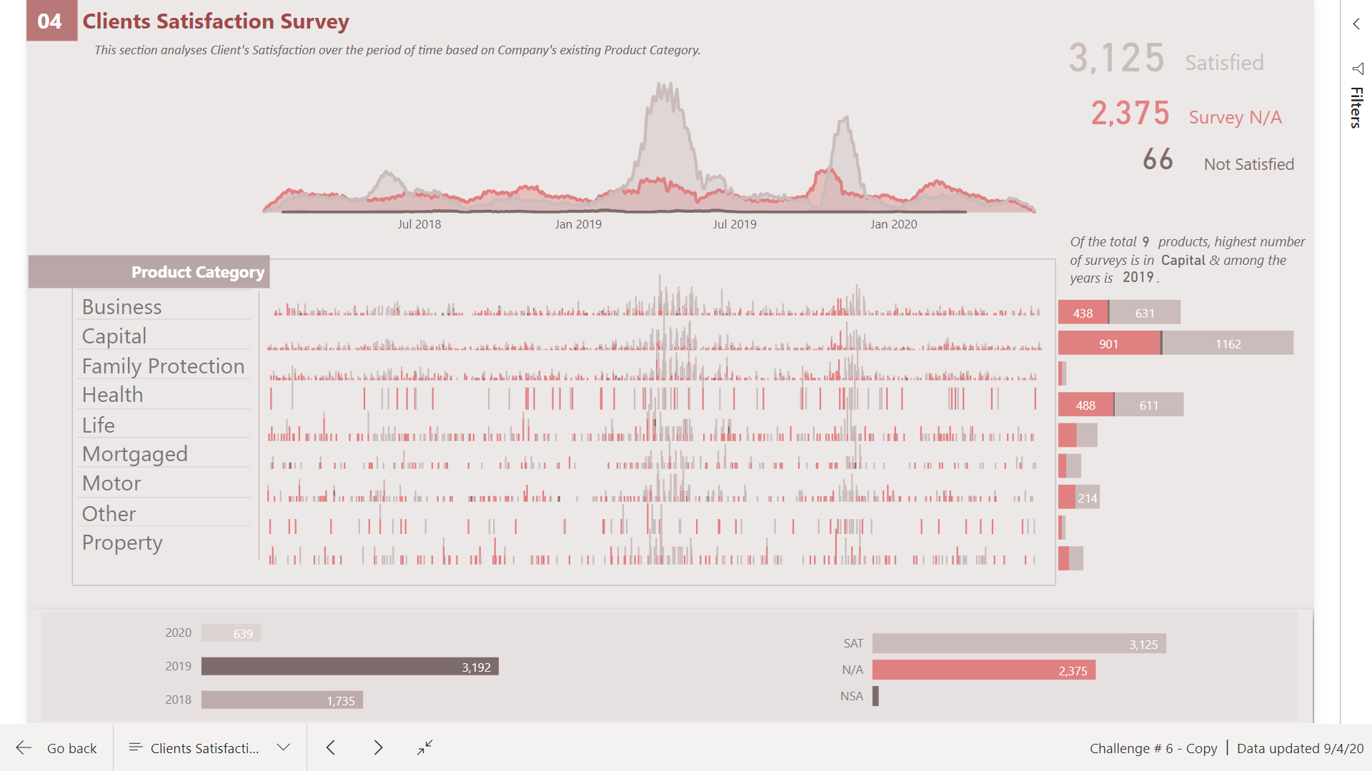
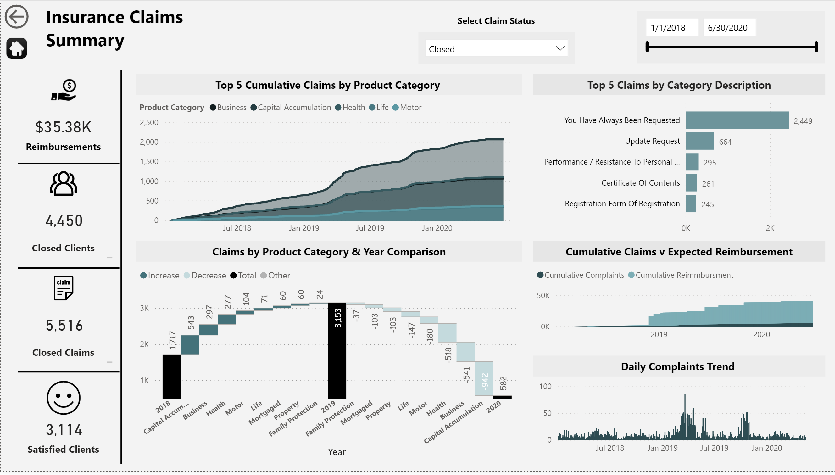
@BrianJ Thanks a lot for the appreciation. I have adopted the audit reports approach with #MakeoverMonday visualizations. With this technique I instantly know that there is a problem in 2nd and 4th quarters where there are cluster of N/A survey data that needs to be investigated.
I think power bi is still way behind powerful visualizations.
Hopefully the report turns out to be good.
1 Like
Wow!! This report really looks amazing!!
Love what you’re doing here. Looks awesome
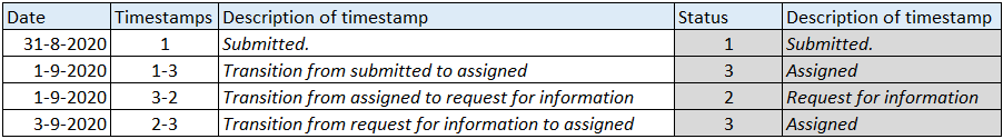
The timing of this question couldn’t be better. Right now we have a real life business challenge where we have to measure all durations (in our case working days) of the different stages. For example the duration from start to assignement. Sometimes statusses are repeated for example when tickets are reopened and gets reassigned.
I am trying to figure out how durations between such repeating statusses are calculated and also how to avoid double counting when stages are changing within a day. So in some cases you wouldn’t delete double status ID’s
Our customer has a bit similar table with status history. The only major difference is an extra column with timestamps. Those timestamps are status transitions like “Timestamp 1-4” from outstanding to assigned to and are generated by power automate when a user of a powerapp changes the status of a ticket.
Great challenge. Thanks eDNA!
Daniel
You’re absolutely right that it comes down to the specifics of the question(s) being asked in determining the right approach here. In this case, I interpreted the language of the initial brief (" The ability to see status changes and when they happened) as pertaining to changes in the Complaint Status ID. WIth this interpretation, intra-complaint information that doesn’t result in a change in status is extraneous.
However, in your case the problem is specifically defined such that those repeating status entries are relevant. To make the previous value pattern work, you must have a column that is continually increasing within the scope of the calculation (in this case, has to be increasing within a given complaint, since we don’t care in this calculation at least, about status changes across complaints). The increase doesn’t have to be uniform, but it does have to be continuous( e.g., 1, 14, 67, 195 works just as well as 1, 2, 3, 4).
In your case above, a Power Query transformation of the timestamp, removing “Timestamp”, the hyphen, and converting the remaining digits from text to whole number looks like it will work perfectly, since it will serve as an increasing identifier within the right scope that will make the “repeating” entries now unique.
I hope this is helpful. It is interesting to see how frequently the challenges mirror real life. WIth every challenge that goes by, I find that I am incorporating more and more of what I learn (and steal from others…  ) in my work reports, despite the fact that none of them are substantively similar to the work I do, which is a real credit to @haroonali1000 and how broadly relevant he has constructed these scenarios to be.
- Brian
1 Like
Here is my submission for Challenge # 6:
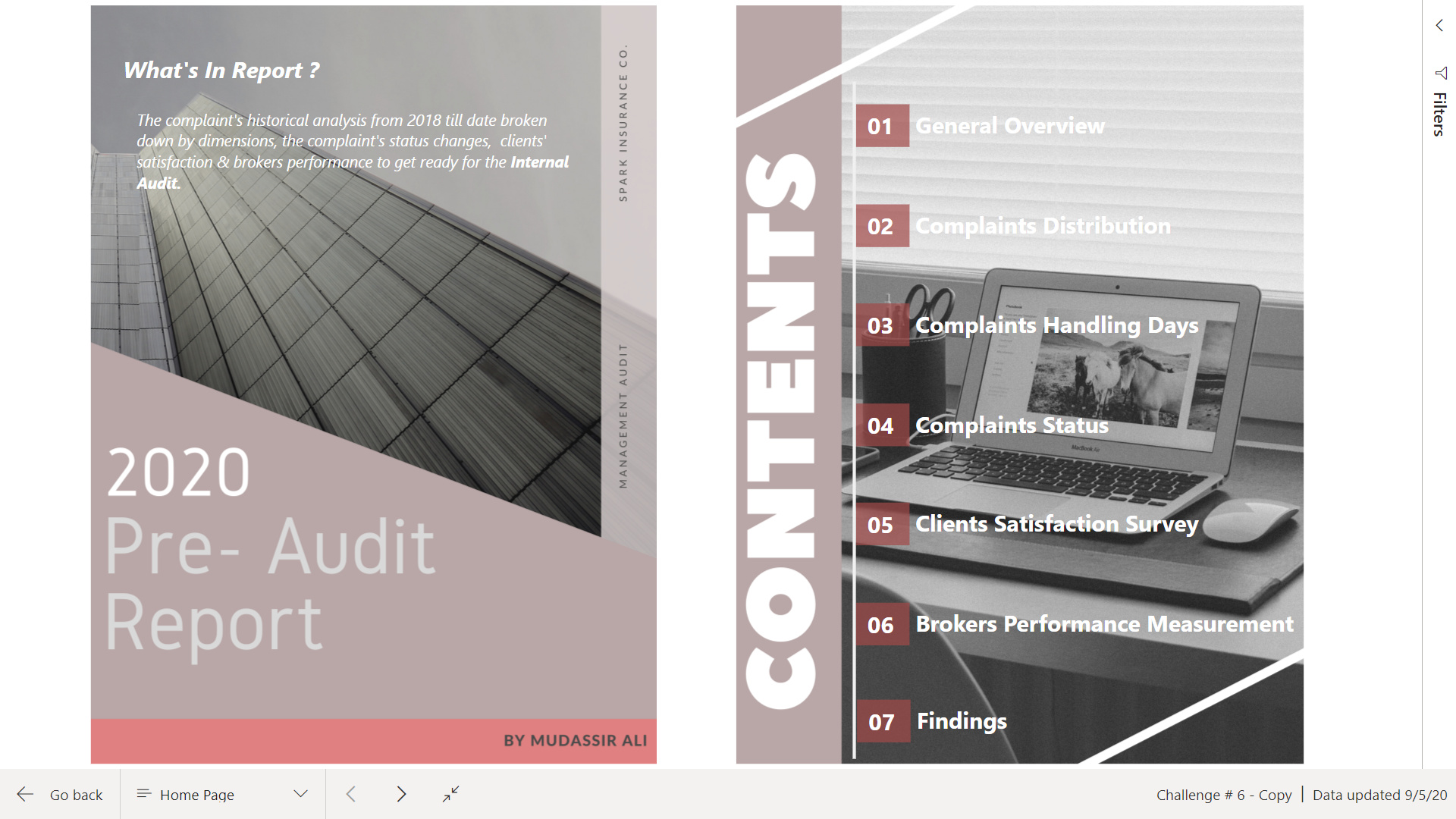
I took the approach like the audit reports and tried to minimize the use of slicers while communicating the required task.
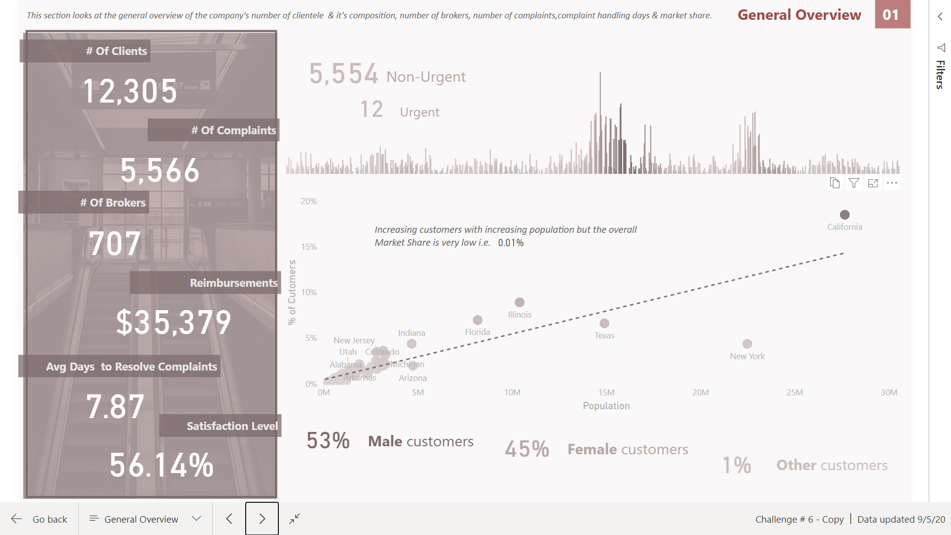
01 - In 1st page I have included a general overview about the company also showing in scatter graph the company’s # of customers in relation to the total population.
-
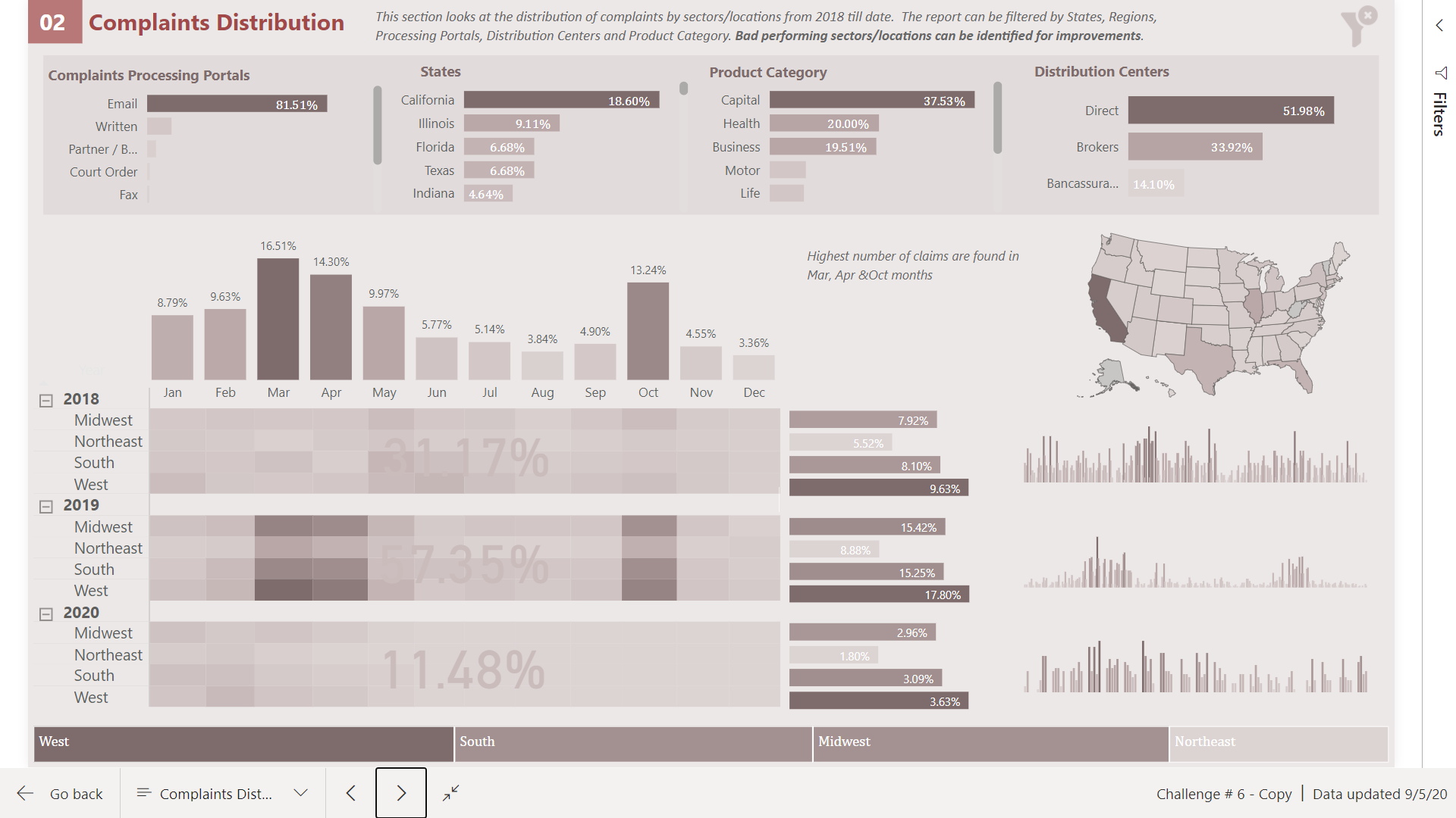
Here I have shown the complaints by years, region and by other dimensions.
-
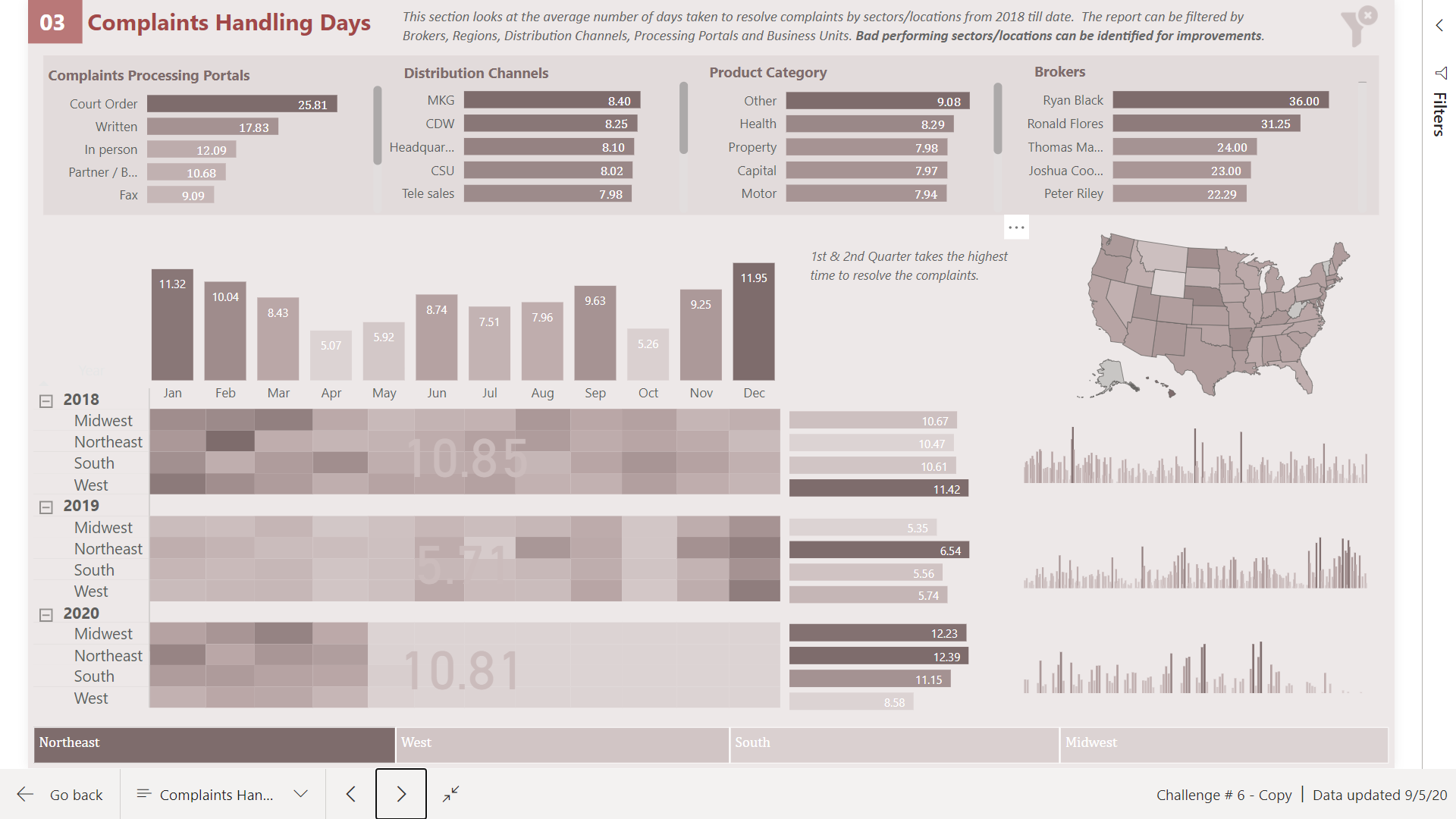
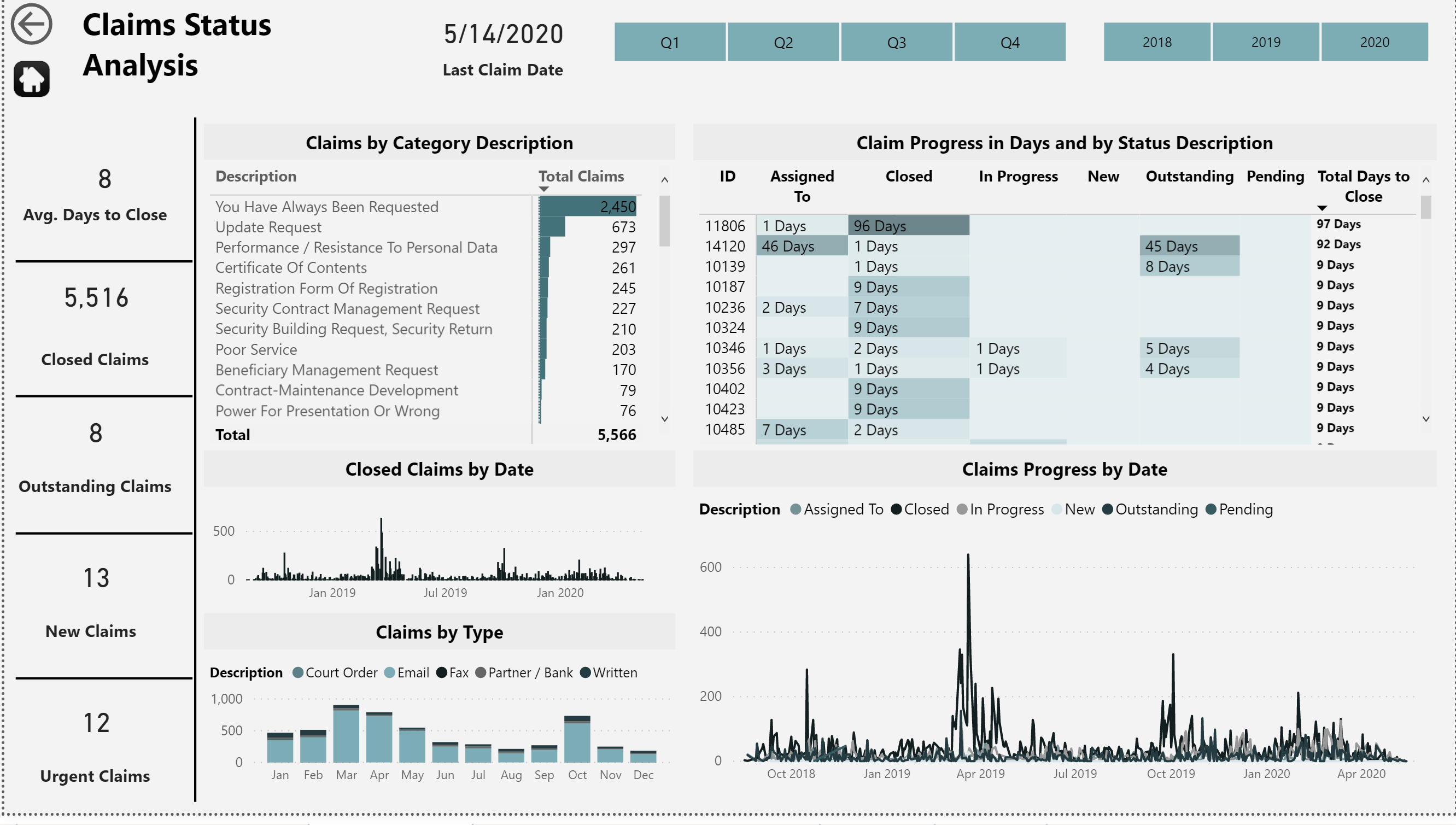
The same report is used to identify the number of days taken to handle the complaints.
-
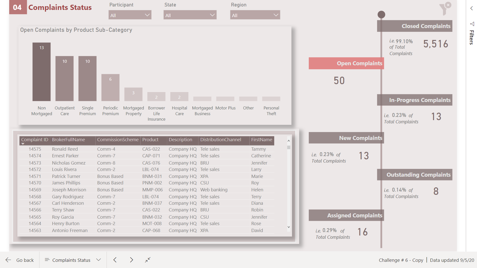
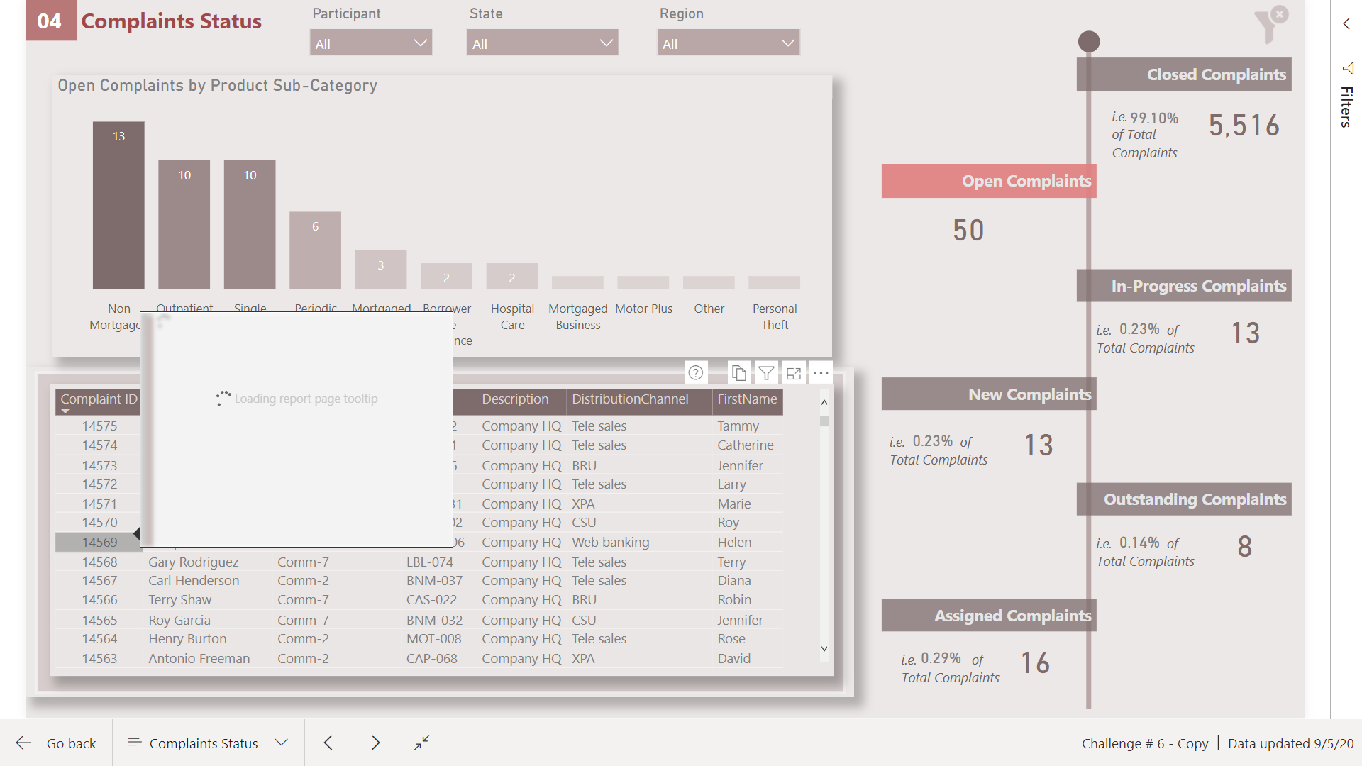
The complaints status is shown in this page and the time taken from one instance to other instance can be seen via tooltip however, tooltips are taking forever to load so I have given up on this.
-
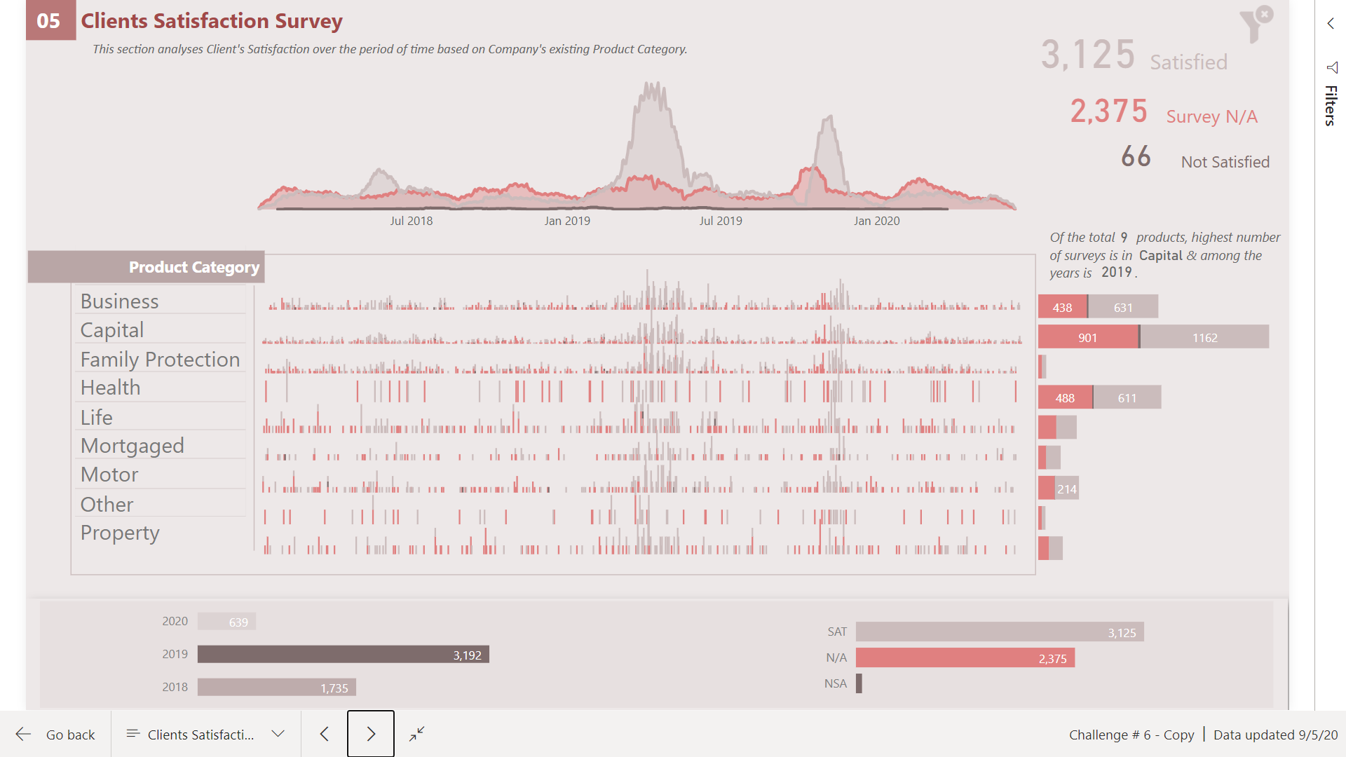
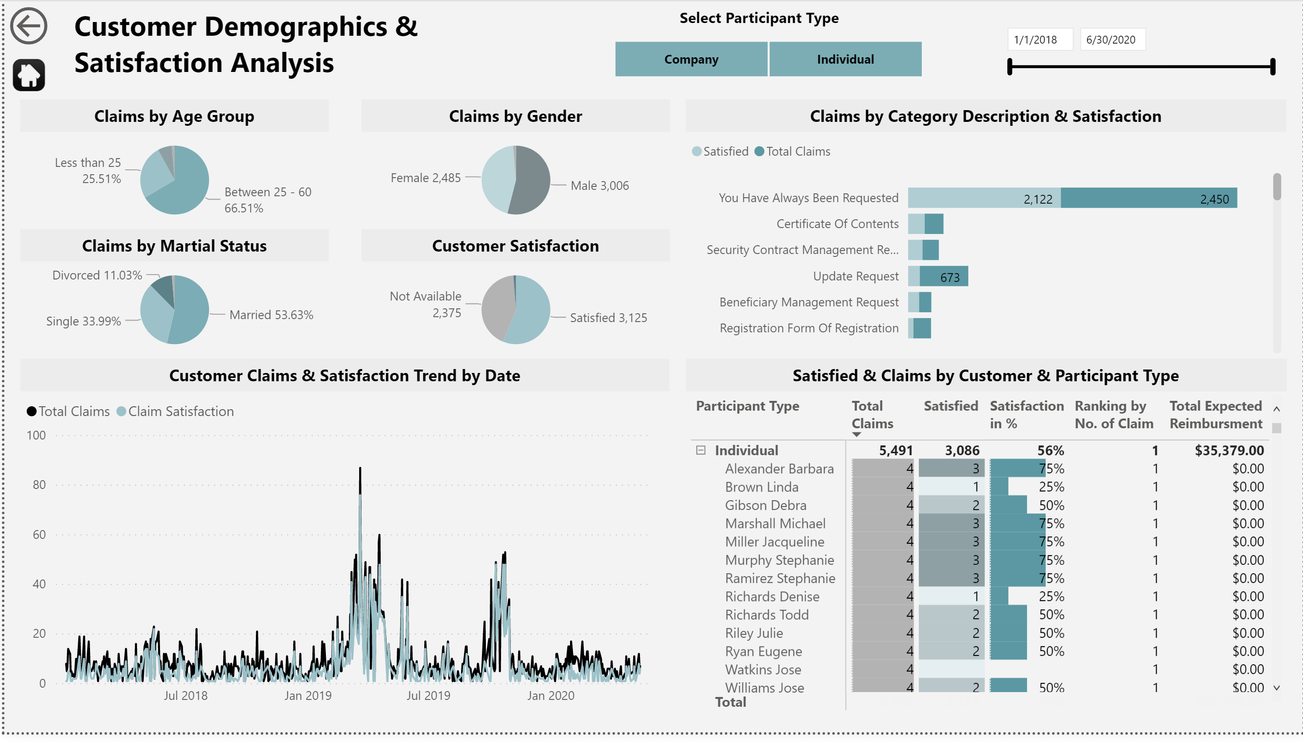
Clients satisfaction is shown and have tried to identify that company’s low Not satisfied rate is due to the absence of data therefore, satisfaction rate is not giving the accurate customer satisfaction.
-
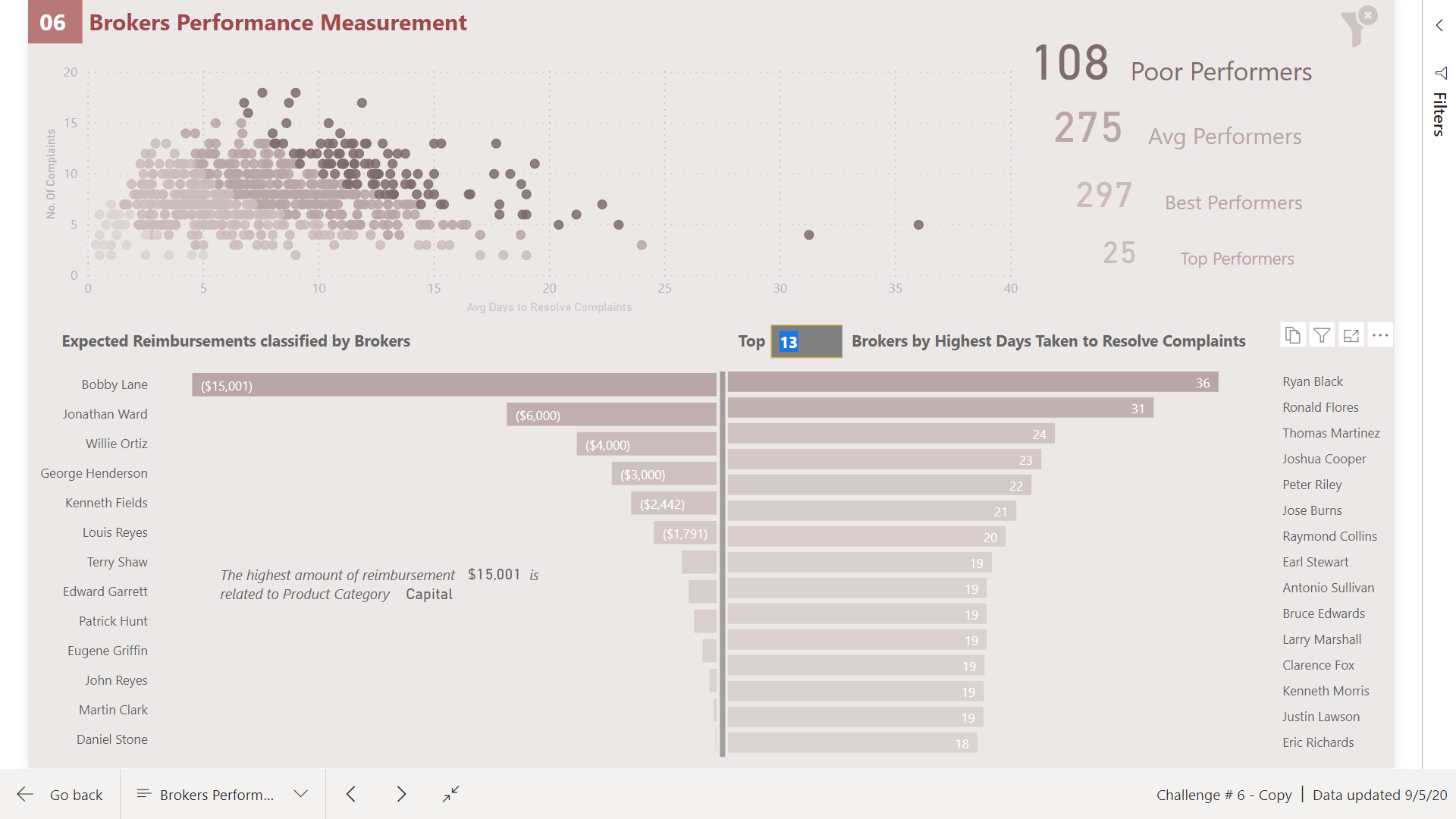
Here I have shown brokers performance by the avg time taken by brokers to resolve the complaints. They are also grouped into different categories to identify performances in groups. I have added the WHAT IF parameters to dynamically select Worst brokers performances.
-
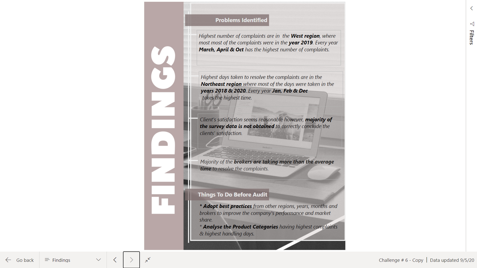
In the last page have summarized the findings and the steps to be taken before the internal audit.
Clear filter button is at the top right corner of the pages.
Navigation through pages is by clicking on the headings of the pages.
This challenge made me work the hardest.
I have just tried to give the idea as to how to use the report and the detailed write-up will be done later.
Surprisingly only one submission so far excluding mine.
Your feedback & suggestions are most welcomed.
Here is the report link:
19 Likes
This is a beautifully conceived and magnificently executed report. The muted, corporate look is perfectly suited to the context of the challenge, and the choice to use a data storytelling approach really works well here. You clearly have given a lot of thought to every element and the detail in this report.
I love how the different visuals are integrated so well with each other – for example even though there’s a tremendous amount of information embedded in the Complaint Handling Days page, very little explanatory text is needed since the heat map, column chart, bar chart, sparklines and map all intuitively build off of each other. There’s a ton of outstanding techniques demonstrated throughout this report, but all of them serve a clear purpose in advancing the overall story, rather than being technique for technique’s sake.
Great balance of style and substance. Just a magnificent job all around. 
- Brian
4 Likes
Outstanding report! I imagine the tremendous amount of work you invested in it! Great job!
2 Likes
Ummmmmmmm wow! Incredible work
3 Likes
WOW @MudassirAli
To me all of your report pages look incredibly well balanced, you’ve managed to cover the elements from the brief and maintain a nice flow throughout the entire report
The chosen visuals and colors - they all match and work really well together.
I look forward to reading your write up and giving your report a spin !!
3 Likes
Thank you very much! Certainly props to @haroonali1000 for coming up with these fantastic scenarios.
About my real life business challenge thanks for your suggestion to transform the timestamp column in order to use the previous value pattern. I will have to look closely into it. They may not always be continuous after transformation because my table looks like this:
I will try for sure
Daniel
2 Likes
2 Likes
Thanks @alexbadiu. Yes, I have invested a lot of time in completing the report. In power BI, every additional visual takes a lot of time and the worst part is when you are done completing the visual and suddenly a new idea kicks in and now you are changing that visual. This challenge has also taught me that good relationships are so important 
1 Like
Thanks @BrianJ for your comments and defining the elements of my report. I had to work very hard for this challenge. First I read the Definitive Guide to DAX book previous week and tried to absorb the concepts. Then this week I started working on the challenge. It does not matter how much you read but the concepts will only be cleared once they are practically implemented and these challenges giving the outlet to do so.
I could feel the confidence while writing the Dax codes but still a very long way to go. Some crazy ideas I had to abandon because I couldn’t make them work due to lack of skills in Dax at the moment.
Learning is a never ending process though.
3 Likes
Thanks @Melissa. It’s because of you as you raised the bar so high last time that it became difficult to come even close to your work. I will definitely give a detailed write up of the report however, can’t share the link within my tenant. I had one thing to add in the report that I really struggled with but will go ahead and complete it and will ask on the forum for help also.
1 Like
Hello Everyone,
This is one of the best challenges yet from @haroonali1000 and thanks for challenging us in different ways every few weeks. I am learning a lot.
For this report I created one navigation page and five different pages containing insights such as : -
- Complaints Summary.
- Claim Statuses.
- Customer demographics and satisfaction.
- Regional Analysis.
- Brokers insights.
Feedback and criticism are welcome.
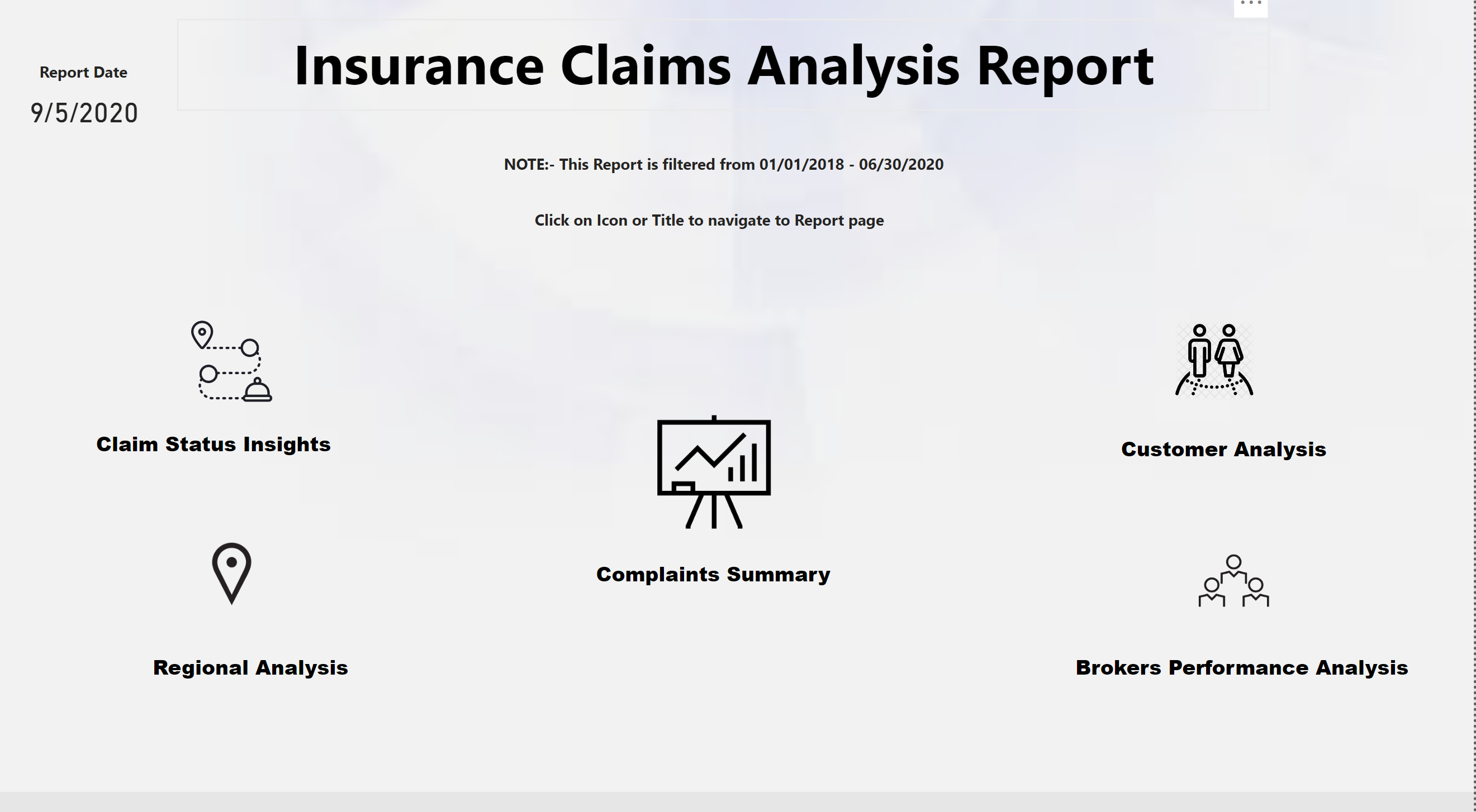
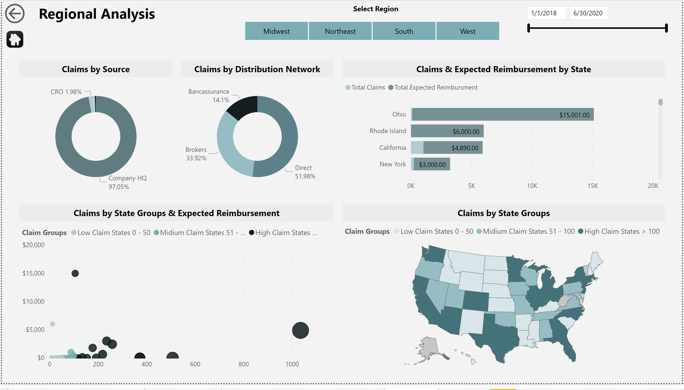
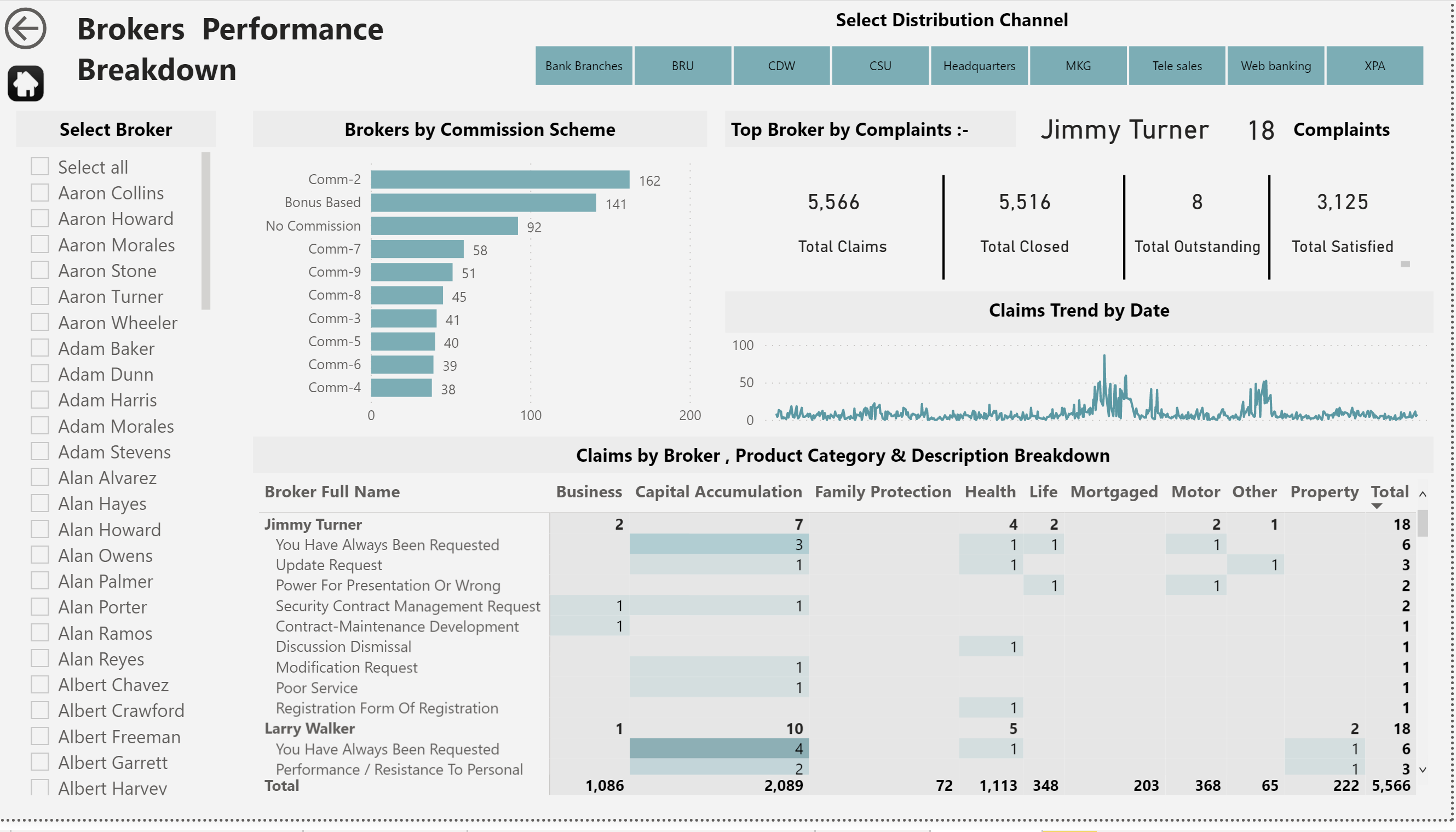
Here is a Link to the Published report
P.S. - I Improved the home and Navigation page after a positive feedback from @BrianJ . Not perfect but I hope it looks better.
Thank You,
Nebiyu
12 Likes