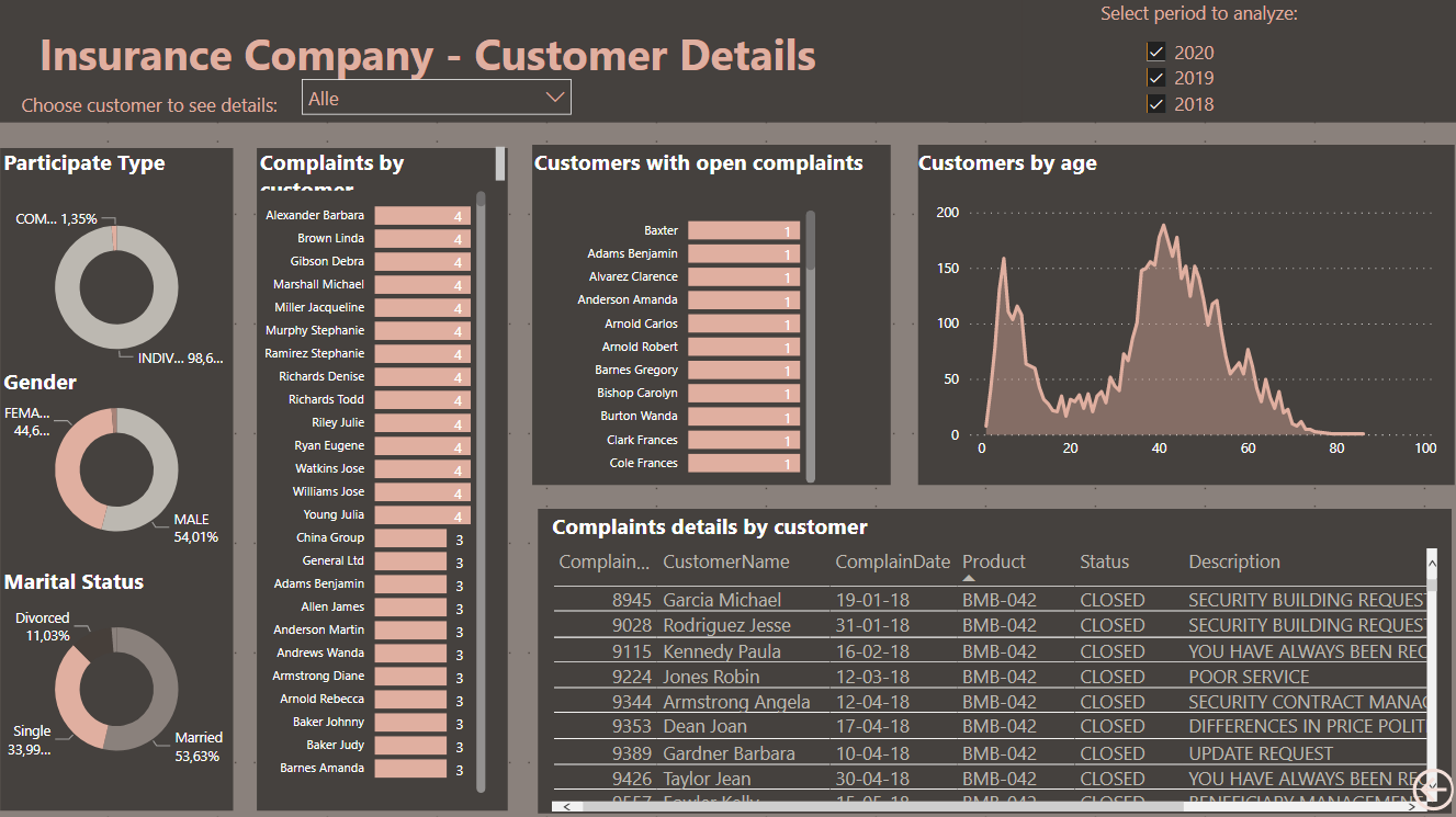
Looks like Customer FirstName and LastName are flipped.
correct the first and last name column heading are switched
I can’t argue about data validity with statistician 
Looking forward to your report. 
I already know the quality of content we are about to get from your report.
Thnaks Marieke, I like your report
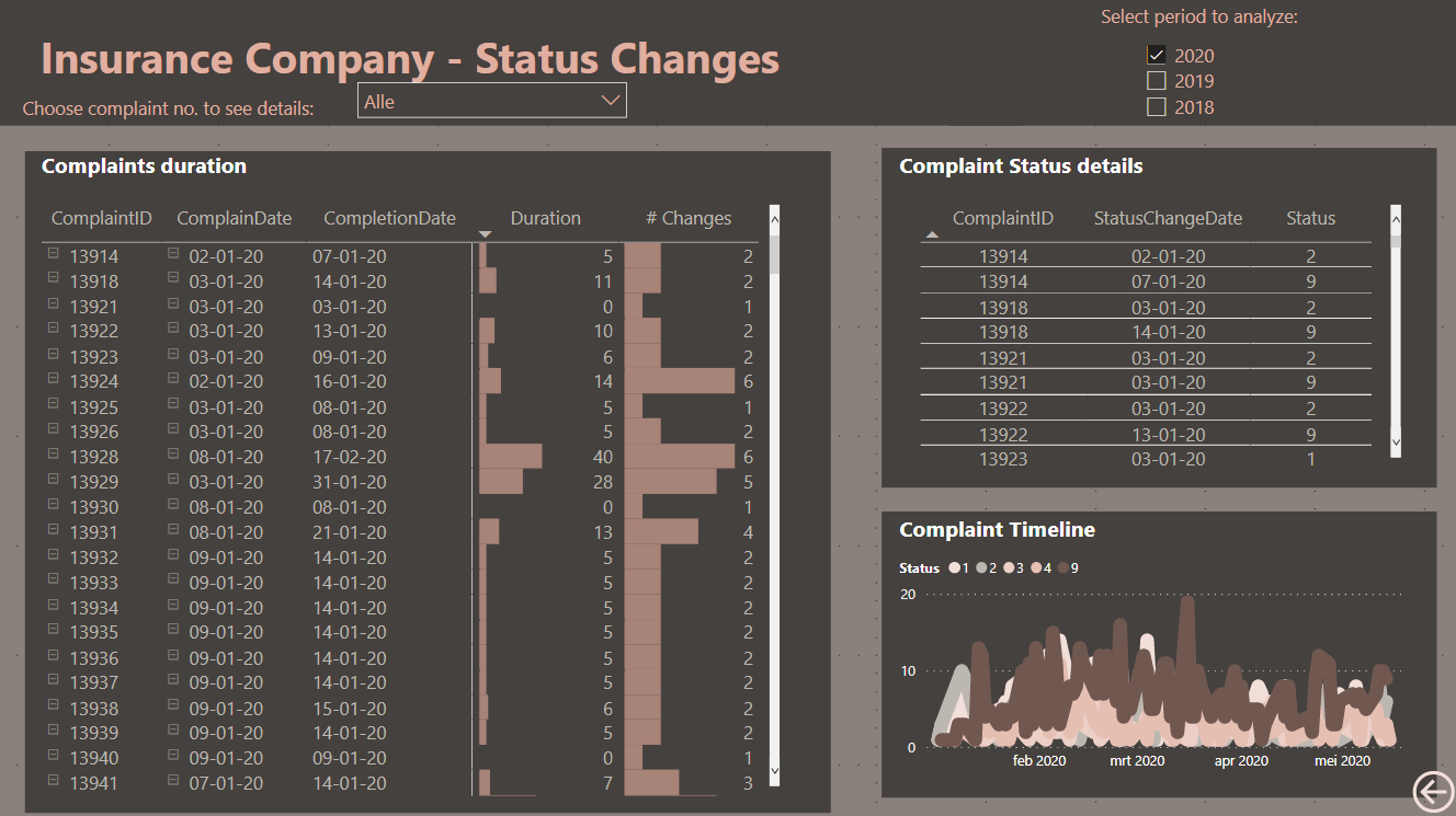
I am still struggling calculating the duration of each complaint and I used the following Calculated column
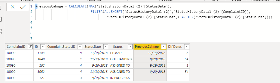
I left the sample of the claim 10090 which has 2 different status in the same day
My question y how you calculated the duration
Appreciate your comments
Ho @JarrettM
thank you for your feedback. I don’t know why it is giving the error message, I think it has too many rows in it. I have now set a filter to show only current year and then it seems to be okay…
Thank you!
1 Like
Hi @Marta,
This is how I have calculated total duration:
ComplaintDuration = DATEDIFF(‘Complains Data’[ComplainDate],‘Complains Data’[CompletionDate],DAY)
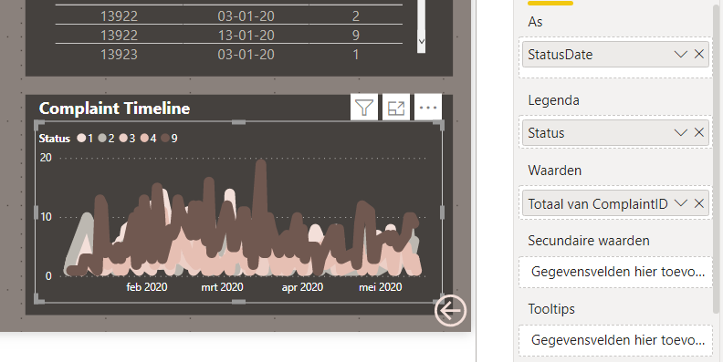
I have also tried to calculate the individual duration for each step in complaint handling, but I didn’t manage to do that properly. In this visual I tried to show the different status updates within a complaint, but to be honest, it is not working 100 % correctly. I have used the status dates from the Status History Data.
So I hope somebody else can advise us about this ![]()
2 Likes
Thanks Marieke for your prompt response
Please, can someone else advise us in this issue? 
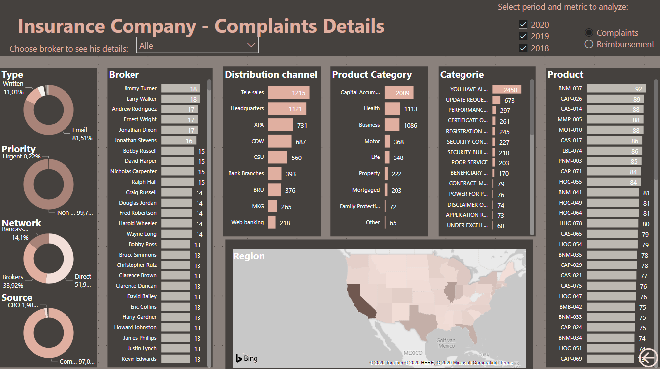
I am working to show heat map style in a matrix a shown below:
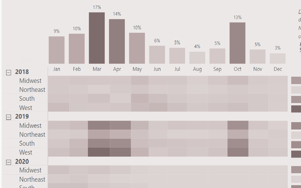
It works fine unless I make a selection from a slicer. If the data is not present for a relevant selection in the matrix, my visual looks like this:
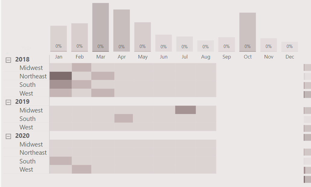
There is not a highlight option for matrix in edit interactions. It is either filter or not filter. I can select not filter for this matrix only but then it wouldn’t be dynamic with various selections.
Need your tips and suggestions to fix this.
Thanks.
Cool visual approach.
The approach that comes to my mind to address this problem is to use a disconnected table in your slicer, and then use IF or COALESCE to keep the current value if date <= disconnected slicer value, and then assign a different value if date > disconnected slicer value (say, -1 for example), and then in your conditional formatting rules assign a color to the value representing dates outside the slicer range.
I hope that’s helpful.
- Brian
1 Like
When I started working with this data set I found heat map technique to be very useful in this case.
Thanks for the tips . I will try that and will let you know.
My recollection from the past challenges is that I used a similar heat map in Challenge #1 and @alexbadiu had one structured very much like yours in one of the early challenges. You may want to look at the PBIX files from each of those to see if they provide any additional insights.
- Brian
I checked both the reports and yes the visual i have used is the same as @alexbadiu and yours. In your report also, you have have disabled the filter on the matrix table so any selection made on other visuals or slicers, the heat maps don’t change on the table. If I enable the filter, the table expands or collapses with selection(s) whereas I want the columns and rows of my table to be intact even if there is no data to be shown in the table/heatmap.
Watch out for my report submission tomorrow! Plenty of ways you could take this analysis. Looking forward to seeing everyone’s reports
Sam
2 Likes
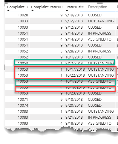
I’ll offer a tip here. There are a lot of records in the Status History table with the same Complaint ID and Complaint Status ID, but a different date. Those latter records are not useful in computing the duration between stages and actually make the DAX quite a bit more difficult. If you remove them (but keeping the one with the earliest Status Date) it makes calculating the duration between stages much easier through the use of the Previous Value DAX pattern.
For example, in the screenshot below, keep the records in the green boxes and get rid of the records in the red boxes.
- Brian
3 Likes
Hello,
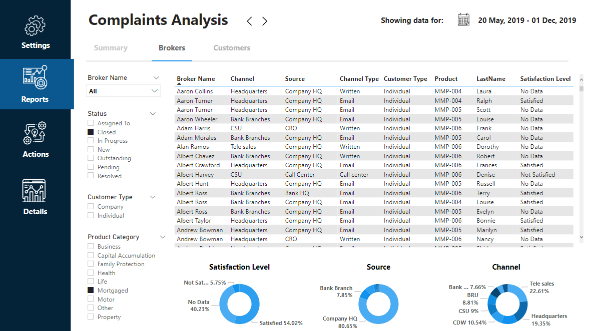
Any ideas to how displaying the worst offending brokers ?
I think it would be broken down by reimbursements, # of complaints and by processing times. Also have to see over the years whether the brokers have been performing badly consistently and in which products.
haha yea some pretty wise juniors in this data set
1 Like
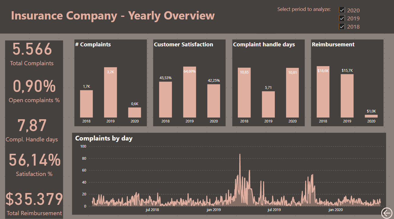
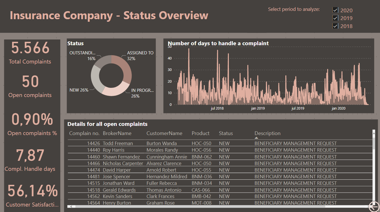
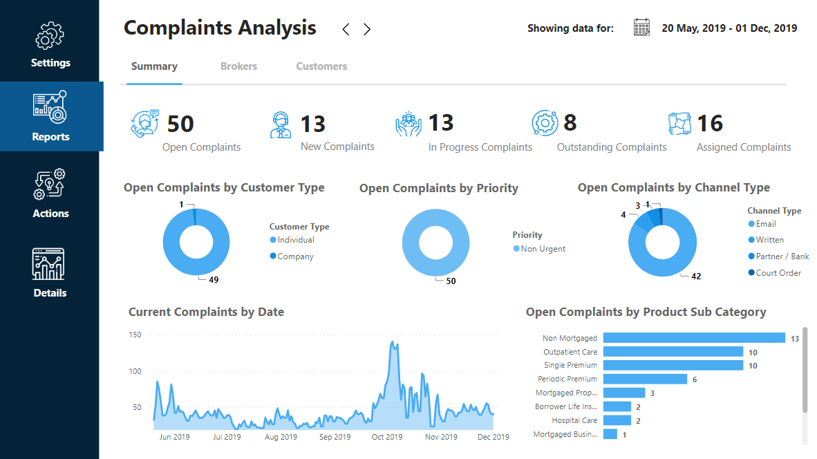
Not quite finished yet but wanted to show where I’m up to.
I’m going big on the application look and feel this time round.
It’s really incredible how far you can take Power BI these days.
It’s all down to your creative mind.
Hopefully will have this down in the coming days.
Next up drillthrough and tooltip integrations.
Sam
16 Likes