Here’s Brian’s entry for Power BI Challenge 6. @BrianJ, feel free to add other details of your work.
Here’s how Brian described it:
My strategy was to use the challenge to explore some of the AI and machine learning capabilities of Power BI that I hadn’t previously delved deeply into. Here’s how I was planning to structure my entry:
- Fraud detection algorithms built in DAX and R to detect irregularities in the data based on Benford’s Law (based on a suggestion from @Paul).
- Analysis and visualization of status changes and when they happened using Synoptic Panel to transform a static process flow diagram into a dynamically linked visual that would depict status changes clearly and graphically.
- Complaints broken down by dimensions using Microsoft Research’s Sand Dance visualization/ML interface.
- Worst offending brokers analyzed using Power BI Key Influencers visual.
Here’s how it shook out: #1 I think was a big success, #2 was a partial fail – I learned a lot, ultimately got it to work but it ended up being a confusing visual that didn’t provide significant value or insight. In the right situation, I do think this is a good technique and you’ll probably end up seeing me use it down the road in another challenge. One that you will not see me use ever again is #3 Sand Dance. This section was an epic fail – I hated the interface and the look of the resulting visuals. #4 I think worked pretty well in terms of making what would be quite a complex analysis easily accomplished and accessible to even relatively new users. Given the failures on sections #2 and #3, I don’t have a complete entry to present, but thought some may find value in the explanation of #1 and #4, so here goes:
FRAUD DETECTION ALGORITHMS
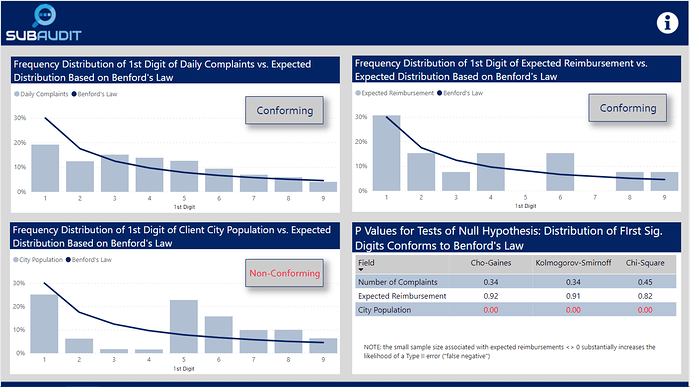
Given that this challenge is about preparation for an audit, I thought focusing first on the reliability and validity of the data was a good starting point. Forensic accounting frequently uses Benford’s Law to detect irregularities in data that may be attributable to tampering/fraud. Benford’s Law states that:
“In many naturally occurring collections of numbers, the leading digit is likely to be small. For example, in sets that obey the law, the number 1 appears as the leading significant digit about 30% of the time, while 9 appears as the leading significant digit less than 5% of the time. If the digits were distributed uniformly, they would each occur about 11.1% of the time.” (Wikipedia)
Benford’s law has been shown to apply to series’as varied as transaction level accounting data, census data, home addresses, areas of lakes, stock prices, death rates, home prices, distances between planets, and a wide array of other types of data series.
For this challenge, I calculated using some virtual table-heavy DAX measures the frequency distribution of the first digits of the daily number of complaints, the expected reimbursement amounts and the population of the cities of the clients associated with each complaint. What I found is summarized in the visuals below, which compare the observed distribution of the first digits of each of the chosen fields versus expected distribution under Benford’s Law.
I then tested using the attached R script whether statistically the observed distribution conformed to the expected Benford distribution (note: this cannot be done reasonably within Power BI, because to generate the necessary P values to evaluate statistical significance you need to simulate 10,000 trials of this test. R can do this with just a few lines of code and almost instantaneously). In the case of complaints and expected reimbursements, the distributions did conform, while the distributions associated with city population did not. The first two results strongly imply that these data are real, not fabricated. The third result strongly indicates that this data either is fraudulent or has been randomly assigned to clients in a way that does not represent their actual locations and other attributes of the regional table. I groundtruthed these findings with @Haroonali1000, and he confirmed that my findings for all three were indeed correct.
This is a powerful technique that can be used in many different contexts to evaluate data quality.
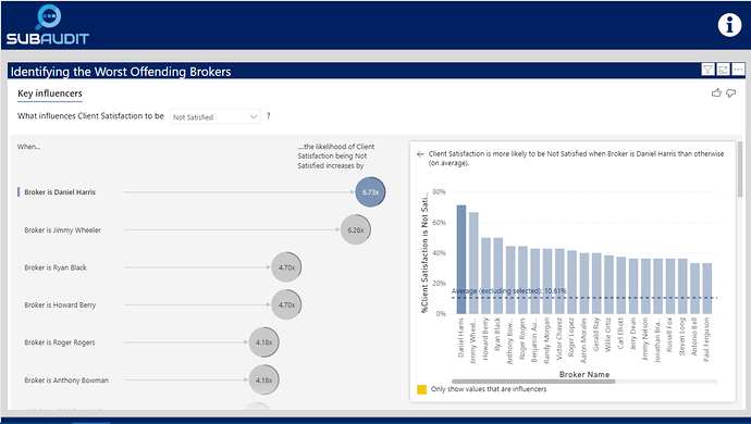
IDENTIFYING WORST-PERFORMING BROKERS USING KEY INFLUENCERS VISUAL
There are a lot of different ways one could define “worst performing” per the requirements of the brief. I thought the most direct way was to identify which brokers had the lowest levels of client satisfaction. To do this in a statistically rigorous way, one would typically need to build a multiple regression model. However, standard regression models won’t work if the outcome variable is categorical or in this case binary (satisfied versus not satisfied). To do that analysis you would typically need to employ a logistic regression model in R or a similar statistical package. However, Microsoft fairly recently incorporated the Key Influencers visual which easily does the heavy lifting of building the logistic regression model for you.
Simply by selecting the Key Influencers visual and dropping the right fields into the appropriate wells, you get a fully interactive logistic regression visual that identifies the worst performing brokers:
By dropping down the outcome variable slicer, you can also quickly change the visual to show the best performing brokers.
Anyway, disappointed that I don’t have a full entry to submit, but hope you found some value in what I learned through experimentation above.
To learn about the real-life scenario presented for the challenge, be sure to click on the image below.
