Here’s Greg Philps’ entry for Power BI Challenge 5. @Greg, would you like to share how you built this dashboard and what your inspiration is in building it?
Here is the link:
To learn about the real-life scenario presented for the challenge, be sure to click on the image below.
Hi eDNA … Thanks for the opportunity to describe my report. Here’s an edit of the notes I included with my submission:
I tried to make this “report” look more like an app, so I made minimal use of analytical visuals, instead concentrating on the main “Appointments” page; the secondary “Patients” page was to be accessed as a drill-through target of the “Appointments” page only, and the “Export” page was added to allow not only allow easy export of the patients needing appointments, but one that would “sync” with the main “Appointments” page.
NOTES:
Data:
made assumption that the optician that did the patient’s last appointment would do the next appointment
Data Model:
imported [Optical Data Set.xlsx] as a staging query, and created references in new [Data Model] group for [Patients], [Opticians], [Appointments]
merged first and last name columns; duplicated column; split columns to re-create first name and last name
added [Dates] table using eDNA Extended Date Table M Code;
marked as Date table
used parameter to get and set start date to Jan 1 of first appointment year
used parameter to get and set end date to Dec 31 of the year after this year
added [Periods] table using eDNA Period Table M Code (Dynamic Date Range Slicer- Query M); adjusted for “this” and “next” periods (week, month, quarter, year)
added pages for [Appointments], [Patients], [Export]
hid all pages except for [Export] page for so PDF export (in either Power BI Desktop or Power BI Service) will output only the [Export] page
added buttons for page navigation to header (font bold white for current, font regular grey for options)
added card for [Session Admin] to footer to display last refresh, report ID, report version, report version date (these in card title and whitespace character in card field well)
added card for [Report Admin] to footer to display current date, current user (these in card title and whitespace character in card field well)
made extensive use of the [General] section in the Visualizations pane to confirm and adjust the values X/Y/Width/Height as necessary
calculated whether user was accessing report in Power BI Desktop or the Power BI Service and used this info to present tooltips relevant to the user’s environment
(used difference between NOW() and UTCNOW() to see if user was on Desktop or Service; I know this is a hack, and doesn’t work if the time in your time zone is the same as UTC, and I would have preferred to use USERNAME() and USERPRINCIPLENAME(), but against my understanding, for whatever reason [perhaps my free PBI license type?], these both gave me the same value irrespective of environment) (*** I’m not happy with this method, I’m still looking for a better way, and would be interested in anyone’s experiences/thoughts/comments ***)
[Appointments] page:
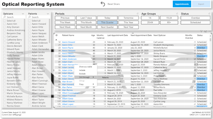
used standard list slicers complete with “Search” for (Next) Opticians and Patients
used “Chiclet Slicer” custom visual for Periods, Age Groups, and Next Appointment Status
used “Reset Slicers” button complete with bookmark to allow user to easily return to the original state
changed font colour of [Patient Name] column to blue to indicated that you can do something (in this case drill-through to [Patients] page for the selected patient)
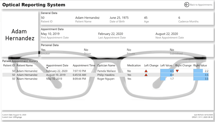
[Patients] page:
used 3 multi-row cards to display General, Appointment, and Personal information for the selected patient
set “Patient Name” as drill-through target
presented the patient’s appointment history in a table, complete with data bars and up and down triangle icons as necessary to denote a changed right-eye or left-eye value from the previous appointment
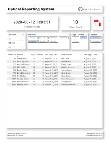
[Export] page:
changed page size to “Letter” and increased spacing from edges in case PDF export was printed
used “Chiclet Slicer” custom visual for Periods, Age Groups, and Next Appointment Status
sync’d slicers to [Appointments] page to allow export of the patients/appointments that had been selected (via slicers) on the [Appointments] page
added PDF Download icon to permit use of the current environment (Desktop, Service) to display the tooltip relevant to the user’s environment
Things I’m happy with (in no particular order):
the simplicity of the report; from the brief, there were only a few requirements and my read was that none of these had to do with analytics, so instead tried to make “Penny” feel at home with an “app-like” experience
this challenge gave me the opportunity to explore drill-through, which I hadn’t used before
this challenge gave me the opportunity to explore the “Chiclet Slicer” custom visual, which I hadn’t used before
the use of measures to present relevant tooltips whether the user is accessing the report via Power BI Desktop or the PBI Service
the “red triangle” UNICHAR code images that denote changes in current-vs-previous left eye or right-eye value in the [Patient Appointment History] table on the [Patients] page
the use of dedicated admin measures to reference the UNICHAR codes and thus hide the need to remember which code means what when they’re used in subsequent measures (e.g.,
Red Triangle Up = UNICHAR( 128314 ) Red Triangle Down = UNICHAR( 128315 )
the data bars in the [Patient Appointment History] table on the [Patients] page; I’ve become such a fan of data bars in tables, as I see them as a great “bridge” for end uses who are comfortable with tabular reports (i.e., Excel spreadsheets) but may be unfamiliar with the wealth of visuals available in Power BI
I wanted to increase my knowledge of UNICHAR in Power BI, and this challenge gave me the opportunity to do so; I even was able to create a small set of about 200 (what I considered may possibly be) useful UNICHAR codes to reference for possible for future use
I wanted to increase my knowledge about the use of a [Periods] table, which I included using the eDNA Period Table M Code (Dynamic Date Range Slicer- Query M) Dynamic Date Range Slicer- Query M
Things I’m not happy with (in no particular order):
as noted above, the use of the difference between NOW() and UTCNOW() to see if user was on Desktop or Service; I’m sure there is a better solution than this hack, but I ran out of the time that I’d allowed myself for this challenge before I found an acceptable solution
the “window-blind” effect of the table backgrounds on the [Appointment] and [Patients] pages; I really liked the simplicity of the eyeglasses graphic background, and wanted to see it, but when my transparent tables were placed above it, it was difficult to read the table, so I changed the alternating row background; a better solution was clearly (no pun intended ) needed, but I again ran out of the time that I’d allowed myself for this challenge before I found an acceptable solution
I liked the addition of the PDF export image and tooltip, and in retrospect should have added a similar image and tooltip for Excel export, to give “Penny” more options
I should have added an image (or button) and tooltip to lead the user to drill-through capability; as per my submission, I only had a different colour for the patient name to denote you could do something, and if you didn’t try to right-click on a name you wouldn’t even know drill-through was available (this was further made an obvious omission as many other forum members included such an ability in their submissions (kudos to all)
Awesome writeup. Thanks so much for taking the time to do this. Your entries always demonstrate a level of craftsmanship and attention to fine detail that I find wonderful, and I always pick up some new ideas and techniques by working through them - this writeup is a great guide to some of the subtle touches that folks many have missed in the initial look at your submission
The UNICHAR PBIX reference you put together is great. I use UNICHAR icons a lot (my temporary descent into madness this challenge not withstanding…) and this is a really quick way to find the most useful ones, rather than fishing through the massive list.
Thanks @BrianJ I’m flattered by your comments. Yeah, I really like the ability to use the UNICHAR code in a measure, then reference it by name in other measures … I find it very useful to only have to source/use the UNICHAR code once and not in every measure…
I’m a huge fan of your report submission here Greg.
Just like Melissa’s I think there is real beauty in the simplicity of how you have showcased your insights here. The design and flow of the solution also meets the brief exactly on point in my view.
I really love the drill through aspect of the report as well. It’s so simple yet incredibly effective as a way for a consumer to navigate to key information really fast.
I also like how you’ve summarised information into three distinct pages. Definitely in some of the submissions you can get this overcrowding and it takes away from what a consumer or stakeholder should be able to interpret from a particular piece of analysis.
I also think the colours work really well. Nothing over complicated and that’s why it’s so effective.
Really appreciate the epic write up as well. The fact we can get into your brain around how you work through each aspect of the development is so valuable for the community.
Also really like how you’ve decided to challenge yourself by looking to incorporate features to your report that you haven’t really explored before. I really feel this is actually such a big part of why these challenges are so important for those connected to Enterprise DNA. There’s just no better education opportunity in my view than from getting involved and from learning from others especially yourself.
I especially like the way you’ve laid out your grids in the design of your report pages as well. I’m still a big believer in this great concept and to me it really differentiates between certain insights that a consumer shouldn’t absorb from looking through the reporting application.
Overall a really high quality submission and to me a one of the best this time round.
Thanks for the kind words @sam.mckay … to quote my Taekwon-Do instructor from a few years ago, “… never say I can’t, rather say I haven’t done it yet…” The eDNA challenges give me the opportunity to explore things I haven’t done yet, so thanks to you and the entire eDNA team. Greg

 I’m flattered by your comments. Yeah, I really like the ability to use the UNICHAR code in a measure, then reference it by name in other measures … I find it very useful to only have to source/use the UNICHAR code once and not in every measure…