Here is my submission for Challenge 5. I will provide a full write up after all the entries have been posted. My objective in this challenge was to provide screens that provided the following info:
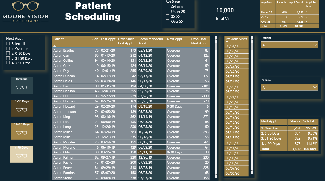
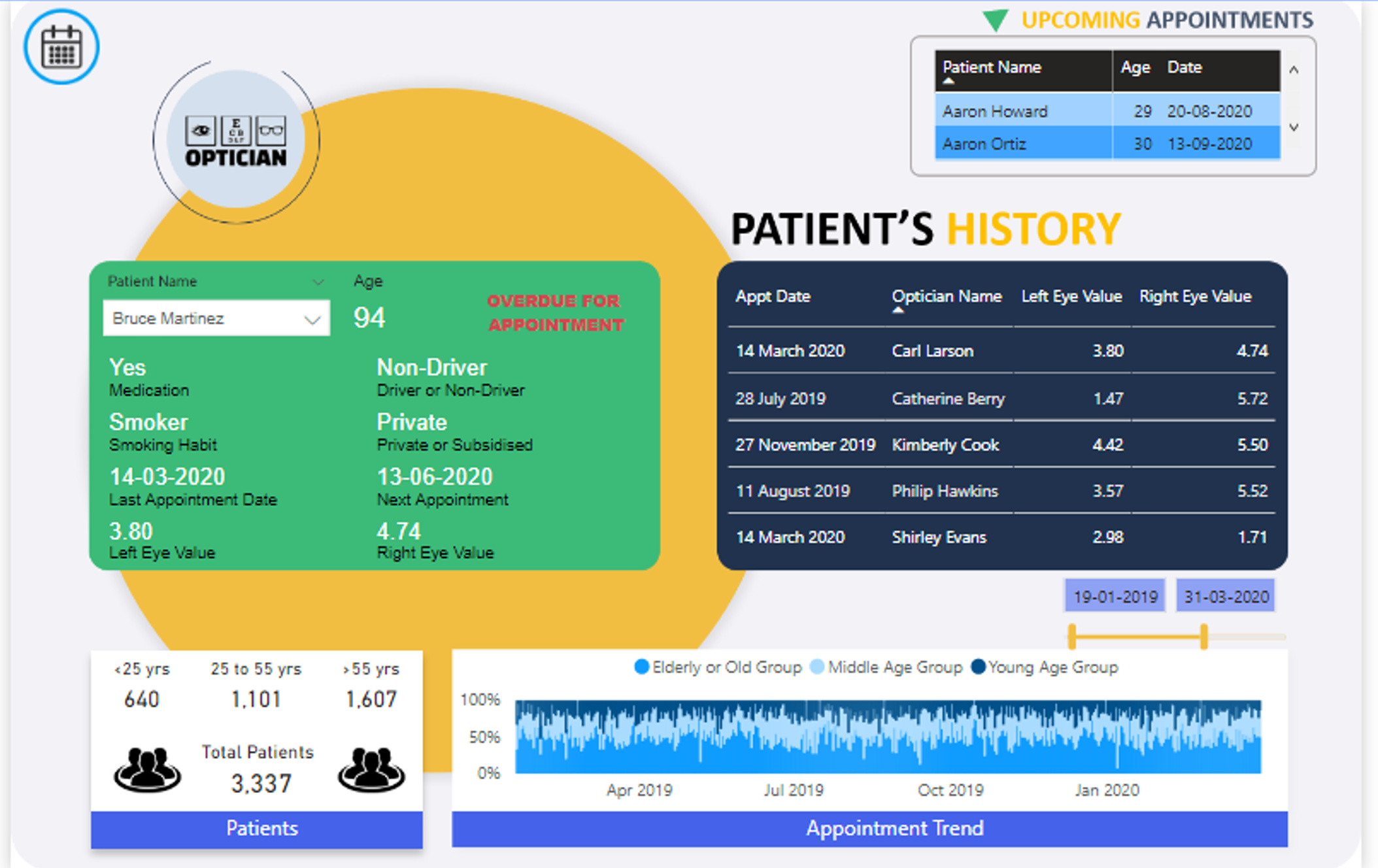
Scheduling Info
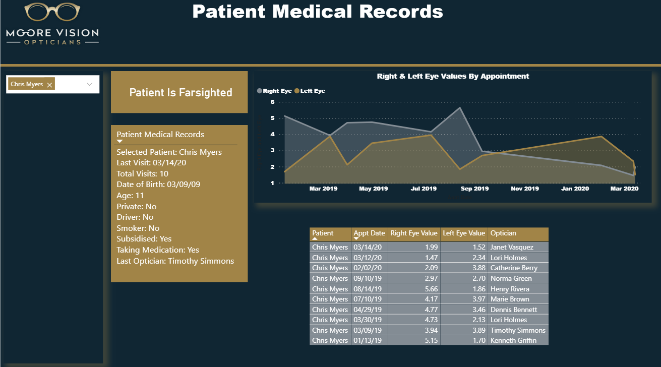
Medical Records
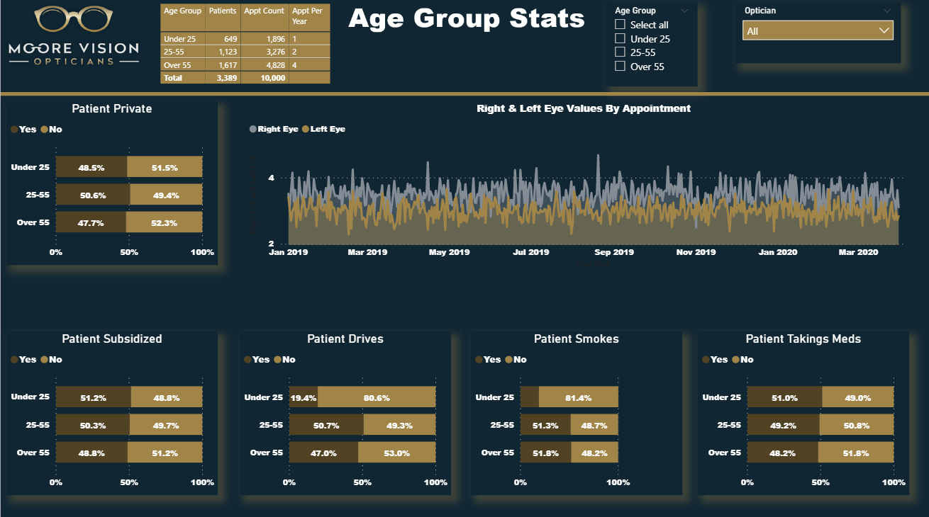
Age Group Stats
Did a bit more DAX than usual with this one, but was able to get this one done very quickly. Looking forward to seeing all of the other entries!
I’ve been wondering when you were going to roll out the heavy artillery in one of these challenges, and I guess now I have that answer. This is beyond brilliant, with better functionality then many full-blown commercial scheduling apps I’ve used. And it looks terrific.
I can’t wait to start digging into how you did some of this. It looks like we’re holding off posting the PBIX files until the challenge closes, but can you please post a publish to web link so that we can play with the full functionality of this report?
Hi uriah1977 ,
Thank you for you for your great feedback. Even though you created an impressive report before I even try to think about creating a report.
Thank you both so much for your kind words, really appreciate it!
I’m sorry to say I can’t publish to web within my tenant but will definitely share the PBIX file in the final write up after the closing date.
What I love most about seeing all submissions - is that although we all start with the same dataset - everyone finds a different way to get amazing insights from it and create appealing reports.
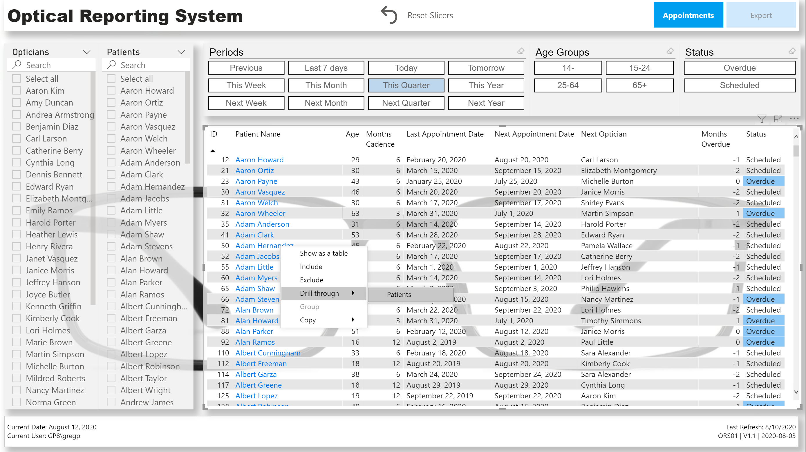
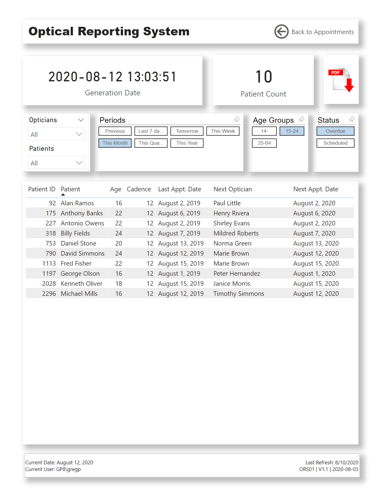
I tried to make this “report” look more like an app, so I made minimal use of analytical visuals, instead concentrating on the main “Appointments” page; the secondary “Patients” page was to be accessed as a drill-through target of the “Appointments” page only, and the “Export” page was added to allow not only allow easy export of the patients needing appointments, but one that would “sync” with the main “Appointments” page.
NOTES:
Data:
made assumption that the optician that did the patient’s last appointment would do the next appointment
Data Model:
imported [Optical Data Set.xlsx] as a staging query, and created references in new [Data Model] group for [Patients], [Opticians], [Appointments]
merged first and last name columns; duplicated column; split columns to re-create first name and last name
added [Dates] table using eDNA Extended Date Table M Code;
marked as Date table
used parameter to get and set start date to Jan 1 of first appointment year
used parameter to get and set end date to Dec 31 of the year after this year
added [Periods] table using eDNA Period Table M Code (Dynamic Date Range Slicer- Query M); adjusted for “this” and “next” periods (week, month, quarter, year)
added pages for [Appointments], [Patients], [Export]
hid all pages except for [Export] page for so PDF export (in either Power BI Desktop or Power BI Service) will output only the [Export] page
added buttons for page navigation to header (font bold white for current, font regular grey for options)
added card for [Session Admin] to footer to display last refresh, report ID, report version, report version date (these in card title and whitespace character in card field well)
added card for [Report Admin] to footer to display current date, current user (these in card title and whitespace character in card field well)
made extensive use of the [General] section in the Visualizations pane to confirm and adjust the values X/Y/Width/Height as necessary
calculated whether user was accessing report in Power BI Desktop or the Power BI Service and used this info to present tooltips relevant to the user’s environment
(used difference between NOW() and UTCNOW() to see if user was on Desktop or Service; I know this is a hack, and doesn’t work if the time in your time zone is the same as UTC, and I would have preferred to use USERNAME() and USERPRINCIPLENAME(), but against my understanding, for whatever reason [perhaps my free PBI license type?], these both gave me the same value irrespective of environment) (*** I’m not happy with this method, I’m still looking for a better way, and would be interested in anyone’s experiences/thoughts/comments ***)
[Appointments] page:
used standard list slicers complete with “Search” for (Next) Opticians and Patients
used “Chiclet Slicer” custom visual for Periods, Age Groups, and Next Appointment Status
used “Reset Slicers” button complete with bookmark to allow user to easily return to the original state
changed font colour of [Patient Name] column to blue to indicated that you can do something (in this case drill-through to [Patients] page for the selected patient)
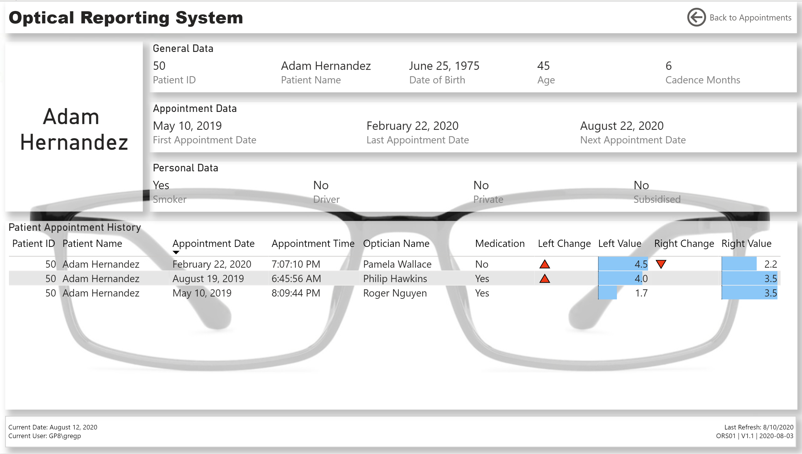
[Patients] page:
used 3 multi-row cards to display General, Appointment, and Personal information for the selected patient
set “Patient Name” as drill-through target
presented the patient’s appointment history in a table, complete with data bars and up and down triangle icons as necessary to denote a changed right-eye or left-eye value from the previous appointment
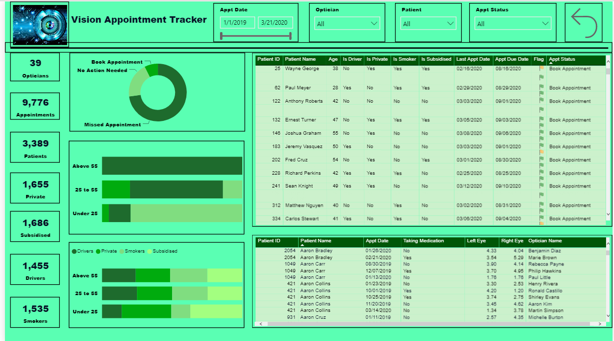
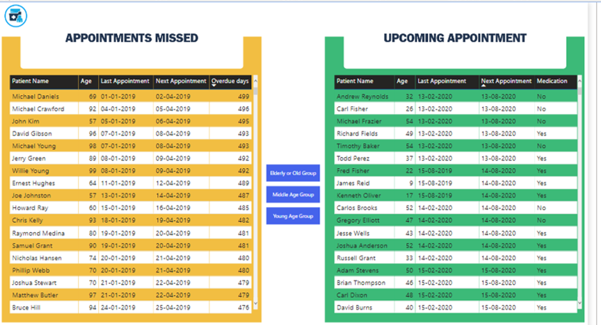
[Export] page:
changed page size to “Letter” and increased spacing from edges in case PDF export was printed
used “Chiclet Slicer” custom visual for Periods, Age Groups, and Next Appointment Status
sync’d slicers to [Appointments] page to allow export of the patients/appointments that had been selected (via slicers) on the [Appointments] page
added PDF Download icon to permit use of the current environment (Desktop, Service) to display the tooltip relevant to the user’s environment
@Greg Good report and great explanation of what you have done in the report. I like the PDF export concept in the report too. I was wondering how you did you calculate the Next Optician for a particular patient.
Are next optician was selected randomly or you used/assumed a particular concept behind this?
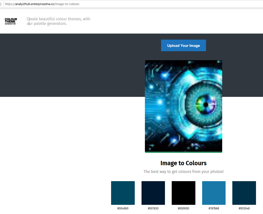
I like the way you structured your report, and showed all of the data that was required. One area I would suggest to improve on is the color theme. This is one thing, even if you are a newbie to Power BI , can help take you to the next level! First of all, I will proclaim that I’m color blind, and without the help of additional tools my report color schemes would be awful. You have a great image in the top left corner of the report. Use this to your advantage, and create your color scheme off this. Here are step by step instructions to help create this.
** If you want to take these colors a step farther and create your own JSON theme, go to this site and enter all of the HEX codes: https://themes.powerbi.tips/
Selecting a color scheme is very first thing I do when I’m creating reports. Nothing beats a great first impression!
@JarrettM
Thank you very much for your input and feedback. I am learning a lot with the challenges and valuable feedback from others. This will really help me for next my challenges.
You raise an awesome and very important point here that I think is relevant to the vast majority of us here on the forum. The eDNA content does SUCH a good job on DAX training, that for almost all of us that’s our comfort zone.
However, @nick_m and @melissa have both said something to the effect of (and I’m grossly oversimplifying here) “if something can be done upfront in Power Query, it probably should be”. This was a huge revelation to me, but as I’ve tried to implement it more and more over the past few months rather than just jumping right into DAX, I’ve come to realize that in many/most cases, it is the best approach both from a performance standpoint and also in terms of making your DAX much simpler and easier for others to understand.
Toward that end, I can’t recommend @melissa’s Enterprise DNA TV YouTube Videos highly enough. By working through these in detail (often multiple views per video) and forcing myself in my own work not to jump immediately into back DAX when I struggle with PQ, I’ve started to gain a much more balanced skill set that has been enormously beneficial. It’s hard work at times, but also really rewarding because, while totally different in structure and operation from DAX, M code is incredibly interesting and powerful in its own right.
So, you are spot on in thinking about DAX as just one force among many.
Once again I look at these and fail to see how they help us to get any better.
I look at the submissions and figure why am I doing this I’m not a graphic artist or a design person.
It’s intimidating at best to us out there that don’t have any design/artistic abilities. What is wrong with a couple of charts and a couple of tables to get the point across.
@GuyJohnson It is all about Data Story telling, if your end user can get the idea of what you are showing them in first 10 seconds of seeing the dashboard then your end goal is achieved. You don’t need to decorate a dashboard to make it look good, only few elements related to the data and boom you have a great report, for example someone above used glasses and without even looking at the data I know this report is somehow related to eyes.