Sure. When I submitted my entry, I talked about my learning goals for this challenge. I’ll walk through what I thought worked well, what didn’t, and what I learned from the latter.
WINS:
- Heavy reliance on Power Query (PQ) - for a large portion of my time using Power BI, I used PQ only for importing data into my data model, and then relied on DAX for almost everything else. However, more recently thanks in large part to @Melissa’s posts and videos, I have been using PQ for a much wider array of tasks. Here, I used the following M code to create columns that added 3, 6 and 12 months to the appointment date, greatly simplifying the DAX that calculated the next appt. date:
= Table.AddColumn(#"Sorted Rows", "Appt+3", each Date.AddMonths( [Appt Date], 3 ))
I also used it to create multiple index values for merging staging tables and the URLs for web scraping necessary to incorporate “patient” photos into my report (see below).
-
Use of Custom Visuals - I know there are a range of views about the merits of custom visuals, and that reasonable people can disagree on this issue, but I think this report was very well served by the use of the MS Tornado chart to clearly and simply depict the historical left and right eye values, and the BeyondSoft calendar to effectively depict graphically the density of monthly appointments and provide a way to filter the data by day.
-
Photo Webscraper - this was for me by far the most fun and interesting part of the challenge. Web scraping is all about pattern recognition and replication. I started with a long list of current and past NBA players that I imported into a table, using the Web connector from the Get Data menu. Then I looked at the URL structure for player photos in basketballreference.com. Here are the URLs for the photos of Michael Jordan and Lebron James:
“https://www.basketball-reference.com/req/202008124/images/players/jordami01.jpg”
“https://www.basketball-reference.com/req/202008124/images/players/jamesle01.jpg”
This was a best-case scenario - each URL followed the exact same pattern - identical prefix, first 5 characters of last name, first two characters of first name, 01.jpg. It then just a matter of writing some simple M to take the full name from the web-imported list and convert it to a URL using this pattern. (Note: sometimes websites will “bin” photos in a more structured hierarchy - in that case you will need to create a table of values to iterate over to create the URLs. For those interested, this video on creating holiday tables has instructions for iterating your web scraper over a secondary table, but it was not necessary here).
The next step of the web scraping process was when I realized that a significant number of names on the list had no photo in the basketballreference database. To avoid having my report show a bunch of broken links, I wrote the following M code to check each URL to see whether it contained a valid image. If it did, it returned the original value for URL without altering it and if it didn’t it returned null, and then the nulls were replaced it with a URL for a “Photo Not Found” image:
= Table.AddColumn(#"Removed Columns3", "ValidURL", each if Text.Contains(Binary.InferContentType(Web.Contents([nbaurl]))[Content.Type],"image") then [nbaurl] else null)
= Table.ReplaceErrorValues(#"Added Custom", {{"ValidURL", "https://www.bnap.tv/wp-content/uploads/2019/03/photo-not-available-Male.gif"}})
I then added an index to the Players staging table and used that to merge the cleaned URLs into the Patients’ table. Viola, patient images!
Finally, I used a custom visual called Simple Image to read the URLs created in PQ and display them as pics on screen.
- Report Design - I have pretty limited artistic/design skills, and will absolutely never be on the level of the top-tier designers in these challenges. However, I am learning and borrowing from them and I think each of my designs has improved incrementally from one challenge to the next. Other than the photos, two things I think worked well here were: the heavily B&W theme, with limited color for emphasis; and the subtle eye chart background that I developed using @sam.mckay’s technique from this video.
LOSSES:
-
Overly Restrictive Data Model - For those who’ve read my forum posts related to data modeling, you know that I believe Alberto to be correct about this:


To avoid creating a bi-directional relationship while still adding a dynamic period slicer to my report, I had to create a second fact table using a DAX ADDCOLUMNS/SUMMARIZE structure. In many respects, this worked fine, but it had the effect of wiping out my ability to use conditional page navigation buttons for drillthrough from the schedule page to appointments page - something I very much wanted to incorporate into my report, both as a feature for this challenge and more importantly as a learning opportunity for incorporation into my real-world PBI reports. All the other experts used a bi-directional relationship snowflaked off of their dimension table, enabling the conditional drillthrough, as well as the period slicer , and by effectively isolating the bi-directional relationship they eliminated the risk of ambiguous paths that plague many models that deviate from the strict star schema due to the use of bi-di filters. Lesson learned: evaluate each situation on its own merits - being overly dogmatic results in lost opportunities.
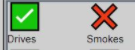
- (Attempted) Use of Local Images - I wanted to use icons to dynamically represent the patient attributes (e.g., smoker, driver, etc.). I initially used the UNICHAR codes for the green checkmark and red X icons. This is done via a very simple IF statement - literally took a few minutes to dynamically generate these for every patient attribute:
However, being somewhat of an obsessive crazy person, I decided I didn’t love the look of these and thus wanted to swap them for custom flaticon.com icons and additionally incorporate them as local files, rather than web URLs, again as a learning goal.

This worked poorly, to say the least. I tried pulling these in a SVG and Binary 64 formats, and while after a bunch of SVG code cleaning and Binary 64 encoding I was technically able to do it, it proved a huge waste of time, since the visuals I wanted to use (standard card visuals and/or Cards With States) wouldn’t read the local file path names (but oddly, table visuals read them just fine…) and convert them back to icons. But out of the fires of failure, came two positives:
a) I found a free image hosting site called imgbb.com. This site makes it incredibly simple to upload icons, images, and other graphics, and then generate a direct URL link to them making it easy to incorporate them as conditional graphics within your PBI reports.
b) turns out Microsoft, in their gallery themes, incorporates backgrounds into the theme JSON files as… binary 64 files. What I learned from the exercise above allowed me to solve this member’s problem, something I would definitely not have been able to do had I not attempted this in the challenge.
Overall lesson learned - Go nuts! Treat the challenges as your own personal mad scientist lab. Try stuff you otherwise might not in your real-world reports. Some of it will work beautifully and you will be left with a bigger, better toolbox. Some of it will catch fire and explode, but you’ll probably learn as much from the failures as from the successes. Either way you win.
If you made it this far, thanks for reading and thanks for participating and for being a part of this amazing community. Also, huge thanks to @haroonali1000, @sam.mckay and the rest of the @EnterpriseDNA team. Thanks to your efforts, these challenges just keep getting bigger and better.
- Brian
P.S. If you want to dig further into the details of any of this, here’s a link to my PBIX file (too big to post directly):
https://drive.google.com/file/d/1DFJIy-7cHg-71kJWaTdzG-8MyQXOwbiV/view?usp=sharing