Here’s the entry from one of our non-member participants, Fernando.
4 Likes

Here is my submission for Challenge 17
Initially I wasn’t going to participate but due to some encouragement (Brian & Federico) I began and then I wanted to give up many times but again due to some encouragement (Brian & Federico) I persevered, and I am very happy I did.
What was difficult:
The data as I couldn’t find the story and it took some time to work it out. Best advice I received was to focus on the long-term trends.
Managing my time…once again I spent way too much time on this report.
What was easy:
Data was clean and easy to work with.
Dax was easy, only a couple of tricky ones.
What worked:
I did my first Python chart!!
What didn’t work:
- My Python chart
 whilst it worked in the desktop version, once I published the report, I got an error message which I didn’t have time to resolve. Instead, I inserted an image of the chart.
 - Dumbbell chart – when I published the report, it come up that I need a licence in red. Instead, I inserted an image of the graph as I had no time to redo it.
Techniques learnt from Accelerator that I could apply to this challenge:
- Conditional formatting map circle colours using dax
- Conditional formatting colour of max value in chart using dax
- Bookmarks – best tip ever was to group charts/images/tables etc together, makes bookmarks so much easier to work with
- Hiding slicers with bookmarks
- Horizontal bar chart – love this one
Help received:
- County table with Latitude/Longitude coordinates from Brian


Here is my publish to web link
https://app.powerbi.com/view?r=eyJrIjoiNWRkZjQ3ZmEtNDgzNi00NWQ4LWJiNGItNzdhYTc4OGFjMjFmIiwidCI6ImJkM2ZjNmFlLWE0NTUtNGFlYS1hM2RiLTI4NzlkMjI1MzM4NiIsImMiOjEwfQ%3D%3D
8 Likes
@KimC ,
Fantastic report – so glad you decided to participate! One thing I learned back in Challenge #5 when @Greg created the Python ring chart is that Python visuals do not come through in Publish to Web.
For purposes of the competition, I wanted to note that Kim’s entry was received well in advance of the deadline. However, I was working on the Accelerator #8 problem set and didn’t notice it had been received, along with the request for me to publish it to web until a few hours later:

- Brian
1 Like
It was my C8, but yes, at that time (Nov 2020), PTW didn’t display either Python or R visuals.
Greg
Nice!!! 

1 Like
@KimC this is really well crafted and beautiful. Excellent Report Kim
3 Likes
Love the insights! It is a true data story!
3 Likes
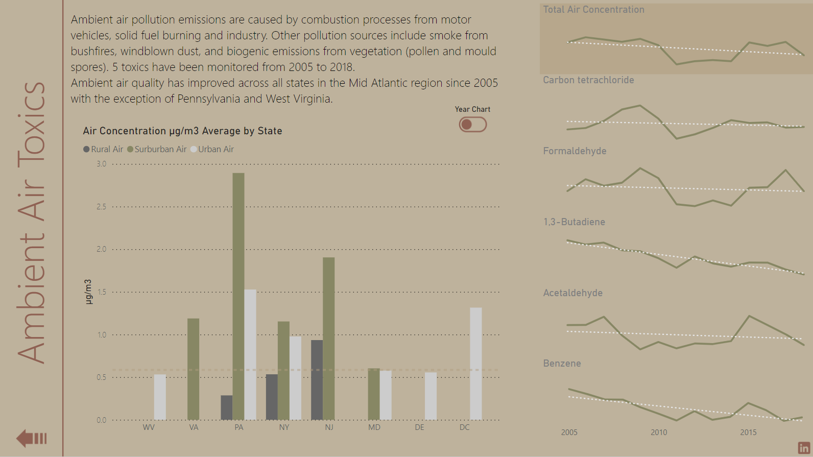
Attached is an entry I received over the weekend from Carlos Cesari, an industrial chemist who has developed a strong interest in data analytics. He is a relative newcomer to Power BI, but wanted to contribute his expertise to the Challenge, so submitted his analysis in Excel and PowerPoint.
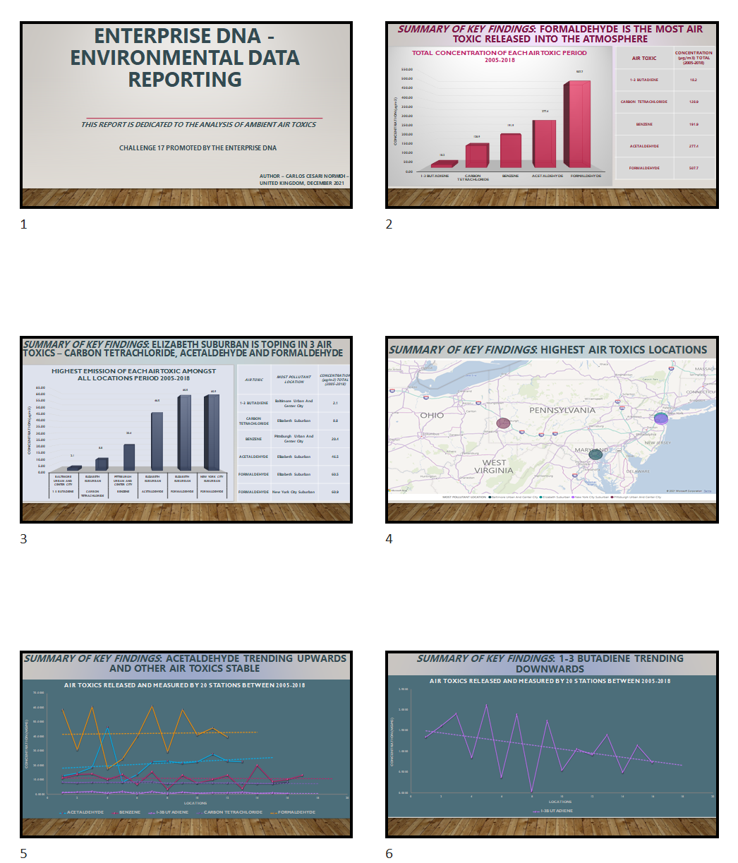
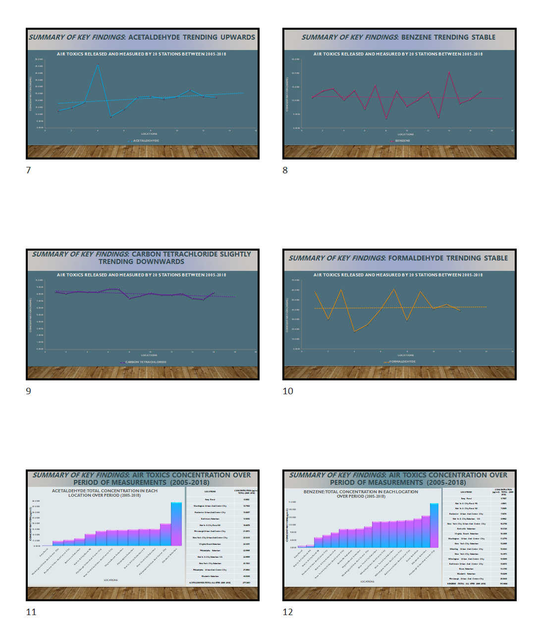
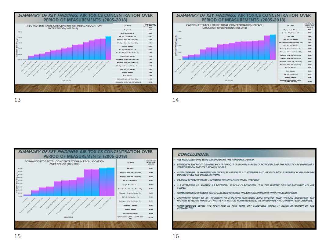
Thanks very much to Carlos for participating, and sharing his expertise!
ENTERPRISE DNA - ENVIRONMENTAL DATA REPORTING.pptx (676.0 KB)
DC17FinalData_adjustedfortask.xlsx (269.2 KB)
- Brian
2 Likes

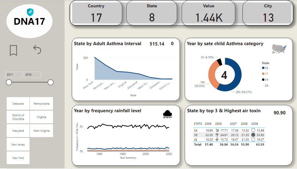
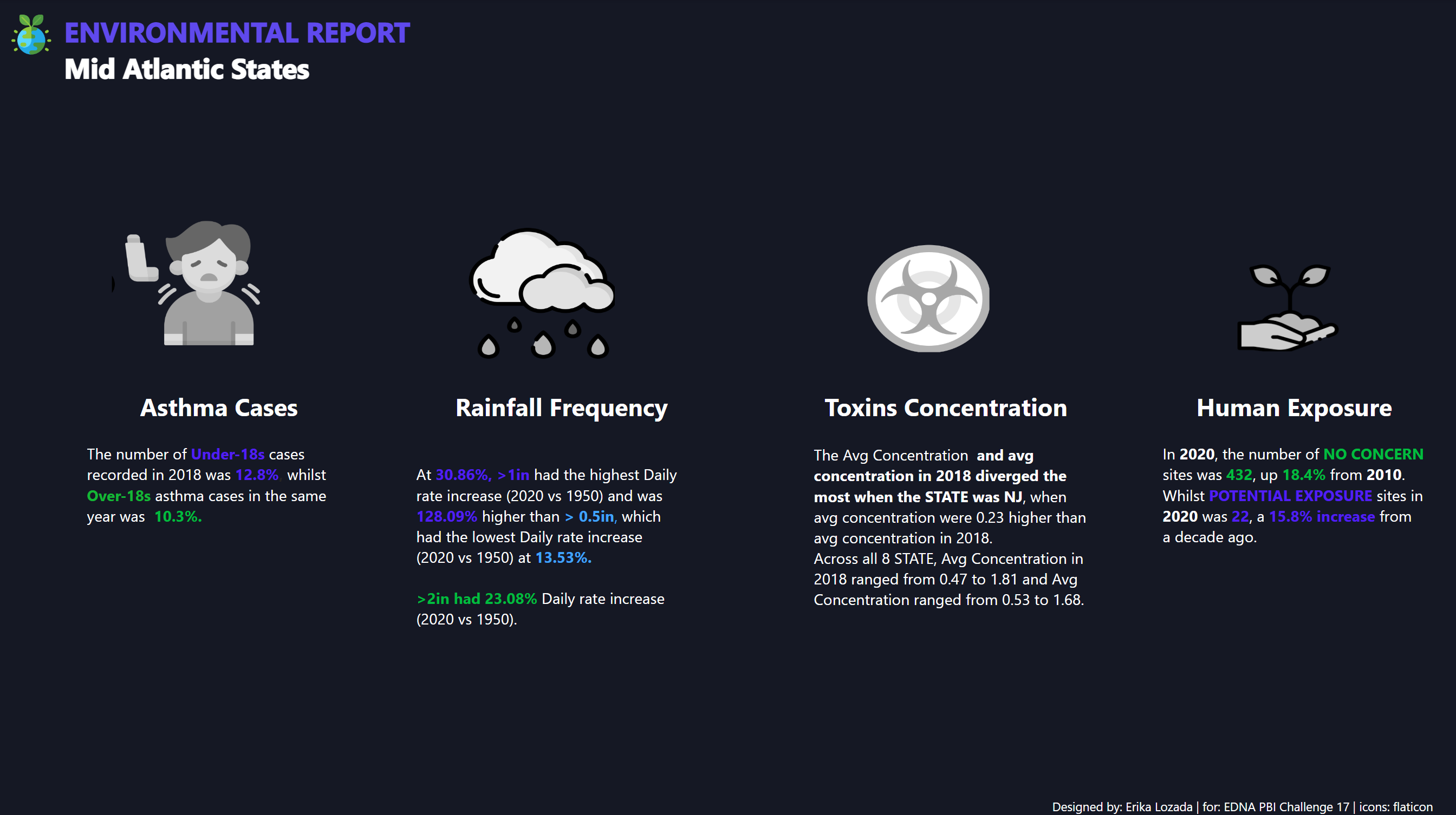
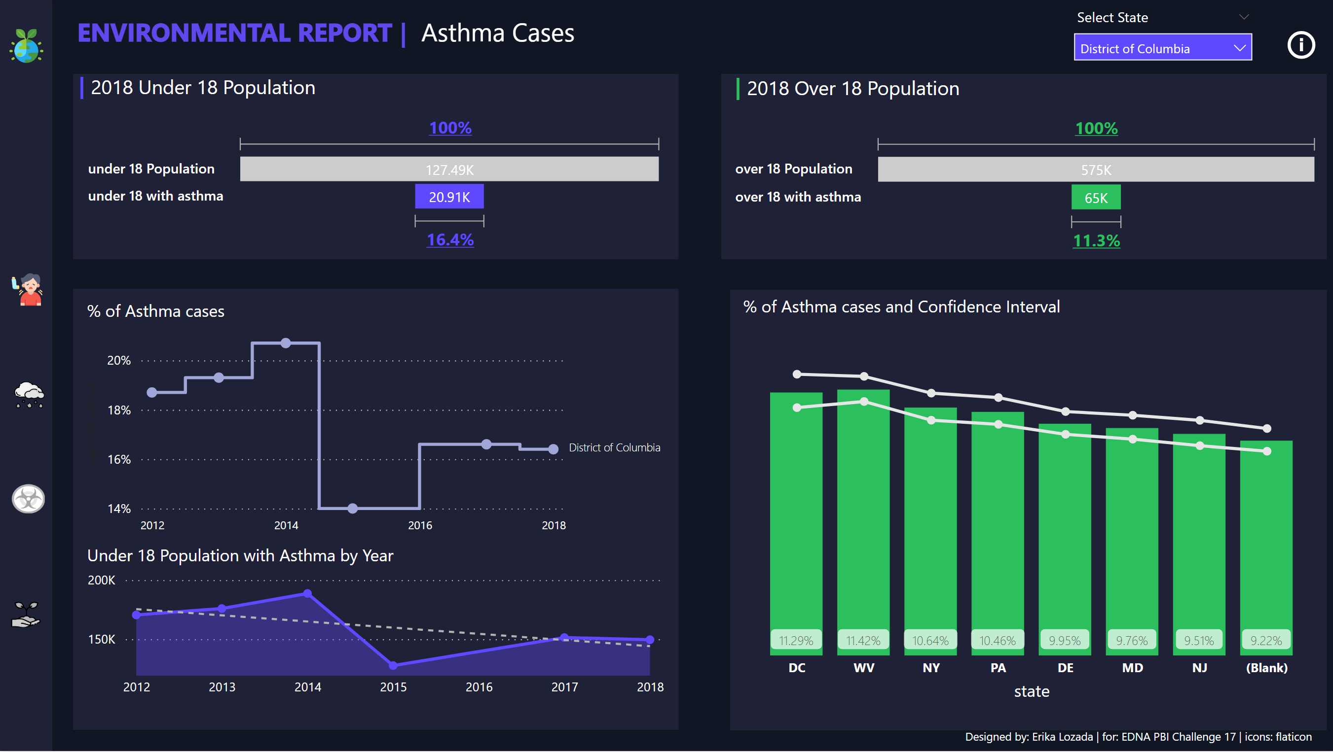
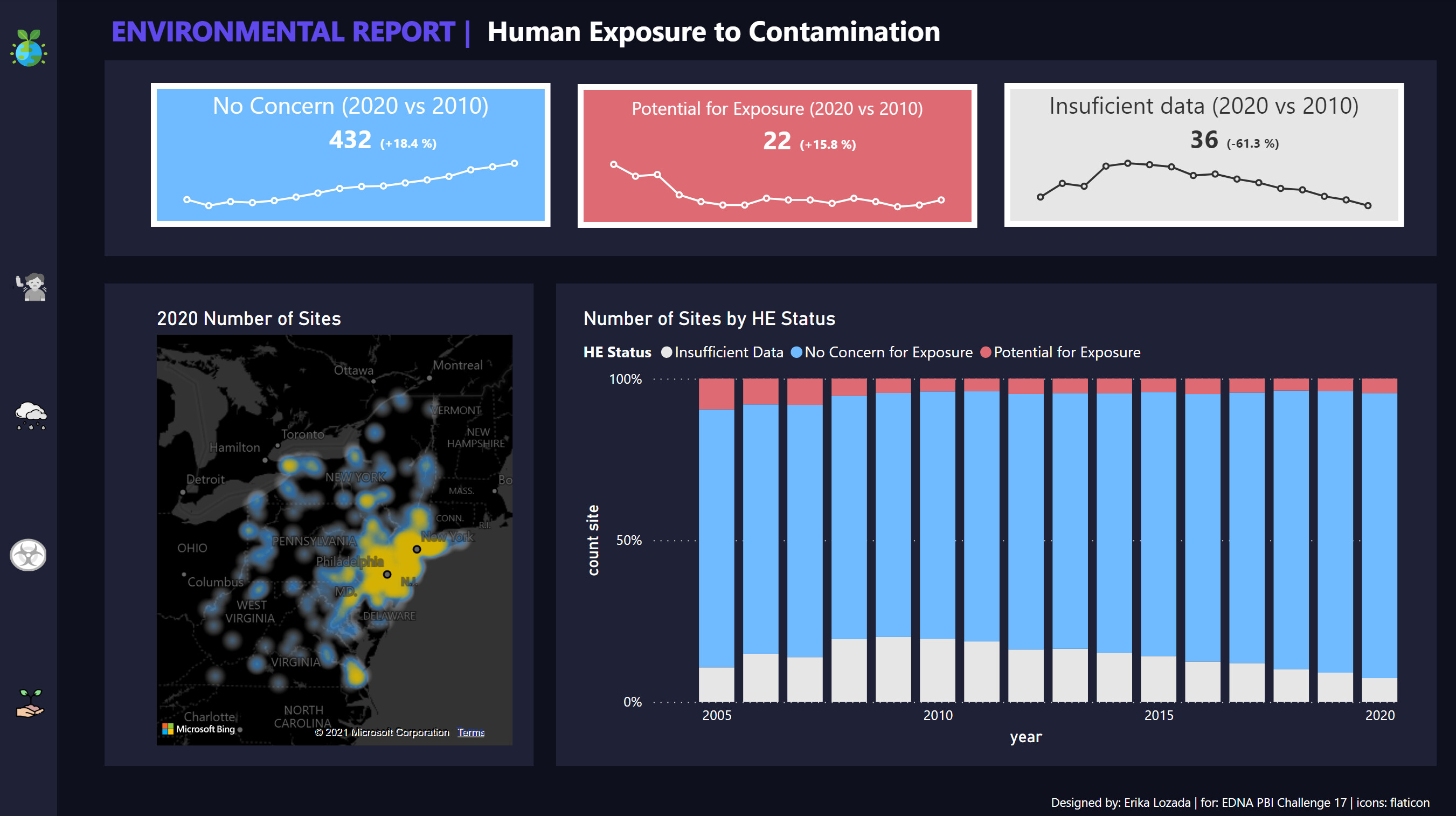
My report images was already posted on this forum and you can access it online here thanks to Brian: https://app.powerbi.com/view?r=eyJrIjoiZjM3ZjdmZDYtMzBmMC00YjQ3LWE5YzItY2NlMDhkMzlmNjRiIiwidCI6ImJkM2ZjNmFlLWE0NTUtNGFlYS1hM2RiLTI4NzlkMjI1MzM4NiIsImMiOjEwfQ%3D%3D
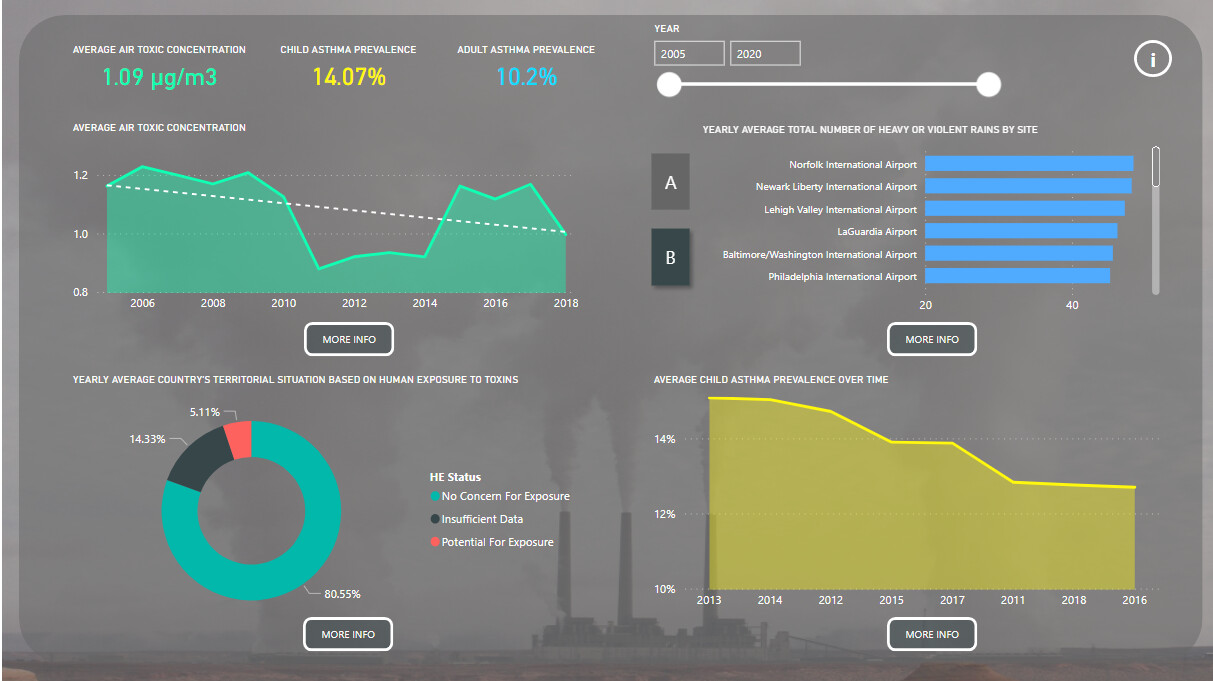
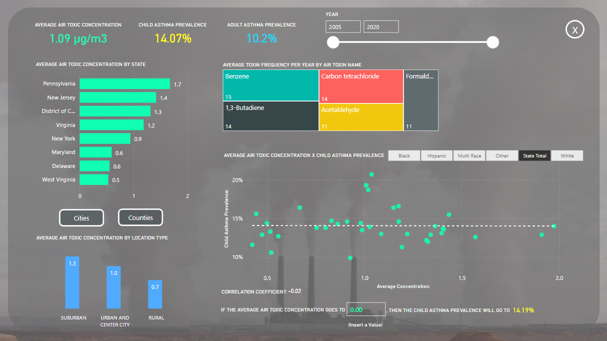
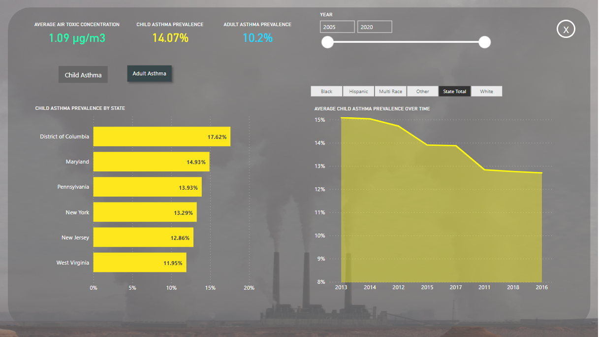
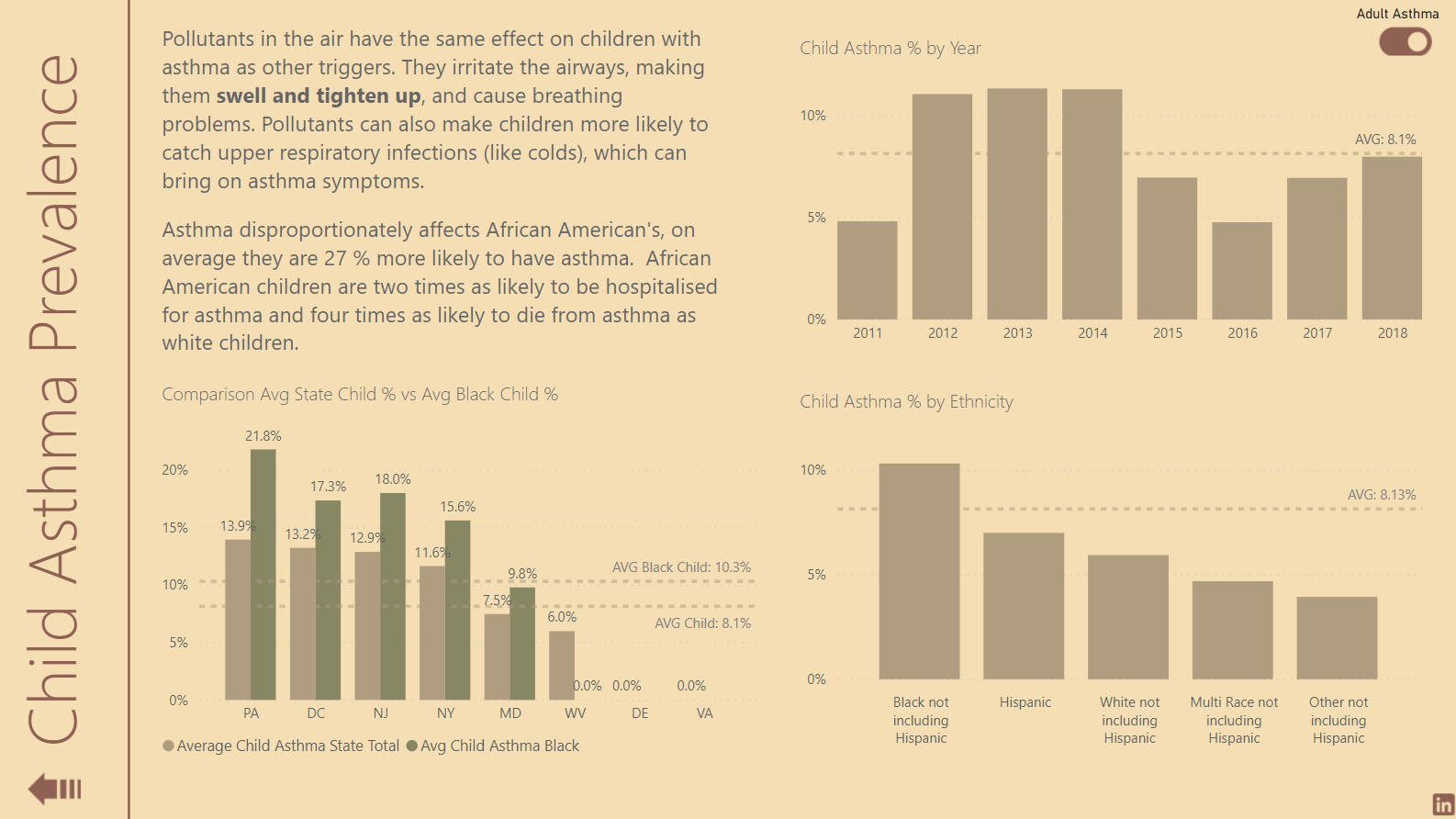
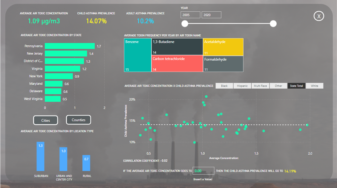
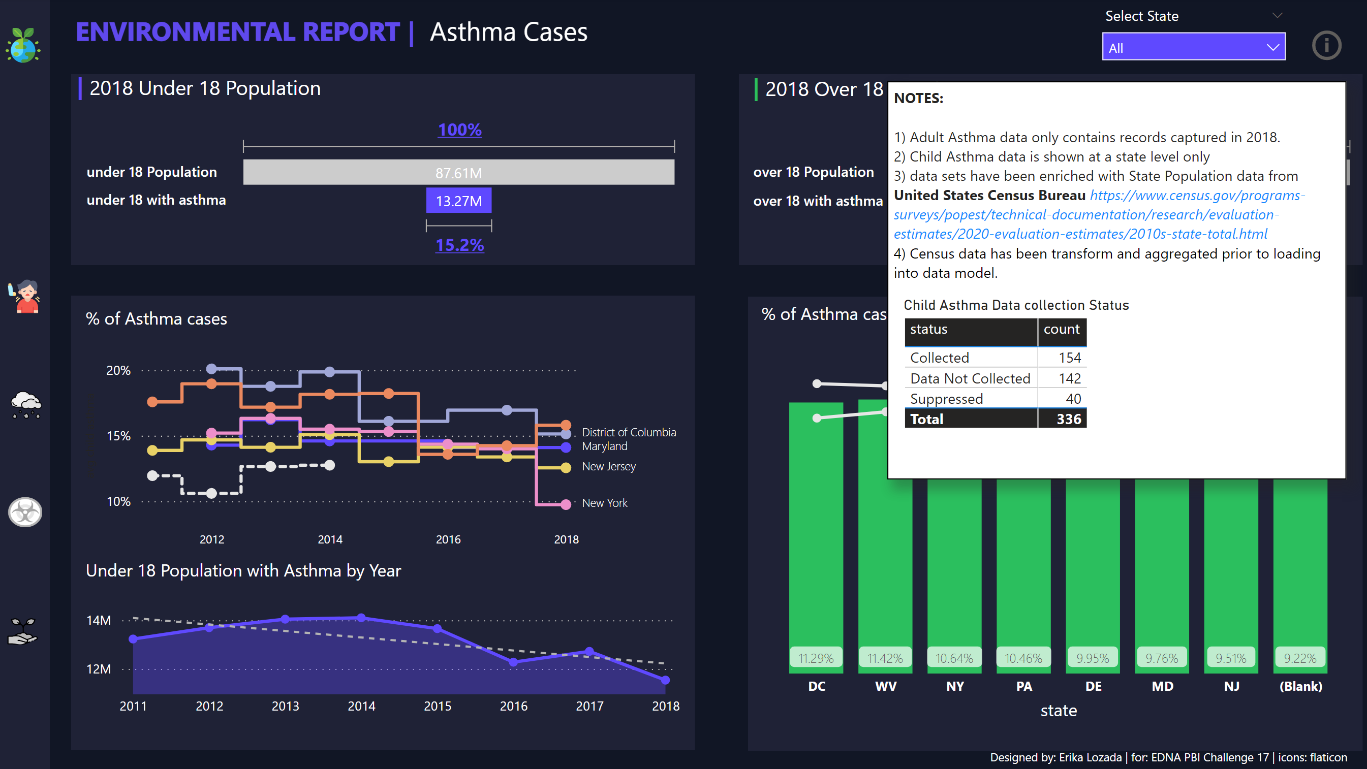
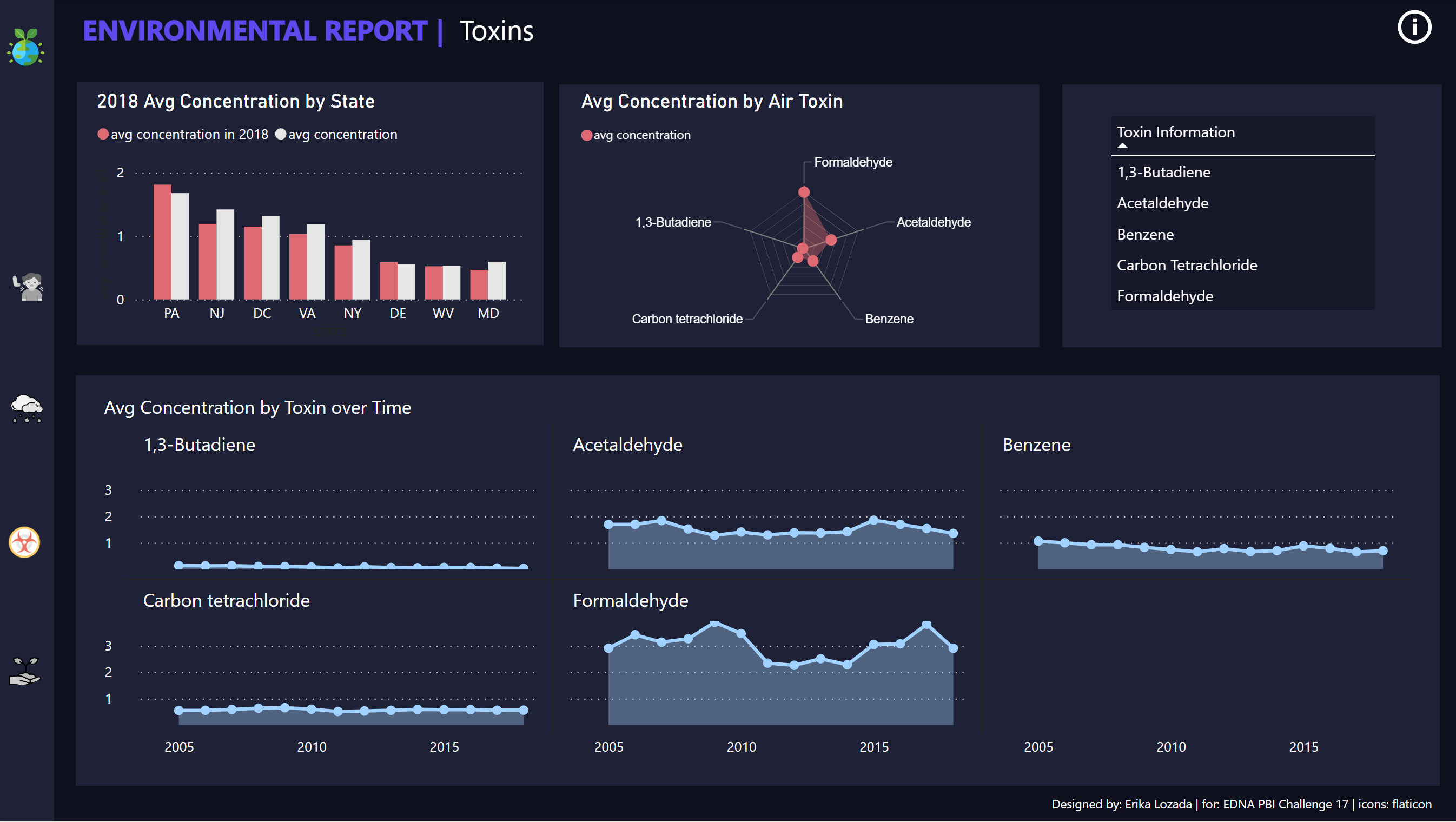
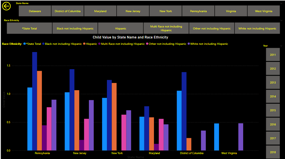
I want to talk about the correlation of those two pages. Holding CTRL and clinking on multiple visuals, you can create multiple scenarios to see how strong the correlation is and statically predict the behavior.
For example: you can establish a correlation between the average air toxic concentration of Butadiene in the state of Maryland and the Child Asthma Prevalence in the White or Black community. After that you can insert a new average air toxic concentration of said toxin (butadiene in this case) to see how the child asthma prevalence would behave on the selected community. You can create multiple scenarios and do multiple tests.
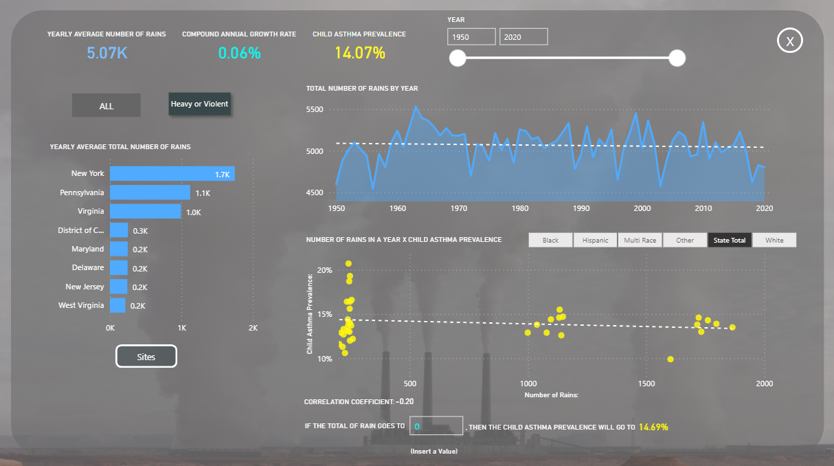
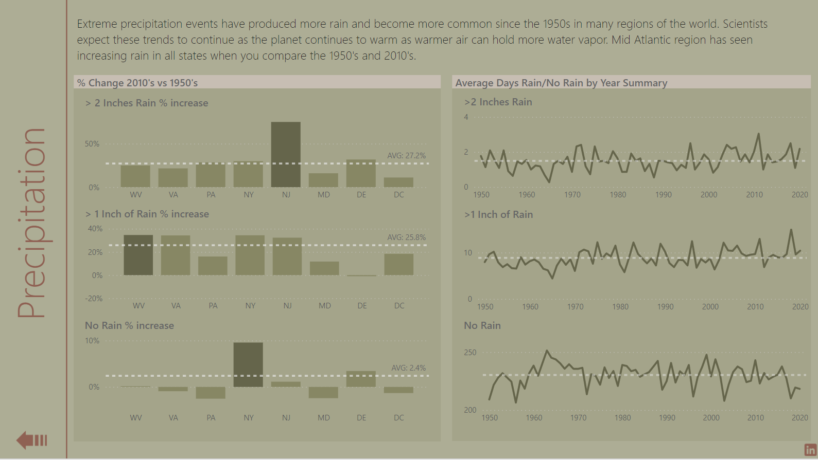
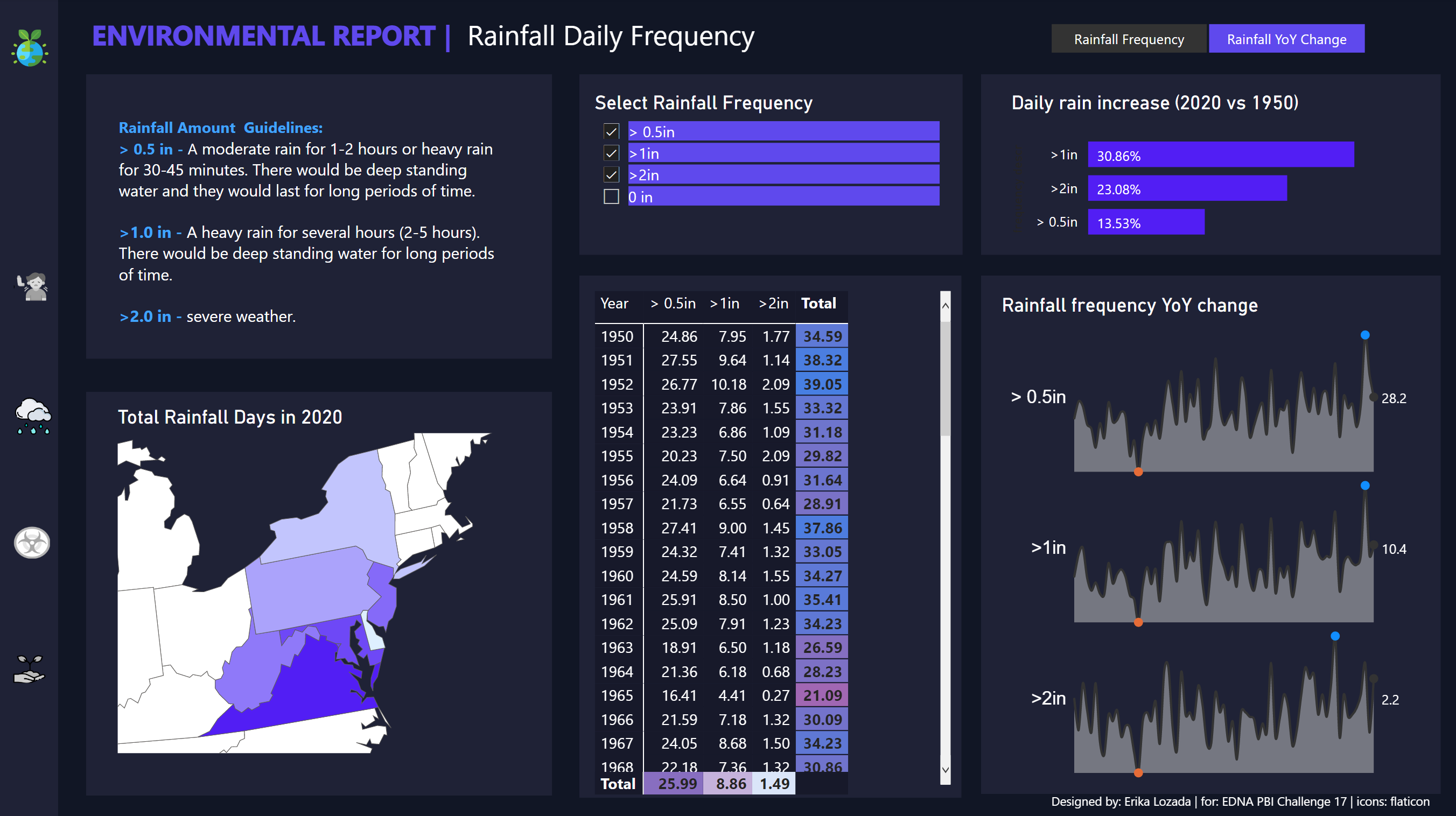
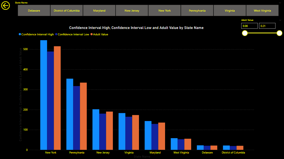
This same thing can be done for the precipitation report.
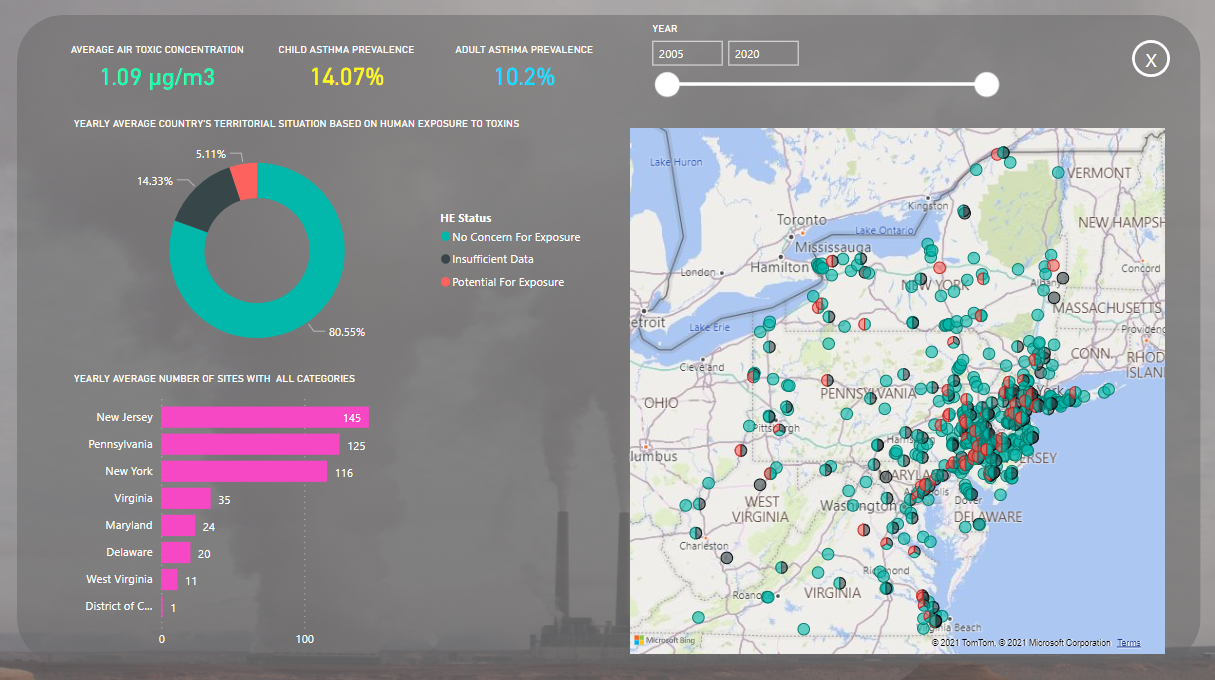
I’ve created a category named “heavy or violent rain” based on the classification that I’ve found on wikipedia.
Ps: I don’t trust the correlation to be 100% correct. I’ve created the report to be as automatic as I could make for now (the only thing that needs to be manually updated is the year table and clicking to refresh the tables). The correlations utilizes a table that I’ve created through power query utilizing reference and other things in order to make it automatically update by each database update (I hope ![]() ). There’s some nuances in it and more revision would be good.
). There’s some nuances in it and more revision would be good.
5 Likes
All,
I’m getting ready to really dive in and review all the entries received on this Challenge today, but I first wanted to say a massive “WELL DONE!!!” to all the participants.
I have to admit, I was nervous about this Challenge. I know the submitter quite well, and have gone on and on to them both about what an incredible tool Power BI is for this type of analysis and reporting, and even more so how incredibly talented the eDNA Challenge community is, and that they would see reports that would knock their socks off.
But when I saw the dataset, I realized that this was a wide-ranging and difficult Challenge. I worried whether people would be willing to put in time on something this large, difficult and likely unfamiliar to many of you. I was also concerned that newcomers would be overwhelmed and sit this one out.
Thankfully, my worries were completely unfounded. You rose to the challenge (no pun intended) and produced an incredible set of entries that beautifully showcase the capabilities of Power BI, and also provided an array of creative ideas on ways to visualize not only environmental data, but in general large datasets spanning multiple decades. In addition, it was fabulous to see a bunch of new names in the mix this month - with a lot great entries coming from newcomers.
We are extremely appreciative of the obvious time and thought spent on these entries. I know for a fact that some entrants spent 30+ hours on their entries. We hope you enjoyed this challenge and learned a lot in the process.
Sam and I will be putting together our feedback on each of the entries received, and I will be working through the judging of the different categories with the @EnterpriseDNA team - a task you have all made incredibly difficult for us. ![]()
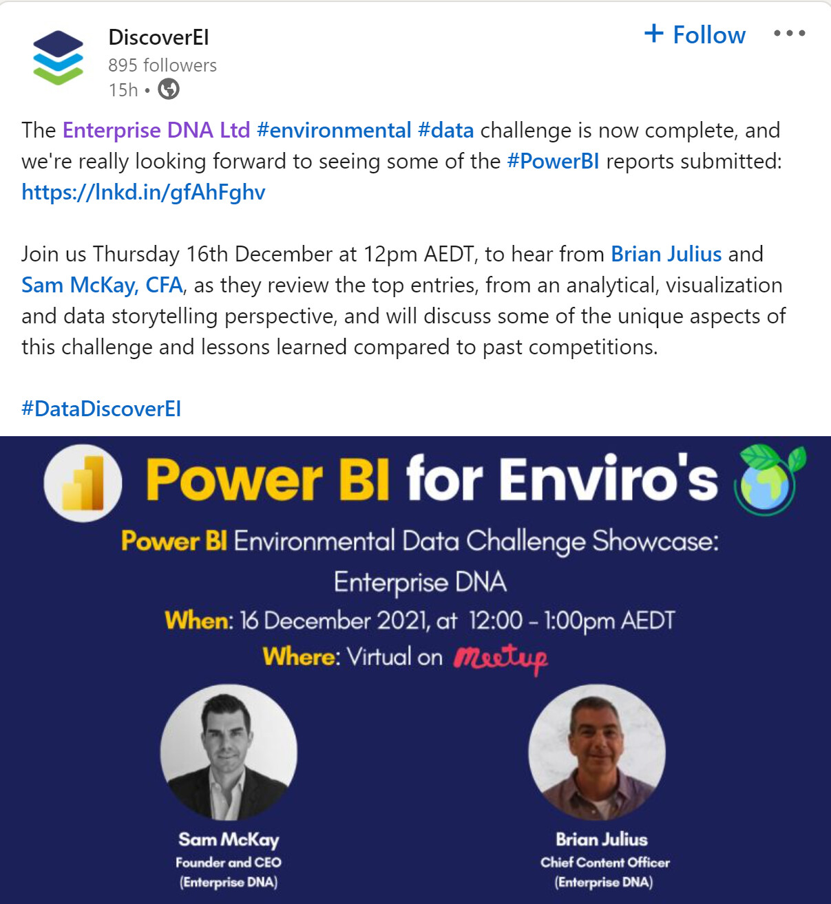
So, wanted to say a huge “Thanks!” to all, and also let you know that @sam.mckay and I will be the guests at the “Power BI for Enviros” meetup this week, run by Microsoft MVPs Alice Drummond and Christian Borovac of DiscoverEI, where we will be presenting and discussing the entries received on this Challenge.
You can click here to register for the free event.
Plenty more to follow on this Challenge over the next week!
- Brian
5 Likes
@tweinzapfel Awesome report. Great visuals. You did a fantastic job!
1 Like
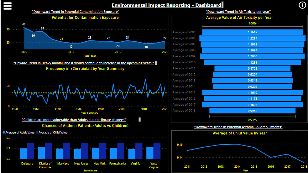
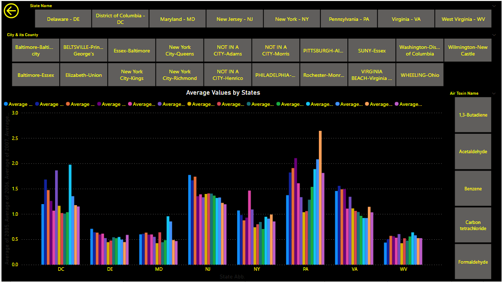
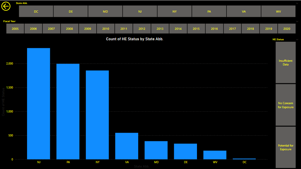
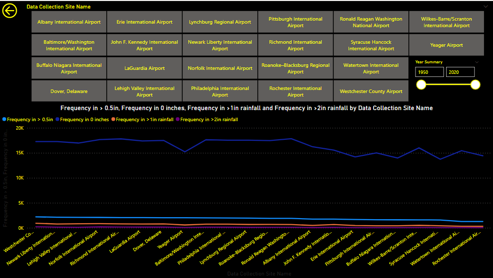
Attached is my very late submission. I realised I have missed the deadline, but I wanted to submit a report at least once this year 
I have wanted to build a dark themed dashboard for a while now, but never got the chance at work and finding the time and interesting data for side projects can be difficult. I’m happy that this challenge was very interesting and gave me plenty of opportunities to try a different theme.
I would have like to spend more time adding some context around the different pages, an creating some narrative to help audience navigate dashboard. Next challenge, I’ll give myself more time to implement this.
I’m having some issues publishing my PBIX file. I will edit this message with a link once I have it.
7 Likes
Awesome design
1 Like
Thanks for submitting, even after the deadline. Terrific report - and I think the dark background really works. Per your problems publishing, if you’d like to send me your PBIX file (at brian.julius@enterprisedna.co), I’ll be happy to publish to web on our tenant and send you the link.
Thanks very much for participating!
- Brian
2 Likes
Bien Fernan, buen reporte y bienvenido a los challenges.
Saludos y Feliz Navidad
Federico
Bad timing for me, would love be present… I guess I will see the video once posted in you tube.
Thanks
F Pastor
1 Like
Fantastic report Kim. Loved some of the visualisations you chose. Very thoughtful and creative
2 Likes