This is what I did too!
HI All,
This was quite a challenging assignment. It is my first time connecting to web data, but it was a good learning experiencing.
Here is a video of how the my dashboard works because I don’t know how to make my dashboard public. I think it is a permission thing.

And thanks Haroon for putting this challenge together. The eDNA videos came in big handy while doing this challenge.
Pictures
Good afternoon/evening everybody!
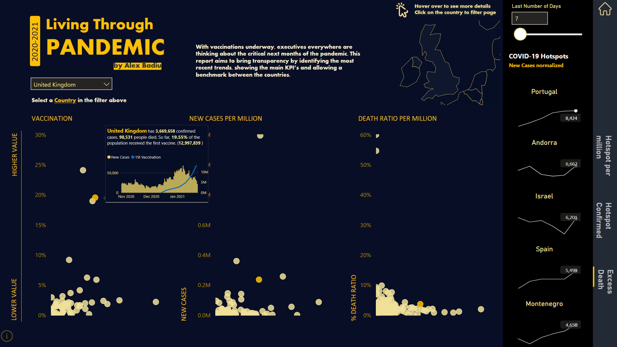
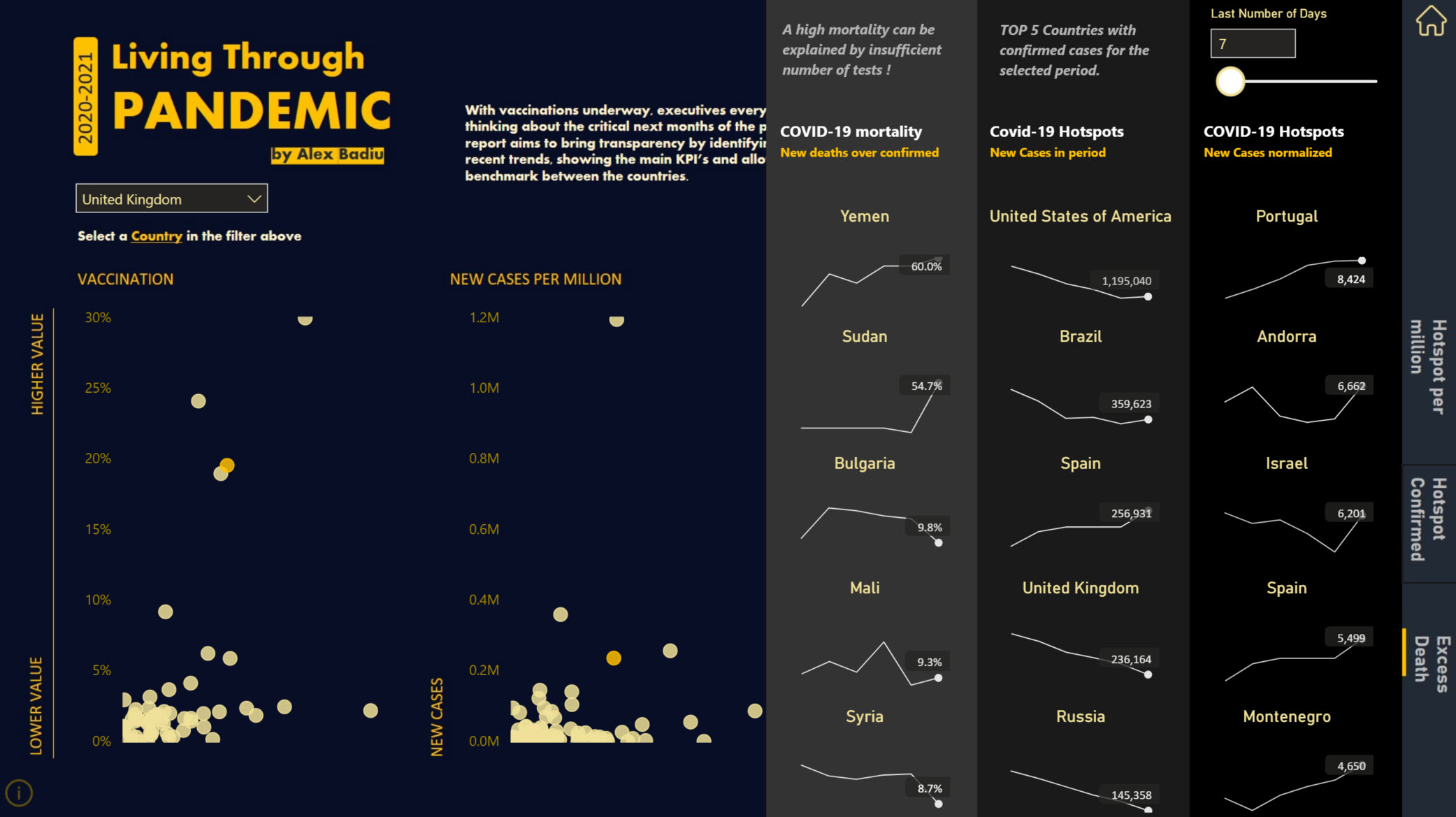
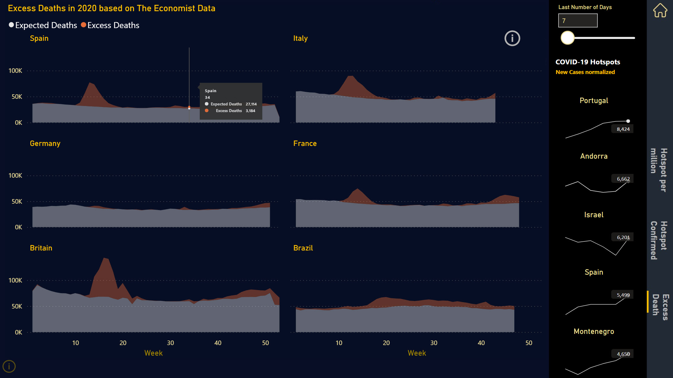
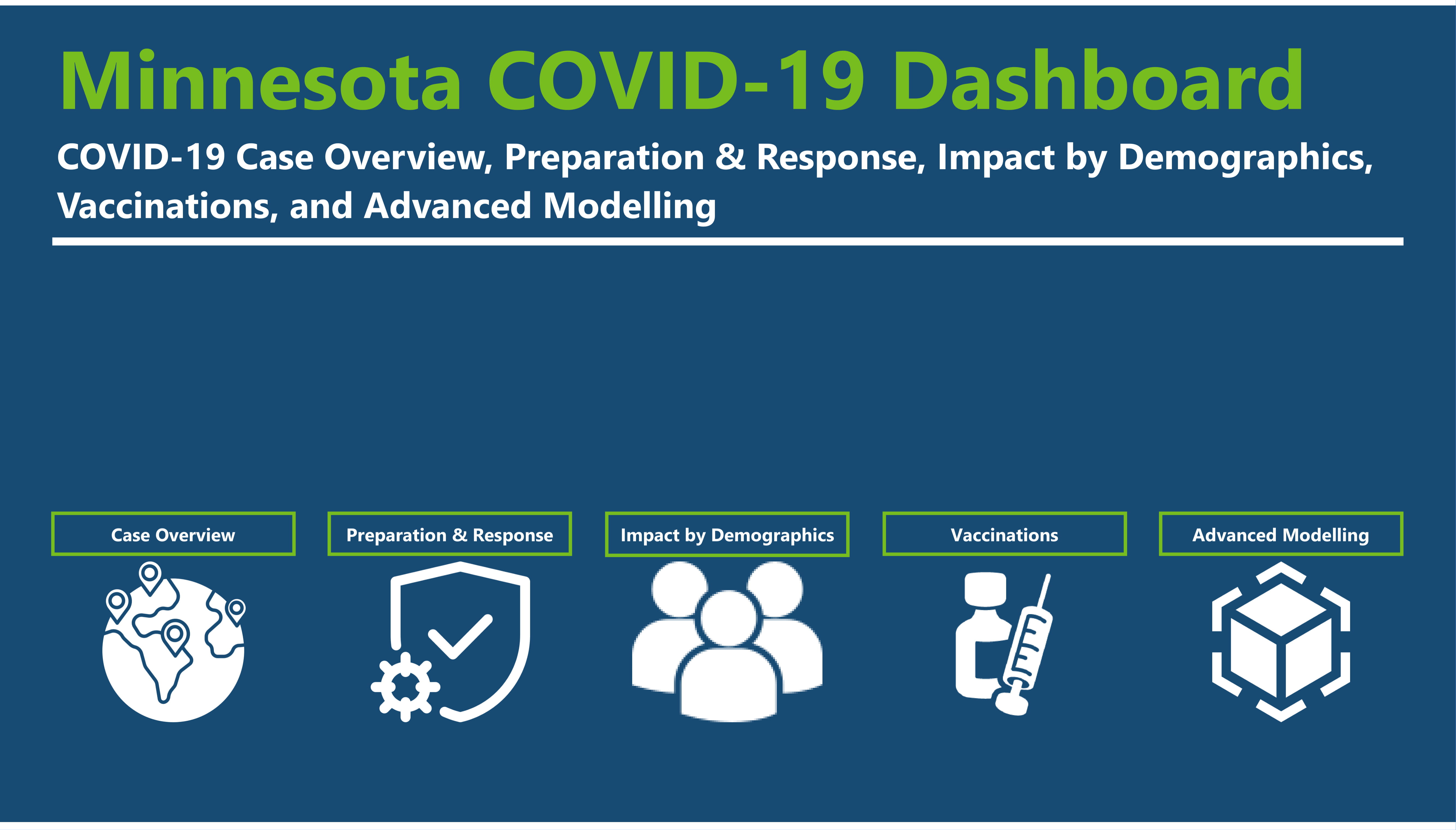
I was having some network issues yesterday so I didn’t get to post this on the forum. I was able to send my submission on time, but I wanted to wait till today to see if I could get the report to work using the direct connection to the source data. But anyways… below you’ll find my submission for Challenge 11. I decided to specialize my report to my home state of Minnesota in the United States to add a personal touch to the report and allow for a deeper dive into the data. This also allowed for me to take direct inspiration from the Tableau reports and one Power BI report the Minnesota Department of Health already use to report to the public. Combining these reports into a single comprehensive report, as well as incorporating the Minnesota COVID-19 model developed by an interdisciplinary team at the University of Minnesota School of Public Health and the Minnesota Department of Health, this allows for a single source for all COVID-19 data in the state as well as allowing for someone to split the report into multiple parts to improve performance.
Now, let’s dive into the report itself! The report has 5 distinct parts: Case Overview, Preparation and Response, Impact on Demographics, Vaccines, and Advanced Modeling. Below you will see a brief summary for each page and a screenshot of the complete page. Some of the pages are very tall, but as all the information is related I chose to keep them on one page and allow the user to scroll.
Home
Basic landing page with icons to direct the user to the appropriate report.
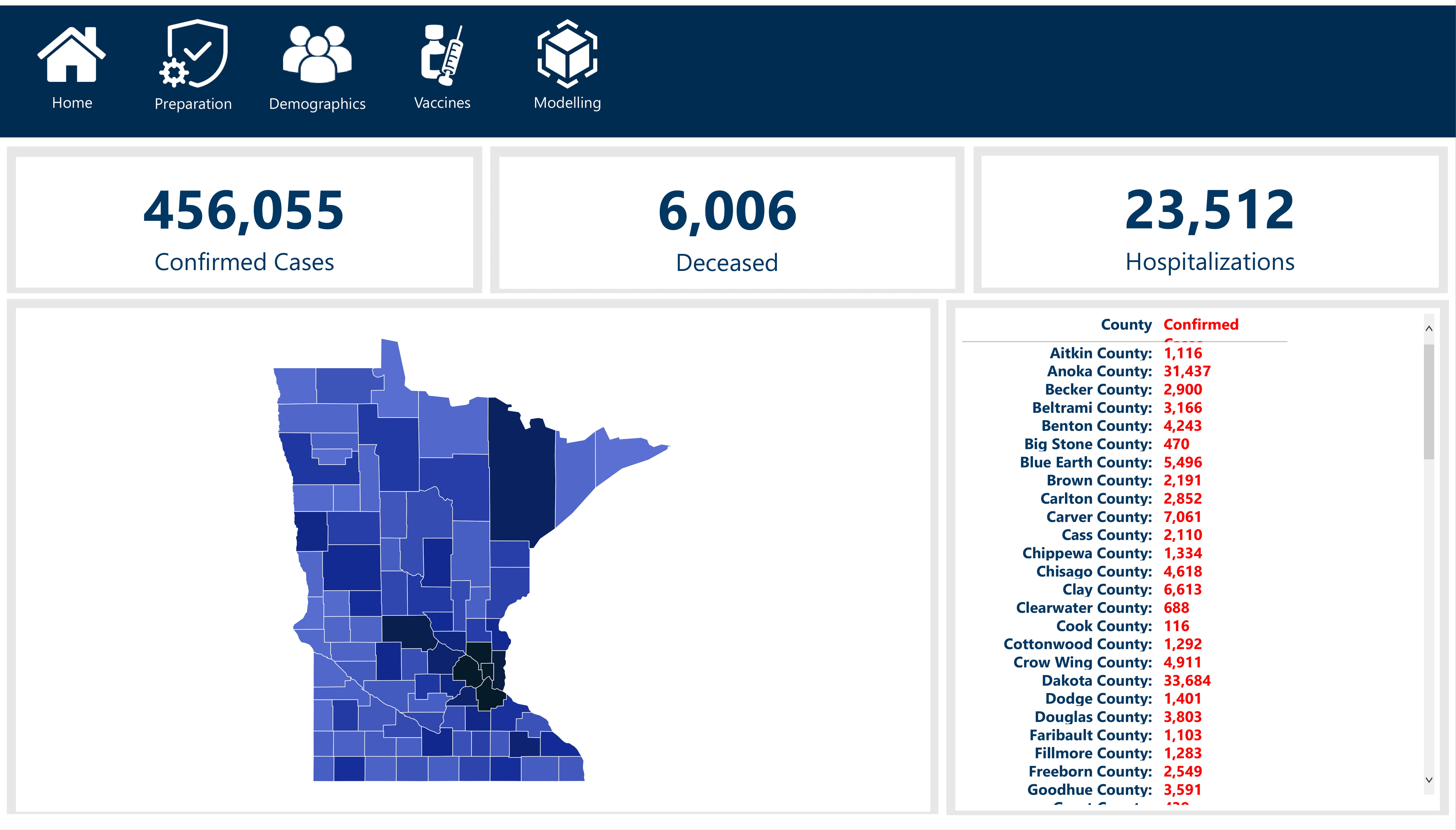
Case Overview
This is really the single quick view that higher ups and the general public would look at. Basic stats, clean, and minimalistic. This would most likely answer most peoples questions that aren’t looking for much more information.
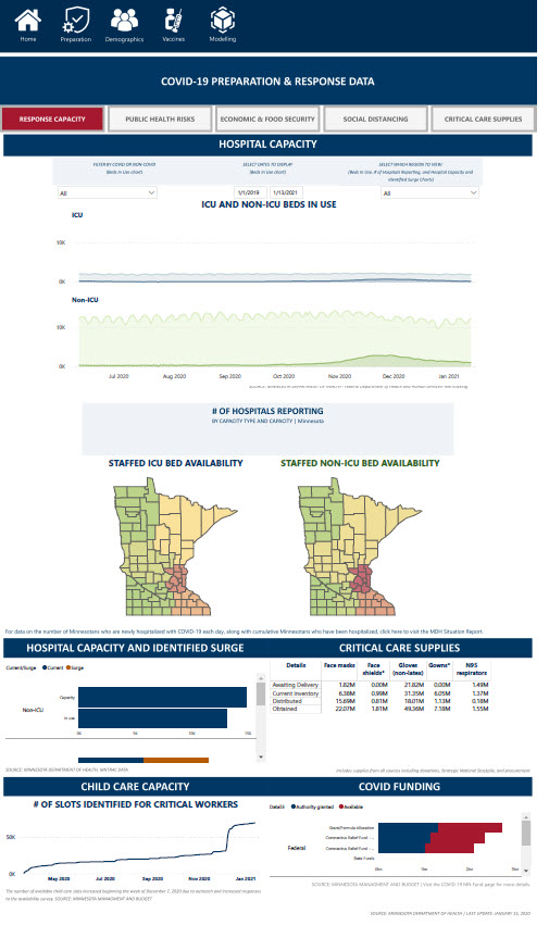
Preparation and Response
This is the operation side of the pandemic (i.e. capacity, economics, public reactions, etc.). There’s five pages in this section including: Response Capacity, Public Health Risks, Economic & Food Security, Social Distancing, and Critical Care Supplies.
Summary
Response Capacity
Response Capacity focuses on if we currently have enough available beds, staff, or supplies to meet demand.
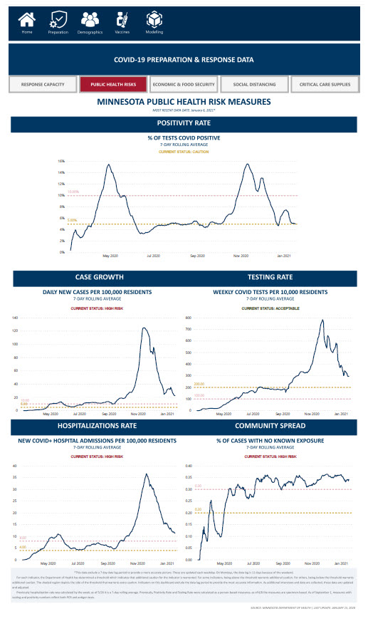
Public Health Risks
The Public Health Risks page focuses on tracking the spread of the virus and includes positive test rate, case growth rate, testing rate, hospitalization rate, and the rate of spread. Minnesota has established high risk and critical measures for each of these so we can see if we are not only flattening the curve but are getting to manageable levels.
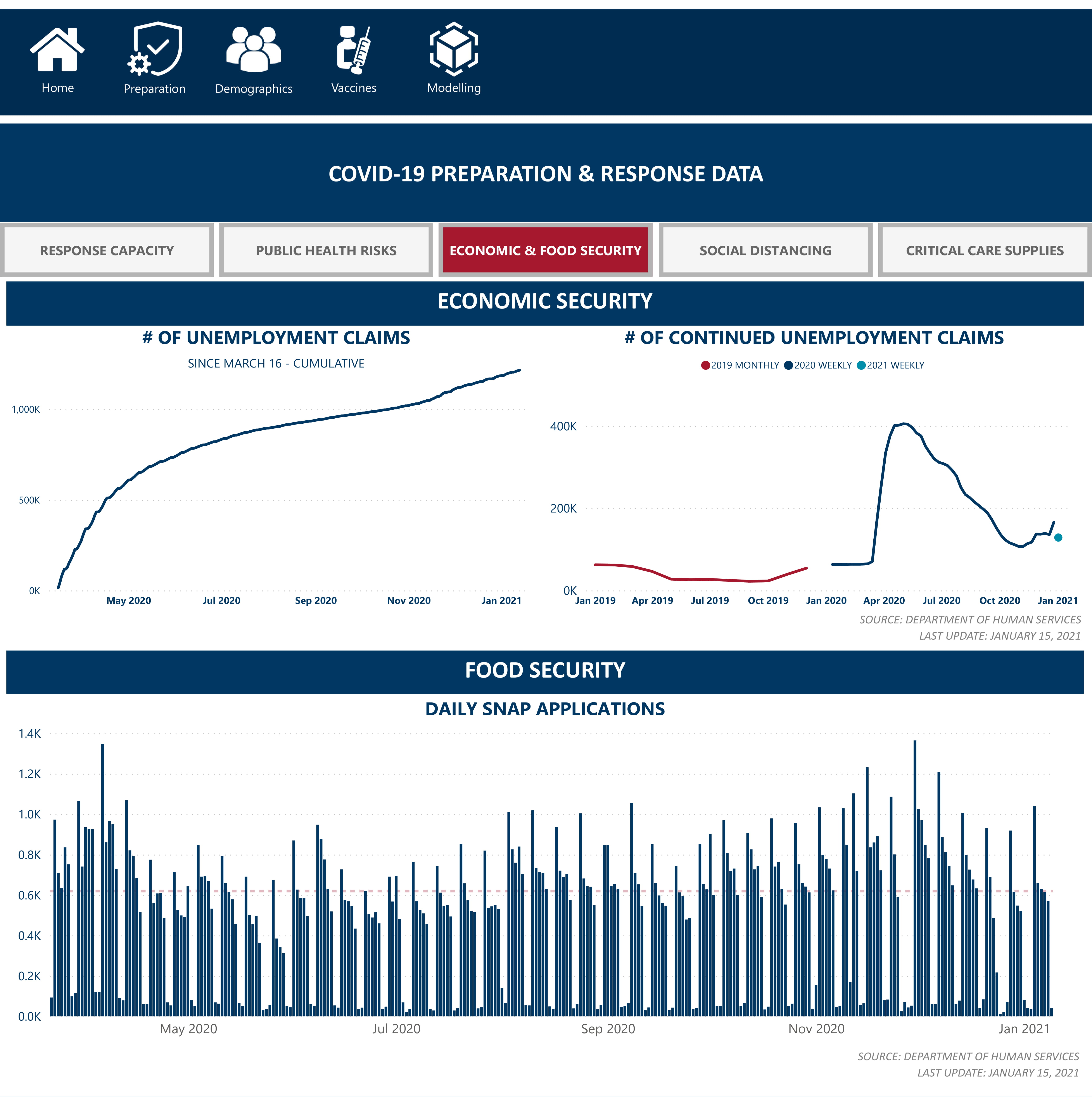
Economic & Food Security
This is a high level look at how COVID has affected Minnesotans livelihoods by tracking new unemployment claims, total existing unemployment claims, and applications for the Supplemental Nutrition Assistance Program (SNAP).
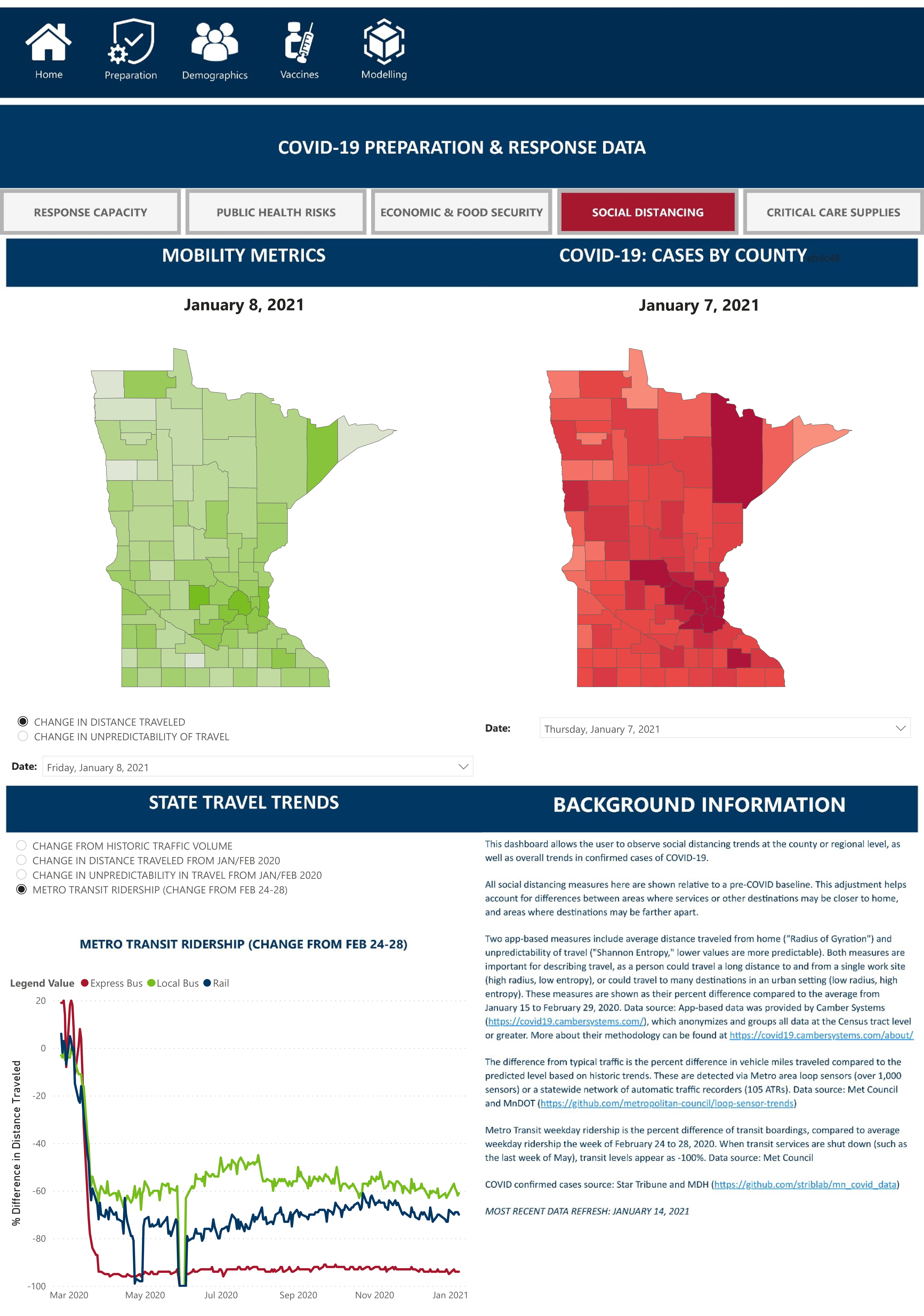
Social Distancing
Yes, it’s not truly ‘social distancing’ since it tracking if people are staying 6 feet apart would be pretty invasive, but we can see how travel increases exposure, spread, and new COVID cases by county.
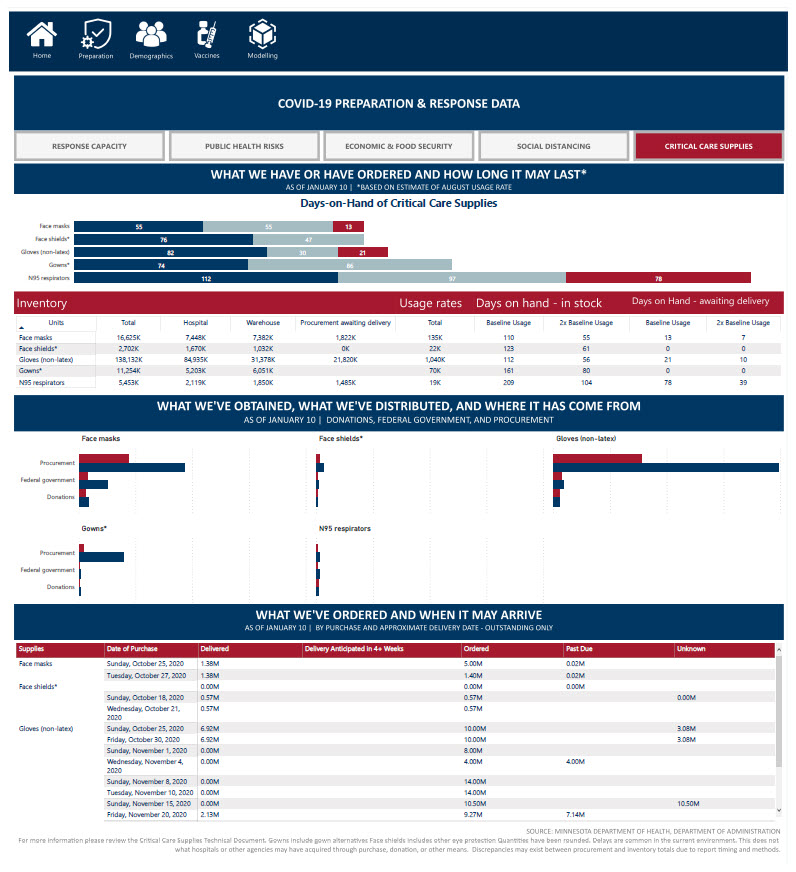
Critical Care Supplies
This page tracks the inventory, supply, and shipment of critical care supplies in the state. The state itself is working with the private and public sector to ensure that healthcare professionals have all the essential supplies they need to fight the virus even if demand for these supplies increases.
Vaccines
Now that the vaccines have been created and distribution is in full swing, we are no longer simply trying to hold off the virus, but bringing the fight to it. Demand for the vaccine is of course very high so this section of the report includes a high level vaccine summary, demographics on who is getting vaccinated, supply and distribution, and administration of the vaccine across the state.
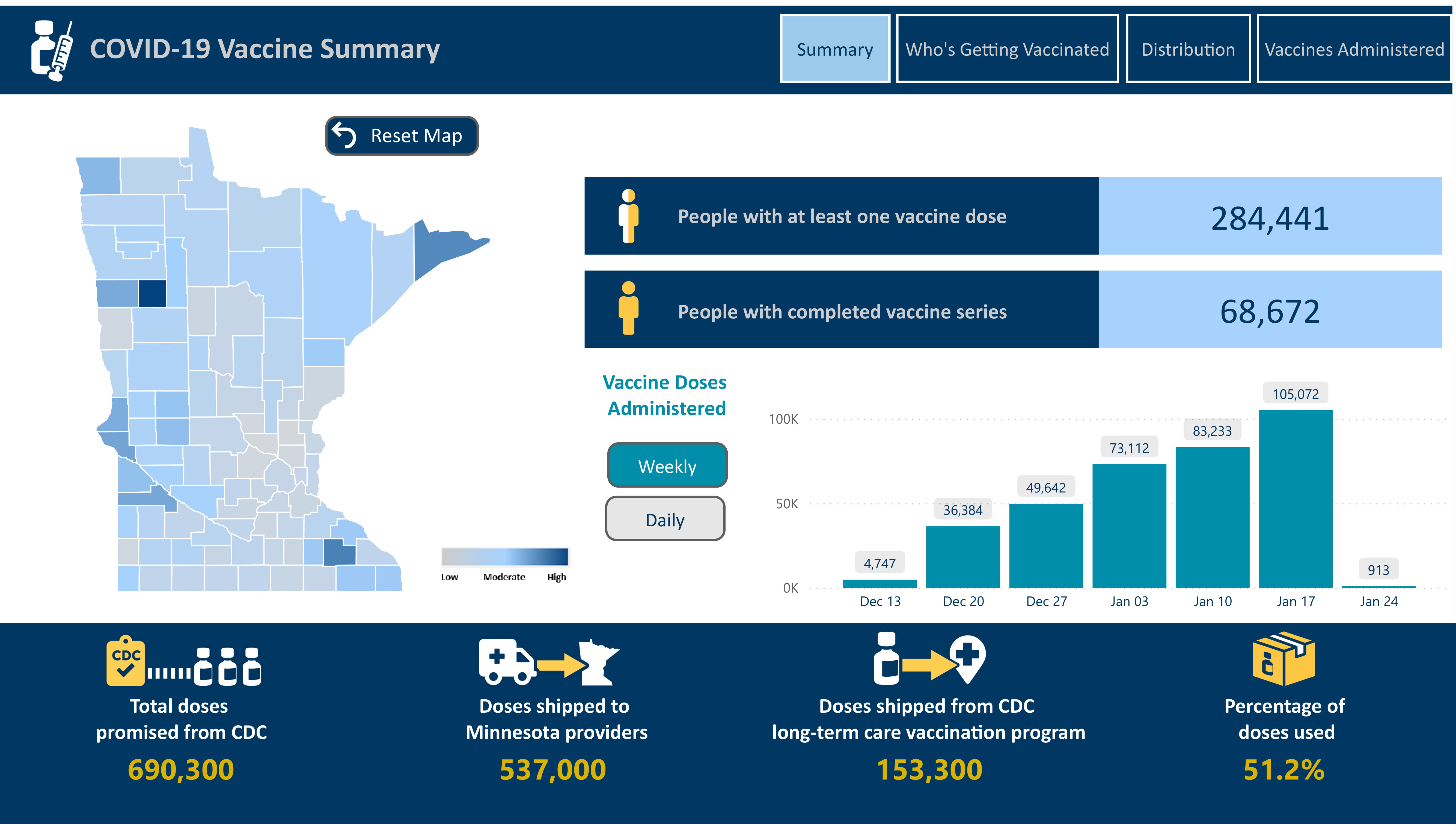
Summary
Summary
The summary answers most questions people have around the administration and supply of the vaccine (how many people have been vaccinated, how much of each type do we have, how many doses have been administered).
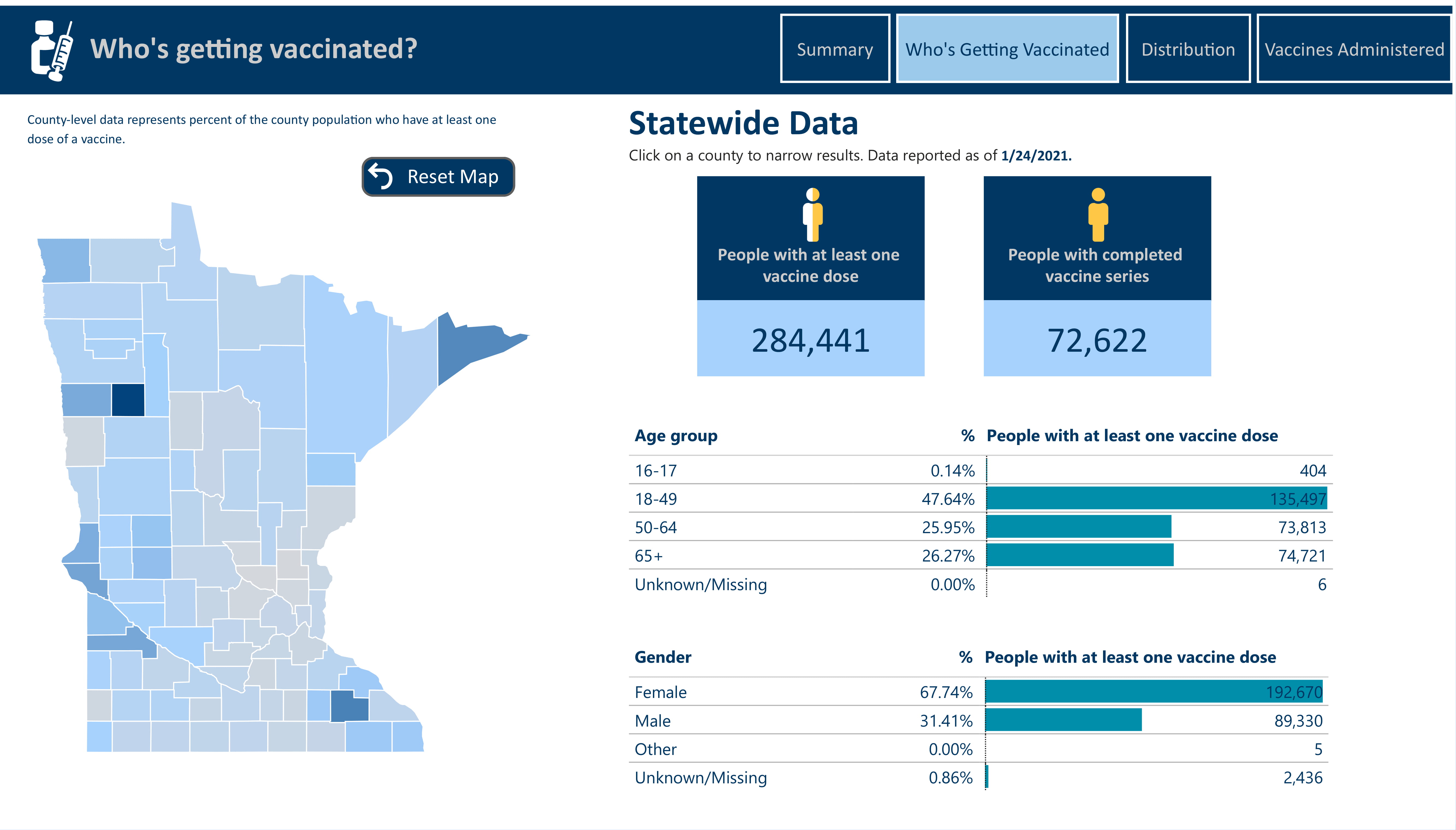
Who’s Getting Vaccinated
Currently very basic since the data is just starting to come in, but breaks out vaccine dose administration by gender and age group.
Distribution
Tracks the available supply of the vaccine, supply shipped to Minnesota providers, and supply shipped for the CDC Long-Term Care Vaccination Program. They just released more information on this so I wish I could have included that in my submission but I felt like that would be cheating.

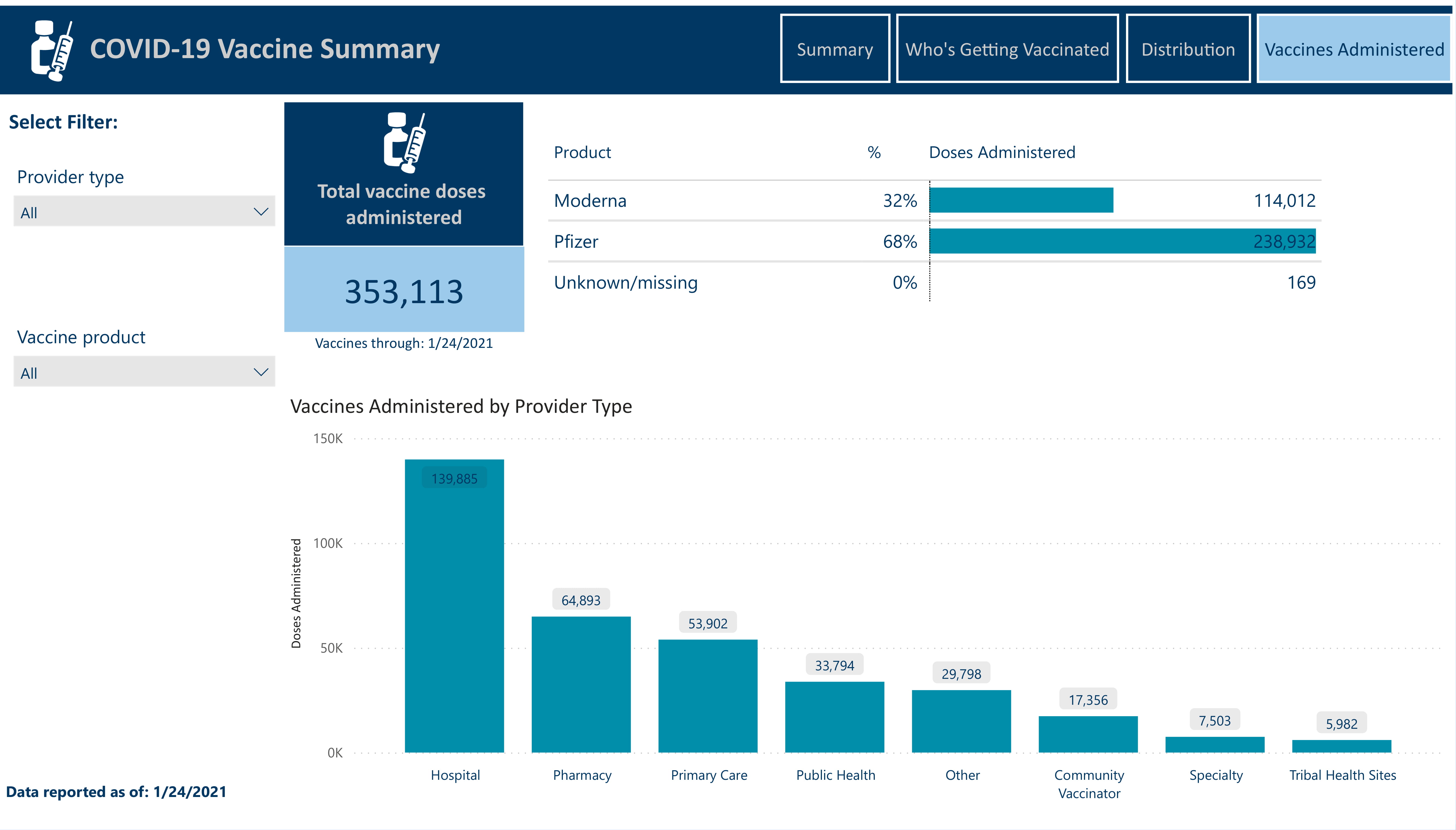
Vaccines Administered
Breaks out the administered doses of the vaccine by product type and provider type.
Demographics
This is probably the most fascinating part of the report in my opinion. This analyzes the impact COVID has had by demographics with a special focus on its effects by race/ethnicity in different facets of life. This section touches on the effect COVID has had on different demographics not only by the number of cases and deaths, but also by unemployment, worker characteristics, and homelessness.
Summary
Intro
This section starts with a basic overview of the purpose of this analysis and the need for such analysis when looking at the affect the virus has had.

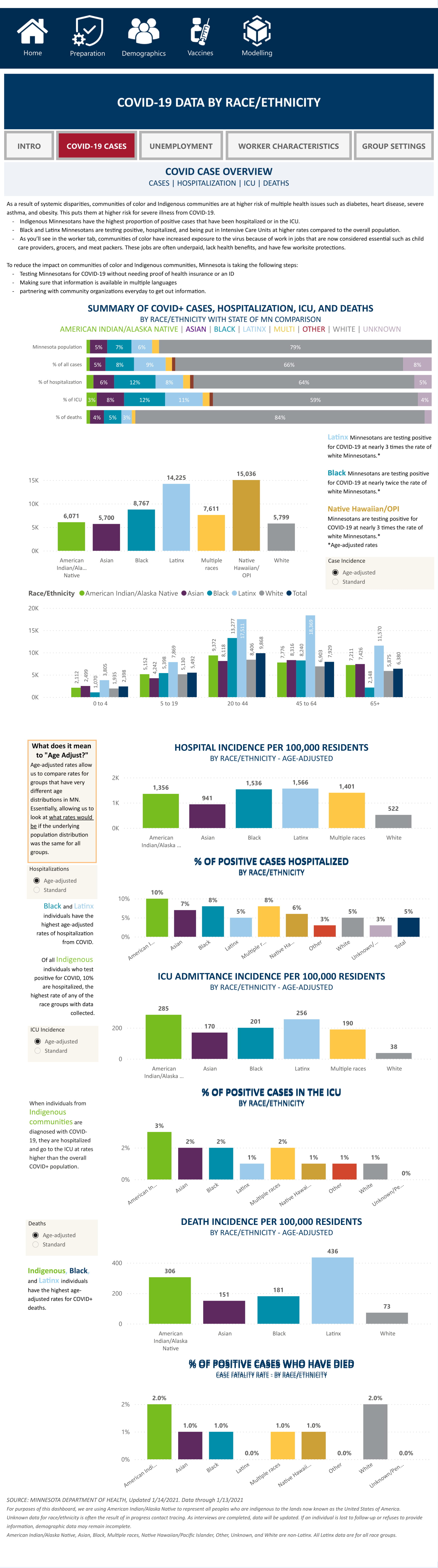
COVID-19 Cases
This is a detailed breakout of the main overview page, but analyzes COVID-19 cases, hospitalizations, and deaths by race/ethnicity. This is one of the longest pages as it’s really three pages stacked on top of each other.
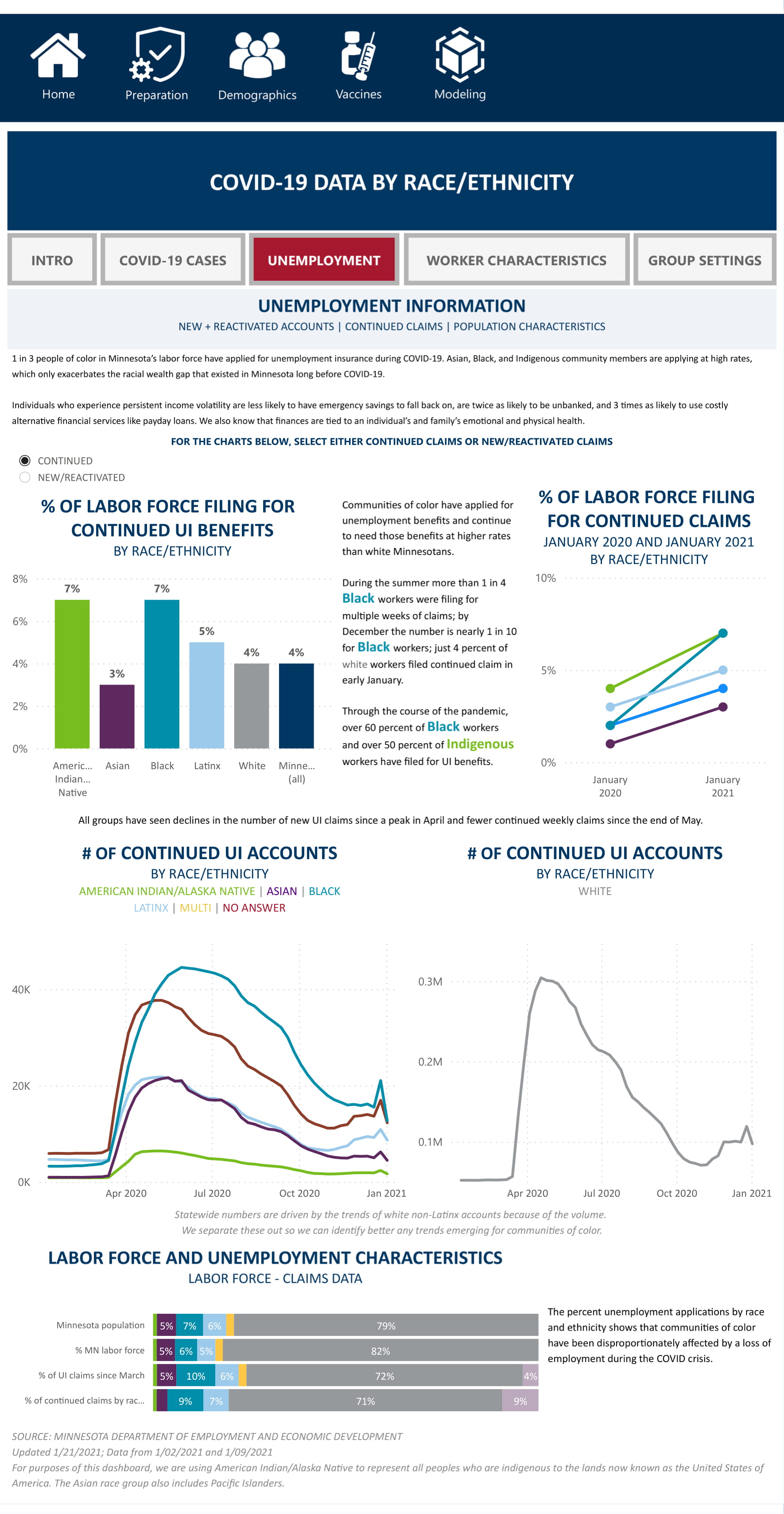
Unemployment
Takes a look at how COVID has affected employment by race/ethnicity. I would have liked to eventually add a correlation heatmap to this page to prevent any misinterpretation of the data, but the data does speak for itself here.
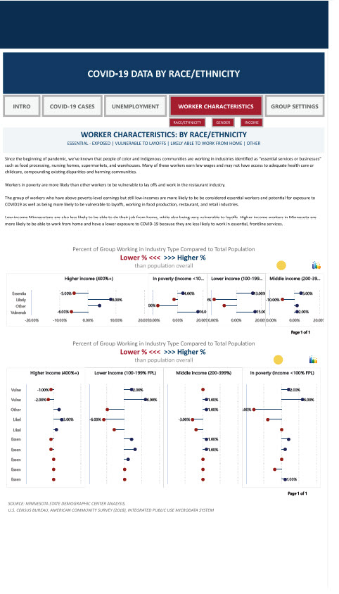
Worker Characteristics
The next three pages all reflect the impact COVID has had on worker characteristics (essential/non essential workers, ability to work from home, vulnerability to layoffs, etc.). The difference is in how you want to see the data: race/ethnicity, gender, income range. The top chart is a high level look for quick analysis and the bottom chart is industry specific.


Group Setting
This page focuses on the impact COVID has had on homelessness in regards to race/ethnicity. It also lays out the effects it has had on healthcare staff treating the homeless by race/ethnicity.
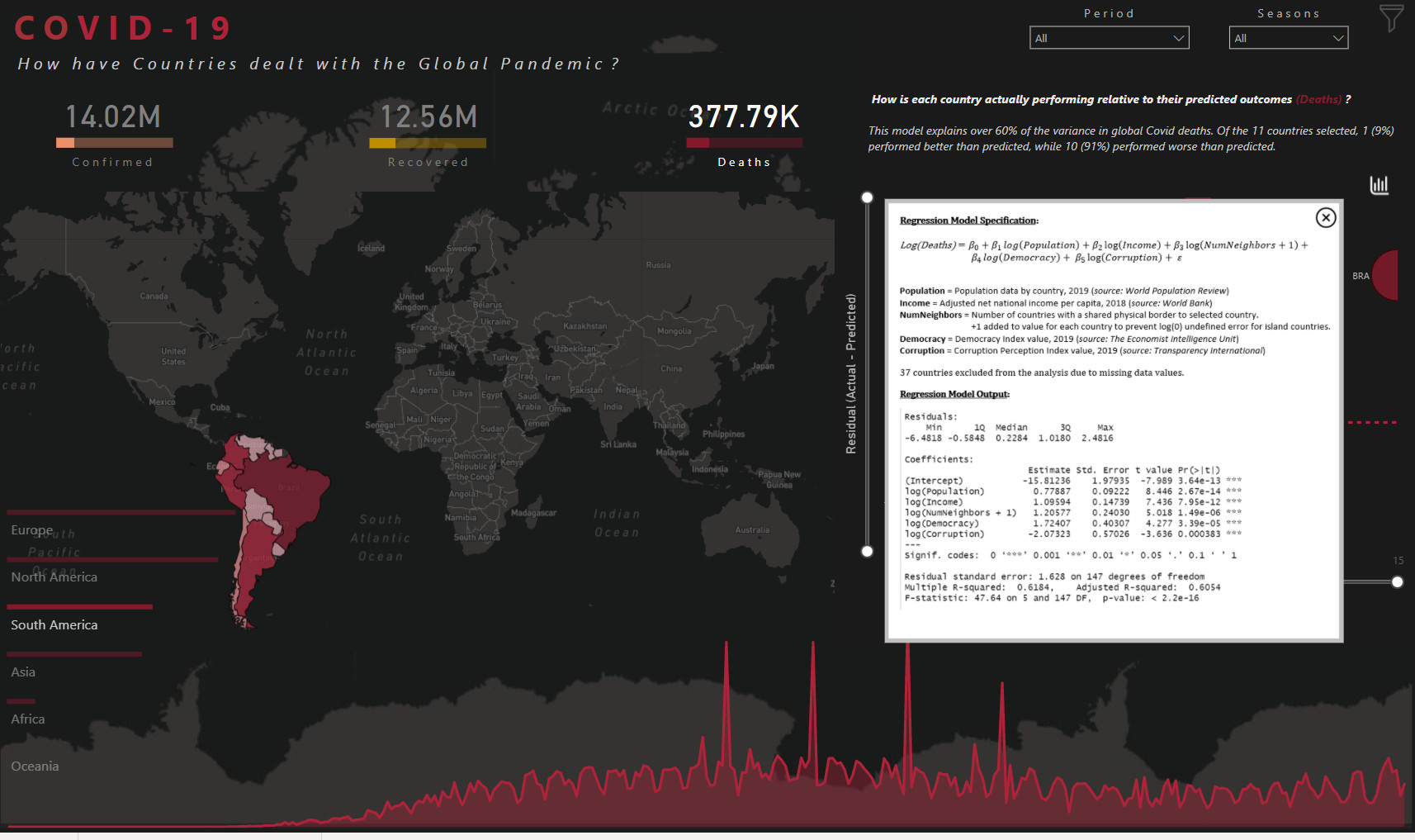
Advanced Modeling
I wish I could show you this visual, but I am having major network issues so this model isn’t able to connect to the source data, but it’s an incredible model. When my connectivity issues are resolved I’ll update this page.
A little bit about the model itself - the model used is a SEIR (susceptible-exposed-infectious-recovered) model and the interesting part about their model is that it contains a lot of flexibility around uncertainty which has really had a big impact on the spread and treatment of the virus. I was going to implement some additional what-if parameters to allow for a user to see directly how things like the availability of ICU beds, increases/decreases in travel, and funding impact the spread and treatment of the virus over time, but I since the code for this model is publicly available I am planning to incorporate that into some training videos for everyone. The model is rather easy to implement so I think it will be great for everybody to see the implementation of a model like that and how to add parameters to a machine learning model in Power BI.

I hope you like it!
Hi All, here is my submission.
Learnt a lot in these 3 days of putting up the dashboard. Thanks to the team.
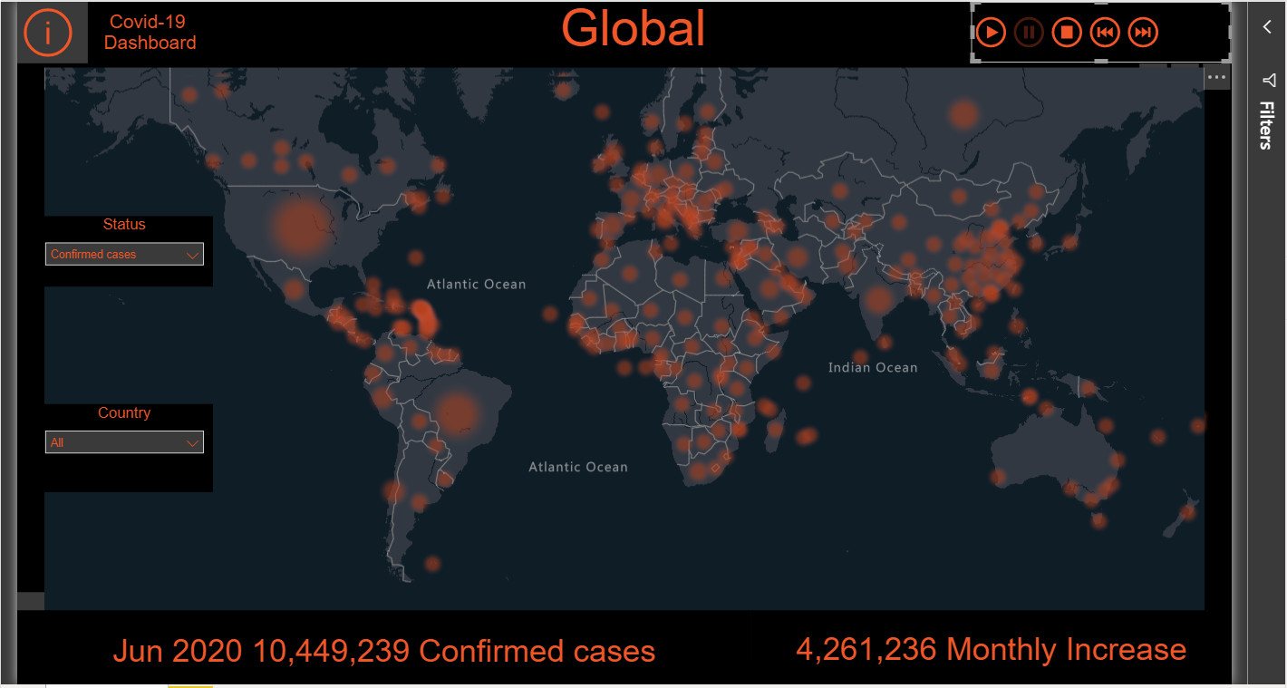
I had the same issue to update the data, thanks to Melissa and hajni157 for answering that and thanks to Emercado777 for asking the question.
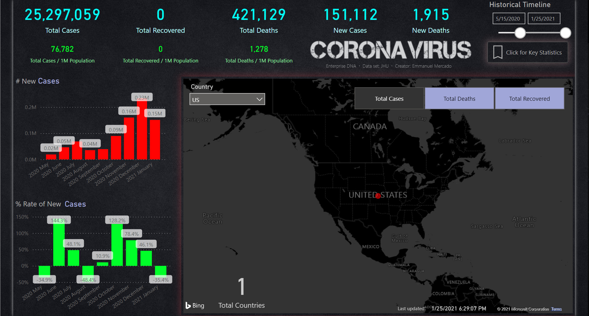
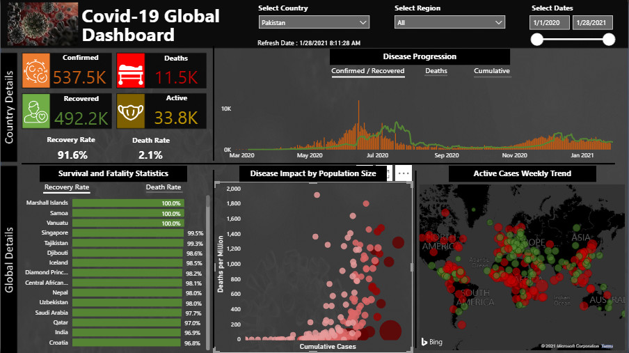
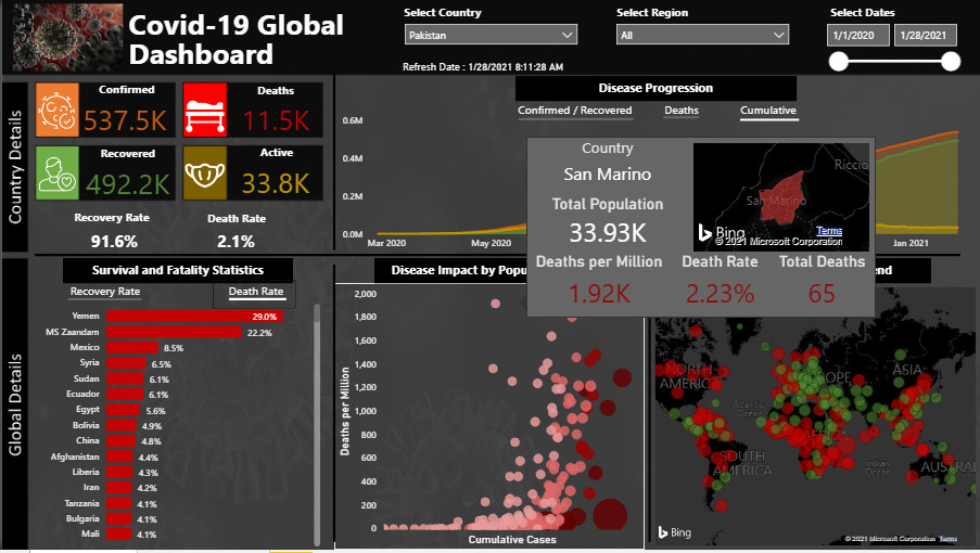
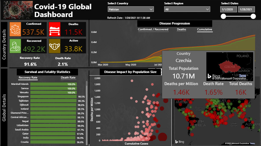
I have 2 pages and you can navigate via the button, the second page has some animation with the map visuals. Also have a custom tool tip , as you hover over the country, it gives you the statistics.
Regards,
Mustafa
Wow, amazing work Brad
Wow awesome work everyone, looking forward to reviewing.
Still time to submit!
Thanks,
Haroon
Thanks @sam.mckay! I wish I could have submitted the final version that connected directly to the source data since that version was scaleable to global data and most countries but it was still fun working with data from my home state.
I was able to update the Advanced Modeling page final visual for those who are interested!
HI @bradsmith ,
Cool work Brad. Is there anyway to get a clearer view of the dashboard? When I click on the screenshots, I am unable to zoom in – I particularly want to see the demographic section because I been meaning to find something like this.
Also, have you thought about adding a forecast of new cases into the model? I am wondering if this is possible. I suppose it would need to look at averages over the last 7 days or so and then project forward, but maybe you have more knowledge of how something like this would work.
Hi Everyone
Please see my submission for Challenge-11.
I will post a detailed review on the working methodology once the deadline for submission is over. You can experience the complete report at the following link.
Looking forward to any suggestions / feedback.
Regards
Abu Bakar Alvi
Hi @emercado777,
I went and split some of the larger slides up and included them as a reply in the project update forum post for my submission (Power BI Challenge 11 - Covid 19 Reporting from Brad). The demographic data was really what drew me into focusing on a specific state so that I could really do it justice.
And I didn’t really consider adding a forecast of new cases as a variable, but as one of the charts I did. That’s probably the most common use of the SEIR model and almost every forecast put out by a health organization uses a variation of the SEIR model. I take it back, I did consider using a LSTM model but the main drawback to that is that LSTM models for viral infections generally just focus on the number of infected and ignored other factors that truly have an impact on cases. It would be interesting to create a hybrid approach that uses the two together. It has actually been very interesting to see how these models have changed due to COVID.
Most of the models used were originally created fairly early into the pandemic and were created from much smaller/shorter outbreaks/pandemics. This is why many of these models only forecast 7-14 days out, they never had the such vast amounts of data for a single pandemic nor has it been this wide reaching so the models are subject to overfitting. A number of variants of the SEIR model have been developed as a result and some of them are truly incredible. There’s one in particular out of India that I really wanted to try but is much more complex and I didn’t have time to implement.
If you can’t tell, I get pretty excited about machine learning and these types of models haha
Alex, I’ve just gotta say I’m always so impressed at the elegance of your reports!
Thank you @bradsmith! I am also very impressed by your analytical skills & attention to details! I also enjoy reading your write ups! Your ability to describe your approach is inspiring! We also feel your passion for machine learning and data science 
Thanks @bradsmith for providing your thoughts of how you worked through this challenge. The SEIR model sounds like a more evolved forecasting method than taking the average total cases over the last 7-14 days – even better would be the hybrid that brings in additional information (perhaps health, lifestyle, age, etc). I hope I will be at the level to create it in the future. Nonetheless, very fascinating.
Also thanks for creating better screenshots of the demographic section. There is a definitely a lot of details there. I will need to sit and absorb it. You have given me a some good material to read this week. Thanks
Hi All.
Here is a collaborative effort from a group of experts. We wanted to go through the process that many of may experience in your work environments, and see what benefits and limitations arose. As well, part of the reason for the collaborative effort was to do a dry run for a future course/webinar on collaborative Power BI development that we’ll be putting together for release later this year.
So, without further ado, here is the collaborative submission from JMAP (Julius, Moore, Ali, and Philps).
(GP: I was the lucky one who got to make our post, but others did an overwhelming portion of the development, so …)
We’re still trying to figure out the best way to share our experiences in this group development effort, and more will become available shortly.
Thanks again to Enterprise DNA for hosting and administering these challenges, and congratulations to the Enterprise DNA community for all your efforts. Bon chance!
Greg (on behalf of @BrianJ, @JarrettM, @MudassirAli, and @Greg)
You can think of it like this: a moving average forecast is like a microwaveable dinner-quick, maybe not the best option, but it’ll be sufficient. The SEIR model is like a recipe. It can be as basic as Mac n cheese or as complex as a paella. Neither is really difficult as long as you have the ingredients and follow the recipe.
The great thing about the SEIR model is that it’s what’s called a compartmental model which is really just a model explaining how different people interact. Each letter in the model is a different group of people (in this case: Susceptible, Exposed, Infected, and Recovered). People can move between the groups but it’s generally in the order the letters are in. And since each letter is a group it can be really fairy basic like a SIR model (Susceptible, Infected, Recovered) or complex like the mode from India I was talking about, the SEIAQRDT model (Susceptible, Exposed, Infected, Asymptomatic , Quarantined, Recovered, Deaths, and Insusceptible).
And you’re welcome! I’m glad you found the extra detail helpful! Let me know if you have any questions!
@bradsmith wow wow my friend.You have done something extraordinary here. The analysis, the visuals & the explanation, everything is outclass. Well done & thank you for participating in the challenge. Really amazed to see this type of work being produced here. Excellent.