Power BI Challenge 11 – Covid 19 Reporting

@chris786,

@alexbadiu Is spot on in identifying the issue. The alternative way we chose to handle this was to initially normalize the data in Power Query back to the marginal value for each date, rather than the cumulative value. Involves a bit more work up front, but now all your traditional measure approaches will work properly.

  • Brian
2 Likes

Thanks Alex, didn’t think of that.
Great…will get to work on it.

Thanks Brian, for hoping in.

@tweinzapfel,

In digging into the data in real detail, I now see exactly what you mean. There are a number of instances (December 13 being the most extreme) where it appears that instead of coding missing data as a blank/null it was coded as a zero, leading to a huge discontinuity in the analysis. My plan is to treat these as if they were coded correctly as null and remove these observations from the analysis.

  • Brian

1 Like

hi, i did sent my PBIX file to powerbi challenge@enterprisedna.co did you receive?

Hi, is there any reason why my values for “Recovered” shows zero for the USA. It is zero for all of January. Does anyone else have this issue? I am guessing there is data missing.

@emercado777,

I’m not at the computer now so I can’t check that specific problem, but we’ve identified a lot of wonkiness in the Recovered data. While we’re reporting it minimally on the report for completeness, we are focusing our primary analyses on Confirmed and Deaths.

  • Brian
1 Like

@BrianJ
Thanks for looking into things Brian but the data does appear odd.
Assuming the data is cumulative, I get a maximum unfiltered total for recorded deaths of just over 376K which is incorrect based on the Joh Hopkins Dashboard. I have now downloaded the CSV’s and will take a look again later.
Regards,
Craig.

Problem Now Solved.

2 Likes

Thanks for the quick response. Yeah, the data seems to be missing some values there. Anyhow, no worries. I might need to make some assumptions when doing this.

Here is my Submission.

Attached PBIX file:Challenge 11 w ISO.pbix (1.4 MB)

Link to PowerBI service:

4 Likes

Hello to Everybody,

Please find here my 1 page solution to this Challenge. I am first participant.

Link to webreport

Let me give you a short description of my work:

In the summary of COVID situation I had 4 main objectives :
1: have a quick global vision of main indicators with international comparison
2: be able to dig into any country in detail with all main measures to set up a country diagnosis
3: show trends, actionable indicators that decision makers need
4: keep historical data for further analysis

You can track daily new cases and deaths, but I also calculated 14 day average measures (generally used in covid statistics as well) to visualise cleaner trends without having the daily fluctuation in data.

By using the time slicer, you can visualise cumulated data for any period, for instance to compare the First Wave results to the Second Wave results of the pandemic.

On the map visualisation it is easy to have a global view how the different countries are impacted at the moment (size of the bubble = average daily new cases taking into account last 14 days). Trend is shown vs 7 days before to show the evolution of this same 14 days average indicator. By changing the time slicer you can see which were the countries with worsening trend for instance a month ago, and how this changed for now.

Continent category is mainly used to have better visualisation of data by geographical zoom on the map but also by ignoring “extreme data” : ex: without selecting Europe, it is difficult to see relative size of the bubbles for European countries due to US extremely high value.

I voluntarily did not focus on the active cases information, as it seems the least reliable and the least accurately managed by authorities.

Regards,

7 Likes

Challenge Participants,

If the cumulative reporting data structure in the Johns Hopkins data is giving you as big a headache as it gave me, be sure to check out @markperrone’s excellent post here for a relatively simple solution:

– Brian

4 Likes

Hello All,
This is my submission for Challenge 11.

Data:
I used the data provided by EDNA. I continue the development using given PBIX.

Approach:
I wanted to show most important details in also as simple as possible. Therefore I used colours to differentiate the 3 categories . So user can understand the report even without reading the title. Also I used dark theme because I feel Covid 19 brings negative effect to World. I used most important metrics to show in this report. Also Added date filter to filter the result by date.

3 Likes

Here is my submission. I still have some things I want to add but it will have to be added in v2 later as I only had a few hours to work on this one.

I added two parameters. The first one is to estimate the number of people mourning for their loved ones. I think this is an important impact of COVID-19 deaths. The second one is a cases multiplier. I added this one after articles saying the number of people reported as having COVID can be much lower than actual, due to mild sickness/asymptomatic or when many people get it in the same residence. After the first person is positive they no longer need to test to realize they have it, so it won’t get reported in official numbers. This is important for the deaths % of confirmed, and also confirmed per 100k population views (I haven’t added population yet!).

Edit: fixed the counts formula, will take a few mins for the report link to update.

5 Likes

Thank you Haroon for setting this challenge. This is the first of the challenges that I have taken part in and I have found it really useful to get a bit more familiar with the presentation tools available in Power BI.

I am still getting to grips with some of the whizzier graphics that I have seen on other submissions - but this has been really helpful for me to explore the use of custom tool-tips to enable more detailed numerical information to be made available to a user while staying within the brief that it should be a 1 page report. I have taken a screen shot of the report - but hopefully the link to the app will work too.

https://app.powerbi.com/reportEmbed?reportId=ff99e155-0a6f-40f7-975d-62d1f1034b15&autoAuth=true&ctid=05ce1cbd-1d9d-44ba-8c1d-2ff97ee4b6ff&config=eyJjbHVzdGVyVXJsIjoiaHR0cHM6Ly93YWJpLW5vcnRoLWV1cm9wZS1yZWRpcmVjdC5hbmFseXNpcy53aW5kb3dzLm5ldC8ifQ%3D%3D

Have a great week.

Chris

7 Likes

Everyone,

Attached is my submission. For this one, I opted to keep it a bit simple as the data set was limited, but more importantly due to limited time. However, my approach on these challenges is more about learning new approaches, visuals, etc.

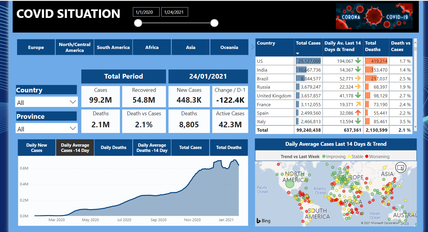
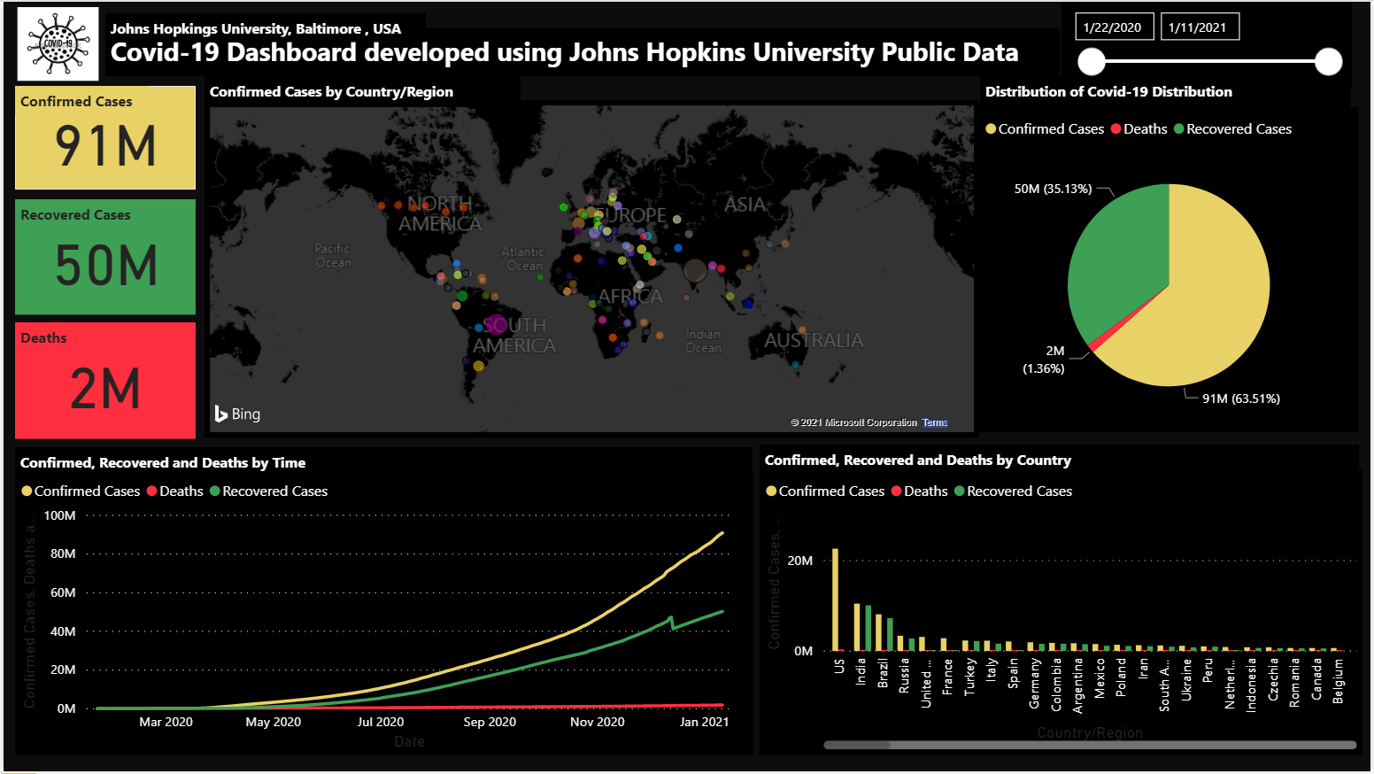
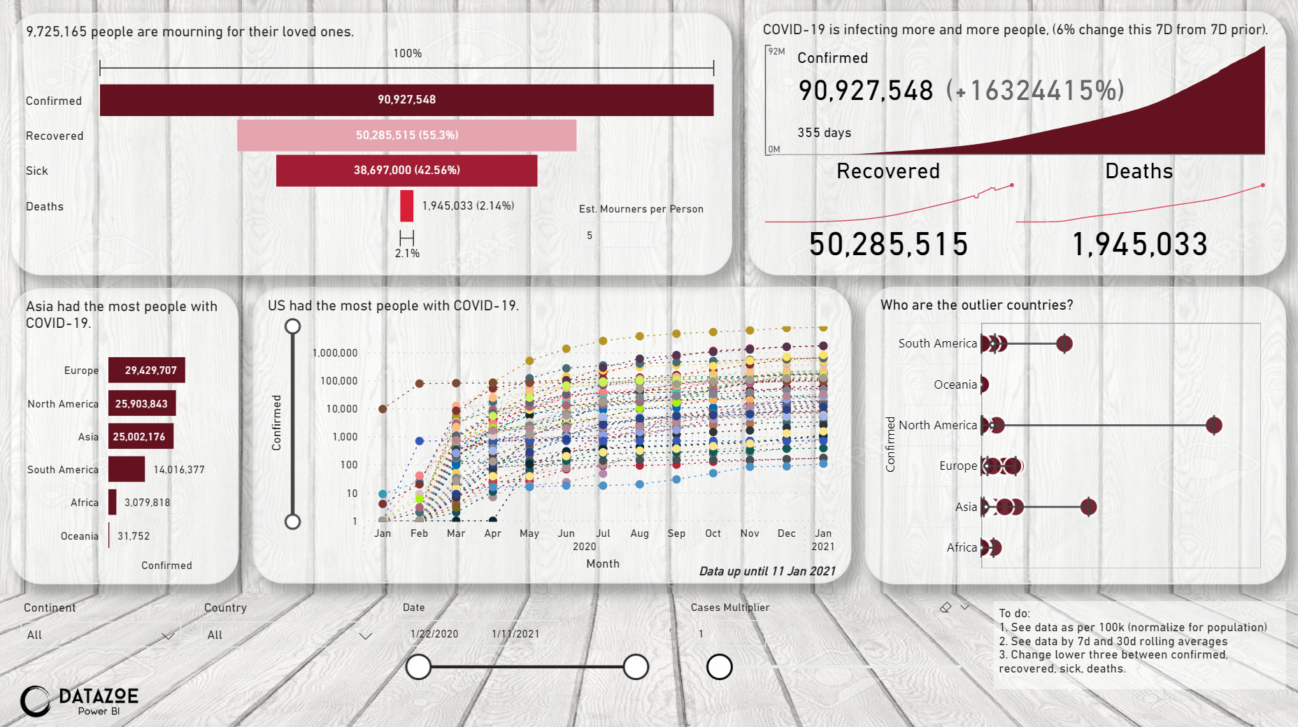
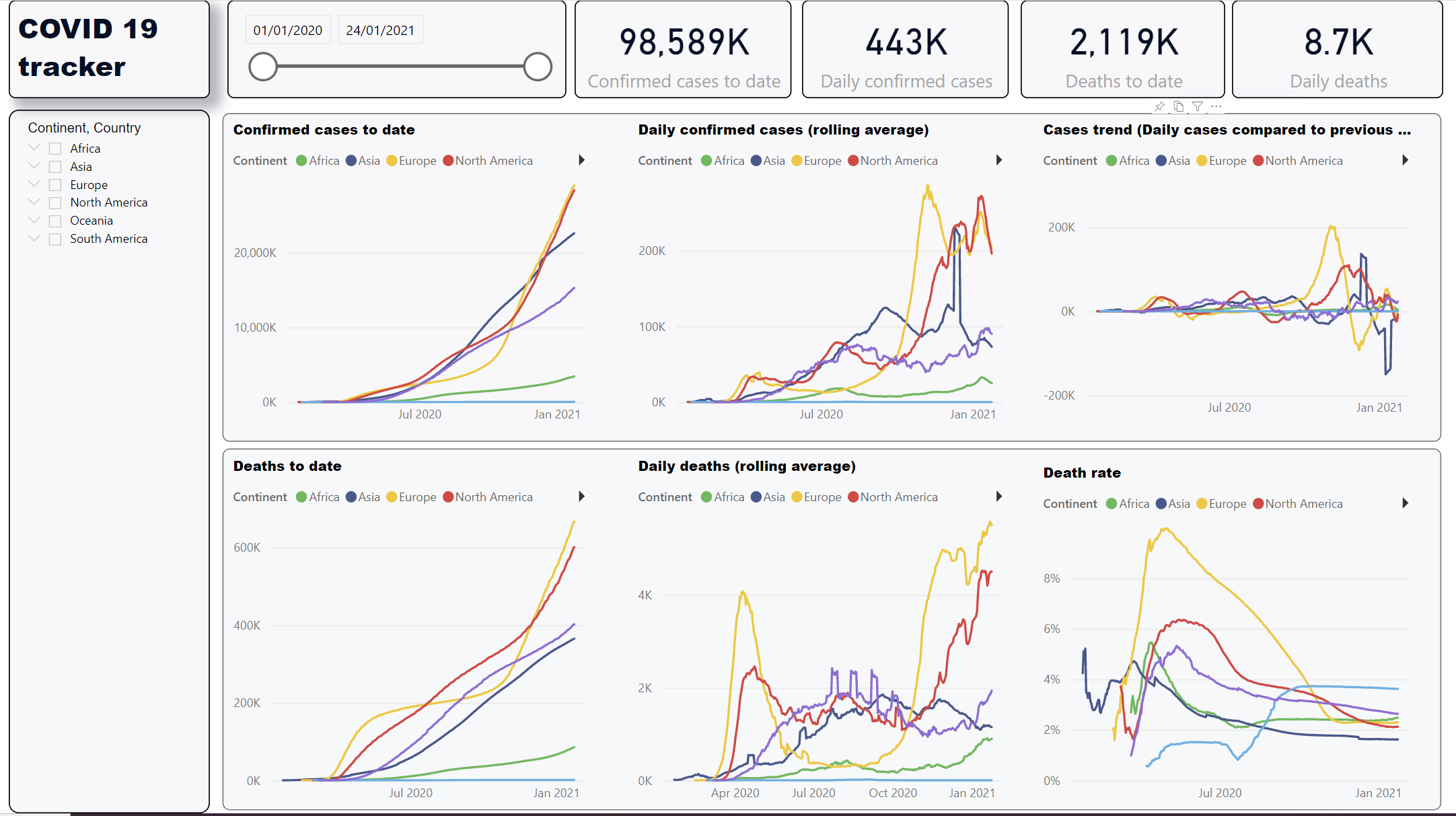
Here are two screen shots. I have a toggle button (the white button above location slicer) to flip between charts showing the information by “Confirmed Cases” versus “Deaths”. I ignored the “Recovered” data.

Here was my approach:

Data
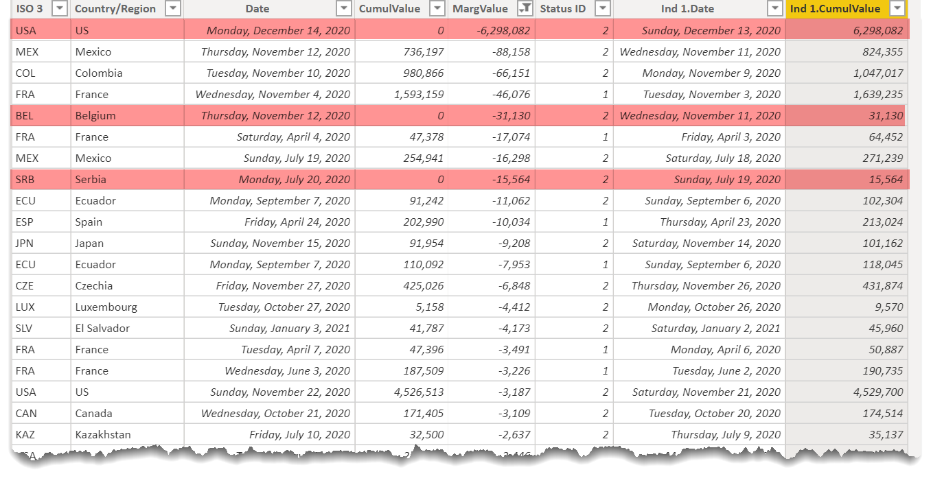
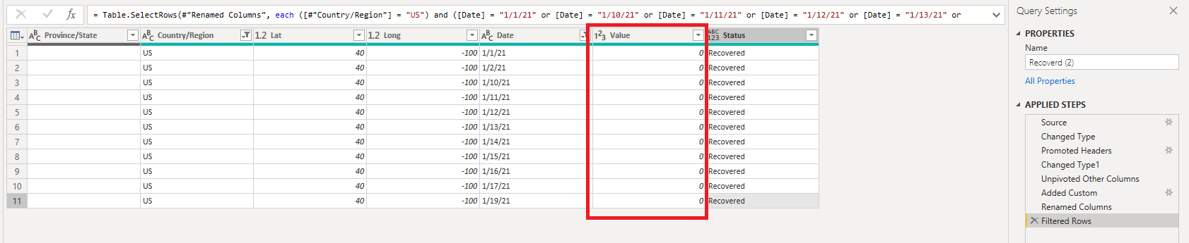
Given that the count in the original data set is just the cumulative amounts for a given day, I created 4 additional calculated columns in the Covid Data table. I opted to go with calculated columns instead of measures as I just found it quicker this time and the data set was relatively small. The columns were:

“Previous Day Count” – this was used to get the value from the previous day which would then allow me to calculate what the daily count was. I added variables to take both the category (Confirmed, Death, Recovered) as well as location.

“Daily Count” – this would just be the amount in the original Value column (provided with the dataset) minus the previous day count above.

I then added two more columns to find out what the daily change was from the previous day as well as the percentage change. I was hoping to use this information to track the % change over time – but ended up running out of time. I’m hoping someone else did something around this.

Key Measures
There is nothing fancy here. Mainly the daily counts for each category and then 7 day moving averages. I also created Top 10 countries for both confirmed cases and deaths.
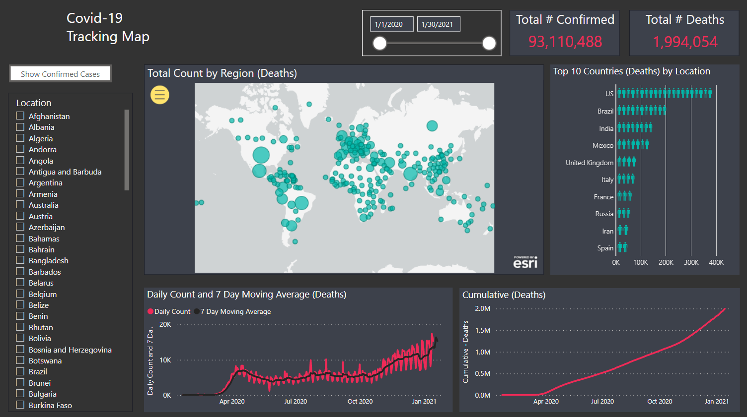
Visuals
Very standard visuals here. I did use the ArcGIS map visual but found that with this as well as the standard Microsoft map that the bubbles representing size aren’t very good at representing the actual amount. A small bubble could be 20 cases or 20,000 cases and they look to be the same size. So overall, I didn’t find this very effective. I am going to review others who used maps to see what you all did.

A new visual that I have never used before is the one for the top 10 countries for confirmed cases/deaths. I used the Infographic Designer visual (available from the custom visual location) – and then used people as the icon. I thought this would be the most relevant to display the number of cases.

Credit for the icon

Icons made by Freepik from www.flaticon.com
7 Likes

Hi,

I noticed that when I refresh the John Hopkins data set, PowerQuery does not fetch the newest dates. I think this is because the column dimension is hard coded into the applied steps of PowerQuery.

Is there a simple way to add a dynamic column to the applied steps, so that when refreshing the data, all the newest data will download from John Hopkins site?

https://raw.githubusercontent.com/CSSEGISandData/COVID-19/master/csse_covid_19_data/csse_covid_19_time_series/time_series_covid19_confirmed_global.csv

1 Like

Hi Emercado777,

You can simply delete the Columns=… part by clicking on the Source Step in the Applied steps. I had the same issue before. Here is my example that left after deletion:

= Csv.Document(Web.Contents(“https://raw.githubusercontent.com/CSSEGISandData/COVID-19/master/csse_covid_19_data/csse_covid_19_time_series/time_series_covid19_confirmed_global.csv"),[Delimiter=",”, Encoding=65001, QuoteStyle=QuoteStyle.None])

Regards,

3 Likes

@hajni157 is correct, you can replace that hard coded value by null

For example.


.

see the documentation here

2 Likes

Excellent, that worked! I added “null” to the column variable. I also added an additional step at the end of the transformation to change the date type of “Value” to Whole Number.