After seeing the data for this challenge I was pretty sure that it would be a smooth ride but the little did I know that there was no smooth ride at the analytical side. Not much was going on in the data transformation or in the DAX computation side but I hit a dead end on how to present the analysis. What’s worse is I started late on the challenge thinking it would be an easy one that turned out to be very difficult at least for me.
This time I wanted to do something different on the design side of the report. Therefore, I decided to combine a bit of Adobe Photoshop with my report and now I am wondering what it would be like to go full out on the design side with the help of Photoshop or Illustrator. This was to give the idea what the PowerBI Analysts can do when they collaborate with the in-house Graphics Designer in the organization or by learning some Graphics Designing Skills themselves. If my company is reading this post then I want them to know that I am interested in the Graphics Designing course  .
.
Story behind the Report
At first I thought that presenting the defects quantity would be useless as there was no comparative data to analyze with but later realized that there might be some correlation between Downtime & Defects and I was right. It is not necessary that the defective material will cause downtime as with some tweaks while running the material can avoid the downtimes. There were some instances where the number of defects were lower but downtimes were higher and vice versa.
Second part was to decide whether to present the Downtime in Minutes or Hours. I chose the Hours as I wanted to keep it consistent as the Costs are generally calculated per hour basis in manufacturing environment.
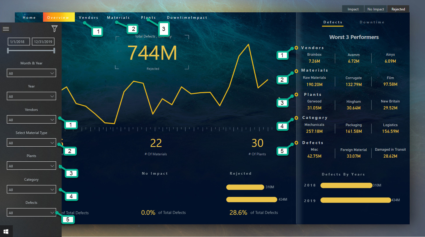
Third part was to choose what slicer to show on the report and what to hide in the navigation panel. The main slicer I found was the Defect Types that showed whether the defective material caused delay in production denoted by Impact or caused total shutdown of a particular production as the material was not suitable for use denoted by Rejected or the defective material had No Impact at all. However, the question I had was if the defective material had no impact then why the company had the downtimes? So I assumed that the Downtime was caused by reasons other than the defective materials i.e. maybe problem in a machine, power flickers, shortage of staff during vacation seasons or delay in getting the material. This was the Main Point of the analysis that will be shown in the Vendors section and in Downtime Impact analysis.
As there was not much of a transformation at Power Query side, therefore we are heading towards the main report page.
Home Page
Here you can see the power of Graphics Designing & Creativity and how adding some cool tricks you can make your report stand out. It’s difficult to write everything as how I got the main page looking like this so it might be better to show with the help of a video later on.
However, note that here on the main page I have established with Gradient Color lines what colors I will be using in my reports.
Defects
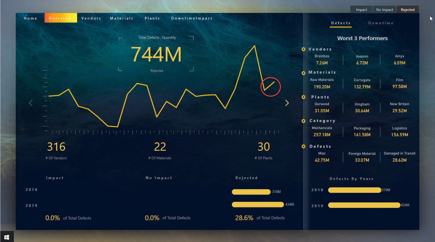
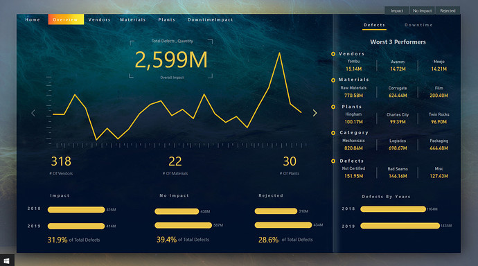
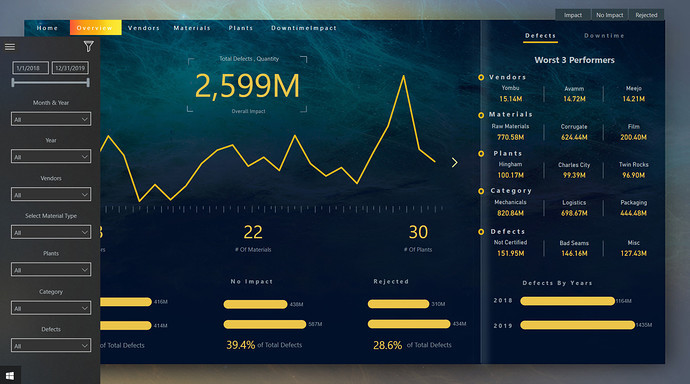
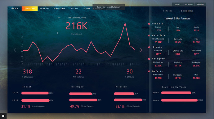
Here comes the second page where I thought it would be better to give the overview first and then head over to the detailed analysis. However, it turned out that the Overview page was in fact not just the overview but showing many deep insights. The first thing you noticed that the screen is capturing the Total Defects Quantity and showing the trend of the occurrence of the defects. The main slicer I have put at the top right corner of the page to make sure the user won’t miss out as to how I want them to slice and dice the data. If you click on the slicer Rejected it can be easily seen that the Trend is upward and the company needs to look what’s causing the issue here.
Moreover, The worst 3 performers in all the dimensions can be seen here which gives the company a lot of information as to which areas to target for improvement.
Note When designing a dashboard the biggest point that people miss out is the consistency either of the colors or of the order of the presentation. Confused right? Let me tell you what I am talking about. Note that the order of the dimensions on the navigation panel is the same as the order on the Worst 3 performers. On top of that, the order of the dimensions even in the navigation panel is the same.
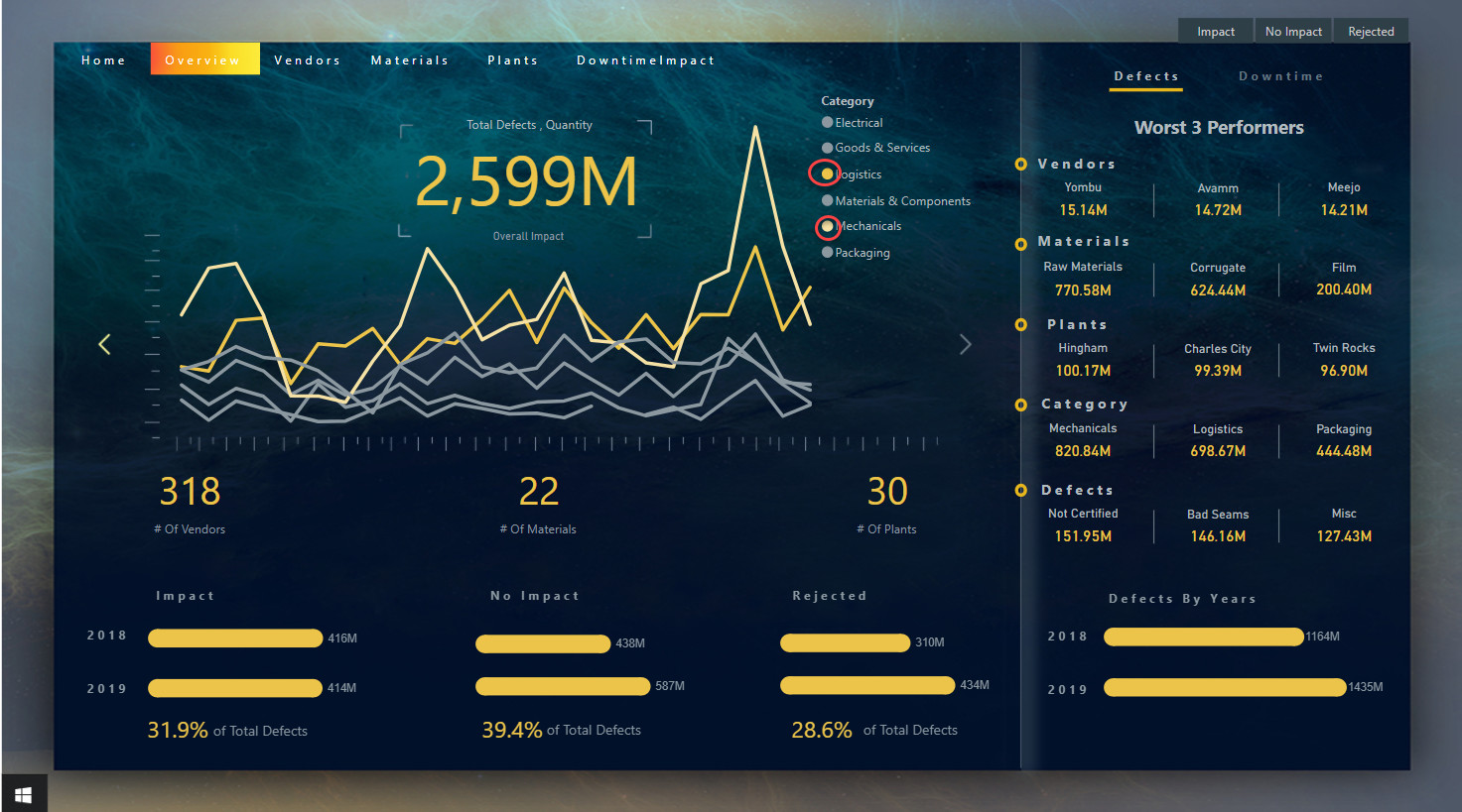
I also want to give user the detail of the trend by Category wise that you can access by clicking on the next Yellow Icon at the right side of the Line Chart. You can also notice that I highlighted Logistics & Mechanicals with the yellow color and gave the rest same color. The reason was to show that the Defects relating to Mechanicals reached the all time high in a particular month whereas the Defects caused by Logistics are on the rising trend.
As of now, we have also established that the Yellow color will be used for The Defects only.
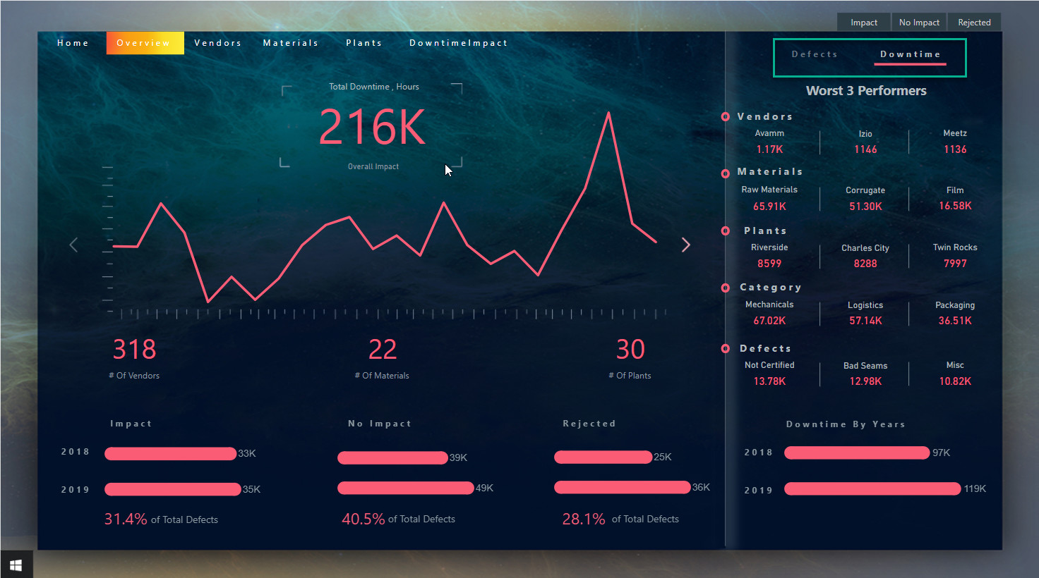
The same type of information is also shown for Downtime but in Red Color. You can navigate by clicking at top right side of the page.
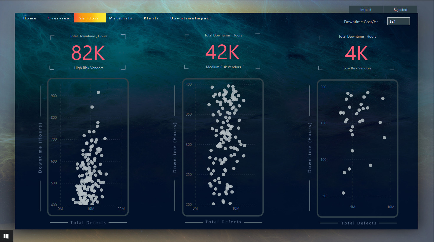
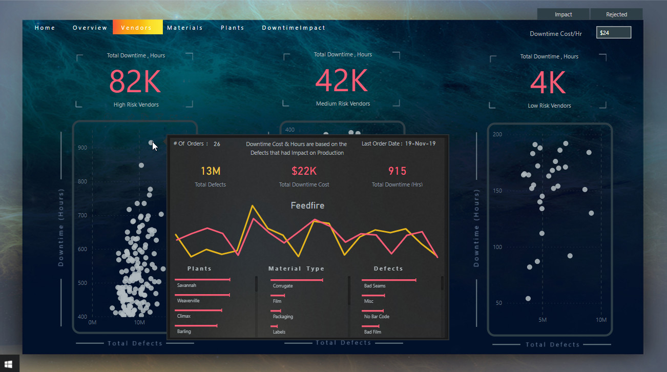
Vendors
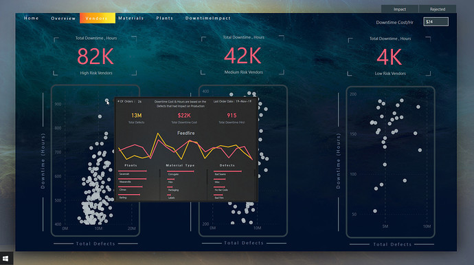
Here the analysis gets a bit tricky as I just want to analyze the vendors whose materials actually caused downtime. Therefore, I computed the Downtime Hours here only based on the materials that caused delay in production but included the total defects as company might want to use some KPI’s to monitor the performance. Through the tooltip, you can also see the impact in "$$ therefore, also included the Downtime Cost/hr parameter at the top right side of the page. Also with the tooltip, it is very easy to see the combination of Vendors, Plants, Materials & Defect Types.
The visuals here are my most favorite as I have successfully managed to show Dynamic Segmentation differently. I calculated 3 measures giving different criteria for e.g. if the number of hours are greater than 400 then the Vendors are
High Risk and so on. Then I placed each Criteria in different Scatter Charts where you can even see the highest and lowest Downtimes caused in each of the Criteria
High, Medium & Low.
Furthermore, if you look at the topmost right section, I excluded the
No Impact slicer as I want the users to know what they are looking at without explicitly mentioning on the page.
P.S. This will be my go to visual for scatter charts from now on as I like the way they look and love the way how so much information they convey without cluttering the page with many details.
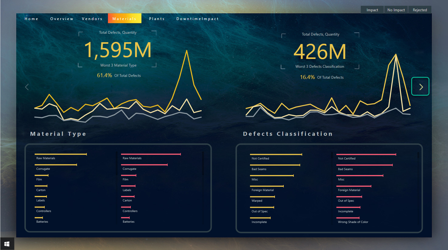
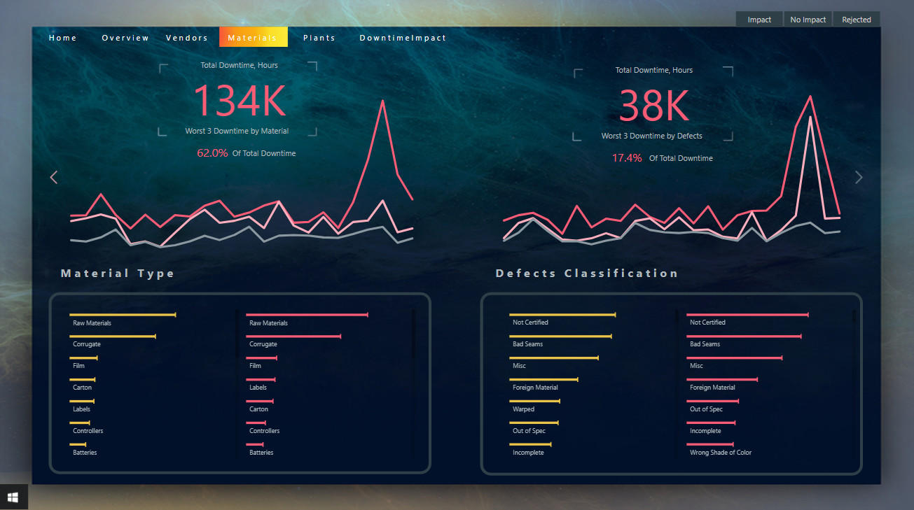
Materials
Here I wanted to show what type of materials causing issues and what are the defects in materials. You should note that in our reports Yellow color always come first before Red as we started our report with Total Defects. These are the little details that should be kept in mind for uniformity. In the line charts, I have added only the worst 3 as again keeping the uniformity with the overview section of the report. However, here I disabled the tooltip as the user can easily see in skinny bar charts below by clicking on the lines in line chart. You can also see the analysis by Downtime when clicking on the Next icon in Yellow at the right side.
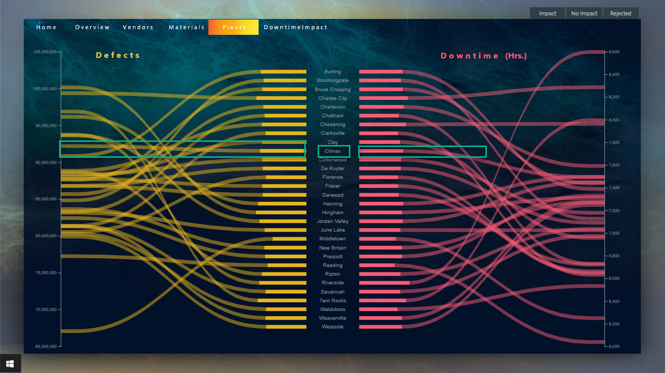
Plants
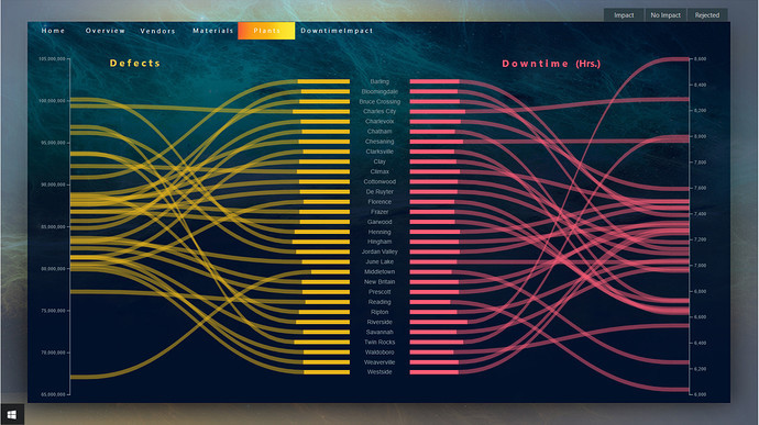
Even though the visual looks very appealing but I failed to derive the maximum information out of it because somehow it failed to show the Report Page tooltips same as what I showed in Vendors section. However, it still shows some key insights for e.g. in plant Climax, total defects quantity is increasing but the downtime is decreasing which is something worth investigating to analyze the cause and effects.
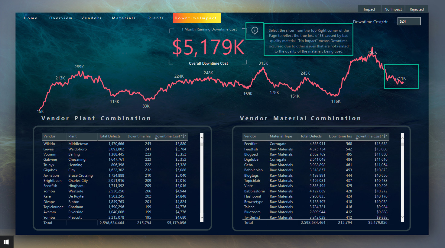
Downtime Impact
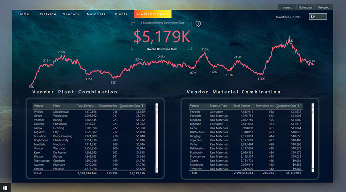
Here is where the management will get a heart attack after seeing what the defective materials has caused the impact in terms of $$ loss. The Card visual highlights the total $$ lost but if you select the Impact & Rejected from Top right slicer, the total $$ loss will be displayed only related to the reasons of poor quality materials. Moreover, you can also see the moving trend of the $$ lost indicating that recently the downtime hours have been declining.
At the bottom, the combination of Worst/Best Vendor-Plant & Vendor-Material combination can be analyzed by sorting the downtime cost in ascending or descending order.
Conclusion
In the end I would say I absolutely enjoyed creating the report and loved collaborating on the forum for the challenge.
Thanks to @haroonali1000 & EDNA again for conducting the 10th challenge successfully.
That’s it from my side. Hope you all liked the report & don’t forget to hit the like button 


Thanks to my brother who helped me in some design aspects of the report.