Everyone,
Here is the link to the "Empowering Sales Team W/Power BI: video. Looks like they are having some issues with the video, but you can downlaod the resource pack with the PBIX.
Thanks
Jarrett
Everyone,
Here is the link to the "Empowering Sales Team W/Power BI: video. Looks like they are having some issues with the video, but you can downlaod the resource pack with the PBIX.
Thanks
Jarrett
Here is my Visualization, though not a rookie, but your constructive criticism is appreciated. All thanks to my mentor @sam.mckay. I’m glad that my skills are improving daily.
Really like how you added the scroller, but think it would probably be best utilized at the bottom of the page stretched out across the whole page. Here is an example of what one looked like from the 1st challenge:
Thanks
Jarrett
Thanks, let me make necessary corrections
Well, you certainly didn’t rest on your laurels after the first win - another terrific entry. I have a few questions:

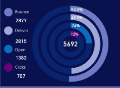
Nice dramatic effect, and a lot more space efficient than the funnel chart, which isn’t particularly readable in a small tile.
For the pop-out slicer panel, did you use bookmarks or hidden page navigation?
Did you use a specific tool to create your color theme, or just eyeball colors that worked really well together?
Thanks in advance! The way these contests give us the chance to learn from each other is fantastic.
Wow Walter, impressive work once again!
Sorry, yes it should be available now in the webinar series module at Enterprise DNA Online.
Video should be ready in a couple of hours
Well done Diana. Looks great.
Hi Chad, nice work.
One small piece of feedback on your one is around the colours.
Check out this new tool we’ve created in our AnalystHub application
Consistent colours, that work well together is an important aspect of Power BI reports I believe.
It will make things stand out more
Sam
Hi all,
I really encourage those who’ve participated to discuss and talk through your solutions in more depth in new threads.
I believe we can be sharing more about how we went about the project. Share ideas and also get feedback on how we can get better at our work in Power BI.
I’ve kicked things off here.
Let’s all place these into the Project Updates category.
Look forward to learning more about what you’ve done.
Sam
Hi Sam, thank you for the compliment.
It was a thought work with several combination and fancy thoughts before landing the final version. I tried the gauge and funnels but space usage was poor. I had to reinvent to meet my objective of having a single report page that provides both customer and engagement insights on all dimentions to provide our customer engagement manager (Janet) with a 365 view on one spot.
Hello @Walter - is this reported to the power bi apps so we can navigate to it? Looks really fantastic.
Hi Brian,
I reflected several times over the report tried some combinations that didn’t work. My objective was to provide a single report page with all dimensions for both engagement and customer sales.
I tried the funnel and gauge but space usage was inefficient as you mentioned. I couldn’t tradeoff my objective.
Try and error landed me to the Donut Chart. Did some trials- it was fun!
1)The trick is to adjust the send emails for each of the engagement metrics.
An example for delivered Donut (the grey Donut): first adjust the Send to exclude deliveries given the inclusive nature of the metric.
– “SentAdjustedforDelivery = [EmailSent]-[Delievered]” (If this adjustment is not done the percentage depicted on the Donut would be inconsistent)
Then place “SentAdjustedforDelivery” and “Delievered” measures within the same Donut.
Do this for all the metrics.
The next step is to delicately place all the Donuts and make them compelling to your taste.
Use “Format” ===> Shapes ===>Inner radius to adjust the size.
For the Pop-out Slicer, I used bookmarks.
The tool used to create the color theme are my “eyes balls”  and UX feelings I want to communicate.
Hope this helps.
Bravo! I was certain that you had used a custom visual for that graphic. I had no idea that the standard donut visual was customizable in that way – I’ve never seen that done before. Thanks very much for the detailed explanation. I learn something new every day here…
Hi,
Here’s my submission for the Challenge. though is coming late (Sorry about that)
am open to your thought and contribution on area of improvement.
DAVID.
Hello Sam! Can we, by any chance, be able to download the final report you made for this challenge?
Yep will release it in the coming days.
We just released three other showcases on the showcase page.
Here’s link to download my report for Power BI Challenge 2