I thought it would be a good idea to put down my thought process and development ideas from the latest Power BI challenge.
Here is my report dashboard
You can explore it more here
I think creating separate threads to explain your work is a great idea so the community to learn from you and also provide feedback. I recommend others participating in the challenge to do the same.
The challenge was all about understanding if there was any correlation between the sales a customer had with a business vs the engagement we saw from them via an email marketing strategy.
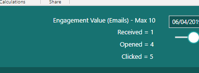
The data itself was not perfectly set out initially in my view to create the type of analysis that I thought would be interesting so one of the first things that I did was I came up with a metric that we could compare our total sales to.
I called this metric the engagement value. And I decided to break it down and give a score value if an email was received, then opened and then clicked. By giving a score to the importance of all of these behaviors from our customer I was able to come up with an overall score per email received out of 10.
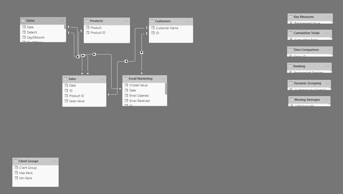
Once I was able to do this you’ll see that my model was far more efficient and I was able to work with the waterfall methodology that I like to discuss quite often.
You’ll see that my model is now very simple to understand and operate and I can easily link up my date table and my other lookup tables to different fact tables. You’ll also see I have multiple fact tables (Sales & Email Marketing) which is absolutely fine if it makes sense.
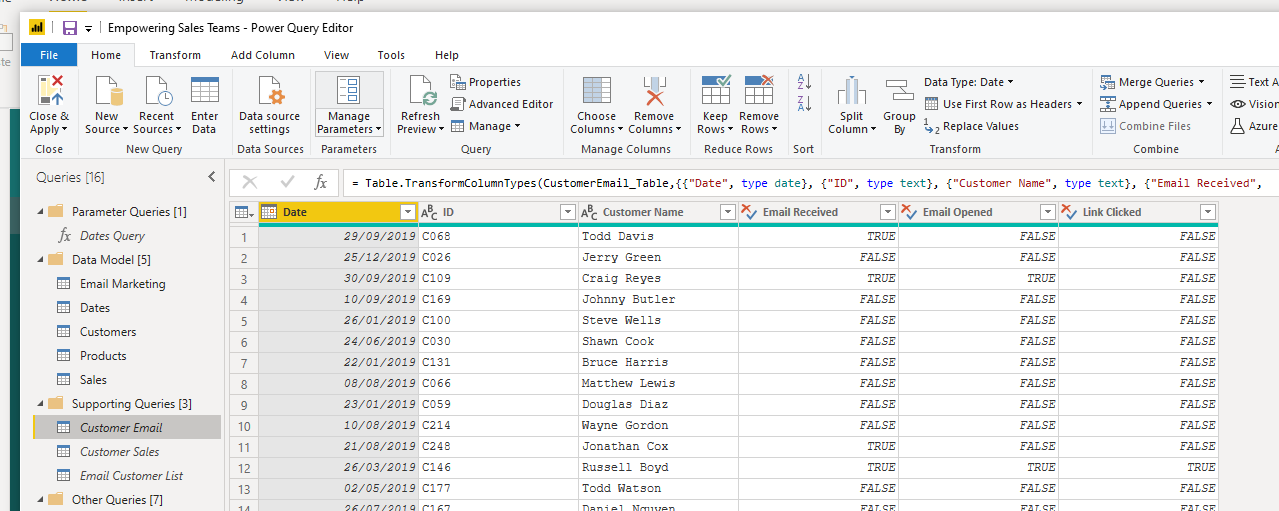
To get to this point I did a bit of work in the query editor which made my job in the data model much easier. You can see a lot of the work that I’ve done for this in the recent webinar we held on empowering sales teams.
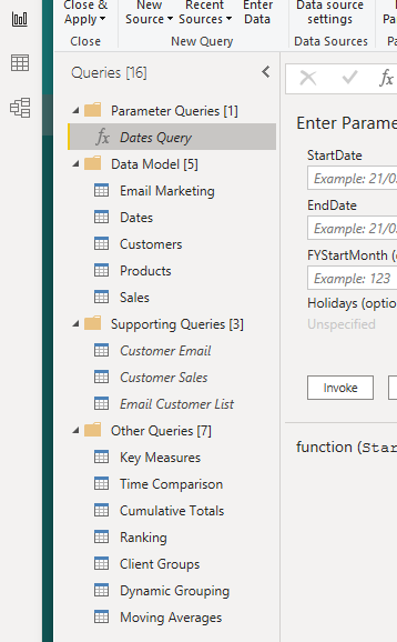
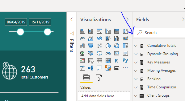
Then we got to the front end of the model where I decided to quickly create a range of different measures covering off different calculations and analysis that I wanted to showcase.
Because of the common patterns of DAX formula I was able to create these relatively quickly because I could just grab from my memory bank how to create a cumulative totals, moving averages or ranking techniques etc.
Then I got to the visualization and I made full use of the new color palette generator from the Analyst Hub. The Analyst Hub is our new web based application that we’re investing a lot of money and resources into. To develop a tool that can sit side-by-side your development work inside of Power BI.
This is an exciting initiative for everyone connected to Enterprise DNA and it was great to actually use it in a real world example. And I was impressed with the functionality.
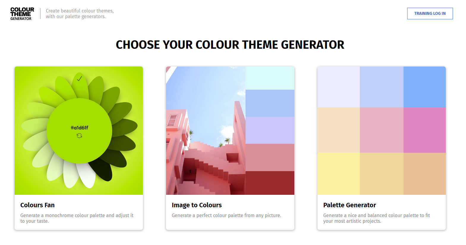
I ultimately used the color fan part of the app which enabled me to create some consistent colors around a greenish palette.

You’ll see in my report visualization that I’ve kept things relatively simple and I’ve also kept to best practices that I’ve developed over a number of years. The main ones here being sticking to grids, making key information stand out, using a simple color palette and using many labels to make it very obvious what a consumer is looking at.
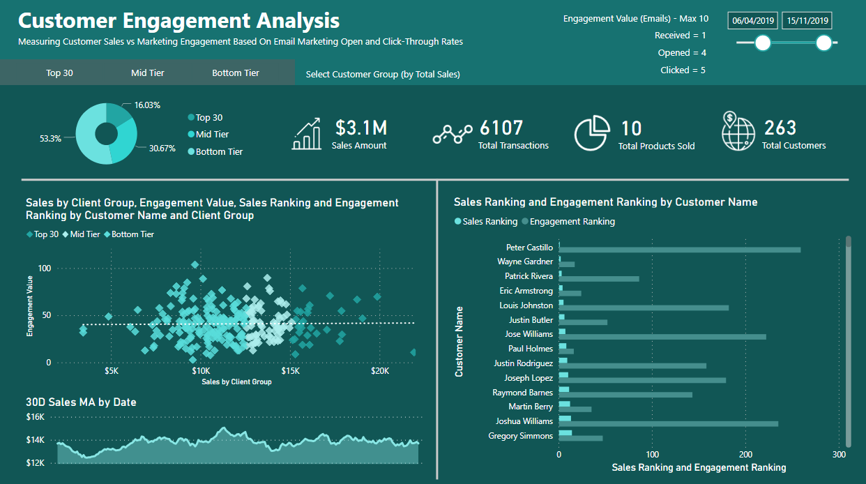
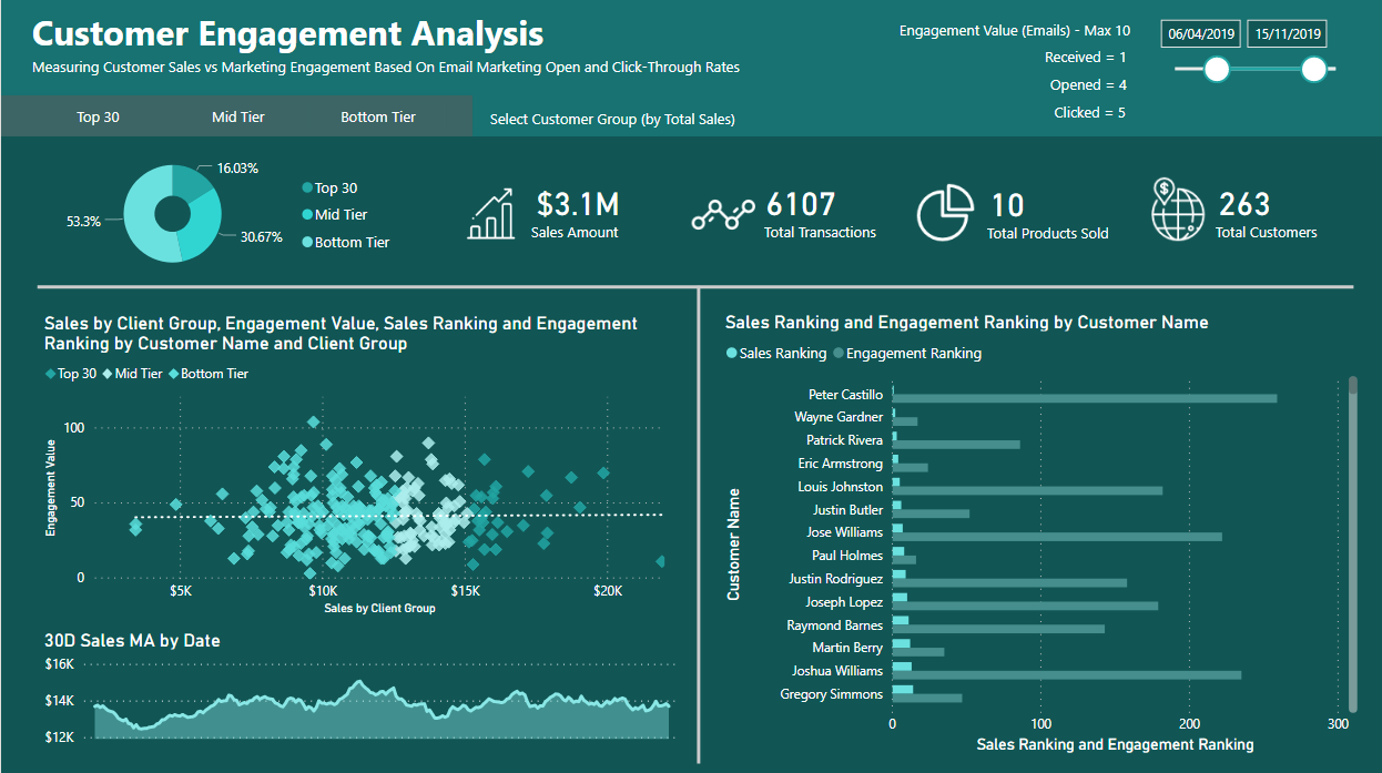
I played around with a few different designs, but what I ultimately came up with was the ability for the consumer to dive into different groupings of clients. So they could dive into the top 30 or their mid tier clients or bottom tier clients. By doing this you were able to see if there was any correlation overall between the engagement value and sales or dive into specific groups of your clients.
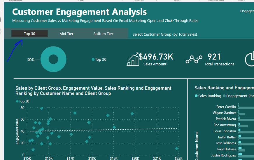
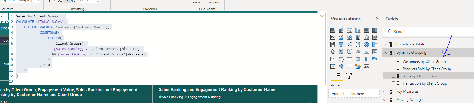
I felt like this was a good idea and I used the dynamic grouping formula pattern to be able to showcase this throughout the report. This way I would be able to dive into just my key customers and understand where the bulk of my revenue was coming from and if the email marketing strategy is really working for that subset of customers.
Sales by Client Group =
CALCULATE ([Total Sales],
    FILTER( VALUES( Customers[Customer Name] ),
            COUNTROWS(
                FILTER(
                   'Client Groups',
                   [Sales Ranking] > 'Client Groups'[Min Rank]
                  && [Sales Ranking] <= 'Client Groups'[Max Rank]
                )
            ) > 0
    )
)
My conclusion with the report and the data is that there really isn’t actually too much of a correlation. Only a very very small one, if that. In my clustered bar chart here I’ve decided to showcase the ranking around sales versus the ranking around engagement value and when you search down the list of customers you actually see that there isn’t a huge amount of correlation. It’s relatively random where someone is ranked in either.
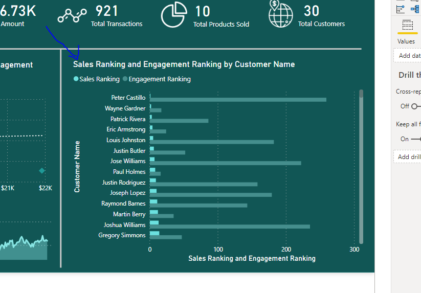
So my conclusion is that there probably isn’t that big a difference which means from a decision perspective or an actionable insight perspective we probably want to improve our email marketing because you would expect if there was high engagement you would have higher sales.
It was a great experience working through this challenge and also getting a lot of my analytical thoughts down into a report. It really just highlights to me once again that Power BI is just an incredible analysis tool that enables such scalable insights.
Well done to the team running the challenge and all those who have participated.
All the best.
Sam