Super cool that you are going back through the previous challenges that you missed. There’s a whole lot I like about your report here, but there is one very big flashing red light. Scatterplots with the dynamically calculated trendline are great for showing the relationships between two variables – unfortunately they are also great at showing relationships that don’t actually exist, which is the case in this challenge.
This point was one of the primary focuses of my entry on this challenge:
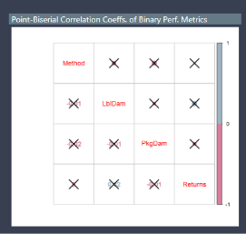
Unfortunately, this challenge was before we commonly started sharing write ups about our entries, so I don’t have a ready-made supplement to accompany my entry. However, what I typically try to do when depicting these types of relationships is to report the correlation coefficient between the two variables ( or the R squared from a regression), as well as some indication of the significance of the correlation coefficient (either a p value, or what I did in challenge #4 which was to report the correlation matrix and have it place an “x” over each coefficient that was not significant at the 0.05 level.). My posting on challenge #4 includes the R script for how to do this.
R is a great way to run this analysis to make it dynamic within Power BI, but you can also do it using a custom visual (what I did in challenge #2) or using a Power BI measure for computing the Pearson correlation coefficient, posted on the Microsoft Community forum:
Ruth from Curbal also did a nice video a while back on the same topics:
There are a lot of different options, but reporting the magnitude and significance of the correlation coefficient will help prevent the consumers of your report from drawing the wrong conclusions
@BrianJ I did see your report, and it’s really well done! I actually did the scatter plot on purpose, knowing your point. This data is so flat, I wanted something ha. To be fair, I don’t think I’d call any of these plots a correlation looking at them as they are, even if the trend lines go up.
I left it because I wanted to see some change, but I suspect the increase is simply because more time had past after email than before. I’m going to add in an average per day and average per month into the report to test that theory. See it here: Now with avg per day and avg per month
For the top plots, it’s also fake, because all I’m doing is upping my chances on the fake data. Out of 45 days with emails sent, I get 1 sale on the same day. 34 days with emails sent I get 4 on the same day. As the number of emails sent increases, so does my chances that the day of sale is going to be the same. These are terrible outcomes for clicking a link especially. I was trying to prove that spamming isn’t actually driving the customer away. (it’s having no affect at all)
Edit: Also, there is not enough data here to really say the email affected sales. For one, there is too much email. If I email everyday and people make sales, I can’t say that the email was why that sale happened. Second, there are a lot of things that would impact sales – was it payday? was it black Friday? was there a massive sale? did they post something on twitter? was there no pandemic (ha)? I run into this with work, people want to see if business initiatives had an impact, but there is rarely a clear indicator. I’ve found that simply asking in a survey yields better results. Asking directly, did our email affect your purchase today (yes, no, what email?). It is also why I didn’t try to interpret the data.
@BrianJ I’ve been thinking about your comments all week. What you say has merit so I have already removed the trend lines and changed out the titles, as I think they were misleading.
I am still thinking of how to best show what I want effectively. I like the scatter plots because honestly I never get to use them in a report and I’ve seen so many entries with them and I wanted to try it!
I like the scatterplots too. I would suggest just including a card with the correlation coefficient and p value. In cases where the null hypothesis is rejected (it never is in this challenge due to the randomized data, but generally speaking), you may also want to include the trendline.