Power BI Accelerator Week #6 is Live!

All,

Sorry for the delays in getting this Week’s Accelerator #6 launched, but I hope you’ll find it was worth the wait. This one is a sharp left turn from the previous five weeks. No data modeling this week, no Power Query and only a very small amount of simple DAX (not a CALCULATE statement to be found…).

The focus of this week’s Accelerator is visualization, but not the visuals themselves. Instead, we’re going to be focusing on the incredible tools that Microsoft has added to Power BI over the past couple of years that allow you to create an amazing app-like user interface/user experience (UI/UX) within your reports, and control the users’ path through your report to allow you to tell a compelling story with your data.

I recently saw a great documentary on Quincy Jones, where he talked about how for hundreds of years all music has been composed from the same 12 notes. The same is true for Power BI reports - everyone uses the same techniques to create their UI/UX:

  • Buttons
  • Bookmarks
  • Tooltips (standard, modern visual and report)
  • Drill Through (direct and conditional)
  • Page Navigation (direct and conditional)

Thus, in this challenge we will be traveling back in time to the simple report we created in Week #1 (in actuality, @sam.mckay 's interpretation of the Week #1 report from the live solution session, which I liked a lot). Using that report as a base, I’ve constructed 5 separate mini-challenges, each of which focuses on one or more of the above UI elements/techniques.

To explain what you need to do for each mini-challenge, please refer to the short video below:

https://drive.google.com/file/d/1xHsOixvyLDOI6al4Jo3KFxab8_o-i2vp/view

Also, to help you out below is the Publish to Web link to my solution, so that you can play with my report to see exactly how each completed mini-challenge should operate.

And in the post below is an extensive list of learning resources, as well as excellent sources for free icons for your buttons.

For the report tooltips and the drillthrough and page nav pages, don’t feel that you need to replicate my pages exactly. You don’t need to make these elements look particularly nice - the focus should be on just understanding the mechanics of each technique.

If you complete this full exercise, you will know how to execute the exact same techniques that the best developers in the world use in their reports. Now knowing how to play those 12 notes on the trumpet doesn’t automatically make you Miles Davis, but it’s a necessary first step.

Later this year, report designer extraordinare @alexbadiu will be coming out with a course on the Enterprise DNA platform on Data Storytelling, that will go through in detail how to turn those 12 notes into amazing compositions, but for now we’ll just focus on the fundamental techniques.

The Accelerator Advisory team members (@KimC and @eric_m ) and I really hope you enjoy this one.

Good luck! And as always, if you have questions, just give a shout on this thread of the forum.

  • Brian

Power BI Accelerator -Week 6 Problem.pbix (9.1 MB)

P.S. Planned live solution session for this problem set is Wednesday, Oct 27 at 5pm ET. Registration link to follow soon…
7 Likes

All,

Per the post above, here are the links to the Learning Resources for Accelerator Problem Set #6, as well as a list of sources for free icons for your buttons. (I use the paid subscription version of flaticon.com, but I think they have over 1M free icons as well. I learned about the White Icons site from @JarrettM , who uses those extensively in his reports - thanks, Jarrett!).

SUGGESTED LEARNING RESOURCES:

Using Bookmarks To Change Views On The Report Page In Power BI

How To Use Options Within Bookmarks in Power BI

How to Create a Pop-up Slicer Panel

New Modern Visual Tooltips For Power BI

Creating A Visual Tooltip In Power BI - Make Your Consumers Really Go Wow

How to Add Or Overlay Tooltips To Any Area Within A Power BI Report

Using Buttons to Enable Drillthrough Capabilities in Power BI

Conditional Page Navigation for Buttons in Power BI

Brilliant Navigation Ideas For Power BI Applications - Get Creatively Inspired

SUGGESTED SOURCES FOR FREE ICONS:

Enjoy!

  • Brian

Hope everything is ok with your family emergency @BrianJ and thanks for this weeks challenge. I believe I’ve got everything covered in 1 attempt for a change, but we’ll see!

Power BI Accelerator -Week 6 Problem - Final.pbix (9.2 MB)

This reminds me of a question I’ve been meaning to ask as well. With the toolbar part, is there a better way of dealing with “cross bookmarks” for lack of a better term? For example, on my reports for work I have a hamburger menu at the top left, that opens a bookmark to overlay a menu for report navigation. So each report has 2 bookmarks.

However, if on a report I introduce switching between chart types like in this weeks challenge, I now need 4 bookmarks. Menu open/closed for chart A and menu open/closed for chart B. Is there a better way to handle this, such as just 1 bookmark that opens the menu, or toolbar in the context of this weeks challenge?

@jamie.bryan ,

Outstanding! I just ticked through your report and everything is working exactly as it should. Well done, sir!

If I’m understanding the situation you’re describing, I think you should be able to handle that using the “Selected Visuals” switch in the Bookmark options to separate the status of the menu open/closed from the chart type status. When Bookmark interactions get too complicated, I sometimes “cheat” and segregate them by replicating the page and using Page Nav instead of bookmarks in some cases - it makes your report file larger, but sometimes really simplifies the interactions.

I hope that’s helpful. If not, if you can provide a representative PBIX I’d be happy to work through the issue with you.

  • Brian

P.S. Thanks very much for asking - still some medical testing left to confirm, but family emergency appears to have resolved well. Whew…

P.P.S I’m very curious as to approximately how long it took you to develop your solution on this one? We really didn’t have a good sense of how long this would take relative to the others since it’s so different.

1 Like

Thanks! I’ll give that a go when I get chance to have another look at it.

Glad to hear, hope the tests come back with good news.

Umm, maybe 2.5-3 hours? However I get very particular of things lining up and colours matching so that probably took a fair chunk of the time.

1 Like

Hello:

I’m trying to download icons from www.iconsdb.com.

This is my first attempt at downloading icons.

Which download protocol should I use? I’ve tried a couple (ICO and PNG), but the downloaded images are empty.

Thanks.

Scratch the question above. All set.

@JohnG ,

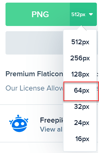
Even though you’ve got this squared away now, I’ll give my $0.02 to help those wrestling with the same issue. If the site gives you the option to download in multiple formats, I typically choose PNG (works well if you want to tinker around with changing colors and transparency masks). If they also give you the option to choose resolution, I typically pick 64px unless the button is really large.

  • Brian
2 Likes

Thanks, Brian.

Another icon-related tip. I really like the pay version of flaticon.com - amazing variety of icons, well-organized and easily searchable, great web-based icon editor, easy to organize icons into collections, etc. but membership is not cheap. However, typically in November of each year they run a Black Friday sale where you often can get annual memberships for 40-50% off the regular price. They don’t often run sales/specials, so if you do enough custom report design to warrant the pay version, keep your eyes out in Nov.

  • Brian

I probably spent 4 hours in total, but certainly could accomplish a task of similar difficulty much quicker the next time around. It’s a matter of knowing what the available configuration option are and where they reside. Very helpful.

1 Like

Accelerator friends:

Microsoft has a new PowerBI training on effective report design. Many of the concepts that we are learning this week are discussed, and much more. There are lots of examples of what to do and not to do in report design.

Check it out

Design effective reports in Power BI - Learn | Microsoft Docs

1 Like

Hi @BrianJ , [spoiler]
thanks for such a great challenge Brian. I haven’t quite got the map button working like yours but the rest looks to be working ok.

Looking forward to your feedback

Power BI Accelerator -Week 6 Problem.pbix (9.2 MB)
[/spoiler]

1 Like

@mhough ,

Thanks for the info! - I hadn’t seen this training prior, but it’s really comprehensive and quite well done.

  • Brian
2 Likes

@mhough ,

Great job. You are 95% of the way there on this one. The one remaining issue I’m seeing is that the Clear Filters button in the popup is not working properly for me.

One hint on that one beyond just rechecking your baseline state for the Clear Filters bookmark - rather than using an image and a text box, take advantage of the new capabilities in the Sept 2021 update to create a button with a custom icon and text in one element. This will look cleaner and also remove any ambiguity as to where to click.

Thanks also for the info on how long this took you. I am absolutely terrible at estimating how long it will take me to do tasks in PBI, and even worse at estimating how long it will take others. Even with the excellent input and guidance of the Advisory Team, the survey (which I’ll discuss at Wednesday’s session) indicates that these problem sets are taking folks a good deal longer than I’d anticipated. This sort of feedback will help us adjust future sets. Very glad to hear you’re finding it useful though.

Terrific work on this set - thanks very much for participating!

  • Brian
1 Like

@stevens,

Terrific work. You’re very close here. The report looks great, and I really like the aesthetics of your popup panel. I thought that was going to be the toughest aspect, but you all are totally nailing that one.

Two remaining issues I see here:

  1. The first is that I’m not getting any action in terms of a report tooltip when I mouse over the bottom right table.
  2. As you mentioned, you’ve got the drillthough working perfectly via the modern visual tooltip, but not via the interface.

Here’s where the problem on #2 is occuring: you’ve constructed that element as an icon and a text box. Instead, what you need to do is construct it as a blank button with a custom image and text. That will give you the option of different states for the button, and from there you can change its look depending on whether a state on the map is selected or not.

Great work on this set overall - thanks for participating!

  • Brian

Hello Brian:

I haven’t dealt with the Toolbar section yet, but I wanted to send you my submission for what I’ve done up to now.

I worked through the Line Chart / Bar Chart and selected visuals pretty quickly. Also, I added a tooltip to the Line / Bar Chart, and modified the tooltip for the Salesrep visual.

I’ve had trouble with the State Map and drill-through. The trouble wasn’t so much with the drill-through to the State details, but in managing the button messages. As best as I can understand my problem, I just don’t understand how one button can display different text messages depending upon whether a single state has been selected, or the selection has been disabled. Perhaps, I wired the map selection to the drill-through button incorrectly?

I went back to some other work I’ve done and came up with a clumsy solution. Any suggestion you can provide will be much appreciated.

As far time spent, the Line/Bar Chart toggle and Visual Tooltips required about an hour in total.

I’ve spent far more time on the Map drill-through, although it’s difficult to gauge since I’ve had personal matters that have consumed some time, also. There’s been considerable stop and start.

Here’s my PBIX. I don’t want to devote any more time to the drill-through since I want to take a swing at the pop-up toolbar.

Power BI Accelerator -Week 6 Work.pbix (9.2 MB)

Regards,

John Giles

2 Likes

Thanks @BrianJ, sorted the table. What is the visual you used on the table tooltip?

Thoroughly enjoyed this exercise and have learnt so much more about buttons!

1 Like

Brian:

I made the toggle a little less clumsy. (Attached)
Power BI Accelerator -Week 6.pbix (9.2 MB)

Certainly, I want to know how others managed the buttons and images according to your brief.

@stevens ,

It’s a Microsoft custom visual called Horizontal Bar Chart. It is so much better and more flexible than the native bar chart, I’m not sure why it’s not the default visual in Power BI. Coincidentally, @MudassirAli 's YouTube video on the Enterprise DNA channel today does a direct comparison between the native bar chart, this custom visual and Charticulator.

However, I really like the visual you chose for your tooltip instead in breaking down the top 10 products.

The button options that Microsoft has included in the recent Power BI updates are some of the best new features I think they’ve added to Power BI since the introduction of the External Tools menu.

– Brian

P.S. what’s the skeleton image in the bottom right corner supposed to do? It’s not tied to any particular action at this point.

1 Like