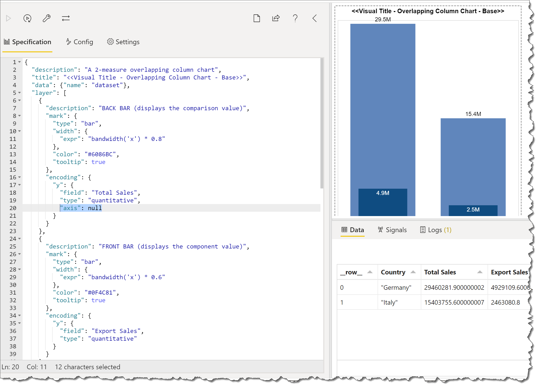
The overlapping column chart(more advanced version in the below linked) is awesome, when comparing actual vs. forecast, plan prior year,etc.!
Simple question (I hope) - how do you elminate the row and column axis titles? More complex question - how would you add a 3rd comparison, such as comparing actual vs. prior year and plan, probably by adding a line? Thank you for any asssistance.
For additional comparisons, you can add other bar marks or tick marks as desired. Here’s a 4-bar/1-tick example of a bullet chart that may be of some interest.