Deneb Template - Overlapping Column Chart

The standard clustered column chart in Power BI can be used to compare two measures, but when the value of the second measure is a component of the value of the first measure, an overlapping column chart can also be used to illustrate the comparison. Included here are two Deneb templates for creating such overlapping column charts.

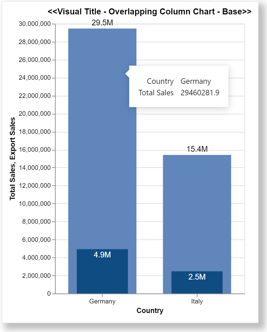
Here is the base version of the visual:

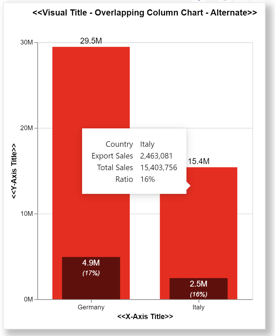
A more advanced alternate version of the visual has also been developed that has a few more features, including:

  • an allowance for space between the title and the visual body for a legend to be added (I am still learning the correct syntax for adding legends, and wanted to release the templates as soon as it was viable; my plan is to attach a new version of the alternate template when available)
  • configuring the approximate number of Y-axis labels
  • a second label on the front bar showing the ratio of the front bar as a percentage of the back bar
  • custom tooltips showing not only the front and back bar values, but their ratio as well

The intent of these templates is not to provide a finished visual, but rather to serve as a starting point for further custom visual development. Thanks to @dm-p for a review of my initial versions of these templates.

Also included is the sample PBIX using the Enterprise DNA Practice Dataset as a demo.

NOTE: These templates are provided as-is for information purposes only, and their use is solely at the discretion of the end user; no responsibility is assumed by the author.

Greg

deneb.overlapping_column_chart.base.0.2.json (3.4 KB)
deneb.overlapping_column_chart.alternate.0.2.json (5.4 KB)
Deneb Templates - Overlapping Column.pbix (1.6 MB)

6 Likes

Marking as solved.

1 Like

I have tried to use deneb to create an overlapping column that show numbers of active streams out of the total Active Participants, but it didn’t work. Below my code.

image

Any idea why my columns didn’t change it?

{
“title”: {
“text”: “Total Active Participants by Active Stream”,
“anchor”: “start”,
“align”: “left”,
“font”: “Segoe UI Semibold”,
“fontSize”: 14,
“fontWeight”: “bold”,
“offset”: 10
},
“data”: {“name”: “dataset”},
“layer”: [
{
“mark”: {
“type”: “bar”,
“width”: {
“expr”: “bandwidth(‘y’) * 0.8”
},
“color”:“#ae002f”,
“tooltip”: true
},
“encoding”: {
“x”: {“field”: “Max__highlight”}
}
},
{
“mark”: {
“type”: “bar”,
“width”: {
“expr”: “bandwidth(‘y’) * 0.2”
},
“color”: “#580720”,
“tooltip”: true
},
“encoding”: {
“x”: {
“field”:“Stream Active Participants__highlight”
}
}
},
{
“mark”: {
“type”: “text”,
“baseline”: “bottom”,
“fontSize”: 12,
“color”: “#000000”,
“yOffset”: -2
},
“encoding”: {
“x”: {
“field”: “Max__highlight”,
“type”: “quantitative”
},
“text”: {
“field”: “Max__highlight”,
“format”: “#000
}
}
},
{
“mark”: {
“type”: “text”,
“baseline”: “top”,
“fontSize”: 12,
“color”: “#FFFFFF”,
“yOffset”: 4
},
“encoding”: {
“y”: {
“field”:“Max__highlight”
}
}
}
],
“encoding”: {
“y”: {
“field”: “Stream”,
“type”: “nominal”,
“axis”: {“title”: “Stream”}
},
“x”: {
“type”: “quantitative”,
“axis”: {“title”: “Stream Active Participants”}
}
}
}

Hi @AnaCarolina. Please post issues to a new thread as forum members often don’t review solved threads (if it helps, as in this case, link to the solved thread for more background). As well, please a PBIX file that illustrates your issue (with sample data if the original data is confidential). @EnterpriseDNA, please break-out the above post into is own thread.
Greg

Hi Greg,

I would like to format x axis title Q1,Q2, Q3 to Cambria font. Can you help me?

Hi Greg,

And also I would likt to move red bar chart to the left side as the picture. Can you help me?

Hi @zjenkins.

Both posting to a solved thread and calling out a specific forum member are discouraged. Please create a new thread for all new issues, as many forum members do not review solved threads, so visibility will be increased.

@EnterpriseDNA, please split this question into its’ own thread.

To help review your issue further, please upload a work-in-progress PBIX showing the visual in question (create sample data or obfuscate the data as necessary). As well, you can reference an existing forum post if it helps clarify your issue.

Greg