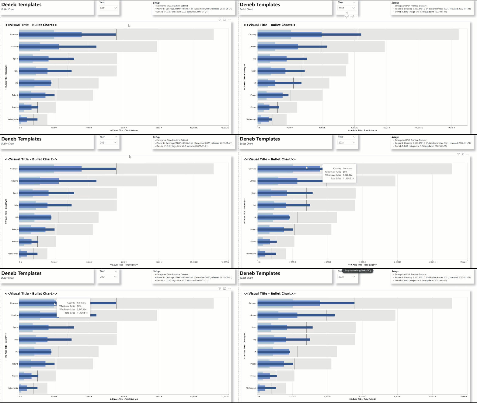
The standard clustered bar chart in Power BI can be used to display a group of measure values for a set of categories, for example the channel sales for a country. An alternative could be a bullet chart with separate bars for the total and channel sales, and I enclose a Deneb/Vega-Lite template for a bullet chart displaying not only the total and channel sales, but a vertical bar at the 50% mark of total sales to add context.

This template illustrates a number of Deneb/Vega-Lite features, including:
- a title block setting additional display properties
- a params block adding parameters for the bar heights and colours
- a transform block extending the dataset by calculating both ratios of channel sales to total sales and a 57% value for total sales
- a standalone “Y” encoding for the country (external to the layers)
- 5 overlapping layers:
- total sales (bar; grey)
- 50% total sales (tick; black)
- export sales (bar; light blue)
- distributor sales (bar; medium blue)
- wholesale sales (bar; dark blue)
- a custom tooltip showing the total sales, the channel sales, and their ratio
- a custom sorting of the countries by total sales (descending)
The intent of this template is not to provide a finished visual, but rather to serve as a starting point for further custom visual development.
Also included is the sample PBIX using the Enterprise DNA Practice Dataset as a demo.
NOTE: This template is provided as-is for information purposes only, and its use is solely at the discretion of the end user; no responsibility is assumed by the author.
EDIT: resolved Deneb v1.1 template generation issue and uploaded new template version
Greg
deneb.bullet_chart.0.3.json (7.2 KB)
Deneb Templates - Bullet Chart.pbix (1.7 MB)